The latest versionof Angular JS is here and all the programming heads cannot hold on to their excitement. First look at the Angular JS 2.0 and you can easily make out that it is so different from the earlier version that you could give it a new name altogether. Therefore, it will definitely give a chance to the angular team to implement everything that they have learned being the most popular frontend framework over the last 6 years. Having said that, Angular 2.0 is going to be a new learning just like Angular 1.0 was. Although it’s worth that effort as once you get your heads around it, we think it would be a much easier framework to use. So, let’s quickly take a look at how it is different and better than the previous version.
1.3 million developers are currently using Angular JS 1 and 480K are already using Angular JS 2. Now, the big question is that what is it really that you should jump on to this new version?
Template Basics
Templates are written in HTML and is a vital user-facing part of any Angularjs app. Major changes in the basic templates can be noted in Angularjs 2. These changes include local variables, Filters and Bindings.
Template Directives
Angularjs 1 offers more than 70 built-in directives for templates. In AngularJS 2, many of them are not necessary. So, they have created some equivalents in the latest version. Although you can bootstrap an Angular 1 app in code, many applications bootstrap declaratively with the ng-app directive, giving it the name of the application’s module
Modules/Controllers/Components
In both Angular 1 and Angular 2, Angular modules help to systematise your application into closely knit blocks of functionality. The previous version required  you write the code that provides the model and the methods for the view in a controller. In Angular 2, you build a component. JavaScript code is shown in the Angular 1 column because a lot of Angular 1 code is in JavaScript. The Angular 2 code is shown using TypeScript.
Filters/Pipes
Just like Angular 1 filters, angular 2 give transformation and formatting for data in the template. A lot of built-in filters of Angular 1 have matching pipes in Angular 2. A few examples- json COPY CODE <pre>{{movie | json}}</pre> Converts a JavaScript object into a JSON string. This is useful for debugging.
limitTo COPY CODE <tr ng-repeat=”movie in movieList | limitTo:2:0″> Selects up to the first parameter (2) number of items from the collection starting (optionally) at the beginning index (0).
orderBy COPY CODE <tr ng-repeat=”movie in movieList | orderBy : ‘title'”> Displays the collection in the order specified by the expression. In this example, the movie title orders the movieList.
Style Sheets
Style sheets glams up your app and provide an admirable look to your app. With evolution over the years, the styles for many parts merge, which can cause unanticipated results. In Angular 2, now you can also encapsulate a style sheet within a specific component along with the option of defining style sheets for your entire app.
Better performance Easier to use Future proof with ES6 Uses web standards
Angular JS is pretty much popular among the developers and the latest version surely has a bunch of new and improved features to play with. Well, in our word it’s definitely worth to upgrade from Angular JS 1.0 to Angular JS 2.0
Developing a website is not the same as it use to be 10 years ago. At that time, the best websites were built keeping the latest prevailing technology in mind and implementing it on the website. However, if on this day you are developing a website using today’s technology, you surely are lagging behind as your website will not be future ready. Tomorrow’s user expects a website that literally reads his mind, provides prompt response and is responsively designed to provide excellent user experience across all devices. In this article we will cover 5 UX trends that will help you to be future ready and your website will not look outdated on the ever changing technology canvas.
1. More of functionality and less of user input
It is a proven fact that users don’t like to twiddle around with numbers and passwords. In fact, any kind of information that they need to provide as input again and again. To top it up, the conditions and rules of inputs like case sensitive, 16-digits etc. add to the frustration of users. No one today likes to connect their WiFi or Bluetooth manually by providing these inputs every time they try to connect. The 2017 generation will definitely want the elimination of this input functionality and would expect single-click interactions. The information would be fetched from pre-saved information based on their previous interactions along with usage of smart logics.
2. Customization is the key
A fun fact – According to a study, only 14% of Americans used the Internet in 1995. Checked the statistics again in 2014, and only 13% of the Americans did not use the Internet. That’s how rapidly the Internet usage has upscaled. What does that mean? It simply means that the target audience has widened now. Internet use stretches across demographics, from geeks to common men and from elderly to children.
Amidst this versatile demographics, it is foolish to implement the fundamental of one-size-fits-all. One needs to customise the user experience for every different demographic in order to provide the best experience for everyone. This provides an opportunity to website developers to play around with personas. Use radiant and vivid colour fonts to children and provide big & bold fonts to the elderly. Ensure that you touch upon the user interest to provide tailor made blogs. Customization will surely be among the top UX trends of 2017
3. Content-focused websites will be the fashionista in 2017
New businesses have noticed an upsurge in their web traffic simply by using a content-focused approach and hence it is selling like a hot soup in today’s market. Startups have left the conventional web designing style of designing a website first and befitting content into it. They are following the content-focused approach to design their websites today.
A content-focused approach is not restricted to content heavy websites, but the primary objective of this approach is to minimise all extra buttons, ads, sliders etc. so that they don’t interfere with content displayed on the website. A content-focused approach portrays an impression to the user that mere selling of products is not your goal, but you want to build a strong connection with users by interacting with them and providing them information.
4. Don’t try to tame the users, give them option of Non-Linear flow
The world of technology is governed by mobile applications today. When we talk about today’s applications, most of them are designed to instruct the users step by step to complete their transactions or requests. Undoubtedly, this has simplified the process to many folds, but it’s more of like herding cattle. The present and future user want to be respected for his intelligence and demands for freedom of movement within the user flow. It’s best to provide a non-linear flow (open navigation design) to users along with an option to jump back onto the linear track any point in time.
5. Use of modular code design
If you think that you have done something out of the box by implementing a responsive design in your website then you are sadly mistaken. It’s no big deal today and users expect your website to function smoothly across devices. What matters is the modular code design allowing your code to quickly adapt itself according to the developing technology.
The utmost important component that requires modular code design is the visual display functionality. At any given point, your developers should be able to quickly adapt to the changing display technology without actually rewriting the entire code. For example – You plan to showcase same site functionality on wearable devices and you do that within a week without actually rewriting the full code. That is modular code design.
Live in the present But plan for the future
Join hands with our expert team today and lay foundation of a picture perfect tomorrow. Check out our services and contact us today.
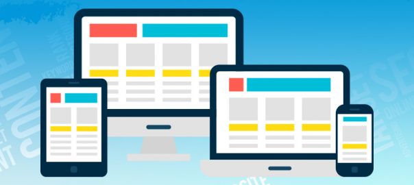
The tech world has been extremely beautified with the implementation of latest high-end technical concepts and features. Jump into the internet world and you can witness a myriad of dazzling websites welcoming you at every click. Responsive design, headers & logos play a prominent role in the creation of delightful websites and it’s a commonly discussed phenomenon among the front end developers of today’s world. But it’s not a cakewalk to fully understand the concepts of designing responsive layouts as the subject is an ocean of knowledge and information.
There are tonnes of unique areas of a website which call out for attention but concentrating on individual elements will provide you an edge to fully understand the user goals. Once the user goals are carefully understood, it becomes easy to identify how these goals can be achieved using a responsive design.
In this article, we will cover website components like logos, headers, and navigation menus as they fall under the umbrella of a responsive design. Here are 4 important tips that developers should keep in mind while creating a responsive design:
1. Iconification of the logo
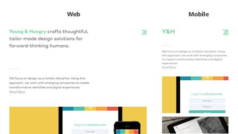
A logo is the most important element of a brand’s identity and usually contains a graphic, some text or an icon. This provides a leverage to iconify the logo into a symbol altogether. The header of a website is usually a bit cramped up and fitting in the complete logo of the brand isn’t appropriate. Agreed, that you might lose some glam and charm of a full sized logo but that isn’t a bad compromise for maintaining a clean responsive layout. In addition, you really don’t need to always rely on graphics for condensing the logo. Even the text can get condensed to create the effect. Check how Young & Hungry uses a bright green logo which condenses when viewed on a mobile device.
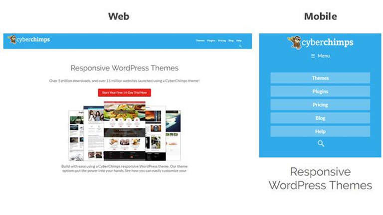
2. Use thin navigation bars
A big header seems alright on a large display screen but definitely not on a smaller screen of handheld devices. Native mobile applications usually have a fixed header and a responsive design follows the same practice. On smaller devices, the fixed header must also shrink down to display maximum content while still providing an easy access to the header & navigation. A dropdown box as a responsive view is another way to handle navigation, especially on a smaller mobile screen. Take a look at the image below. The header has related icons for all the text links. This looks absolutely fine on a widescreen but for a smaller screen, it’s too much of details. A dropdown option comes handy here.
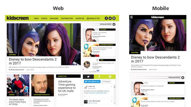
3. Keep the navigation very simple and basic
It’s always a good practice to not make things too complex. When you revive the design for a smaller screen it’s best to keep as many links as you can in the navigation along with providing an easy access. This becomes challenging when you have a multi-tiered dropdown menu and hence you need to drop a few items. However, if you play a little smart, you can accommodate all of them. One of the techniques is to use a flyout menu showing sublinks in your responsive menu. A Hamburger menu is a necessity for websites that need to display lengthy navigation menus and it’s perfectly accepted as a menu button by the smartphone users. It simplifies the process of navigation by providing more clickable area and large link text.
4. Keep the focal point always visible while dealing with full-screen backgrounds
A full-screen background certainly draws a few extra eyeballs but it again works best on large monitors. The designers usually remove the background image after a certain breakpoint or the image realigns itself as per the screen size. The key is to maintain the focal point in view at all times no matter what the screen size is. It needs some CSS positioning to implement this solution and is fairly simple once you get a hang of it.
As mentioned earlier, the topic of responsive designs is deep as an ocean and there are umpteen other tips and tricks which could be implemented to create a scintillating web design giving the same delightful experience across all screen sizes and resolutions. Let our web design experts create that perfect website for you. CONTACT US TODAY!
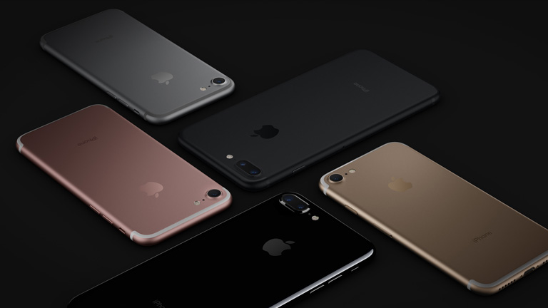
Every Apple enthusiast was eagerly waiting for the month of September for one simple reason – Launch of the next generation of iPhones. And here it is! Apple released the new iPhone 7 and iPhone 7 Plus at an event organised yesterday in San Francisco.
The latest versions are aesthetically pretty much similar to its predecessors iPhone 6 and iPhone 6 Plus. However, it showcased plenty of new features which included a faster processor, better quality camera, pressure sensitive home button, improved battery life, and a missing headphone jack. With a starting size of 32 GB, it also poses a new range of colours to choose from.
What’s New?
Amongst the list of changes, the most compelling change is the omission of 3.5 mm headphone jack along with an improved camera and the new home button. The new iPhone 7 uses its lightning port to fit in the earphones, unlike its traditional headphone connection. The Plus model has a more powerful “dual-lens” camera. Let’s have a detailed look at the significant changes in the all new Apple iPhone 7:
No more headphone jack
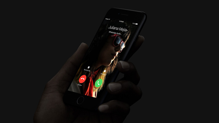
The new iPhone 7 series is equipped with Lightning Earpods that connect to the charging port and wireless Apple Airpods, powered by a WI chip. The decision of replacing the traditional headphone jack has surely got some eyes popping and is one of the most controversial Apple Inc. decision. The infrared sensors detect when each pod is plugged into the ear and motion sensors assist the earphones to sync with Siri. The compact Airpods comes with a compact charging case that delivers 24 Hrs of battery life. It provides 5 Hrs of listening time without charging.
Although traditional headphones are not a part of the new iPhone series, Apple will supply an adapter which enables traditional headphones to plug into the iPhone but without the option of charging simultaneously. These pods are connectable to Laptops, Apple watches and iPods. Beats electronics have launched two versions of wireless headphones for these specific iPhone models. For the first time, iPhone 7 series will feature stereo speakers which are mounted at the top of the phone.
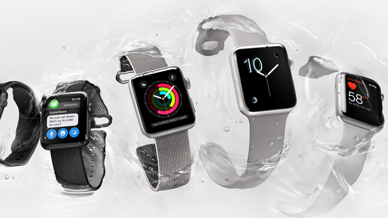
Apple Watch 2
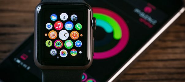
Apple also announced Watch 2 at the San Francisco event. The watch is now swimming proof in comparison to its previous splash proof version. It has a dual-core processor providing 50 percent better performance and 2 times better graphics. Watch 2 has a built-in GPS, a screen with 1000 nits brightness, and will also be available in ceramic along with metal. With the launch of new Watch 2, developers will surely need to know some tips to effectively design apps for Apple watches.
Home Button
The home button is now pressure sensitive and has been provided with a vibration-based taptic feedback which gives feedback to users when touched. This feature is already in use on Apple’s Macbook laptops.
Improved Battery Life
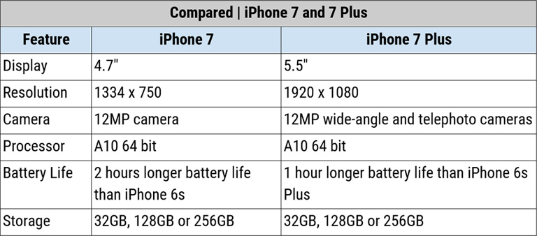
Like every upgraded iPhone model, iPhone 7 will feature the most efficient battery of all times. The new battery will last 2 hours more than iPhone 6 and 1 hour more than iPhone 6 Plus. The new iPhone 7 will last for 14 Hrs on WiFi and 12 hours on 4G, while iPhone 7 Plus will last for 15 hours on both WiFi and 4G.
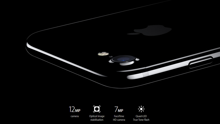
New enhanced camera
The updated camera features better low-light capabilities to capture sharper and crisper pictures with an adequate balance of light. iPhone 7 (4.7-inch device) has an f-1.8 lens allowing 50 percent more light on the lens along with a new 12MP sensor which is 60 percent faster and 30 percent more energy efficient.
Talking about the bigger Plus version (5.5-inch device), it has a dual-lens camera which provides enhanced picture quality while taking pictures in Zoom-in mode. The iPhone 7 Plus has two 12 MP cameras, one of which features a telephoto lens that can zoom 2X in high-quality without using any software. The telephoto lens allows a total of 10X optical and soft zoom. The other camera has a wide angle lens that allows clicking rich quality pictures in major angles. Both the models have 4K recording capabilities.
It also has a new camera flash and image stabilisation feature to provide enhanced images in low-light. The number of LEDs has also been doubled to four – two warm and two cool, to produce a more effective flash. The front camera has been upgraded to 7 MP from 5MP for selfies and facetime.
Looks and Appearance
The new iPhone 7 series looks quite similar to iPhone 6 series with only the antenna bands moved from the back to the edges of the device. Space Grey colour will no longer be an option in the 7 series. iPhone 7 is offered in 5 colours – Matte Black, Glossy Black, Silver, Gold, and Rose Gold. The new “Shiny Jet Black” is exclusively offered in the 128 GB and 256 GB options.
Internal Performance
The new models are powered by a 64-bit 4 core CPU and Apple A10 fusion. The graphics are 40 percent more powerful than the A9 processor. Overall, the new iPhone is 40 percent faster than 6S and double the speed of A8 processors.
The new generation of iPhone 7 is water resistant with IPX67, enabling it to endure immersion in 1 meter of water for 30 mins.
Release Date & Price Details
The ordering begins this Friday on 9 September 2016 while the shipping will start from 16 September, 2016.
PRICES:
iPhone 7 32GB – $649
iPhone 7 128GB – $749
iPhone 7 256GB – $849
iPhone 7 Plus 32GB – $769
iPhone 7 Plus 128GB – $869
iPhone 7 Plus 256GB – $969
Comparison
Apple made a profit of $48.67 billion last year and with the launch of new iphone 7, it’s all set to scale new heights. The new iPhone 7 looks promising but has some controversial changes like no traditional headphone jack and it would be interesting how the ever growing Apple fan base are going to react to that.
Top 5 Mobile App Navigation Patterns Ruling The Market
Imagine you are in the middle of a crowded square surrounded by dozens of streets with signboards which are all Greek to you. And, there isn’t any savior like a google map to rescue you from this situation. Sounds like an absolute nightmare, isn’t it? Such can be a case when it comes to playing around with an app on a mobile device. If the app navigation is not clear and user-friendly it can easily force the user to tap on that RED cross or tap the home screen. The design of an app is no longer restricted to the beautification quotient but has extended to the engagement part. No matter how classy, sassy, attractive, or eye-catching your app is, it’s all down the drain if the user can’t find his/her way around the app. So, today in this article we will take a quick look at the top mobile app navigation patterns which are proving to be super comfy and popular among the users.
But before we jump onto these cutting-edge navigation patterns, let’s understand the basics of a user-friendly navigation pattern –
“We need to be SIMPLE, COHERENT, and CONSISTENT In order to hit their SENTIMENT”
In character, in manner, in style, and in all things, the supreme excellence is simplicity. Keep your app navigation system as simple as possible. The users at all points must feel like a hand of God is guiding them across different pages of the app. The moment you try to be too fancy and make it a little complex, you lay the foundation of a bad user experience. In addition, the functions of the app must be self-evident with the use of proper signifiers in ways of words, images or sound to make the navigation self-explanatory.
Another plus point is to have a tutorial or an orientation to make the user familiar with the app beforehand. Last but not the least by any means, the navigation must be consistent across all pages of the app. A user would be livid if he finds a save image option on one screen only to be exchanged with an exit option on the next screen.
So let’s hop onto the 5 best mobile navigation patterns ruling the charts today :
1 Pictorial Icons
The pictorial Icons is one of the best approaches for an effective mobile navigation pattern. Each icon picture displays exactly where the user will be guided to once he clicks on it. It very smartly uses the ‘less space’ quotient of mobile apps. An envelope is a universal signature for emails, however, there is freedom to play around with the look of that envelope.
2. Content based navigation
This pattern boasts seamless transition between overview and detail states within an app. It helps in creating a fluid and intuitive user experience. The best example would be ‘Tinder’. A user can toggle between the two states of a user profile by simply clicking on the central picture in each view. You can easily swipe through the pictures in the detailed view and if you click on the picture in detailed view, it takes you back but stays on the same pic.
3. Vertical Navigation
A listicle is any day better than any other display format and we could not agree more in the case of mobile navigation patterns. It neatly displays all the available options in a gridview leaving the header and the footer for universal actions. Music player apps, Spotify, Yahoo Digest and countless other apps rely on the same.
4. Sliders
If your app portrays a very few closely knit progressive pages and you have a very few basic elements to go through, then Sliders should be your call. The pioneering example in this context is ‘Uber’ which allows users to navigate between different types of services without changing the MAP VIEW (the main context) for each service.
5. Card Grid
Without the slightest of the doubts, CARDS are the best designs for mobile apps. A Card-based UI helps in aggregating individual pieces of content into one single piece of easy user experience. Quick stories and scenes can be best described through a card layout. Not to mention, that cards are best for mobiles and varying screen sizes. Check PINTEREST!!
Technology is changing every day and we need to keep ourselves abreast so that we can use the best practices to enhance our apps, websites, designs, and businesses. NYX Ditech is here to be your helping hand in the journey to build up the best experience for your customers at all touch points. Contact us TODAY!!
Ask any expert of the tech industry and he will nod his head in agreement that wearable technology is the future. This marketplace is growing at a tremendous rate eyeing to reach up to $12.6 billion by the year 2018. One of the most popular segments of this market is the smartwatches. While Google, Samsung and other companies are pouring money in this segment, Apple leads the charts in the smartwatches section. With that being said, here are a few facts to keep in mind while designing apple watch apps :
1. Increased focus on App Icons
First things first, an Apple Watch doesn’t have text like the smartphones. So, it’s just the icon that you have to play with. Thus, an impressive icon design becomes critical in creating the overall impact on the user. Also, Apple Watch uses a circular design rather than a squarish one. You need to design the icon similar to the one used in smartphones to maintain the brand identity and design consistency. Lastly, apple watch is available in 2 different sizes. Hence your icon design should be consistent across both sizes.
2. Simplify your app
Apple watch is a wearable device which is designed to support short interactions with users. Unlike smartphones, these interactions don’t last for minutes but are often over within a few seconds. A study conducted by Apple showed that the average user interaction time lasts between 2-5 seconds. This calls for simplification of the apps. These short interactions are either Glances – time, date, heartbeat, current weather etc. or Notifications – information presented when a user lifts his/her wrist or Applications – allowing the user to interact with the information. Out of these 3, glances and notifications are most common adding to the importance of simplifying the apps.
3. Create an impact by thinking small
This goes without saying that there isn’t a lot of space on the Apple watch display. Your design should be precise, impactful and there should not be any hodgepodge on the screen. The use of images should also be minimal to avoid high loading time as this is a smartwatch and demands for an easily comprehensible app.
4. The navigation should be minimum
The Apple watch comes with two different navigation systems. One is Force Touch which differentiates the screen depending upon how hard the user touches the screen – like a tap or hold. The second one is the Digital Crown which zooms in and out when the user twists it like the traditional watch crown. This helps in not blocking the watch’s display. Because of these 2 navigations, you need to keep the navigation menus as simple as possible. You don’t want the users to constantly tap and zoom for the info that they seek.
5. Use animation to upscale the UX
If there is one thing that undoubtedly adds an edge, it has to be animations. Animations are not new when it comes to enhancing the user experience. But, with the space limitations on apple watch you need to play very smart. Be subtle with your animations and focus only on the elements which are vital in drawing user attention. Don’t use too many data-heavy features as it will definitely compromise the app functionality.
Well, the future of Apple smartwatches is yet to be decided, but the present popularity favours a bright future. There are a huge number of similar advancements which knock the door of the digital world everyday and only a team of expert minds can best utilize the opportunities and dodge the challenges. Get your expert advice today. Click Here to check the full basket of services that we offer at NYX Ditech.
We are a part of this constantly changing world which has shocked all of us with the level of evolution and change. Our private lives are changing and becoming more and more public nowadays. With the booming popularity of social media, human emotions which were once quite private and restricted have become substantially liberal. Sharing a breakup with the world on social media is an acceptable emotional expression in today’s social frenzy world. As humans have become more emotional online, they also expect a similar kind of response from the websites and UX design they interact with. They feel that a website should have a personality of its own and the interaction is more of an emotional communication rather than merely a transactional one.
We are possessed by our emotions and get magnetically attracted to things that tickle those emotions. Visual impact is something which is most effective to pull the emotional trigger. People are smoothly attracted to images, graphics, videos, and other visual elements. UX design for emotions carefully identifies the importance of these emotions and use it in web designing and app designing.
Humans are very emotional creatures. They want a personal experience with a website, nothing less than building a relationship.
So let’s try to peek at some of the important techniques which can be used to evoke human emotions and create an impactful experience to drive the users to come back again and again:
Laughter is the best medicine:
Which is your favorite TV commercial? I bet it would be some creatively developed humorous ad. You never forget it and share it through word of mouth as well. That’s because happiness is contagious. People seldom forget things which make them smile. The same concept applies to websites as well. Implement the humor quotient in your web designs as well. Use cartoons or funny graphics to create a light, happy feeling across the website. Check out these funny ERROR 404 messages –
Balancing the Surprise and expectation factor:
We humans are very predictive of nature and we are always enticed by things and experiences which we can kind of predict and follow easily. It is important to identify and utilize this attribute in UX design for emotions. However, being completely predictable can lead users to boredom and thus a little surprise element should always be a part of the design process.
Attention and Personal touch:
It’s human to be an attention seeker and center of attraction. This is one of the emotion that should not be neglected and UX design for emotion must use this emotion to its advantage. For instance, you browse through an Italian website and see a speech bubble reading “HELLO!! I’m Doris. Do you want me to be your translator for today? ____YES___NO___” When you select YES and enter your name, it reads back “Thank You Roger. Let’s start exploring the website”. So every time you hover your cursor on any word, it translates it to English. How about that for personal attention?
Enhanced user engagement:
User engagement is pivotal in creating a repeat visit. The whole user interaction should be very engaging and compel the user to build a liking towards your website and enhances his comfort level. Users should be engaged through some way like visuals, easy transactional flow, customization or interactive interface.
Have a word with them:
A healthy interaction with the users helps to build their trust in the product or the website itself. People like getting heard and appreciate a response more than anything. With the help of UX design, communicate to the users in a way that makes them feel you are their companion or friend rather than just a mechanical business platform. The choice of words and tone of the language are crucial in this process. Too formal or too casual can both be harmful towards your relationship with the users.
Now, did we ring a bell here? Are you startled and amused by discovering the complexity along with the importance of the entire UX design for emotions fundamentals? Well, you don’t need to scratch your head over it as we are here for you. Let us infuse this ideology in your website and make you the best friend of your customers. Take the first step, reach us TODAY!
Hiring a web design agency? Here’s what you need to know
Zeroing on a web design agency to carry your tasks can be a daunting process. It’s essential to understand what are your requirements to ensure that you partner with the perfect agency who can share your vision and business objectives. So here is a list of pointers you should keep in mind while selecting a web design agency : 1.Services under their umbrella: Defining your own requirements and narrowing down on the overall business objective is a prerequisite. Once done, it is important to know what are the services offered by the agency that you are considering. Whether they provide web designing, UX, UI, SEO, content, digital marketing etc. or not. Match your requirements and services offered while choosing the agency. 2. How do they charge and what’s the price: Pricing is one of the biggest decision-making factor in this process. You should have a thorough understanding of their pricing model and charges for every service. You must have info if they bill you on a flat project rate basis or hourly basis depending upon the manpower required. 3. A good reference check is highly advisable: Know more about the company and the people to whom you wish to outsource your work. Who owns the company, how much experience they hold, what’s their feedback in the client world, what’s their overall strength (not that it defines something) are some good to know information. Information about their previous projects, clients and success will give u feel of satisfaction and will grow your confidence in the agency. 4. How versatile is the agency? Imagine you decide to start a blog section on your website and want to develop written and video content for the same. You approach your current agency, only to discover that they don’t have this expertise and you need to look for a separate agency altogether for one single section. Complete waste of time and efforts. Always analyze how versatile is a digital agency and whether they can hold your hand when your business is enhancing and more services will be required. 5. How and who will manage my project? There are two kinds of agencies: One who have an in-house team of experts and second has a bunch of freelancers who work on contract basis for them. You must know what is the project management pattern of the agency and knowing the SPOC (Single Point Of Contact) like a project manager comes very handy to avoid running in circles. Also, the number of discussions and review meetings should be pre-decided to ensure smooth functioning throughout the project. So what are you waiting for? If you want to partner with the perfect  web designing agency, search no more. Click here to know the services we provide.
Tech Trends 2016 – without a doubt, the world has become a better place to live with the technological advancements and progression. Technology has touched every bit of us and we have embraced it warm-heartedly. Tracking the super dynamic nature of technology, let’s try to foresee the future while checking out the top 10 web design & development trends of 2016:
Run with the time and you would go places,
Take a pause, and you will be lost among the many faces.
Let’s catch up with the most happening developments in the sphere of technology
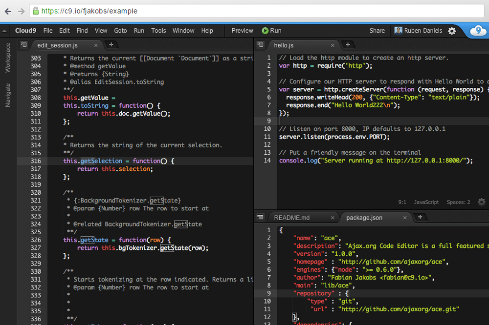
1. Browser-Based IDEs:
For quite a long time developers were stuck with Desktop IDEs which are present since a couple of decades now. But, with the technological advancements and an itch to move to the cloud, Browser-Based IDEs have immensely become popular. The traditional desktop IDEs like Notepad++, Xcode, Visual Studio etc. were released as desktop applications which allowed devs to code with suggestions and syntax highlighting. However, the wind of change and enhancement has made Brower-Based IDEs the new face of IDEs. They don’t require any software apart from a web browser, providing great liberty to the developers who can now code from any place with just the internet access.
A developer can easily save the code fragment to his account for sharing and personal usage. Cloud 9, Codeanywhere, Cloud IDE, CodePen, and Codeply are some of the popular Browser-Based IDEs.
Browser Based IDEs
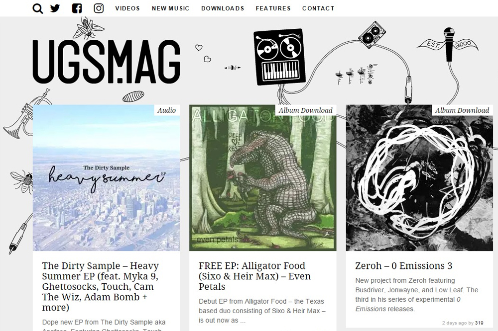
2. Card Layouts:
The effectiveness of a card can be traced way back, even before the tech outburst (remember visiting cards, business cards etc.). The fundamental is simple- putting all the essential information at one place for a convenient scan. Pinterest was the first one to master this art followed by Facebook and others. Ever since then, card layouts have gained phenomenal popularity, especially among the content heavy web pages. Card layouts are popular for all the good reasons –
— I’s instinctive, spontaneous and super easy to understand
— Best match for a responsive design
— Large chunk of information can be compressed into smaller portions which can be easily absorbed
Card layouts hold its ground firmly in the present trending environment and looks very promising with more and more websites banking on it for displaying concise content. Contrastly and UGSMAG are beautiful examples of card layouts used to perfection in displaying the content.
Ugsmag
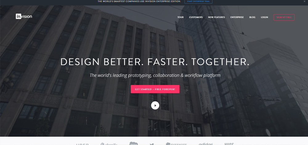
3. Collaboration Tools for Design :
The Working environment has changed drastically over the period of time. Gone are the days when everyone use to work under one roof and thus sharing work material wasn’t really difficult. But, we stand in a different era today. The design team may not sit in the same office or may work in small distributed groups or maybe some of them work from home and the clients are scattered across the globe these days. This necessity to have a simple sharing tool for sharing designs with each other is the mother of invention of various design collaboration tools which are topping the trend charts. Tools like Slack, InVision and Google Keep are the favorites among designers which allow them to participate in collaboration work on a real time basis.
InVision
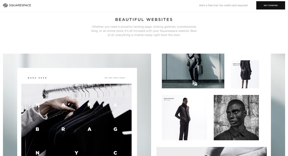
4. High Definition Visuals :
High Resolution devices have quickly gained popularity over the last few years marking 2016 as the year of HD Design. People with HD devices certainly expect HD designs. The share of HD devices has risen from 2% to 18% from 2010 to 2016 and it is expected that this number will swell to almost 50% in the next 5 years. High-quality HD visuals including gripping videos, alluring photographs and enriched graphics are quickly becoming a vital force to drive this transition. Engaging HD videos and high-resolution graphics are pivotal in increasing the time on site which eventually can act as a game changer.
Squarespace
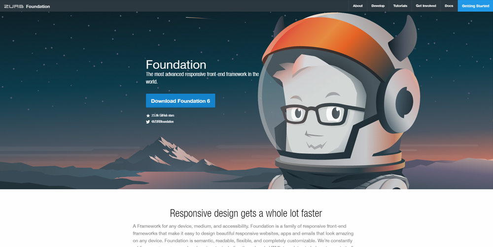
5. Responsive Frontend Frameworks :
That day is history when the only access to the internet (or the website for that matter) was through a desktop. People are on the go and mobile & other devices have surpassed desktops as a medium to access the web. In fact for some people mobile is the only way to access the internet today. Although frontend frameworks like Bootstrap still prove meaningful and have been around for ages, responsive design has eventually enforced its entry into the framework world. It has created a requirement to develop a frontend code along with a backend code. Semantic UI, Leaf, Foundation, Pure, and Clank are some of the most used responsive frameworks by the designers. Inching towards 2017, a lot of new enhancements are expected and responsive frontend frameworks will surely stir the buzzworld of web designing.
Foundation
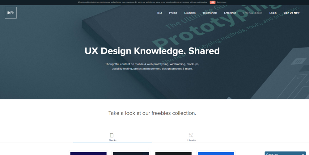
6. Spotlight on UX Design:
User experience has definitely taken the front seat today with more and more designers acknowledging the importance of a good UX. UI is a part of UX or to be more precise it is the path towards the ultimate goal of creating a better User Experience. Turn the clock back 5 years and the designers had no clue about how to apply UX into the design interface and didn’t even had sources of information related to UX. But today we have various resources like US Stack Exchange and free UX ebooks to enhance UX knowledge. 2016 is the best time to learn about the UX principles and apply them to every form of Digital Interface.
Uxpin
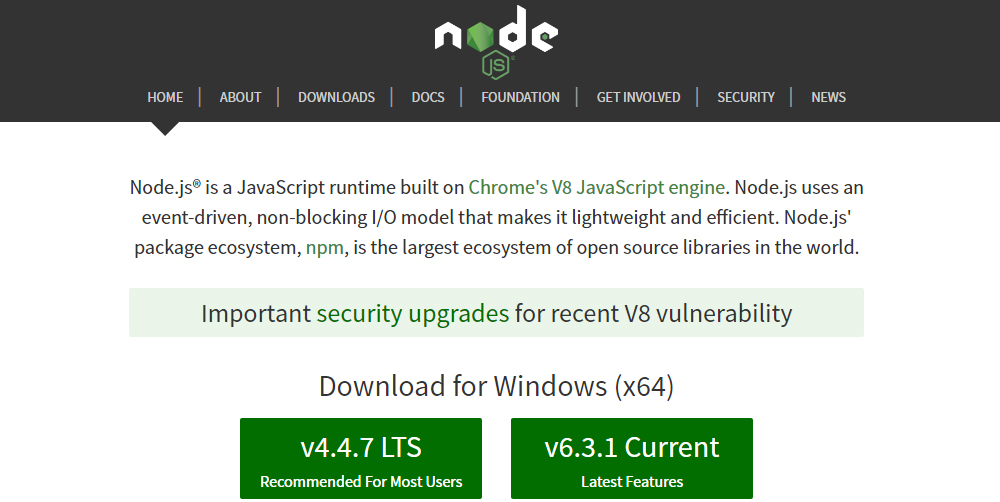
7. Server-Side JavaScript- Node.js :
Node is one player which is proving its metal at the backend language arena and has simply amused Javascript developers. The devs have fallen head over heals to this server-side JS and rank it neck to neck with other prominent backend languages like Python or PHP. The best part is that Node allows developers to code both the frontend and the backend in one single language. The following years will see many more advancements in Node and we foresee a booming future of this javascript. Our advice – get your hands on it as soon as you can.
Node.js
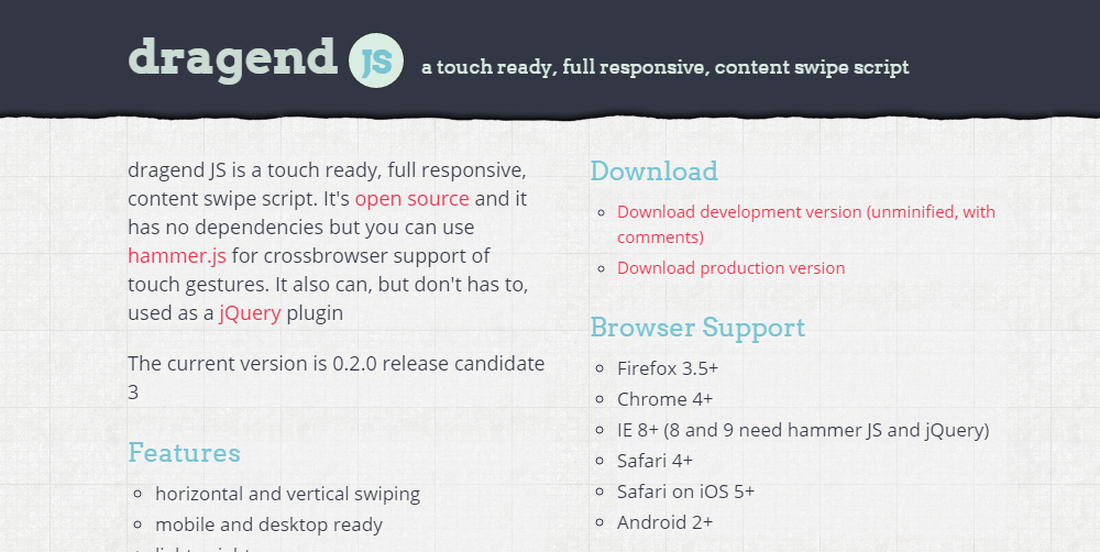
8. Touch-Supported Website Features:
Without slightest of the doubts, touch is the future and the world has gladly accepted this fact. Well, smartphone browsers always managed the backward compatibility factor by supporting the touch function, but off lately more plugins and custom features have been implemented on websites solely for the purpose of managing touch interactions. With this changing environment, devs are pushing themselves to build touch-enabled websites rather than just responsive websites. Photoswipe and Dragend.js are some popular plugins which help in handling swipe and tap features on touchscreen displays.
Dragend
9. Cross Platform App Development :
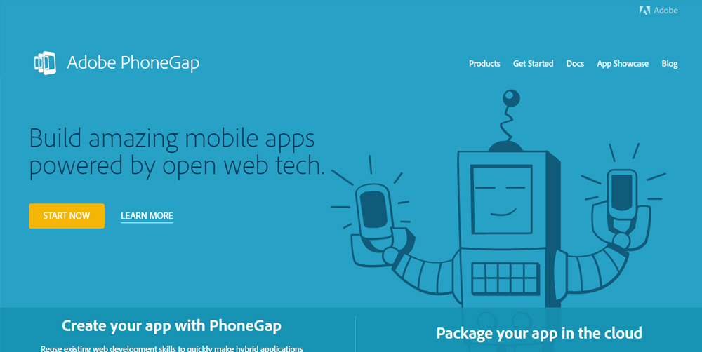
Companies no longer work on a single platform. Mobile workers have grown over the years and various mobile gadgets like a tablet, for instance, is used more over a conventional desktop. With that being said, today people expect to use same applications, with same features, functions and capabilities across different devices and platforms without compromising on the performance front. Today, the devs need to focus more on easing the transition process for mobile workers to move from their desktops to mobile devices, by developing cross platform solutions. 2016 and recent years to come will be overshadowed by cross platform app development. Sencha, Phonegap and Cocos2d are a few cross platform mobile development tools which are popular among devs.
Phonegap
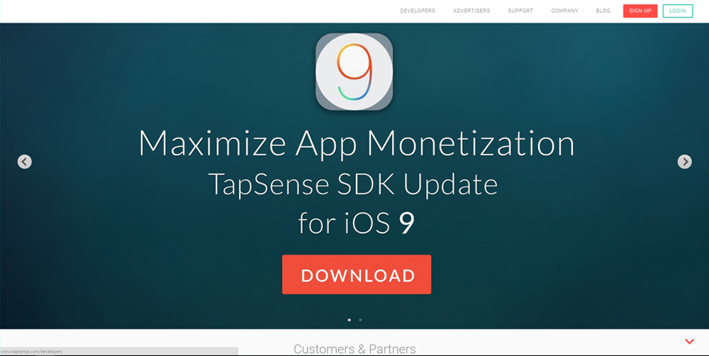
10. Wearable Devices :
Wearable devices have slowly walked into our lives and by the time we even realized their presence, they became a undetachable part of our everyday life. Look around and you will find smart watches, fitness devices, smart bands and a variety of other wearable devices. Not to forget, the augmented reality which has become extremely popular in last few months (The world is going bonkers over Pokemon Go). People with smart watches want to have enhanced applications in their mobile phones with a superior interface that can support any kind of a wearable device. Nobody could think that wearable devices would so easily and rapidly evolve and if you think that this trend will diminish soon, you are sadly mistaken. This is still in the growing phase which leaves a big opportunity for the developers.
Tapsense
At NYX Ditech we have a great team of thinkers, professional developers, and designers who keep themselves abreast with the latest trends in the world of technology. We have a precise vision of what future holds for us in terms of technology and we implement this vision in your products and services. Choose what you need from the list of services that we provide and let us walk this road of tech evolution together.
Are you looking to start a new website? Or thinking about a makeover to your existing website so that it looks better? In any case, it’s essential to understand at least the basics of what goes into website designing and development. It’s a no-brainer that your website is the heart of all your business and marketing activities. There are a lot of marketing channels linked to the website which draws visitors on your website. The core business objective of the website here is to convert these visitors into customers. What does it mean? It simply means that if you have a bad website, all your marketing expenses would be wasted as the website needs more conversions rather than more visitors. On the other hand, if you have a good website then it will increase the conversion ratio.
There are hundreds of self-proclaimed web designers out there on the streets with some knowledge of HTML and stuff. They will no doubt create a website for you with a lot of information, but ask yourself, is that what you need to improve conversion? The answer is NO. So you got to look for someone who is seriously an expert in web designing and development and follows a methodical approach towards building a website. Let’s understand this approach step by step:
1.Information Collection
Identify the business objective and know the target audience. Collect information as to why we are building the website and what are the long-term goals.
2. Planning
Plan and prepare a site map for the website to determine the content and topics to be included on the website. Define a proper structure for the website and also zero down on the technologies which will be used.
3. Design
After collecting the vital information and planning, it’s time to decide on the look and feel of the website. Target audience plays a pivotal role here. For example – A website targeting the youth and teenagers must have the same youthfulness and vibe in its design. It’s no point going subtle and classy in this case. The wireframe models, visual style, usability, UI & UX are the integrals in this phase.
4. Content
Content is the king for any website and pretty much determines the success of a website. Implement a correct set of text, photos, videos etc. on the website which should not only be customer centric but also search engine friendly (SEO).
5. Development
Now comes the actual creation part. Create a website using HTML and CSS coding along with support from a few databases and other required technologies.
6. Testing
Once the codes have been implemented it’s very important to check and test it to identify and rectify any technical issues. Along with the technical testing (testing the code), check the compatibility of the website in different browsers and also analyze if the website really fulfills the business purpose.
7. Maintenance
The job isn’t over once the website is live. Monitor the live website constantly for bug fixes and also to maintain the website with regular updating of information which is very essential.
So let’s admit, it’s a little complex procedure overall and that’s where NYX Ditech comes to your rescue. We follow the exact same methodology to provide you the best possible experience. So what are you waiting for? Click here and check out our services.