NYX Ditech

Categories
UX UX Design

Microinteractions – Improve Your UX Experience With Subtle Graphical Elements

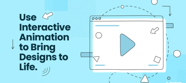
Every website owner or developer wants to deliver the best experience for their users. There are multiple strategies to improve the user experience, such as building personas, designing information architecture, and creating thoughtful textual content. However, after designing the high-level framework, it is the minor interaction design elements that delight the users. Unknowingly, users interact with these micro-interactions every day. Microinteractions are quick animations that are ideally functional and serve the user by offering visual stimuli and making changes more noticeable. Our creative design agency has been excelling in this subtle work of art, micro-interactions, and that’s why we are so confident about our UX creations! 

About Microinteractions

Micro-interactions give users feedback by showing them the state of an interaction, like the loading bar. It lets users see the direct, real-time effects of their interactions. It increases the sensation of direct manipulation to which users effectively respond. When users click a button, these subtle visual effects inform them that action has been initiated, giving them a sense of control. Some web design services make use of Micro-interactions as a medium for branding.

Definition: Microinteractions are trigger-feedback combos where the trigger is either a user action or a change in the system’s state, and the feedback is a specifically targeted reaction to the trigger and is delivered through tiny, highly contextual (often visual) shifts in the user interface.

User-initiated triggers can involve a GUI command, motions, or voice commands. On the other hand, system-initiated triggers involve meeting a specific set of parameters. When a GUI command triggers a micro-interaction, a visual feedback element is generally put next.

How do Microinteractions work?

Any interactive website should include micro-interactions. They are activated when a user hovers or clicks on functional areas of a website. This change in status is usually indicated by animation or other obvious visual or audio signals. Some graphic design services use micro-interactions for larger purposes in a design- they can simply be decorative, adding splashes of motion and other visual touches.

Micro-interactions can be system-triggered as well as user-initiated; they can appear at a specific time as a person moves through the website. Trigger, rules, feedback, loops, and modes are the four mechanisms of micro-interaction.

Trigger: This is what starts micro-interactions and is usually presented as a floating icon that prompts the user to swipe, click, press, scroll, or pull. 

Rules: This controls the actions the system takes after a micro-interaction is triggered. The effectiveness of this is defined by how natural it feels to the user — if the movement is abrupt, the overall purpose is ruined.

Feedback: This tells the user exactly what happens once the micro-interaction is activated. Generally, this takes the form of a loading bar, a colored icon, or a simple icon animation. Feedback includes everything that a user hears or sees during a micro-interaction.

Loops and modes: This sets the detailed strategy of the micro-interaction, such as the duration of its display. Each micro-interaction has a combination of loops and modes since micro-interactions can change over time.

Importance of Micro-Interactions in Website Designing

User engagement and control are two of the best features of using technology. Micro-interactions can greatly impact the look and feel of a product or service, paving the way for a more engaging experience that goes beyond usability. Microinteractions can boost user experience in the following ways:

  • Promoting engagement
  • System status display
  • Providing error prevention
  • Branding communication

When compared to its modern counterparts, such as pull-to-refresh elements, basic micro-interactions such as scrollbars need to be the same attractive. To make a meaningful, well-designed experience, our creative design agency pays more attention to these micro-interaction elements to boost UX. 

Benefits Of Improvising Micro-Interaction Elements

Well-designed micro-interactions are a definite indication of user-centered design. That is why they are so valuable. With the help of an app or website, a user can learn how to interact with the system and take instructions as well as feedback on whether or not their action was right and approved by the system. The main difference between an outstanding website and an average one is attention to detail. Here are some reasons why micro-interactions are brilliant:

  • They improve web page navigation.
  • They facilitate user interaction with your website.
  • They give users timely feedback regarding performed actions.
  • They offer recommendations to your users.
  • They provide info about specific parts, such as whether something is interactive or not.
  • They improve the user experience significantly.
  • They encourage people to share, like, and comment on your work.
  • They draw users’ attention.
  • Finally, they basically enhance the emotional value of your website.

When done correctly, micro-interactions can help users feel good about your brand and influence their decisions without the user even recognizing it. You have a positive or negative viewpoint toward a product if you like or dislike certain features of it. The so-called Halo Effect can work in your favor or against you. This is where the need for expert web design services comes into the picture. With the right application, expert graphic designers can improve a user’s feedback on your Website. By paying close attention to the little things, experts can help you impress your users.

How Do Smart Websites Use Micro-Interactions?

A website that includes micro-interactions feels more personalized. Interactivity engages visitors and gives them more freedom and control over how they experience it. Popular micro-interactions include the following:

  • Sign-up forms for newsletters and contacts
  • Social networking buttons for “like” and “share
  • Call to action buttons
  • Tap and hold features
  • horizontal scroll buttons
  • Progress bars
  • Audio and/or visual feedback
  • Click or hover to reveal text or images.
  • Transitions between pages
  • Hover animations on links or buttons

Conclusion

Micro-interactions are user communication powerhouses packaged in small packages. They offer excellent opportunities for meaningful, entertaining, and dynamic interaction with users. They are noteworthy because they excite the user, which boosts their focus on the content and builds an emotional connection in subtly powerful ways. However, to reap the full benefits of micro-interaction, careful and exact design is important. This is why you need expert graphic designers who have mastered the subtle art of micro-interaction. Contact our team of experts today!

Read more about you can improve app design using microinteractions here.

Categories
Trends UI Design UX UX Design

How Can Anyone Bring Their Designs to Life With Interactive Animation?

Undoubtedly interactive animation gains a lot of attraction nowadays because of the active expressions and interactivity. Creative designers can build great user experiences through dynamic animation crafts. People love to experience beautiful animation, especially if it is interactive. We will discuss more interactive animation and its advantages in this article.

What is Interactive Animation?

In the simplest terms conceivable, interactive animations are any animation that enables viewers to engage with the work in ways beyond merely watching it. There are numerous opportunities for participation for viewers. These are most frequently seen in highlighted reels and drop-down menus.

The Advantages of Interactive Animation Over Standard Ones

An interactive animation encourages viewers to engage actively with the experience. They enable viewers to choose the direction a movie or infographic will go as it progresses. The likelihood that your audience will choose your business will improve when their level of interaction increases to this stage. Interactive animation designers with their expertise will help you in giving direction to your business.

The Advantages of Interactive Animations Include The Following List:

Through the use of interactive animations, it is possible to make a movie or advertisement in a way that is specifically tailored to the viewer, increasing conversion rates.

Interactive animations commonly motivate users to stay on a website for longer periods, lowering bounce rates.

Engagement is higher as the spectator has a choice over what they watch and what they skip.

Interactive animations can create higher levels of responsiveness since they are enticing, compelling, and convincing.

Verify That You Have The Necessary Tools:

If you’re looking for an interactive graphics end-to-end pipeline that is made for quick and effective real-time animation, there are many great tools to start with. These tools will give you everything you need to create interactive animations that are not only aesthetically pleasing but also flawlessly executed conceptually.

Only Use Animations On Purpose And When Important:

Interactive animation should only be used to provide help, never as a means of showcasing one’s talents. You do not need to animate every single element on your stage. Understanding when and where to use interactive animations is essential for successfully incorporating them into your designs. Keep things as simple as you can, and pick your animations wisely to keep your audience’s attention when animating.

When in doubt, if something appears to be clean and effective in its current state, the best course of action is to do nothing with it.

Test Repeatedly

It is crucial to test your interactive animations before releasing them to the public, just like you would with any other design element. Test them across browsers and mobile devices to ensure that your designs function as intended. Keep a close eye on how users interact with your animations, and make changes as needed.

Interactive animations will help you in creating websites, games, and apps as you want. You can unlock many tools and create captivating interactive animations as you desire. Hire an efficient creative design agency to help you out.

Categories
Brand & Identity Design UX

10 Archetypes of Design and Branding

Present-day competition demands a deep understanding of the brand archetype. It only not assists in representing the identity better but also assists in creating a deeper connection with potential customers. Brand archetypes are based on the study performed by Carl Gustav Jung during the 1890s. 

After that, some modification was performed by Carol S. Pearson to sort brand archetypes as per the 19th century. They are still used for developing a marketing strategy to boost a company’s earnings. Let us discuss the top 10 branding archetypes with proper details in this post.

The Creator

This archetype talks about creativity and innovation. Normally, the brands that come under this category are the creator or inventors of the latest technology. 

The major motive of these brands is to eliminate a problem by launching something previously not present in the world. 

Premier examples of this approach are YouTube, Adobe, and Pinterest who have changed lives of millions. 

The Hero

As the name suggests, this one is considered a sign of inspiration, and brands following it works to improve the world. Such brands are very common in the outdoor and sports industries.

This approach has assisted numerous brands in achieving success that very few have. 

A few notable examples of this archetype are American Red Cross, Accenture, Nike, and Marvel.

The Caregiver

The brands that work to provide advice and services for the welfare of the community comes under the caregiver category. 

They are known for passion, generosity, efficiency, and sacrifice, which make things convincing. 

The premier examples of this archetype are Johnson’s, Marriott, and Volvo. 

The Rebel

These brands prefer freedom, stay away from conformity, and allow customers to show their unorthodox identity. 

It mainly works for brands related to tattoos and motorcycles in the real world.

Some examples of the Rebel archetype are Harley-Davidson and Diesel, which are very popular for such attitudes. 

The Explorer

This archetype focuses on the audience’s wishes to travel and find new communities and places. The explorers always look for paths using which self-fulfillment can be attained with proper freedom. They have a huge curiosity to let the world knows about them. 

In the Explorer archetype, there is a huge value given to self-discovery for extra uniqueness. Although the market attaches this archetype to the adventure, it isn’t the only method for marketing this technique.

Some notable examples of this archetype are Red Bull, NASA, Timberland, National Geographic, North Face, and Jeep. All of them have successfully implemented this technology with great results. 

The Ruler

This archetype work on the philosophy of dominance, superiority, and control. The Ruler is the one who wishes for success and wants it for everyone who follows them. 

Their major traits are confidence and responsibility, which they never want to miss at any cost. This industry is ruled by brands related to high apparel, luxurious cars, premium watch companies, and hotels. 

The names like Rolex, American Express, Apple, and Qantas are prime examples of The Ruler archetype branding. 

The Sage

This archetype represents truth and wisdom in various sectors, like schools & universities, media & news outlets, search engines, etc. The main motive of this strategy is responding to the needs of consumers and respecting their knowledge.

The brands that follow the Sage understand the layered meanings and well-researched information. 

Well-known examples of this technology are CNN, Mayo Clinic, Google, BBC, The New York Times, and TED. 

The Lover

The Lover archetype is followed by brands that target aesthetic appeal and become strong beauty advocates. Their main motive is to create a desire in their customers for intimacy and passion. 

Whether it is about creating sensual short films or a chocolate company, the main motive is to develop feelings with their products or services. 

Some examples of the Lover archetypes are Godiva, Loreal, Victoria’s Secret, and Alfa Romeo. 

The Regular Guy

The Regular Guy is a low-cost strategy for targeting the general public instead of a particular audience. They try to build emotional connections with their customers.

The major characteristics of this archetype are sincerity, common sense, and hard work, which are common among the general audience. 

It is used by many known brands, like GAP, Walmart, Levi’s, and Budweiser. 

The Magician

We believe many people should have understood from the name of this archetype that their main motive is transforming dreams into reality. The brands always offer transformative experiences to their customers using this approach. 

They have a huge focus on creativity and imagination to deliver idealistic and spiritual experiences. 

Many well-known brands, like Dyson, Disney, Mary Kay, and Polaroid, have used this technology for success. 

Wrapping up

We strongly believe the information about major archetypes of design and branding has been acknowledged in this post. Always understand that selecting the right archetype is key to success in the market. 

Want to say something regarding these archetypes? Feel free to write back to us

Read more about avoiding mistakes in branding here.

Categories
Design UX UX Design Web Design

Most Effective Website Layouts For 2022

Website Layout is the first and most important stage in creating any webpage. This phase lays the groundwork for the majority of your work and determines the overall structure and functionality of your website. A website’s structure, or site design layout, is what decides how that site’s content will be presented and how users will interact with it. Selecting the most appropriate website design for your needs and those of your target audience may be a complex task and that’s where this blog comes in handy.

What Is a Website Layout?

A website’s layout is the blueprint that specifies its overall layout and organization. The design prioritizes the most important aspects of the website and makes it easy to navigate. If a website is going to be successful, it all comes down to the design. The purpose of employing web design services is to attract and retain visitors by making the site’s pages easy to use and logically organized.

What Makes For A Good Website Layout?

Although the variety of professional web design layouts is a source of great admiration, it is important to remember that there are some core elements that every layout type has to incorporate, even if they do it in a non-traditional fashion. The most important things to keep in mind while designing a page are:

  • The header should always include the site’s primary navigational features and clearly communicate the site’s structure and how to reach specific content.
  • The page’s main content, including images, text, and any other supplementary materials.
  • The menu used to navigate the site; might be a sidebar, hamburger menu, scroll-triggered menu, sticky menu, or any other type of menu.
  • No matter how small or large a website’s footer is, it should always include links to social media, legal disclaimers, and privacy policies.

Creative Website Layout Ideas 

Z-Pattern Style

As soon as we find a new website, we scan it quickly to get a feel for what it’s about. In order to skim and read quickly, many people make the shape of the letter Z or read in a zigzag pattern. Our gaze travels from the upper left to the upper right, then to the lower left, and finally back to the upper right. The Z-pattern website layout takes use of this pattern of reading by laying out the most crucial details over the Z’s surface.

A logo is strategically positioned at the top left of the homepage in this design to grab the viewer’s attention immediately. It’s usual practice to put the menu and a conspicuous CTA beside it, in the right-hand corner. The most important details should be placed along the diagonal of the Z-pattern, which runs from top to bottom of the page. Incorporating eye-catching images and a single, clear sentence that sums up the website’s purpose are two effective methods used by website design professionals.

F-pattern Layout

Similar to the Z-pattern layout, this one takes into account how readers often skim web pages. Websites with a lot of text prompt us to scan or read in an F-shaped pattern. This indicates that we focus mostly on the left side of a page, but we do pay some attention to the top horizontal section.

If you’re going with an F-shaped design, put your money where people’s eyes are most likely to stay: above the fold. To help your site’s users find the content they’re looking for, a navigation menu and anchor texts are both useful additions. Text on the left side of the page may be made more aesthetically pleasing by using the F-vertical pattern’s line. Images, icons, and list formats like bullets and numbers are all useful tools for this purpose.

Full-Screen Image Layout

Fullscreen image layouts may make for striking and engaging home page designs by featuring a huge image in the middle of the screen. Massive media features may tell an audience a lot about you and your accomplishments with just a glance. This design is wonderful since it adapts well to mobile viewing.

Anything from a still image to an animated GIF or even a short clip will do as visual support. However, in order to make the most of this format, the content you provide must be of good quality and appropriate to your service, product, or general vibe. Include some descriptive text with your Fullscreen picture to help users understand what your site is about. Create an attention-grabbing header or motto to showcase your business’s offerings and entice site visitors to read further.

Distinctive Box-like Layout

The grid-based or box-based style of a website combines disparate elements of design into a single, unified whole. Information is contained in its own box, making the whole thing seem more cohesive. The user can click on any of the boxes to be sent to a specific webpage devoted to that topic.

To unify the many boxes on your site, it is advised that you include one huge featured box as the header. The page’s title, a short summary of its contents, and a link bar to other sections of the site can all be included in the featured box. Another piece of advice is to carefully select the images to use in each section of the boxes so that they complement one another and form a unified brand image.

Cards Layout

Cards layouts, like box-based layouts, make use of a number of boxes or other rectangular containers to showcase a wide variety of information. The website’s design is mostly non-hierarchical, with no particular elements being given more prominence than others and all content being given equal weight.

Every single card has the same capabilities, making it simple to copy and paste your data across all of them. The resulting modular design works well across a variety of display sizes, making the site’s content more accessible and less intimidating to newcomers despite its depth. The use of a card layout is a fantastic option for a website with a lot of content, such as a video blog or an eCommerce site.

Split Screen Layout

You may demonstrate to your reader how two seemingly disparate elements can complement one another by using a split-screen arrangement. Any kind of division on your website, whether vertical or horizontal, falls under this category. It facilitates instant decision-making and immediate participation from the reader. E-commerce sites that have different parts for men and women, as well as portfolio sites, company sites, and so on, benefit greatly from split-screen layouts.

Asymmetrical Layout

This trendy website design makes use of a split-screen layout, however, the division between the two halves is not symmetrical. By shifting the apparent center of gravity from one side to the other, this design becomes more dynamic.

To emphasize some details without distracting from the whole, you can use non-standard sizes, colors, and spacing across the page. This may be accomplished in your own website design by making specific items larger, bolder, or brighter to serve as focal points.

Conclusion

If you own a business, your website serves as the virtual equivalent of a physical storefront. Your online shop should mirror the aesthetic quality, simplicity, and warmth that you’d expect from a physical location. We hope that this list was helpful in narrowing down which website design is ideal for your site’s visitors. Contact Us today to evaluate your website’s layout.

Read more about website layout to highlight your content here.

Categories
Brand & Identity UI Design UX UX Design

Understanding the Effects of Color on Design Outcomes

Choosing the right color on design for a project is one of the most significant aspects of its design. Because everyone is different and has varied tastes in colors, it’s tough to determine which one is the most effective. There is a lot of room for interpretation when it comes to this form of UI designing. And that’s why design is such a compelling career choice.

A user interface designer doesn’t just conjure up graphic ideas out of thin air. Instead, he does extensive research on the tastes of his target audience. This indicates that color on design selection is never the result of sheer chance. Conversely, it’s the product of extensive study and careful consideration of all available options. To get the desired impact in design, we’ll go through all the information you need to know about color.

Colors on Design and Their Symbolic Values

Red

This is among the most captivating hues. The color red is associated with passion, warmth, and excitement, yet it also has a tendency to be abrasive. In addition to Coca-Cola and Red Bull’s use of it in their logos, numerous other well-known businesses utilize it as well. Don’t be afraid to use a few red accents to your items if you’re catering to a younger demographic.

Blue

The color blue symbolizes wisdom and trustworthiness. It is dependable and demonstrates a calm demeanor and rationality. When a brand uses this shade in its graphics, it demonstrates that it is reliable and trustworthy. American Express, BMW, and Boing are just a few of the well-known companies that you can rely on. Blue is the most popular color, and it’s a safe choice for businesses. It’s a no-brainer if you don’t want to run any experiments.

Yellow

If you would like to project a sense of optimism, inventiveness, and self-confidence, this is the tone for you. It elicits strong emotional responses, which is why it is often used in conjunction with a complementary or contrasting color. IKEA, McDonald’s, and DHL are just a few of the companies that love the color yellow. Yellow, as opposed to blue, has the potential to be a huge liability in visual presentations. Yet, a few experienced website designing professionals might occasionally take the risk when no one else sees the possibility.

Just because you’ve figured out the basics of color theory doesn’t imply your work is done. In addition, you must be able to put colors together in logical sequences. Colors on the opposing ends of the color wheel are known as complimentary colors.  Another option is to utilize colors close to each other in the color scheme as an analogous approach. 

You can, for example, combine blue and green or yellow and orange. You should not shy away from using this approach if you want to develop designs that are accessible to the general public and appeal to their aesthetic sensibilities. As an example of others, there are triad and split-complementary models. If you can think of a creative way to incorporate one of these into your design, you can use it.

Aspects Of Color on Design and Cultural Diversity

In addition to the broad meanings of colors, there are also specific connotations based on factors like age, gender, and cultural preferences. There are situations when a well-designed product will not operate in a certain context. Wondering why? You most likely did not factor these factors into your analysis:

Cultural Preferences

The color black has long been associated with death and grief in Western culture. The converse is true in China, where white connotes death. What individuals think about it depends on numerous things, including their own country’s history and customs. Make sure to take cultural preferences into consideration if you want your design to be flawless.

Age And Colors

It’s no secret that one’s taste in colors changes with age. In surveys, it was found that older individuals prefer blue or white, whilst children choose a variety of greens, blues, reds, and yellows. It’s all about the energy that each hue carries and how that energy is perceived by different people at different points in their lives. Make sure you don’t use too much brown in your designs if you’re targeting young people. A 60-year-old teacher, on the other hand, is likely to think it’s a fantastic shade for his clothing or any other item he wants to buy.

Gender Differences

Color on design are seen differently by men and women. Blue is the most popular choice for both parties, although the preference for purple among women outweighs the preference for green. Even if these distinctions seem insignificant, consider trying to sell a pink football shirt to the ordinary American football fan. One of the most important aspects of color theory is gender disparities, and you may have observed this already.

In Conclusion

Choosing the appropriate colors on design for your company’s logo may make or break your company. Although it seems enticing, this is not that simple to accomplish. To come up with new and intriguing designs, designers need to be well-versed in every nuance of color theory, correlation, and symbolism. Contact our experts today to know more

Read more about how to design UI for color blind, here.

Categories
Brand & Identity UX UX Design

Tips to Enhance Your Website’s User Experience

You need to make sure your website presents your company in the best light possible. However, when a website is published and made available to the public, it is possible that few User Experience elements are often overlooked. This will have a detrimental effect on the website’s navigation, which will cause people to leave. As a result, it is critical that you eliminate any design errors by employing UX designing services and Enhance offering your visitors a stunning design.

Follow These Tips To Enhance User Experience Of Your Website

#1 Boost Page Loading Times

The poor loading time of a website is one of the most aggravating factors that utterly distract a visitor. In today’s world, there are a plethora of websites dedicated to a specific subject matter. Consequently, consumers will choose a website that loads quickly and provides the information they need to do their job. All UX design ideas that slow down a website must be avoided while developing a website.

Slow page load times not only frustrate your site’s users but also hinder your website’s SEO efforts. Customers will begin to explore elsewhere on the internet for better solutions, which is bad for your company’s bottom line.

#2 Examine The Broken Links

Increasing numbers of people are turning to their smartphones and tablets to get information on the web. We can thus say that creating websites that are mobile-friendly is essential, and no web designer can afford to ignore this requirement. A responsive website will guarantee that consumers enjoy a consistent or seamless experience regardless of the device they are using. The user experience (UX) of a website may be greatly enhance by making it mobile-friendly.

#3 Include Attractive CTAs

These “Call to Action” (CTA) buttons can be finicky. The click-through rate can be dramatically boosted or impacted by a few little adjustments. According to one case study, user experience designing services that used contrasting colors for their CTA buttons saw an increase in click rates of 122%. Moreover, it is crucial to consider the location. The closer a button is to the top of the page, the more likely it is to be clicked.

#4 Design Consistently and Simply

It’s always a good idea to redesign your website to include new design features. However, you must be careful not to drastically alter the appearance of your website in the process. Changing a considerable amount of the design will cause the users to believe that they’ve arrived at the wrong site.

Moreover, your website’s components must be clearly and easily seen by your visitors in order to maintain a consistent design. Texts, pictures, a nice contrast ratio, and a slew of other things fall within this category. Your site’s users shouldn’t have to exert extra effort to understand anything displayed to them.

#5 Reduce The Number Of Ads That Are Shown

Ads are an excellent method of generating revenue, but the brutal reality is that everyone dislikes them. These adverts take up valuable space on your website, which might have been used to provide additional information to your visitors. Ad blockers are commonly used by online users to avoid being bombarded with intrusive advertisements. An improved user experience may be achieved by providing users with full access and control over a website’s content.

#6 Colors Matter

Colors have a great deal of significance in terms of branding. Using a consistent color palette may boost brand awareness by as much as 80%. Various psychology studies have shown that when a company uses colors, buyers attach different meanings to them. For example, blue inspires a sense of trust and honesty, whereas orange conveys a sense of originality. Make sure that the colors you choose for your brand are consistent with the message you want to convey.

#7 Avoid 404 Error

404 or page not found messages bother everyone. If any user receives this notification, he may hesitate to visit your site in the future, which speaks to the quality of your website user experience. It’s pointless to maintain a website if you can’t lead the visitor to the appropriate page. 

Conclusion

Even the smallest and most subtle adjustments can have a significant influence on UX design. In addition to these design tips, there are a slew of additional approaches that may be used to enhance the user experience on a website. However, the suggestions mentioned in this blog are regarded as some of the best for drastically enhancing your website’s UX. Contact our User Experience experts today to enhance your brand’s identity.

Learn more about hoe you can become a UX Expert here.

Categories
Brand & Identity UI Design UX UX Design

How to Use a Customer Survey to Improve UX Design

User research is a collection of tools and techniques for determining who your users are, what their goals are, what they think of your product, and more. One of the most critical steps for product designers in developing a product or service is carrying out user research. In the designing of a UX survey, there is no such thing as perfection; rather, there is always room for improvement and learning. To help you get started, we’ve put up a few tips to help you create a user-friendly UX designing survey.

UX Survey: Overview 

User experience (UX) surveys gather information on how a website or digital product is being used by actual users, both quantitatively and qualitatively. It’s important to know what your customers want and need in order to improve your products and services. These user experience design surveys can supply information and guidance for the development of new and creative goods, as well as produce user feedback that confirms whether or not updates and modifications are meeting the needs of consumers.

Best Practices for Conducting UX Surveys

#1 Recognize Your Goal

Before writing the questions, we must have a clear understanding of what we hope to discover about the customer from this particular survey. You and your team should know exactly what you’re trying to accomplish.

#2 Keep It Simple and Short

Be concise and straightforward in your survey questions if you want to make them as simple as possible for respondents to complete. Do not add extraneous background information unless it is required to comprehend the subject at hand, and only ask questions you want to analyze and are crucial for what you are seeking to find.

#3 Arrange The Questions

The questionnaire should be organized in a way that minimizes the burden on the mind. Start with simple questions, progress to more difficult ones, and finish with easy ones. Put together a list of relevant questions. Each area should have its own segmentation if necessary.

#4 Test Out With Pilot Users

Before finalizing the survey, it’s usually a good idea to conduct a test run. You may test with coworkers to see whether it’s simple for them to grasp what you’re saying. In order to better understand the challenges and difficulties that users face, interface designers can conduct a pilot test.

#5 Incorporate both Close-Ended and Open-Ended Questions

It’s critical to think about the advantages of using both open-ended and closed-ended questions when conducting a UX survey in order to get as much information as possible on how your customers are really using your product or service.

Closing-ended queries tend to generate clearer answers. With the data at your fingertips, it’s much easier to figure out what works and doesn’t for your clients. Open-ended questions, on the other hand, allow respondents to elaborate on their responses, which can produce thought-provoking suggestions on how to enhance a product or resolve an issue reported by many of your consumers.

#6 Set a Screener

It is possible that your survey might reach the wrong people when you distribute it. When we say “wrong audience,” we’re referring to those who aren’t aware of your product or service. You don’t need their input or responses anyhow.  With the use of screener questions, you may narrow down your target audience and reject individuals who do not suit the profile you are attempting to achieve.

Screening questions come in two varieties. Screening questions based on behavior are known as behavioral screeners. For instance, suppose you are seeking website feedback and wish to poll your most regular visitors. Using a screening question like “How frequently do you visit this website?” would tell if someone visits daily, weekly, monthly, or never.

#7 Avoid Any Bias

Even the most meticulously crafted surveys can be tainted by bias. For instance, you may inquire, “How challenging is it to utilize this product?” This phrase is considered a leading question because it discreetly leads the user to the concept of difficulty. Instead, you might question, “Is this product easy or difficult to use?” and offer a variety of alternatives to select from.

#8 Incentivize the Users

Respondents appreciate being rewarded with vouchers, discounts, free trials, and early access. It improves the quality of the data since the user may be more inclined to provide thoughtful responses. However, it might potentially backfire owing to the user’s assurance of an incentive.

Conclusion 

When it comes to designing survey questions, there are no hard and fast rules, but it’s important to keep in mind the environment in which you’re trying to analyze user behavior. You may personalize the questions to your product, or you can even add additional questions to the survey if you need to do so.

However, as previously said it is best to keep it brief and focused. We hope that these best practices have assisted you in gaining a better grasp of the types of questions you should ask your users in a UX survey.

Contact our experts today for more in-depth analysis

Read more about how UI and UX connected with each other here.

Categories
Design UI Design UX UX Design Web Design

Outsourcing Web Design: Why Should You Opt For It?

Professional web designers can develop a site that is both user-friendly and visually appealing in order to hook and retain clients. The question now is where can you find such a team in a cost effective way? An easy solution is to outsourcing web design!

Have you ever wondered why certain websites are so enticing, while others make you want to leave immediately? This is because of the “brand reception value”, which determines whether or not a person stays on the website. Many studies have demonstrated that a pleasing visual design and simple navigation produce a favorable initial impression of the brand. In contrast, a poorly designed or poorly navigable site will be ignored, regardless of the quality of the content that is presented therein.

Why Is Web Design So Crucial?

#1 Creates The Initial Impression

Your website is the first impression your audience has of your business on the digital space. They will form an opinion about your company or brand by landing on your website. Your customers will have an unfavorable opinion of your company as soon as they see an unimpressive or outdated website. They will leave your page if they do not find your website appealing. You’ll lose out on potential customers since they’ll switch to a competitor’s site instead of yours.

#2 Boosts Your Search Engine Marketing

There are several web design aspects and practices that have an impact on how search engine spiders explore and index your website, which in turn impacts your website’s SEO. Web designing services that incorporate SEO services as part of their package are the greatest approach to ensure good web design practices.

#3 Conveys Credibility to Your Customers

Websites that are poorly executed are seen as untrustworthy by the general public. People aren’t going to trust your site if they see a shoddy design or outdated information. You might be perceived as shady or deceptive since your website does not have an up-to-date look.

A professional website, on the other hand, communicates authority and credibility to your visitors. They’ll have faith in your company and be more open to checking it out. In order to keep visitors on your site, you need to establish a relationship of trust with them first. The more time a visitor spends on your site, the more chances your business has to grab that lead.

#4 Develops Consistency

Your brand is an important part of your marketing strategy when you’re looking for new customers. If you want your customers to pick you when they’re ready to buy, you need to make them aware of your brand and educate them about your services. It is critical to employ the best website design services and have a unified look and feel for your website’s online presence.

Every page on your website should have the same fonts, styles, and layouts. Having a distinct design on each page will make your site appear amateurish. Moreover, it might be more difficult to create brand awareness, as your audience will not know which colors to connect with your business.

Why Should You Outsource Web Design Work?

Creating interactive designs and performing quality control on them may be beyond the capabilities of in-house teams. In contrast, outsourcing firms employ QAs who closely monitor the project, project managers who oversee the work of the programmers, and UX designers whose job is to enhance usability and accessibility while also ensuring that customers are satisfied. As a result, web design outsourcing may provide you with everything you want.

#1 Innovative Approaches to Challenges

You might get new insights and innovative ideas for your project by working with outsourced web development and design team. Those who design websites on a regular basis are creative problem solvers who can come up with novel solutions to complicated issues. To keep their clients satisfied, they consistently perform at a high level.

#2 Increased Productivity

You’ll undoubtedly agree that time is money in today’s digital environment. As a result, every player in the market must move to a more beneficial position as quickly as feasible. And outsourcing can do the same for you.

In the first place, outsourcing your project to a web designing agency saves you time in finding and training new programmers. Second, remote software development teams with specialized expertise are in high demand. They have a lot of work to do, and they want to get it done as quickly as possible. These all speed up the time it takes to build and advertise your website.

#3 Support Available Round-the-Clock

A solid outsourcing staff will be accessible to assist your organization seven days a week, 24 hours a day, if necessary. When your in-house staff is unable to operate due to conflicting time zones, you can fall back on an offshore crew. As a result, your company’s operations will run smoothly.

#4 Updated Resources and Methods for Getting Things Done

To keep up with today’s fast-paced consumer demands, technology is always improving. Unless your company’s major business is a web design, your staff may not have up-to-date knowledge of the newest web design tools and solutions.

Outsourcing web design services allow you to take advantage of professionals that are up to date on the latest trends. For the greatest possible outcome, they know exactly when to employ established technology and when to try out something new. Moreover, they know when to employ established technology and when to try something new in order to get the greatest results.

#5 A More Extensive Range of Knowledge

An external web design company may have greater expertise and a wider range of talents than your in-house staff; therefore it is advisable to outsource this work. With regards to constructing large-scale websites, knowledge and skills are crucial.

#6 Access To A Larger Pool Of Talent

Outsourcing web development or web design opens the door to a vast selection of specialists, each with their own set of talents. For short-term projects that demand specialized abilities that your organization will not need in the future, it makes little sense to employ in-house web designers.

#7 Expanded Performance and Flexibility

Agile approaches, in which projects are split down into smaller chunks, are used by the majority of professional outsourced software development organizations. In this way, clients obtain results more quickly and have more influence over the project. 

It is considerably easier to manage a dedicated web development team than to manage a web development crew on site. In the first scenario, the remote team has the option of adding extra employees based on production and peak hours. It is also more cost-effective for clients to switch projects than to pay internal personnel on a monthly basis.

#8 Saving Money

Cost reductions are a major benefit of outsourcing any work to a third-party source. Your cost will cut down if you hire web designers in a country where rates are lower and taxes are more favorable.

The hourly fee for web design outsourcing company professionals in the United States is typically $100-150 per hour. For a Philippine or Indian designer with the same skills, you can expect to pay between $35 and $56 per hour.

Endnote

A company’s website design should be one of its first priorities when preparing to launch the site. Providing a great user experience that motivates people to return to your site is essential because buyers equate website design with the reputation of a company or product. Contact our creative team today to analyse your brand’s design.

Read more about what to consider while hiring an agency to for web design outsourcing here

Categories
Trends UI Design UX UX Design

2022 Icon Trends: What You Need to Know

UX designers have been using icons since their inception in 1981, and they’ve explored creative methods to evolve their designs through them. Icon designs are all around us these days, and our brains have been conditioned to recognize them without having to think about them twice. For instance, when we see an envelope icon, we know it indicates an email, whereas locks and keys signify online security.

Top Icon Design Trends In 2022

Minimalistic

As the logo design became more minimalistic, so did the icon design. A minimalistic approach to design helps designers to produce simple, distinctive artworks that don’t rely heavily on either the color palette or the layout.

Despite the fact that their representations aren’t necessarily accurate, simple symbols are easy to interpret, allowing designers to express themselves freely. Even websites that formerly used intricate designs and symbols are now gravitating toward a more straightforward visual style of their content, which is reflected in the icon design.

Circular

The circle is the earliest, simple, and most perfect geometric form seen in nature and design. This style of symbol may be used in a variety of ways, from flat icons in a circle to 3D spheres, and designers are more inclined to incorporate them.

The problematic element of circular icon design is that circles don’t often mesh well with other forms in the design, such as app icons, which are typically square.

Flat Icons

The emphasis on flat design appears to be fading in all areas except icon design, which is probably owing to flat design’s simplicity, which lends itself well to the expression on a tiny scale.

A flat design is a style of user interface design that emphasizes the use of basic, two-dimensional objects and vibrant colors. Using a flat design lowers the number of variables like textures and shadows, which gives a simple and clean image.

Line Style

Choosing line icons is usually a good idea because they go well with just about every other design element or overall aesthetic. The new trend adds a dash of color to the look, making it more appealing to the eye.

The color can either completely fill the symbol or float in the backdrop, which unifies the icon’s components and emphasizes the brand color.

3D Gradients

Over recent years, the 3D gradient has gained a lot of traction in many elements of design, including icon design, and it’s becoming increasingly popular. This style, which includes anything from enhancing the color of the components in the icon to creating a pop effect to monochrome icons on a full gradient-colored backdrop, looks trendy and attractive.

Abstract

Abstract icons, as the name indicates, are meant to represent a wide range of ideas and feelings in a single image. A company’s personality, ideals, and product offerings may all be represented by an abstract icon.

Abstract symbols can influence consumer perceptions of a brand even if they don’t depict a real product or have a defined meaning. Freelancing networks and social networking sites, for example, frequently make use of this kind of design to link individuals and businesses together.

Hand-Drawn

Icons that are drawn by hand are more real and distinctive. An artist’s style may range from simple forms and lines to more intricate depictions. The wonder and delight that may be evoked by both colorful and black-and-white hand-drawn artwork are evident in both. If you’re looking to highlight the emotional side of your business, this design is ideal for you.

Bright Colors

As bright colors capture the viewer’s attention and provoke pleasant emotions, it’s unsurprising that they’re trendy in many areas of design, especially icon design. Icons with gradients, monochrome icons, and full-color components may all benefit from these hues.

Bright color icons may enhance the characterization of a brand or product by creating a sense of optimism. Yellow, blue, green, and purple are some of the most popular hues used by designers because they work well together and produce beautiful color schemes.

Conclusion 

Since the beginning of time, humans have relied on signals and illustrations, and icons are the core elements of this communication. In the digital era, designers are finding new techniques to reinterpret aesthetic icons by creating new styles or re-inventing older ones. Contact Us today to know more about evaluating your web/app’s icons.

Read more about How Can You Effectively Simplify Your Website Design here.

Categories
UI Design UX UX Design Web Design

User-centered Interface Design: Know the Top Five Principles

Any software, website, application, or other software must have a user interface. User interface design is concerned with the interface’s structure in front of the user. The most effective design is one that does not appear to be one. Yes, you read that correctly; there is no mistake.

UI designdoes not have to look good to operate well. And designs that operate well will look and feel fantastic by default. Many factors influence the creation of such designs. Your target audience, industry, and operational niche are just a few examples.

Creating visually appealing interfaces is critical, but User Interface design services go well beyond that. When using an app, it should be simple to use—you should be able to do your tasks without assistance. On a website or app, you should be able to tell where you are. When you press a button or flick a switch, you should be able to predict what will happen. User Interface designers employ visual clues to assist users through the interface. It also needs to be user-friendly and welcoming. Users should be able to operate and understand the interface regardless of their ability, age, color, gender identity, or background. This could include choosing a font that is easy to read and can be translated into several languages or choosing colors that are visible to color-blind people.

UI Roles and Tasks

As a User Interface designer, you’ll be in charge of creating the appearance and feel of digital products as well as how people will interact with them. This can include a variety of responsibilities and decisions, such as:

  • Layouts and the right spacing of page elements on a page
  • Existing design environments are being improved and modernized.
  • Assuring those designs can be adapted to a variety of device types (adaptive design)
  • Button, slider, toggle, icon, drop-down menus, and text fields are examples of interactive components.
  • Color palettes, fonts, and typesetting are all things to consider.
  • Creating style guides to ensure that the company’s brand identity is constant.

While all of the variables must be considered, there are a few user interface principles or golden standards that may be used to construct designs and direct the designer to the best combination of essentials.

Precision & Prominence: 

This may seem obvious, but when we analyze client websites, we frequently find that a large quantity of vital content is misplaced or hidden behind a bad user interface. In a world where your rival is just a click away, you don’t want to confuse your user by forcing them to seek the information they came to your website for because they’ll immediately close the tab and go to your competitor’s. As a result, make sure you understand your clients’ requirements and provide them with vital information that is easily visible and accessible.

Reliability: 

This may seem obvious, but when we analyze client websites, we frequently find that important content is misplaced or hidden behind a bad user experience. In a world where your rival is only a click away, you don’t want to confuse your user by forcing them to search for the information they came to your website for because they’ll immediately close the tab and go to your competitor’s website. As a result, ensure that you are aware of your clients’ requirements and that vital information is readily available to them.

Learnability: 

Every interface has a design system, and the user should be able to quickly and easily grasp it. Learnability takes into account how much time and effort users will have to put in to become proficient at utilizing the interface and navigating the product. Colour coding, signposting, functions, and symbols are examples of aspects that can help you develop a predictable and intuitive interface in which users can execute fundamental activities the first time they see the design but also find their way around easily when they return.

Simplicity: 

A good UI design agency is practically imperceptible to the user; it avoids distracting features, animations, and clicks. Labels and calls to action that employ plain language that guides the user toward completing their goal. Designs that are simple and elegant will never go out of vogue. There are two characteristics of an easy-to-use interface:

  • Visual cues: It’s important to let the user know where they are and what they’re interacting with. Give them indicators that will make it easier for them to navigate the UI. 
  • Prediction: When your consumers use the interface, it gives them a sense of being ahead of the game. When you buy a product or create a profile, for example, there are headlines at the top that describe the procedure. When users click the Next button, it informs them of what will happen next.

Feedback

This is where the user and the UI communicate:

  • I’m not sure where I am.
  • Is it still downloading?
  • What will happen next in the future?
  • What happened in terms of outcomes and outcomes?

Providing feedback reassures the user that they are on the correct track, and they will most likely continue! As a result, create unambiguous feedback for every action the user is likely to take; examples of good feedback include green ticks, red crosses, page navigation, and confirmation notifications.

We’re all attracted to a well-designed website. However, the truth is that, in the end, a site’s visual aesthetics will almost certainly have little bearing on its success or failure. If a site looks excellent, it captures my interest, and we can enjoy the design, but it quickly boils down to whether the site can perform what I want it to do for me. The usability and utility of a website are important considerations in determining its success. Of course, content is king, but it must be found and accessed.

So, in your current and future projects, we hope you will consider these five golden principles of User Interface designers. Contact Us today to get started.

Read more about designing effortless user interface designs here.