There are zillions of websites over the internet, and standing out from the crowd is a big task. A lot of designers follow the tried and tested design format of the website layouts since it’s a safe bet. But, by doing that they become part of the crowd. If you browse through the internet today, you will find a lot of similar websites; we are not saying that they are designed poorly, but they are not unique. That said, you still come across some website layouts that take an alternative approach to designing and come with something special. In this article, we will show you some examples of unique website layouts designs, so you can create sites that break the monotony, without compromising on user expectations.
1. The Goonies
The Goonies use a full-screen hero image that scrolls into the page and transitions into a series of grid website layouts. The Goonies is a 1980s classic movie, which is turned into a promotional-style website by Joseph Berry. It has won an honorable mention and Site of the Day award from Awwwards. It is an excellent example of storytelling and modern web design. The interactions and animations create a highly engaging user experience and allow fans to relive some of their favorite moments from the movie.

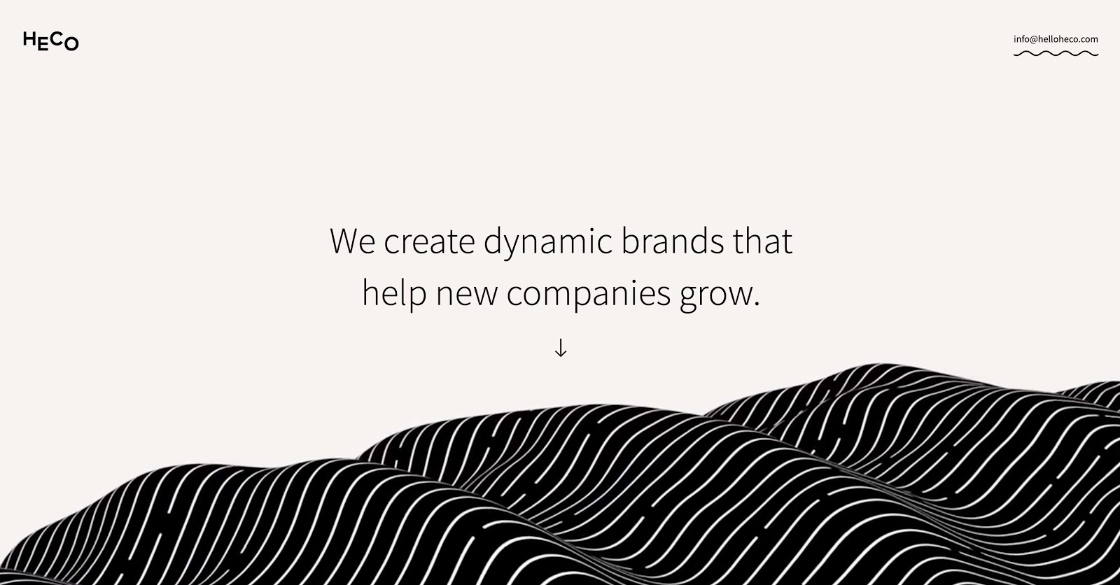
2. Heco Partners
Heco Partners, a Chicago-based design agency, draws you into their website with its flowing movement. On its landing page, you see the words, “We turn information into experiences that people care about” hovering above an undulating wave. These two elements, in combination, symbolize their promise of transforming ideas into action. The visitors straightaway get a powerful sense of who they are and what they do, without even scrolling down. This site is a superb example of the right way to combine a portfolio with more detailed background information, as illustrated by each of their projects.
There are no obvious navigation cues, but an arrow prompts you to scroll down to get the whole Heco Partners story, but you can also deviate into their project-based case studies. The beauty of the fading transitions between each section, as well as various other animations, makes the site a pure pleasure to scroll through.
3. Beagle
Another excellent example of visually and progressively telling the product story in a simple and easy-to-digest way is Beagle. It’s challenging for many startups; even experienced companies miss out at simple storytelling. It gets even trickier when companies are introducing new concepts to existing markets. There are obvious questions in people’s mind – what is your product? How does it work? Why do I care? Beagle answers all those questions while simultaneously showing their product and compelling the user to purchase. Another interesting point to notice is that it is one of the few sites to implement scroll hijacking successfully.

4. World of SWISS
SWISS airlines have created an incredibly immersive site that tells their story and describes what it’s like to fly with them. They have done a fantastic job by using strong visuals and animations to introduce the user to different sections of the site that are packed with information beyond the mundane sales and marketing pitch that is very commonly used these days.

5. Nelu Cebotari’s Portfolio
Nelu Cebotari’s is a portfolio website that uses a three-column hero that transforms into the main navigation menu upon scrolling. It is a personal online portfolio that captures the creator’s personality and skills as a designer while avoiding the stamp of a cliche.
Overall, the color scheme makes an impact. Prominently, the background color choice makes the black text really stand out. Another unique part of this design is its navigation. It is placed upfront and center, as are the calls to action – about, work and contact. Hovering over each of these reveals a box that slides up from the bottom. Each of these squares has a bit of text prompting you to learn more or to get in touch. This stripped-down, spartan approach is distinctive, and not commonly found.

6. Never Summer Snowboards
Never Summer Snowboards uses a full-screen background video that provides a portal into more traditional eCommerce pages. Never Summer concentrates on its products without losing its sense of fun. It’s easy for action sports companies such as snowboard manufacturers to coast on the charisma and abilities of their riders. Whoever goes out loud and bigger can sell almost any snowboard to their adoring fans. Never Summer allows the riders to be a part of their story. However, the real focus here is on their high-quality products.
There are a lot of technical specs, but they’re there for reasons – they’ll help out customers on the slopes. Instead of using jargon, they inform you how all of these materials and construction techniques make their boards better.
There was every possibility that this site may overload customers with information since there were many technical specs and a focus on board construction. But, they avoided this by injecting plenty of personality and character.

7. Sounds of the Universe
Sounds of the Universe digitally allows its customers to get the real-world experience of going to the record store. The grid-based representation of a brick-and-mortar record store is out of the box and makes the site stand out.
Sounds of the Universe is the digital offshoot of the eclectic record label Soul Jazz. From reissuing rare funk, jazz, and punk, to putting out new releases, they make sure people listen to music that gets less attention.
The eCommerce website represents many genres with plenty of background information about the artists and sound samples. What is particularly enticing about the site is that its layout design beautifully captures the feel of being in a record store. You can flip through various releases in a gallery, if you like something you can click the cover for a closer look, just like the real store. By translating the physical act of browsing through records into a digital experience, Sounds of the Universe sets itself apart from other music retailers who lack this sort of familiar interactivity.

We hope that you’re inspired by the creativity shown by the designers of these sites. It takes courage and lots of confidence to attempt a unique design style, but it definitely pays dividends by setting yourself different from the clutter and adds a unique element to the user experience. Want to talk more about creating out of the box designs? Get in touch with our experts.
Read more about how you can highlight your content in the specific website layouts
*all images are sourced from respective websites