NYX Ditech

Categories
eCommerce UI Design UX Design Web Design

Emerging Ecommerce Trends: 14 Key Factors Shaping the Industry’s Future

The world of ecommerce is evolving rapidly, and staying ahead of the curve is essential for businesses to thrive in this competitive landscape. We spoke with industry leaders to gain insights into the latest trends shaping the ecommerce industry. From augmented reality (AR) to sustainable practices, here are 14 ecommerce trends that are leading the way in 2023.

Ecommerce Trends of 2023

  1. AR enhances the reality of online shopping: Augmented reality technology has revolutionized the way consumers experience online shopping. By allowing customers to visualize products in their real-world environments, AR enhances engagement, boosts confidence, and reduces the likelihood of returns.
  2. Growing volume of voice search: Voice assistants like Siri, Alexa, and Google Assistant have gained significant popularity, leading to an increasing volume of voice searches. Ecommerce businesses must optimize their websites for voice search to ensure their products are easily discoverable.
  3. AI helps shops learn about shoppers: Artificial intelligence (AI) has become instrumental in analyzing consumer behavior and preferences. By leveraging AI algorithms, ecommerce businesses can gather valuable insights about their customers, enabling personalized marketing campaigns and targeted product recommendations.
  4. On-site personalization creates individualized experiences: Building on AI insights, on-site personalization tailors the shopping experience to each customer. By displaying relevant product recommendations, personalized offers, and dynamic content, ecommerce platforms can enhance customer satisfaction and drive conversions.
  5. Big data fuels personalized experiences: Big data analytics provides ecommerce businesses with actionable insights derived from large volumes of customer data. By leveraging this information, companies can deliver highly personalized experiences, resulting in increased customer loyalty and engagement.
  6. Chatbots improve the shopping experience: Chatbots have emerged as valuable tools for ecommerce customer service. They offer instant support, answer queries, and provide product recommendations, enhancing the overall shopping experience and increasing customer satisfaction.
  7. Mobile shopping is still on the move: Mobile commerce continues to dominate the ecommerce landscape. With the increasing use of smartphones, businesses must ensure their websites are optimized for mobile devices, offering a seamless and convenient shopping experience.
  8. More ways to pay: As consumers demand convenience, ecommerce platforms are expanding their payment options. Apart from traditional credit cards, digital wallets, cryptocurrencies, and buy-now-pay-later services are gaining popularity, providing customers with more choices during checkout.
  9. Headless and API-driven ecommerce allow continued innovation: Headless commerce, decoupling the frontend and backend of an ecommerce platform, allows businesses to adapt and innovate quickly. With an API-driven approach, companies can integrate new technologies, experiment with different interfaces, and improve the overall user experience.
  10. Customers respond to video: Video content has become a powerful marketing tool for ecommerce businesses. From product demos to behind-the-scenes footage, incorporating videos into product listings and marketing campaigns helps captivate customers, boost engagement, and drive conversions.
  11. Subscriptions keep customers coming back: Subscription-based models offer recurring revenue and foster customer loyalty. Ecommerce businesses are increasingly leveraging subscription services, allowing customers to receive products on a regular basis, ensuring long-term engagement and sales.
  12. Sustainability is becoming more important: Consumers are placing greater emphasis on sustainability, and ecommerce businesses are responding. By adopting eco-friendly practices, promoting ethical sourcing, and reducing carbon footprints, companies can attract conscious consumers and differentiate themselves in the market.
  13. Businesses should optimize digital strategy for conversion: Maximizing conversion rates is crucial for ecommerce success. From optimizing website speed and navigation to streamlining checkout processes, businesses must continuously refine their digital strategies to increase conversions and drive revenue.
  14. B2B is growing…and changing: Business-to-business (B2B) ecommerce is experiencing significant growth and transformation. With the rise of online marketplaces, self-service portals, and personalized experiences, B2B companies are adapting to meet the changing demands of their

Conclusion

the ecommerce landscape is constantly evolving, driven by technological advancements and changing consumer behaviors. To stay ahead in this competitive market, businesses need to embrace the latest trends and adapt their strategies accordingly. The 14 ecommerce trends discussed in this article provide valuable insights into the direction in which the industry is heading.

However, navigating these trends and implementing them effectively can be a daunting task for businesses. This is where our company can assist you in achieving your ecommerce goals. With our expertise in ecommerce solutions, we can help you leverage the power of augmented reality, AI-driven personalization, big data analytics, and chatbot integration to enhance the shopping experience for your customers.

Our team understands the importance of mobile optimization, seamless payment options, and the integration of video content to drive engagement and conversions. We can assist you in adopting sustainable practices, optimizing your digital strategy for improved conversion rates, and tapping into the growing B2B ecommerce market. Reach out our team now

At NYXDiTech, we are dedicated to providing comprehensive ecommerce solutions tailored to your specific needs. By partnering with us, you can leverage our experience, knowledge, and cutting-edge technologies to stay at the forefront of the industry and achieve your ecommerce goals.

In this dynamic era of ecommerce, it’s crucial to seize opportunities and adapt to changing trends. Let us be your trusted partner in harnessing the power of ecommerce and driving your business towards continued growth and success. Read more about improving the user experience of ecommerce store here.
Categories
Mobile Apps UI Design UX Design Web Design

Product Reveal Hover Effect UX and UI Designs

In today’s competitive digital world, creating an impressive and unique user experience has become crucial for every website and application. One of the key factors that can enhance the user experience is an engaging product reveal hover effect. In this blog post, we will explore the UX and UI designs of product reveal hover effects and its impact on user engagement.

What is a Product Reveal Hover Effect?

It is a design technique that displays additional information or details about a product when a user hovers over it. The product’s key features, pricing, and images are some of the information that can be displayed. This effect can enhance user engagement by providing users with a more in-depth look at the product without requiring them to click through to a new page.

Benefits of Product Reveal Hover Effect

The hover effect has several benefits for both the user and the website owner. It provides users with quick access to additional product information, which can lead to increased user engagement and ultimately, higher conversion rates. Additionally, this effect can save users time and effort by eliminating the need to navigate to a new page to get more details about the product. From the website owner’s perspective, it can increase user retention and time spent on the website, which can improve SEO and ultimately lead to increased sales.

Design Considerations

To ensure the product revealing effect is effective, designers need to consider several factors, such as the location of the hover effect, the color and font of the displayed information, and the size of the image displayed. The location of the effect should be intuitive and easy to find, such as on the product image or title. The color and font of the displayed information should be consistent with the overall design of the website or application. The size of the image displayed should be large enough to provide users with a clear view of the product but not so large that it overwhelms the user.

Examples of Hover Effect

Some websites and applications have implemented product reveal hover effects effectively. For instance, Amazon uses a product reveal hover effect to display product ratings and customer reviews when a user hovers over the product image. Apple’s website uses this effect to display product specifications and pricing information when a user hovers over the product title. These examples demonstrate how effective the product reveal hover effect can be in providing users with quick access to valuable product information.

Best Practices

To create an effective product reveal hover effect, designers should keep the following best practices in mind:

  • Use intuitive placement: The effect should be placed in an intuitive location to make it easy for users to find.
  • Keep it simple: The displayed information should be brief and concise, providing users with quick access to essential product details.
  • Use consistent design: The hover effect design should be consistent with the overall design of the website or application to maintain brand consistency.
  • Consider accessibility: It should be accessible to all users, including those with disabilities, by providing alternative text for images.

Conclusion

The product reveal hover effect is an effective UX and UI design technique that can enhance user engagement and ultimately lead to increased sales. By considering the design considerations, best practices, and examples, designers can create an effective product reveal hover effect that provides users with quick access to valuable product information. Contact our team of experts today for customized solution for your product needs.

Read more about measures of successful product design here.

Categories
Design Technology Trends UI Design UX Design Web Design

The Rise of Minimalism in Graphic Design

Minimalism has been continuously evolving to be one of the most popular trends in various creative fields, including graphic design. The key traits of a minimalistic design are simplicity, clarity, and functionality over extreme ornamentation and artistic complexity. 

In the recent times, the use of minimalism in graphic design can be seen rising at a greater pace, with a large number of designers embracing its neat and subdued aesthetic. 

Here are the main characteristics that mark the virtues of minimalism in graphic design:

Limited Color Palette

Minimalism in graphic design follows the principle of using limited color palette. With the help of a few colors and limited shades graphic designers can achieve more sense of harmony and composure in their designs that is considered to leave a good impact on audiences. 

With minimalism, graphic designers are able to establish a consistent visual identity for a brand or product. To take an example, if we talk about the tech giant Apple, its minimalist design approach makes it keep it between white, black, and gray in everything related to its branding gear and product design. 

Negative Space

Minimal design is also about working on the use of negative space (also known as white space). It is the vacant or vacuum area around and between design elements. As designers are able to use negative space effectively, it allows them to deliver a sense of clarity, receptiveness, and openness in their designs. 

This helps in building more focus on important areas, such as the elevator pitch, product image, or a call-to-action, and command a better response from the audiences.

Typography 

Typography is another important element of minimalism in graphic design. By minimalizing your typeface and fontal entity you can effectively establish a simplistic channel of design. Here, you can use cleaner lines and sans-serif fonts to achieve it more effectively across the line of presentation. 

With this approach graphic design professionals are able to compellingly build on the traits of legibility and readability. This makes it easier for viewers to understand the message and get more clarity about the expression without making much efforts. 

Most leading businesses these days are going with the idea of minimalist typography for their branding purposes to stand out as a more confident, recognizable, and perceptive brand.

Sophisticated Artform 

Apart from everything, minimalism can convey a sense of sophistication and elegance in any type of graphic design. With its nominal art references, clean expressions, and responsive tonal agreement, designers can create a sense of impact by making their graphic designs more effortless and receptive for the target audiences. This makes more graphic design companies and professionals to now increasingly opt for minimalism in their designs.

Versatility

Minimalism adds to the versatility of designs. Minimalist designs offer open-ended mechanism to address any context and idea of communication. From brand assets and marketing creatives to web layouts and user interface designs, it can help any of the design resources to pitch and convey the underlying idea of the communication more cohesively.  

Apart from this you can simply adapt or recreate it to be used in different branding channels and communication mediums, such as print, digital, and mobile.

To Conclude 

The rise of minimalism in graphic design suggests of the growing demand for simplicity, clarity, and functionality in design. By adopting the minimal approach designers are increasingly seeking versatile, adaptability, and cohesively in designs. With this, it is likely that we will see minimalism to be a more intrinsic and frequent part of the design process and will rule the factors that decide eligibility and performance of the work of graphic design ahead of here. Contact our team of experts today to learn more.

Read more about minimalistic website designs here.

Categories
Business Succeess Mobile Apps Web Design

10 Measures of a Successful Product Design

What do you think is the best meaning of a successful design and what are its measures? In the real world, thinking about a perfect design is a never-ending process that always leaves space for improvements. Whether we talk about UX or UI designers, a professional one will continue testing and optimization to bring something better.

However, knowing the critical points is essential to make a design near perfect. This post will discuss the top 10 measures of a successful design in detail. 

Measures For Successful Design

  1. How good is customer experience?

This factor looks into the brand’s digital and physical aspects to identify customer loyalty and its ability to affect revenue. It is one of the major benchmarks often used by a graphic design agency that helps retain customers. 

Also known as CX Index, it helped maintain a solid brand customer base. The higher this index gets, the better the chances of retaining the audience.

2. Using the AARRR Framework?

AARRR is a crucial framework that targets company growth and is widely used by startups. Dave McClure proposed it in 2017 and helped determine how a company loses their customer base. It includes performing steps like acquisition, activation, retention, referral, and revenue.

The UI designers set metrics for every step and begin tweaking the design to meet the goals successfully. There can be a significant level of improvement guaranteed with each step.

3. Better than the Previous Version

A true designer will always think to make things better than the previous one. They believe in practising this art, and making a better design seems achievement. 

You should use a similar strategy and try to make a design better than previous work. 

4. Improving Efficiency

Another parameter that web design companies generally use is making their efficiency better than the last time. They work on a framework that believes the battle has been won if the results are more satisfying than the previous attempt.

It is an effective factor that consistently works to improve design efficiency.

5. Improvement in Process

Designers use many unnecessary steps during the creative process. However, professional designers perform the research process to identify them and make the process better.

You can think about performing it using enhancements or optimizations, whatever suits your needs adequately. 

6. Do Clients Get Inspired?

If someone wishes to succeed in the design world, the best way is to let the client feel inspired. There is a need to think outside the box to succeed in this industry. 

You should look like a problem solver in front of the client with whom they can share their issues comfortably. 

7. What Type of Toolkit is Used for Designing?

A very important role is played by type of toolkit used for designing. It offers guidelines for incorporating ethics into the work process by UI designers.

It is very useful for the tactical growth of a company in terms of design. If someone is open to putting aside their pride, the doorway to success opens instantly. 

8. What do you feel about the work?

The next thing to take seriously is your belief in the work. Web design companies with professionals with a sense of pride always impress their clients. There should be a feeling of happiness about the created work. 

Feeling proud of your contributions always leads to better work and great results in the long run. Professionals who feel satisfied with their designs only not support company’s goals essentially but also help customers with what they want. 

9. Does your work show courage?

A common mistake is believing that design is all about self-serving, but the reality is beyond that. A top-level graphic design agency always ensures its designers understand clients’ needs adequately. 

A design can be considered a huge success when there are plenty of interested parties. Make sure every important concern of the client is fulfilled from the core. 

10. How consistent are your designs?

Just tell how many times you have visited the same restaurant due to its tasty dishes! The same goes for this Work as UI designers with consistent work have a greater chance of success than those without. 

If you make a habit of creating perfect work repeatedly, there will always be successful designs created for your clients.

Wrapping up

The factors mentioned here are adequate to measure how successful your design is. They can be extremely helpful for understanding which areas need improvement.

Which of these qualities you think is a must to make it for a great design? Feel free to write about it in the comment section! Or Contact our team experts to know more.

Read more about what are components of successful product design here.

Categories
Design UI Design Web Design

How to Deliver a Great Dark Mode Design

Have you ever felt the need to make the transition to more intelligent energy-saving or, for that matter, screen-saving practices? If you’ve never done it, now is the moment to start thinking about it, given the design of dark mode. Dark mode emits low levels of light while keeping the highest levels of quality standards, which is one reason why its use has gained significance in the modern era. This is accomplished by using colours like desaturated and dark greys.

When a user activates the dark mode, they typically anticipate a website or product to provide a darker experience. Nothing more than a baseline feature is offered with it.

Delivering a Greater Design of Dark Mode: How to Achieve It 

First, the best entity that can assist you with this prerequisite is a UX designer who has years of experience and competence. Icons, shadows, images, colour, and typography are the main five ideas or components that would be used to deliver this design if we were to discuss how it could or would be delivered.

This is how incorporating these features would guarantee consumers a dependable and accessible experience.

You can use the following tech-savvy advice to produce more effective dark-mode designs:

1. Serving the desired objective

You must always be aware, whether you’re an expert or a novice, that gloomy mode is not always just about looks. You must comprehend its true meaning and its hidden goal, which is to lessen the pressure on the user’s eyes. The finest user experience design services, which concentrate on providing high-class experiences, can better take care of this.

Additionally, the readability of this design is intended to be improved even in low light. You must keep this goal in mind as you create the dark mode interface.

2. Select appropriate colour schemes

The colour scheme you choose when designing a dark setting will greatly affect how it appears. Here, you need to choose hues that providea great source of readability in low-light situations without demanding a lot of the user’s eyes’ attention. Avoid neon and vivid colours and opt for more subdued hues. You can choose hues of grey or white.

Additionally, when using colours, you must consider the backdrop and ensure that there is sufficient contrast between the text and background to make the text easier to read.

Also, you must pay close attention to the contrast because it is crucial in dark mode. To create a more subtle difference with a darker backdrop, use lighter text and icon colours.

3. Choosing typefaces and typography with care

Typography is a crucial factor that you must take into account when creating a darker mode. Fonts that are simpler to read in both light and dark modes must be used. This helps the user to avoid too much pressure on the eyes. 

Also ensure that the font size and font style are properly adjusted to give the user the best experience possible. 

4. Testing the design

A UX design agency might help you in this regard. Prior to delivery, they thoroughly test the concept and implementation to ensure that there are no unresolved issues.

This is a crucial aspect of the procedure. The dark mode design you have selected needs thorough testing to check whether it is compatible on a number of devices. Test the selected theme in some random lighting settings for also ensuring readability and functionality.

5. Enhancing the user experience

As a professional, it’s your responsibility to provide users with a better and simpler experience. This is the case because some users prefer and are accustomed to using the light option, while others prefer to use the darker modes. Therefore, a simple method of switching must be provided to the user in order to make switching simpler depending on the external environment and personal preferences. This can be done by providing users with a toggle button that allows them to quickly transition between the light and dark modes. This is how your customers will find it easier to use the mode that you are developing.

This process is Continuous

The environment for innovation and design is constantly changing and adopting new trends. Your responsibility is to follow these evolving patterns and give your customers the hippest, cosiest experience you can. Dark mode architecture is not an exception in this regard. You can therefore offer your users a more sophisticated dark mode design by keeping all the factors in mind and working on them constantly. Contact Our Team Of Design Experts today to know more.

Read more about when to use and when not to use dark mode design, here.

Categories
Brand & Identity Trends UI Design Web Design

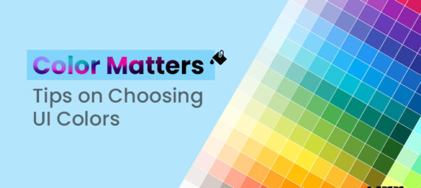
Color Matters – Tips on Choosing UI Colors

Choosing the right scheme of colors for your user interface (UI) can make a lot of difference in how your audiences perceive your product and responds to your communication. Colors have an impact on emotions, they convey meaning, and demonstrates a visual hierarchy that builds a cohesive reception for your design. 

However, with a broad palette of colors, it can be overwhelming to choose the right options and implement it optimally. Here are some tips to help you choose UI colors that will help you with make impact with your design and build a rewarding user experience.

Consider Your Brand Identity

Your brand’s color palette is a great starting point to build your UI color scheme. Here, if your brand has already come up with a guideline, consider implementing those colors to build your design. This helps to create a system of order and consistency across all brand touchpoints and reinforces your brand identity and recognition.

If you are pushing it from scratch, think about the design sensibilities and emotions you want to capture for your brand to covey the underlying meaning right. Use the right color psychology to choose colors that align with those characteristics. For example, blue is often associated with inspiration and trust, while green is associated with growth and harmony.

Use a Limited Color Palette

Too many colors can hamper your idea of communication and distract your users. It’s important to keep your palette of color limited to a few key color codes that work well together in relative combination. This not only helps to create a unified and synchronized design, but also makes it easier for users to understand the visual hierarchy of your UI.

Alternatively, you can limit your color palette by using a monochromatic color scheme. This involves applying different shades and tints of one color. Another option is to use an analogous color scheme, which involves using colors that are adjacent to each other on the color wheel.

Think About Contrast

Establishing contrast in your design is important for making sure that the elements and texts on the interface are legible and interpretable for all users. 

One way to ensure sufficient contrast is to use a color contrast checker tool. Any expert UI designing professional can help you with choosing one. Any of these tools analyze the contrast between two colors and provide a score based on the Web Content Accessibility Guidelines (WCAG). You should hit for at least the ratio of 4.5:1 for normal text, and 3:1 for larger text.

Use UI Colors to Create Visual Hierarchy

You should consider creating a visual hierarchy that guides users through your UI design. By using color to differentiate between different forms of presentations and types of information, users can quickly comprehend the meaning and importance of each element.

For example, you can use a bright, bold color for hero text, and a more muted color for side information. You can also use color to establish a difference between different types of content, such as titles and body text.

Test and Iterate UI Colors

Once you are done with choosing your UI colors, it’s important to run a pilot trial and test them with users to see how they respond. You can use A/B and split testing to compare different color combinations to get it to perform and deliver well as per your requirement.

It’s also important to iterate on your design based on user feedback. If users are not able to understand and interact with your UI design with ease, consider adjusting your scheme and pallet to create a more agreeable visual hierarchy.

To Conclude

Choosing the right scheme of colors of designing user interface is an important part of creating a great user experience. By considering your brand identity, using a limited color palette, thinking about contrast and visual hierarchy, you can achieve it right! Contact our team of experts to know more

Read more about color psychology in app design here.

Categories
Blog Business Succeess Technology Web Design

How to work with a Graphic Designer? Tips to Get Started Right

It can be both enjoyable and rewarding to work with a graphic designer. You can always expect something fresh from your customers as a business. Your client can ask you for anything, from the website’s content to the graphics. Therefore, the most important factor in this situation is how well you are prepared.

No matter how big or small your company is, the best graphic design professionals can assist you in developing a logo or website. Make the most of your working relationship with a graphic artist by following a few tried-and-true advice from renowned professionals.

All you have to do to make working with a graphic designer easier is to follow the patterns and trends. 

Working with Graphic Designer – Tips to Follow

1. Draw your expectations and convey your goals clearly

Before moving forward with hiring graphic design services, you should draft a strategy for yourself that outlines your company’s objectives. You must express clearly what you want to achieve with your work.

As you proceed with hiring professional graphic design services, this should be the question-and-answer type of mechanism. What is the goal of the project? What are the aims and objectives of your project? These queries will assist you in effectively expressing your vision to the graphic designer you have engaged. 

2. Provide a detailed project brief

The extent and outline of the project should be covered in the project brief. Additionally, it needs to discuss the intended demographic, color scheme, and design aesthetic. Additionally, it should discuss the typeface, the message you want to deliver, and any additional pertinent messages.

The project’s output will be more successful the more transparent the communication is and the more information you provide.

Additionally, you must be aware that last-minute adjustments and additions can disrupt the project’s flow. Employ only those graphic design professionals who have the necessary skill set and knowledge to assist you.

3. Set your expectations for deadlines

Working until the very last minute and receiving your product after a long period of time can ruin its core. When hiring graphic design services, be more realistic about how long it will take to finish a project. To do this, make the communication as clear as you can.

Set expectations and make sure the designer you selected understands them. Set a deadline and plan frequent check-ins to make sure the job is moving along according to the plan.

It’s essential to stay informed so that you are conscious of every action being taken to complete the design. This is due to the ineffectiveness of communicating last-minute adjustments.

4. Be a good communicator and provide feedback

Effective collaboration with a designer depends on clear, constant communication. Be more succinct and clearer in your comments, and don’t be afraid to voice any worries or questions you may have. Graphic design professionals with client-centered working methods will continually provide you with receptive input and will collaborate with you up until the very end to refine the design.

Every professional designer will work hard to see the project through each step without any problems until the goals have been reached. Therefore, you have proactive communication here. You keep providing feedback about your goals and having your questions answered to make the output clear.

5. Be receptive to ideas and changes

A designer possesses the highest level of expertise and information regarding the design and its application. They create a style that not only satisfies your unique requirements but also works wonderfully and practically in real life.

Therefore, you should be willing to consider any suggestions or changes that the graphic design professionals working on your project may make. If a compromise works for you, you should be prepared and eager to accept it.

Don’t insist that something your designer suggests isn’t very lucrative or paying off. Always follow their wise counsel.

6. Honor the designer’s contributions and efforts

As a business, you must respect the time and knowledge of the graphic design services providers or experts who contribute fully to the output’s lifespan. Graphic design is a highly specialized skill, so a competent designer’s work is crucial to the outcome’s success and effectiveness.

Be more considerate of other people’s time and be ready to pay a reasonable fee for the services your designer offer. Professionals never undercharge or overcharge; they always charge what is required. So, pay them for their dedicated efforts.

Last Thoughts

Always strive to establish a positive working rapport with your graphic design team. You could accomplish your goals with the aid of this. Working with a designer is a two-way street, so you should strive for efficient communication, have respect for one another, and appreciation for the work they put in. Always be prepared to add to the effectiveness and success of a team effort. Contact Us Today if you need assistance of graphic designer

Read more about Graphic Design types here.

Categories
Brand & Identity Business Succeess Design Virtual Reality Web Design

Motion Design Principles: A Guide to Creating Dynamic and Engaging Visuals

Motion design is an art style that combines design and animation to generate graphics that are dynamic and captivating. It has the ability to fascinate and enthral its audience, whether it’s an animated logo, a motion graphic video, or an interactive web design. However, developing effective motion design requires more than making things move. It strikes a delicate balance between design concepts, animation techniques, and storytelling abilities. In this guide, we will explore the 10 essential principles of motion design and how they can be used to create engaging, dynamic, and impactful visuals.

10 Motion Design Principles

1. Timing and Pacing

Timing and tempo play a key influence on a motion design’s overall effect. Timing refers to the duration of a movement, whereas pacing refers to its velocity. When creating a motion design, both of these elements must be considered, since they might affect the emotional effect and overall narrative of the design. Timing and tempo must be continuous and coherent across the entire piece in order to produce a fluid and natural motion design.

2. Easing

The rate of acceleration or deceleration of an object’s movement is referred to as its ease. In other words, it indicates how quickly or slowly an object approaches its target. Easing can have a substantial effect on the perceived realism and naturalness of a motion design, and it is a crucial component employed by a designing agency in creating natural and convincing animations. By applying easing to an object’s movement, you can make it appear more lifelike and add a sense of weight and direction to the design.

3. Movement Pathways

The movement routes of elements inside a motion design also contribute significantly to its overall impact. The path an object follows throughout its motion might alter the viewer’s visual interest and focus. For example, a straight and direct path may create a sense of efficiency, while a more complex and winding path may create a sense of unpredictability and excitement. When developing a motion, it is essential to evaluate the movement pathways of the items and to select paths that are consistent with the overall story and goal of the design.

4. Contrast

Contrast refers to the disparities between elements such as color, size, shape, and motion, and it is an effective tool for generating visual intrigue and impact in motion design. Items with high contrast can attract the viewer’s attention, while elements with low contrast can create a sense of solidity and backdrop. In order to direct the audience’s attention and bolster the overall narrative, it is crucial for UX designers to think about and strategically employ contrast in motion design.

5. Follow-through and Overlapping Action

Follow-through and overlapping action are two notions that define how moving elements in a motion design continue to move after their initial movement has concluded. Follow-through relates to how an object continues to move after its original movement has ceased, whereas overlapping action refers to how distinct design elements move in relation to one another. By adopting these ideas, you can build a design that appears more natural and believable, so enhancing the design’s visual appeal and overall effect.

6. Staging

Staging is the arrangement of items and features in a motion design, and it plays an essential part in generating visual appeal and impact. Staging can be used to direct the viewer’s attention, highlight significant aspects or items, and add depth and perspective to the design. When making a these design, it’s crucial to think about how everything will be staged and to arrange the parts so that they serve the bigger picture.

7. Balance

When elements of a design are balanced, they appear to be held in place and dispersed uniformly to the eye. Motion design artists can accomplish balance by the use of symmetrical or asymmetrical layouts, and it plays an essential part in establishing a sense of harmony and stability in the design. The success of a motion design relies on the careful placement of its individual components, which must be balanced with an eye toward the design’s overall aesthetic appeal and emotional impact.

8. Repetition

Repetition, in motion designs, is the practice of using the same or similar elements (such as forms, colors, or animations) repeatedly to establish a theme or pattern. Repetition can be used to promote a brand or message, as well as to create visual interest and impact. It’s crucial to think about and skillfully employ repetition in motion design to bolster the design’s narrative and accomplish its intended objective.

9. Proximity

Proximity refers to the arrangement of pieces in close proximity to one another, and it is an effective technique for establishing a sense of interaction and connection in motion design. By placing elements in close proximity, you may create a sense of unity and cohesion in your design and also direct the viewer’s visual attention. When creating a motion, it is critical to keep the parts close together and organize them in a way that supports the main narrative and goal of the design.

10. Rhythm

Rhythm is the recurrence of elements in a constant and predictable sequence, and it is an essential component of motion design. Good use of rhythm can give a design a sense of unity and coherence, making it more enjoyable to watch and easier to understand. It can also help to create a sense of energy and movement, drawing the viewer’s eye through the design and keeping their attention focused on the action.

Conclusion

The principles of motion design are the foundation for creating dynamic and engaging visuals. Whether you’re a professional motion designer or just starting out, understanding these principles and incorporating them into your work will help you create motion designs that stand out and connect with your audience. From timing and pacing to overlapping action and staging, each principle has a unique role to play in creating captivating and memorable visuals. So take the time to explore these principles, experiment with them, and let your creativity soar! Contact our team of experts to learn more.

Read more about how to use motion graphics animation for your business here.

Categories
Blog Brand & Identity Business Succeess Mobile Apps UX Design Web Design

Types of Motion Graphics Animation for Your Business

People’s tastes and preferences constantly change in today’s modern, fast-paced culture. As a result, businesses compete fiercely to develop cutting-edge ideas and strategies to persuade customers to buy their goods or services. Motion graphics animation has recently seen a lot of innovation thanks to global changes. You cannot fairly expect to get the outcomes you want if you consistently post the same old animated video style. To meet market demand, you must know the newest motion graphics trends.

Explainer Videos

Explainer videos are brief segments of video content intended to help people understand how your product works. This one is one of the most often utilized motion graphics today. Because businesses will have services or items they need to make more evident to their clients, you will see this a lot on their feeds.

If you’re trying to promote a good or service that isn’t immediately obvious, you should consider investing in an explainer video.

This in no way suggests that there is a problem with the stuff you’re trying to sell. Instead, it gives you more chances to offer viewers of your material a captivating motion graphics movie they will want to share. Some products need more instruction than others, but this is just another opportunity to interact with your customers!

User Interface

If you created the program or digital platform, it’s a good idea to incorporate motion graphics to show how it operates. With this strategy, your audience’s perceptions will match what they observe. When users start using your platform, they will be comfortable with how it works. Additionally, you can draw attention to your platform’s best features. To make the most out of your platform, look for effective motion graphic design services to help you out.

Broadcast

The type of motion graphics that receives the least attention is the broadcast graphics category. The stunning idents that may display during a football game’s coverage gaps offer one example of this type.

The visual appeal of programs like those on a football field, where the environment doesn’t change regularly, is improved by graphics during broadcasts. A fascinating motion graphic can increase player interest as the game progresses.

GIFs

You send them to your family, friends, and coworkers and post them on your various social networking websites: GIFs have a remarkably high level of acceptance in motion graphics. While some GIFs are generated specifically to be GIFs, others are created from the live-action video that has been transformed INTO a GIF format.

GIFs for motion graphics are especially helpful and effective on social media. Additionally, the preparation period is relatively brief. 

Logos

What other features of your company’s brand besides its logo make it particularly memorable? You have the option to play around with your logo’s structure to use those components to create an interesting animation. It’s crucial to remember that all motion graphics are still images that have been edited to give the appearance of movement.

For instance, if the circular shapes in your company’s logo are used, you could show them spinning or whirling before they come together to form the final image. Alternatively, you only need to take your logo and give it a little life by letting it hover on the screen. You don’t even need to make it complicated.

Presentations

We’re all aware that presentations make up a sizable chunk of corporate life, and we want to wow our investors, clients, and vendors with the incredibly creative slides we’ve made. The stakes are also much higher for these events because companies frequently rest their business model on their presentations. They should be able to effectively convey your point while also attracting the interest of potential investors.

Why would you employ old static visuals and pre-loaded transition effects for your company’s most precious asset? Please get rid of them and substitute motion graphics-based presentations in their place. Working with a reputed graphic design company can help you make desirable presentations.

Having said all that, there is an excellent chance that the animation trends we have listed above will be useful in most businesses that need motion graphics animation. Go through each and select the most appropriate animation trends to serve your purpose. 

Read more about how to use videos to enhance UX of website here.

Categories
Brand & Identity Design Testing UI Design Web Design

Brand Storytelling and Why Is It Essential for You

In today’s crowded digital marketplace, the competition is fierce. Every brand is out there fighting for the attention of its consumers. Consumers only have limited attention and time to give as they are busy with their own life. This is where a brand storytelling comes in. It gives you the means to make an emotional connection with your customers.   

Telling a good brand story is a difficult job. This is why digital branding agency and their digital branding services are in so much demand. If you want to know about the nuances of brand storytelling, you’re at the right palace. Read on, and find out why it is a must for your brand. 

What Is a Brand Story?

A brand story is a narrative of your brand that tries to strike an emotional chord with your customer. It is different from traditional advertising which is telling your customers what you do. The objective of a brand story is to inspire an emotional reaction. The end result of this emotional reaction is to be memorable to your customers.   

Brand stories or branding of your company is done through all the content it releases be it blog posts, videos, or social media campaigns. Even something as small as your logo can be a reflection of your brand story.  

Why Brand Storytelling is Important?

Your ideal customer is being bombarded with advertisements, campaigns, and whatnot to catch their attention. But their capacity to remember a brand is limited. Good digital branding helps your brand to stand out from the competition. It tells the customers why the business exists, what sets them apart and why they (the customer) must choose your brand over others.

This separates your brand from being just another brand running ads to one that is trusted by the customers. This in turn helps your audience turn into loyal and paying customers. Articulating your core values into a cohesive story also helps you attract the right kind of talent. Future employees who find your values align with that of yours.  

How To Get Your Brand Story Right? 

To get your branding right, a digital branding agency has to know the answer to some very fundamental questions regarding your business. This will help them to provide you with the best digital services in line with your goals.

Find your ‘why’?

Knowing your why is at the core of getting your digital branding right. You have to know why you do what you do, and what makes you get up from bed in the morning. Once you are aware of it only then can you get your branding right. Because as the American author and inspirational speaker, Simon Sinek says in his book Start With Why, “It’s worth repeating: people don’t buy WHAT you do, they buy WHY you do it.” 

Talk to your ideal customer

A brand story is a story, and like all good stories, it needs a hero. Your ideal customer is the protagonist of your brand story. All the content you put out is directed to them. This is why it is important to find your ideal customer and put your message across as if you are talking to them. To take this even further, make sure you only have one person in mind. You know their age, demographic, background, education, hobby and aspirations. 

Be authentic 

Being authentic is another great way to nail your branding. Your customers can tell when you are being a copycat and trying to imitate a successful competitor. Being authentic is all about being true to your core values and sharing those values across platforms. 

Be consistent across platforms 

The messaging across platforms is different, a video is a visual medium while a blog post is a text-based one. To make your brand story effective and memorable your message across various platforms has to be the same. Whether it’s your videos, website, blogs or even logos, there should be consistency in your digital branding. 

Keep it simple 

The objective of your brand story is to resonate with your customers and evoke a favorable emotion, not to win awards. This is why you need to keep it simple and not overcomplicate it. Unless that’s what your ideal customers would prefer- sophisticated and complex. 

Examples of Good Brand Storytelling 

Spotify Wrapped 

Spotify wrapped by Spotify is an annual campaign that informs you about your listening in the year gone by. You get to see what were your favorite songs, artists, and playlists. It also recommends songs and artists you might like based on your listening habits. The audio streaming combines data and personalization to deliver ‘sound’ brand storytelling. What’s more? The annual event can be replicated every year while adding new features to it.

Nike  

The Just Do It slogan by Nike has to be one of the most memorable and effective brand storytelling in recent times. Across its various campaigns and advertisements, the footwear and apparel brand asks its consumers to Just Do It. The messaging remains consistent across platforms and does help in evoking a positive emotion in consumers’ minds.  

Old Spice 

The Smell like a Man campaign by Old Spice made the brand a household name. It is a witty take on how your man should smell like. The brand shows the traits of a perfect man, the one you become when you use Old Spice deodorants. The campaign became extremely successful and the brand now tries to outdo itself with each new campaign.  

Wrap-up

A Brand story is an excellent way to make an impression on your customers and evoke an emotional response. When done right, it helps you stand apart from your competitors and provides you with an edge even in a market with cutthroat competition. The key is to know the basic values of your business inside out and keep the message consistent across platforms. If the whole brand storytelling seems a bit overwhelming to you, you can get help from a digital branding agency. Contact Us to know more.

Read more about storytelling through design here.