
As of 2015, mobile phone traffic has been on the rise, with the global number of Mobile phone users topping approx 4 billion in 2021. Mobile devices now account for more than 88 percent of all online searches. Responsive design thus play major role in today’s market.
This increase in mobile web access is due to Google’s AMP and Mobilegeddon. Google launched a new browser algorithm on April 21st, 2015, which incorporated a website’s mobile-adaptability as one of the ranking considerations. This ranking algorithm was created to improve mobile-adaptable pages in search results.
Websites that were not mobile-adaptable and friendly, on the other hand, saw a drop in their search engine results. Google then introduced AMP on October 7th, 2015, intending to provide internet consumers with the greatest mobile experience possible. These are the primary reasons why responsive web design has become a prominent web development trend in recent years.
What Exactly Is Responsive Design?
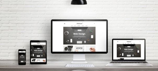
In essence, responsive design creates a website that automatically adapts its information and components to fit in the size of the screen on which it is viewed. It develops a mechanism allowing a single site to respond to the size of a user’s device—all with a single URL and source of the content.
A responsive website has an adaptable and fluid layout that changes to screen size. It stops graphics from being larger than the screen width and saves mobile users from doing extra work to understand your content.
The primary objective of responsive design is to eliminate the needless zooming, resizing, planning, or scrolling on web pages that have not been designed for different devices. It is frequently tough to navigate these sites, which may lose potential clients who feel annoyed while finding out how to do things.
When all of these factors are considered, it is evident that having a responsive web design offers several advantages. There are several ways it may help your website rank and flourish, ranging from favorably affecting your SEO and conversion rates to boosting user experience.
Why is it Critical to be Responsive?
The growth of Google is linked to the proliferation of smartphones. Even if you live in a hut, you’d probably utilize Google to discover material daily. Google is how users will find a product on any specific website – especially if you need many of them to locate it. This leads us to the second point that makes responsiveness so important: Google’s mobile-first indexing.
It might be tough to comprehend the role of SEO in UX design, particularly when it comes to content optimization. In broad strokes, Google’s decision to prioritize mobile design signals to any new website that the mobile version will affect the product’s rating. In a nutshell, there is no responsive mobile website and no front-page ranking for any search.
Why Should You Invest in Responsive Design?
We live in a multi-screen culture. As a result, your site must be available on as many devices as feasible as one never knows what device someone will use to browse your website.
It is a great idea to appeal to both desktop and mobile readers, according to responsive website statistics. The number of mobile viewers currently outnumbers PC watchers, and this figure will only grow as worldwide smartphone accessibility grows.
In summary, the advantages of using responsive design for your website are as follows:
1. Better SEO
Improved search engine rankings are among the most significant benefits of having a responsive site design. Google considers the responsiveness of all websites as one of the factors that influence their ranking in the results of the search engine. This implies that if your website is not responsive, it will be ranked lower in the results of search engines.
2. Economic Viability
Keeping different sites for your mobile and non-mobile clients might be costly. You may save money by using responsive design, as you will then not have to pay for a mobile site. To appeal to all visitors and devices, you will need to invest in a single site design.
3. Better User Experience
A website design which is responsive provides an excellent experience for your visitors regardless of the device they are using. When your website guests discover that your website calibrates and reacts to changes well and can access all of the buttons and menus, they are likely to spend a significant amount of time on it. Although, if people find it difficult to browse and are continuously compelled to pinch & zoom stuff, they will most likely go.
4. Adaptability
When you have a responsive design website, you may make adjustments easily and swiftly. You do not have to be concerned about making modifications to two websites. This flexibility is extremely useful when you need to make a fast design change or correct a typo on your website—you only have to do it once.
The Final Word On Responsive Design
In conclusion, mobile devices outnumber desktops and laptops in terms of internet usage in today’s world. Correspondingly your website must appear amazing and function properly on tablets and smartphones as well as desktops and laptops.
If your website design isn’t yet responsive, it’s time to seek web design advice and adapt it to be more responsive. This will not only make it easier for you to administer your website, but it will also greatly increase your website’s SEO, conversion rate, and user engagement rate. Contact Us today to know more and evaluate your brand.
Read more about what mistakes you should avoid while designing a responsive website here.


 source:Mclaren
 source:Telegraph
 source:Wallmob
 source: square