NYX Ditech

Categories
Mobile Apps UI Design UX Design Web Design

Product Reveal Hover Effect UX and UI Designs

In today’s competitive digital world, creating an impressive and unique user experience has become crucial for every website and application. One of the key factors that can enhance the user experience is an engaging product reveal hover effect. In this blog post, we will explore the UX and UI designs of product reveal hover effects and its impact on user engagement.

What is a Product Reveal Hover Effect?

It is a design technique that displays additional information or details about a product when a user hovers over it. The product’s key features, pricing, and images are some of the information that can be displayed. This effect can enhance user engagement by providing users with a more in-depth look at the product without requiring them to click through to a new page.

Benefits of Product Reveal Hover Effect

The hover effect has several benefits for both the user and the website owner. It provides users with quick access to additional product information, which can lead to increased user engagement and ultimately, higher conversion rates. Additionally, this effect can save users time and effort by eliminating the need to navigate to a new page to get more details about the product. From the website owner’s perspective, it can increase user retention and time spent on the website, which can improve SEO and ultimately lead to increased sales.

Design Considerations

To ensure the product revealing effect is effective, designers need to consider several factors, such as the location of the hover effect, the color and font of the displayed information, and the size of the image displayed. The location of the effect should be intuitive and easy to find, such as on the product image or title. The color and font of the displayed information should be consistent with the overall design of the website or application. The size of the image displayed should be large enough to provide users with a clear view of the product but not so large that it overwhelms the user.

Examples of Hover Effect

Some websites and applications have implemented product reveal hover effects effectively. For instance, Amazon uses a product reveal hover effect to display product ratings and customer reviews when a user hovers over the product image. Apple’s website uses this effect to display product specifications and pricing information when a user hovers over the product title. These examples demonstrate how effective the product reveal hover effect can be in providing users with quick access to valuable product information.

Best Practices

To create an effective product reveal hover effect, designers should keep the following best practices in mind:

  • Use intuitive placement: The effect should be placed in an intuitive location to make it easy for users to find.
  • Keep it simple: The displayed information should be brief and concise, providing users with quick access to essential product details.
  • Use consistent design: The hover effect design should be consistent with the overall design of the website or application to maintain brand consistency.
  • Consider accessibility: It should be accessible to all users, including those with disabilities, by providing alternative text for images.

Conclusion

The product reveal hover effect is an effective UX and UI design technique that can enhance user engagement and ultimately lead to increased sales. By considering the design considerations, best practices, and examples, designers can create an effective product reveal hover effect that provides users with quick access to valuable product information. Contact our team of experts today for customized solution for your product needs.

Read more about measures of successful product design here.

Categories
Business Succeess Mobile Apps Web Design

10 Measures of a Successful Product Design

What do you think is the best meaning of a successful design and what are its measures? In the real world, thinking about a perfect design is a never-ending process that always leaves space for improvements. Whether we talk about UX or UI designers, a professional one will continue testing and optimization to bring something better.

However, knowing the critical points is essential to make a design near perfect. This post will discuss the top 10 measures of a successful design in detail. 

Measures For Successful Design

  1. How good is customer experience?

This factor looks into the brand’s digital and physical aspects to identify customer loyalty and its ability to affect revenue. It is one of the major benchmarks often used by a graphic design agency that helps retain customers. 

Also known as CX Index, it helped maintain a solid brand customer base. The higher this index gets, the better the chances of retaining the audience.

2. Using the AARRR Framework?

AARRR is a crucial framework that targets company growth and is widely used by startups. Dave McClure proposed it in 2017 and helped determine how a company loses their customer base. It includes performing steps like acquisition, activation, retention, referral, and revenue.

The UI designers set metrics for every step and begin tweaking the design to meet the goals successfully. There can be a significant level of improvement guaranteed with each step.

3. Better than the Previous Version

A true designer will always think to make things better than the previous one. They believe in practising this art, and making a better design seems achievement. 

You should use a similar strategy and try to make a design better than previous work. 

4. Improving Efficiency

Another parameter that web design companies generally use is making their efficiency better than the last time. They work on a framework that believes the battle has been won if the results are more satisfying than the previous attempt.

It is an effective factor that consistently works to improve design efficiency.

5. Improvement in Process

Designers use many unnecessary steps during the creative process. However, professional designers perform the research process to identify them and make the process better.

You can think about performing it using enhancements or optimizations, whatever suits your needs adequately. 

6. Do Clients Get Inspired?

If someone wishes to succeed in the design world, the best way is to let the client feel inspired. There is a need to think outside the box to succeed in this industry. 

You should look like a problem solver in front of the client with whom they can share their issues comfortably. 

7. What Type of Toolkit is Used for Designing?

A very important role is played by type of toolkit used for designing. It offers guidelines for incorporating ethics into the work process by UI designers.

It is very useful for the tactical growth of a company in terms of design. If someone is open to putting aside their pride, the doorway to success opens instantly. 

8. What do you feel about the work?

The next thing to take seriously is your belief in the work. Web design companies with professionals with a sense of pride always impress their clients. There should be a feeling of happiness about the created work. 

Feeling proud of your contributions always leads to better work and great results in the long run. Professionals who feel satisfied with their designs only not support company’s goals essentially but also help customers with what they want. 

9. Does your work show courage?

A common mistake is believing that design is all about self-serving, but the reality is beyond that. A top-level graphic design agency always ensures its designers understand clients’ needs adequately. 

A design can be considered a huge success when there are plenty of interested parties. Make sure every important concern of the client is fulfilled from the core. 

10. How consistent are your designs?

Just tell how many times you have visited the same restaurant due to its tasty dishes! The same goes for this Work as UI designers with consistent work have a greater chance of success than those without. 

If you make a habit of creating perfect work repeatedly, there will always be successful designs created for your clients.

Wrapping up

The factors mentioned here are adequate to measure how successful your design is. They can be extremely helpful for understanding which areas need improvement.

Which of these qualities you think is a must to make it for a great design? Feel free to write about it in the comment section! Or Contact our team experts to know more.

Read more about what are components of successful product design here.

Categories
Blog Brand & Identity Business Succeess Mobile Apps UX Design Web Design

Types of Motion Graphics Animation for Your Business

People’s tastes and preferences constantly change in today’s modern, fast-paced culture. As a result, businesses compete fiercely to develop cutting-edge ideas and strategies to persuade customers to buy their goods or services. Motion graphics animation has recently seen a lot of innovation thanks to global changes. You cannot fairly expect to get the outcomes you want if you consistently post the same old animated video style. To meet market demand, you must know the newest motion graphics trends.

Explainer Videos

Explainer videos are brief segments of video content intended to help people understand how your product works. This one is one of the most often utilized motion graphics today. Because businesses will have services or items they need to make more evident to their clients, you will see this a lot on their feeds.

If you’re trying to promote a good or service that isn’t immediately obvious, you should consider investing in an explainer video.

This in no way suggests that there is a problem with the stuff you’re trying to sell. Instead, it gives you more chances to offer viewers of your material a captivating motion graphics movie they will want to share. Some products need more instruction than others, but this is just another opportunity to interact with your customers!

User Interface

If you created the program or digital platform, it’s a good idea to incorporate motion graphics to show how it operates. With this strategy, your audience’s perceptions will match what they observe. When users start using your platform, they will be comfortable with how it works. Additionally, you can draw attention to your platform’s best features. To make the most out of your platform, look for effective motion graphic design services to help you out.

Broadcast

The type of motion graphics that receives the least attention is the broadcast graphics category. The stunning idents that may display during a football game’s coverage gaps offer one example of this type.

The visual appeal of programs like those on a football field, where the environment doesn’t change regularly, is improved by graphics during broadcasts. A fascinating motion graphic can increase player interest as the game progresses.

GIFs

You send them to your family, friends, and coworkers and post them on your various social networking websites: GIFs have a remarkably high level of acceptance in motion graphics. While some GIFs are generated specifically to be GIFs, others are created from the live-action video that has been transformed INTO a GIF format.

GIFs for motion graphics are especially helpful and effective on social media. Additionally, the preparation period is relatively brief. 

Logos

What other features of your company’s brand besides its logo make it particularly memorable? You have the option to play around with your logo’s structure to use those components to create an interesting animation. It’s crucial to remember that all motion graphics are still images that have been edited to give the appearance of movement.

For instance, if the circular shapes in your company’s logo are used, you could show them spinning or whirling before they come together to form the final image. Alternatively, you only need to take your logo and give it a little life by letting it hover on the screen. You don’t even need to make it complicated.

Presentations

We’re all aware that presentations make up a sizable chunk of corporate life, and we want to wow our investors, clients, and vendors with the incredibly creative slides we’ve made. The stakes are also much higher for these events because companies frequently rest their business model on their presentations. They should be able to effectively convey your point while also attracting the interest of potential investors.

Why would you employ old static visuals and pre-loaded transition effects for your company’s most precious asset? Please get rid of them and substitute motion graphics-based presentations in their place. Working with a reputed graphic design company can help you make desirable presentations.

Having said all that, there is an excellent chance that the animation trends we have listed above will be useful in most businesses that need motion graphics animation. Go through each and select the most appropriate animation trends to serve your purpose. 

Read more about how to use videos to enhance UX of website here.

Categories
Brand & Identity Design Mobile Apps

How to Create Great Mobile App Icons?

An app’s design, features, and performance all greatly affect how long it lasts. It serves as the application’s long-term success indicator. But the icon also plays a significant part in this. Even in our regular activities as consumers, we typically find ourselves drawn to things that appear attractive and alluring. The same applies to app icons. It has much to do with how many buyers would click on it, from beauty to aesthetics.

If the app icon is compelling enough, users will be drawn to click on it and continue using it. Here, the emphasis must be on creating a distinctive icon design.

Creative designing would be beneficial. Therefore, all that is left to do is focus your designing efforts on getting as many users to download and utilize your app as possible. Let’s examine what you can do to make your app icons and design stand out.

Curate a Design that Stands Out- Make Your App Icons and Design with These Tips

1. Strive to be very unique

The main distinguishing characteristics of the present are individuality and USPs. You must be competitive and, most importantly, distinctive if you want to succeed. Here, your app’s icon and design should be based on a thorough market analysis to determine which trends are currently in use and how you can adapt to them.

Instead of making it more recognized by everyone, try to make it as one of a kind as possible to make it impossible for your rivals to replicate.

Develop a symbol that expresses authenticity and individuality by using your creativity. The best designing agency will take care of everything for you in this stance.

2. Take note of hues

The appearance of your icon has a lot to do with colors. It should be nothing less than a flower with nectar that draws bees. Select a hue that stands out and draws attention in a way people find difficult to resist. Pick a vibrant color that looks stylish and attractive.

If you select any muted colors, the user may have a tougher time spotting them in the chaos of the home screen. The on-brand app icon design and selected colors must not impair performance or functionality. Add gradient and contrasting colors to make the icons stand out more. Nurture the icon design to its best.

3. Exercise consideration as you shape.

The design must be original and considerate. Most people need more time to read the long app descriptions when browsing the Play Store. In this case, the app’s symbol needs to say a lot without using words. The form or shape itself implies the app’s functionality. The symbolic message will be most clearly expressed when the shape is crisper and superb.

To define the shape more sharply, you can add certain 3-D and gradient effects. Just keep moving forward while trying to stand out.

4. Concentrate on graphics

Some creative design services might reduceyour tension on this issue. At present, photos are scaled less. Graphics typically look nice in all contexts and sizes.

Graphics have apparent features and crafted forms. The design of the app icons is much more in line with the idea that less is more practical and appealing. A graphical representation is more memorable and clearer. Therefore, use the best programming and creative designing services to make your app more unique.

5. A border frame can do some finishing

Your following advice will be to give the design a little polish. Your design efforts could never suffer from a cleverer tiny design trick. Some completed touch or border will be the best design choice of the day if you want to adorn your app’s design so that it never exhausts the user’s memory.

Increase the shape’s visibility and outline it clearly, so it doesn’t blend into the background of color.

Always aim for a well-defined shape and texture. So, pick a shape contour that is more definite and accurate.

Testing and Implementation Goes Hand in Hand

Before you create and launch the application, it is always a good idea to conduct some trial-and-error testing. Make numerous iterations of your icon, then test each one. You may need to invest some time and money in this, but it will be well worth it.

A/B testing should be used to evaluate the app on Android. The best action for iOS icons and apps is to execute social media campaigns or display advertisements.

Wrapping Up

You become more innovative by using your resources as efficiently as possible. To get started, you must engage professionals from the renowned network of creative design services. Take advantage of a chance to seize a profitable market and create an exceptional app with the help of a top design firm. Contact Us today to know more.

Read more about how you can improve app design through micro-interactions here

Categories
Design Mobile Apps UI Design UX Design Web Design

Best Design Strategies For eCommerce Websites To Increase Conversions

The well-designed eCommerce websites are crucial in converting site visitors into paying customers. Ideally, your site’s design should facilitate a quick and effortless buying experience. If your digital storefront isn’t optimized for sales, it doesn’t matter how good your online ads are; you risk losing your key customers. Statistics reveal that due to poor site navigation and design, 68% of customers never complete their purchases. Customers are more likely to make purchases when they have a positive shopping experience, which can be achieved with the assistance of UI design services.

Having an online presence through Ecommerce web development gives you the opportunity to build a reputation among consumers who may return for future purchases. Connecting with your consumers in this way helps you sell more of your products and services while also encouraging them to be loyal. Therefore, to have a successful eCommerce websites that brings in more paying clients, you need to have a well-designed website.

Best eCommerce Websites Design Strategy To Increase Conversions

Implement a Hierarchical Interface

If you want your audience to swiftly understand your content, you should implement a visual hierarchy. Many individuals visit your website for the first time, so it’s important to keep your web pages organized so that visitors don’t get frustrated and leave. The business’s name, logo, and calls to action (CTAs) are all important parts of the visual hierarchy. Although it may seem trivial, the placement of your company’s name and logo, as well as the sort of typeface you use, are crucial.

The next step is to showcase your brand’s UVP, or its main selling point so that customers can immediately understand what you’re offering. Furthermore, you should position call-to-action (CTA) buttons where you want visitors to go, such as at the top of your home page or on product descriptions pages, next to the products.

Highlight Products on Landing Page

Site landing pages should function like an inviting walkway leading up to the front door. Your website’s landing pages need to be visually appealing and provide potential visitors with a taste of the content they may expect to find on the rest of your site. Try showcasing your best-selling items besides a rolling banner. It’s an old yet highly efficient method of attracting visitors’ attention and guiding them to things they might wish to purchase.

Set Up a Search Box on Every Page

Your website’s usability will increase, and your bounce rate will decrease if shoppers can search your store’s inventory from any page. Having a search bar available makes it easier for customers to navigate through the online store.

Enhance Readability of Content

Even if a website contains significant information, its users will get nothing out of it if they are unable to read and comprehend it. Before releasing your website to the public, check to see that the typeface, text size, and font color all work well together. To ensure your information is easily comprehensible and readable, you may also do user testing with people in your inner circle.

While there is no hard and fast rule on how many fonts a website can use, most sites use between two and four. It’s acceptable to use a single font style throughout an entire website. However, as a general rule, you shouldn’t employ more than three different fonts to avoid distracting your readers and keep them focused on the store.

Include a FAQ Section

You can provide useful responses to your client’s inquiries with a Frequently Asked Questions (FAQ) page. About 83% of people who shop online want the help of some sort before making a final purchase decision. Having a FAQ page can ease the burden on your support staff and give clients peace of mind when making an online purchase.

Branding Must Be Consistent

Getting people familiar with your brand is essential if you want them to return to your website. For this reason, employing consistent branding is crucial for establishing brand recognition and avoiding user ambiguity. In addition, your typography should follow the same color scheme as your company logo for maximum brand recognition. Selecting a color that is not part of your primary color scheme is acceptable if doing so will improve the readability of your CTAs and fonts.

Pay Attention To Mobile Users

Mobile users continue to expand their presence in the online world. Make sure your Ecommerce websites design agency is aware of the best practices for making a website mobile-friendly on tablets and smartphones. Approximately 74% of consumers use their mobile phones to conduct price comparisons, and 61% of them will simply not return to a non-mobile-friendly website.

Add a Static Navigation Bar

By far, this is the most crucial design principle to keep in mind while online store development. Fixed navigation allows users to view the top menu without scrolling back to the top of the page, regardless of whether they are. By reducing the amount of time customers spend navigating your site, fixed navigation can help you provide a better overall eCommerce experience.

Regardless of the fact that adding a product to the shopping cart requires users to scroll to the bottom of the page, CTAs must remain visible to all customers regardless of their location on the page. Like fixed navigation, fixed calls to action (CTAs) help in redirecting visitors to specific pages and simplify the buying process.

Upload High-Quality Pictures Of Your Products

In order to get a true feel for an item before purchasing it online, consumers need to see high-quality photographs of the same. Better still, buyers can perceive that you place importance on your products’ presentation thanks to the high quality of the images you post. If you need assistance creating graphics, you may always hunt for professional graphic designers or photographers.

Hiring experts may be costly, but it’s worth it to have your products displayed in the most appealing light possible. Customers will be more willing to spend money on your products if they are more visually appealing.

Streamlined, One-Page Checkout

This is yet another recommended design approach for enhancing your online marketplace for mobile use.  Creating a simple, one-page checkout is a great way to reduce cart abandonment and increase sales. Guests shouldn’t be required to sign up for anything before making a purchase from your shop. 

You may be able to keep customers from abandoning their carts and lowering cart abandonment by implementing a single-page checkout. Customers will feel more at ease making a purchase if they see trust marks and other verifications of the site’s safety and security prominently displayed during the checkout process.

Conclusion

Investing the effort and time needed to apply these best practices for eCommerce store design will pay off in increased conversions, decreased cart abandonment percentages, and increased revenue. If you follow these strategies, you’ll be able to showcase your eCommerce websites in a way that’s both user-friendly and professional. Contact Us today to learn more.

Categories
Brand & Identity Design Mobile Apps Technology

A Comprehensive Guide for eWallet App Designing

Following the COVID-19 epidemic, digitalization has taken hold across the globe. The use of digital components has become prevalent in every sector. People all across the world are beginning to use mobile payments as a means of making purchases. According to a survey by Market Research Future, the e-wallet market is expected to reach about $2100 billion in revenue by 2023, growing at a CAGR of 15%. It may be quite complex to design a eWallet app with the finest functional traits and service features. Product design experts for eWallet apps must provide the most practical and intuitive user interface designing as smartphones are becoming more capable. It’s now imperative that designers revisit the design of their eWallet app to ensure that it is easy to use and secure enough to be used on a daily basis.

Components of E-wallet App Design

Numerous components must be incorporated into the design of the eWallet application to provide a spectacular look and experience. It takes time and a skilled eWallet app developer to create a stunning design that will captivate your users.

Background

It’s critical for small and large web design firms alike to establish their brand and make an impact. The app’s design must reflect the company’s unique personality in every way. UI, symbols, and logos, among other things, must be incorporated appropriately into the design of an e-wallet application.

Animation

User engagement must be at an extremely high level if a eWallet product application designers want to provide a high-quality product to its customers. A variety of eWallet software panels and features may be animated to provide the user with an enhanced level of engagement. 

Color Scheme and Gradient

When it comes to apps, the color theme is the most significant aspect. A majority of users are drawn to an app based on its color palette. The combination of hues has a calming effect on the psyche. This demands the use of a color gradient in the application’s design.

Isometric Style

To help customers relax and focus on the components, a clean and balanced design is essential. It is possible for the app’s welcome page to include balance, pay bills, and transaction information as well as buttons to recharge your phone, make mobile payments, and other incentive offers. Digital product designing services can suggest a cost-effective solution template for putting together a feature set.

Process For Designing an eWallet App

Doing a Market Analysis

Some of the most popular eWallet apps on the market provide a wide range of features and an extremely high degree of security. Major providers like Gpay and Samsung Pay have amassed significant market share and have a devoted following of users. In order to choose the best developers for your eWallet application, you must first conduct thorough market research.

Personas for Users

Understanding the user’s persona is critical to meeting the user’s needs. There is no one-size-fits-all solution for every user. However, it’s always a good idea to divide your customers into a variety of categories. Successful eWallet app developers know what it takes to create a popular app. Companies may gain a better understanding of user behavior by grouping people into many categories and subcategories.

Development of the User Flow

Flow is a term that refers to how a user moves through a process to accomplish a goal. The design of an eWallet must be simple and easy to use for the end-user. The user flow assists in determining which features are most likely to meet and exceed users’ expectations. The user’s journey is determined by the user’s profile; however, your application must choose the path that is most convenient for the majority. Make sure that you select a workflow that will work well for the majority of your team members.

Wireframing

Wireframing is the process of sketching out the eWallet’s interfaces. This is to ensure that all functionalities, in addition to basic functions such as login identification and registration, are provided. This also assists in comprehending the logical sequence of steps that must occur within your application.

UX Research and Testing

An improved customer experience may be achieved by using UX Lab. It seeks to analyze the app’s numerous processes to see how simple or complex it is for users to complete activities. Moreover, it ensures that the app’s design is in accordance with the original concept and that its functionality is in accordance with the intended user flow.

Top Features for eWallet App Design

Summary of Financial Transactions

The summary, which includes a financial transaction, is critical since it enables customers to monitor their entire financial situation from the home screen. This feature enables people to access their balance at any time, as well as the flow of cash, evaluate transactions, etc.

Analyses of Spending

The spending analysis tool is a critical component of an eWallet’s functionality. This tool aids users in keeping tabs on their spending patterns, such as how much they spend on movies, clothes, and other items. Having this information easily available on the application makes it much easier for customers to build a budget and keep track of their expenditures.

Convenient and Effortless Orders

One of the most important aspects of mobile wallets is their speed. Transactions are expected to be completed in the smallest amount of time feasible. Any delays might have a negative impact on the customer experience. As more and more applications are accessible for booking taxis, buying meals, and other activities that involve money transactions, this functionality has become increasingly important.

A Bill Paying Option

eWallets may be used to make electronic payments such as online purchases and bill payments. It’s no longer necessary for consumers to lug around a wallet full of cash or credit cards. This benefits users by allowing them to earn cashback, discounts, and other rewards while also facilitating improved financial management.

Chatbots

Chatbots are virtual assistants that converse in the same way that people do. Providing users with effective and cost-effective customer care ensures high-quality service and rapid resolution of issues. There has been a dramatic increase in the ease with which enterprises may communicate with chatbots. 

Near Field Communication (NFC)

NFC is integrated into the eWallet design so that consumers can just touch their smartphones on a device to make a payment at a business. NFC transactions are more secured than credit card payments, so users may rest assured of their safety. Additionally, NFCs are compatible with other payment systems and serve as a versatile platform for numerous forms of safe payment. Transactions are simplified and expedited since users no longer need to take cash or credit cards with them everywhere they go.

QR Codes

Adding QR codes to an eWallet is a smart move. This enables users to connect to other individuals online simply by scanning their QR codes, eliminating any necessity for cards or bank details. Also, QR codes have simplified the process of tracking money flows from one individual to another.

Conclusion 

eWallets are becoming increasingly popular since they are accepted in more locations, provide improved security, and open up new avenues for making. Contact Us today with your requirements.

Read more about why your business needs a mobile app here.

Categories
Brand & Identity Design Mobile Apps UX Design

How User Experience (UX) Significantly Influences eLearning

There’s no denying that eLearning has several advantages over traditional classroom teaching, including accessibility, cost savings, and improved teamwork. UX design has a significant impact on training efficacy. For example, a platform that is difficult to use is unlikely to attract many visitors. User Experience design for remote learning has been shown to have a major impact on how effectively students learn. The lack of it will lead to students being puzzled, dissatisfied, and furthermore distracted.

What is the impact of UX on eLearning?

eLearning’s User Experience (UX) is frequently shaped by a variety of elements, such as the efficiency, design, and interaction of the course material. However, the main concern here is what effect does UX has on the distance learning process?

The goal of any UX designing agency is to provide a unique constraint for all of the elements that go into creating a positive user experience. Design, interaction, speed, and even brand awareness are all examples of what is included in this category. Whenever it comes to distance education, each of these factors is critical. Here are several ways UX may improve or ruin an eLearning experience:

#1 User Experience Can Help eLearners Retain More Information

Visual aids used by User Experience designers can boost learning by as much as 400%. As a result, students will retain more of the content they learn when it is presented to them in the form of visual elements like charts, graphs, and interactive movies. Better understanding allows students to apply their knowledge and skills more quickly and effectively.

Duolingo is an excellent illustration of how UX can affect remote learning. A large part of the platform’s popularity is due to its user-friendly layout, which makes it easier to remember new vocabulary and grammar rules as you learn a new language. Additionally, the interface assists learners in learning more quickly, owing to their ability to comprehend the visual clues provided by the platform.

#2 You Can Make Learning Fun Using UX Design

It’s been shown that students remember more information and have more fun with their lessons when they have a positive impression of the eLearning experience. They will thus study for longer lengths of time, gain a greater amount of information, and have a more positive outlook on the topic.

A great example of how UX can be used to enhance online learning would be any online gamification platform. Gamification, quizzes, and even interactive lessons may help students get more out of their distance learning experiences and achieve their goals. They add levity to the process, which encourages students to stay on the platform longer and use it more frequently.

#3 User-Centered Design Makes eLearning Easier

When learners can easily retrieve their information, it becomes more relevant to them. This means that students with impairments or who do not know the language of the eLearning platform may have difficulty navigating it. However, an experienced UX designer can assist you in overcoming these obstacles and drastically improve users’ online experience with the appropriate UX strategies.

Most prominent EdTech platforms contain functionalities that can be used on a variety of devices and platforms since they are standardized. This makes it easy for users to access eLearning content and information on a wide range of devices and ecosystems. 

#4 UX May Speed Up The eLearning Process

Enhancing the UX can assist learners in enhancing their speed and overall comprehension. Navigations can be quicker and more efficient when the UI is simple and straightforward to use.

This also aids creative design agencies in the creation of relevant content. This means that students may spend more time studying and less time waiting for items to load on an eLearning platform.

#5 UX Can Improve the Relationship between eLearners and Teachers

Students will engage more with one another and understand more if an eLearning platform is easy to use and attractive to look at. This may lead to greater connections among community members and more training in the long run.

UX can have a significant influence on distance learning, and YouTube is a prime example of this. A user-friendly and quick video hosting platform makes it simple to exchange videos and gain knowledge from one another. This also has an influence on the social component of learning, as users may share what they’ve learned with other community members or voice their questions via the comments box.

eLearning UX Design Tips & Tricks

Minimize Distractions, Increase Value

Users who enroll in a course or program on your platform do so because they are interested in the content. Because it’s online, they’ll have to put in more effort to get the most out of it. Distracting students with animations or music that aren’t relevant to the lesson will only lead to lower levels of engagement and, ultimately, decreased scores.

Swift Navigation

Navigability is a critical consideration in the creation of an effective eLearning course. You should utilize controls that are easy for anyone to understand and navigate since they make it easier for everybody to find the information they need. Focusing on navigation also increases student involvement and participation, allowing them to concentrate more on taking in content rather than figuring out how to move on to the next activity. 

All of this can help students better retain and apply what they learn in the classroom. Having an easy-to-navigate course helps students to absorb the knowledge and progress at their own speed.

Adaptive Design For All Platforms

Making sure that content can be accessed via mobile applications is as important as designing for diverse devices and platforms. But it’s even more crucial to maintain a consistent user experience across all of your platforms. Responsive web design is a great way to do this. In other words, your platform should be responsive to the device from which it’s being used, and the user interface components should adapt to the screen size of the user.

Identify Your Ideal Customer

When it comes to developing an engaging eLearning course, taking the time to analyze an individual student’s character might be helpful. Don’t forget to consider the age group of the intended buyer while developing a product. UX and UI will be impacted as a result of this consideration. More information is always better. Consider their long-term and short-term objectives, abilities, mindsets, requirements, and patterns of conduct.

Accessibility

When it comes to UX design, accessibility can be portrayed in a variety of ways. Make sure the typefaces are understandable by paying attention to their size. Big fonts are simpler to read on mobile devices, such as smartphones and tablets. In order to make the platform’s most critical features stand out, they should be given more importance.

Another factor to consider is cognitive fatigue. When the amount of knowledge needed to perform a task exceeds one’s ability to process, this is known as cognitive overload. This is especially important in online design since it has an effect on the bounce rate, reduces conversion, and cuts down the number of returning users. The design shouldn’t be too flamboyant. Keep your focus on the content and let it do the talking.

Conclusion

Designing for eLearning is a lengthy and complicated process that requires careful consideration. Due to the fact that remote learning is a relatively new idea, the majority of platforms place a premium on user experience. Enhanced customer experiences lead to more positive social interactions as well as better learning results in the vast majority of situations.

The most effective strategy is to match the demands of your intended audience and empower them to achieve their goals. As a result, they’ll be more eager to use your platform and pick up new skills, hence increasing the learning experience as a whole. Contact Us today to learn more and get started.

Read more about frictionless UX Experience here.

Categories
Brand & Identity Mobile Apps UI Design UX UX Design

Improve App Design with Microinteractions

Microinteractions are the simplest yet most critical component of all UI engagements in an application’s design. While consumers may take these little activities casually, microinteractions make any mobile UI design useful and appealing. These not just determine an app’s aesthetic attractiveness, but also contribute a sense of illusion to mobile UI experiences. 

For instance, On/Off sliders do not really move in the same way as physical buttons do, but they do probably move when animated. Thus, microinteractions in any UI design assist users in seeing how the program’s user interface behaves.

Microinteractions: What Are They?

Microinteractions are brief interface responses to the user’s activities within the application. The finest microinteractions in smartphone user interface design make the customer feel valued for performing the action. Each microinteraction serves three major purposes:

  • To deliver immediate feedback.
  • Encourage engagement with users.
  • Make the user experience enjoyable without diverting from the primary task.

Why Are Microinteractions Important?

While there are several common methods for acing app design, no UX design is complete without smart microinteractions. These tiny design touches are necessary not just for promoting user engagement or directing them to a specific activity, but also for moving the user around the product and making them feel acknowledged for their efforts.

When microinteractions are implemented right, they may generate good sentiments about your product and impact users’ behavior, frequently without the user being aware.

Each microinteraction is composed of three components: activity, response, and evaluation. On the basis of how successfully this procedure engages application users, one may assess the degree to which your application layout is optimized. Therefore, before including a specialized microinteraction into a mobile app or website design, ensure that it is consistent with your target demographic and the product or concept. 

Microinteractions: Breakdown

Each microinteraction in UI design is comprised of four components.

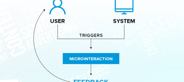
  1. Triggers – That prompt usersto browse between screens, drag to refresh, tap, click, or execute other graphical user interface operations. Triggers can be started by the user or by the system.
  1. Rules – That govern what happens in response to a trigger.
  1. Feedback – That keeps consumers informed about the app’s current activities. This might include loading transitions, pop-up notifications, and color changes, among other microinteractions.
  1. Loops and Modes – That define the meta-rules, the duration of an in-app activity, and notify users when they must do transition.

When To Use Microinteractions?

Swipe – The swipe movement minimizes the need for tapping and provides a far more engaging and seamless user experience. It enables the consumer to easily navigate between pages and get further details regarding the product. Additionally, swiping is a fairly frequent action that directs people intuitively without them having to think about it.

Data Input – We are all familiar with the hassles associated with setting up user profiles. This action is certain to raise eyebrows. While proactive advice about strong password and management make it simple for the user to progress, some interactive engagements during data entry work to keep consumers engaged with the flow.

Animations – Animation facilitates and enhances micro-interactions in a straightforward manner. They exemplify excellent design; their existence may go unnoticed, yet their absence has a detrimental effect on everyone. They function as glue, enabling designers to make even the most mundane procedures exciting and addicting. However, use caution since they are intended to engage people, not to overwhelm or irritate them.

Create Interesting Tutorials – Every single one of us is always on the lookout for knowledge. Tutorials educate people about an app’s operation through the use of microinteraction by streamlining and emphasizing key features and functionalities.

Call To Action (CTA) – Microinteractions are simply nudges that encourage individuals to engage with a website or application. CTA instills a sense of accomplishment and also an empathic component in user behavior, and the most effective approach to getting your user to engage with your CTA is to make it interesting in order to pique the user’s interest.

Animated Buttons – They serve as a reference manager by directing users throughout your application or website. To create a smooth user experience, we must pay attention to color, form, visual effects, transitions, positioning, and texture.

How Should Micro-Interactions Be Designed?

Microinteractions are fascinating for designers because they allow for experimentation with new design ideas and the exploration of new methods to surprise consumers. However, you must bear the following in mind:

  • Place yourself in the consumers’ position – and utilize everything at your disposal to ascertain how they interact with your software.
  • Create effective animations – Animations that are not only visually appealing but also capable of enhancing the customer experience.
  • Engage your users – The user’s experience with the application is the reason he continues to use it. If the customer appreciates and considers the experience nice, he will return.
  • Avoid becoming obnoxious – An excessive number of animations has the opposite impact on consumers. Users that are irritated with your app will abandon it.
  • Utilize a conversational tone and non-technical terminology – Humorous and sarcastic content might temporarily distract users from the frustration of an error page within the application.

Conclusion

We hope that the suggestions and examples of microinteractions provided above will assist you in creating in-app magic and crafting unforgettable user experiences that will captivate consumers.

Contact us today with you app design requirements.

Categories
Brand & Identity Design Logo Design Mobile Apps Trends

Changes in Logo Design Trends in 2021

Not only has the COVID-19 catastrophe profoundly altered how consumers engage with goods & services, but it has also intensified the movement toward a digital marketing strategy. Due to the abrupt transition toward digital platforms, companies must respond more quickly to changes in consumer behavior and expectations.

Many companies were compelled to undergo digital transformation in the aftermath of the pandemic, while others took advantage of the opportunity and reinvented themselves by adopting design trends. Major businesses such as Google and Burger King have changed their logos to be interesting and relevant in this new era, while others have pushed creative limits to differentiate themselves from the competition.

Trends are critical in logo design, as the logo is an essential part of branding. If a firm creates a mediocre logo, it immediately loses its prospects of big success. Therefore, we’ve examined significant innovations in the world of design and compiled a list of the top logo design trends for 2021. Are you prepared to rebrand? Let’s get started! 

Logos with Minimalist Style

As we are constantly overloaded with pictures and descriptions, clarity and absolute minimalism become increasingly important. Tech behemoths are abandoning their original logo designs in favor of more generic, predictable, and nearly similar logos.

A basic and flat typeface, such as sans-serif, enables logos to be scaled more efficiently and effectively. Sans-serif logo designs are often more appealing to a large audience due to their simplicity since they can easily be integrated into a coherent brand identity. 

Given all of this, it’s unsurprising that the majority of companies choose generic logotypes, which give a very straightforward message to consumers: “We’re clean, adaptable, and efficient.”

Motion Design

Dynamic logos are a critical opportunity to push the boundaries of marketing. Typically, we encounter logos as static images on the packaging or other items. Nonetheless, we must modify the assumption regarding the logo. Over the last few years, animations and videos have been an integral element of visual advertising. This tendency will only grow in popularity as technology advances.

The more we stare at a picture, the more vividly we recall it. What’s noteworthy is that the customer will stare at the static logo for no more than three seconds before forgetting about it. Why? The consumer will next be shown with at least ten pictures. All of them will get confused in memory.

An animated logo provides a chance to keep the consumer’s attention for a few seconds more. As a result, your brand will become more memorable.

Wordmark Logos

Because wordmarks have existed for generations, this is not a new trend on the rise. The goal behind a wordmark logo is to make use of the brand name but to style it uniquely to serve as a trademark for the brand; therefore, the term “wordmark”.

We’ve seen an increasing number of brands abandoning icons in favor of wordmarks, making adjustments with their type, and generally cleaning up their designs for a more minimalistic feel. This trend will continue in 2021, as a well-designed wordmark works wonders for the company, as they are one of the most recognizable types of logos.

Gradients & Vibrant Colors

There are two types of individuals in the world: those who adore gradient logos and those who dislike them completely. When not applied properly, it may be rather unpleasant. The classic old linear method of progressively blending two hues, such as blue and green, will no longer suffice, as it will provide an obsolete appearance to a logo. However, there are several innovative techniques to apply gradients:

  • Include a minimum of three colors.
  • Unusual color combinations provide an edgy appearance.
  • Mixing specific colors together in novel ways to fit the contours of the design.

In general, the usage of gradients in logos will flourish in 2021. However, there are a few factors to consider before opting for a multicolor mix for your logo. As previously said, it is a divisive issue, thus it is critical to examine the intended audience for the logo.

Monogram Design

Since the nineteenth century, monogram logo design has been a classic style. Numerous logo designers use monograms while developing a logo, therefore it is not a new style in the field of logo design.

Monogram-style logos are gaining popularity, particularly those with strong geometric and layered components.

Expressive Shapes and Icons

Symbolism in design is a relatively recent development. For decades, major businesses such as Nike and Apple have used symbolic emblems. However, it is expected that logo artwork using symbols and icons will gain popularity in 2021. Additionally, the emblems will be more explicitly integrated into the overall design.

Successful brands will utilize symbols to communicate their intent rather than their action. The symbols will explain why brands focus on a certain good or service. To get a subtle impact, you can combine symbols and icons into your logo’s typography.

Contact Us and let us know your logo requirements