NYX Ditech

Categories
Design Technology Trends UI Design UX Design Web Design

The Rise of Minimalism in Graphic Design

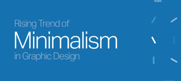
Minimalism has been continuously evolving to be one of the most popular trends in various creative fields, including graphic design. The key traits of a minimalistic design are simplicity, clarity, and functionality over extreme ornamentation and artistic complexity. 

In the recent times, the use of minimalism in graphic design can be seen rising at a greater pace, with a large number of designers embracing its neat and subdued aesthetic. 

Here are the main characteristics that mark the virtues of minimalism in graphic design:

Limited Color Palette

Minimalism in graphic design follows the principle of using limited color palette. With the help of a few colors and limited shades graphic designers can achieve more sense of harmony and composure in their designs that is considered to leave a good impact on audiences. 

With minimalism, graphic designers are able to establish a consistent visual identity for a brand or product. To take an example, if we talk about the tech giant Apple, its minimalist design approach makes it keep it between white, black, and gray in everything related to its branding gear and product design. 

Negative Space

Minimal design is also about working on the use of negative space (also known as white space). It is the vacant or vacuum area around and between design elements. As designers are able to use negative space effectively, it allows them to deliver a sense of clarity, receptiveness, and openness in their designs. 

This helps in building more focus on important areas, such as the elevator pitch, product image, or a call-to-action, and command a better response from the audiences.

Typography 

Typography is another important element of minimalism in graphic design. By minimalizing your typeface and fontal entity you can effectively establish a simplistic channel of design. Here, you can use cleaner lines and sans-serif fonts to achieve it more effectively across the line of presentation. 

With this approach graphic design professionals are able to compellingly build on the traits of legibility and readability. This makes it easier for viewers to understand the message and get more clarity about the expression without making much efforts. 

Most leading businesses these days are going with the idea of minimalist typography for their branding purposes to stand out as a more confident, recognizable, and perceptive brand.

Sophisticated Artform 

Apart from everything, minimalism can convey a sense of sophistication and elegance in any type of graphic design. With its nominal art references, clean expressions, and responsive tonal agreement, designers can create a sense of impact by making their graphic designs more effortless and receptive for the target audiences. This makes more graphic design companies and professionals to now increasingly opt for minimalism in their designs.

Versatility

Minimalism adds to the versatility of designs. Minimalist designs offer open-ended mechanism to address any context and idea of communication. From brand assets and marketing creatives to web layouts and user interface designs, it can help any of the design resources to pitch and convey the underlying idea of the communication more cohesively.  

Apart from this you can simply adapt or recreate it to be used in different branding channels and communication mediums, such as print, digital, and mobile.

To Conclude 

The rise of minimalism in graphic design suggests of the growing demand for simplicity, clarity, and functionality in design. By adopting the minimal approach designers are increasingly seeking versatile, adaptability, and cohesively in designs. With this, it is likely that we will see minimalism to be a more intrinsic and frequent part of the design process and will rule the factors that decide eligibility and performance of the work of graphic design ahead of here. Contact our team of experts today to learn more.

Read more about minimalistic website designs here.

Categories
Blog Brand & Identity Design eCommerce

How to Design Custom Merchandise for Online Selling

Designing custom merchandise for online space can be a fun and lucrative way to turn your creativity into a successful business. No matter if you are an artist, designer, or entrepreneur, you can adequately build a system to design your merchandise and make some good money online. 

6 Key Points to Design Custom Merchandise that Sells Big Online

  1. Know who is your target audience

Before anything, you should know whom you need to target as your audience. Who are you designing it for? Know their interests, behaviors, values, and preferences. Identify their problems and needs and how your merchandise is going to fit in there. 

By knowing who your target audiences are and understanding them well, you can design merchandise that resonates with them and best serves their requirements.

2. Choose your merchandise

If you are sorted with identifying your target audience, it’s time to choose the merchandise you want to sell. You have many options to choose from like t-shirts, hoodies, mugs, phone cases, stickers, etc. Just make sure the merchandise that you choose is best suited to your target audience’s profile and you roll it out to make it work with them.

3. Get the merchandise designed

Now, you need to work on designing your merchandise. You can use different tools and resources to help you create custom designs. This may include design software like Adobe Photoshop or Illustrator or ready-to-use design platforms like Canva to create your custom merchandise designs. 

If you think you need to bring in more expertise and assure you make no mistake with getting results coming your way, you may take help from graphic design professionals.

4. Choose your printing method

As you have your design ready, you need to now pick on a printing method. You can go with options like screen printing, DTG printing, and heat transfer printing among others. All of these have their pros and cons, so take into consideration all the factors that may have impact on your end result. 

5. Set up your online store

With your merch printing solution sorted, you should start working towards setting up your online store to sell custom merchandise. You can go with platforms like Shopify, WooCommerce, and Big Cartel as they support immersive choices to build e-commerce business in B2C segment. While doing this just make sure, your online store is visually appealing, easy to navigate, and has a simple checkout process. 

6. Market your merchandise

Once your store is up and running, you should take up to market your products. Create social media profiles on Instagram, Facebook, and Pinterest to build your communication board and product showcase to directly interact with and engage your audiences. 

Here, you should consider connecting with influencers in your niche to get you an expansive reach. Running paid ads and boosting your posts on these platforms are also a great way to increase the reach of your store.

To Conclude

As you look to design custom merchandise for online users that gets you to pitch your creativity to build a profitable business through it, you may need to go with a step-by-step plan. Start with identifying your target audience followed by choosing the right merchandise. Then you can create unique designs for your merchandise and get them printed. 

Now all you need to do is set up your online store and market your merchandise. Going with this plan, you can get your way through building a successful custom merchandise business online.

To get more information on designing custom merchandise, reach out to our product design professionals!  

Read here about how to start an online store.

Categories
Design UI Design Web Design

How to Deliver a Great Dark Mode Design

Have you ever felt the need to make the transition to more intelligent energy-saving or, for that matter, screen-saving practices? If you’ve never done it, now is the moment to start thinking about it, given the design of dark mode. Dark mode emits low levels of light while keeping the highest levels of quality standards, which is one reason why its use has gained significance in the modern era. This is accomplished by using colours like desaturated and dark greys.

When a user activates the dark mode, they typically anticipate a website or product to provide a darker experience. Nothing more than a baseline feature is offered with it.

Delivering a Greater Design of Dark Mode: How to Achieve It 

First, the best entity that can assist you with this prerequisite is a UX designer who has years of experience and competence. Icons, shadows, images, colour, and typography are the main five ideas or components that would be used to deliver this design if we were to discuss how it could or would be delivered.

This is how incorporating these features would guarantee consumers a dependable and accessible experience.

You can use the following tech-savvy advice to produce more effective dark-mode designs:

1. Serving the desired objective

You must always be aware, whether you’re an expert or a novice, that gloomy mode is not always just about looks. You must comprehend its true meaning and its hidden goal, which is to lessen the pressure on the user’s eyes. The finest user experience design services, which concentrate on providing high-class experiences, can better take care of this.

Additionally, the readability of this design is intended to be improved even in low light. You must keep this goal in mind as you create the dark mode interface.

2. Select appropriate colour schemes

The colour scheme you choose when designing a dark setting will greatly affect how it appears. Here, you need to choose hues that providea great source of readability in low-light situations without demanding a lot of the user’s eyes’ attention. Avoid neon and vivid colours and opt for more subdued hues. You can choose hues of grey or white.

Additionally, when using colours, you must consider the backdrop and ensure that there is sufficient contrast between the text and background to make the text easier to read.

Also, you must pay close attention to the contrast because it is crucial in dark mode. To create a more subtle difference with a darker backdrop, use lighter text and icon colours.

3. Choosing typefaces and typography with care

Typography is a crucial factor that you must take into account when creating a darker mode. Fonts that are simpler to read in both light and dark modes must be used. This helps the user to avoid too much pressure on the eyes. 

Also ensure that the font size and font style are properly adjusted to give the user the best experience possible. 

4. Testing the design

A UX design agency might help you in this regard. Prior to delivery, they thoroughly test the concept and implementation to ensure that there are no unresolved issues.

This is a crucial aspect of the procedure. The dark mode design you have selected needs thorough testing to check whether it is compatible on a number of devices. Test the selected theme in some random lighting settings for also ensuring readability and functionality.

5. Enhancing the user experience

As a professional, it’s your responsibility to provide users with a better and simpler experience. This is the case because some users prefer and are accustomed to using the light option, while others prefer to use the darker modes. Therefore, a simple method of switching must be provided to the user in order to make switching simpler depending on the external environment and personal preferences. This can be done by providing users with a toggle button that allows them to quickly transition between the light and dark modes. This is how your customers will find it easier to use the mode that you are developing.

This process is Continuous

The environment for innovation and design is constantly changing and adopting new trends. Your responsibility is to follow these evolving patterns and give your customers the hippest, cosiest experience you can. Dark mode architecture is not an exception in this regard. You can therefore offer your users a more sophisticated dark mode design by keeping all the factors in mind and working on them constantly. Contact Our Team Of Design Experts today to know more.

Read more about when to use and when not to use dark mode design, here.

Categories
Brand & Identity Business Succeess Design Logo Design

What Is The Process Of Designing a Logo?

Process of designing a logo is an essence of a brand; it conveys its story and becomes a source of visual interaction between a seller and a consumer in the market. 

Your company’s logo isn’t your brand, but it is a culmination of the perception, experience, and reputation that align with your business model. 

The logo is the building block of branding, and creating a logo must seem like a top priority to a company. Therefore, your extensive-time must go into the research, feedback and testing phase before bringing your logo onboard. 

Bear in mind your logo would be a tangible expression of your brand. It will be imprinted on your products, become a highlight of your social media pages, a visual identity of your branded website, and, most importantly, create a place in the customer’s mind. 

So, stop undervaluing the significance of the logo; your mind couldn’t be more wrong. Have a look at these principal steps of designing a logo. 

The 6 Steps of Designing a Logo That Become an Identity of a Brand 

  • Summarizing a Brand 

Knowing a brand entirely isn’t essential. Rather than that, break down the company’s major services, values, mission and vision into small segments. 

Streamline choices, and eventually, you will come up with a creative brief. But make sure this single brief defines the business and isn’t hampering the major goals and objectives of its existence. 

You can even align this step with a “questionnaire phase.” Such as, you can ask yourself – 

  • Who is your target audience? – if your business is particular to certain age groups or gender
  • What is the story behind a brand? – the best logo inspiration if the brand has a story
  • Who are the top 2 or 3 role models? – if the business was built by someone special.  
  • What is the key value you wish to express? – if your business serves more value to customers

Put up some basic questions and see how you complete the brand evaluation for the logo building. 

  • Industry Mapping 

The corporate world is highly competitive. Challenges will spike if you are entering into a pre-competitive market. 

That’s why industry mapping is worthwhile before you come up with the final design for your logo. Bear in mind your logo must create a strong first impression. 

It is only possible if you map out your industry. Explore and bookmark carefully, 

  • What do all their logos have in common? 
  • Which brand logo is more popular?
  • How can you differentiate from others?

Once you have done a thorough assessment, you can finally come across those final pieces with vast potential to become your brand’s identity. 

But make sure don’t forget the industry alignment. For example – you can’t use a fashion theme for a financial business logo, or you can’t use a finance theme for a healthcare logo. 

  • Evaluating Logo Position 

Well, that’s come the main part or what you can call a “bridge” between ultimate designs and inspirations. Not every logo design will work for every brand. 

Mainly if you have come up with new packaging, your logo theme may not blend well. So ideally, you should think about a logo that properly fits the product’s aesthetic requirements. 

Where you want the logo should be placed and how you want it to be visible. Create a well-defined size of the logo; best if created section-wise and make sure it professionally fits there. While doing it, check on other information as well, which will be shown near the logo.  

  • Creating a Draft 

Remember, we still haven’t come across that final design which will become our brand’s visual identity mark. You have only covered half of the race; the rest still remained. The logo creation process involves multiple twists & turns. Such as, the following steps will be involved here – 

  • The process will begin by studying design elements, the colours, fonts, design, and theme to be used.
  • Keeping the competitor’s logo in mind but not in the heart is a worthwhile consideration. 
  • Colours must blend perfectly with the images and other illustrations that best define product & service specifications. 

Try & test everything that comes to mind and go for the ultimate grading, clarity and adjustments – if required. 

  • Fine Tune & Gathering Feedback 

The logo designing process isn’t over. Gathering feedback is the next fundamental step of logo design. You should ask people for their reviews. It could be a social media group to collect feedback. 

Or it can be a community online where you can use your logo to collect people’s reviews on that. You can even launch a voting poll and can ask people –

  • Did you like logo A?
  • Did you like Logo B?

If you are working for a client, you can simply share two or a few logo designs so that they make a selection and come across the final piece. But it will not stay that simple. Some fine tunes and adjustments may still be required. 

  • Final Delivery 

Once your logo design is finalized, head to the delivery with the proper format and details. Remember, you haven’t created just a single logo but multiple copies of the product. Therefore, the design template for each product’s logo must be clearly pre-defined. If we talk about the deliveries, the best way to send a file to someone is described below –

  • Ideally, you should use layered vector files, such as Adobe Illustrator
  • You can even use layered PDF/EPS files to make files readily accessible
  • High-quality raster files for the web
  • PNG files with transparent background 

You can export and deliver the work in the following format or as desired by someone from you. Try exporting all high-resolution images, so they look classy and attractive in the real world. 

Wrapping up

Developing a ground-breaking design that interacts with the audience takes a pool of thoughts. Logo design can’t be limited to something that’s just as attractive. Your logo should adapt to the product packaging and should be engaging and memorable enough that it gets noticed from far away eyes. And we are hoping this guide might help you create that masterpiece. Contact Us today to know more.

Read more about difference between expensive and cheap logo designing here.

Categories
Brand & Identity Business Succeess Design Virtual Reality Web Design

Motion Design Principles: A Guide to Creating Dynamic and Engaging Visuals

Motion design is an art style that combines design and animation to generate graphics that are dynamic and captivating. It has the ability to fascinate and enthral its audience, whether it’s an animated logo, a motion graphic video, or an interactive web design. However, developing effective motion design requires more than making things move. It strikes a delicate balance between design concepts, animation techniques, and storytelling abilities. In this guide, we will explore the 10 essential principles of motion design and how they can be used to create engaging, dynamic, and impactful visuals.

10 Motion Design Principles

1. Timing and Pacing

Timing and tempo play a key influence on a motion design’s overall effect. Timing refers to the duration of a movement, whereas pacing refers to its velocity. When creating a motion design, both of these elements must be considered, since they might affect the emotional effect and overall narrative of the design. Timing and tempo must be continuous and coherent across the entire piece in order to produce a fluid and natural motion design.

2. Easing

The rate of acceleration or deceleration of an object’s movement is referred to as its ease. In other words, it indicates how quickly or slowly an object approaches its target. Easing can have a substantial effect on the perceived realism and naturalness of a motion design, and it is a crucial component employed by a designing agency in creating natural and convincing animations. By applying easing to an object’s movement, you can make it appear more lifelike and add a sense of weight and direction to the design.

3. Movement Pathways

The movement routes of elements inside a motion design also contribute significantly to its overall impact. The path an object follows throughout its motion might alter the viewer’s visual interest and focus. For example, a straight and direct path may create a sense of efficiency, while a more complex and winding path may create a sense of unpredictability and excitement. When developing a motion, it is essential to evaluate the movement pathways of the items and to select paths that are consistent with the overall story and goal of the design.

4. Contrast

Contrast refers to the disparities between elements such as color, size, shape, and motion, and it is an effective tool for generating visual intrigue and impact in motion design. Items with high contrast can attract the viewer’s attention, while elements with low contrast can create a sense of solidity and backdrop. In order to direct the audience’s attention and bolster the overall narrative, it is crucial for UX designers to think about and strategically employ contrast in motion design.

5. Follow-through and Overlapping Action

Follow-through and overlapping action are two notions that define how moving elements in a motion design continue to move after their initial movement has concluded. Follow-through relates to how an object continues to move after its original movement has ceased, whereas overlapping action refers to how distinct design elements move in relation to one another. By adopting these ideas, you can build a design that appears more natural and believable, so enhancing the design’s visual appeal and overall effect.

6. Staging

Staging is the arrangement of items and features in a motion design, and it plays an essential part in generating visual appeal and impact. Staging can be used to direct the viewer’s attention, highlight significant aspects or items, and add depth and perspective to the design. When making a these design, it’s crucial to think about how everything will be staged and to arrange the parts so that they serve the bigger picture.

7. Balance

When elements of a design are balanced, they appear to be held in place and dispersed uniformly to the eye. Motion design artists can accomplish balance by the use of symmetrical or asymmetrical layouts, and it plays an essential part in establishing a sense of harmony and stability in the design. The success of a motion design relies on the careful placement of its individual components, which must be balanced with an eye toward the design’s overall aesthetic appeal and emotional impact.

8. Repetition

Repetition, in motion designs, is the practice of using the same or similar elements (such as forms, colors, or animations) repeatedly to establish a theme or pattern. Repetition can be used to promote a brand or message, as well as to create visual interest and impact. It’s crucial to think about and skillfully employ repetition in motion design to bolster the design’s narrative and accomplish its intended objective.

9. Proximity

Proximity refers to the arrangement of pieces in close proximity to one another, and it is an effective technique for establishing a sense of interaction and connection in motion design. By placing elements in close proximity, you may create a sense of unity and cohesion in your design and also direct the viewer’s visual attention. When creating a motion, it is critical to keep the parts close together and organize them in a way that supports the main narrative and goal of the design.

10. Rhythm

Rhythm is the recurrence of elements in a constant and predictable sequence, and it is an essential component of motion design. Good use of rhythm can give a design a sense of unity and coherence, making it more enjoyable to watch and easier to understand. It can also help to create a sense of energy and movement, drawing the viewer’s eye through the design and keeping their attention focused on the action.

Conclusion

The principles of motion design are the foundation for creating dynamic and engaging visuals. Whether you’re a professional motion designer or just starting out, understanding these principles and incorporating them into your work will help you create motion designs that stand out and connect with your audience. From timing and pacing to overlapping action and staging, each principle has a unique role to play in creating captivating and memorable visuals. So take the time to explore these principles, experiment with them, and let your creativity soar! Contact our team of experts to learn more.

Read more about how to use motion graphics animation for your business here.

Categories
Brand & Identity Business Succeess Design Marketing Trends UI Design

Creating Impactful YouTube Graphics

YouTube, the ultimate stage for creators, has become a powerful platform for showcasing talent, sharing ideas, and building a community. And as a content creator, you must be aware that a YouTube video is not just about the content, but also the graphics that accompany it. From thumbnails to end screens, graphics play a vital role in the success of your channel. In this blog, we’ll take a journey into the world of design, exploring the secrets to creating graphics that will make your audience stop, look and engage. 

Secrets For Creating YouTube Graphics Design

  1. Define your brand: Having a clear understanding of your brand is crucial when creating YouTube graphics. And when we say brand, we mean everything from your logo, color scheme, and overall aesthetic. These elements should be consistent across all of your YouTube graphics to establish a recognizable and memorable visual identity for your channel. This will make it easier for your audience to identify your content and build a sense of trust with your brand.
  2. Use high-quality images: The quality of the images you use in your YouTube graphics is essential. High-resolution images that are clear and crisp will make your graphics look professional and polished. Avoid using low-quality or pixelated images, as they can detract from the overall impact of your graphics. It’s also important to optimize your images for web viewing so that they load quickly and look great on any device.
  3. Make it visually interesting: To make your YouTube graphics stand out, they should be visually interesting and engaging. This can be achieved by using bold colors, interesting fonts, and eye-catching images. Experiment with different layouts and compositions to create graphics that are unique and memorable just like any graphic design company does. You can also use a variety of design elements such as patterns, gradients, and textures to add visual interest to your graphics.
  4. Use typography creatively: Typography refers to the use of text in the design. To make your graphics stand out, you can use typography creatively. Experiment with different fonts, sizes, and colors to make your text stand out and add an extra layer of interest to your graphics. Additionally, using different typefaces can help to convey a certain mood or tone. For example, using a bold and modern font can give a sense of confidence and authority, while a script font can give a sense of elegance and refinement.
  5. Keep it simple: While it’s important to make your graphics visually interesting, it’s also important to keep them simple. Too many colors, fonts, or images can make your graphics look cluttered and overwhelming. Maintain a design that is clear and simple to read and comprehend. Avoid cluttering your graphics with too much text or information, and instead focus on the main message you want to convey.
  6. Use animation and motion graphics: Animation and motion graphics can add an extra level of engagement and interest to your YouTube graphics. This can include things like moving text, animated logos, and other effects. However, it’s important to use animation and motion graphics sparingly, as they can be distracting and take away from the main message of your graphics.
  7. Optimize for different devices: YouTube graphics should be optimized for different devices to ensure that they look great on any screen. This means making sure that your graphics are the right size and resolution for desktop, tablet, and mobile viewing. By doing this, your graphics will look crisp and clear no matter how they are viewed. You can take the assistance of graphic design services for implementing this optimization. 
  8. Test your graphics: Before you use your graphics on your YouTube channel, it’s important to test them out to ensure they look good and are effective. Testing your graphics will help you identify any issues and make necessary adjustments before they are used on your channel.

Final words

Creating impactful YouTube graphics is not just about making something that looks good, it’s about making something that truly connects with your audience. By understanding your brand, experimenting with design, and using storytelling, you can create graphics that will not only make your channel stand out but also, leave a lasting impression on your viewers. Remember, the key to creating impactful graphics is to think outside the box, be creative and test your designs. So, Contact Us today and make your YouTube graphics pop, and watch as your channel takes off!

Real more about print design for creative professionals here.

Categories
Brand & Identity Design Testing UI Design Web Design

Brand Storytelling and Why Is It Essential for You

In today’s crowded digital marketplace, the competition is fierce. Every brand is out there fighting for the attention of its consumers. Consumers only have limited attention and time to give as they are busy with their own life. This is where a brand storytelling comes in. It gives you the means to make an emotional connection with your customers.   

Telling a good brand story is a difficult job. This is why digital branding agency and their digital branding services are in so much demand. If you want to know about the nuances of brand storytelling, you’re at the right palace. Read on, and find out why it is a must for your brand. 

What Is a Brand Story?

A brand story is a narrative of your brand that tries to strike an emotional chord with your customer. It is different from traditional advertising which is telling your customers what you do. The objective of a brand story is to inspire an emotional reaction. The end result of this emotional reaction is to be memorable to your customers.   

Brand stories or branding of your company is done through all the content it releases be it blog posts, videos, or social media campaigns. Even something as small as your logo can be a reflection of your brand story.  

Why Brand Storytelling is Important?

Your ideal customer is being bombarded with advertisements, campaigns, and whatnot to catch their attention. But their capacity to remember a brand is limited. Good digital branding helps your brand to stand out from the competition. It tells the customers why the business exists, what sets them apart and why they (the customer) must choose your brand over others.

This separates your brand from being just another brand running ads to one that is trusted by the customers. This in turn helps your audience turn into loyal and paying customers. Articulating your core values into a cohesive story also helps you attract the right kind of talent. Future employees who find your values align with that of yours.  

How To Get Your Brand Story Right? 

To get your branding right, a digital branding agency has to know the answer to some very fundamental questions regarding your business. This will help them to provide you with the best digital services in line with your goals.

Find your ‘why’?

Knowing your why is at the core of getting your digital branding right. You have to know why you do what you do, and what makes you get up from bed in the morning. Once you are aware of it only then can you get your branding right. Because as the American author and inspirational speaker, Simon Sinek says in his book Start With Why, “It’s worth repeating: people don’t buy WHAT you do, they buy WHY you do it.” 

Talk to your ideal customer

A brand story is a story, and like all good stories, it needs a hero. Your ideal customer is the protagonist of your brand story. All the content you put out is directed to them. This is why it is important to find your ideal customer and put your message across as if you are talking to them. To take this even further, make sure you only have one person in mind. You know their age, demographic, background, education, hobby and aspirations. 

Be authentic 

Being authentic is another great way to nail your branding. Your customers can tell when you are being a copycat and trying to imitate a successful competitor. Being authentic is all about being true to your core values and sharing those values across platforms. 

Be consistent across platforms 

The messaging across platforms is different, a video is a visual medium while a blog post is a text-based one. To make your brand story effective and memorable your message across various platforms has to be the same. Whether it’s your videos, website, blogs or even logos, there should be consistency in your digital branding. 

Keep it simple 

The objective of your brand story is to resonate with your customers and evoke a favorable emotion, not to win awards. This is why you need to keep it simple and not overcomplicate it. Unless that’s what your ideal customers would prefer- sophisticated and complex. 

Examples of Good Brand Storytelling 

Spotify Wrapped 

Spotify wrapped by Spotify is an annual campaign that informs you about your listening in the year gone by. You get to see what were your favorite songs, artists, and playlists. It also recommends songs and artists you might like based on your listening habits. The audio streaming combines data and personalization to deliver ‘sound’ brand storytelling. What’s more? The annual event can be replicated every year while adding new features to it.

Nike  

The Just Do It slogan by Nike has to be one of the most memorable and effective brand storytelling in recent times. Across its various campaigns and advertisements, the footwear and apparel brand asks its consumers to Just Do It. The messaging remains consistent across platforms and does help in evoking a positive emotion in consumers’ minds.  

Old Spice 

The Smell like a Man campaign by Old Spice made the brand a household name. It is a witty take on how your man should smell like. The brand shows the traits of a perfect man, the one you become when you use Old Spice deodorants. The campaign became extremely successful and the brand now tries to outdo itself with each new campaign.  

Wrap-up

A Brand story is an excellent way to make an impression on your customers and evoke an emotional response. When done right, it helps you stand apart from your competitors and provides you with an edge even in a market with cutthroat competition. The key is to know the basic values of your business inside out and keep the message consistent across platforms. If the whole brand storytelling seems a bit overwhelming to you, you can get help from a digital branding agency. Contact Us to know more.

Read more about storytelling through design here.

Categories
Brand & Identity Business Succeess Design Web Design

Mastering the Fundamentals for Business Success with Design Principles

Creating attractive designs is not as simple as flipping a switch. One must first master the basics, much like a child must master walking before he or she can run. However, if you don’t have the time or interest to enrol in a design course, you won’t have a lot of resources. Canva templates are helpful, but only if you know how to make the most of them. That’s the reason why we created this post. We will go over some of the most fundamental concepts of design principles to help you understand what makes for a successful design.

Top 6 Design Principles For Businesses

#1 Balance

Balance in design principles refers to the way that the elements of composition are arranged to create a sense of visual stability. Proper balance helps create a sense of stability and harmony in a design and can make it feel more pleasing to the viewer. There are two types of balance: symmetrical and asymmetrical. 

Symmetrical balance is achieved when the elements on one side of the composition mirror those on the other side. This creates a sense of stability and order in the design. Asymmetrical balance is achieved when the elements on one side are balanced by elements of a different size or visual weight on the other side. This can create a sense of tension and dynamism in the design. 

Balance is an important principle of design because it helps create a sense of stability and harmony in the composition. By using balance effectively, you can create a design that feels balanced and pleasing to the viewer.

#2 Alignment

The term “alignment” is used to describe the dimensional accuracy of a page’s text or images. They may be left-, center-, or right-aligned within the larger composition, or they may be aligned with one another. An overall sense of disorder is introduced into a composition when individual pieces aren’t properly aligned, especially with respect to one another. It’s a jumbled mess that doesn’t look very deliberate. Aligning elements appropriately with respect to one another is an important aspect of design principles. 

#3 Emphasis

When talking about design, “emphasis” refers to whatever it is that is noticed first. This is commonly utilized to draw attention to the most crucial aspects of a design. Size, color, positioning, and contrast are just a few of the ways that emphasis can be established. One way to emphasize something and call attention to it is to use a higher font size or a more prominent color.

One further way to highlight anything is to position it in such a way that draws attention to it; for example, putting it in the exact middle of the composition or aligning it diagonally. When used correctly, emphasis can draw attention to key elements and clarify a design’s intended message.

#4 Movement

When discussing design, the concept of “movement” refers to the way in which the components of a composition guide the viewer’s gaze through the design. Lines, curves, and gradual color changes can all help you reach your goal. Adding motion to a design is a great way to draw attention and give it a sense of fluidity and energy. Lines can be used to give a design a sense of motion. For instance, diagonal lines have the ability to provide a sense of motion and direct the attention of the spectator to a certain component or focal point in the composition.

Patterns and gradients are two effective ways for artists to convey motion using shapes. Using a color gradient, for instance, may make something feel dynamic by drawing the eye from one shade to the next. You may direct the viewer’s attention and give your design a sense of energy by strategically including motion. This is especially helpful in advertising, as you want to keep the reader interested in what they’re reading.

#5 Hierarchy

Design hierarchies describe the arrangement and prioritization of elements within a given layout. The most crucial details are brought to the forefront, and the reader’s attention is directed accordingly. Applying the principle of hierarchy, you can guarantee that the focal points of your design are noticed and understood by the target audience.

Design hierarchy can be achieved in various ways. One typical way is to employ size, with larger items suggesting greater importance. Hierarchy can also be established by the use of color and font size, with more prominent colors and fonts signifying a higher level of importance. It is also possible to establish hierarchy through the use of placement, with components placed higher or closer to the center of the composition typically being accorded more importance.

You can make a clean, easy-to-navigate design that gets straight to the point and helps people comprehend what’s most important in a flash by employing some basic principles of hierarchy. For marketing materials, where you want to get the message through quickly, this is crucial.

#6 Contrast

When two or more things are different from one another, it is called contrast. This difference can be in the form of color, shape, size, or any number of other characteristics. Although contrasts in color are the most obvious form of contrast, differences in size, shape or any other feature can also produce contrast.

There are two main purposes that contrast might serve. In the first place, it lets you emphasize certain parts of a design over others. A design with no contrast at all would consist of a single hue with no other elements. The presence of contrast is an inherent quality of any design that allows for the differentiation of individual components.

Contrast also helps to make things more approachable. It is essential to create an accessible design by providing adequate contrast between elements, notably text and background. It might be difficult for those with visual impairments to comprehend the content on a screen if the font size or color contrast is inadequate. If you’re concerned about whether or not your designs have enough color contrast for accessibility reasons, you can use one of the many accessibility tools accessible.

Bottomline

Design can take many forms. It plays a crucial role in promoting companies and brands across a wide range of mediums, from online design and print graphics to interior office layouts. If you’re not a designer by profession, but appreciate good design, read up on the many kinds of design and remember the fundamentals. Contact our team of experts today to know more.

Read more about Gestalt design principles here.

Categories
Blog Design Trends UI Design Web Design

Looking For a Killer Graphic Design? Get Inspiration to Dominate the Web World

“People eat with their eyes,” and if you also agree with this statement, maybe you are already convinced that you need graphic design inspiration for your business through agency.

Deploying interactive graphics in every stage of the marketing funnel is a new business trend.

After all, aesthetics are the best medium to change a customer’s perception. It is a source to silently communicate with customers and create a big influence on their buying behavior.

With almost every business activity happening online, graphics have become an enduring topic.

But, How To Identify the Best-Suiting Graphic Design?

If you are in online business, eventually you’ll need website design services. But most importantly, you need a well-crafted sales page that effectively ignites a sense of excitement deep in a viewer’s mind and, in turn, fulfils your business goals.

For the accomplishment of this vision, you can’t make any choice ambiguously. Indeed, you should better have a look at these suggestions that are a great inspiration.

Interesting data visualization

With graphics, we basically meant with an ecosystem that put forward your achievements, your ideas first. Statistics, research findings, impact-expressed facts and figures, charts, and maps are the best and finest graphical instruments to tell a story and showcase your achievement like a professional. Post-pandemic, data visualization has seen outstanding growth. Some of them became incredibly useful to the audience, while others served merely for promotional objectives.

Yes, sleek design is timeless.

Trends come and go, and this is also true for design. Most graphic designs have been quite popular for a long time. If you are also a new design enthusiast, you may be able to capitalize on new trends more effectively. Beyond a doubt, they are helpful in keeping your brand bright and fresh. But not if they aren’t conveying your brand’s motives and hampering the key vision. Either if you are moving to website renovation, sleek design should be a top priority.

Bold, abstract shapes

Interesting shapes, like blobs, ellipses, or ovals, with topping of some bright colors are making rooms in the modern graphic designs. Abstract surrealism and geometric patterns can serve a rich user interface (UI) and user experience (UX). With several eye-catching moving on-screen elements, graphics can become visually striking. However, cutting unnecessary work is necessary.

Dark-mode friendly graphics

Over 81.9% of users run their device in dark mode. One of the reasons is that it can significantly alleviate potential eye strain. Amid the growing popularity of dark mode, unfortunately, most graphic designs might fail to serve the intended purpose. The world’s leading social media giants, Apple and Facebook, are adjusting to the dark mode interface requirements of their audiences. So you can ask your graphic design services provider to work on the dual-scheme visuals.

Final Words on Graphic Design Inspiration

A compelling graphic is good, but well-informed selection for design provides you an edge over the competition, yields outstanding marketing outcomes, and eventually builds the odds for you to stand out from the crowd. Graphics sets your business apart from others in the competition, but not until it informs the audience who you are, so there must be no room for errors and faults. Contact Us today to know more.

Read more about rules of Visual Hierarchy here.

Categories
Brand & Identity Design Technology Web Design

Top 7 Reasons to Hire UI Designer from a Web Designing Agency

UI designers are not simply about attractive layouts but about effective impression building. Since your website is the first channel of contact with the viewer, you must ensure their entire customer journey goes seamless, and they are left wanting more of your products and services. UI designs are a means to find opportunities for increasing conversions and reaching the company’s goals. With the right UI designer at hand, you will have all the advantages to stand out from the competition and build your edge through user interaction and engagement.

Here Are Top Seven Reasons to Hire UI Designer From a Web Designing Agency:

#1- Gives You the Required Thrust: Web designing may be your A-game. However, there may be times when you are distracted with something more concerning and things may get jumbled. An expert from a web designing agency can help you at such times since it is their daily job to know solutions to anything and everything that could go wrong during the process. An expert can figure out the issue that might take you hours to troubleshoot.

#2- Offers Expert Optimization: Creating a website that is search engine optimized is crucial to getting you on the search engine result pages. Most website design platforms available online will be able to provide these optimizations but only to a certain point. After that, you will need an expert who understands and is up-to-date with all the techniques and ideas that are going to take your website to achieve higher ranks in the SERPs.

#3- Creates Custom Designs: There is no telling what your target customer would be looking for in a website. Design plays a very important role in attracting and retaining a viewer. Hiring a UI designer with design subscription services allows you to create a website that will offer more flexibility and convenience to your users which will in turn ensure you get the best user reception and experience. Moreover, your designer can also add useful plugins and elements that may be helpful to your client in their journey through your website.

#4- Adds More Value to Accessibility: A good website is one that offers its users what they are looking for. But an outstanding website is one that not only offers your users their search query in hand but also provides various accessibility features to viewers with physical and cognitive disabilities. Hiring a UI designer from a web designing agency adds all the necessary features to your website that allow your user to easily navigate through your web pages.

#5- Creates a Faster Website: Ready-to-design websites may get your job done as a new business, but you will need a better website with features that speak for you and your business once you scale and expand. Moreover, customized websites have tools that make them faster. The loading speed can impact the interaction level of your user with your website, which will ultimately affect your ranking on the search engines.

#6- Adds Compatibility Features: Clients today expect websites to be compatible with every and any device that they use, from laptops to mobile phones. A quick website might not provide you with these features that play a significant role in ranking through Google algorithms. Hiring a UI designer will ensure your website can be opened on any device with the same efficiency as on desktops.

#7- Provides a Better ROI: A website that can make a strong first impression ensures that the user revisits it every time for a similar query. If you create a web design which does not build confidence or suggest value, the user will lose interest in you. A well-built web design makes you reliable in the viewer’s eyes, and they are more likely to convert

Contact our team of experts today for your brand’s UI needs

Read more about points to consider before hiring a design agency here.