NYX Ditech

Categories
Brand & Identity Business Succeess Marketing Trends

Influencer Marketing: Harnessing the Power of Authentic Influence

Influencer marketing has emerged as a powerful strategy for businesses to connect with their target audience and drive brand awareness, engagement, and conversions. This performance marketing trend revolves around partnering with influential individuals in specific niches or industries to promote products or services to their dedicated following. By leveraging the power of authentic influence, businesses can effectively reach and engage their target audience in a more personalized and trusted manner.

Key Factors to Achieve Effective Influencer Marketing

  1. Define your goals and target audience: Clearly define your marketing objectives and identify your target audience. This will help you select influencers who align with your brand values and have an audience that matches your target demographic.
  2. Find the right influencers: Conduct thorough research to identify influencers who have a genuine connection with their audience and possess expertise or influence in your industry. Look for influencers who share similar values, aesthetics, and brand voice to ensure a seamless partnership.
  3. Authenticity over reach: Focus on finding influencers who prioritize authenticity over follower count. Engaging with micro-influencers (those with smaller, more niche audiences) can often yield better results as their followers tend to have a stronger connection and trust with the influencer.
  4. Build genuine relationships: Establish genuine relationships with influencers based on mutual respect and shared values. Take the time to understand their content, engage with their posts, and provide value to them before approaching them for collaborations. Building trust and rapport will lead to more effective partnerships.
  5. Set clear expectations: Clearly communicate your expectations and campaign objectives to the influencers. Provide detailed guidelines regarding the messaging, content format, and any specific call-to-actions. However, also allow room for the influencers’ creativity and personal touch to maintain authenticity.
  6. Monitor and measure: Implement tracking mechanisms to monitor the performance of your influencer campaigns. Set key performance indicators (KPIs) such as reach, engagement, website traffic, and conversions. Utilize tracking links or promo codes unique to each influencer to accurately measure their impact.
  7. Encourage disclosure and transparency: Ensure that influencers disclose their partnerships with your brand in compliance with applicable regulations and ethical practices. Transparency builds trust with their audience and maintains the authenticity of the influencer’s recommendations.
  8. Long-term partnerships: Consider building long-term partnerships with influencers who consistently deliver results and align with your brand values. Long-term collaborations allow influencers to develop a deeper understanding of your brand, resulting in more authentic and effective promotional content.
  9. Leverage user-generated content: Encourage influencers and their followers to create and share user-generated content related to your brand. This not only extends your reach but also reinforces authenticity and social proof.
  10. Evaluate and optimize: Continuously evaluate the performance of your influencer marketing campaigns and make data-driven optimizations. Analyze the engagement, conversions, and feedback to refine your influencer selection, messaging, and overall strategy.

Summary

By effectively harnessing the power of influencer marketing, businesses can tap into the trusted relationships influencers have with their followers, driving brand awareness, credibility, and ultimately, conversions. Remember, authenticity, mutual value, and genuine relationships are key to achieving successful influencer marketing campaigns. Get in touch with our team of experts to learn more.

Read more about importance of web marketing campaigns here.
Categories
Design Technology Trends UI Design UX Design Web Design

The Rise of Minimalism in Graphic Design

Minimalism has been continuously evolving to be one of the most popular trends in various creative fields, including graphic design. The key traits of a minimalistic design are simplicity, clarity, and functionality over extreme ornamentation and artistic complexity. 

In the recent times, the use of minimalism in graphic design can be seen rising at a greater pace, with a large number of designers embracing its neat and subdued aesthetic. 

Here are the main characteristics that mark the virtues of minimalism in graphic design:

Limited Color Palette

Minimalism in graphic design follows the principle of using limited color palette. With the help of a few colors and limited shades graphic designers can achieve more sense of harmony and composure in their designs that is considered to leave a good impact on audiences. 

With minimalism, graphic designers are able to establish a consistent visual identity for a brand or product. To take an example, if we talk about the tech giant Apple, its minimalist design approach makes it keep it between white, black, and gray in everything related to its branding gear and product design. 

Negative Space

Minimal design is also about working on the use of negative space (also known as white space). It is the vacant or vacuum area around and between design elements. As designers are able to use negative space effectively, it allows them to deliver a sense of clarity, receptiveness, and openness in their designs. 

This helps in building more focus on important areas, such as the elevator pitch, product image, or a call-to-action, and command a better response from the audiences.

Typography 

Typography is another important element of minimalism in graphic design. By minimalizing your typeface and fontal entity you can effectively establish a simplistic channel of design. Here, you can use cleaner lines and sans-serif fonts to achieve it more effectively across the line of presentation. 

With this approach graphic design professionals are able to compellingly build on the traits of legibility and readability. This makes it easier for viewers to understand the message and get more clarity about the expression without making much efforts. 

Most leading businesses these days are going with the idea of minimalist typography for their branding purposes to stand out as a more confident, recognizable, and perceptive brand.

Sophisticated Artform 

Apart from everything, minimalism can convey a sense of sophistication and elegance in any type of graphic design. With its nominal art references, clean expressions, and responsive tonal agreement, designers can create a sense of impact by making their graphic designs more effortless and receptive for the target audiences. This makes more graphic design companies and professionals to now increasingly opt for minimalism in their designs.

Versatility

Minimalism adds to the versatility of designs. Minimalist designs offer open-ended mechanism to address any context and idea of communication. From brand assets and marketing creatives to web layouts and user interface designs, it can help any of the design resources to pitch and convey the underlying idea of the communication more cohesively.  

Apart from this you can simply adapt or recreate it to be used in different branding channels and communication mediums, such as print, digital, and mobile.

To Conclude 

The rise of minimalism in graphic design suggests of the growing demand for simplicity, clarity, and functionality in design. By adopting the minimal approach designers are increasingly seeking versatile, adaptability, and cohesively in designs. With this, it is likely that we will see minimalism to be a more intrinsic and frequent part of the design process and will rule the factors that decide eligibility and performance of the work of graphic design ahead of here. Contact our team of experts today to learn more.

Read more about minimalistic website designs here.

Categories
Brand & Identity Trends UI Design Web Design

Color Matters – Tips on Choosing UI Colors

Choosing the right scheme of colors for your user interface (UI) can make a lot of difference in how your audiences perceive your product and responds to your communication. Colors have an impact on emotions, they convey meaning, and demonstrates a visual hierarchy that builds a cohesive reception for your design. 

However, with a broad palette of colors, it can be overwhelming to choose the right options and implement it optimally. Here are some tips to help you choose UI colors that will help you with make impact with your design and build a rewarding user experience.

Consider Your Brand Identity

Your brand’s color palette is a great starting point to build your UI color scheme. Here, if your brand has already come up with a guideline, consider implementing those colors to build your design. This helps to create a system of order and consistency across all brand touchpoints and reinforces your brand identity and recognition.

If you are pushing it from scratch, think about the design sensibilities and emotions you want to capture for your brand to covey the underlying meaning right. Use the right color psychology to choose colors that align with those characteristics. For example, blue is often associated with inspiration and trust, while green is associated with growth and harmony.

Use a Limited Color Palette

Too many colors can hamper your idea of communication and distract your users. It’s important to keep your palette of color limited to a few key color codes that work well together in relative combination. This not only helps to create a unified and synchronized design, but also makes it easier for users to understand the visual hierarchy of your UI.

Alternatively, you can limit your color palette by using a monochromatic color scheme. This involves applying different shades and tints of one color. Another option is to use an analogous color scheme, which involves using colors that are adjacent to each other on the color wheel.

Think About Contrast

Establishing contrast in your design is important for making sure that the elements and texts on the interface are legible and interpretable for all users. 

One way to ensure sufficient contrast is to use a color contrast checker tool. Any expert UI designing professional can help you with choosing one. Any of these tools analyze the contrast between two colors and provide a score based on the Web Content Accessibility Guidelines (WCAG). You should hit for at least the ratio of 4.5:1 for normal text, and 3:1 for larger text.

Use UI Colors to Create Visual Hierarchy

You should consider creating a visual hierarchy that guides users through your UI design. By using color to differentiate between different forms of presentations and types of information, users can quickly comprehend the meaning and importance of each element.

For example, you can use a bright, bold color for hero text, and a more muted color for side information. You can also use color to establish a difference between different types of content, such as titles and body text.

Test and Iterate UI Colors

Once you are done with choosing your UI colors, it’s important to run a pilot trial and test them with users to see how they respond. You can use A/B and split testing to compare different color combinations to get it to perform and deliver well as per your requirement.

It’s also important to iterate on your design based on user feedback. If users are not able to understand and interact with your UI design with ease, consider adjusting your scheme and pallet to create a more agreeable visual hierarchy.

To Conclude

Choosing the right scheme of colors of designing user interface is an important part of creating a great user experience. By considering your brand identity, using a limited color palette, thinking about contrast and visual hierarchy, you can achieve it right! Contact our team of experts to know more

Read more about color psychology in app design here.

Categories
Brand & Identity Business Succeess Design Marketing Trends UI Design

Creating Impactful YouTube Graphics

YouTube, the ultimate stage for creators, has become a powerful platform for showcasing talent, sharing ideas, and building a community. And as a content creator, you must be aware that a YouTube video is not just about the content, but also the graphics that accompany it. From thumbnails to end screens, graphics play a vital role in the success of your channel. In this blog, we’ll take a journey into the world of design, exploring the secrets to creating graphics that will make your audience stop, look and engage. 

Secrets For Creating YouTube Graphics Design

  1. Define your brand: Having a clear understanding of your brand is crucial when creating YouTube graphics. And when we say brand, we mean everything from your logo, color scheme, and overall aesthetic. These elements should be consistent across all of your YouTube graphics to establish a recognizable and memorable visual identity for your channel. This will make it easier for your audience to identify your content and build a sense of trust with your brand.
  2. Use high-quality images: The quality of the images you use in your YouTube graphics is essential. High-resolution images that are clear and crisp will make your graphics look professional and polished. Avoid using low-quality or pixelated images, as they can detract from the overall impact of your graphics. It’s also important to optimize your images for web viewing so that they load quickly and look great on any device.
  3. Make it visually interesting: To make your YouTube graphics stand out, they should be visually interesting and engaging. This can be achieved by using bold colors, interesting fonts, and eye-catching images. Experiment with different layouts and compositions to create graphics that are unique and memorable just like any graphic design company does. You can also use a variety of design elements such as patterns, gradients, and textures to add visual interest to your graphics.
  4. Use typography creatively: Typography refers to the use of text in the design. To make your graphics stand out, you can use typography creatively. Experiment with different fonts, sizes, and colors to make your text stand out and add an extra layer of interest to your graphics. Additionally, using different typefaces can help to convey a certain mood or tone. For example, using a bold and modern font can give a sense of confidence and authority, while a script font can give a sense of elegance and refinement.
  5. Keep it simple: While it’s important to make your graphics visually interesting, it’s also important to keep them simple. Too many colors, fonts, or images can make your graphics look cluttered and overwhelming. Maintain a design that is clear and simple to read and comprehend. Avoid cluttering your graphics with too much text or information, and instead focus on the main message you want to convey.
  6. Use animation and motion graphics: Animation and motion graphics can add an extra level of engagement and interest to your YouTube graphics. This can include things like moving text, animated logos, and other effects. However, it’s important to use animation and motion graphics sparingly, as they can be distracting and take away from the main message of your graphics.
  7. Optimize for different devices: YouTube graphics should be optimized for different devices to ensure that they look great on any screen. This means making sure that your graphics are the right size and resolution for desktop, tablet, and mobile viewing. By doing this, your graphics will look crisp and clear no matter how they are viewed. You can take the assistance of graphic design services for implementing this optimization. 
  8. Test your graphics: Before you use your graphics on your YouTube channel, it’s important to test them out to ensure they look good and are effective. Testing your graphics will help you identify any issues and make necessary adjustments before they are used on your channel.

Final words

Creating impactful YouTube graphics is not just about making something that looks good, it’s about making something that truly connects with your audience. By understanding your brand, experimenting with design, and using storytelling, you can create graphics that will not only make your channel stand out but also, leave a lasting impression on your viewers. Remember, the key to creating impactful graphics is to think outside the box, be creative and test your designs. So, Contact Us today and make your YouTube graphics pop, and watch as your channel takes off!

Real more about print design for creative professionals here.

Categories
Blog Design Trends UI Design Web Design

Looking For a Killer Graphic Design? Get Inspiration to Dominate the Web World

“People eat with their eyes,” and if you also agree with this statement, maybe you are already convinced that you need graphic design inspiration for your business through agency.

Deploying interactive graphics in every stage of the marketing funnel is a new business trend.

After all, aesthetics are the best medium to change a customer’s perception. It is a source to silently communicate with customers and create a big influence on their buying behavior.

With almost every business activity happening online, graphics have become an enduring topic.

But, How To Identify the Best-Suiting Graphic Design?

If you are in online business, eventually you’ll need website design services. But most importantly, you need a well-crafted sales page that effectively ignites a sense of excitement deep in a viewer’s mind and, in turn, fulfils your business goals.

For the accomplishment of this vision, you can’t make any choice ambiguously. Indeed, you should better have a look at these suggestions that are a great inspiration.

Interesting data visualization

With graphics, we basically meant with an ecosystem that put forward your achievements, your ideas first. Statistics, research findings, impact-expressed facts and figures, charts, and maps are the best and finest graphical instruments to tell a story and showcase your achievement like a professional. Post-pandemic, data visualization has seen outstanding growth. Some of them became incredibly useful to the audience, while others served merely for promotional objectives.

Yes, sleek design is timeless.

Trends come and go, and this is also true for design. Most graphic designs have been quite popular for a long time. If you are also a new design enthusiast, you may be able to capitalize on new trends more effectively. Beyond a doubt, they are helpful in keeping your brand bright and fresh. But not if they aren’t conveying your brand’s motives and hampering the key vision. Either if you are moving to website renovation, sleek design should be a top priority.

Bold, abstract shapes

Interesting shapes, like blobs, ellipses, or ovals, with topping of some bright colors are making rooms in the modern graphic designs. Abstract surrealism and geometric patterns can serve a rich user interface (UI) and user experience (UX). With several eye-catching moving on-screen elements, graphics can become visually striking. However, cutting unnecessary work is necessary.

Dark-mode friendly graphics

Over 81.9% of users run their device in dark mode. One of the reasons is that it can significantly alleviate potential eye strain. Amid the growing popularity of dark mode, unfortunately, most graphic designs might fail to serve the intended purpose. The world’s leading social media giants, Apple and Facebook, are adjusting to the dark mode interface requirements of their audiences. So you can ask your graphic design services provider to work on the dual-scheme visuals.

Final Words on Graphic Design Inspiration

A compelling graphic is good, but well-informed selection for design provides you an edge over the competition, yields outstanding marketing outcomes, and eventually builds the odds for you to stand out from the crowd. Graphics sets your business apart from others in the competition, but not until it informs the audience who you are, so there must be no room for errors and faults. Contact Us today to know more.

Read more about rules of Visual Hierarchy here.

Categories
Trends UI Design UX UX Design

How Can Anyone Bring Their Designs to Life With Interactive Animation?

Undoubtedly interactive animation gains a lot of attraction nowadays because of the active expressions and interactivity. Creative designers can build great user experiences through dynamic animation crafts. People love to experience beautiful animation, especially if it is interactive. We will discuss more interactive animation and its advantages in this article.

What is Interactive Animation?

In the simplest terms conceivable, interactive animations are any animation that enables viewers to engage with the work in ways beyond merely watching it. There are numerous opportunities for participation for viewers. These are most frequently seen in highlighted reels and drop-down menus.

The Advantages of Interactive Animation Over Standard Ones

An interactive animation encourages viewers to engage actively with the experience. They enable viewers to choose the direction a movie or infographic will go as it progresses. The likelihood that your audience will choose your business will improve when their level of interaction increases to this stage. Interactive animation designers with their expertise will help you in giving direction to your business.

The Advantages of Interactive Animations Include The Following List:

Through the use of interactive animations, it is possible to make a movie or advertisement in a way that is specifically tailored to the viewer, increasing conversion rates.

Interactive animations commonly motivate users to stay on a website for longer periods, lowering bounce rates.

Engagement is higher as the spectator has a choice over what they watch and what they skip.

Interactive animations can create higher levels of responsiveness since they are enticing, compelling, and convincing.

Verify That You Have The Necessary Tools:

If you’re looking for an interactive graphics end-to-end pipeline that is made for quick and effective real-time animation, there are many great tools to start with. These tools will give you everything you need to create interactive animations that are not only aesthetically pleasing but also flawlessly executed conceptually.

Only Use Animations On Purpose And When Important:

Interactive animation should only be used to provide help, never as a means of showcasing one’s talents. You do not need to animate every single element on your stage. Understanding when and where to use interactive animations is essential for successfully incorporating them into your designs. Keep things as simple as you can, and pick your animations wisely to keep your audience’s attention when animating.

When in doubt, if something appears to be clean and effective in its current state, the best course of action is to do nothing with it.

Test Repeatedly

It is crucial to test your interactive animations before releasing them to the public, just like you would with any other design element. Test them across browsers and mobile devices to ensure that your designs function as intended. Keep a close eye on how users interact with your animations, and make changes as needed.

Interactive animations will help you in creating websites, games, and apps as you want. You can unlock many tools and create captivating interactive animations as you desire. Hire an efficient creative design agency to help you out.

Categories
Brand & Identity Design Trends UI Design UX Design

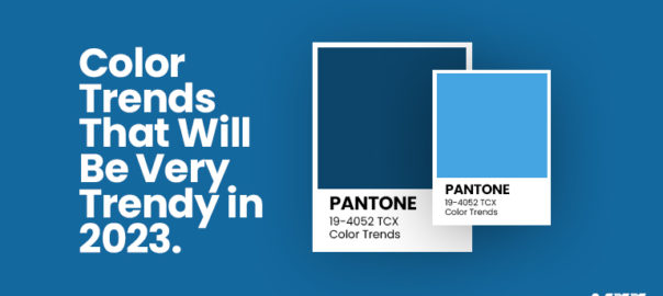
Color Trends That Will Go Big In 2023

Whether we talk about graphic designing, web designing or any digital design, colors are one of the most important factors that influence the overall appeal of the design. Every year or month, new colors are doing rounds and are loved by a wider audience. But how do you know these colors will work? By understanding the value of color trends and different trendy colors. Often color trends are influenced by everyday affairs, and all that is happening around the world. For instance, cultural shifts, inflationary trends, world market, political scenarios, etc., people express these emotions via colors and designs. From cool colors to warm colors, every year new trends are followed to attract an audience and enhance the value of designs through graphic design services. If you are looking for design trends to be followed in 2023, this guide will help you. 

Here Is The List of Color Trends That Shall Prevail In 2023: 

#1 Bold Reds: Red is already taking over the runways by the end of this year. As per many designers, Red is going to be one of the influential colors in 2023. Worn by many celebrities, Red is going to be a major attraction for graphic designers. Even one of the largest luxury brands Dior’s Fall campaign has models posing with red backdrops. Reds are making a comeback in color trends in 2024. Red color signifies power; it is one of the most attention-demanding colors that grab eyeballs quickly. 

#2 Soft shades of bold colors: In 2023, people will continue to find pastels or soft shades more attractive. This time it is going to be soft shades of bold colors such as dark blues or dark browns, etc. Using soft shades of gold colors will help you make monochromatic looks more easily. Monochromatic Colors with soft shares bring a sense of consistency and help emphasize drawing attention towards significance. So, a creative design agency can use soft shades to put focus on key elements next year. 

#3 70s color hues: 70s color schemes are going to be on the top of color trends in 2023. Web and graphic designers are looking back into 70s color options and combinations. 70s color scheme inspirations such as earthy browns, mustard yellow, greens, etc are top of the options. These colors are the best way to bring nostalgic feelings and bring back memories of simple times, comfort, and familiarity. 70s color schemes majorly reflect calmness, cool color combinations, and a simple environment. 

#4 Pretty Pink- Prom Queen: Prom Queen Aesthetics are back in trend again in 2023. Do you remember those pink Barbies in different vibrant colors of clothes? Yes! That era of prom aesthetics is back in 2023. You might see a pop of pink shades everywhere from clothes to graphic designing, pink is going to be a trendy color. Bright pink combinations reflect color, and brightness, and will attract people. The nostalgic effect of Barbie colors will be trendy. 

#5 Warm Mediterranean: The desire to jump into post-COVID traps will reflect in warm Mediterranean color options. The color options include grey clay tones, dusty pink, dusty red, browns, etc. will give calmness to your design. The colors that you can usually find in a ceramic shop will become more common and trendy in graphics. Soft and warm tones giving gentle vibes from Mediterranean colors will bring relaxation and calmness to your designs. When everyone else will go for bold colors like reds and 70s combinations, there should be a balance with gentle colors like these. 

#6 Dark Academia or Dark Sci-fi tones: In a world where sci-fi is trending everywhere, these colors are going to be chartbusters. The dark sci-fi or academia colors will represent the dark side of the world and the inclination towards technology. Moreover, these colors will reflect the darker times humans are going through such as inflation, wars, climate, etc. The combinations will reflect the dark misery and the need to find the light at the end of the tunnel. 

Conclusion

These are some of the most trendy color schemes and colors you will see in the coming year. From dark sci-fi to 70s color schemes, these trends are reflecting current times and our need or desire to find nostalgic simple times before the pandemic. The color schemes are going to be a part of major graphic designs in 2023 by graphic design services. Let our experts know to choose a best color theme for your brand.

Read more about how you can boost your web design through different colors here.

Categories
Brand & Identity Design Marketing Trends

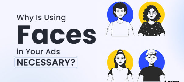
Why Do You Need to Use Faces in Your Ads?

You probably already know that you need to find the most effective ways to interact with your customers to see success in your marketing efforts. You are already aware of this. You have probably even heard that human faces or characters should be used in your marketing campaigns and advertisements, a strategy that many of the most well-known corporations in the world have adopted. However, why is that a crucial marketing puzzle piece in the first place?  

So many effective marketing efforts feature a faces because it makes it possible for firms to build a strong emotional bond with their audiences. Marketing campaigns can be used to establish this link. Regardless of the industry you are in or the size of your company, connecting with your audience on a human level can help you increase engagement and generate conversions.

The Faces Are All That Matters

A study states that 91.7% of commercials with a face receive more attention than those without a face. We can detect faces at a rate that is at least twice as fast as that of many other forms of stimuli because our brains are physically wired to do so. Nobody should be surprised by the findings that showed increased brand and ad identification with face advertising since paying attention helps memories stick.

Humans are social creatures. Thus we are compelled to look at other people’s faces. We want the sense of community that comes with belonging; in the end, our prosperity correlates with our ability to work with others around us. Because of this, incorporating human faces in your ads can help them stand out and develop a connection with their target audience despite the abundance of advertising stimuli. For the same you can also look for quality based animation designing services for your company to make the best out of your marketing campaigns.

Make a persona for yourself

How is the persona related to the brand? If you select a persona representing your brand, your business will have a unique identity. While your logo can (and should be used) to identify you, if it lacks a face, your customers may perceive you as impersonal and even cold to them.

The truth is that people do not interact with logos like they do with other people or objects that resemble humans. This is so because logos are devoid of human traits. So, a smart strategy to portray your brand as being pleasant and approachable is to give it a face that people can immediately identify and relate to human traits.

You end up developing into a more reliable brand

How to gain recommendations and trust of new clients? The opinions of their peers are more likely to be trusted by consumers than businesses. Customers will therefore be more likely to believe in you and your products if your brand can convey human qualities. When you gain their trust, they will be more likely to use your products and recommend you to their friends and relatives.

It offers a chance for interaction

Interactive content is quite popular nowadays. Nothing engages customers with a company like a genuine conversation, and when your marketing strategy includes a human face, customers feel as though they are conversing with someone they already know. This familiarity not only increases the possibility that customers would buy from you but also encourages participation in the social media campaigns you undertake. Look for a company offering graphic design services to create the content for a completely new campaign for you if your team lacks the time or resources to address the issue that your ads are not doing as well as they could. 

Wrapping up 

Even if your competitor’s product is trustworthy and has an interesting backstory, having a human face that identifies with your brand and creates a relationship with your audiences will set you apart. You will stand out if you have a human face that gives your brand a personality and establishes a connection with your audience. Whether you decide to utilize a real person or a fictional character, this is a strategy you should use in your marketing if you want to build the strongest connection with your target audience. Contact Our Experts today to get more insight on how and which faces you can use in your brand’s Ads

Read more about how to establish a strong brand identity here.

Categories
Brand & Identity Trends

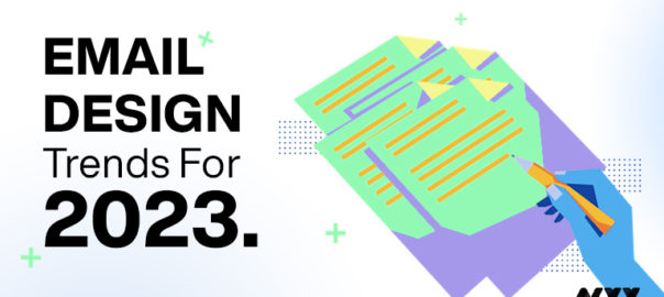
Email Design Trends For 2023

New email design trends that can be included in your email templates appear when another year begins. While some patterns from the previous year are predicted to persist, there are also more chances for brands to use creativity to engage customers in the best ways.

However, creativity is needed to stand out from the multitude of emails and newsletters being sent out on a global scale. In this article, you’ll learn how companies create email design plans using templates created with the latest email trends in mind. In 2023 and beyond, popular design trends like minimalism, dark mode, vibrant colors and typography, and smart use of white space will help you grow your email newsletter subscriber base, foster client loyalty, and boost click-through rates.

Embracing the New Email Design Trends for 2023

In 2023, the email design landscape will continue to change as more businesses prioritize personalized communications, responsive email design, artistic images, interactive components, and minimalistic design.

Subscribers desire genuine interaction with the businesses they follow, and every email is an opportunity to provide a distinctive and personalized experience. Each element—from the selection of colors and images to the layout of the content—is essential to telling a brand’s story. These components make up an essential whole when combined. Choose a perfect designing service to keep you updated with the trends.

Marketers must remember that email design trends change and advance in response to the diverse tastes and preferences of their clients if they are to meet these objectives. If you want to stay competitive, you must keep up with the latest changes in email design and email marketing because what worked yesterday may not work today. Tracking trends will help you do this.

Ultra-personalization

Personalization will become a new trend in 2023. The level of personalization in the email directly correlates with its likelihood of success. The elements of customization are as follows:

  • A split-up database
  • Utilizing the name property in the email’s body using smart tags to improve the relevancy of the material
  • Utilizing powerful visual aids like images, videos, and illustrations.

Creating a unique user experience that is enhanced for both desktop and mobile platforms

The fact that ultra-personalization goes beyond design should not be shocking. A significant change must be made in the email’s design and approach to be as relevant and direct to the recipient as humanly possible. 

Look at the “Year in review” emails from various service providers. The information and statistics offered to the user in these emails are also personalized with their name. This approach will help you sort through the chaos.

Animated GIFs

Animated GIFs and interactive elements have rapidly gained popularity over the last several years, and they will continue to be a big trend in email in 2023. Particularly animated GIFs can significantly contribute to the delivery of messages, the inclusion of humor, and the enhancement of conversion rates. They promote action and may improve the visual attractiveness of regular emails, which are primarily text-based and encourage reading.

Animated GIFs also improve user experience and can be a successful conversion-boosting tactic. A countdown offer is one promotion that encourages customers to click on the offered link. In addition, a GIF of a slot machine with a spinning wheel improves the likelihood of winning the contest for the player.

Dark mode

Due to its popularity, Dark Mode is now receiving attention from most email marketers. To give subscribers a flawless experience, email specialists are now trying to understand Dark Mode and the effects of utilizing it.

Dark Mode can be conceptualized as an inverted color scheme with white text in its most basic form on a dark background. Several advantages of using dark mode in emails are listed below:

  • Relaxing to the eyes, even in situations with little natural light.
  • Wonderful for extending the life of the battery
  • Enhancements made to the content’s legibility and readability
  • A refined demeanor and appearance

Designing emails compatible with Dark Mode will improve your sender’s reputation by increasing email engagement and click-throughs. It will signal to inbox service providers that your subscribers want to receive your emails, which will raise their level of interaction with them. As a result, subscribers will receive your emails in their inbox, eventually becoming a self-feeding mechanism.

Bold typography:

While certain emailer design trends emphasize simplicity and minimalism, others are getting bigger and bolder. Font design is one of these. It must capture the reader’s attention because it is the primary means of communication within the email. There are a few ground rules, though:

Decide against making the entire text bold and huge. Make sure your headlines are well-chosen and elicit a positive and emotional response from the reader.

There are better choices than combining an enormous and bold font with a gigantic and bold color scheme. On occasion, it goes too far. Keep the color scheme neutral and let the text take the stage.

Refrain from attempting to cram everything into such a small space. Please give it some more room, and make sure the readability is acceptable on all systems.

Take advantage of a responsive design opportunity. The font must be readable on both large screens and mobile devices; otherwise, it will turn off viewers and make everything appear crowded.

In the past, the image would command attention in an email’s visual layout. Not anymore, sadly.

Animated GIFS

Animated GIFS can be used to deliver your key message, the most recent product update, or the most recent campaign to email subscribers in a fun and captivating way. Additionally, smart brands prefer animated emails for a reason—it has been repeatedly shown that they can increase conversions when used in conjunction with the right message and tonality.

Several businesses use GIFs in their email correspondence to increase interaction with their target consumers. You may send emails that are distinctive, innovative, and bursting with personality with the help of this web design fad. Users will be able to watch GIFs regardless of the device they use, be it a smartphone, a tablet, or a desktop computer because they are compatible with the vast majority of browsers and gadgets.

In Conclusion

The effectiveness of email marketing activities is anticipated to be significantly influenced by email design this year. They must be memorable, catch people’s attention, and elicit strong feelings. There are numerous design trends available today, and there is no approach that can be used to handle every one of them. When writing an email, the receiver should always be in mind. It all depends on the tastes of the individuals who have signed up to receive your emails, whether that means including a video, developing a very visual, low-copy email, or using animated GIFs. Contact Us today to plan out email designs for upcoming year.

Read more about change in behaviour of marketing here.

Categories
Blog Brand & Identity Trends

4 Simple Steps For Successful Brand Building

As you aim at building a brand that allows you to stand out from the crowd and earns the loyalty of your customers, you need to have a practicing framework in place. The successful brand depends on your ability to build meaningful bonds with your clientele. Perhaps, in any given market situation, one of the most valuable marketing assets of any organization is its brand identity. Branding is a constant endeavor at articulating and positioning your company’s mission and appointing a certain perceived value and image in front of its audiences.

Why Is Building A Brand So Important?

The manner in which a firm develops its brand will affect how the public views the company and its products. Consumers’ impressions of a company’s name, reputation, logo, and advertising campaigns can all be shaped by its brand’s success.  When consumers purchase a product, they also purchase the lifestyle that the thing represents.

It is important for businesses to build innovative and memorable brands so that consumers can readily identify their products and understand how those things will improve their lives. Establishing a trustworthy reputation through branding is a powerful marketing strategy.

Steps To Build A Successful Brand

  1. Identify Your Target Audience

The first thing you should do when developing a brand is to identify your ideal customer. To attract your ideal clientele, you should:

  • Find out who will be your most likely customers. Create a demographic by thinking about aspects like age, gender, geography, and income.
  • Look into the current sales data that has been collected. You can learn a lot about how people shop and what they buy from this data. Using demographic data, a business can gauge whether or not a given customer base will buy a given product.
  • Research competing businesses. Companies that have already found success with a similar offering might serve as a valuable source of information and guidance. Examine how they develop campaigns to reach the people who are most likely to buy their items and see if you can learn anything from their tactics. 
  • Communicate with the people you’re trying to reach. It’s a good idea to talk to people who represent your company’s ideal customers so you can learn more about their wants and requirements and the kinds of products they tend to buy. 

Once you’ve settled on your intended demographic, you can move on with developing your brand’s appeal.

2. Position Your Product And Company

One of the first steps in developing a successful market strategy is determining how to position your company’s products and services in relation to competitors. Before you can effectively compete with your direct competitors, you need to learn as much as possible about them. This includes studying their products, prices, target customers, and marketing approaches of successful brand. 

3. Define The Essence Of Your Business

A company’s brand is a significant part of how its reputation is communicated to the public. Identifying the company’s core values and culture is, thus, essential to the branding process. A company’s identity can be shaped not just by the goods and services it offers, but also by the consumers who buy them. The branding team as a whole should engage in some imaginative brainstorming to settle on a corporate persona.

4. Design Your Brand Assets

Having a memorable tagline and a visually appealing logo design will enable clients to remember your brand. A company’s logo should reflect its values and traits most plausibly. To assure that your logo is all lucid, attractive, and impactful you must seek the help of a professional. A digital branding agency can offer insight into aesthetic choices including typeface, color palette, logo size, icons, and layout.

Endnote 

Going by this four-step process of building your brand, you should be able to reach the right ends of creating an impact over your audiences building an effective business identity and dialog. Contact Us today to evaluate your brand.

Read more about fundamentals of successful branding strategy here.