NYX Ditech

Categories
Brand & Identity Design UI Design

When To And When Not To Use Dark Themes?

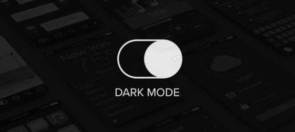
The dark theme or the dark mode design has been trending from quite some time now. It became seemingly famous across the world of the internet when Google adopted it for Google drive. It did receive an excellent response from all nooks and corners of the world; however, that doesn’t mean that every business or website can pull off a dark theme. What are the factors that need to be considered before deciding on using dark themes? When should you use dark themes? When should you avoid a dark theme? Let’s check it out.

The Dark Themes Can Be Used When You Want To:

  • Emphasize visual content
  • Enhance emotional branding
  • Go minimalistic
  • Match your brand colors
  • Improve usability

Emphasize Visual Content

A dark theme is perfect for making visual applications and websites stand out. The deep, substantial backgrounds provide the much needed high-contrast backdrop for images, graphics, videos, and visuals of any shape and color. It elevates the visual hierarchy as the lighter visual content stands out against the dark background; Especially if you’re using large, high-contrast images. If images are playing the lead role in your application, or website, and a copy is a sidekick, consider a dark color palette.

Enhance Emotional Branding

A dark theme needs much more blank space to avoid looking chaotic and cluttered. Thus, dark applications and websites tend to elicit stronger emotions than light ones. Color psychology also impacts the emotional appeal. Generally, we associate dark colors, primarily black, with mystery, power, elegance, and drama. Therefore, when a dark background is paired with some high-contrast, big images, the finished output looks stunning.

This mood-setting strategy works beautifully and frequently appears on product pages and entertainment applications. Apple’s iOS 13 page uses a dark color scheme to make their product seem more sophisticated and elegant. Similarly, the Halo App’s dark theme makes it look more dramatic. However, a lightly-colored website or app can be just as impactful. Choosing the right color scheme depends entirely upon what emotions you want your brand to evoke.

Go Minimalistic With Dark Themes

In case you already use a minimalist design that has limited content, your conditions are suitable for dark mode. In a situation where the text is the primary content, dark UI can make legibility an issue. Typically, dark mode amplifies visual clutter making a cluttered screen even more chaotic.

Match Your Brand Colors

When a brand’s existing color palette is already dark mode compatible, the dark mode is the way to go forward. Think twice about going dark if it seems like you have to change the brand to fit the aesthetic. Similarly, if your brand needs to use a wide spectrum of colors, consider a lighter UI. The full-color spectrum doesn’t read pleasantly on dark backgrounds.

Improve Usability

Sometimes, your app has to be dark to be user-friendly. For instance, apps designed for heavy nighttime use will employ a dark color scheme to avoid straining the user’s eyes. The trend is especially noticeable in entertainment apps like Netflix and Prime Video, but other applications offer a dark mode, too. Twitter lets users toggle between light and dark in the settings, and Google Maps automatically darkens at night.

However, the time of day isn’t the only usability factor to consider. If your application is intended to be used for hours without rest, a dark theme may minimize eye strain. That’s why dark themes are popular in code editors and financial apps.

You must avoid dark themes when your website or app has:

  • Lots of text
  • Lots of elements
  • Bright colors

Lots of Text

One of the most significant drawbacks of a dark color scheme is that it is terrible for displaying text. Light text on a dark background is hard to read. Dark themes are not suitable for interfaces with lots of copy. Not only do people have to spend more time reading the text, but the comprehending ratio also dips. On the other hand, dark text on a white background looks crisp, clean, and refined. The copy is easy to read and extremely legible. Browse across all major news and blogging websites, and you will find that they all have light backgrounds instead of dark ones. Your website should not have a dark theme if it contains lots of written content.

Lots of Elements

Finally, a dark theme can be a poor choice for apps and websites with lots of icons, buttons, and small images. That’s because of the dark background de-accentuate empty space. While de-emphasized empty space makes large images and minimalist pages elegant and dramatic, it makes small icons and dense pages look cluttered, unorganized, and unprofessional. Admin backend panels are a great example. The difference is even more obvious when you compare a light panel with a dark one. 

On dashboards, the dark theme does not look bad, but it does look denser. In some instances, that’s not a problem. However, the clutter problems don’t end here, because, with a dark color scheme, it’s hard to make each element stand out. Since a dark color scheme limits your color selection, it’s harder for a designer to maintain good contrast. This does not pose a problem if a page has a few key elements, but if a page contains several buttons, icons, menus, and banners, the overall design will look much less cluttered on a light background.

Bright Colors in Dark Themes

Dark themes also limit your color options. Too many bright colors can clash against the dark background and give your entire website a harsh and unfriendly appearance. While the occasional splash of color can add brilliant emphasis, most of your elements should be muted neutral colors.

Read more about how to use colors in web design here

There are a lot of advantages to using a dark theme:

  • It reduces the strain on eyes
  • It increases visibility in low-ambient lighting
  • Saves a lot of battery life
  • Gives an emotional boost 

But, you need to understand that one size doesn’t fit all, and hence the pointers mentioned above will help you in deciding if you must use a dark theme or not. Still, confused? Talk to our experts now!

Categories
UI Design Web Design

All You Need To Know About Interaction Design

Interaction design is creating quite a hype in the designing world over the last few years. The presence of interaction design can be seen in both web and graphic design. Creating a smooth, delightful user experience is key to the success of any design, and that has led to the growing popularity of interaction designs and interaction designers. Interaction design is a process in which designers use logical and thought out behaviors and actions to create engaging web interfaces. In other words, interaction design is the relationship between user and product and the services they use. The products can be software products like apps or websites.

Interaction Design

Interaction design is used to create a great user experience. That’s the reason why most of the UI disciplines require in-depth understanding and hands-on experience of interaction design principles. It involves designing for the whole interconnected system –  the device, interface, environment, context, and people. It’s a fact that there’s considerable overlap between interaction design and UX design. After all, UX design is about shaping the experience of using a product, and most of that experience involves some interaction between the user and the product. But UX design is much more than interaction design. It includes user research, creating user personas, performing user testing, usability testing, and a lot more. Let’s say that UX is a big umbrella and interaction design is something that falls under that umbrella.

Who is an interaction designer?

An interaction designer is a person who creates a design strategy based on his understanding and knowledge about meaningful relationships between people and the products. He can be a part of the design, development, creative or marketing team. He is required to create prototypes to test concepts and stay current on technology and trends that will impact users. Simply put, companies hire an interaction designer to make sure their digital applications work and function when users use it.

One can grow into an interaction designer by learning through formal design programs or may just develop the skills from hands-on experience and learning on the job. Either way, the two of the common traits of interaction designers are a curiosity – their passion for understanding how things work, and the ability to visualize and play with elements and concepts in new ways.

Interaction design examples

Here are a few fantastic examples of interaction design:

By Jony Vino – Dribble
By Tubik – Dribble
By Mykolas Puodziunas – Dribble
Android Wear by Ramotion
Nike by Owi Sixseven

Key interaction design principles

Consistency is the key

Striking consistency is vital for creating an interaction design. The design should be consistent throughout the process and between related applications. Moreover, people’s expectations must be matched through terminology, layout, and interactions. You are helping users learn more quickly by creating and maintaining consistency. You can re-apply their prior experiences from one part of an application to another to maintain consistency throughout the design. 

On the other hand, the inconsistencies can be used to indicate to users where things might not work the way they expect. It’s all about knowing exactly when to be unconventional and break the consistency.

Aim For a Minimalist Design

It would help if you cut down the possible actions for users to a bare minimum. The actions should not be more than the absolutely necessary ones. Offering too many options will spoil the users with choices, detract the primary function, and will reduce usability. Do not provide unnecessary features and functions to users. Also, you must break any complex tasks into smaller, manageable sub-tasks to improve usability. Lastly, limit the functions rather than the user experience.

Minimize Cognitive Load

Cognitive load refers to the mental effort that is required to learn new information. It is a process of thought. In UX design, cognitive load is the mental processing power needed to use a product. A good user interactive design minimizes the user’s efforts to think and complete a task. For example, while designing an interactive interface, we need to understand how much concentration a task requires to complete it. Accordingly, you can create a UI that reduces the cognitive load as much as possible.

Avoid Hidden Interactions

Interactions within interactions or hidden interactions must be avoided. They decrease the efficiency, usability, and user experience. At any given point in time, people should not have to guess or look for opportunities to interact. The interactions must be clearly presented to the users, eliminating any possibilities of guessing.

Interaction designers must create interactive designs where users can review an interface and identify the interaction points. No two users will interact with the interface in the same way. In the process of interaction design, always provide hints and indicators like buttons, icons, textures, textiles, etc. Let the user check if these visual cues can be clicked or tapped with their fingers. Always consider the usability and accessibility of the interactive media.

Create an Engaging Experience

When it comes to user experience, engagement is the extent to which the user has a positive experience with your product. And, not just enjoyable, but more comfortable and productive too. That said, do remember that engagement is subjective to the system. For instance, what appeals to teenagers might be irrelevant to their grandparents. Your design must engage with the desired audience. Apart from aligning your design for the appropriate audience, achieving and creating control is also critical.

If you wish to create some stunning interaction designs that offer brilliant user experiences, talk to our team of proficient designers.

Also, check-out our blog on top UI Trends for 2020.