NYX Ditech

Categories
Blog Design Trends UI Design Web Design

Looking For a Killer Graphic Design? Get Inspiration to Dominate the Web World

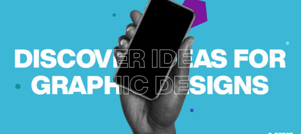
“People eat with their eyes,” and if you also agree with this statement, maybe you are already convinced that you need graphic design inspiration for your business through agency.

Deploying interactive graphics in every stage of the marketing funnel is a new business trend.

After all, aesthetics are the best medium to change a customer’s perception. It is a source to silently communicate with customers and create a big influence on their buying behavior.

With almost every business activity happening online, graphics have become an enduring topic.

But, How To Identify the Best-Suiting Graphic Design?

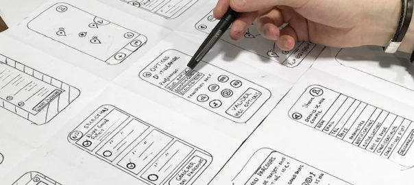
If you are in online business, eventually you’ll need website design services. But most importantly, you need a well-crafted sales page that effectively ignites a sense of excitement deep in a viewer’s mind and, in turn, fulfils your business goals.

For the accomplishment of this vision, you can’t make any choice ambiguously. Indeed, you should better have a look at these suggestions that are a great inspiration.

Interesting data visualization

With graphics, we basically meant with an ecosystem that put forward your achievements, your ideas first. Statistics, research findings, impact-expressed facts and figures, charts, and maps are the best and finest graphical instruments to tell a story and showcase your achievement like a professional. Post-pandemic, data visualization has seen outstanding growth. Some of them became incredibly useful to the audience, while others served merely for promotional objectives.

Yes, sleek design is timeless.

Trends come and go, and this is also true for design. Most graphic designs have been quite popular for a long time. If you are also a new design enthusiast, you may be able to capitalize on new trends more effectively. Beyond a doubt, they are helpful in keeping your brand bright and fresh. But not if they aren’t conveying your brand’s motives and hampering the key vision. Either if you are moving to website renovation, sleek design should be a top priority.

Bold, abstract shapes

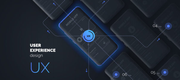
Interesting shapes, like blobs, ellipses, or ovals, with topping of some bright colors are making rooms in the modern graphic designs. Abstract surrealism and geometric patterns can serve a rich user interface (UI) and user experience (UX). With several eye-catching moving on-screen elements, graphics can become visually striking. However, cutting unnecessary work is necessary.

Dark-mode friendly graphics

Over 81.9% of users run their device in dark mode. One of the reasons is that it can significantly alleviate potential eye strain. Amid the growing popularity of dark mode, unfortunately, most graphic designs might fail to serve the intended purpose. The world’s leading social media giants, Apple and Facebook, are adjusting to the dark mode interface requirements of their audiences. So you can ask your graphic design services provider to work on the dual-scheme visuals.

Final Words on Graphic Design Inspiration

A compelling graphic is good, but well-informed selection for design provides you an edge over the competition, yields outstanding marketing outcomes, and eventually builds the odds for you to stand out from the crowd. Graphics sets your business apart from others in the competition, but not until it informs the audience who you are, so there must be no room for errors and faults. Contact Us today to know more.

Read more about rules of Visual Hierarchy here.

Categories
Brand & Identity Design UX UX Design

UX Design Practices To Prevent Users From Making Errors

Nobody likes to commit mistakes in the first place. Not committing an error is the ideal situation, but it’s not always possible. Mistakes are an integral part of user experience as well. Designers must consider all scenarios wherein a user can commit a mistake/error and lookout for ways to prevent users from making at least some of those errors. In today’s article, we will discuss a set of design practices that help in preventing users from making mistakes.

Before diving into the design practices, let us categorize the types of errors. There are primarily two kinds of errors – 

Slips – these occur when users intend to perform one action, but end up doing another (often similar) action.

Mistakes these are made when users have goals that are inappropriate for the current problem or task; even if they take the right steps to complete their goals, the steps will result in an error.

Directional Cues

One of the best ways of preventing mistakes is by offering directional cues. Directional cue is an element of user interface that gives a visual hint on specific interaction or content to let the user see it faster and easier. Just like the road signs and signposts. They guide a visitor or user to the essential elements, text lines, and call-to-action elements. This makes the conversion reachable and users’ reach to the solutions of their problems quickly. Arrows, pointers, and other visual prompts help to navigate users through the interface and make it easier to avoid unnecessary clicks and interactions.

Helpful Constraints

While it’s not always a good idea to limit users’ choices, in cases where there are clear rules that define acceptable options, it can be an excellent strategy to constrain the types of input users can make. For example, booking a flight typically involves selecting the dates of travel, and there are a few rules that govern which dates are acceptable. One of the primary rules is that a return flight cannot happen before a departure. If users aren’t limited in the dates they can choose, they may slip and accidentally select a set of dates for their flight that doesn’t follow the rules. A helpful constraint here will force users to pick a date range that fits.

Visualized Limitations

One more way to prevent the user from wasting their time and effort is by showing the visual limitations, if they exist, right in the process. One of the classic examples is Twitter. There is a limitation of 140 characters per tweet, and the platform shows you clearly if you exceed that number: the extra part is highlighted with color, the number of additional characters is shown, and the button of the tweet becomes inactive. Such an approach saves users’ time and effort and prevents unnecessary clicks.

Text Prompts

UX designers know much more about user interfaces and interactions than an average user. While that’s a great advantage, when they design interfaces, it may act as a barrier at times. Something that may be obvious to a designer, may appear confusing for users. The function behind the particular field or button may seem crystal clear to the designer, but not for users of an app or a website. Short and clear text prompts are very helpful in such cases. Usability testing will help you to find the pain points where it’s needed most of all. One of the popular examples is text prompt in the search field or simple clues in the fields of a contact form.

Clear Indications

‘You have made an error’, Something went wrong, ‘can’t proceed’ – these are error messages, but not helpful error messages. A good design clearly highlights where the error has been made and what is the error. Let’s take the example of Facebook. When you enter a wrong password or username, it tells me exactly what errors I have made. Facebook flags the exact mistakes I made by warning me, very visibly, that I’ve entered a wrong password or username. Such real-time feedback reduces the cognitive load on users’ part. It also helps in creating an overall good UX for them.

Onboarding Tutorials and Tooltips

Onboarding is a set of techniques and interactions to comfort the user. It provides a brief introduction to the product or service. One of the ways to quickly introduce the app to the user in onboarding tutorial, a set of several screens that are shown to the first-time users and explaining the benefits and functionality. You may show some crucial things that differentiate the interface from others and potentially lower the chances of errors that could arise later.

Tooltips are another onboarding technique that significantly reduces errors. Tooltips are prompting messages tied to particular layout elements or user actions. They usually appear in modal windows rather than separate screens. Tooltips present a proactive way to guide the user to the right option and avoid misunderstandings.

Forgiving Formatting

Some tasks do require users to type very detailed or precise information, but forcing people to provide this information in a particular format can be a poor user experience. If you are asking users to input numerical information into a form, be flexible, and format that information in a way that is easily scannable (by humans, not machines) to prevent mistakes.

While your website’s database might not allow non-numeric characters to be stored in a phone number, you surely want your users to notice typos when they enter their phone number. One solution is to let users type in a way that’s natural to them, rather than forcing them to use the format that your application expects. Do some behind-the-scenes data scrubbing to remove parentheses or other characters that users may type, rather than frustrating them with an inflexible format. Even better, format the users’ input as they type.

Conclusion

A good design is all about enhancing the user experience. Users will commit mistakes, but if designers follow the above-mentioned design practices, the chances of errors will be reduced substantially. Do you want to know more about sound design practices? Talk to our design experts.

Want to know more about UI and UX. Read our article about how they are connected

Categories
UI Design Web Design

All You Need To Know About Interaction Design

Interaction design is creating quite a hype in the designing world over the last few years. The presence of interaction design can be seen in both web and graphic design. Creating a smooth, delightful user experience is key to the success of any design, and that has led to the growing popularity of interaction designs and interaction designers. Interaction design is a process in which designers use logical and thought out behaviors and actions to create engaging web interfaces. In other words, interaction design is the relationship between user and product and the services they use. The products can be software products like apps or websites.

Interaction Design

Interaction design is used to create a great user experience. That’s the reason why most of the UI disciplines require in-depth understanding and hands-on experience of interaction design principles. It involves designing for the whole interconnected system –  the device, interface, environment, context, and people. It’s a fact that there’s considerable overlap between interaction design and UX design. After all, UX design is about shaping the experience of using a product, and most of that experience involves some interaction between the user and the product. But UX design is much more than interaction design. It includes user research, creating user personas, performing user testing, usability testing, and a lot more. Let’s say that UX is a big umbrella and interaction design is something that falls under that umbrella.

Who is an interaction designer?

An interaction designer is a person who creates a design strategy based on his understanding and knowledge about meaningful relationships between people and the products. He can be a part of the design, development, creative or marketing team. He is required to create prototypes to test concepts and stay current on technology and trends that will impact users. Simply put, companies hire an interaction designer to make sure their digital applications work and function when users use it.

One can grow into an interaction designer by learning through formal design programs or may just develop the skills from hands-on experience and learning on the job. Either way, the two of the common traits of interaction designers are a curiosity – their passion for understanding how things work, and the ability to visualize and play with elements and concepts in new ways.

Interaction design examples

Here are a few fantastic examples of interaction design:

By Jony Vino – Dribble
By Tubik – Dribble
By Mykolas Puodziunas – Dribble
Android Wear by Ramotion
Nike by Owi Sixseven

Key interaction design principles

Consistency is the key

Striking consistency is vital for creating an interaction design. The design should be consistent throughout the process and between related applications. Moreover, people’s expectations must be matched through terminology, layout, and interactions. You are helping users learn more quickly by creating and maintaining consistency. You can re-apply their prior experiences from one part of an application to another to maintain consistency throughout the design. 

On the other hand, the inconsistencies can be used to indicate to users where things might not work the way they expect. It’s all about knowing exactly when to be unconventional and break the consistency.

Aim For a Minimalist Design

It would help if you cut down the possible actions for users to a bare minimum. The actions should not be more than the absolutely necessary ones. Offering too many options will spoil the users with choices, detract the primary function, and will reduce usability. Do not provide unnecessary features and functions to users. Also, you must break any complex tasks into smaller, manageable sub-tasks to improve usability. Lastly, limit the functions rather than the user experience.

Minimize Cognitive Load

Cognitive load refers to the mental effort that is required to learn new information. It is a process of thought. In UX design, cognitive load is the mental processing power needed to use a product. A good user interactive design minimizes the user’s efforts to think and complete a task. For example, while designing an interactive interface, we need to understand how much concentration a task requires to complete it. Accordingly, you can create a UI that reduces the cognitive load as much as possible.

Avoid Hidden Interactions

Interactions within interactions or hidden interactions must be avoided. They decrease the efficiency, usability, and user experience. At any given point in time, people should not have to guess or look for opportunities to interact. The interactions must be clearly presented to the users, eliminating any possibilities of guessing.

Interaction designers must create interactive designs where users can review an interface and identify the interaction points. No two users will interact with the interface in the same way. In the process of interaction design, always provide hints and indicators like buttons, icons, textures, textiles, etc. Let the user check if these visual cues can be clicked or tapped with their fingers. Always consider the usability and accessibility of the interactive media.

Create an Engaging Experience

When it comes to user experience, engagement is the extent to which the user has a positive experience with your product. And, not just enjoyable, but more comfortable and productive too. That said, do remember that engagement is subjective to the system. For instance, what appeals to teenagers might be irrelevant to their grandparents. Your design must engage with the desired audience. Apart from aligning your design for the appropriate audience, achieving and creating control is also critical.

If you wish to create some stunning interaction designs that offer brilliant user experiences, talk to our team of proficient designers.

Also, check-out our blog on top UI Trends for 2020.

Categories
Technology UX UX Design

Creating Fantastic Frictionless User Experience

The digital world has become super competitive, and it’s a real challenge for businesses to keep themselves ahead of the soaring competition. One of the key propellers of attaining success in the digital world is to offer exceptional, or if not that, at least a good user experience. Companies need to understand the context that aids in creating a smooth, frictionless user experience. Designers and developers have acknowledged the importance of becoming familiar with methods to develop frictionless user experiences.

What is Friction?

NO! We are not going to discuss the scientific definition of ‘friction’ here. In terms of design and user experience, friction is anything that prevents users from intuitively achieving their goals while they interact with a product. Friction is everything people complain about when they find technology challenging. High friction is one of the major causes of cart abandonment and high bounce rates.

Frictionless User Experience

Users don’t want to stress out themselves while browsing your website. They expect simplicity while interacting with your site. Frictionless designs are synonymous with simplicity as it ensures that everything is simplified for the users. A frictionless experience is the one wherein the user needs not to learn anything. Here, the interactions are very intuitive, and every action or operation is a natural, smooth process.

How to create a frictionless experience? 

The first and the foremost step for designers and developers is to deep dive into the user interaction process. They need to understand how a user interacts with a user interface. Understanding the user journey is the key. Also, friction doesn’t need to be always harmful; it can be useful at times. They must decide when friction can be helpful, where it can be harmful, and design the product accordingly. The team can indulge in user research and testing, by creating user flows, to identify the exact places where friction might occur. 

Avoiding Frictions

1. Don’t overload users with content or features

One of the most difficult tasks of user experience is to keep the users attentive and focused. With a strong focus, users can achieve their goals without taking too much effort. The problem rises when you bombard users with loads of content and features; they lose focus.

Get rid of anything unnecessary. Follow the simple yet powerful principle of minimalism, which states that less is always more. Prioritize your content and features and place them according to user expectations. 

You don’t need to put everything on a single page. Prioritize your content and place it according to user expectations. Divide your content and other elements into chunks. For example – break lengthy and complicated forms into a few simple forms and simplify the form filling process. 

2. Users must not be guessing anywhere, anytime

A lot of UIs lack the ability to provide apt and timely feedback from the system. If users initiate action and don’t receive acknowledgment of the same, they think that their request wasn’t delivered. Therefore, they keep trying again and again, which leads to what is known as ‘rapid clicks’.

Visual or audio feedbacks are the most effective forms of feedback. Also, the loading time of the feedbacks must be pretty quick. When users have to wait for content to load, they experience friction. When the users have to wait for a long time for the content to load, they start worrying whether the app is doing anything or it is stuck. It’s essential to provide information on how much time is required to complete the operation.

3. Keep the design clear and consistent

Clarity has a direct and positive impact on user expectations. When users are aware of what to expect, they happily interact with a product. Clearly label all the interactive elements, like buttons and all, with labels that describe their function. Avoid using jargon in labels and other places.

An inconsistency often creates confusion. When the same elements in UI look different in different parts of the app/website, it confuses your users. Maintaining a consistent design approach allows users to use their previous knowledge when interacting with a product.

Simplification of navigation is another way to impart clarity. Poor navigation adds a lot to user frustration. Users should be able to navigate from one place to another easily. The app’s navigation hierarchy, at all times, must tell the users – where they are.

4. Avoid too many steps

Too many steps might also cause unnecessary friction. Right from sign-up to individual operations, every step requires some amount of effort and thus can create friction. Get rid of all the extra steps in user flow and always keep the KISS design principle in mind when designing user flows.

Use default settings, as most users rarely change them. Also, use the data you have about your users to offer a personalized experience. Amazon and Netflix provide tailored recommendations based on previous purchases and viewing habits, which enhances the user experience.

5. Anticipate errors and handle them appropriately

An ideal app prevents the user from making errors by anticipating the errors upfront and eliminating them. Still, it’s not possible to eliminate all error situations. But, a clear help text, telling them the reason for the error as well as about how to resolve the issue, can be provided to them. When you already prepare yourself for the potential errors, you design better experiences. By validating user input and providing feedback as soon as possible, you help users to detect and fix problems.

Conclusion

If there are traces of friction during user interaction, the user experience will not be smooth and enjoyable. As a designer, you must always strive to identify all possible friction elements and get rid of all of them. Discuss more about your design needs with our team NOW!!

Interested in More About UX? You might like the difference between UX and CX. READ HERE

Categories
Brand & Identity Design UX Web Design

Designing a Healthcare App? Here’s What You Need To Know

3G, 4G, 5G, unlimited access to the internet and a smartphone in every pocket. The world has undoubtedly come a long way on the path of technological advancements over the past two decades. With so many connected devices, no wonder mobile health has started to gain popularity. The most significant transformation in medicine since the early ages is happening right now and UX is at the forefront. The healthcare-tech sector is among the fastest-growing in the world today. 

According to a study conducted by the European Hospital and Healthcare Federation, the average number of general hospitals per 100,000 inhabitants, in Europe, was 2.9 in 2014 and the number of patients is increasing day-by-day. Therefore, the need for health apps has snowballed. 

Today, for the first time, patients are active decision-makers, and the healthcare industry needs to understand that patients are their partners. Creating a delightful user experience is essential for the success of health apps and the health industry as a whole.

Key UX Elements to Consider While Designing Healthcare Apps

1. Changes in Healthcare Accessibility

Times have changed. The Healthcare sector doesn’t operate the same way it uses to a few decades ago. It’s no longer a 9 to 6 affair, with emergencies being attended to as and when they occurred. It’s round the clock these days and patients expect full service 24/7. Be it an expecting mother or an ailing older adult, they all need access to health facilities at any given point in time.

2. The Emotional Quotient

In no other industry, businesses have to deal with such a broad spectrum of emotions. Sorrow, pain, anxiety, depression, joy, panic in cases of emergency, and what not? The interaction of patients with an automated mobile app can sometimes lack the emotional factor. Therefore, designers need to take the utmost care of factoring this element while designing the UX of the app. Although they are interacting with the app, it’s as good as the interaction between a patient and a doctor.

3. Patient Interaction Through Multiple Channels

Before the dawn of digital transformation, patient interaction limited to medical facilities or pharmacies. Fast forward to today, and the healthcare industry has to deal with various channels now, including traditional and mobile platforms. Moreover, today, our health-related decisions are influenced by social media too. UX designers need to address differences in trust levels among various channels. When in doubt, patients are more likely to trust the members of their close social circles rather than cold-hearted professionals. Social media also plays a significant role in the creation of support structures between patients. The user experience at these different levels is also essential to consider. 

Best practices to Improve Healthcare App UX

1. Understand The Users And Their Needs

From the outset of the project, developers and designers must be aware of the perception, needs and pain areas of users. A thorough understanding of the market is the base for developing a successful health app. Set focus on which type of app you plan to build?

For example – General health and fitness apps, chronic care management, medication management apps, professional medical applications, etc. The functionality and features of the app will depend on the type of app and its audience.

The involvement of practicing clinicians specialized in the area of your app is pivotal. With their insights and your research, you can zero down the fundamental problems that the app will address. Additional features that are not really necessary can be parked to be developed at a later stage. Understanding the existing user behavior and their needs are the key to a successful health app.

2. Make The Healthcare App Look Attractive

The styling themes and patterns that use to work a few years ago may not be best suited for today. Give due diligence to user psychology, current design trends, and your target audience. Studies have revealed that most of the health apps lack styling and visual appeal, which is the primary cause of users not using the app regularly after installation. Apps with clear and appealing data visualization have more chances to elevate user experience and retain users.

The layout of the app pages should be appealing and easy to use so that the users stick with your app. Give special consideration to the color schemes that you choose. Soothing colors are best suited for health apps. Navigation must be easy, the alignment and spacing should be appropriate, and most importantly, the headings must be clearly visible. A significant chunk of your target audience will be older adults. They need larger text and more prominent icons. Moreover, there will be users with specific health conditions, like epilepsy, diabetes, mental disorders, etc. Hence, the look and feel of the app must be apt for them too.

3. Make It Easy To Access, But Don’t Compromise On Security

A health app needs to be simple, intuitive and easily consumable. The registration or the sign-in process must be smooth and must not be time-consuming. The sign-in process must ideally be done on a single screen and with only a few clicks. Limit the information required to register (of course you need to capture vital info which is mandatory). The critical element is to offer quick access in the event of an emergency. Quick access to relevant information like doctor’s phone number and details about previous hospitalizations, allergies, etc. is quintessential. The data must be backed up over the cloud, to rescue in case of a lost or stolen phone.

Healthcare apps deal with a lot of personal and critical information about patients. These details must be strictly secured under personal data protection laws. Observe all laws and regulations that govern the personal data privacy when you set out to design the app.

4. Strike A Balance Between Functionality and Usability

There are two main participants of a health app – patients and health professionals. You need to understand that the app will either be professional-centric or patient-centric. If you go professional-centric, functionality will be the key. If you go patient-centric, usability will be the key. Which way you want to sit depends on the core objective of your app. But, you still need to strike a balance between the two. 

More on Usability Mistakes That Can be Avoided

Don’t lose sight of the main objective of the app and don’t try to fill the app with the maximum number of features. The app should be informative, but not overloaded with details. An app that deals with patient data, medication prescriptions and/or doctor appointments should have the proper messaging matrix providing different types of notifications and calendar integrations. Educational apps should contain different types of content, such as text, images, and video.

5. Test Your App Through The Life-cycle

Quality assurance and testing are a must. Field-test your app before the release. Proper testing, including testing the prototypes among the target audience ensures the readiness of the app. ideally, the UX design of the app must be regularly tested at the end of each iteration. Support your app continually and provide app users with undisrupted service. 

Are you looking to develop a health app? Do you wish to discuss the UX designing elements in-depth? Talk to our design experts now!

Categories
Brand & Identity Design UX Web Design

CX vs UX: What’s the Difference?

CX vs UX: User experience or UX is a well-known term. Designers, even non-designers, are well versed with the meaning of UX. But, have you heard of the term CX? It’s not as commonly used as its counterpart – UX, but is soon growing in popularity. CX or customer experience is often mistaken to be the same as UX. However, the truth of the matter is that both these terms are fundamentally different and need to be treated as two separate entities. 

It all starts with how we address and define our clientele. Our users are our customers and vice versa. That’s where we start believing that user experience is similar to customer experience. So let’s clear this confusion once and for all. Let’s understand CX vs UX.

User Experience

The concept of user experience is specifically connected to your product; be it the app, software, or website. The experience of users while interacting with that product is user experience.

The design, interface, usability, navigation, visual hierarchy, information architecture, etc. are all contributors to the user experience. It can either be positive or negative for the product’s users. 

Similarly, UX design is the process of designing products that are intuitive, easy, enjoyable to use, and solve problems. The aim is to develop something that solves user problems in the simplest and most user-friendly manner possible. Success rate, error rate, task time, click to completion and abandonment rate are some of the metrics used to measure UX.

Read about UX trends of 2019

Customer Experience

Customer experience, on the other hand, is a much broader concept. It encompasses all the interactions a user has with your brand and not just your product or service. CX interactions occur across multiple touchpoints, like your advertising, marketing materials, social media channels, pricing, sales process, customer service, and your actual product. 

Customer experience is concerned with customers’ perceptions of the organization and its services as a whole, not just the usability and functionality of its products. Overall satisfaction, Net Promoter Score (NPS) and loyalty are some of the metrics that define CX.

CX vs UX

CX vs UX: The above image clearly explains that UX is a subset of CX. User experience is the experience your customers have with your product, whereas customer experience is the experience those users have with your brand as a whole.

Importance of UX and CX

Both UX and CX are equally important in today’s world. Overall customer satisfaction is no longer dependent only on the quality of the product or service; it goes far beyond that. The experience and process of buying must be a satisfying one. Not just that, even the after-sales service and support plays a crucial role in setting the brand image.

Studies reveal that more than one-third of consumers walk away from a brand they love after one bad experience, and more than half of the consumers do the same after two bad experiences. Consumers are willing to pay more for a better experience, and this fact needs to get its due importance.

The good UX design is important because users will decide within just a few seconds whether your app, software or website is worth their time or not. On the other hand, good CX is important because it goes beyond the usability and functionality of your product, and serves as a key differentiator in a competitive market. 

Both CX and UX are independent, and therefore there can be scenarios where either one of them is good. For example – Good UX and bad CX, or, bad UX and good CX. Let’s understand this with two scenarios:

1. Good UX and bad CX

Tom wants to buy a music system. He goes onto an e-commerce portal. The online store has a fantastic UI and UX. The search engine is accurate and helps Tom to reach to his desired models within no time. He compares a few models and selects the best-suited one for him. The checkout process is also seamless. Within a few clicks, Tom selected a payment method and made the payment. Great!! His new music system is on its way.

But, when he received the package, he was unpleasantly surprised. The packaging was awful, and he received the wrong product. The model which he selected and the one that was delivered were completely different. He rang the customer support and was pushed from pillar to post before he could reach the correct department. The team was not able to track his order and told him that he would receive a call back within 12 hours. No phone call for two days. He got a call on the third day and was advised to send back the music system at his own expense, then only the replacement could be initiated. The entire process took three weeks.

Tom’s experience after placing his order was nothing short of disastrous. He poured out his grievances on the company’s social media handles, product page, and many other places. No matter how good the UX was, he has no reason to remember it now.

2. Bad UX and good CX

Now let’s see the flipside. Haunted by his previous experience, Tom decided to try some other e-stores to buy a professional camera. He browses a new portal that has a poor UX. The search engine wasn’t accurate; there was no option to compare products, and lacked details on the product pages. It took him a lot of time to buy the product, but he did it finally.

However, history repeats itself, and Tom again gets the wrong product. He called customer support and was delighted with their response. The team apologized for his inconvenience and quickly arranged a pickup of the product. In the meantime, they initiated the replacement process. Within two days, Tom received the camera that he ordered. Moreover, the company gave him a 30 percent discount voucher to make him feel valued. John is unlikely to remember the lacking user experience and is highly unlikely to leave negative feedback in the comments section of the site.

UX is one of the strongest influences on the whole CX, but both CX and UX play a crucial role in the ultimate success of a business. Lacking in any of the two areas can lead to a bad overall impression of the brand. Therefore, companies must optimize both of them to stay ahead in this competitive market. Have more questions? Talk to our experts.

Categories
Blog Brand & Identity SEO Technology UX

5 Tips To Select The Right Button Labels

Designing a website is not just about making it look visually appealing; there’s a lot more to it. One of the most critical aspects of developing a successful website is to give due importance to the copy and button labels. What your buttons say is as vital as they look. No matter how pretty and attractive your buttons look, if you choose incorrect words to describe them, it may all go wrong.

Incorrect button labels can confuse the users, making it hard for them to take the desired actions. It also reduces the speed at which the actions are performed. If you wish to simplify the process of taking actions on your app, you need to choose the right words on your button labels. So how do you do that? Here are some pro tips to get your words right.

1. Use Action Verbs Instead Of Simple Words

The one thing that you want your buttons to do is encouraging users to take actions. Thus, button labels should be inspiring, and action words are the best for the same. An action verb on a button makes users aware of the action which will be performed upon clicking on it. There’s no need for additional text along with an action verb to guide the user.

Let’s take an example of generic “yes/no” button labels, which are often used on confirmation screens. Users have to read the dialogue before they can take action. They can’t take action without reading the message, and there’s every possibility that they press the wrong button. If the button label is replaced by an action verb like ‘save’ instead of ‘yes’, the user clearly gets the action message without any supporting information. It saves time and allows them to make quick, correct actions.

2. Use Clear Verbiage in Button Labels

Each action verb you use has a specific connotation. If your verbiage is unclear or isn’t precise, you may confuse users about the real action attached to the button. For example, the words ‘delete’ and ‘remove’ are very close in their meanings, but different in their intentions. ‘Delete’ implies the item will be erased completely from the system or the memory. On the other hand, ‘remove’ means that the button will separate the item from a particular group. Using these words in the wrong context can make the users press the button to initiate an action they don’t want.

Another example could be of a playlist of songs, using ‘delete’ instead of ‘remove’ is incorrect. The ‘delete’ label makes the users think that the song will be erased completely, from the system memory as well, whereas that’s not the case. The song will be removed from a particular group of songs. That’s why ‘remove’ is the more apt and correct label.

Read More About Designing The CTA Buttons: Tips To Design Buttons on a Site

3. Language Must Be Task-specific

Button labels must be clear, precise and specific. A vague and generic button label causes uncertainty and users feel unsure of the actions that they are about to take. They don’t have a clear idea about what the button will do, because the words used on the label are not specific. Using a task-specific language ensures that the users are aware of the results of their actions.

For example, the word “submit” and the word “publish” may seem to perform the same action. However, ‘submit’ is a commonly used, generic, technical term. But if you wish to make the button more specific, you should use a word about the actual result of the action.

Like ‘publish’ is a specific button label with regards to online publishing. ‘Submit’ can also work very well here, but ‘publish’ informs the user explicitly that the item will not only be submitted but would be broadcasted too. This button label is more precise and gives users certainty to act.

4. Use Active Imperative Form

You should aim to use as fewer words on a button label as you can. More words make users read more, which slows down the action process. Use of imperative form in an active voice minimizes the number of words, and the button label becomes more natural to scan.

The active imperative form turns verb phrases into commands. The subject and unnecessary articles can be dropped off using the active imperative form, to get a concise button label. All you need to include on your button label is a verb with an adverb or direct object.

Users trust and understand commands on button labels. It gives them certainty and clarity about the intended action, which aids their decision-making. Let’s take an example of “click here for more details” in a button label. The label is too wordy, and it’s also redundant for the user. Instead, use verbs that are unique, describe the action and provoke users to click. ‘Read details’ is a suitable replacement for the label mentioned above. 

5. Button Labels Should Be In Sentence-case

The capitalization style of your button label expresses your tone to users. It’s more about how you’re saying it, rather than what you’re saying. The tone of your message and interaction with users creates an emotional reaction in users. This reaction will either repel them or motivate them to engage with you actively.

The perks of a sentence-style capitalization are many. It conveys a friendly tone, comforts the users, and invites them to press the button. Most of the reading done by humans is in sentence case. They are familiar with it, so when they read it on your buttons, they feel like someone is really speaking to them, in a natural voice. 

Title case breaks the natural reading flow and distracts users from the underlying message. Additionally, unnecessary capitalization is considered rude in some cultures, hence giving you more reasons to avoid it. 

The call to action buttons is imperative for the success of your website. Words on your button labels play a crucial role in determining the effectiveness of the CTAs. If you choose the wrong words on your button labels, the call to action won’t matter. Want to get more action on your buttons? Talk to our design champs now!

Categories
Brand & Identity Design Technology UX Web Design

Benefits Of A Copy-First Approach In Designing

It has been a little over six years now that I have been writing for websites, and every now and then I find myself participating in the never-ending debate between Designers, Product Managers, and Writers – Copy-first approach or Design first approach? Many writers feel that the designers should get the ball rolling and based on the design, the words should be tailored. However, I stand on the opposite side of this belief. For me, a copy-first approach to any kind of design project is the best way to go about it. 

Read More: Content Or Design First

The very first step of a design project, of any nature, or size, is to construct and shape the thought behind it. Thoughts are also content; words in our mind form the base of the very-first content, which needs to be articulated through the copy. Jeffrey Zeldman, the famous entrepreneur, and web design expert, once said “Content precedes design. Design in the absence of content is not design; it’s decoration.” This may sound a bit harsh, especially to my designer friends. However, one thing is clear to me, be it a stand-alone page, a new website, or a website re-design, the copy-first approach can make your project more efficient. Let’s discuss some key benefits of a copy-first approach to website designing.

Better Timeline Setting and Deadline Planning

The initial content doesn’t need to be written by the Content Writer or the Content Strategist. It can come straight from the client or any other team member, which can be further validated and polished by the Content Writer. If the copy and a content plan are ready, right at the beginning of the project, it allows you to think on realistic timelines. You can set accurate deadlines based on it.

There are a lot of tools available which can be used to manage tasks and their progress. High-level tasks must be clearly outlined in order of operations to move the project smoothly, and not jumping from idea to idea. No matter which software you use, the entire team should be able to see the task list, to be on the same page.

A rough draft at the beginning is good to kick-off the project. The final and complete copy takes some time, depending upon the size of the project. Moreover, it isn’t required to create all the content assets in one go. A simple indication of where you want to use a photo, or mentioning when the photo shoot may take place in the project timeline is enough to start with.

Proper Site Planning

This majorly benefits larger projects, like new websites or full-blown corporate website redesigns. Preparing the copy and content plan upfront helps the team to plan the project and lets you focus on the overall strategy. It allows you to estimate the scope of the project; it lets you understand how extensive the website and its different pages are. 

On the other hand, in case of a small project, like a single page, looking at the copy and the content plan shows how extensive the page could be. Here, you can check the user flow and analyze how well it fits into the scheme of the existing website.

With copy written upfront, we know exactly what the header, footer, and other sections will look like. We know what kind of images we need to source or create, where the CTAs will be placed, and what they were going to say. In short, we have an excellent plan for the page right from the start.

Having a site map early in the project is very fruitful; irrespective of the way it is documented, the important thing is that everyone involved must have access to it. A sitemap is the best way to keep content organized, linked, and accessible. It presents a better picture to you of what’s missing, what needs immediate attention, and what’s ready to move on to the next stage.

Offering Concise Content

Deciding what amount of copy is a good amount of copy is a very tricky and challenging task. Besides, there are specific sections on a webpage or website which needs to have more copy as compared to other sections and vice versa. Steve Krug, the author of the famous UX book ‘Don’t make me think’ once said: “Get rid of half the words on each page, then get rid of half of what’s left”. That’s a powerful statement; however, studies have suggested that too much text on web pages isn’t suitable for any of the following – user experience, usability, readability or site metrics.

That said, we still come across websites that are stuffed with the copy. Trimming the copy by more than 50 percent is a strategic move and results in some serious decluttering. Decluttering improves user flow, site map, sales funnel, and navigation. If the path to purchase is improved and becomes more accessible, removing a whole page or a whole section is worth it.

Constant Comparison Against Set Goals

As the project is moving along, you should also be always able to check the content against your set goals; both user goals and business goals. On a large scale, you’d be checking content alignment with the intended user and business goals; and if each page aligns to the goals? Similarly, on a smaller level, check if individual sections and sentences also align.

If you find deviations in the planned copy and content, from those goals, it’s best that you re-write them. Even if the content deviation is minor, this allows you to start optimizing it. Re-wording the copy and adjusting content assets to be more direct is a great way to strategize. It leads to higher conversion rates and lower bounce rates.

Clearly Defined Visual Design

A copy-first approach helps to define and set up the visual design. It helps with a variety of design aspects, especially layout. The copy-first approach is a highly collaborative process. The designers, copywriters and marketers, all need to work together while deciding the content. Even developers actively participate in the process. The plus point is that these conversations start at the early stage of the project. This leads to better collaboration and results. The copy-first approach lets the visual designing process kick off from the very first step.

Because of the collaborative and planning nature, the copy-first approach helps to eliminate revisions and strengthens the UX. By the time the visual and UI design stages come, all the pages and sections are already agreed upon, by everybody involved in the project. It’s a great way to lead design projects most effectively. Talk to our design experts to discuss more on the same.

Categories
Brand & Identity Design Mobile Apps Web Design

Designing For Kids: A Different Ball Game All Together

If you think that kids are not exploring the web, you are probably living in a different world. Technology advancements and exposure to the internet with changing times has created a rapidly increasing, new category of the audience – kids. Designing For Kids is a whole new ballgame as compared to designing a website for adults. Unlike adults, children aren’t looking for information on a website. They’re looking for some fun and happiness. A website for kids needs to focus on engagement, entertainment, and education. It can be in forms of games, videos, puzzles, or stories. Here are a few tips and tricks to follow when designing for kids.

Design for various age groups

Targeting the specific age group of children is crucial. According to some researches, children are very aware of age differences and do not enjoy engaging with something they feel is for the ones younger or older to them. Therefore, it is very important to offer tailored content. 

Ages 3-5 will be enticed by bright colors and sounds, along with cute characters, and themes around nature. Jump to ages between six to eight and things start getting tricky. Kids in this category seek recognition that they are above younger children. Bright colors still work, but with added depth. Graphics and images become denser, and the characters are more human-like.

Children aged 9-12 are much proficient with the internet and are generally attracted with websites which look more or less the same as any other website for grown-ups. The typography stays simple and color-saturated, palettes become more complex, and word structure should be more traditional.

Be bold and bright

It’s no rocket science that kids love anything and everything which has bright colors in it. Colors excite them and make them inquisitive about things. Spread your colorful, creative wings while designing a website for the kids. Use lots of vivid and vibrant colors to grab attention. Red, blue, yellow, green, purple and orange are all happy colors and must be used as primary and secondary colors. 

When designing for the kids, think like kids. Have fun with bright colors, and break the rules and monotonous approach. It’s all about grabbing those little eyeballs and making them stick to your website for as long as possible.

Use visuals more than text

Visuals have a deeper impact on humans as compared to text, be it grown-ups or kids. The impact of visuals is more on kids as compared to adults; it offers a great opportunity for designers to be at their creative best. Kids recognize symbols before the text. A six-year-old is virtually on the verge of learning to read, but older kids recognize text and visuals both. They are more inclined to visuals then grown-ups. 

Visual cues are more effective than text at some parts on the website like icons, tabs and other areas where they can, or are required to take action. Use large buttons and graphics instead of text; make them obvious and oversimplified in order to clearly stand out.

Go easy on the language

They are kids, communicate with them in a language they easily understand. There is no need to use words they are not familiar with, even if these are the most commonly used words for a particular section, tab or activity. 

One of the most commonly used words on a website is ‘submit’, which is used to capture information. However, when it comes to kids, we can replace it with another simple word, like ‘done’, which makes more sense to them, and they can easily relate to it. Similarly, ‘sign up’ is way too hard for them to comprehend and understand the purpose. A simple ‘go’ button is enough for them to understand the purpose and result of the action.

Read More about how to design CTA buttons

Avoid making them type

Which kid would like to keep tapping keys on a keyboard? Be aware of the motoric skills of your target audience. A keyboard and a mouse is very basic for adults, but that’s advanced and a cumbersome task for a kid. Young children are more comfortable with touch sensors to take actions rather than typing. Replace elements which require typing with elements that support touch or slide. 

For example, if you are trying to capture the age of the user, instead of an input field, use a slider. Kids would love sliding forward and backward rather than typing their age in the input field. It’s fun sliding, and you can cash on that.

Create a happy and vibrant mood

Children always look forward to a happy experience while they are browsing a website. We discussed earlier how bright colors make kids happy; try to create an overall happy environment on the website. Use smiling faces, cheerful characters, energetic gestures, and positive words to provide an amazing experience packed with fun and friendliness.

Almost every kid is familiar with Disney and Peppa Pig characters. Every single character wears a smile almost every time. Use these characters on the website to offer a sense of friendliness and welcome. The Disney characters are always smiling, looking directly at you, which is a very jovial feeling. Similarly, Peppa Pig characters are always doing some kind of activity, like reading, playing, dancing, etc. 

These characters are charged with energy, they are always smiling, create an engagement with the audience, and are a perfect role model for kids.

Kids are a niche audience, but they are increasing in number as fast as they can. Children centric businesses are on the rise and are expected to grow faster than ever. Understand your audience, put yourself into their shoes, think like them, and most importantly break the shackles of commonly used practices. Kids are different, and they need a tailored website. For more information, talk to our design ninjas now!

Categories
Design Technology UX Web Design

Pro Tips To Offer An Amazing User Experience in 2019

We are in the middle of 2019. In the past six months, we have witnessed a few new User Experience trends blooming, while some of the anticipated trends did not live up to the expectations. Amidst all the latest growing practices and the fading out ones, some User Experience tactics and methods stand firm to amplify user experience at every level. Here are some of the best, tried and tested tips to design a ‘WOW’ user experience.

1. Design A Responsive & Mobile-friendly site

With Google enabling mobile-first indexing by default for all new websites starting 1 July, designing a responsive and mobile friendly site becomes paramount. Smartphones are driving massive traffic for several websites, making it essential for sites to be a responsive one. To cater to mobile internet users and ensure better visibility, a mobile-friendly website is a must. But, don’t compromise at the quality front while including the responsive elements. Many responsive design testing tools help check the responsiveness of websites, so use one of them and analyse your website.

2. Provide Engaging content

Content is the king; it is indeed the key ingredient to a pleasant website user experience. Browsing a website is more than a transaction; it has become an experience. Expectations of users have increased multiple folds, which makes it essential for web designers to consider these expectations while designing UX.

An effective way to accomplish this is by choosing an engaging content strategy. Effective content strategies focus on telling a brand’s story to build a relationship between a business and its client.

Content can be offered through blog posts, pictures, vlog or a separate website altogether. Using content to establish a brand identity helps to ensure that potential clients get acquainted with your brand. Tailor-made content, based on the audience, will increase users’ trust in your business.

3. Use Enticing CTA

CTA is the key element on your website, which will drive all the business. They must be strategically placed on the site, to ensure that visitors take the intended step. CTAs should be easily accessible on every page across the website. It will not only improve the conversion ratio but will also enhance the user experience.

Make sure you place the CTA above the fold. At this placement, users can easily view the button and respond. Your conversions are bound to increase if you provide an easy chance for the visitors to find and react to your Call-To-Action. Moreover, users are delighted to experience the ease of access and clarity on how and when to take actions.

4. Use Hamburger menu

Hamburger menus have gained popularity over the last few years. Hamburger is a typical icon which upon clicking opens a side menu. It indicates that there is something hidden for users. It leaves them curious to find out more about the features and functionalities of the website. It is a very effective way to keep the audience engaged on the site.

Users are not bombarded by all the information in one go, so they feel comfortable. They will reach out to the Hamburger menu if they seek more information. They can navigate their way precisely to the information they seek. It is a boost to the overall user experience of visitors.

5. Provide Concise Information In An Effective Manner

The primary objective of visitors to go to any website is to seek information. There’s something that they are looking for, and they feel they can get it on your website. Designers should design the website keeping this fact in mind. Always provide information in a structured and straightforward way.

Designers are slowly drifting towards simpler designs. Presenting information in a concise format is the best way to deliver your message. Bullet points are one of the ways to convey information and get good results. Clearly providing information is also profitable to the businesses as it helps to draw attention to relevant elements.

6. Track User Activity

One of the effective ways to improve UX design is to understand what users do on your websites. A tool like Crazy Egg can be used to track and analyse user activities. It provides visual heat maps and scroll maps that show you where users click and what they do. Basis of this study, you can add elements that improve a user’s experience.

7. Use Customer Surveys

As stated earlier, customers these days are looking for an experience and not just transaction interactions. Therefore, it’s essential to provide high-quality customer service and ensure that a proper communication channel is built between the business and its users.

Users must be able to reach your customer support team and the technical team, depending upon the nature of your business, during all hours. Immediate action on problems must be taken, and the website processes must be regularly scanned to make it better for customers.

The importance of UX has been recognized across the world of web. Designers must understand that a business’ success fairly depends on understanding and fulfilling users’ expectations and offering them an amazing user experience. Get in touch with our experts and learn more about best UX practices.