NYX Ditech

Categories
Brand & Identity Design UI Design UX Design Web Design

7 Tips for Designing Effortless User Interfaces

The fact that simplicity is the ultimate elegance is an eternal truth. The power of simplicity can elevate any design for web and mobile interfaces. Moreover, a simple design is highly human-centric and thus creates a delightful user experience. But, a lot of times designers misunderstand ‘simple’ and interpret it as empty or monofunctional. Instead, it means clear, intuitive and helpful. The website with simple user interfaces not only solves user’s problems but also reduces their efforts.

Websites and apps are generally defined in terms of their appearance, functionality, or content. They are rarely defined in terms of respect. Often neglected, respect for the user’s time and energy is one of the vital goals that designers should aim at. In this article, we throw light on some tips and techniques which could help you in designing effortless user interfaces that reduce the time and effort of users, thereby creating an unforgettable user experience.

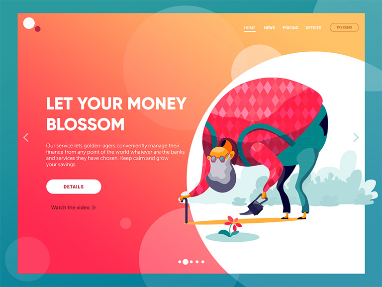
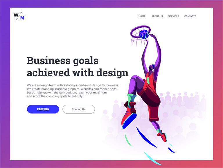
1. Put the essential information in headers

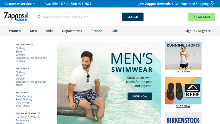
Quick and easy navigation is vital for any website. Website headers play a critical role in grabbing a user’s attention and stabilizing connection with the website. Clear, eye-catching details should be included in headers. Being on the top of the web page, users first see the header, before scrolling the page.

The biggest problem is to decide on what is key information? This challenge grows larger in cases of websites with a vast amount of data, like big e-commerce websites, news platforms or multi-theme blogs. The header is the first thing people notice before scrolling the page during the first few seconds of their interaction with the website. Being a sign of invitation, the header should provide the key information that users could scan it in a few seconds.

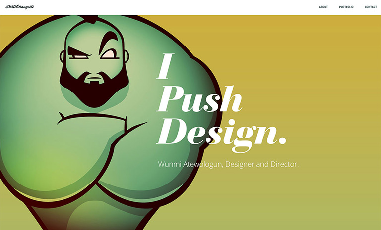
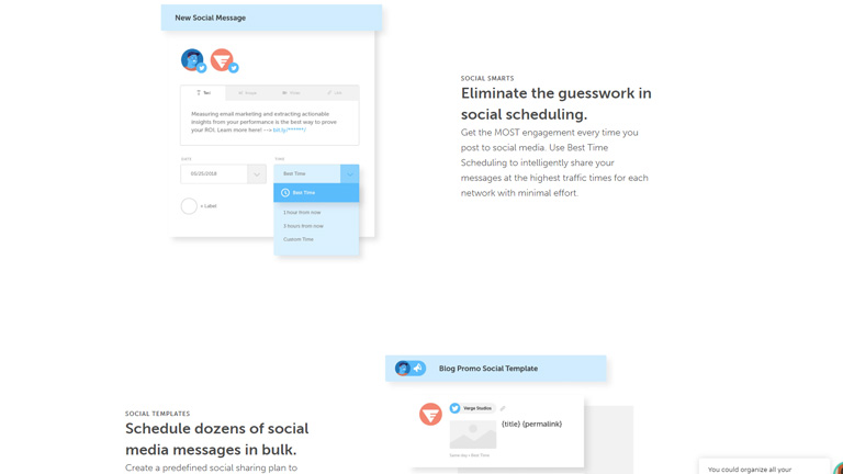
2. Use visual content to encourage actions

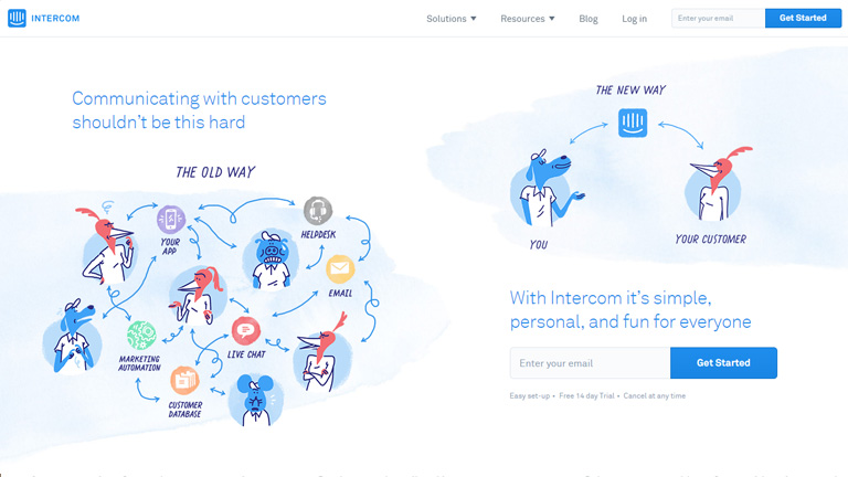
Strong visuals, including photography and videos, are an easy way to grab user attention, and when paired with an actionable element, it can help generate an immediate click. Various visual elements can be used to define the brand style. Guiding the user from point A to point B using visuals is an excellent way of saving time. 

Let’s understand this with the example of an e-commerce website. A user sees a pair of sunglasses on Facebook and clicks on the image to get to the website. A time-saving design would show the shoes with a button to buy now. Use the same image for off-site and on-site promotions. A different picture of those same sunglasses might not register as quickly with the user as the same image. Images are processed faster than text and thus reduces the time for users.

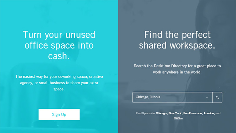
3. Design clear, distinct, and bold CTAs

The call-to-action (CTA) must be instantly noticeable and unmissable by the users. CTA elements are the interactive controls that enable users to take the intended actions. Common types of such interactive elements in the layout are buttons, tabs, or links. In all kinds of user interfaces, CTA elements play a crucial role in usability and navigability. When all the path of interaction and transitions are built clearly for users, but CTA element is not well designed, users are bound to get confused and need additional effort to achieve their goals. 

Bright colors and elements that are oversized can help users see what they are supposed to do with the design immediately. Further, provide content within buttons that tells users exactly what to do and what will happen when they “click here.” A CTA should have plenty of contrast so that it doesn’t blend in with surrounding elements and draws attention to itself.

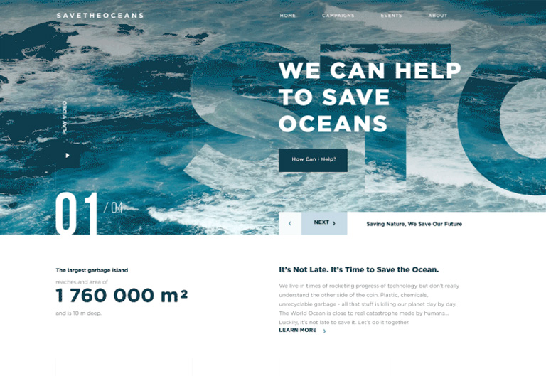
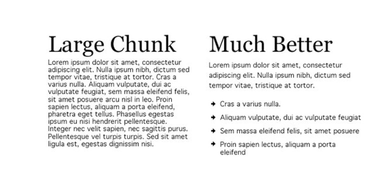
4. Use numbers, not words

According to a study conducted by Nielsen Norman on user behavior, the eye-tracking studies revealed that numbers often stop the wandering eye and attract fixations, even when they’re enclosed within a mass of words that users otherwise ignore. People subconsciously associate numbers with facts, stats, sizes and distance – something potentially useful for them. So they are hooked with the numbers included in copy while words representing numerals can be missed in the bulk of the text. 

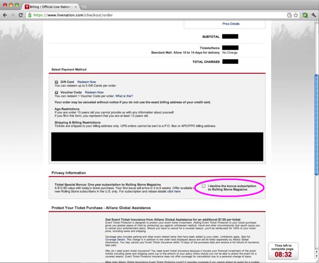
5. Cut down user forms

It is very common to end up asking way too much information from the users while they fill any form on the website. One of the easiest ways to make the design quicker for users is to cut down on asking for information that you don’t need. Forms don’t have to ask for layers of information. Always aim to collect basic, valuable information.

Only ask essential information, such as name and email address, and follow up later for forms designed to generate leads. Use forms that validate data so users know if they’ve entered something wrong, and can quickly correct. Also, minimize the typing efforts and use buttons or checkboxes in forms where possible. Lastly, don’t ask for repetitive data.

6. Be consistent

Consistency is the key to simplicity and drastically reduces a user’s efforts and time taken to perform actions. A consistent design consists of repeated elements, actions, and interactions that work in the exact same way throughout the design. In simple words, it means that a button should always look like a button, have the same color and font, same hover state and work in the exact same way no matter where the button leads the user.

It would be best if you repeated this idea for any element in the design that gets used multiple times. Not just the design elements, but other things like headlines, body text, and image usage should also follow a consistent style. Consistency ensures that the user never has to guess or experiment to figure out how something works.

7. Talk to users in their language

The copy is an integral part of user design and contributes to reducing the overall efforts of a user. It plays a crucial role in communicating with the user. Not just the aesthetics but the style, structure, and vocabulary used in the copy should also correspond to the user’s expectation from a page. 

Usage of too formal or business-like style in an entertainment app for teenagers or vice versa won’t work. A website wherein the copy doesn’t follow business goals, as well as the habits and needs of a target audience, brings down the overall user experience. That kind of content inconsistency is confusing and moves the users away from the website or app. Want some more tips on how to design effortless user interfaces? Talk to our team now!!

Read more about user interfaces here

Categories
UI Design Web Design

All You Need To Know About Interaction Design

Interaction design is creating quite a hype in the designing world over the last few years. The presence of interaction design can be seen in both web and graphic design. Creating a smooth, delightful user experience is key to the success of any design, and that has led to the growing popularity of interaction designs and interaction designers. Interaction design is a process in which designers use logical and thought out behaviors and actions to create engaging web interfaces. In other words, interaction design is the relationship between user and product and the services they use. The products can be software products like apps or websites.

Interaction Design

Interaction design is used to create a great user experience. That’s the reason why most of the UI disciplines require in-depth understanding and hands-on experience of interaction design principles. It involves designing for the whole interconnected system –  the device, interface, environment, context, and people. It’s a fact that there’s considerable overlap between interaction design and UX design. After all, UX design is about shaping the experience of using a product, and most of that experience involves some interaction between the user and the product. But UX design is much more than interaction design. It includes user research, creating user personas, performing user testing, usability testing, and a lot more. Let’s say that UX is a big umbrella and interaction design is something that falls under that umbrella.

Who is an interaction designer?

An interaction designer is a person who creates a design strategy based on his understanding and knowledge about meaningful relationships between people and the products. He can be a part of the design, development, creative or marketing team. He is required to create prototypes to test concepts and stay current on technology and trends that will impact users. Simply put, companies hire an interaction designer to make sure their digital applications work and function when users use it.

One can grow into an interaction designer by learning through formal design programs or may just develop the skills from hands-on experience and learning on the job. Either way, the two of the common traits of interaction designers are a curiosity – their passion for understanding how things work, and the ability to visualize and play with elements and concepts in new ways.

Interaction design examples

Here are a few fantastic examples of interaction design:

By Jony Vino – Dribble
By Tubik – Dribble
By Mykolas Puodziunas – Dribble
Android Wear by Ramotion
Nike by Owi Sixseven

Key interaction design principles

Consistency is the key

Striking consistency is vital for creating an interaction design. The design should be consistent throughout the process and between related applications. Moreover, people’s expectations must be matched through terminology, layout, and interactions. You are helping users learn more quickly by creating and maintaining consistency. You can re-apply their prior experiences from one part of an application to another to maintain consistency throughout the design. 

On the other hand, the inconsistencies can be used to indicate to users where things might not work the way they expect. It’s all about knowing exactly when to be unconventional and break the consistency.

Aim For a Minimalist Design

It would help if you cut down the possible actions for users to a bare minimum. The actions should not be more than the absolutely necessary ones. Offering too many options will spoil the users with choices, detract the primary function, and will reduce usability. Do not provide unnecessary features and functions to users. Also, you must break any complex tasks into smaller, manageable sub-tasks to improve usability. Lastly, limit the functions rather than the user experience.

Minimize Cognitive Load

Cognitive load refers to the mental effort that is required to learn new information. It is a process of thought. In UX design, cognitive load is the mental processing power needed to use a product. A good user interactive design minimizes the user’s efforts to think and complete a task. For example, while designing an interactive interface, we need to understand how much concentration a task requires to complete it. Accordingly, you can create a UI that reduces the cognitive load as much as possible.

Avoid Hidden Interactions

Interactions within interactions or hidden interactions must be avoided. They decrease the efficiency, usability, and user experience. At any given point in time, people should not have to guess or look for opportunities to interact. The interactions must be clearly presented to the users, eliminating any possibilities of guessing.

Interaction designers must create interactive designs where users can review an interface and identify the interaction points. No two users will interact with the interface in the same way. In the process of interaction design, always provide hints and indicators like buttons, icons, textures, textiles, etc. Let the user check if these visual cues can be clicked or tapped with their fingers. Always consider the usability and accessibility of the interactive media.

Create an Engaging Experience

When it comes to user experience, engagement is the extent to which the user has a positive experience with your product. And, not just enjoyable, but more comfortable and productive too. That said, do remember that engagement is subjective to the system. For instance, what appeals to teenagers might be irrelevant to their grandparents. Your design must engage with the desired audience. Apart from aligning your design for the appropriate audience, achieving and creating control is also critical.

If you wish to create some stunning interaction designs that offer brilliant user experiences, talk to our team of proficient designers.

Also, check-out our blog on top UI Trends for 2020.

Categories
Brand & Identity Design Technology UX Web Design

Investigating Various Types of Dark UX Patterns

There are two aspects to designing a website – a company’s marketing objective and users’ needs. One of the most challenging decisions a designer has to make is to strike a balance between the two. Boosting a company’s reach and profits is a common reason why brands use Dark UX Patterns.

What is Dark UX?

Dark UX Patterns are interfaces designed carefully to deliberately mislead users to choose a path they didn’t want to take. They are purposely designed to reach a company’s objectives without taking care of ethics and users’ needs. Dark UX came to light in 2010 after the boom of eCommerce industries on the web. To generate more sales, hit target numbers and get more subscriptions, etc., designers and business associates started creating misleading user interfaces to manipulate users.

Good user experience design is all about offering seamless and enjoyable interactions to users. User’s best interest should be of utmost priority, and there is no place for a deceptive or sneaky user experience design. 

Here are some of the most commonly used Dark UX patterns that designers should not be ideally designing, and of which the users must be careful.

Get in-depth information about innovation in UX patterns here

Bait and Switch

Bait and switch is a sales (especially retail) tactic, which is no short than a blatant fraud. Baiting and switching usually consist of offering customers an enticing item at an attractive, affordable price. This lures users to perceive it as a good deal (that’s part one of the trick – the bait), but later turning the offer into a less desirable deal (that’s the second part of the trick – the switch). Although the deal is not as appealing as it was previously, the users are likely to take it to minimize their perceived loss.

Bait and Switch - Dark UX

Confirmshaming

Confirmshaming is the act of creating a feeling of guilt and regret, forcing the users into doing something, which they may not like to do in the first place. The option to decline is written in such a way as to shame the user into an agreement. The most common use is to get a user to sign up for a mailing list. It is also often found in exit-intent modals and other popups. Confirmshaming has made its way into retail, shaming users who don’t want to be bothered with a pop-up by assuming they’d rather pay full. Take a look at the following example:

Confirmshaming - Dark UX

Friend Spam

A lot of mobile apps seek various permissions when installed. One of the most commonly asked permission is to get access to your contacts on the pretext that they will use it for a desirable outcome (like finding friends to join you). However, in reality, it spams all your contacts in a message that claims to be from you.

Friend Spam - Dark UX

Disguised Ads

As the name suggests, this pattern is adopted so that ads are disguised on the page, as if they were a part of the regular content or navigation. Considering the ads as regular content, users click them more often. Companies often run advertisements that look like a download button, tricking users into clicking on the ads rather than getting what they want.

Disguised Ads - Dark UX

Trick Questions

It’s a common situation in case of pop-ups with a confirmation. You read, and you don’t know whether to press OK or CANCEL. You respond to a question, which, when glanced upon quickly appears to ask one thing, but if read carefully, ask another matter entirely. They are cheap tricks that take advantage of the fact that people browse through web and app pages, instead of reading the content carefully. Users want to complete their tasks as quickly as possible, and that’s where they fall to these tricky questions.

Trick Questions - Dark UX

Hidden Costs

You get to the last step of the checkout process, only to discover some unexpected charges have appeared, e.g. delivery charges, tax, etc. That’s not a new situation. A lot of E-retailers are trying to be transparent about it. However, you can still site examples of E-retailers, now and then, who use it to boost their profits. The designers should stay away from such practices. We checked out GoDaddy, a leading domain and web service provider, and found out an example of hidden costs.

Hidden Costs - Dark UX

Forced Continuity

Read the small print; many free trials end with continuing charges. When your free trial with a service comes to an end, your credit card silently starts getting charged without any warning. You are then not given an easy way to cancel the automatic renewal. To avoid this dark pattern, don’t provide payment for anything that’s free.

Forced Continuity - Dark UX

Misdirection 

Misdirection occurs when the user’s attention is guided to a specific place. This is done so that they won’t notice something else that is happening. This dark pattern design forces you to focus on one thing just to distract you from another. Your reflex actions could send you far, far away from what you had in mind. So, take a good look and read the message before you click

Misdirection - Dark UX

Roach Motel

This type of dark pattern is pretty standard and reasonably relatable by all. The design makes it very easy for the user to get into a specific situation but then makes it hard for them to get out of. Once you have signed up, you are suddenly not given an easy way to cancel the automatic renewal, unsubscribe or opt-out of a service.

Roach Motel - Dark UX

You may be interested in a few golden rules for UX designs

The designers’ community must take the same guard altogether and should advocate honest designs. There shouldn’t be any frauds, misleading communication or any form of trickery. Want to hear more about Dark UX patterns? Have a quick chat with our designers.

Categories
Brand & Identity Design UX Web Design

UX and UI: Connected, But Completely Different

User Experience, or more commonly known as UX is not a new term for the world of graphics and designing. It has been around for as long as the modern day revamping of the design techniques, ideas, tools and philosophy has evolved; so is the case with User interface or UI. They both do compliment each other and often go hand-in-hand, however, a lot of us think that they are the same thing, which is not true. User interface is, let’s say, a part of user experience. Not clear yet? Let’s clear the smoke and try to understand what are the basic differences between UX and UI designs. Let’s go!

User Experience

It refers to a person’s interactions with a product, application, website, or operating system. Which means, creating a UX design involves defining the way a product operates and how it meets a user’s needs. Some of the obvious benchmarks are that a UX should be clear, comfortable and user-friendly. Moreover, a great UX is cautious and elaborate; you will most probably won’t even notice it while browsing through a website.

A good UX aims at simplifying the user journey. It makes the website navigation simple; simple enough that even a layman finds it a walk in the park. If a user finds it difficult to perform some of the most basic functions on a website, like to sign up, change their password, or get to their shopping cart, then there’s a clear problem with the UX. An effective UX smoothly guides a user through a website or an application.

A UX designer is responsible for all aspects of a user’s interaction, which means a UX designer is not just responsible for the technology behind a product, but they’re responsible for how a user interacts with a company, both online and offline, including customer service and other aspects.

User Interface

While User Experience is the accumulation of tasks specifically focused on the optimization of a product for enjoyable and effective use, User Interface Design is its complement; the look and feel, the presentation and interactivity of a product. User interface (UI) is anything a user may interact with to use a digital product or service. This includes everything from screens and touchscreens, keyboards, sounds, and even lights.

A UI designer’s responsibilities are more cosmetic than a UX designer’s. A UI designer is mostly responsible for the presentation of a product. That said, it’s not that a UI designer randomly picks some pictures and logos and use them blindly.

A UI Designer takes care of the Interface design, prototyping design, interaction design, user testing and optimal design. Towards the end of development, a UI designer takes control over the app’s appearance, including on-screen forms, images, buttons, links and icons. Without a user interface designer’s intervention, a design would not appear beautiful and appealing.

Key Differences

UX enhances the usability, UI enriches the visual appeal

The core objective of UX design is to make the product more useful for users. UX designers are responsible for ensuring that the company delivers a product or service that meets the needs of the customer and allows them to seamlessly achieve their desired outcome. On the other hand, UI designers are more inclined towards creating a visually appealing and aesthetically pleasing website design for users. Additionally, UI design must help users navigate through the website by designing buttons in different sizes, to show priority. UI designers take care of minute visual details to make the site look attractive.

UX Design is first, followed by UI

Normally, UX design and research is the first thing that designers dive into when deciding whether to build a product or application. They start with a competitive analysis and market research to come up with insights which improve site functionality. UI design comes much later; once the prototype has gone through several iterations and is almost finalized, all the wireframes are in place, then the UI designer steps in. Here is where the creative spirit of designers is put to test. They work on the visual design and micro-interactions.

UX pertains to products, services and interfaces, but UI only pertains to interfaces


The scope of UX is much broader than UI. UX design is garnering a lot of attention and is becoming more popular day-by-day. It’s no longer restricted to the companies with a web presence, but many others that develop products or provide services are identifying the importance of researching the market, users and validating them before they build. The scope of UI is however restricted only to user interfaces. That said, it doesn’t mean that UI is limited to graphical user interfaces of computers, tablets and mobile devices. A lot of other products also need a touch of UI designing these days, like watches, washing machines, car dashboards, vending machines etc.

UX has a social component, UI has an artistic component

UX is more about people; it has a social component as it deals with market research, analysis, identifying a customer’s pain points and how the product will solve these problems. User personas, journey maps and product user scenarios are accounted through UX research like contextual interviews, focus groups and prototyping, involving people. UI design has an artistic component as it relates to the design and interfaces with the product. It is about the aesthetic value and visuals. It affects what the end-user sees, hears, and feels.

Concluding notes

It is evident that UX and UI are completely two different things and focus on different aspects. But, they both complement each other and go hand-in-hand. It is almost impossible to bail out UI from UX and UX from UI. In a nutshell, UX design helps users accomplish meaningful tasks across platforms and services, while UI design makes compelling and aesthetically pleasing interfaces that connect with humans.

Categories
Design

Infuse Innovation In Design Patterns: Why and How?

A lot of researches have proved that human behavior happens in patterns and humans largely use the default, familiar patterns to interact with technology, without seeking a new way to do so. Having identified the substantial influence of patterns over human behavior, it is a wise step to use established design patterns in your work. That said, repetition can also kill innovation. It’s nearly impossible to design something new for your audience if you only concentrate on what’s been already done.

In this article, you will learn how you can use innovative ideas with established design patterns to meet the need of your end-users.

What are Design Patterns?

Design patterns are established solutions to recurring problems. Established design patterns are extremely useful for interface designers. One of the best examples of UI design trends can be positioning the login call to action at the upper right-hand corner of the navigation. People are familiar with this type of positioning because they’ve used the same behavior to log in or check their profile for years. They expect the login button to be there.

Tax Zar
Image source:Taxjar

People enjoy the familiar and are reluctant to anything that they don’t know, or is unexpected. When an interface matches the user’s expectations, it reduces cognitive load, saves users’ time, and makes the software more intuitive.

While we are discussing how to bring out originality and infuse innovation in design works, patterns do have a number of advantages for your design process.

Utilizing a pattern saves time as you don’t have to design an interface from scratch, everytime you start a project. You would be building on a solution that has been successful and has worked well in the past. However, relying heavily on design patterns can easily drive you towards an under-researched design.

Before you start customizing patterns, make sure you select the right pattern for the job. Yes, design patterns are usually reliable solutions to recurring problems, but if you don’t choose the right one, your design could actually reduce clarity for your audience. There are various repositories that offer examples of important design patterns. You can choose the most suitable one for you from there. Once you have your patterns in place, it’s time to get into the innovation mode. Here, innovation means specific changes in a few parts of the interface, not spinning the entire thing on its head. The fundamental design still fits a pattern, but new ideas are added to better help your users understand the interface, satisfy their needs, and accomplish their goals.

Cresent Heights
Image source: crescent heights

Ways to Innovate

There are two most commonly used, tried and tested techniques which can be used to infuse innovation in existing design patterns.

Mental Models

A mental model refers to an established belief someone has about how a system should look or function. This principle states that people find something challenging to use if the interface doesn’t function as they have already decided it should. How designers perceive a product or website and how users perceive the same is often poles apart. This discrepancy is the biggest pathway to poor design.

A couple of research methods like Usability testing and card sorting can be used to uncover what’s on your users’ minds. In Usability testing, people verbalize what they’re thinking as they interact with your site, while in card sorting, users group types of data based on categories, which can help you understand where in the interface people expect to find content.

Empathy Maps

An empathy map is a qualitative research method that visualizes specific needs and actions of your users. Using data collected from user interviews, surveys, and field studies, empathy maps typically categorize user needs in four sections: Says, Thinks, Does, and Feels. This kind of research helps in identifying what users feel versus what they do. These conflicts will help you identify what elements to highlight or hide in your UI design.

Innovation has always led to great things, however, it’s not really wise to only depend on innovation and everytime crafting something completely new, without the essence of tried and tested solutions. It should always be a combination of new ideas and established design patterns. Know more about the same by speaking to our design experts.

Categories
Design

Mid Year Round-Up of Latest UI Design Trends

Half the year has gone by and we can say this was a pretty interesting year in terms of web designing, especially UI designs. A lot of new design trends surfaced, while a few faded away. Here’s a list of the hottest UI design trends which were highly popular by far in 2018.

Storytelling with Character Design

The trend of custom graphics has opened doors for personalization and developing personalized special characters. Character design for storytelling in the interfaces is swiftly gaining popularity. More and more websites and mobile apps turn to specially designed characters for storytelling, setting the tone, conveying messages or showcasing the benefits in a way that matches the mood and voice of the platform. The interactions are more human-like when original characters are involved and thus creates a strong visual association with the real world. Moreover, the characters make the page or screen compelling and vibrant.

Full-Screen Background Images

More and more websites have now started using full-screen background images, be it photos or specially rendered visualizations. Use of these images not only visually enhance the websites, it makes them emotionally appealing. It is the most effective way of captivating visitor’s attention and sets the tone for an ideal user experience even when the site is loading, in addition to boosting the UI. Only high-quality images must be used as background images; the recommended background image size is 1250×800 or anything higher than that but with the same proportions.

Custom Digital Illustrations

Some trends continue to be popular for years. Custom digital illustrations are one of them; its presence on the web and mobile user interfaces is increasing every day. Custom graphics effectively support the quick perception of information provided on the page or screen; they set a solid ground for originality. Custom mascots, icons, illustrations are some of the most common forms of custom graphics which designers use to enhance the look of a page or screen, as well as boost usability and intuitive navigation. Another growing trend is creating digital illustrations as title images for blog articles.

Hero Images

A hero image is the first, main photograph or graphic that you see at the top of a web page. Its primary objective is to grab immediate attention and show visitors what your site, content is all about. They are flashy, pretty and keep visitors engaged. Moreover, as well as any other striking graphics on web pages, this is a kind of content which is both informative and emotionally appealing. This might be the reason why designers often turn to this technique to add diversity to landing pages.

Split Screens

One of the hot trends of this year is the active usage of split screens in both web and mobile interfaces. However, this trend is not really a new one. We have noticed that it fades away, only to make a comeback in various spheres of design, and looking at the year so far, it’s safe to say that it’s definitely back and alive. Split screen approach is believed to be more effective in responsive designs as you can work around with different content variations without missing the consistency. Additionally, it offers liberty to designers to try different color combinations and experiments. Some websites even use split screens to show two options of equal importance.

Multiple Interactive Layers

UI designers never shy away from experimenting and infusing creativity in their designs to find new, interesting ways of making the web page interactive and highly engaging. One of the growing trends is applying several interactive layers that make scrolling experience and interactions look original. By playing around with the positioning of various items on the scroll, they create an amazing parallax effect that provides a deeply layered experience.

Bold Typography

This UI trend has become very popular over the last few years and continues to do so in 2018. Bold and catchy typography can be seen all across the web and mobile layouts. In most cases, it becomes one of the key design elements and designers pay plenty of attention towards keeping it readable and scannable. Typographic hierarchy along with thoughtfully chosen fonts are among the core tasks of every UI design project.

Apart from these, there are many other UI design trends which have been the talk of the designer’s town. Share the ones you like in the comments section. Even better, talk to our design experts and know in-depth about the latest design trends.

Categories
Web Design

Why Is Whitespace So Important In Web Designing?

The term whitespace is often perceived as white empty sidebars between which the content is squeezed. But that’s not the case. whitespace, also known as negative space is also the empty area around images or other elements on the web page in addition to the spacing between letters in your titles and text. Irrespective of the design style you follow, it is very important to include and use whitespace wisely to create a visual appeal. It may not eat a lot of your screen real estate, but surely makes your website look refined. Here are a few benefits of using whitespace in your design.

1. It Grabs Attention

We may get into a never-ending debate zeroing down on the best strategy to attract user attention online. However, one thing we all may agree on is to what doesn’t grab attention- emptiness, blank space, nothing. This simple fact helps in putting blank space to best use. whitespace can be used to draw and funnel attention to the important elements which you want to highlight.

Grabs-Attention

You may clutter a page with images and texts, and highlight the important page elements; you can choose to leave more space around vital images or even go for larger fonts to make them stand out. You can do this on your homepage, landing pages, portfolio pages, conversion funnels etc. Empty space around the key object eliminates distracting elements or clutter around it, thereby extracting all of user’s attention towards the object itself.

2. Demonstrates Visual Hierarchy

It’s very important to distinguish important elements from the ‘not so important’ ones. Mostly, this is done by playing around with the size of elements. In addition to the size of the elements, size of whitespace is also critical, especially from a design point of view. Vital elements have more whitespace around them and the size of whitespace keeps on decreasing with the importance level of elements. This establishes a visual order or visual hierarchy.

Demonstrates-Visual-Hierarchy

By implementing this hierarchy of visual priorities and effectively using whitespace, your design will exhibit a smooth visual flow that eliminates ambiguity. The viewer knows what’s important and where to go next. Landing pages are usually the best examples of this. There’s a large title with more whitespace than the text that will follow, and that test runs up till a large ‘Subscribe Now’, or ‘Buy Now’ button that has the most amount of whitespace around it.

3. Sets Groups Apart

A lot of minds think whitespace is really waste of space, but when used appropriately and wisely, it actually saves space. If you find yourself running out of screen real estate and still have a huge list of products, services, or anything else that you want your viewer’s attention towards, then you may end up placing items too close together. This will make items in that section appear to be similar and will not get the desired attention as they’ll blend in with the noise.

Sets-Groups-Apart

To rectify this, instead of highlighting your products, you just alter the size of them, change their layout and orientation, or combination of the two. This will create some whitespace between the objects, set them apart from each other, and make it easier for viewers to pick up on that.

4. Improves Readability

Whitespace is the backbone of text readability. You wouldn’t be able to read through this text if it was all crammed together with minimal spacing. Text looks all packed up and hard to read if you leave very little whitespace. That said, leave too much space and you end up wasting it. This is the reason why the world’s top designers emphasis so much on fonts and typography.

Different fonts employ different amounts of whitespace, depending on the font style. However, font size holds equal importance. Headings are larger and use more space in order to draw viewers’ attention. Some other areas that use whitespace to improve and enhance the reading experience include line spacing and paragraph margins.

If one has to describe whitespace in a poetic way, it could well be “a perfect amalgamation of art and science.” A scientific application of this art is required for the design to be effective. One can achieve beautification through simplification by effectively utilizing whitespace. Intrigued by learning this?  Talk to our experts to know more.

Categories
Design Web Design

5 UI Trends That Topped The Charts In 2017

These 9 months of 2017 have been quite exciting in terms of technology and the web. The world of web is moving at a fast pace with new advancements emerging every now and then. In line with these technological advancements, the design world has also allowed itself to evolve by accepting new trends and ideas. Designers have welcomed fresh design trends and methodologies with both hands especially while designing the User Interface. With a majority of the year gone by, let’s have a quick look at the UI trends which ruled in 2017.

1. Use Of Deeply Engaging Videos

We have repeatedly highlighted the importance of videos in terms of web design and User Interface. It’s the best way of voicing out the brand’s message in an appropriately associated tone. ‘A picture speaks thousands of words’, and is much more engaging as compared to mere words. Use of pictures has been a trend for quite some time now and videos are its natural successor. Images are static whereas videos are dynamic, thereby creating an amplified effect. 2017 has seen a shift in momentum from the use of static images to engaging videos. Having said that, images are not going to disappear from the scene overnight. However, videos are the next big thing in designing an impressive interface.

2. Long Scrolling

Scrolling is not really a so-called trend and is more of a fundamental functionality. It has been prevalent from a long time both in websites and desktops. But, long scrolling has emerged as a design trend in the last few years. A huge number of websites are using long scroll & longform content for desktops and other larger devices in order to display their content. Due to an increase in access to the internet through smaller devices like mobiles etc., users have become extremely comfortable with scrolling. This has pushed designers to implement long scroll and longform of content in bigger screens. With help of long scroll, users can access a huge amount of content in a single and smooth motion. It works well with all forms of content like longform journalism, news articles, stories, landing page etc.

3. Flamboyant Colors & Gradients

The year 2013 saw the uprise of a design methodology which changed the look and feel of the web back then. It was the introduction of flat design. The concept was to keep the design as simple as possible while eliminating all the fancy and jazzy elements from the design. Functionality wise it was very strong and therefore soon spread like wildfire among the designers. However, it had its own drawbacks. Soon everyone was using a flat design and therefore every website looked more or less similar.

Designers realized the need of creativity and individuality once again and they broke the shackles in 2016. Designers started focusing more and more on personality, experimenting with bold colors, vivid colors etc. instead of dull and simple color shades to provide a sense of uniqueness to their websites. 2017 has seen a great increase in vivid colored and stylized websites. This trend has shown positivity and is bound to gain momentum in the upcoming year as well.

4. Bold & Beautiful Typography

In an extension to use of vivid colors and bold designs, designers have fearlessly experimented with loud Typography as well in 2017. Today, there are a lot of free or cost-effective web font services (like Google fonts, Typekits etc.) available to designers, which provides them creative freedom and more experimenting power. 2017 has seen a huge rise in the use of unconventional, bold, and out of the league web fonts in comparison to conventional fonts. This trend is here to stay for quite some time and the upcoming year will see more and more bold & beautiful typefaces against the traditional typefaces.

5. Illustrations

Illustrations provide an immense sense of personality, individuality, and character which can barely be achieved with traditional photography. Illustrations designed in line with a brand’s identity develops a sense of authenticity and builds trust in users and customers. Illustrations have their own versatility. Some brands may prefer sophisticated illustrations to achieve that posh and classy look, whereas others may rely on more rough and edgy styles to position themselves as fun and playful. Illustrations have performed well in 2017 and they seem to be buzzing in the coming years as well.

The only thing constant is ‘change’ itself. New trends and ideas keep on emerging at the scene and designers should always try to keep themselves abreast these trends. The aforementioned trends are the most popular trends that created a buzz in 2017. However, there is a huge list of other trends as well which were successful in modifying the design world. Share your design requirements with our experts and see how you can ride on these trends to create an impressive User Interface.

Categories
Design UX

4 Brainy Ways To Use Illustrations In UI Design

It’s an accepted fact that as human beings we are more attracted towards visuals. Any visual information grabs our eyeballs faster than any other means of communication. Almost 90 percent of all the information that our brain interprets is in form of visuals. Due to this fact, it’s easier to convey information through visuals as compared to a complex and lengthy block of text. Pictures have always been part of a good interface. However, use of illustrations has interestingly increased recently. Illustrations provide a lot of freedom to designers to produce creative effects. Moreover, they have added control on content and technical aspects as well. Here are 3 smart ways to implement illustrations in UI design effectively.

1. Illustrations On Homepage

No matter how brilliant your product may be, it is bound to be a failure if it is poorly packaged. Similarly, people judge your company and the quality of your product by the look and feel of your website. Thus it’s imperative that your website must look stunning and provide an unforgettable experience. That’s why designers take a lot of efforts in order to provide a visual delight to the customers.

This is where homepage illustrations come into the picture. It provides an aesthetic and imaginative touch to the entire website. You can customize your illustrations to strike a personal connect with your customers. This works wonder in terms of creating a strong brand recall.

intercom

Pic Courtesy: Intercom.com

2. Onboarding And Tutorial Illustrations

Illustrations provide help using visuals. They provide clarity in messaging by drilling down concepts into very basic visuals. Pictures create a far better impact and accelerate the overall experience. This is what makes illustrations so prominent for on-boarding and tutorials.

Onboarding screens propose the key features and benefits of the app to users. Illustrations help in providing context and add clarity in information for the user. This smoothly leads him towards the next step. Illustrations can really help in conveying the core message with the minimum use of copy.

An engaging and interactive onboarding instantly creates interest in user’s mind. It generates eagerness among the users and also creates a sense of happiness. A tutorial is usually a boring manual which can often kill interest among users. Using illustrations is a much better way to engage users during this initial process.

pinterest

Pic Courtesy: Pinterest.com

3. Illustrations On Reward Screens

We all have played video games at some point in time of our life. Be it mobile games, TV video games or any other type of games. Almost every game has a feature of rewarding the player on an achievement of certain criteria. Terms like level unlocked, stage unlocked, power unlocked etc. go hand in hand with these games. But why is rewarding so important? It’s because rewarding provides a human touch to the interface experience. The user feels as if he is interacting with a real human rather than a machine.

It stimulates a positive emotion among the users and they feel more connected. It helps in creating a positive engagement between the users and the app. Users tend to overlook the flaws of your app when they receive a rewarding experience from your side.

pmbr

Pic Courtesy: pmbr.tn

4. Character Illustration

Character Illustrations in simple terms means using a person, animal or cartoon character to illustrate your brand and website. The character can act as a mascot for your brand as well. The best example of character illustration can be cited at Mailchimp. The company uses an appealing chimp as their brand mascot who is present in almost every part of the website. Characters can be used in designing the logos of your brand as well.

mailchimp

Pic Courtesy: Mailchimp.com

However, Character illustration requires more efforts in order to seize and display the real personality of the character. But we believe it’s worth it as it ensures that your brand stands out distinctively from the crowd.

Illustrations act as a very impressive and imperative way to enhance user experience and create positive engagement. These are some of the best ways to use them. However, it’s not limited to only these 4 ways neither there is any set of rules on how to use them. The soul purpose is to display the desired information in the most basic visual manner so that users can easily interpret it. Talk to our design experts and understand more about the use of illustrations and other design requirements for your business.

Categories
UX

5 Golden Rules To Create An Excellent User Interface

Over the last few years, the world has digitized so rapidly and drastically that it becomes a little hard to believe. Digital interaction and experience have become a part of our daily routine. This raises the importance of user experience to a whole new level. User Interface is associated with us practically everywhere. Be it on our mobiles, websites, car displays, thermostat control in our offices/homes and the list goes on and on. But what differentiates a quality UI from an ordinary UI ? Let’s find out the answer by discovering 5 key elements of an excellent UI.

1. The Design Must Be Simple:

As simple as it sounds. Simplicity has its own charm and it never fails to impress. Don’t clutter a page with unnecessary elements and options. Furthermore, the target is to provide only essential elements and options which are required by the user to complete their task. Rest of the elements can take a step back. A lot of designers push in a bunch of “can be neglected” elements in the page design which defeats the purpose of providing best user experience.

This Toader Photography website is a brilliant example of simple user interface.

Toader Photography
Pic Courtesy: toaderphotography.com

2. Users Must Sense Familiarity:

When a user lands on a web page, at no point in time he should think “What to do now?” Neither he should be greeted with something unexpected. The interface must be intuitive in nature so that users easily understand it. This will create a sense of familiarity in a user’s mind. A great example – A lot of restaurants and food joints are using a food article icon (like a burger or a pizza slice) on their app and websites. This instantly tells the user where the menu is?

In another example, see how Zappos has placed all the familiar tabs at familiar positions.

zappos

Pic Courtesy: zappos.com

3. The Messaging Must Be Clear:

The first point emphasized on being simple and ditching the complexity. But, it’s equally important to be clear and concise. Save your users from the trouble of reading lengthy messages, labels, and descriptions. It will really annoy a user and would only lead him towards the “X” button. Cut to the chase and be point blank. Users like it. Moreover, it’s all about providing a delightful user experience and stretched messaging is a roadblock in this process.

4. Be consistent:

Never loose on consistency throughout the user experience journey. People like consistent interfaces as it smoothens the entire experience. They develop usage patterns and later rely on these patterns which further improves their experience. The process is simple. They learn about your design pattern and want to use the learning in their future interactions. An inconsistent interface will make it hard for users to understand how things really work on your website or app.

5. Create A Visual Hierarchy:

This is a very critical element in terms of user interfaces. However, most of the designers overlook it. It is quintessential to focus on the important elements. Never try to make every element look important. It clutters everything and the user gets confused in taking any action. A proper distinction between colors, shapes, and placement of elements must be maintained to guide the user towards the action. If the visual hierarchy is properly implemented in a design, it kills complexity and helps users in performing their tasks more efficiently and swiftly.

Look how Decathlon has highlighted the “Season Clearance” tab by coloring it bright red. This instantly grabs attention and leads the user towards the action.

decathlon

Pic Courtesy: decathlon.com

Times have changed and so have the users. They demand a satisfying user experience more than just a transaction. Therefore, designers should dig in deep and try to understand each and every aspect related to user experience to create a user-friendly interface. Talk to our experts and fulfill your design requirements.