NYX Ditech

Categories
Brand & Identity UX UX Design

Tips to Enhance Your Website’s User Experience

You need to make sure your website presents your company in the best light possible. However, when a website is published and made available to the public, it is possible that few User Experience elements are often overlooked. This will have a detrimental effect on the website’s navigation, which will cause people to leave. As a result, it is critical that you eliminate any design errors by employing UX designing services and Enhance offering your visitors a stunning design.

Follow These Tips To Enhance User Experience Of Your Website

#1 Boost Page Loading Times

The poor loading time of a website is one of the most aggravating factors that utterly distract a visitor. In today’s world, there are a plethora of websites dedicated to a specific subject matter. Consequently, consumers will choose a website that loads quickly and provides the information they need to do their job. All UX design ideas that slow down a website must be avoided while developing a website.

Slow page load times not only frustrate your site’s users but also hinder your website’s SEO efforts. Customers will begin to explore elsewhere on the internet for better solutions, which is bad for your company’s bottom line.

#2 Examine The Broken Links

Increasing numbers of people are turning to their smartphones and tablets to get information on the web. We can thus say that creating websites that are mobile-friendly is essential, and no web designer can afford to ignore this requirement. A responsive website will guarantee that consumers enjoy a consistent or seamless experience regardless of the device they are using. The user experience (UX) of a website may be greatly enhance by making it mobile-friendly.

#3 Include Attractive CTAs

These “Call to Action” (CTA) buttons can be finicky. The click-through rate can be dramatically boosted or impacted by a few little adjustments. According to one case study, user experience designing services that used contrasting colors for their CTA buttons saw an increase in click rates of 122%. Moreover, it is crucial to consider the location. The closer a button is to the top of the page, the more likely it is to be clicked.

#4 Design Consistently and Simply

It’s always a good idea to redesign your website to include new design features. However, you must be careful not to drastically alter the appearance of your website in the process. Changing a considerable amount of the design will cause the users to believe that they’ve arrived at the wrong site.

Moreover, your website’s components must be clearly and easily seen by your visitors in order to maintain a consistent design. Texts, pictures, a nice contrast ratio, and a slew of other things fall within this category. Your site’s users shouldn’t have to exert extra effort to understand anything displayed to them.

#5 Reduce The Number Of Ads That Are Shown

Ads are an excellent method of generating revenue, but the brutal reality is that everyone dislikes them. These adverts take up valuable space on your website, which might have been used to provide additional information to your visitors. Ad blockers are commonly used by online users to avoid being bombarded with intrusive advertisements. An improved user experience may be achieved by providing users with full access and control over a website’s content.

#6 Colors Matter

Colors have a great deal of significance in terms of branding. Using a consistent color palette may boost brand awareness by as much as 80%. Various psychology studies have shown that when a company uses colors, buyers attach different meanings to them. For example, blue inspires a sense of trust and honesty, whereas orange conveys a sense of originality. Make sure that the colors you choose for your brand are consistent with the message you want to convey.

#7 Avoid 404 Error

404 or page not found messages bother everyone. If any user receives this notification, he may hesitate to visit your site in the future, which speaks to the quality of your website user experience. It’s pointless to maintain a website if you can’t lead the visitor to the appropriate page. 

Conclusion

Even the smallest and most subtle adjustments can have a significant influence on UX design. In addition to these design tips, there are a slew of additional approaches that may be used to enhance the user experience on a website. However, the suggestions mentioned in this blog are regarded as some of the best for drastically enhancing your website’s UX. Contact our User Experience experts today to enhance your brand’s identity.

Learn more about hoe you can become a UX Expert here.

Categories
UX UX Design Web Design

10 Rules Every UX Designer Must Know

User experience or UX is a vast discipline. Anyone who practices UX design should be equipped with skills in many different fields. UX designer creates designs based on their knowledge, experience, trends, creativity, and gut feeling. While there’s no rule of thumb, or a fixed combination of ingredients when it comes to designing fantastic user experiences, here are ten golden rules which will surely help you in creating an excellent experience for people.

1. UX And UI Are Different

Swapping UX with UI, as if the two are the same, is a common mistake among many UX designer. It’s essential to understand the difference between the two disciplines. User Interface is the space where interactions between humans and a product occur, while User Experience is an emotional outcome after interactions with a product.

2. User Research Is a Natural First Step In The Design Process

It should come as no surprise that one of the most important factors you should consider when designing a product is the audience. If you plan to design a product your users will love, you must have an idea of what your audience actually wants and needs. And this means user research should be an essential part of the UX design process. It’s critical to keep your users top of mind before you start designing! This will allow you to provide value for people who’ll use your product and focus on benefits instead of features.

3. Test With Real Users

Designers often assume that people who will use their interfaces are like them. As a result, UX designer projects their behaviors and reactions to users. But thinking that you are your user is a fallacy. This effect in psychology is called the false-consensus — a tendency to assume that others share our beliefs and will behave similarly in a given context.

Most probable, the people who’ll use your product have different backgrounds, different mindsets, different mental models, and different goals. 

There is a technique that helps UX designer overcome false-consensus bias, called usability testing. If you want to build products that users love, then you have to focus on testing. Testing with real users allows designers to learn how to create products that are right for those who will use them. This may be time-consuming, but it’s the only way to be sure that you’re moving in the right direction.

4. Prototype Before You Build a Real Product

Skipping prototyping and putting a lot of effort into building an actual product is another common mistake among many design teams. When we put a lot of effort into creating something that we believe is great, it can be stressful to realize that our solution doesn’t work as expected when we release it into the wild.

Prototyping is creating a model of a product so that it can be tested. Prototyping allows you to test your hypothesis before spending time with an engineering team building the actual product. UX designer can use different design techniques for prototyping. One useful prototyping technique is called rapid prototyping. It’s a popular way of quickly creating the future state of a product, be it a website or an app, and validating it with a group of users.

5. Avoid Lorem Ipsum And Dummy Placeholders

Almost every product is based around content, whether that’s text, images, or videos. It can be said that design is an enhancement to the content. Yet many designers don’t take content into account during the design phase — they use Lorem Ipsum instead of real copy and placeholders instead of real images. While such a design might look great on a designer’s artboard, the picture might be completely different when the same design is filled with actual data.

6. Aim To Be Consistent And Straightforward

The hallmark of a great user interface is simplicity and consistency

In the context of digital products, simplicity means that’s it’s easy to understand and interact with a product. Your users shouldn’t need to read instructions to understand how to use an app or have a map to navigate through it. It’s part of your job as an interface designer to make things clear and subtly guide them from where they are to where they need to go.

Interfaces must also be kept consistent throughout a design. In an attempt to make designs appear more creative and memorable many UX designer intentionally add inconsistencies in style. For example, different color schemes can be used on different pages on a website. Such design decisions often cause confusion and frustration in users. Thus, it’s always important to keep the design element familiar, reinforcing the most important facets of your design at every turn. Remember to apply the Principle of Least Astonishment to your product design.

7. Design Must Be Usable And Accessible

Design for a diverse set of users that will interact with your products

When it comes to design, designers often obsess over the look and appeal instead of functionality and accessibility. Most of us try to make things look beautiful. Quite often, this leads to a situation where aesthetics become more important for UX designer than usability. Of course, aesthetics are important, and we definitely should try to make our designs appealing, but only after we have usable products. The most important job of digital products and services is to perform a function.

8. Design Is An Iterative Process

It’s important to understand that UX design isn’t a linear process. The phases of the UX process (ideation, prototyping, testing) often have considerable overlap, and usually, there’s a lot of back-and-forths. As you learn more about the problem, the users, and the project details (especially any constraints), it may be necessary to revisit some of the research undertaken or try out new design ideas. Don’t think that it’s possible to make your design perfect right after just one iteration. Instead, refine ideas to the point where you can test them with real users, collect valuable feedback, and iterate based on this feedback.

9. Preventing Errors Is Better Than Fixing Them

Whenever possible, design products to keep potential errors to a minimum. To err is human. Errors often occur when people engage with user interfaces. Sometimes, they happen because users make mistakes, and other times they happen because an app fails. 

Whatever the cause, these errors, and how they are handled have a huge impact on the user experience. Users hate errors and hate the feeling that they triggered such behavior even more. Thus, you should strive to either eliminate error-prone conditions altogether or check for them and notify users before they commit to the action.

10. There’s No ‘one’ Universal UX Process

UX process is a make-it-or-break-it aspect of UX design. Without a solid UX process, a designer could be completely moving in the dark. A clear and concise UX development process, on the other hand, makes it possible to craft amazing experiences for users.

Read more about how to prevent mistakes in UX practices here

Many designers believe that there’s one universal UX process that can be applied to all projects. Unfortunately, there’s no such thing as a one-size-fits-all UX design. While it’s possible to define individual steps for each project, a precise UX process should always be selected based on project requirements — each project is unique and has its own needs. This means that to create the best possible user experience a designer should be ready to adapt their design process based on project specifics. 
Talk to our team now – learn more about the rules of UX designing.

Categories
UI Design UX UX Design Web Design

7 Best Practices To Design Dropdown Menus

Dropdown menus are an integral part of website design and user experience. A clean, well-structured dropdown menu helps navigate visitors through a website, narrow their choices and save screen space easily. It is widely used in navigation bars, search bars and tab bars. However, it’s a perplexing task to design simple, effective and attractive dropdown menus. Even the simplest looking components can be tricky some times when designing for usability. Here are some best practices for designing effective and user-friendly dropdown menus.

Avoid Long Dropdown Menus

Using dropdown menus in forms is quite apparent. Forms don’t take much space on the interface, all browsers support them, and users are acquainted with them. It’s all right if you have 10-12 option, but it could be overwhelming for users to navigate when they have to choose from more than 15 options. Users face a hard time reaching to what they’re looking for. Also, there are scrolling issues where the user has to keep the mouse cursor within the dropdown box. They may end up scrolling down the page instead. 

The most classic example for long dropdowns is the country selector which has more than 100 options typically. Generally, it sorts by alphabetical order, but sometimes the most popular countries are placed at the top. That may look like a convenient practice but can confuse the users sometimes. The dropdown menu isn’t the best choice in this instance. A text field option with autocomplete functionality is more user-friendly here. The user already knows his choice and can input it quickly.

Grey Out Disabled Options

This one is a no-brainer, but still gets missed out by many designers. If you have an option that is disabled or unavailable, it should not be removed but greyed out. If disabled items are removed, the interface loses spatial consistency, and it becomes more challenging for the user to learn. When you grey out the disabled or unavailable options, it is more purposeful and adds to the user experience. You may choose to show a tooltip to indicate the reason why that option is disabled and how to activate it.

Use Clear Hover States

Designing an “active” class for hovered menus keeps the attention where it belongs. Most designers use the ‘CSS :hover’ pseudo-class, which works great for actively-hovered links. However, keeping the main link highlighted when the user is hovering submenu links is also a good practice. It acts as a clear path of activity where users can glance at the menu and quickly determine which primary link is active and which sub-menu link hovers. You can design hover states with many techniques like font color changes, text underlines, background color changes, highlights, box shadows, and more. The primary objective is to keep the parent link active even when it’s not hovered directly.

Avoid Dropdown Menus Where Typing Works

There are many situations when typing might actually be convenient and faster than using a dropdown menu. For example, inputting the credit card expiry date or entering birth dates. It is definitely much faster to type the dd/mm/yy or mm/dd/yy formats, rather than scrolling through two dropdown menus and selecting the month and year. Although a free-form input field does require data validation, in some form at least, it’s still a better alternative from usability and convenience point of view.

Keep The Number Of Actions To A Minimum

A dropdown menu must be customized based on the information required. This ensures that the user takes a minimum number of actions. A classic example is the “date selection” field, where you would need 3 dropdown menus (month, day, and year) if a normal list menu is used. This can annoy and frustrate users. Instead, the menu components must be customized, and users must be able to enter the date using only one dropdown menu.

Make Seamless Dropdown Menus

Dropdown menus should appear seamlessly and without interruption. Dropdowns should load immediately. Many times website developers end up overloading the menu, making it too heavy for instantly loading upon hover. The last thing you want is users waiting for something to happen with their cursors on dropdown menu title. Transition effects like wipe down or fade can be the other options to display the change. They look really cool but ensure that the transition is quick and not disruptive.

Use Clear And Concise Labels

Labels on menu options initiate the action. Users choose the menu option based on their labels, so it’s vital to make them accurate and informative. It’s best to use sentence case in labels. Avoid uppercase letters. Keep your labels short and crisp. Concise labels that clearly indicate the purpose of the selection must be used. As part of best practices, use verbs for action menu items. It should describe the action that will occur. For links, use nouns to identify the page that the user will be directed to. Exclude articles in menu items; use “delete page”, instead of “delete the page”. Lastly, keep menu items to a single line of text. Don’t write a story there.

Using these best practices, you can design dropdown menus that are attractive, user-friendly and purposeful. For more, feel free to get in touch with our design experts.

Read about Mega Navigation menu here

Categories
Brand & Identity Design UI Design UX Design Web Design

7 Tips for Designing Effortless User Interfaces

The fact that simplicity is the ultimate elegance is an eternal truth. The power of simplicity can elevate any design for web and mobile interfaces. Moreover, a simple design is highly human-centric and thus creates a delightful user experience. But, a lot of times designers misunderstand ‘simple’ and interpret it as empty or monofunctional. Instead, it means clear, intuitive and helpful. The website with simple user interfaces not only solves user’s problems but also reduces their efforts.

Websites and apps are generally defined in terms of their appearance, functionality, or content. They are rarely defined in terms of respect. Often neglected, respect for the user’s time and energy is one of the vital goals that designers should aim at. In this article, we throw light on some tips and techniques which could help you in designing effortless user interfaces that reduce the time and effort of users, thereby creating an unforgettable user experience.

1. Put the essential information in headers

Quick and easy navigation is vital for any website. Website headers play a critical role in grabbing a user’s attention and stabilizing connection with the website. Clear, eye-catching details should be included in headers. Being on the top of the web page, users first see the header, before scrolling the page.

The biggest problem is to decide on what is key information? This challenge grows larger in cases of websites with a vast amount of data, like big e-commerce websites, news platforms or multi-theme blogs. The header is the first thing people notice before scrolling the page during the first few seconds of their interaction with the website. Being a sign of invitation, the header should provide the key information that users could scan it in a few seconds.

2. Use visual content to encourage actions

Strong visuals, including photography and videos, are an easy way to grab user attention, and when paired with an actionable element, it can help generate an immediate click. Various visual elements can be used to define the brand style. Guiding the user from point A to point B using visuals is an excellent way of saving time. 

Let’s understand this with the example of an e-commerce website. A user sees a pair of sunglasses on Facebook and clicks on the image to get to the website. A time-saving design would show the shoes with a button to buy now. Use the same image for off-site and on-site promotions. A different picture of those same sunglasses might not register as quickly with the user as the same image. Images are processed faster than text and thus reduces the time for users.

3. Design clear, distinct, and bold CTAs

The call-to-action (CTA) must be instantly noticeable and unmissable by the users. CTA elements are the interactive controls that enable users to take the intended actions. Common types of such interactive elements in the layout are buttons, tabs, or links. In all kinds of user interfaces, CTA elements play a crucial role in usability and navigability. When all the path of interaction and transitions are built clearly for users, but CTA element is not well designed, users are bound to get confused and need additional effort to achieve their goals. 

Bright colors and elements that are oversized can help users see what they are supposed to do with the design immediately. Further, provide content within buttons that tells users exactly what to do and what will happen when they “click here.” A CTA should have plenty of contrast so that it doesn’t blend in with surrounding elements and draws attention to itself.

4. Use numbers, not words

According to a study conducted by Nielsen Norman on user behavior, the eye-tracking studies revealed that numbers often stop the wandering eye and attract fixations, even when they’re enclosed within a mass of words that users otherwise ignore. People subconsciously associate numbers with facts, stats, sizes and distance – something potentially useful for them. So they are hooked with the numbers included in copy while words representing numerals can be missed in the bulk of the text. 

5. Cut down user forms

It is very common to end up asking way too much information from the users while they fill any form on the website. One of the easiest ways to make the design quicker for users is to cut down on asking for information that you don’t need. Forms don’t have to ask for layers of information. Always aim to collect basic, valuable information.

Only ask essential information, such as name and email address, and follow up later for forms designed to generate leads. Use forms that validate data so users know if they’ve entered something wrong, and can quickly correct. Also, minimize the typing efforts and use buttons or checkboxes in forms where possible. Lastly, don’t ask for repetitive data.

6. Be consistent

Consistency is the key to simplicity and drastically reduces a user’s efforts and time taken to perform actions. A consistent design consists of repeated elements, actions, and interactions that work in the exact same way throughout the design. In simple words, it means that a button should always look like a button, have the same color and font, same hover state and work in the exact same way no matter where the button leads the user.

It would be best if you repeated this idea for any element in the design that gets used multiple times. Not just the design elements, but other things like headlines, body text, and image usage should also follow a consistent style. Consistency ensures that the user never has to guess or experiment to figure out how something works.

7. Talk to users in their language

The copy is an integral part of user design and contributes to reducing the overall efforts of a user. It plays a crucial role in communicating with the user. Not just the aesthetics but the style, structure, and vocabulary used in the copy should also correspond to the user’s expectation from a page. 

Usage of too formal or business-like style in an entertainment app for teenagers or vice versa won’t work. A website wherein the copy doesn’t follow business goals, as well as the habits and needs of a target audience, brings down the overall user experience. That kind of content inconsistency is confusing and moves the users away from the website or app. Want some more tips on how to design effortless user interfaces? Talk to our team now!!

Read more about user interfaces here

Categories
Technology UX UX Design

Creating Fantastic Frictionless User Experience

The digital world has become super competitive, and it’s a real challenge for businesses to keep themselves ahead of the soaring competition. One of the key propellers of attaining success in the digital world is to offer exceptional, or if not that, at least a good user experience. Companies need to understand the context that aids in creating a smooth, frictionless user experience. Designers and developers have acknowledged the importance of becoming familiar with methods to develop frictionless user experiences.

What is Friction?

NO! We are not going to discuss the scientific definition of ‘friction’ here. In terms of design and user experience, friction is anything that prevents users from intuitively achieving their goals while they interact with a product. Friction is everything people complain about when they find technology challenging. High friction is one of the major causes of cart abandonment and high bounce rates.

Frictionless User Experience

Users don’t want to stress out themselves while browsing your website. They expect simplicity while interacting with your site. Frictionless designs are synonymous with simplicity as it ensures that everything is simplified for the users. A frictionless experience is the one wherein the user needs not to learn anything. Here, the interactions are very intuitive, and every action or operation is a natural, smooth process.

How to create a frictionless experience? 

The first and the foremost step for designers and developers is to deep dive into the user interaction process. They need to understand how a user interacts with a user interface. Understanding the user journey is the key. Also, friction doesn’t need to be always harmful; it can be useful at times. They must decide when friction can be helpful, where it can be harmful, and design the product accordingly. The team can indulge in user research and testing, by creating user flows, to identify the exact places where friction might occur. 

Avoiding Frictions

1. Don’t overload users with content or features

One of the most difficult tasks of user experience is to keep the users attentive and focused. With a strong focus, users can achieve their goals without taking too much effort. The problem rises when you bombard users with loads of content and features; they lose focus.

Get rid of anything unnecessary. Follow the simple yet powerful principle of minimalism, which states that less is always more. Prioritize your content and features and place them according to user expectations. 

You don’t need to put everything on a single page. Prioritize your content and place it according to user expectations. Divide your content and other elements into chunks. For example – break lengthy and complicated forms into a few simple forms and simplify the form filling process. 

2. Users must not be guessing anywhere, anytime

A lot of UIs lack the ability to provide apt and timely feedback from the system. If users initiate action and don’t receive acknowledgment of the same, they think that their request wasn’t delivered. Therefore, they keep trying again and again, which leads to what is known as ‘rapid clicks’.

Visual or audio feedbacks are the most effective forms of feedback. Also, the loading time of the feedbacks must be pretty quick. When users have to wait for content to load, they experience friction. When the users have to wait for a long time for the content to load, they start worrying whether the app is doing anything or it is stuck. It’s essential to provide information on how much time is required to complete the operation.

3. Keep the design clear and consistent

Clarity has a direct and positive impact on user expectations. When users are aware of what to expect, they happily interact with a product. Clearly label all the interactive elements, like buttons and all, with labels that describe their function. Avoid using jargon in labels and other places.

An inconsistency often creates confusion. When the same elements in UI look different in different parts of the app/website, it confuses your users. Maintaining a consistent design approach allows users to use their previous knowledge when interacting with a product.

Simplification of navigation is another way to impart clarity. Poor navigation adds a lot to user frustration. Users should be able to navigate from one place to another easily. The app’s navigation hierarchy, at all times, must tell the users – where they are.

4. Avoid too many steps

Too many steps might also cause unnecessary friction. Right from sign-up to individual operations, every step requires some amount of effort and thus can create friction. Get rid of all the extra steps in user flow and always keep the KISS design principle in mind when designing user flows.

Use default settings, as most users rarely change them. Also, use the data you have about your users to offer a personalized experience. Amazon and Netflix provide tailored recommendations based on previous purchases and viewing habits, which enhances the user experience.

5. Anticipate errors and handle them appropriately

An ideal app prevents the user from making errors by anticipating the errors upfront and eliminating them. Still, it’s not possible to eliminate all error situations. But, a clear help text, telling them the reason for the error as well as about how to resolve the issue, can be provided to them. When you already prepare yourself for the potential errors, you design better experiences. By validating user input and providing feedback as soon as possible, you help users to detect and fix problems.

Conclusion

If there are traces of friction during user interaction, the user experience will not be smooth and enjoyable. As a designer, you must always strive to identify all possible friction elements and get rid of all of them. Discuss more about your design needs with our team NOW!!

Interested in More About UX? You might like the difference between UX and CX. READ HERE

Categories
Brand & Identity UI Design UX Design Web Design

Latest Logo Designing Trends For 2020

A logo is an integral part of branding for any business. It acts as the unique identity of a company and plays a vital role in creating brand recall. The style and pattern of logos have evolved significantly over the past years. Every year certain new themes gain popularity and some of the ongoing trends fade out. So, what are the latest logo designing trends which will shape the designing of stunning, effective, impressive logos in 2020? Let’s check out.

1. 3D Gradients

Looking at the current developments in the field of logo designing, we predict that the popular gradient trend will evolve and merge with the 3D trend in 2020. This would be a tailored fit for our smartphone society. Gradients are a great way to turn any group of colors into a dynamic spectrum of color that feels like it has life and energy. In 2020, designers will boost the latest evolution of gradients creating depth and 3D effects in logos. Particularly, tapered gradients are set to top the 2020 logo design trend charts.

Don’t forget, 3D gradient logos are tough to print. That’s why they’re apt for screens. Brands that don’t need to worry too much about how their logos look in print are the ones that can best use 3D gradient logos. We expect to see designers explore the full potential of gradients this year. They can create captivating 3D effects, shadows, and depth as never before.

2. Motion graphics and videos

It’s a common assumption that that logos are still and stationary. Whether they’re on product packaging or on a business card, we think of them as images only. However, that’s soon going to change with the evolution of video and animation. Motion logos are becoming an integral part of visual branding. The popularity and use of video logos are only going to rise in 2020.

The growing popularity of social media platforms, and them becoming central points for marketing, calls for creating more engaging advertisements. Brands need to push themselves and need to switch from plain image logos to more engaging ones, like the motion and gif logos.

3. Bye-bye grids

Over the past few years, brands have been playing it all safe, when it comes to logo designing. They have been using the grids to place colors and designing the logos. But, it’s 2020, and designers are ready to take a bit of risk. There is a time and place for using a grid to guide your logo designs—it ensures your composition is symmetrical and visually balanced. But in 2020, we’re likely to see a move towards more abstract logo designs that push the boundaries.

Now you must be wondering how do you incorporate this design trend without ending up with a messy and chaotic logo? Even though you’re not using a traditional grid, it’s all about making sure the visual elements you use are distributed in an aesthetically pleasing way. The focus must be on the hierarchy of elements and negative space that makes the overall design look poised.

4. Raw, not-so-perfect logos

On one hand, there are digitally designed gradient and 3D logos which will gain popularity in 2020, and on the other hand, we feel that hand-drawn, free-flowing logos will also become immensely popular amongst designers this year. These logos reject the sleek, perfect look made possible with design programs and take us back into sketchbooks where there are asymmetry, uneven lines and shading techniques like cross-hatching and contour shading.

Just like other 2020 logo trends, raw, imperfect logos have been on the rise for a while. This year, they’re getting grittier and more sketch-like and stamp-like as brands continue to embrace the homegrown, organic look. With all the digital perfection out there people are craving the raw imperfections of hand-drawn logos. Brands can use the hand-drawn look to show off their authenticity and give their logos the personality their customers want to see.

5. Responsive logos

Functional and user-friendly design is one such trend that will always be popular. We all have seen the rise of responsive websites, and now is the time for responsive logos. Today, the brands want to be unique, they want to create an impact on their customers, they want to revolutionize their industry. Responsive logos are bold, powerful and really showcase a business’s innovation and expertise as leaders in their fields.

A responsive logo is one that adapts to different screen sizes. Generally, this will require a designer to create versions at various dimensions, to optimize their performance. That way, whether you’re viewing it on desktop, smartphone or tablet, it will always look its best. Anyone can jump on the responsive logo trend and it’s an excellent way to ensure your brand stands out as being polished and professional. The best way to use this in your own designs is to find out the correct size for that device, and use custom dimensions tool to create a logo that fits.

Read about the stories behind the logo of these famous brands

Designing the right logo is critical for a business. There’s a lot of thinking which goes behind the process. Logo designing is a process that requires an amalgamation of the brand’s vision and design trends. It has to be done right to create an impressive and effective logo. Talk to our experts and learn more about logo designing.

Categories
UI Design UX UX Design Web Design

10 Great Examples of Creative Landing pages

The landing pages are the first and foremost introduction of your website and plays a vital role in marketing your brand on the web. it introduces the specific offers, your services, products and key elements of your business. Therefore it’s necessary to give a good thought behind designing a visually attractive, intuitive and user-friendly landing page. The goals behind the landing page design can be different. 

Landing pages are not just about selling and buying. They are also used to present and promote mobile applications, educational resources, communities, make special announcements, etc.

The design process for any landing page must start by setting a clear and concise target to be achieved. An ideal landing page must feature a clear visual hierarchy, bold and highly readable typography, a short scannable tagline, an instantly visible call-to-action element, and a readable and concise description.

Today, we have collated a list of 10 amazingly designed landing pages featuring a variety of products and offers. Take a look and draw inspiration from each one of them.

1. Photomate – A Photo Service

Landing Pages Example 1 - Photomate

Photomate is a digital product for photography lovers. It’s design is created for the direct purpose of web promotion. The app lets users keep their photos in an organized gallery and albums. They can find photos quickly and improve their looks with an AI-based editor. This landing page is a good example of using custom hero illustrations to boost storytelling, add originality and enhance the effectiveness of marketing efforts.

2. Cleanerz – An Innovative Car Wash Service

Landing Pages Example 2 - Cleanerz

The focus of digital products has shifted from selling, offering, informing, or educating to just connecting people who can help each other solve their problems. This design is a perfect example of connecting people. It is the landing page for a service that provides innovative car cleaning and let people join and earn money. This particular page is targeted at people who are looking to be hired as cleaners. The hero illustration is both cute and catchy. It creates a positive mood and informs about the nature of the service with readable and clear content placed on the light background.

3. Let’s Read Together – The Subscription Page

Landing Pages Example 3 - Let's Read Together

This is the subscription page of an online bookstore selling children’s books. Its conversion goal is to engage users and make them subscribe to the newsletters. The simple tagline and description that explains the benefits, with the hero illustration, instantly creates the proper aura and encourages users to subscribe. The dark background here doesn’t hurt readability in any way due to the thoughtful choice of fonts.

4. Checkbags – A Luggage Delivery Service

Checkbags

If you are a frequent traveler or you have to constantly move, you must be aware of the luggage challenge. This app aims to overcome this challenge and that’s the point behind the service presented in this design concept. The app picks up clients’ luggage from the desired location and delivers it to the chosen destination. The bright and catchy hero image along with a subtle color palette instantly sets the right mood. Color accents effectively unite the layout composition and the tagline fits great.

5. Flober – A Hair Accessories Store

Flober

One of the basic rules of e-commerce websites is to display the offered item at its best. This landing page demonstrates how to do it in the case of an e-commerce website. The page is designed for an online store selling exclusive hairclips and accessories. The illustration is very much prominent and artistic, which instantly sets the theme, gives aesthetic pleasure and creates a strong emotional appeal. The sophisticated typography nicely compliments the design.

6. Secure – A Security Service

Secure

This is another landing page that promotes a mobile app. The security application helps a user quickly contact the nearest police station and cares about the safety of the neighborhood. The visual contrast of a hero illustration, with irregular curves and thin lines makes the landing page stand out. Also, the bold solid Druk font creates an instant impact.

7. Carbonex – An Environment Protection Community

Landing Pages Example 7 - Carbonex

People are becoming more and more environmentally aware and concerned with every passing day. The seeking for solutions related to environmental problems is growing at a rapid pace. Carbonex is a web page designed for the website of the eco-aware community consulting businesses and manufacturers as well as launching projects devoted to environmental protection. The composition and color palette of the hero illustration supports the emotional appeal and creates an instant message about the theme. Visual hierarchy features easy scannability to make the major information. The infographics and CTA are also instantly visible.

8. Commo – A Social Network Management App

Commo

This catchy web page is designed to promote an application that allows users to manage all their social accounts in one place. The illustration has a dynamic composition that best reflects the fast-paced communication in social networks. The page has a split background with a light part for the graphics and the dark part for the text. The CTA button unites the general composition as white elements in dark. 

9. Smartmap – An Interactive Mapping App

Landing Pages Example 9 - Smartmap

Today, websites and apps are much more than just sources of information and communication. They are used for various purposes and often act as our virtual assistants. This landing page was designed to promote an app that allows users to build interactive maps for their smart homes, offices and even public spaces. The catchy and concise layout with an artistic hero image becomes reflects a strong brand image.

10. EasyShops – A Shopping Delivery Service

Landing Pages Example 10 - EasyShops

This is the landing page of a local delivery service, the one that helps shoppers who don’t have the time to shop. It uses catchy 3D graphics set in combination with a unique color palette which gives a trendy look to the page. It helps the brand to stand out. As the website is targeted at local clients, the CTA is designed for a quick call as a priority action.

Read more about UX tips on Landing Pages here

The web is full of such inspirations. It is just the trick to zero-down on the message that you want to convey, the way you want to convey and knowing exactly the brand perception that you want to build in your target audience’s mind. Wanna create a WOW landing page for your business? Talk to our experts.

Categories
Brand & Identity UX Web Design

Boost Your Conversion Rate With These UX Basics

The expectations of users over the web and mobile apps has risen exponentially. A vast majority of users are unlikely to return to a website after one bad experience. There’s massive importance of user experience in website design – UX Basics, and the conversion rate of any website is directly proportional to how good is its user experience.

User experience (UX) is the wholesome experience a visitor has on a website or in a mobile app. It is a complete compilation of various small interactions knitted together, producing positive or negative feelings about the website and the brand. It’s not just a single design element or layout that defines the experience. The connection that visitors feel and the experience they receive on a website, as a result of the UX design, directly impacts consumer retention, brand identity, and the business as a whole.

A research conducted by Stanford University suggested that over 46 percent of consumers consider website design as an indicator of credibility. The fact is crucial for brands to secure existing users and captivate new consumers.

The following three UX design tips will help you improve your UX Basics, increase conversions and revenue, and will boost your business.

1. Branding must be consistent

There have been ample studies conducted to study the correlation between consistent branding and revenue. These studies suggest that consistent branding can boost revenue by a substantial amount. Moreover, a connected visual identity across all the platforms and devices, including the website, will help in creating a brand that consumers love to engage with. If users enjoy engaging with your brand, they will come back to you, again and again.

This cohesive visual identity(UX Basics) is pretty simple to reproduce. The top website designs use a recognizable color palette, consistent typography, imagery that provides value and information, and ingenious branding on every page of the website. The consistency in branding creates a balanced environment that allows your users to look for, and find, the products or information they seek; that too, without diverting their attention or confusing them. Users are aware of where they are, what to expect, and they can determine what they wish to do.

Amazon is an excellent example of consistent branding and a delightful user experience design. The modern yet simple logo design and an easy-to-use website add to the user-friendliness of the website and its mobile app. Users can quickly search, easily access their profile and cart, and quickly find their way back to the homepage, in case they go too deep into the thousands of pages on the website. 

Read More about tips to boost your brand

This simple, consumer-centric, clean design is branded in its messaging too. Every piece of Amazon’s marketing collateral, from commercials to social media posts to banner ads, speak the same language. 

UX Basics - Amazon - 1
UX Basics - Amazon - 2

2. Use clear and precise calls to action

If you want something to happen, you need to take action and go for it. It is only one part of the user journey to get them on your website. Many users won’t have a clue of the action you want them to take until you make it crystal clear to them. You should use distinct, clear and precise calls to actions (CTAs) with direct language.

Follow these UX Basics to maximize the UX design and the effectiveness of a CTA button:

  • Use large and fully clickable buttons. Don’t just depend on the text within the button
  • Write clear, easy to understand copy. It can be witty and playful at times, but most importantly, users should immediately understand the action. 
  • Include a verb or an urgent adjective. 
  • Keep the whole CTA short and sweet.
  • The font itself should be readable and large.
  • Avoid playing with any trendy, swirling fonts. Stick to straightforward sans-serif typography.
  • Ensure the call to action stands out. Stick to your color palette and use a hue or unique shape so that the action stands out.
  • Include small complementary design elements, such as an arrow or a shopping cart if it is in line with.
  • Utilize white space to allow the messages to breathe.

Read More about designing your CTA Buttons

3. Be user-centric, not designers-centric

Remember that the consumers will be using your website and not the designers. Therefore, before adding any features or implementing any changes, designers should first walk through what that means for the user experience and customer journey.

After you conduct consumer research, you and your team will better understand the features. You can segregate the features into two categories. The ones that are most important for users and the ones that are less important. no matter how aesthetically appealing they may be.

Finally, once you design any UX design improvement, take the time to A/B test it. A/B testing of the new feature will ensure that it is functional and leads to better conversions. Studies show that most companies discover the best conversion rate optimization through A/B testing as opposed to total implementation.

Ultimately, investing in user experience design will provide a strong return on investment down the road. Want to increase the user experience of your website? Need help to improve conversion rate and revenue? Talk to our design experts.

Categories
Design

Evolution Of UX Design Principles Over The Years

Since the early 70s, designers and developers are working hand in hand to make screen-based user interfaces. At that time, actual user experience(UX Design) was least recognized and making everything work with a limited amount of processing power and a monochromatic screen was the sole goal. Slowly and gradually the hardware evolved which led to the growth of design possibilities.

Whether its a simple text on a screen or a fully-functional Graphical User Interface (GUI), its the UX designer who helps people to understand and draw sense from the technology. The early period of computing restricted the learning process to how to use windows, tabs and icons. While in the contemporary era, learning focuses more on making the most out of a tiny screen and touch gestures.

The iPhone Revolution

It all began with the iPhone which started a revolution and changed the principles of UX design. It was the iPhone which shifted our focus towards user experience and made it one of the most critical elements of any design. The use of button-free gesture control is iPhone’s best-known innovation and is the biggest contributor to its success.

iPhone Revolution

With the iPhone, users could control everything from the screen and there were no buttons like the other smartphones of that age. The iPhone looked clean, elegant and consistent. It completely transformed the use of smartphones. This design innovation made a smartphone more of a fully-functional computer. Although iPhone was not a leader in camera quality, memory, connection speed etc., it sure was a fully capable computer operating system.

Parallelly, UX design also evolved owing to faster processors and extended memory and in conjunction with that the iPhone suddenly opened up thousands of new possibilities for designers.

Responsive Design

Designing was much simpler when you knew that most of your users were accessing your interface on a desktop computer. That was changed with the growth of smaller screens like a laptop, a tablet or a smartphone. A UX designer had to make sure that the interface looks good across every platform. Responsive design has changed the way companies think about UX design. A Responsive Design enables the different elements to act according to the size and configuration of the device.

Responsive Design

A menu can widen out across the desktop screen, giving users more choice, then shrink to essential navigation elements on a smartphone. Moreover, it has driven us towards a unification of user experience across devices and modes. Companies take extra efforts to ensure that their browser-based UX has the exact same workflow and feel as their app does. With a change in how people access the web now, mobile-first has dominated both web design and software development.

Data-Based Design

The design revolution posed new challenges which weren’t on the surface previously. Designers required to make complex user interactions clear and intuitive on both smaller and bigger screens. A list of tasks which previously required a 17-inch screen, keyboard and mouse must now be accessible with a 4-inch screen and a thumb. User demands were increasing day by day and designer had to live up to the expectations. This pushed the companies towards data-based design which involved user testing to get everything right.

It became common for companies to implement user testing in order to address issues like flow, accessibility and user design preferences. User testing allows a trial of multiple versions simultaneously, get user feedback and suggestions, make changes and retest without actually programming and reprogramming the app.

Data-Based Design

Not every company implies UX design testing in the best ways and can draw false conclusions or data. For example, many companies don’t really watch users while interacting with the software, so all they get is self-reported data. Another good example – users may be testing the app prototype sitting down at a desk, but in real time they are likely to use the actual finished app while walking around. This can lead to developers thinking their UX design principles are sound when they actually are flawed. Moreover, untrained testers can draw wrong conclusions from user data.

For UX designers it’s important to learn how to effectively integrate testing and other data sources into design decisions. Usability testing has already driven a refinement in UX design principles. Companies like Apple or Google carry out lots of testing and use their findings to create their own style guides, both for in-house work and apps carried in their store.

The pace of design evolution has been on an increase since past few decades and it wouldn’t be a surprise if the design principles which are trending today completely fade out in a few decades. It’s important for a designer to understand the changes in user experience fundamentals and incorporate it in the design. Talk to our design gurus for more insight.

Categories
UX Web Design

How To Enhance The UX Design of A Hotel Website?

User experience is an essential element of any website. However, the hospitality industry is one such industry wherein the importance of user experience grows multiple folds right from the word GO! The heart of the entire hospitality industry goes in providing an amazing experience to its customers, especially when it comes to hotels. As a hotel owner, you wish to provide a memorable stay and experience to the guests and also offer them amazing user experience right from the first point of contact, which is your hotel website. So, here are 5 tips to enhance the UX design of your hotel website and create unforgettable experiences.

1. Optimization Of The Booking Flow To Boost Conversions

Conversion is the key. No matter how divine your website looks, or how delicious your food tastes, if the conversion ratio of your website is low, it all goes down the drain. To ensure that your conversion ratio is in place, you must streamline the booking process on your website.
Focus more on usability rather than the aesthetics of the booking window. Always place the booking window at a clutter-free and visible spot on the website.
Clearly highlight the room types and rate differences between the rooms. Also, support it through relevant high-quality images. This helps the user to quickly make an informed decision.
Gather only vital information upon checkout and refrain from asking unnecessary questions. Make sure that you provide a clear summary of the booking so that the customer can review and confirm the booking.

Source: Holiday Inn

2. Design For Mobile First

This needs no detailed explanation. Majority of the people these days access the internet through their smartphones and thus it’s pivotal that you design your hotel website for the mobile screens first. Moreover, the importance of mobile first design grows more as the users predominantly make bookings while on the go. There’s a sense of urgency in these cases, which means the design should be focused towards usability rather than functionality. In case you’re not able to provide the complete functionality of the website to mobile users, at least provide a link to your full website to them.

3. Make Your Website Visually Compelling

Users crave for high- resolution photographs of the hotel property. They want to take a virtual tour of the entire hotel through the images. So provide them high-quality photographs of every nook and corner including the rooms, bathrooms, lobby, view from the balcony, interiors, exteriors, swimming pool, banquet and all other facilities available in the hotel. That said, ensure that your images are optimized, else the loading time of your website will skyrocket, only to push up the bounce rate and drag down your business.

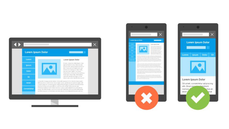
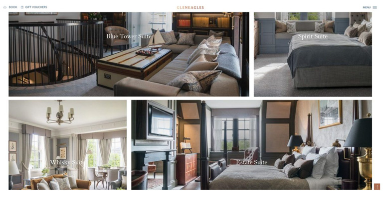
Source: Gleneagles.com

4. Offer Delightful Customer Experience Through The Website

User experience and customer experience are very closely connected and go hand in hand. Your website user experience can heavily influence the overall customer experience of your guests. So, it’s best to provide a delightful customer experience from the very first touchpoint which is your website. Online travel booking websites like Booking.com, Expedia etc. can never provide a personalized guest service, which is an advantage for you as a hotel owner.
Ensure that there are multiple ways for a customer to get in touch with your hotel administration, straight from your website. A landline phone number, skype, contact form for reservation related inquiries and special requests, as well as a live chat are must-haves on your website.
Offer special add-on services, which are not available on any other sales channel. It can be a complimentary welcome drink, a bottle of wine or perhaps a special discount. This will make the user feel the difference when booking with a hotel directly and will ensure repeat purchase directly from the hotel website.

Source:thelincolnhotel.com

5. Add Reviews From A Trusted Source

A study showed that almost 77% of travellers do reference review before booking an accommodation. Social proof is one of the most important factors to influence a buyer’s decision. In order to enhance your website’s credibility and provide social proof for your guests, showcase reviews from a trusted and well-known source like Tripadvisor. While adding a Tripadvisor review widget might not add an aesthetic appeal to your website, it surely is much more convincing than your own website testimonials.

Source: West Side Guest House

Developing a hotel website which is great in terms of both UX and marketing is a daunting task, and it might take more than one go to achieve the feat. But, these tips really come in handy during the design process and smoothens the path towards the ultimate goal. Talk to our UX experts, and learn more on how you can revamp your hotel website.