NYX Ditech

Categories
Blog Technology UI Design UX Design

Reasons Why You Should Hire a Creative Agency like NYX Ditech?

Whatever sector of the industry you are in, no matter how big or small, the likelihood is that you will need to contact a creative agency at some point. Whether you’re seeking to create a brochure or a booklet, need assistance with web design, or are simply searching for some fresh ideas, a creative design agency may assist you in your commercial endeavors.

Reasons Why You Should Hire A Creative Agency

The following are five key reasons why you should consider hiring a creative agency:

  • TIME – Possibly the most critical reason. Numerous hours are squandered due to a lack of action and time spent deliberating and preparing the next best step. Establish a partnership with a creative agency that may assist you in relieving this strain.
  • SKILLS – The worlds of marketing and communication are always evolving. New trends emerge frequently, and staying current with the latest technology may be a full-time job in and of itself. Creative agencies hire professionals with a genuine interest in the business. Utilizing the knowledge and experience of a creative agency may be a significant advantage to a business.
  • COST EFFICIENCY – The cost reductions associated with employing an agency might be a marketer’s dream. You won’t have to worry about recruitment expenses, specialized software, or IT equipment after hiring a creative agency.
  • EFFECTIVE RETURN ON INVESTMENT – Any business must devote adequate time and resources to branding its product or service. If you employ a creative agency, they will go outside the workers’ skill set and identify new opportunities, which will result in the growth of the firm and hence more income.
  • REDUCED TRAINING COSTS – If you demand your existing employees to perform a task exceeding their skill set, they will demand further training, for which you will need to acquire an additional employee. Evaluate the expense of training, paid leave, and other perks; a creative agency will cost you much less than that.

How NYX Ditech can help you achieve your branding goals?

A New Perspective

It’s easy to lose track of the broader picture when you spend every day, all day, around the chores of your business. NYX Ditech may give critical perspective to help steer or enhance your approach, as well as new ideas to assist you in achieving your goals.

Execution by a Professional

NYX Ditech is a group of skilled professionals that can build and implement your brand strategy. We have expertise in creating expressive designs and engaging content that effectively drive brand communication. Our experts are familiar with best branding practices, user experience designs, business collaterals, media profiling, and content marketing, and know how to get the maximum benefit out of brand communication.

Insider Information

While you may be intimately familiar with your brand but, how much do you understand your industry? Who are your adversaries? What are the current market trends? NYX Ditech collaborates with a diverse range of partners and serves customers from a variety of sectors. As a result, we have a unique perspective on how to build your brand authority and get your business to attain a significant presence and definitive value in your niche. 

Networks of Connections & Creators

One of the most typical reasons for seeking outside assistance is that your brand lacks the necessary knowledge, bandwidth, or resources to complete the task at hand. Along with having well-rounded professionals, NYX Ditech has a well-established network of skilled digital artists. Whether you’re searching for a production company to shoot your newest video or a developer to build an online tool, NYX either possesses the necessary talents or expert referrals which can be very useful for the growth of your brand.

Speed

Numerous companies fail to implement their objectives due to the lack of an organized process and adequate infrastructure at their service facility. This is understandable, given various deliverables need unique considerations and dynamic handling, which may be missing with the limited arrangements these agencies have. This is not the case with NYX, as it has adequate resources to deal with different creative requirements and situations of a business. Furthermore, NYX is aware of the frequent obstacles, errors, and traps that might undermine productivity, allowing you to manage them more effectively.

Superiority

An effective content marketing operation requires a high level of quality, consistency, and pace. Numerous brands fail to fulfill at least one, if not all, of these criteria. Again, NYX is a creative agency that can generate high-quality content and great designs that work in the real world.

Also, we are committed to performing a good job because when you win, we win. As a result, we will go above and beyond to find the finest creativity for your business.

Build Your Network

Every business requires networking, and one of the most effective ways to do it is by collaborating with a renowned creative firm like NYX Ditech. This is because NYX has worked with firms in various industries and can connect with them all through comparable marketing efforts.

Building your network will assist to increase your brand’s awareness and trustworthiness. This will give a huge boost in your attempts to build your business at no direct expense.

Conclusion 

Operating a business amidst the growing digital competition is not easy. There are a lot of bottlenecks and gaps that may appear in your way, keeping you from achieving your creative goals and marketing objectives best serving your growth perspective. However, if you take the right route going with reliable support you can get close to your mark of success. NYX Ditech can be the right choice to help you with building a viable business presence and brand voice effectively targeting your audience base. 
Categories
Brand & Identity UX UX Design Web Design

A Basic Introduction To Lean UX

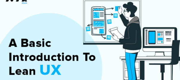
Lean UX has been debated and discussed in a variety of forums. Some have seen it as a condemnation of extensive documentation while others have said it’s a rebranding of techniques they’ve been practising for years. Lean UX is about bringing the true nature of a product to light faster, in a collaborative, cross-functional way that reduces the emphasis on thorough documentation while increasing the focus on building a shared understanding of the actual product experience being designed. 

Lean UX is deeply collaborative and cross-functional because we no longer have the luxury of working in isolation from the rest of the product team. We can’t continue to ask our teams to wait for us to figure it all out. We need daily, continuous engagement with our teams if we are going to be effective. This continuous engagement allows us to strip away heavy deliverables in favor of techniques that allow us to build shared understanding with our teammates.

The Lean UX Cycle

The cycle contains three phases, and they are Thinking, Making, and Checking or Testing.

1. Thinking

Instead of exactly knowing what you would build, you start with something that might work, so, you build a hypothesis and then find the fastest way to validate that hypothesis.

In this phase, your team collaborate with different teams in the organization, this is not interrogative but a collaborative effort to generate more ideas or hypothesis to work on. This creates transparency between teams.

2. Making

After building the hypothesis, now you work on the way to validate it, and the best way to validate is to test it with the users of your product in real-time, but before that, we have to build something. This is where the concept of MVP(minimum viable product) comes into the picture. MVP is the smallest possible thing that we can build to help us to learn whether or not our hypothesis is true. That smallest thing could be wireframes, mockups, or working prototypes. The goal of MVP is to validate the hypothesis before committing a huge amount of resources to them.

3. Checking/Testing

In this phase, we test what we have built (our MVP) with users in real-time, we monitor them while they use our products and provide us with feedback. The goal of this phase to learn, whether a feature/product likely to succeed before you put resources to completely build it.

Key Facts About Lean UX

  • Lean UX is an iterative process.
  • It is a collaborative process.
  • It is a user-centred process.
  • It works on evidence, after each cycle, we pause and reflect.
  • The goal is to make something in the fastest way possible, with minimum waste of resources, that users will use and buy.

Lean UX Is Not Lazy UX

It may seem at first that this is a lazy approach to UX, that the goal is simply to do less work. On the contrary, you’re actually using all of the tools in your UX toolkit. Sketching, presenting, critiquing, researching, testing, prototyping, even wireframing – these all get a solid workout in each cycle of the process. The trick is to use these tools when appropriate and, more importantly, to use them at the depth appropriate for the immediate problem you’re trying to solve for the business. 

Reasons To Use Lean UX

1. Less Waste

Lean UX moves away from deliverables- (including flow diagrams, sitemaps, etc.) and documentation-based processes. Instead, it moves toward a more quality- and experience-centred practice. Why is this so significant? That’s because whatever is not used in developing the final product is considered wasteful and time-consuming.

2. Collaborative And Interdisciplinary

It intends to ‘‘foster more open, collaborative, and iterative processes, and to break through the organizational red tape that can stifle creativity’’. For example, a Lean UX team may consist of a handful number of experts depending on the nature of the project and the size of the organization from different fields/disciplines – such as creative director, designer and developer, allowing team-wide collaborations and feedback throughout the development process (the process also known as waterfall).

Just imagine how much time you can save through constant iterations and reviews! Collaborations in Lean UX is not only limited among the experts. Collaborations with customers are also placed at the heart of the practice, allowing us to have a shared understanding of problems and solutions with customers.

3. User Feedback Is Reflected At An Early Stage 

Who has the final say in the final product? Without any doubt, it’s the customers. Whatever we design or develop, the successes are determined by whether the end-users will click the final version of the call-to-action button. By staying Lean, user feedback is reflected at an early stage of development, leading to the most desired results.

4. Fast And Efficient

Staying Lean highlights the shift of importance to ‘rapid experimentation and measurement’, helping us achieve the end result in a more efficient manner. The underlying assumption of Lean UX also enables the designers and developers to constantly adjust their plans to respond to the changing needs of the marketplace faster.

Wrap Up

This is a very high-level overview of Lean UX and, of course, there’s a lot more to it. However, these basic concepts should enable you to start heading in the right direction when it comes to implementing Lean UX in your Agile environment. In case you want to know more, feel free to discuss this with our team.

Read more about rules every UX designer should know here

Categories
Brand & Identity Design Mobile Apps UX UX Design

How To Effectively Do Website Personalization?

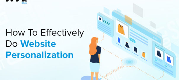
With dozens of businesses reaching out to your target audience every day, you need to make your business stand out from the rest. One of the best ways to get a leg up on the competition by doing website personalization  experience. Personalizing every user interaction and making the site more engaging is critical to the success of any website. Personalization is human, it’s effective, and it’s the direction of the web moving forward. 

What is Website Personalization?

Website personalization is the art of offering an exclusive, one-on-one custom made experience to your online visitors when they land on your site. You customize their experience based on their past purchases, their geography or behavior in a manner that serves multiple business purposes – higher customer satisfaction, longer visit duration, boosted site visits, lower bounce rate, better conversions, and an improved brand reputation.

The better the website personalization experience, the better you can serve your online visitors and help them achieve their goals. This will further lead to better retention rate and better word of mouth for your brand.

Benefits of Website Personalization

  • Optimized landing pages
  • Increased user engagement on the website
  • Better qualified leads
  • Greater brand affirmity

Here are some ways in which designers can start website personalization:

1. Understand Your Target Audience During Website Personalization

The first step in learning how to personalize web content is to understand your target audience. You can’t successfully personalize the experience if you don’t know who wants your products or services. Start by looking at your typical customer(s). Identify and document information like age, gender, location, occupation, income, hobbies, buying habits, etc. this information will help you create a well-rounded profile of your target audience and you can use that information to form buyer personas. Buyer personas are fictional representations of actual customers that you can use to help you target new, similar customers.

In addition to knowing who’s in your target audience, you also want to identify their pain points. What problem do they want to solve, or what frustrates them in their daily life? When you know their pain points, you can show them how your product or service will solve their problems.

2. Display a Custom Message on Your Homepage

Create a custom message on your homepage for your visitors. When users visit your site, you want them to feel unique and valued. A custom message can help personalize the experience for them. A simple personalized message like “Hi [name], check out our latest summer collection” to greet them can do wonders. 

It’s a small gesture of personalization, but it can have a significant impact on your audience. It can make your audience feel welcome immediately, as well as expedite the shopping process by directing them straight to products they’ll love.

3. Create More Intuitive Signup Flows

For many online businesses, the sign-up flow is the bread and butter for the business. If it messes up, all of the traffic that the marketing team drives to the site simply does not matter.

A high conversion rate is what drives long-term business growth. And one of the many goals tasked to UX/UI designers is to reduce friction points during this important customer acquisition moment.

The signup flow is one of the first customer touch points to engage and amaze a user. If the customer walks away from a sign-up excited and itching to use your product, you’ve done a great job at creating a potentially long-time loyal brand advocate. Try including personalized copy and personalized content into each step.

4. Offer Personalized Recommendations

By using data you’re likely already capturing on the backend, you can display demographic (about the users), firmographic (about the company), or behavioral (about the user’s actions on site) data on the front-end to build a more engaging product. If you’re working on designing a project for an e-commerce site, this could be accomplished by suggesting another product based on a visitor’s past actions on site.

5. Create Distinct Call to Actions (CTAs)

CTA buttons are critical for helping your audience take the next step. Many businesses fall short with their CTA buttons because they’re generic and don’t excite leads about their products or services. Seeing a CTA button that says “click here” isn’t exciting for your audience; it doesn’t catch their attention, nor does it tell them what happens if they click. These generic CTAs make the user experience feel lackluster. You need to spice up your CTA buttons to help you provide a better experience for your audience. 

You can improve CTAs by personalizing them. Creating more personalized CTAs can help you increase engagement with your audience and make them more likely to interact with your business.

6. Combine Tailored Content

One quick and easy method to design personalization into a site is to create swappable content modules for visitors based on their behavior or characteristics. All visitors are different, and for that reason you can expect them to want to consume different content media as well as different headlines. If you’re working on a content site, you could shoot the visitor to a relevant new piece of content based on what they just completed reading. The ability to think through what will be most top of mind for a visitor is a perfect way to add an extra bit of engagement and warm the visitor to your brand.

7. Delight High-Value Users

As a designer, you’re tasked with visually capturing your brand. Usually you approach this design challenge by creating a page that captivates all visitors. But what if you wanted to go above and beyond for a certain high-value group. Another way to embrace personalization is to roll it out to a specific subset of your visitors. Optimizely, an A/B testing platform, does a great job of integrating custom experiences for high-value visitors on their homepage.

The overall experience, while more time-intensive than other personalization tactics, can be great if you’re looking to impress a specific, high-value visitor to your site.In today’s highly competitive online market landscape, being personal, timely, and relevant is the key to making your brand stand out as well as prove to customers that you have the right products and services for them. Wanna know more about website personalization? Talk to our experts.

Read more about Pros and Cons of Website Personalization here

Categories
Design Web Design

What Is A Design Audit And How To Conduct It?

The purpose of design is to facilitate interaction. And, this generates the need of Design Audit. This interaction comes in all shapes and sizes. It can range from a purchase on an E-commerce website, a download on a content sharing application or a seamless money transfer via a banking app. Each interaction fulfils some inherent need in a user’s life, and validates the existence of a product or service in today’s digital world.

While there are many intuitive metrics to validate when successful design wins over users, it’s not very easy to figure out where design fails. A Website Audit is a crucial part of the design evaluation and structuring process. Think of it as a product check-up. It’s performed to make sure that the product is expressing itself consistently across all channels.

What is a Design Audit?

A design audit is an enquiry into the user architecture and execution for any website or mobile application to yield actionable business insights. The design audit mechanism can reveal whether the business is achieving the set goal for conversion and if there is a shortfall and by how much. 

Here are some broad areas of auditing:

Web Design and UX

A page structure must be easy to distinguish – headers, titles (H1-H6), footers, content help a user navigate a page. If possible, consider using design breadcrumbs and footer links. Use heat maps to see if your website’s visitors click the footer’s links first. Content density must not repulse a visitor, it should be divided by headings, pictures and white space.

Design leads the visitor to CTA links and buttons. CTAs should be placed within the first half of a user’s screen. The web design must align with the company’s brand. It is also important to check if the website renders well on all devices like desktops, mobiles, tablets, etc.

Lead Generation

The lead generation process follows the design and UX. The design must help to convert visitors into leads. As already stated, a page must have a clear call-to-action (CTA) block. There shoudn’t be more than 3 calls to action. CTAs should be visible and reachable for users. If  website visitors change their mind and leave a particular CTA unfinished you should give them another opportunity to think upon it or doubt their action. You can show them a pop-up offering a free consultation / a knowledge base to get into details / asking a reason for leaving. 

The pop-up is a rather tricky method of communicating with users, but wisely used – it works. Learn what annoys the website’s visitors, when it’s appropriate to show the pop-up, how much time should pass before the pop-up is shown, etc.

Content

The content should always adheres to the overall page goal. If it is a contact page, the content must stick to the ways users can contact you. It’s a very obvious, yet a very common mistake. Content must be logically structured and should not confuse users. The famous “Inverted Pyramid” approach by Jakob Nielsen’s is the best approach to structure the content. Place the most important info first, then proceed with supporting details, and only after that add related information.

One must also adhere to the language basics; no spelling and grammar mistakes, and no unnecessary content. Likewise, you should pay attention to content structure and how it’s divided; in blocks, bullets, white space, and illustrative pictures. Content improvement also facilitates the execution of the mail goal, which is CTAs being clicked or completed.

SEO

A search engine optimization part makes your content visible to a wider audience. Without specific terms, there are many technical operations you can do so that your content is found by more and more people. Some changes, like editing headings and the content, and inserting links can be implemented without the supervision of an expert, but advanced actions require the help of a specialist. 

Set up a correct tracking tool to track what’s going on with your website in terms of traffic, keywords, entry pages, exit pages, etc. Put appropriate title tags, description tags, image tags, and meta tags. Don’t forget to use keywords and their synonyms in the headings and the main text.

Eliminate broken links on your website.Make sure your content doesn’t have references to other sources at the very beginning. This way readers won’t leave your website too soon for Google Analytics or other tools to count it as a bounce and lower a website’s ranking in search. Think about using internal links on your website. Such internal links must help users to continue their journey. If those links are inserted automatically, with the help of a bot, for example, Google can punish you.

Website Maintenance

Website speed and performance is very important to users. You must check if your website load in time? All researchers agree that the optimal load time is from 1.5 to 3 seconds. People don’t wait, and you will lose not only users but also potential customers. Google Search Engine considers website speed in their search rating, so you must take the website  optimization into account.

Check the loading speed of the website and images. Enable the data caching; Drupal has a page caching feature in its core. Review the relevance of the codebase and the PHP version. You should track errors through Google Analytics. Check the functionality of the site as frequently as the website is updated.
A design audit can prove to be a very useful endeavour. Think of it as similar to getting an expert review of your website design to maximise your business conversion and increase user engagement. Want to conduct a website audit or discuss more about it. Talk to our experts.

Read more about UX mistakes for your brand here

Categories
Apple Mobile Apps UI Design UX Design

All You Need To Know About Horizontal Scrolling

Horizontal scrolling has always been considered a controversial web design technique and for a long time and with the advent of devices such as tablets, the swiping movement has enabled a comeback for horizontal scrolling. Could it be that because of the swiping movement, users have become more accustomed to horizontal navigation? 

A few years ago, the users used to remain reluctant to move sideways through content. However, the users have evolved since then and are more receptive to the idea of scrolling in both directions. It is more preferable to scroll through vis-a-vis clicking multiple pages or screens. Scrolling is completely natural and more efficient. We are seeing an increase in designs using non-breaking lists that are scrolled horizontally for more content especially on mobile, where horizontal space is limited.On the other hand, vertical scrolling works as a mainstay of virtually every digital interaction you’ll come across.

Horizontal Scrolling: A Quick Definition

Horizontal scrolling is a page navigation method in which the user scrolls left and right to reveal content from the sides of the window or container. Horizontal scrolling can be achieved by clicking and dragging a horizontal scroll bar, swiping sideways on a desktop trackpad or trackpad mouse, pressing left and right arrow keys, or swiping sideways with one’s finger on a touchscreen.

When To Use Horizontal Scrolling?

1. Displaying several images (e.g. for a photography site or a design portfolio)

2. Displaying information in a large visual area that is not easy to see at a glance (e.g. a map)

3. Displaying discreet sections or slides of information on applications

4. Displaying a large catalogue of products or items so that different product categories can be easily shown

Best Practices

Don’t Use Horizontal Scrolling On Full Webpages

Horizontal scroll should never replace vertical scrolling on a full web page. Violating this convention will alienate the majority of users. If you want different sections of your main page to transition horizontally, consider triggering a horizontal animation with a vertical scroll

Horizontal Scrollbars Should Be Designed Like Vertical Scrollbars

On desktop, horizontal scroll bars should be available within their containers. Horizontal scroll bars should look like and function like their vertical counterparts for design consistency. Avoid custom styling in your scroll bars, since they serve to assist and should not steal focus

There are a couple of exceptions to placing visible scrollbars. If there are buttons on both sides of the container which allow users to scroll, users can click these instead of dragging a scrollbar. Also, don’t show a scrollbar if the contents of a container loop back to the beginning at the end of the content stream.

Other Interaction Methods Must Be Offered

Even if horizontal scrolling serves your page, we recommend giving desktop users another way to reveal hidden content. An arrow button can have the same function. Mobile users will experience fewer issues swiping sideways, so buttons aren’t necessary on mobile sites. Still, the primary scrolling orientation should stay vertical on touchscreen devices.

Horizontal Scroll Option Must Be Visually Apparent

Be sure to minimize the chance of visitors missing your content by signaling that horizontal scrolling is possible. In addition to button indicators like arrows, you might set your scrolling containers such that a horizontal scrollbar appears on mouseover. Or, try showing a sliver of hidden content in your scrollable container.

Horizontal Scrolling Advantages

So, how will incorporating a horizontal scroll on your website help you?

  • As a design, it is almost 100% consistent across all devices
  • It saves a lot of vertical screen space as it is designed to allow room for secondary information, that doesn’t hog page area
  • It allows users to see options within a category by swiping to the side or scrolling down to see different categories.

Horizontal Scrolling Disadvantages

  • To use horizontal scrolling on desktops, users have to rely on scrollbars as compared to scroll arrows on laptops or handheld devices. This burdens the user by requiring constant attention and greater physical effort to maintain the dragging
  • Due to a subconscious dependency on a vertical scroll, users may ignore content accessible through horizontal scrolling as they don’t expect content there
  • Even if people do notice cues for horizontal scrolling, they may not want to risk loading content that is hidden and they have no control over

Conclusion

There is a lot of debate over the internet about the usage of the bidirectional scroll and its impact on UX. But it helps a lot in compartmentalizing the content and saves a lot of vertical space on an app if used wisely. If your app and website are struggling with responsive design issues, feel free to contact our experts.

Read more about long scrolling implementation here.

Categories
Blog Technology Web Design

7 Ways to Optimize Your Website for Voice Search

Technology is ever-changing. Today, we can conduct online searches simply by speaking into Alexa or Siri. Some call it futuristic, others call it convenient. No matter how you look at it, voice search is something you must consider in your marketing campaign. Voice search is what the future holds. It is becoming more popular and websites could be doing more to optimize for queries from voice users. 

With voice search increasing in popularity, voice SEO is a must if you want to rank at the top of search results and bring high-quality traffic and leads to your website. Without an SEO campaign, it’s unlikely that your site will appear in voice searches, so you could lose out on potential customers. content that ranks at the top of search results is likely to also appear as a voice search answer. In fact, nearly 75% of the results you receive from a voice searches ranks in the top three results for that specific query. Though most SEO campaigns employ the same strategies, you have to consider the below-mentioned points to optimise your website for voice search.

1. Think Conversationally

When people conduct voice searches, they phrase questions differently. For example, if someone is searching for a place to shop for kids’ clothing, they might type a query like “kids clothing Harrisburg,” whereas if they’re using a voice search, they may state the same question like “where can I find kids clothing in Harrisburg?”

When you look at the two questions, you can see that the voice search version is longer, posed as a question, and is more conversational than the version that’s typed into Google. That means when you’re optimizing your content for search, you have to think about how your audience would pose a question about your products and services, rather than targeting short, general keywords.

2. Think Local

Mobile phones are a staple in our everyday routine, especially when we’re on the go — we constantly use our phones to look for locations around us at any given time. That being said, it’s not hard to believe that about 50% of local mobile searches lead to a store visit within one day’s time.

That means that when you’re optimizing your website for voice search, you should pay special attention to localized long-tail keywords. Include keywords that are more like phrases and be sure to include your location. This allows your website to rank for specific location queries while voice searchers are close to your location. Not only does it boost traffic to your website, but it also increases the likelihood that customers will visit your physical store location.

3. Use Long-Tail Keywords For Voice Search

Brands must have actionable keywords and put them in the website’s schema markup, also known as code. This will allow the website to provide search engines with more information, which will be important for specific searches people make. when users voice a query, the answer they receive is often not the first result on Google. Long-tail keywords can help websites be the answer that users hear when making a search. Long-tail keywords are longer, more specific and more targeted.

4. Optimize Voice Search For Featured Snippets

Featured snippets, or position zero results, have risen to popularity as more and more search results feature them. A featured snippet is a result that appears in an answer box at the top of search results and displays an immediate answer to a question. In terms of voice search and featured snippets, nearly 41% of all voice search answers come from a featured snippet result.

Though position zero is a great place to rank for any kind of query, this fact makes it even more important to go after that position zero ranking in search. Not only will you see a boost in traffic from your organic result, but it’s more likely that your result will serve as a voice search result as well.

5. Optimize Your Content For Voice Search

Content needs to be relational and usable for voice searchers. The key is not to write overstuffed content; overstuffed content is trying to fit too many keywords into the content. Everyone loves content that is easy to read. If you use overstuffed, complicated, over-the-top jargon, chances are you won’t be featured in voice search results.

When you write at an understandable level, you probably also use shorter sentences and relay information in a more concise manner — ensuring that you only include what is absolutely necessary. Not only should you write at an easy reading level, but to break up your content, use multimedia like images, videos, and infographics.

6. Update Your Google My Business Listing

If you don’t yet have an account on Google My Business (GMB), be sure to get one right away. Having visibility on GMB is a huge benefit, and it’s even more beneficial if you fill it out as comprehensively as you can.

You want to provide as much information as possible, like your location, hours of operation, and services. This information provides even more value to those making local searches, and as we learned, there are a large number of local searches made with this search.

7. Improve The Loading Time Of Web Pages

Lastly, the loading speed of your web page plays a crucial role in the search results ranking. This is true for both text search and voice search. Since there is a large amount of information on the web, the quicker your website loads, the greater chance it has of ranking higher in search results. To ensure that you maintain a high ranking in search results, you need to regularly monitor the loading time of each of your web pages.
Voice searches have become a major trend in today’s fast-paced world –  the quicker you add it to your website, the better. However, to reap the full benefits of voice search, you must make sure that you have a voice search-optimized website. Talk to our experts to know more.

Read more about combining photos and illustrations in design here.

Categories
Brand & Identity UI Design Web Design

5 Pro Tips For Combining Photos and Illustrations In One Design

There’s a trend brewing in website design that combines real photos and illustrations and art elements in exciting ways. It’s quirky, unique, and beautiful. Basically, a combination of visual elements that don’t seem like going together at first, but when done well, can produce a stunning aesthetic that is highly appealing and delightful. This article will provide you with tips and creative ways to develop your own design with photos and illustrations.

1. Apply Photos And Illustrations as UI Accents

You might include illustrated elements into the design all time and don’t even honestly think about it. Many user interface elements are frequently illustrated in some way. They aren’t inevitably in that hand-drawn style but have a less touchable and more “web button” look. Go one step ahead if you want to try a hand-drawn effect, or consider using a sketch as an emphasis mark. 

You can use a mix of illustrations and a hero-style video to draw users into the design; it adds a nice element of playfulness. It makes the site feel less like a sales pitch to work with the agency, and more like you would have fun together.

2. Always Illustrate First

If an illustration is your first impulse when it comes to a project, draw that outline first. After sketching out the illustrated parts you can see where the design goes before you add video or photo elements. The elaborate illustrations can be merged with a hero image; couple that with the fantastic images, and visitors would want to register to see what it is all about.

There’s another way when thinking about starting with an illustration. You can draw an astounding background image for the design. This is a fun way to get precisely what you want in the background without cleaning off the pre-made imagery.

One exciting way is to use a combo of illustrated background panels, plain white backgrounds, and black and white photo backgrounds.

3. Use Photos And Illustrations Like Typography

When you don’t have a lot of excellent imagery to play with, combine photos and illustrations in the same manner you might play with typography. Although the concept sounds unusual, it’s worth a shot. A neat illustration can emphasise a video or photo and highlight what you want users to understand.

4. Consider Illustrated Animations

Whether illustrations are hand-drawn or computer-drawn, they offer an excellent opportunity to include simple animation. From navigational tools to fun, user-engaging divots, an animated illustration can be informational, surprising and fun. However, don’t go overboard with animations. Keep them simple and practical. Every animation should have a goal for the user; it can be a link, a directional cue or a surprise that keeps them engaged.

You may not expect this approach from a serious business, like a financial planning group, investment companies, etc. But some serious businesses do opt for this style, and it has proven to be very effective. They use a blend of illustrated animation and photography elegantly. The illustrated parts of the images can make the serious stuff look a little less intimidating and help users through click paths. The illustrations also fill in color where the website falls short on other imagery. The result is a closely-knit design that is fun, engaging and easy to use.

5. Stick to Storytelling

When it comes to combining real and illustrated images, the most suitable combinations effectively tell a story. The visual must match the mood of the content and feel like part of the brand’s identity. Using this technique can work for one-off applications, but is often blended with a more complete branding strategy.

A Quick Comparison

Photos and Illustrations

Look at Cone Flower Creamery. The logo is illustrated. The website design uses a mostly illustrated story to establish the right mood and inspire users to learn about the brand. And, when you want to see more, there’s a photo to fill in the blanks. The design is effortless, straightforward, and focuses on the story itself, not the techniques used to create it.

On the other hand, we have Kuoz, a portfolio site, with a mix of images and illustrations. Similarly, the combination helps tell a story of who and what Kuoz is while showcasing projects. Look closely at the groupings for insight into why this design works without feeling overwhelming or cluttered. Images and illustrations are linked by similar color schemes so that every placement feels intentional and harmonious.

Conclusion

Mixing photos and illustrations is a growing trend. While the technique can look amazing, it isn’t a safe bet every time. Also, you may find it difficult to sell to a client. The question is, are you brave enough to take on this design trend? Talk to our design experts for more details.

To read more about how to use simple typography and a straightforward images in web design, Click Here

Categories
Brand & Identity Design UI Design Web Design

Psychology Of Shapes In Web Design

Squares, spheres, triangles, circles, and more. We see different shapes everywhere, every day. There’s way more to shapes than meets the eye when it comes to web design. Shapes In Web Design are powerful design elements that enable a brand to build its visual identity. Shapes also aid designers in organizing content in a visually appealing manner and in building users’ interest. Through shapes, designers can ensure the eyes are guided to the essential sections of a website. Moreover, shapes are an effective tool to communicate a brand’s vision, goals, identity and drive conversions. This article will explore various shapes, meanings, and feelings behind different shapes and how a web design company can use them to improve user engagement and decrease bounce rate.

Shapes In Web Design: Circles and ovals

Circles and ovals can be incorporated in any part of a web page – in the logo, call to action buttons, icons, thumbnails, etc. Circles represent infinity, movement, and harmony since they’re smooth and have no sharp angles. Circles make a page feel carefree and more youthful. 

Shapes In Web Design
PC: Helen and hard

Shapes In Web Design: Squares, Rectangles, and Grids

These are the most widely used shapes in any web design, primarily as a base or frame to simplify complex web designs. They are mainly used to organize information and elements within a page. They evoke a sense of balance, security, and reliability and are commonly used for navigation menus and call to action buttons.

Shapes In Web Design
PC: Anthony John Group

Polygons (With More Than Four Sides)

Polygons are plane figures with at least three straight sides and angles, and typically five or more. These can be simple, regular, or irregular. Pentagons, hexagons, and octagons are the most commonly used polygons with more than four sides as they are the most versatile for creating graphics. These intricate geometric patterns can be used to keep the eyes busy and quickly capture the viewer’s attention.

Shapes In Web Design
PC: CWorks

Shapes In Web Design: Triangles and Zigzags

Triangles are powerful geometric shapes that signify motion and direction, and direct the viewer to a specific area of the page. They can convey opposing meanings, depending on their position. If a triangle is pointing up, it communicates power, stability, and energy. However, when it points down, it becomes unstable and can convey tension or conflict.

Shapes In Web Design
PC: Jazz FM Romania

Diamonds or Rhombuses

Although seldomly used, these shapes give a contemporary look to web pages. Diamonds and rhombuses can be placed separately, or together, to make the overall design look and feel more vibrant and active.

Shapes In Web Design
PC: CTRLZAK

Diagonals and Slanted Shapes

These shapes create movement and direction. They guide the viewers’ eyes from one point of the page to another. As a web designer, you can play with diagonals to create a sense of dynamism and encourage the user to explore the site.

Diagonals And Slanted Shapes
PC: Badminton Center

Shapes In Web Design: Curves, Swooshes and Waves

Curves add a sense of fluidity to the website design, making the viewer feel calm and relaxed. As curves are smooth and flowy, they entice viewers to explore the page without pushing too much on the eyes. Web designers can use curves to make the interface look smart, stylish, and contemporary.

Shapes In Web Design
PC: Futuramo

Spirals and Loops

These can be tricky to use. While they can embody perfection, composition and beauty, they can also evoke panic and mystery. Spirals and loops express growth, evolution and creativity. They provide a lot of motion to the website design and intrigue viewers to the site. 

Spirals And Loops
PC: Goal

Shapes In Web Design: Arrows

Arrows are mostly used to convey directions effectively. They assist the viewer in following a path of information from one part of your graphic to other. There are different styles and kinds of arrows. Bold, solid ones convey more strength, wavy arrows can give your design a playful touch, while concentric arrows can be used to showcase cycles and processes.

Arrows
PC: KNEIP

Emojis

In addition to these shapes, new shapes and symbols are also on a rise that say more with less, thereby enhancing the user experience. These new elements add personality to a brand and develop unique web designs that allow users to express themselves.

Emojis are text-sized pictures that convey a wide range of concepts, feelings and emotions. You can use them to make your website designs a bit more fun and frolic. These sort of designs very quickly appeal to users, especially the youth who prefer quick communication. Playful, colorful and straightforward emojis evoke a less formal tone. However, for emojis to really work, it is crucial to put them in the right context. Don’t overuse them, as it can put off your audience.

Emojis
PC: Colorlib

Shapes can help you create eye-catching and responsive websites, which create repeat users and enhance user experience. Understanding the moods, feelings and concepts behind shapes will surely help you pick the best shapes for your web design. And, if you still need some help, our team is happy to help.

You might be interested in understanding card design. Read here to know more about Card Design and is Concepts.

Categories
Brand & Identity Design UI Design Web Design

What Should You Include In Your Next Web Design Questionnaire?

What is the first step to planning a project? It is to understand all the client’s requirements in one go to progress on the right path. Basically, creating a web design questionnaire which helps you get a clear understanding of what the client wants. This questionnaire even helps the client understand what they are looking for. Some practical matters need to be considered at the start of any web design project to facilitate a smooth design process. It is essential to ensure that the final website deliverables fit entirely within the context of your client’s vision, mission statement, and tagline

Putting together a list of questions to ask the client when designing a website ensures everyone involved in a project is on the same page; everyone shares the same vision for the final deliverables. It is an effective tool for setting and managing expectations and laying the foundation of a web design proposal. This article will tell you what questions to ask your client before starting your website design project.

1. Are you looking to revamp your website or build a completely new website?

At the very start, you need to determine whether the project is building a new website from scratch or redesigning the existing one. This will help in estimating how much work is needed. Designing a whole new website requires a completely fresh approach and will be on the higher side in terms of expenses. While improvements to an existing website may require only minor updates. The existing website can offer a wealth of material based on the client’s likes or dislikes; it will also cost far low than creating a new site.

2. How can you best describe your business in a few lines?

Apparent businesses may not require an explanation, but others may. So, it’s always better to get first-hand info about what the business is all about. You may gather details like their motivation for starting their company, their overall vision, mission statement, beliefs and values.

The questions can assist you in gaining insight into what matters, not just to the client but also to their audience. This info will also come in handy if a client wants to portray their inception story on their website. The kind of business your client runs may influence parts of the project’s design and what content needs to be prominently displayed. Let’s say your client is a law firm; you’ll want to create a website that prominently features their work experience, famous case studies, their team of lawyers, etc. 

3. Who is your target audience?

It’s a common goal of any website to be relevant to its audience, which means it has to be targeted to them. Besides basic customer demographics like age, gender, and location, details such as their job titles, industries, company sizes, etc. are also important. 

It’s good to ask if your client’s ideal customer is knowledgeable of the product or solution their brand offers, or there’s a need to educate them. This will determine the user flow and the types of deliverables that may be involved – such as data visualisations, help guides, etc.

4. What services do you offer?

Next, you need to understand your client’s products and services, and their business model. The aim is to gain insight into what kind of website would most suit their brand and their products and services? And, it is not just knowing about the stuff they sell. You must thoroughly understand the client’s business and how it works. 

Your client may maintain an online subscription magazine, or a collated job board, where users require a registration form. It’s good to identify these feature requirements during the early stages, as they can help you learn how realistic the timeline or planned budget is?

5. How are your services different from others?

A mojority of the clients will prefer that you design a unique site that differentiates them from their rivals. One way to do this is by understanding their USPs or competitive advantages. These must be included as a core part of their website. It can be anything – something as simple as excellent response time to customer inquiries or fast, free product deliveries, having unique return policies, offering the cheapest rates around, and more. Understanding your client’s competitive advantage can help you incorporate elements that ensure their target audience gets the best possible impressions of the brand.

6. What features does your website need?

The client’s target audience and industry and their goals will essentially decide what features they need on the website. They may want to increase their site’s visibility in search engines, encourage engagement, boost sales, or amplify newsletter signups. One of the web design questionnaire goals is to get you to the heart of your client’s pain points to design an effective solution for them.

Based on your client’s business, the response can be as fundamental as a contact form that offers a place for users to fill in their phone numbers and basic details. These details can give their target audience the impression that they’re readily available. Or, they may need product pages with clear descriptions, a smooth checkout process, payment integrations in case they are an e-commerce portal. Your goal is to understand what your client most want to see on their site and their audience needs.

7. Would you like to avail the support and maintenance services?

You may understand the time it can takes to stay on top of website maintenance and updates. But, your client may not know. Therefore, your website design questionnaire is an excellent place to determine whether the client might be expecting you to handle these post-launch services. 

Standard support and maintenance tasks can include security tracking and backups, as well as domain name and hosting renewals . You can consider charging a monthly or annual fee to handle extra tasks like new additions or updates to features or generally keeping the website up and running.

8. Do you have any existing style guides and guidelines?

It is crucial to know if your client has existing style guides or other types of branding guidelines. This helps in keeping your design consistent, as well as reducing revisions to the final product. You may need to further discuss if you believe that any style rules do not fit in with their vision of the site. Even if there is no formal documents, you can check if they have online or printed materials such as banners or business cards; draw inspiration from them.

9. What is your ideal launch date for the website?

How much you charge the client partly depends on the timeline for completing the project. Especially if your team need to put in extra efforts to have everything ready on time. Depending on how tight the timeline is, certain features will be prioritized over others. A timeline enables you to zero-down on a launch date and helps you track if your team is on track to complete the project on time. You’ll want to consider carefully whether you can commit to that deadline. This will keep you from having to pull out halfway down the road. The more specifics you have about the project’s scope, the better positioned you’ll be to offer a realistic timeline to the client.

10. Finally, what is your budget?

It’s finally the time to find out your client’s budget. To a large extent, this will determine how much can be done on their site. The client’s budget will influence the tools or features used or included in the final product. 

If their budget is low, it makes the most sense to go for a website builder. While with higherbudgets, you can even opt for building custom solutions. The plugin functionality for a Content Management System (CMS) such as WordPress can also be extended in this case. Their budget quota will also help you decide whether or not the client is suitable for you. If they simply can’t afford your rates, or do not think you are worthy of what you’re charging, they may not be a good fit.
Now that you know what to include in a web design questionnaire and how it can help you zero down the most important details needed to understand your client’s vision of their project thoroughly, you can start compiling your list. For any web design and development requirements, contact our team.

Read more about mistakes to avoid while designing responsive websites here.

Categories
Design UI Design UX Design

Zero UI – The Screenless Future For UI/UX

We have taken in a ton about easy to understand, user-friendly UI/UX. However, do we truly know a standard format that guarantees the success of a  mobile application design? From corporates to SMEs, everybody goes through various hit and trial measures. During this activity, a couple of applications win the heart of clients, and the rest never see the daylight. Designing a delightful UI/UX is a pain for even the most talented and skilled designers, as it’s very hard to meet constantly changing and profoundly unique requests of the millennials. As per nature’s standard, “Necessity is the mother of invention”. This is the reason for the development of the most recent UI/UX pattern called “Zero UI”.

Concept of Zero UI

Zero UI is another worldview and a part of UI design that carries a transition to Graphical User Interface by changing the manner in which users communicate and behave with devices. Mobile applications will be obsolete in a few years because of the growing use of ground-breaking innovations like the Internet of Things (IoT), an idea of associated things. IoT zeros in more on devices than applications. In this way, the tech business will begin launching devices as much of the time as we are launching a mobile application right now. This will get a huge change in the manner in which users communicate with online content. 

Zero UI communications will be more natural in contrast to screen-based as the industry is focusing more on creating potent gadgets that identify and respond as per the human voice, gesture, and context. Zero UI is a design thinking approach that accepts no or moderate UI for the progressive business application and product. 

The design and development of Zero UI are very perplexing, as it doesn’t contain visual presentation. It requires a combination of wearables, data analytics, sensors, connected everything, distributed PCs, etc. Every one of these components will be processed through logically mindful, anticipative and adaptive systems to convey the specific result that users are searching for.

The main piece of this idea is, it tends to be utilized for savvy urban cities, homes, and even ecosystem alongside home gadgets. Thus, this technology makes an enormous impact on the whole society.

Types of Interactions in Zero UI

1. Voice Recognition and Control

It’s a process in which software or gadget identifies human voice and guidance, and takes a specific action based on it. When a user poses a question or gives an instruction to the software, the tool perceives user’s question and responds to it relatively. To give an appropriate response, the system must be sufficiently smart to comprehend user’s words, phrases, and syllables. 

Designing a conversation UI needs careful user research to analyse how users construct their statements or commands. A significant challenge of voice recognition and control system is to adjust to provincial slang and dialect. The Zero UI-based system can perceive the expression and phrasing of users by understanding their intents, needs and motivations. Siri and Amazon Echo are the best examples of voice recognition.

2. Ambient

Ambient devices create a link between the physical and digital space. It works on the principle of glanceability, where there is no need to open applications and notifications. Ambient device-based interactions are connected and offer a browserless experience. Here, the devices permit users to access only needed information and details. Indeed, the existence of these devices is not so long, as they are not able to adapt to changing information needs of users and updated technologies. Chumby and Nabaztag Rabbit are the best examples of ambient interaction.

3. Haptic Feedback

Haptic Feedback aids users with vibration-based feedback. It gained popularity with the Apple Watch; users feel the vibration on their hand when a message comes in, or a notification pops up. Haptic feedback is an important part of wearable products like smartwatches and fitness trackers, since they enable users with notifications.

Sooner rather than later, it will be available with smart clothing. That said, one must avoid the overuse of haptic in order to enhance the feedback value for users. Additionally, ultrasounds and ultra-haptics will improve the sense of touch to virtual reality and Kinect style gaming.

4. Context Awareness

Contextually aware applications and gadgets ease users with more simplified digital and physical experience by predicting their needs. Such devices lessen the overall needs to interact with the settings of an app or device to provide users with what they are looking for. Popular examples of context-awareness devices are Nest Thermostat and Apple AirPods. By installing sensors into a device or fetching location data, we can design a cutting-edge contextual experience that offers more implicit interaction rather than explicit.

These are one of the most advanced types of interactions; many more are getting developed as the concept of Zero UI is still in its early days. Once the trend is adopted and easy to implement, we will have other ultra-modern devices and products which will smoothen the way users interact with apps without requiring them to touch the mobile screen.

5. Gesture-Based User Interface

It is perhaps the most natural ways of interaction. This concept was first adopted by the gaming world. Microsoft Kinect, Think Wii, and PlayStation Move are the best examples of gesture-based user interface. It permits users to assimilate more property of motions and physical space than just performing button-based commands.

 ‘Project Soli’ is a gesture control product launched by Google. It is a sensing innovation that detects touchless gesture interaction using a little radar. Gesture-based devices allow to perform the tasks and access the information without touching the screen directly.

To Conclude

Zero UI is the super-current version of artificial intelligence. Before long, Google Assistant, Alexa and Siri will turn into recollections of the valuable past of the tech world. The arrival of Zero UI has set to build mind-blowing devices or products like Google Home, Amazon Echo and Amazon Dot that enable users to experience more human-like interactions. Very soon, many breakthrough devices with outstanding capabilities of speech science, extending voice tech, ultrasound, multi-tasking, etc. will be launched. Zero UI helps in boosting the concept of a smart home at lightning speed by advancing the way you manage various home appliances and activities.

Talk To Us to know more

Planning to hire a web designer? Here are some tips before you make the decisions.