NYX Ditech

Categories
Apple Mobile Apps UI Design UX Design

All You Need To Know About Horizontal Scrolling

Horizontal scrolling has always been considered a controversial web design technique and for a long time and with the advent of devices such as tablets, the swiping movement has enabled a comeback for horizontal scrolling. Could it be that because of the swiping movement, users have become more accustomed to horizontal navigation? 

A few years ago, the users used to remain reluctant to move sideways through content. However, the users have evolved since then and are more receptive to the idea of scrolling in both directions. It is more preferable to scroll through vis-a-vis clicking multiple pages or screens. Scrolling is completely natural and more efficient. We are seeing an increase in designs using non-breaking lists that are scrolled horizontally for more content especially on mobile, where horizontal space is limited.On the other hand, vertical scrolling works as a mainstay of virtually every digital interaction you’ll come across.

Horizontal Scrolling: A Quick Definition

Horizontal scrolling is a page navigation method in which the user scrolls left and right to reveal content from the sides of the window or container. Horizontal scrolling can be achieved by clicking and dragging a horizontal scroll bar, swiping sideways on a desktop trackpad or trackpad mouse, pressing left and right arrow keys, or swiping sideways with one’s finger on a touchscreen.

When To Use Horizontal Scrolling?

1. Displaying several images (e.g. for a photography site or a design portfolio)

2. Displaying information in a large visual area that is not easy to see at a glance (e.g. a map)

3. Displaying discreet sections or slides of information on applications

4. Displaying a large catalogue of products or items so that different product categories can be easily shown

Best Practices

Don’t Use Horizontal Scrolling On Full Webpages

Horizontal scroll should never replace vertical scrolling on a full web page. Violating this convention will alienate the majority of users. If you want different sections of your main page to transition horizontally, consider triggering a horizontal animation with a vertical scroll

Horizontal Scrollbars Should Be Designed Like Vertical Scrollbars

On desktop, horizontal scroll bars should be available within their containers. Horizontal scroll bars should look like and function like their vertical counterparts for design consistency. Avoid custom styling in your scroll bars, since they serve to assist and should not steal focus

There are a couple of exceptions to placing visible scrollbars. If there are buttons on both sides of the container which allow users to scroll, users can click these instead of dragging a scrollbar. Also, don’t show a scrollbar if the contents of a container loop back to the beginning at the end of the content stream.

Other Interaction Methods Must Be Offered

Even if horizontal scrolling serves your page, we recommend giving desktop users another way to reveal hidden content. An arrow button can have the same function. Mobile users will experience fewer issues swiping sideways, so buttons aren’t necessary on mobile sites. Still, the primary scrolling orientation should stay vertical on touchscreen devices.

Horizontal Scroll Option Must Be Visually Apparent

Be sure to minimize the chance of visitors missing your content by signaling that horizontal scrolling is possible. In addition to button indicators like arrows, you might set your scrolling containers such that a horizontal scrollbar appears on mouseover. Or, try showing a sliver of hidden content in your scrollable container.

Horizontal Scrolling Advantages

So, how will incorporating a horizontal scroll on your website help you?

  • As a design, it is almost 100% consistent across all devices
  • It saves a lot of vertical screen space as it is designed to allow room for secondary information, that doesn’t hog page area
  • It allows users to see options within a category by swiping to the side or scrolling down to see different categories.

Horizontal Scrolling Disadvantages

  • To use horizontal scrolling on desktops, users have to rely on scrollbars as compared to scroll arrows on laptops or handheld devices. This burdens the user by requiring constant attention and greater physical effort to maintain the dragging
  • Due to a subconscious dependency on a vertical scroll, users may ignore content accessible through horizontal scrolling as they don’t expect content there
  • Even if people do notice cues for horizontal scrolling, they may not want to risk loading content that is hidden and they have no control over

Conclusion

There is a lot of debate over the internet about the usage of the bidirectional scroll and its impact on UX. But it helps a lot in compartmentalizing the content and saves a lot of vertical space on an app if used wisely. If your app and website are struggling with responsive design issues, feel free to contact our experts.

Read more about long scrolling implementation here.

Categories
Apple Blog

The New iPhone SE 2020 Review: High-performance packed In An Affordable Smartphone

Apple Inc. started back in 1976, in a garage when three visionaries started their journey towards a dream. What began as a personal computer venture, has evolved over the last four decades and the firm now produces everything from laptops, to phones and portable media players. Apple entered the smartphone market in 2007 with the iPhone, and the rest is history. Apple’s most recent launch was the 2020 version of the iPhone SE, and it was very well received by the techno-heads.

What most attracts smartphone lovers about the latest iPhone model is its lower-than-standard price; it starts at $399. The iPhone SE was first launched in 2016 and flaunted a 4-inch display screen. The 2020 model has a 4.7-inch, which might not be an idle size for operating the phone single-handedly. That said, giant screens are a new norm in today’s world.

So what are the hits and misses of the iPhone SE 2020? What’s there to like and dislike? Does it really prove to be a good bargain? Let’s check it out

Pros

  • A highly competitive price; less than half the cost of top-of-the-line iOS and Android flagships
  • Super-fast performance
  • An effective, secure, and robust mobile operating system 
  • The inclusion of Apple’s A13 chip that ensures support to new apps and updates for a long time

Cons

  • Battery life below-par than other iPhones
  • A dated design
  • No headphone adapter included in the box
  • Ordinary low-light camera performance

Specifications

As we mentioned earlier, the iPhone SE comes with a 4.7-inch IPS LCD screen with a resolution of 1334×750 pixels at 326ppi. The display is well-calibrated and has an impressive 1400:1 contrast ratio, with 625 maximum nits of brightness.

iPhone SE Specification
Source: Apple.com

The phone is powered by the A13 system-on-a-chip, which includes a CPU, GPU, machine learning processor, image signal processor, and more. The A13 is arguably the fastest mobile processor in the market, and at this price, it’s a real bargain. The iPhone SE supports the new Wi-Fi 6 wireless standard, and Bluetooth 5.0.

As far as the photography is concerned, you get a 12-megapixel, ƒ/1.8 aperture camera with a wide-angle lens at the rear that supports Apple’s machine-learning-driven computational photography features. The rear camera can shoot 4K video at up to 60 frames per second. The front camera offers 7-megapixel and a ƒ/2.2 aperture, and it can take 1080p videos at 30 frames per second.

Accessories in the box include a charging brick, a lightning USB charging cable, and EarPods wired earbuds. There’s no 3.5mm headphone jack. Though the adapter only costs $9 when purchased separately, we feel Apple should have included it, considering the target consumers buying the iPhone at this price point. 

The iPhone SE’s battery can last up to 13 hours for local video playback, eight for streaming video, and 40 for audio playback, as per company claims. These figures are way less than the iPhone 11 performance, but we can’t expect a lot from a smaller phone, with less space, packing a big battery.

The latest iPhone SE is available in three storage configurations – 64GB, 128GB, and 256GB, priced at $399, $449, and $549 respectively. 

iPhone SE 2020 Design

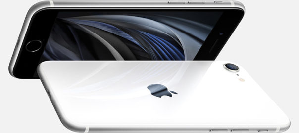
By first looks, the iPhone SE 2020 looks reminiscent of the iPhone 8. It has the exact same dimensions at 5.45×2.65×0.29 inches. All the externally visible components are in the same places, from the camera to the home button. The phone has a home button, making it the only iPhone in the lineup that doesn’t use Face ID for authentication. 

There’s not a lot to say about the design since it is the same basic design we’ve been reviewing for years. It looks dated, and wouldn’t be turning heads around. Although it is one of the most tested and accepted smartphone designs ever, some users might get disappointed by the fact that Apple hasn’t brought back the 4-inch smartphone like the original SE. There are three colors to choose from – black, white, and a special red edition.

iPhone SE  Design
Source: Apple.com

Camera

Preliminary reports suggest that camera hardware remains the same as the iPhone 8. That said, it is paired with the A13 chip, which claims to offer new and improved image processing, so it may take slightly better photos under some circumstances. While Apple’s current flagships offer additional lenses (telephoto and ultra-wide angle), the SE provides neither of these. The iPhone SE camera is just fine, but it’s one of the main things you’re compromising on when you skip out on paying significantly more for an iPhone 11 Pro or any other high-end Android phone.

Camera of iPhone SE 2020
Source: Apple.com

Performance

The iPhone SE performs at par with the iPhone 11 Pro. It outperforms every prior iPhone, and every Android phone, including recent releases with vastly higher price tags. This phone might be small, and it might be relatively cheap, but it is exceedingly powerful. The level of performance for this price is overwhelming. 

On the other hand, the iPhone SE can’t compete with the latest iPhones and Android phones in terms of battery life. Apple says the iPhone SE can handle up to 13 hours of local video playback, that’s quite less as compared to 18 hours for the iPhone 11. If you care the most about battery life in a smartphone, this is not the phone for you. But if you’re looking for an excellent price-to-performance ratio, the SE is the best pick out there.

iPhone SE 2020 Performance
Source: Apple.com

Software

The iPhone SE currently runs iOS 13, the latest version of Apple’s mobile operating system. IOS is the primary reason people buy iPhones. It’s relatively stable and straightforward to use, with one of the best software ecosystems that have ever existed on any platform. iOS differentiates itself from the competing Android platform through a promise of software-hardware integration and an added focus on personal privacy. We aren’t saying that this operating system is perfect, but it’s more than good enough for almost anyone.

Read about 7 most common screens of a Mobile App here

iPhone SE 2020 Verdict

If you prioritize a large screen for consuming rich content on your phone regularly and prefer taking high-quality photos with your phone, especially in low light, then go for the more expensive iPhones. But if you just want a reliable, super-fast phone with excellent software support at a reasonable price, go for the iPhone SE. Apart from a few shortcomings in terms of the camera and battery life, the iPhone SE packs in all the most important things about its flagships. Only the luxuries or good-to-have features like OLED, Face ID, and secondary cameras are excluded, which makes it affordable.

Contact Us today for iOS App Design, Re-Design and Development

Categories
Apple Brand & Identity Design Mobile Apps

Mobile UI Design: 7 Most Common Types of Screens

There are over 2.7 billion smartphone users and 1.35 billion tablet users across the world. According to a study, on average, Americans check their phone every 12 minutes, and 90% of mobile time is spent on apps across the globe. Also, more than 6000 mobile apps are released every day. These figures are staggering and are sufficient enough to highlight the popularity of mobiles and their apps. The first thing a user notices while interacting with your app is its interface. So, it is crucial to have a pleasing mobile UI design to ensure that your user sticks around and enjoys browsing the app.

To build a useful mobile UI design, designers need to investigate its characteristics and learn their constituents and functionality thoroughly. Mobile applications indeed evolve with changing user needs. Thus, designers strive to add new functionalities every day to fulfill user needs. That said, there are still some screens that are default and are commonly used across a majority of apps. Here is a list of the top 7 most common types of mobile app screens.

1. Home & Menu Screen

The home screen is an essential part of any application. It’s the main screen from which users navigate to all the other sections and options of the application. Although home screens differ from one app to another, depending on the product and its purpose, still there are some common key elements of all home screens. Firstly, it has a search field so that users could easily search for what they are looking for. Secondly, it contains navigation elements providing access to the various content sections. There are two ways of presenting the menu in mobile applications – it can either be a part of the main screen or a separate screen. 

Note: It is advisable to keep the number of options in the menu under seven, featuring only the key sections. If the number goes beyond seven, use sub-categories to show them.

2. Log-in & Profile Screen

Creating personal accounts or profiles to sign into an app has become a standard norm these days. While this is a good way to ensure that your user gets a personalized experience, a lousy login screen could lead to people uninstalling your app. Designers must be able to understand how things work on login and profile screens. The key is to keep the login screen clear, uncluttered, and as minimalistic as it can be, to offer easy access to users. The amount of information has to be limited; otherwise, the profile screen may look too complicated. 

The UI must be intuitive, and at no point, users must be confused. The name and password sections, the confirmation button and a sign-up option must always be available on a login screen.

3. Product Screen

A product screen is most common in eCommerce apps. It displays the collection of products and when the user taps on the product they want, another screen displaying its specifications would pop up. 

The product screen shows the key information about the goods. It helps users to decide whether they want to buy the product or not. Designers usually place the product photograph at the center of the screen, with the description placed below it. The information is generally divided into small groups like size, material, weight, etc. so that users can get all the required info.

4. Catalog Screen

The primary objective of any e-commerce business is to sell products. For an e-commerce app, you would need a catalog screen to display all the products in one place. Visuals attract users and prompt them to make a purchase. So, designers must focus on designing a visually appealing catalog that will attract a user’s attention and encourage them to shop for a product. You can offer the user to scroll through the list, just like several other eCommerce websites and apps display it. The amount of merchandise/products in one row can be decided according to the width of the screen.

The product list in mobile apps can be similar to many e-commerce websites where the items are grouped and viewed via a vertical scroll. But, the products can also be displayed in a row with a horizontal scroll. To make the navigation intuitive, the last item in a horizontal row should be shown not in a full view to let the user see that this is the direction of scrolling. 

5. Check Out Screen

Nowadays, most of the shopping is done through smartphones. Therefore, it becomes crucial for companies to offer a smooth and convenient shopping experience to users. The checkout process is the final step during the buying journey of a user, and this has to be an easy task for them. 

The most fundamental aspect of a checkout screen is to have a form that captures all the personal data like name, address, contact number, card number, etc. Here, designers must ensure that their user data and sensitive information is secure. It can be callouts in a copy, icons of the famous brands who gave their approval or maybe even some certificate signs if there are such.

6. Splash Screen

The first impression may not be the last but is undoubtedly the most important impression. It influences the user’s opinion about a mobile application. When the user experience is pleasant from the very beginning of interactions with an app, there are more chances it’ll be more popular among users. That’s why splash screens should be given a lot of attention.

Splash Screen is the page in an app that demonstrates the main idea and features of the app. It must be minimalistic, displaying the logo, tagline, and name of a product. The fundamental elements must be kept in the middle of the screen for added visibility and a simplistic mobile UI design. The screen shouldn’t be shown for any more than 3-8 seconds. Users tend to get irritated after that. Also, it may be useful to show loading progress so that impatient users could know when the app will be launched.

7. Feed Screen

People typically use various social networking apps for communication and to remain updated with the news. You can take ideas from Facebook, wherein the feed is regularly refreshed, displaying the latest news and data related to the pages followed by the user. The mobile UI design should be simple and clear without a lot of fancy visual details. The stories can be presented one by one via a scroll. To make the navigation more intuitive, the next piece of news should be partially displayed.

We hope that these 7 most common UI screen designs will help you to get some clarity on how to get started with your app design. If you still have some doubts, talk to our experts NOW!!

Categories
Apple Blog Technology

iPhone 11 Ready To Release: What’s New?

Apple’s new iPhone series is here. Apple unveiled three new iPhones – the iPhone 11, iPhone 11 Pro and the iPhone 11 Pro Max – at a special event at the Steve Jobs Theatre at Apple Park in Cupertino, California earlier this week. The iPhone 11 is this year’s budget iPhone and the apparent successor to the iPhone XR. It isn’t going to be radically different than the iPhone X and iPhone XS, but there are still noticeable changes to set it apart from last year’s models.

Design

From the front, the iPhone 11 looks similar to the iPhone XR, with the thickness of the bezels too remaining roughly the same. However, it is at the back that Apple has included some new design features. The back panel now has a dual rear camera setup inside a square bump on the back. Apple has upgraded the quality of glass used on both the front and the back, which it claims is the toughest on any smartphone.

Battery

On the iPhone 11, Apple has promised even better battery life thanks to the slightly larger 3,110mAh battery. According to the company, it can offer an additional one hour of battery life when compared to the iPhone XR. It also provides reverse wireless charging and 15W fast-charging support, though the fast-charger is still not offered out of the box.

Camera

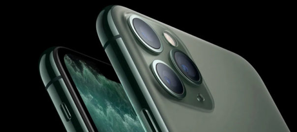
The most significant, noticeable difference is the square camera patch on the back of the two Pro models. The iPhone 11 features a primary 12-megapixel sensor and another 12-megapixel ultra-wide unit. Apple has added new features such as Portrait mode for animals, an ultra-wide mode, and a brand new night mode. You can also shoot video using the ultra-wide sensor at 4K 60fps. The new iPhone gets a 12-megapixel front camera compared to the 7-megapixel unit on the iPhone XR.

And while we’re excited to see what that new lens is capable of, the patch design has polarized Apple fans — at least in renders and mock-ups of the device. Apple could pull off a more refined look than the giant square we’ve seen from case makers and conceptual artists, but the effect will overall be much more noticeable than triple-lens cameras we’ve seen from other smartphone makers.

You may be interested in the iPhone 10’s specs to compare with the latest version. Read Here

Colors

Apple usually plays it safe when it comes to iPhone colors and finishes on its high-end models, saving the fun hues for lower-priced phones. The color options available for the iPhone 11 are Purple and Green, with the older ones Yellow, White, Black, and Red still around. 

Hardware

With the iPhone 11, Apple has upgraded the internals to make the affordable iPhone more powerful than ever. It gets a new A13 Bionic chipset, which is claimed by Apple to be the fastest CPU on a smartphone. The chipset is reportedly paired with 4GB RAM.

A Tougher iPhone

Apple boasts that this year’s phones are the toughest yet. Much of the advertising revolves around their resistance to falls and liquid immersion. The iPhone 11 has a dust- and water-resistance rating of IP68. That’s the highest rating commonly given to consumer products and an upgrade from the IP67 bestowed upon the iPhone XR.

The firm describes the 11 as “splash, water and dust-resistant”. It is said to be it was “tested under controlled laboratory conditions with a rating of IP68 under IEC standard 60529 (maximum depth of 2m up to 30 minutes)”. It’s also reportedly protected against accidental spills from coffee and other common liquids.

The release date is set for September 10, with pre-orders going live from Friday, September 13. It goes on sale on September 20. The new iPhone 11 has storage options starting at 64GB, going up to 128 GB. The Pro and Pro Max come in three storage sizes. The small 64GB option is joined by the default-best-for-most-people 256GB, and the power-user-maxed-out 512GB. There’s no 128GB size this year, for the Pro and Pro max models. With no expandable storage on offer, some might moan that there’s no 1TB option, as there is with the Note 10 and Note 10 Plus.

With the new iPhone 11 series, comes new challenges and opportunities for app designers and developers. How can you provide a better user experience to your users who will be using these new models? What are the tricks and tips? Speak to our design experts for more details.