NYX Ditech

Categories
Design Web Design

Wireframes And Its Importance To Web Designing

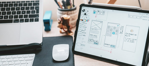
Each of us who is involved in website design and development need to clearly understand the client’s vision. For this, a blueprint is created based on which the final design of the site is created; it is commonly known as the ‘wireframes’. Wireframe designing is the process of creating an introductory visual guide of a potential website’s framework. This document can then act as a blueprint to expand upon. Developing a custom website is a multi-phase process. A website wireframe is the first and the most important step in this process.

The aim of designing a wireframe is to establish a scheme of things for how the information will be prioritized and given to the visitor. The ‘where’ and ‘how’ elements related to the website’s functionality will be implemented, in addition to the desired/expected behavior flow of the website’s visitors.

Role of a Wireframes

In addition to providing the designers with the necessary skeletal framework of the website’s functionality and design, the wireframe is one of the first things offered to the client, to ensure that everyone is on the same page right from the outset. Clients must understand the purpose of the wireframe to get the utmost benefits out of its presentation.

Let us compare a website wireframe with floor plans of a house. Try and imagine how floor plans would look for a kitchen in a new home. It would outline the stove, the refrigerator, and maybe the pantry, but most likely it wouldn’t address the fridge’s brand or color.

Instead, it would address whether the stove will have an overhead vent or not. It may even depict how the pantry doors open. It is the functionality of these appliances and their location in the kitchen that is important at this stage, not the appliances’ visual appearance.

Designers are often suggested to skip the wireframe stage and dive straight into the design. That’s a complete NO NO! Simply overlooking this step and jumping on to the look and feel the part is a big mistake. Here are the top reasons why you need to have a wireframe to start with.

Visual Display Of Site Architecture

At times, the sitemap can be a bit complex; especially very large ones. Taking the sitemap to wireframe commences the first reliable visual process for a project. Wireframes convert the abstract flow charts into something authentic and tangible with no distractions.

The sitemap acts as a checklist; layouts are an outline. Sitemaps consider page goals and information flow. Wireframes allow web design teams to start considering visitor purposes. The site’s architecture that includes the navigation, the user flow through conversion funnels, and the organization of primary pages and subpages is all brought to the forefront in a wireframe.

Clarification Of Website Features

Often, clients may not comprehend terms like hero image, lightboxes, google map integration, product filtering, and several other features. Wireframing specific project features on a website clearly communicates to a client how these features will function, where they will appear on the specific page and how useful they might be.

There are instances where you may decide to remove a feature after wireframing. Maybe it doesn’t align with the site’s goals. Looking at the features without any creative influence allows a client to focus on other critical aspects of the project and on how the features will be executed. That is a real time saver.

Usability Gets The Front Seat

One of the most important advantages of the entire wireframing process is that it promotes usability to the forefront in showcasing page layouts. It pushes everyone to look objectively at a website’s ease of use, naming of links, conversion paths, feature placement, and navigation placement. Wireframes can point out flaws in your site’s architecture or how a specific feature works. The earlier you identify these issues, the better it is. 

Website visitors have a purpose, and wireframes support web design teams and clients focus on its purpose. 

Scalability And Ease-of-Update

For clients who purchase a content managed website, scalability and ease of update are essential. A wireframe will immediately identify how well your site will handle content growth.

For instance, you may currently have only 20 products to offer, but in six months you may have 100. That’s why you would want your website to accommodate this growth without impacting the website design, site architecture, or usability. Wireframes will identify these important areas of content growth.

A website’s average lifespan is two years. Websites need to remain effective through multiple business changes for this timespan at the least. The site needs to be flexible, scalable, and easy to update.

Wireframes Make The Design Process Iterative

Instead of combining the functionality/layout and creative/branding aspects of the website in one go, wireframes ensure that these elements are addressed one at a time. This allows clients (and other team members) to provide feedback earlier in the process. Wireframes facilitate feedback more easily than a complete design.
For more information, talk to our experts!

Click here to know the difference between Wireframes, Mockups, and Prototypes.
Categories
Blog UI Design UX UX Design Web Design

Front-end Styles You Must Follow in 2021

Happy new year folks! Another year passed, and what an eventful year it was. The pandemic, lockdowns, working from home, new design trends, and a lot more. We covered the promising design trends of 2020, which are assumed to be the chartbusters in 2021. There are plenty of design trend articles floating around the web; these articles’ focus is very understandable because the design itself is what both a client and a visitor see. However, the front-end code behind it is mostly irrelevant and neglected by most users.

Of course, the code is as important as the outcome. An optimized approach, clean code, and new techniques help developers create beautiful designs in a scalable manner. Scalability is what the client wants; performance is what users want.

Therefore, to provide due respect to all front-end developers and offer insights and ideas to designers, we’ve compiled a list of front-end trends that you can follow in 2021.

CSS Custom Properties

CSS Custom Properties have been around for quite some time now. However, it hasn’t gained the level of popularity that was expected. Developers have wanted it for years, like the W3C Module Level 1 is from 2015. Any new technology takes a while to get traction; we believe that CSS custom properties will see the most considerable adoption rates since its inception in 2021.

Custom Properties are variables in CSS. One might argue that we have variables in Sass as well. Yes, but when you compile Sass to CSS, you get CSS with no variables. You cannot change the value of that variable ($primary: red is just red).

But, with custom properties, you have (–primary: red). And after that, you can redefine ( –primary) to blue. This can be done directly in the browser, without any compiling. 

One great hack to use them is for custom theming. One can define HSL values via variables and then allow the users to change the hue using a slider at the front-end. The slider value can be connected to the CSS variable with JS and BAM with the “Set your color scheme” functionality.

Variable Fonts

Like CSS Custom Properties, variable fonts have been around for a while, but still are not widely used. One of the reasons for its occasional use is the number of tutorials/guides and techniques to be adopted by developers and the fonts themselves. You cannot simply pick any random font and apply changes to it.

One of the best websites to use and experiment with is Variable Fonts. It also acts as a demo if you are hearing this term for the first time. You can use a single file and apply properties like “font-weight” or “font-style” with complete control over the amount of thickness or slant using variable fonts. 

Variable fonts provide nearly infinite freedom to the developers and designers, in terms of font looks. Every designer comes across a situation where they think that “font-weight: bold” is a little too much, but “normal” is just too thin, and there is nothing in between?

Font-designers are well aware of this situation and often provide middle properties. These middle properties are labeled with numbers such as 100 (light) or 900 (very thick) and everything in between – 300, 400, 600, 700, and more. But, still there can be a situation where you need 750, and it’s not available? That’s where Variable Fonts comes to your rescue.

Another massive benefit of using variable fonts is the size and load time. Fonts are considerable contributors to load times in terms of bandwidth and on-screen rendering. A standard request can easily go beyond 500kb. With a variable font, all variations of one font are received through a single request.

More JavaScript

Front-end developers are not just “JS Developers” or “CSS/HTML Developers”. And, JavaScript is not just a trend, although some very heated discussions might take place with comments like “Yeah, and nowadays, you can’t open a website without it being JS enabled”. No matter how many positives and negatives it has, the use continues to grow. The JS-based tech/approach/tooling is estimated to trend more in 2021:

  • React / Vue as a front to CMSs like WordPress (headless)
  • WebGL (Three.js) 3D graphics, simulations, interactivity
  • VR and AR content
  • Browser APIs for more control/functionality
  • More optimized build workflows (webpack, gulp)

With only JS, you can technically build almost any sized project. You can do a reactive front-end, use the browser’s APIs for the best UX, and deploy your project live. All the adjustments to settings can be quickly made within the setup.

Utility-Based Styling

Utility-based styling aims to apply styles through pre-defined classes. However, here, it’s slightly different than the standard approach. You don’t style a .card with background, shadow, etc. But you style an HTML element with .shadow, .bg-light and .br-5. This approach works quite well with JS developers who need to get a quick output and are not worried about the CSS.

A solid argument could be that it’s very much like writing CSS in HTML, where you really can’t change a component from CSS and have it updated everywhere. Technically, it is true, though, when your components are JS files in a React/Vue app, you update them in one place.

One of the downsides is that you would need to learn another framework. It’s not just CSS; you need to remember the properties since a few elements might look like this: 

class=”text-xl font-semibold text-white sm:text-2xl sm:leading-7 sm:text-black md:text-3xl”

New CSS Features

Using new CSS features can be a trend in itself. While it’s not a change to a specific feature or approach, it challenges the way we’ve been coding so far. It does solve many problems, but its backward compatibility is an issue.

Thankfully, most users worldwide can access the web more efficiently than ever before due to browser vendors’ progress in the past few years.

Writing modes – These are often not used since many developers rarely need to support the right to left languages; however, writing modes exist. They are a must for dashboards/frameworks and multilingual sites. Thanks to the increased support of directional writing properties like margin-inline-start, you don’t have to overwrite margin-left to margin-right for RTL.

CSS Subgrid – There was flex, and then came grids. Now, we have grids inside grids, popularly known as Subgrids. Subgrids are something developers anticipated to be available out of the box when Grid was first supported. Well, now we have it, and it is as useful as it could be. 
Are you looking to get benefitted from these front-end trends? Talk to our experts now!

Categories
UI Design UX UX Design Web Design

Wrapping Up 2020: Promising Design Trends For 2021

What can we say about 2020? The year was no less than a roller coaster ride. Every business had to think of new approaches and new ways to market themselves; the world of the web changed too. New design trends blossomed, and we think many of these design trends are here to stay. In this last article of 2020, we have collated a list of design trends that we think are promising for 2021.

Advanced Personalization

In terms of design, personalization is an approach where a company, or brand, creates tailored content and recommendations for every user. The content and recommendations are based on information gathered – like date of birth, viewing, marital status, and order history, etc. The key objective of personalized design is to make the user feel that the content is crafted especially for them. This leads to an increase in the conversion rate, which is after all that the commercial website owners want.

Personalization is very much a user experience trend apart from being a best practice. Apple and Google continue to develop personalized assistants for their ecosystems. These assistants recognize who is interacting with them by face, voice, or fingerprint. Interfaces will become more personalized in the near future. Their appearance, tone, the position of elements, and behavior will change in a blink of an eye.

Touchless Interactions

Touchless interactions are another UI and UX trend that has emerged during the pandemic. By touchless interactions, we mean the various methods of interacting with devices without actually touching them. These can be voice user interfaces (VUI) or air gesture control.

Even before the pandemic, touchless interactions gained a lot of popularity and was poised to become a major UI/UX trend. Affixing a voice-user interface to your design can substantially expand its reach. It will be no surprise if a lot of companies create complete voice user interfaces.

3D and Immersive Experiences

3D designs are very attractive and grab eyeballs in a jiffy. Since 3D designs have been around for quite some time now, we can hardly call it a novel design trend, for the web and mobile. However, this year, the designers’ interest in 3D components and entire 3D scenes in interfaces will reach new heights. 3D design got all pumped up with Apple incorporating it in their latest macOS update. The macOS BigSur has a set of revamped icons, some of which look rather 3D-ish.

Also, previously the 3D elements were not diverse in practical use since they often put a very heavy load on user machines and therefore were not in much demand. But now, the modern front-end frameworks and libraries can significantly reduce page load time. This allows the 3D objects to become even more detailed and larger.

Looking at the rising popularity of VR and AR technologies, we can bet the 3D will only become more popular in 2021. Unusual angles, cool abstractions, and a lot more – you can do all this in 3D without using real objects. 3d saves money too; think about that expensive car or an unusual house that you want to showcase. 3D offers a WOW experience to users. They stay on the page longer, hence increasing the average session time.

Unorthodox Layouts and Scrolls

When we talk about a UI/UX design, symmetry primarily stands for classic and conventional designs. Although it is a great approach to streamline the structure of a website, all sites built on grids look alike. It is important for a site to stand out against the crowd. By not being unique, the website’s promotion in search engines is also affected. Unorthodox and creative layouts are bound to be more prominent in 2021. This offers more character and personality to your website and emphasizes its particularity.

Creative navigation techniques include scroll color fade, horizontal navigation slideshows, mix and match of horizontal and vertical scrolls, scroll-triggered animation, drag to explore, and more. These are particularly great for promotional sites about creative collaborations and events.

High-tech Landing Pages

One of the trends that are creating hype involves complex work with layouts and animation. For technology and production-oriented websites, an abstract representation of products and processes is a perfect solution. The tricks include hyper-realistic complex animations, volumetric illustrations, and renders that attract and captivate visitors.

However, the main challenge is that visitors get no more than 60% of the information you are trying to convey through your website at the best of times; with these websites, they get about 10%. Though this trend makes designers violate the basic idea of accessible and clear information delivery, you must find the golden ratio where you can astonish and bring value at the same time.

Unusual Illustrations and SVGs

3D is still popular in illustrations and 2Ds with surreal plots, unusual angles, experiments with proportions, vintage-muted colors, etc. There was a time when minimalism ruled illustrations, but now designs based on quirkiness and a combination of the real and the unreal is an emerging trend. Another highlight is vector illustrations in Scalable Vector Graphics (SVG) format. It uses XML to define basic properties such as shapes, paths, fonts, colors, and more advanced features. We know that PNGs, GIFs, and JPEGs lose their quality when the display resolution is increased. That’s the reason you have to keep a separate file for each type of screen. However, with SVGs, there is no such problem. The vector format can be reduced and enlarged without compromising on quality.

UX Simplification

Today, the designer’s task is to cut down the elements and fields to the minimum. The same is the case with the number of steps a user has to take to reach the desired result. For instance, placing the whole checkout in a single step is trending these days. Registration and log-in processes are becoming more simple, or a side step in the user flow. 

In 2021, we expect websites will not force users to remember their passwords. For example, in an online store, the user’s personal identifier can be their biometric data or phone number. Apple introduced its super-button, which substitutes random data for registration. In a lot of applications, you can now register with only one button without the involvement of social networks.
Do you want to create a useful, attractive website based on the current design trends? Talk to our experts now!

Read More about techniques which could help you in designing effortless user interfaces.

Categories
Blog Brand & Identity Design

6 Tips To Create Highly Attractive And Engaging Featured Images

Researchers have conducted studies that show people remember 80% of what they see and only 20% of what they read. In fact, there’s research that suggests that 65% of people are visual learners. In terms of websites, the role of images becomes more important as they capture the visitors’ attention; they can convey complex messages very quickly. Of all the images, featured images are one of the most important images.

A featured image, also known as the primary image, is an image that supports a blog article or web page. It is often found at the top of the content pages. Featured images offer a visual summary of each page on a website. 

If you don’t use your featured images wisely, you will lose an opportunity to grab visitors’ attention. If your images don’t entice users or leave them with a wrong impression, how do you expect anyone ever to read your content? Today, we will look at five tips for creating more attractive and engaging featured images:

1. Use A Consistent Style Featured Images

All your featured images can have the same style; however, giving a different look to certain types or categories of content can improve the appearance and navigability of a web page or blog article. Readers can easily find the kind of content that interests them due to their distinct styling.

While the distinction is helpful, the overall styling must be consistent across all images. People should instantly recognize your brand or business when they look at the images.

2. Use The Right Colors

Colors are one of the most crucial and complex aspects of featured images. Colors set the mood, convey emotions, create an atmosphere, and evoke intense experiences.

According to a study conducted by researchers to study the impact of color on marketing, 90% of quick judgments made about products can be based on color alone, depending on the type of product. Other similar studies have also revealed that colors must support the personality and characteristic you want to portray.

The colors used on your featured images must guide your audience through a story. Consider colors that support storytelling or at least a specific portion of the story. You can start with understanding ‘the principles of color theory’. Use the theory to harmonize your featured images.

Different colors affect our brain differently. It would be best if you used them in storytelling and marketing accordingly.

  • Red denotes energy and urgency
  • Orange denotes aggressive
  • Yellow denotes optimistic and youthful
  • Green denotes wealth and relaxation
  • Blue denotes trust and security
  • Pink denotes love, romance, and feminine
  • Black denotes powerful and sleek
  • Purple denotes soothing and calm

3. Create Balanced Featured Images

Balancing the featured images is tricky, but very essential. One way to approach image balancing is to think as if each element of your design has a weight attached. Simply put – if you place the image on a balance scale, would it lean towards one side?

Remember that different elements carry different weights and balances do not have to be bifurcated right down to the center. There are four types of balances:

  1. Symmetrical
  2. Asymmetrical
  3. Radial
  4. Crystallographic 

All of these can contribute to a beautiful featured image. Symmetrical balance is perfect for illustrations, drawings, photographs. Asymmetrical balance creates tension through contrast and can be visually attractive when done correctly. Because it’s abstract, there is no symmetry; there are no perfect mirror images.

4. Focus On The Main Subject

One way to help readers quickly comprehend the message you want to convey in the image is to make the subject the main (if not only) focus of the image. In most cases, centering the subjects and fading out the background works well for featured images. It will allow your readers to focus on the subject rather than the less essential elements, like the background. Surrounding details create a clutter that gets in the way of the core message.

That said, it doesn’t mean that backgrounds are useless in featured images. It is just that the focus of the post needs to be the front, center, and larger than everything else. The minute the surrounding elements distract from that, you’ll need to look for a new photo.

5. Use Authentic Featured Images

When selecting or creating a featured image for your webpages, you need to focus on a few important things. Make it eye-catching, descriptive, and authentic. If your images aren’t eye-catching attractive and don’t clearly describe what the post is about, you won’t be able to garner the required attention. In simple words, very few or no readers at all. Another risk is that you may attract the wrong readers.

The authenticity of images has more to do with the state of the consumer-business relationship in today’s world. If consumers don’t trust and vouch for a brand, it’s hard for a business to create more users or retain existing ones. So, it would help if you were careful about what your featured images signify.

Abstract and vague images might leave readers wondering if the content is of any use or value. Moreover, heavily staged stock photos may cause them to wonder how genuine the content will end up being.

6. Stay Away From White Backgrounds

It is very much possible and easy for you to go wrong with your image backgrounds if they’re empty or lack the subject matter altogether. Ensure that your website uses a different background color. If not, your featured images should at least come with a dark border automatically. Otherwise, your featured image may get lost within the webpage’s white space.

Your readers must be able to identify where each of your blog posts starts and ends. You also want to keep off surrounding distractions from barging the main content. A clear distinction between featured images and everything else will help with this.
The featured image plays a pivotal role in grabbing readers’ attention and convincing them that the content is worth investing their time. We hope that these tips will help you in creating eye-catching featured images. For more insights and help, contact our team of experts.

Read more about how to highlight your web content here.

Categories
Brand & Identity UI Design UX Design Web Design

Is Your eCommerce Website Ready For the Holiday Season?

The recent pandemic and worldwide lockdown did dent the sales of various eCommerce websites. However, they are up and running again and geared up for more sales. The holiday season is approaching, and with people still reluctant to go out shopping, this may be a chance for your eCommerce website to achieve sales like never before. The success of your business website during the holiday season largely depends on its design, experience, content, and SEO. You may have a fantastic campaign, but if you don’t know how to execute it, all the efforts will go in vain. Here are a few tips on making your eCommerce website ready for this festive season and crack huge sales.

Design A Theme-Based Homepage

Your homepage is the face of your business. Just as people must dress according to the occasion, eCommerce websites should also modify themselves based on the holiday theme. There’s no need to change the UI of your entire website; that would be a tedious and time-consuming activity. You can only focus on some of the most important pages, especially the home page. That’s one place where most of your visitors will land. Use festive fonts, design themes color palette, photographs, and illustrations. These are easily available on the web for free.

Use Festive CTA Buttons

Even if you don’t want to be too fancy with your webpages, you can still get into the festive vibe. For the holiday season, you can decorate your call-to-action buttons to follow the being minimal trend. You can replace the usual corporate style with something that is more inviting to customers and also suggests what they’re about. You could adorn it with gift icons, cornucopia or snowflakes just to give hints of celebration or simply animate them with CSS and SVG filters.

As much as words are important to attract visitors to click, you need to decorate the clickable buttons with a festive color scheme or design element. 

Content Layout On Your Website

Very often we come across a website that is filled with ads and product pop-ups. It is extremely difficult to navigate around that site. Therefore, it is advisable to refrain from spammy marketing tricks and restructure promotions in a way that they don’t look ‘in your face’.

The last thing you want to do as an eCommerce business is to drift away from your visitors from your website with excessive advertising. Sure you want to jump on the bandwagon of ‘holiday marketing’ but dumping things over your customers is a no-no and similar to traditional outbound techniques. Use visual hierarchy tricks to structure your content. Categorize your content and divide it into grids into your web pages.

Design For Mobile

More than 177 million buyers, in the US alone, purchase products and services online via their mobiles. Therefore, you should finally invest in responsive web design this holiday season. You should not miss out on this opportunity. If you decide to adapt your website design to mobile-first now, you’ll get access to an increased number of mobile shoppers. A responsive website meets the requirement of the ever-changing web-scape. 

Be Prepared For Extra Site Load

According to Kissmetrics stats, on any given day 47% of online customers expect web pages to load within 2 seconds. Now since it is the holiday season, expect more traffic. On peak days, customers are literally swamping websites to find good deals. While you prep your design for the holiday, make sure you don’t increase the loading time of your site.

A good website loading speed can increase visitor retention, engagement, and enhance their overall user-experience. Fast page loads also help direct customers across landing pages and this may influence conversion rates. 

Explore Virtual Reality Prospects

Virtual reality isn’t a new thing but the way businesses have started to use is a good case study for startups and small businesses. Alibaba’s GnomeMagic Lab is an example of virtual reality worth exploring. A team member, Zhao Haiping envisioned that virtual reality could enable online customers to shop on New York’s Fifth Avenue virtually from their homes. An excellent idea for those who detest the rush of physical stores during the holiday season.

Write Theme Based Blog Content

There are more than one reasons that you should have a blog for your eCommerce website. You may already have one, but if not, start one soon. It strengthens your brand messages and is a great way to promote your products while solving customers’ problems. It can drive targeted and valuable traffic onto your landing pages. Plus, it’s a cost-effective strategy that has high returns if done properly. If you have a blog then make sure you streamline your content according to the holiday season. Writers and marketers can work together to generate ideas that’ll attract your target market.

Use Holiday-Specific Keywords

During the holidays, you must use tools like Google’s Keyword Planner or any other free keyword tool to know exactly which words trigger the shopping hormones of customers. Set the holiday ambiance with ‘trigger words’ that generate an action. For an eCommerce website, the ideal action is to buy a product. 

So what are you waiting for? Use these tips to get your website ready for the festive season. For more information, talk to our experts.

Click here for the eCommerce website’s product page design tips

Categories
Design Mobile Apps UI Design Web Design

User Interface(UI) Design For The Color Blind

According to a report, approximately 253 million people live with vision impairment or are color blind, out of which 36 million are blind, and 217 million have medium to severe vision impairment. What is color blindness? Color blindness is a condition in which individuals often mistake shades or can’t distinguish colors at all. Majorly, this deficiency is seen in men; every twelfth man of the world precisely; women are at a lesser risk. 

Most color-blind people can see things clearly; just as any common person would do. The problem is that they are not able to distinguish between red, green, or blue light. The mutation in the X-chromosome leads to this type of deficiency. This means, women are more likely to carry the deficiency rather than suffer from it.

The most commonly noticed deficiency is red-green color blindness. A person facing this difficulty mixes up all colors which have red or green as part of the whole color. People who are impacted by Protan color blindness are less sensitive to red light. On the other hand, people affected by Deuteranopia have the same problem with green color. 

Another complication is Protanopia, which confuses people between blue and purple. that’s because they can’t recognize the red element of the color purple. Tritanopia refers to sufferers who struggle to distinguish blue or yellow light; this is the least common type of color blindness.

People experience the content on websites and other platforms much differently than you expect. Therefore, it is important to ensure that your user experience appeals equally to these visitors. If you take care of some basic fundamentals of designing and usage of colors, you can make your UI more accessible to all users. Here are the top things to consider when designing a UI for color accessibility.

1. Use Symbols Along With Colors

Color should not be the only way to convey a message. People affected by a particular type of color blindness face difficulties in identifying red color. It can be sometimes even impossible for them to see common red error messages. One of the ways to address this issue is to use both colors and symbols in attention-seeking areas. One of the best examples could be Facebook’s form fields and the error messaging attached.

2. Always Use Text Labels

Adding text labels to color filters and swatches improve accessibility for color-blind users. Based on the type of color blindness, users may face difficulty in differentiating between different colors, or at their shades, without some sort of descriptive text. Adding text labels to color filters not only improves accessibility for people with color blindness, but also for people with normal vision. Some of the most difficult to distinguish colors on a monitor are white, off-white, and light grey 

3. Avoid Red and Green 

These two colors in combination can be problematic. People with strong CVD (strong meaning a more severe condition of CVD) would see both red and green as brown. On the other hand, people with weak CVD can see strong red and green colors like red and green. But, this can still be problematic when the colors are weak or blended together.

Keep in mind that being able to tell these colors apart is only an issue if color is the only encoding method used to make a distinct comparison. For example, a good number versus a bad number in a table, or one line versus another line in the same line chart. 

Certain color combinations aren’t ideal for color-blind users either because they have low contrast ratios or because they’re difficult to differentiate between. Here’s a list of color combinations that you should avoid using in your interface designs wherever possible:

  1. Green-red
  2. Green-blue
  3. Green-brown
  4. Green-black
  5. Green-grey
  6. Blue-grey
  7. Light green-yellow
  8. Blue-purple

4. Underline Links

A lot of the time we use font color or font weight to denote links. While it may be possible for someone with deuteranomaly, protanopia, or tritanopia to distinguish anchor text from regular text, it’s certainly not ideal due to the low contrast ratio.

Someone with monochromacy wouldn’t be able to differentiate between text and anchor text at all and would have to hover over the text to see if it their cursor changes to a pointer. That is why it’s a good idea to add an underline to text links. This makes it easy to immediately tell regular text and anchor text apart.

5. Make Primary Buttons Standout

Many times, designers rely on color to make primary buttons stand out. The problem with this is that the color you use may be difficult for color-blind users to perceive. Here’s what you could do instead:

  • Increase the size of your primary button.
  • Try out different placement combinations.
  • Increase in contrast between primary and secondary buttons.
  • Use borders, icons, or font-weight to differentiate primary and secondary buttons.

6. Use Patterns and Textures

Color differences are incredibly important with data visualization e.g., graphs and pie charts. Choosing colors that have a low contrast ratio can make your chart difficult to interpret for color-blind users. Here’s what you should do instead:

  • Use patterns and textures to make it easy for users to differentiate different segments.
  • Add text labels to segments to make them even easier to understand.

Conclusion

Designing UI for color-blind users will help you improve your site’s accessibility for users with normal vision, as well. Want to make sure your website is designed colorblind-friendly? Talk to our experts.

Need to know the UI Design tools for 2020? Click Here

Categories
Design UI Design Web Design

When To Use Accordion Menu In Web Design?

Coming up with a brand new solution every time we encounter an interface problem is time-consuming and risky because we just don’t know how much time will be needed to implement a new solution and whether it will gracefully succeed or miserably fail in usability tests. Therefore, as designers, we tend to think of design patterns as generic off-the-shelf solutions that can be applied to various contexts almost mechanically, and without any consideration more often than not. Design patterns can be extremely helpful, mostly because they save time and get us better results, faster. One such design pattern is the Accordion menu.

An accordion menu is a vertically stacked list of headers that can be clicked to reveal or hide content associated with them. It is one of many ways you can expose content to users in a progressive manner. Allowing people to have control over the content by expanding it or deferring it for later lets them decide what to read and what to ignore.

There is a good reason why the accordion is very common in responsive design. It’s an immensely useful pattern for progressive disclosure. Accordions are more of content management tools. When you have a page that’s broken into dozens of paragraphs, links, images, or just too many blocks of content, accordion menus come to your rescue.

Not every website needs an accordion menu and you certainly won’t find them all the time. But that’s no reason to ignore the concept entirely. The purpose of an accordion menu is to manage an overabundance of content through dynamic switching. So when exactly should you use accordions? Mostly with larger menus or content which might behave cleaner using expandable sections. These could be sub-headings or even multiple levels – the point is to organize content in a way that makes navigation simpler than endless scrolling.

Sliding Menu Effects

One of the most common interfaces you’ll experience is the sliding menu effect. This is usually vertical with a series of links hidden within sub-links. Clicking on a primary link will then expand the list of sub-links in a sliding animation. Sometimes a website’s entire navigation menu is built on this accordion effect. Other common choices are dropdown menus which appear on hover – but accordion menus don’t slide over the page since they’re built into the page. So the effect is somewhat different and offers a different user experience by comparison.

Sliding Portfolio

Webpage content is managed via alternate pages for simplicity and ease-of-use. Visitors would rather browse through different pages rather than sift through a long single-page design. However, working with collapsible accordion content makes the latter a lot more reasonable. portfolio sites can be an excellent choice for accordion widgets. Not every project should rely on accordions to best manage content. But think of the control you can offer visitors by organizing projects into larger categories and even sub-categories. Make use of this sparingly but keep it in mind.

CSS3 Tabbed Content

Another example of accordion content is based on tabbed widgets. So instead of having links listed vertically, tabs are used to manage shifting content. This is another really popular method of content management because JavaScript has made the process super easy. An alternative to JavaScript is the expandable accordion UI with CSS3. Granted they both seem like a risk but CSS3 has much less browser support. The only benefit is that CSS3 doesn’t require as much code and offers a simpler method of animation.

Image Galleries

In a similar vein as the portfolio listing is a collapsable image gallery. In accordion-style, this can take many forms as vertical, horizontal, slidable, tabbed, and more. Both CSS3 and JavaScript can be used to create menu effects in the image galleries. Unfortunately, older browsers will never be backward-compatible to support new CSS3 animation. Working with JavaScript is still the safest choice, but as more people upgrade their web browsers we can hope to see a future with primary support for CSS3.

Tabs v/s Accordion Menu

Both tabs and accordions serve their own purposes beautifully! There are many amazing websites that use tabs, and many that use accordions and they are all beautiful in their own ways. So, when to use tabs and when to use Accordions? Here are some factors which will influence your choice:

How Much Data You Have Under Each Section?

If you have only 3–4 categories, but the data is way too much, then there are chances that accordions might be a bad option to use. Consider using Tabs.

What Is The Architecture That Your Website Is Following Throughout, On Every Page?

If your website has vertical navigation throughout, you should go with accordions to keep the pattern the same, and to keep the user comfortable throughout the website.

What Is The Length Of Your Categories/Options? 

If they’re too long, then accordions are a better choice rather than tabs!

These are just some of the examples where you can consider using tabs or accordions.

Benefits Of Using Accordion Menu

  • Collapsing the page minimizes scrolling.
  • The headings serve as a mini-IA of the page. This allows users to form a mental model of the information available.
  • Hiding (some of) the content can make the web page appear less daunting.
  • Accordions can be a better alternative to within-page links, which are problematic because they break people’s mental model for hypertext links. 

Usability Issues With Accordion Menu

  • Forcing people to click on headings one at a time to display full content can be cumbersome.
  • Accordions increase interaction cost.
  • Hiding content behind navigation diminishes people’s awareness of it.
  • Accessibility is an important consideration.

Read more about the Usability Mistakes That You Should Avoid here

You can always pick up a free plugin to rebuild something from scratch. Lots of developers release their code for free and try to help the community with free plugins. And of course, there will always be those who prefer to build everything from scratch. If you need more assistance, get in touch with our experts.

Categories
Blog Brand & Identity Design Technology

Neumorphism: A Growing Trend In The Design World

Designers love trends, especially good ones, and the design world keeps presenting them with new trends in abundance. Neumorphism is one such trend that’s been buzzing around for the last one year. Though it sounds like a medical term, it is a hot new design trend that could be a big one in the near future. Flat design and Material design have been dominating the interface design looks for quite a few years. Then came iOS 7 and rooted out the then prevailing trend for skeuomorphism. 

Skeuomorphism And Neumorphism

Skeuomorphism is a term most often used in graphical user interface design. It describes interface objects that mimic their real-world counterparts in how they appear and/or how the user can interact with them. A well-known example is the recycle bin icon used for discarding files. Skeuomorphism makes interface objects familiar to users by using concepts they recognize.

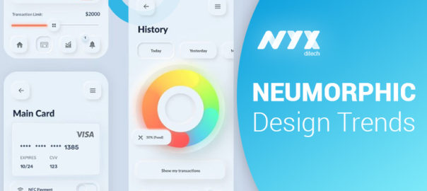
Neumorphism combines developments of flat design and skeuomorphism. Neumorphism, or soft UI, is a visual style that combines background colors, shapes, gradients, highlights, and shadows to ensure graphic intense buttons and switches. All that allows achieving a soft, extruded plastic look, and almost 3D styling. The name was coined by UX designer Jason Kelley.

Neumorphism focuses on a new element of the entire design style. This focus is not necessarily on the contrast or similarity between the real and digital worlds, but on the color palette. Neumorphism is all about the color of the entire screen and delivering an entirely unique experience for users. With Neumorphism, you’d be creating a soft interface, in which the UI elements aren’t placed on the background – but behind it.

It gives a feel that components like buttons or cards are actually inside the background, and are only visible because they’re protruding from within. The general style is all about solid colors, low contrast, and the right play of shadowing.

Key Difference

Common modern UI elements and components, such as material ones are floating surfaces. They are highlighted by appearing on top of the design background. They also cast a shadow on it, thus giving the sensation of floating. On the other hand, neumorphic elements do not appear to float; instead, they give the impression of surfacing out of the background. This is possible because of two reasons:

Firstly, the main principle behind neumorphism is that the background color must be the same as the element color.

Secondly, to make the elements appear as they are extensions of the background, the highlighting part is done by using a simple, but subtle effect. Each UI element has two shadows projected onto it, a light shadow on its upper-left corner and one dark shadow on its bottom-right corner. This gives the impression that the light source is located somewhere in the top-left part of the screen and casts a shadow on the lower right part.

Neumorphism: Cards And Buttons

Neumorphic cards are different from other design styles that we are familiar with such as cards in Material Design, for example, because they don’t look like they are floating. There is no shadow to create that floating effect, not even when the user hovers above that card.

That’s because they extrude from the background, creating a raised look. The way to achieve it is by taking the light and dark shadow you’ve established that will accompany the background and using them on opposite sides of the cards. You can play with the positioning of these two shadows, so it feels as if the cards are seen at certain angles by the user.

Challenges With Neumorphism

You can apply Neumorphism to a mobile app, desktop, or web one. Yet, there are some issues regarding accessibility/visibility, particularly buttons. Thus, buttons may have not enough contrast to be easily spotted for people with vision impairments. Some problems may arise with poor quality screens or lower screen brightness/contrast.

Also, some issues occur regarding ways to efficiently code components, customize buttons, input styles based on the concept of Neumorphism. There are few libraries so far, but new ones are beginning to emerge:

  • React Native components based on the concept of Neumorphism (iOS only).
  • Neumorphic UI, a library of components based on the concept of Neumorphism.
  • Neumorphism.io, soft-UI CSS code generator

Accessibility

Neumorphism might seem futuristic but has some major drawbacks when it comes to accessibility.

User interfaces should be accessible to people with disabilities, regardless of the platform. People with auditory, cognitive, neurological, physical, speech, and visual afflictions should be able to use any given application with as little assistance as possible. Neumorphism lacks support for people with cognitive and visual disabilities, as we will see next.

Neumorphic interfaces are monochromatic and lack in contrast, relying mainly on the use of shadows to emphasize elements. What this leads to is a lack of visual hierarchy and focal points. Since cognitive disabilities impact how people process information, mainly their perception, memory, and attention, this design approach could result in confusing and hard to use digital products.

A good user experience is one that doesn’t make users think, one that guides their eyes through the content. The subtle contrast that characterizes neumorphic design makes it hard for users to perceive hierarchy. User interfaces should be straightforward and intuitive.
Neumorphism was born out of skeuomorphism and minimalism, but aims to deliver experience users have never been through. Neumorphism, like many other styles, is a simple building block of the future. Want to know more about the latest design trends? Talk to our experts.

Read about the design trends of 2020 here

Categories
Blog UX UX Design

UX Personas: They Are Effective, And You Need To Know How To Create Them

The offerings of any business by and large depends on its audience and their needs. The end-user is the most pivotal element in creating your product or service. UX personas are important for you to know who your user is. Thanks to user research and analysis of basic customer experience metrics, you can pinpoint who your ideal user is and, based on this knowledge, create a real user with real problems and real needs. 

Persona is a simple tool to create your product with a specific target user in mind rather than a generic one. It’s a representation of the real target audience data, gathered in previous research such as user interviews. In other words, a representation of your most common target audience. It’ll help you standardize needs and get solutions faster.

As opposed to designing products, services, and solutions based upon the preferences of the design team, it has become standard practice within many human-centered design disciplines to collate research and personify certain trends and patterns in the data as personas. Hence, personas do not describe real people, but you compose your personas based on real data collected from multiple individuals.

Why Create UX Personas?

Well, there many reasons to do so.

  • To know who you are creating the product for.
  • For identifying the basic problems and needs of your audience.
  • To better focus your team’s efforts on creating a usable product.
  • To understand user’s motives and ways of interacting with the product.

There are different perspectives on UX personas. According to Ph.D. and specialist in personas, Lene Nielsen, there are four perspectives that your personas can take to ensure that they add the most value to your design project. 

1. Goal-Directed UX Personas

A goal-directed persona answers the most basic yet critical question – What does my typical user want to do with my product? The key objective is to examine the process and workflow that your user would prefer to utilize in order to achieve their objectives while interacting with your product or service. The goal-directed personas are based upon the perspectives of Alan Cooper, an American software designer, and programmer who is widely recognized as the “Father of Visual Basic”.

2. Role-Based UX Personas

The UX personas of the role-based perspectives are massively data-driven and incorporate data from both qualitative and quantitative sources. The role-based perspective focuses on the user’s role in the organization. An examination of the roles that our users typically play in real life can help inform better product design decisions. Where will the product be used? What’s this role’s purpose? Jonathan Grudin, John Pruitt, and Tamara Adlin are advocates for the role-based perspective.

3. Engaging UX Personas

The engaging perspective is rooted in the ability of stories to produce involvement and insight. Through an understanding of characters and stories, it is possible to create a vivid and realistic description of fictitious people. These personas examine the emotions of the user, their psychology, backgrounds, and make them relevant to the task at hand. One of the advocates for this perspective is Lene Nielsen.

4. Fictional Personas

The fictional UX persona does not emerge from user research but it emerges from the experience of the UX design team. It requires the team to make assumptions based upon past interactions with the user base, and products to deliver a picture of what, perhaps, typical users look like. There’s a substantial risk that these personas can be deeply flawed. That’s why they should be considered as a rule book to create your products and services.

How To Create a UX Persona?

Step 1: Dig Deep Into Your Data

The first step is to take a closer look at your data gathered in Discovery Phase, mainly User Interview. Tag your most essential insights, primarily problems. If you work with a client, you should also account for your stakeholder point of view. A persona should reflect business goals, as well. Both the needs of users and businesses are crucial to creating a balanced and successful UX Persona. In some cases, you won’t have time or money to interview target users. It’s still possible to create Persona based on your stakeholder insight and competitor analysis.

Step 2: Identify Patterns And Form a Hypothesis

Once you gather some data to analyze, it’s time to identify trends. It’s time to take a closer look at tagged data to see if overlap emerges naturally. At this point, you should understand that different groups of people have a novel approach to the subject.

Based upon your initial research, you will form a general idea of the various users within the focus area of the project, including the ways users differ from one another

Step 3: Create a UX Persona

When you start creating a persona, don’t forget to give them a name and upload an image that represents them. It’ll help you to build their virtual identity, and will be easily recognizable by your team. Each persona should have a unique name. It gives it a rational fraction and will help to bring the persona to discussion or any other research material.

You must add a description to your personas. It should include the background of your fictional character, as well as their current desires. What is their primary motivation for using your service or tool? It should consist of several goals and the desired outcome of the user’s actions. Every persona represents different problems. Add all of them to this section to have a summary of the personal struggle.

Step 4: Share Within The Organization

Persona has no value if it’s not distributed well within your organization. All your team members should be familiar with your primary Personas. It will help you be up to date with the main problems for your target users and how they differ within disparate groups.

Conclusion

Personas add the human touch to what would largely remain cold facts in your research. When you create persona profiles of typical or atypical users, it will help you to understand patterns in your research, which synthesizes the types of people you seek to design for. Reach out to our experts to learn more about creating personas.

Click Here to read about how to avoid UX Design Errors

Categories
Brand & Identity Mobile Apps UI Design UX Design

6 Reasons To Develop A Mobile App For Your Business

The business landscape has substantially changed over the years, especially with the tech boom. The biggest game-changers were the invention and evolution of mobile devices and the internet. Consumers have dramatically changed their behavior. The number of hours they spend on the internet is only increasing. New ways to find information and to buy products/services have emerged. E-commerce has become more important than ever. According to a study of IMRG, mobile devices are accountable for 45% of the e-commerce visits on websites. This growth is so significant that, according to what can also be read in this study, Google changed its algorithm to index the mobile app as a search result.

This proves how apps have increased their importance for consumers and businesses. They allow you to create an interaction between the brand and its users, generating and keeping an audience, instead of having to start from scratch with digital marketing.

The majority of adults in 2020 possess at least one smartphone for either business or personal use. This is why you should turn your focus toward mobile technology. Here are the top 6 reasons that should convince you to develop a mobile app for your business.

1. Increased Sales

One of the core objectives of any business is to increase sales and drive revenue. By using promotions and offers, customers are continuously motivated to buy from you. You can use push notifications to directly contact all the users of the app so they are aware of any special offers that may be in place — even using geolocation to contact customers who are close by.

Through apps, customers can make mobile payments using payment technologies within their phones. This can also improve loyalty by creating an automated loyalty point per purchase, which again increases the motivation to buy, and therefore, increases revenue.

2. Brand Recognition

Mobile apps support strong connections between brands and customers. For example, users willingly share links to their favorite sites, ask for feedback, and describe their customer experience in social networks. You can integrate popular social media platforms into your application to let customers discuss your products and services.

These are powerful tools for building your brand’s reputation, advertising your service, and drawing the attention of potential clients. Moreover, mobile users have amazing opportunities to get push notifications with special offerings, discounts, and giveaways. This means that they can save money, so from a psychological perspective, they are likely to interact with such shops regularly.

3. Detailed Analytics

A mobile app allows you to collect a lot of useful information that can be further used for analytic purposes. For example, you can check on taps per view to learn which products your customers buy the most, see how much time they spend on the app, and even which functions are most popular on the app itself.

By keeping track of the way people interact within your app you can start understanding how you can improve it to create a more positive user experience. You can use this information to understand demographics using information such as geo-location, and the interests of your users. Having a solid understanding of your customer base is the key to being successful in any business.

4. Loyal Customers

Although a mobile app is a copy of the existing website, it is highly optimized, personalized, and well-designed, which significantly improves customer experience and facilitates the acquisition and retention of new clients. They find themselves in a convenient online store where they can choose goods and purchase them without the hustle and bustle.

Convenience is the word of the modern customer. Many people are willing to pay a premium to have things done for them with minimal effort. You can use push notifications that advertise your deals and promotions, so your customers are kept aware of the real-time news and information about the progress of their order. Also, for customers who want to get more information about your company, the products you sell, and the services you offer, having an app allows them to do this whenever and wherever they want to. Being constantly exposed to the products and services of a business increases loyalty. And, more loyal customers mean more sales and revenue.

5. Contactless Payments

Individual smartphones can now replace cash and credit cards due to the invention of mobile contactless payments technology. Payment apps provide ease, speed, and security. At the checkout, you don’t need to get a wallet from your bag to take out coins, banknotes, or credit cards. Put the phone to the payment terminal and that’s it!

It has become especially urgent during the COVID-19 pandemic when people have to avoid touching things and try to reduce the time spent in shops.

6. Competitive Advantage

Even after being equipped with all of the knowledge about why mobile apps are a good idea for your business, many still choose not to take advantage of using them. This, however, could be seen as good news because as a result, the competition in this area is still reasonably low, and can still be taken advantage of.

Click here to know about five critical applications of animation within a mobile UI design

Everybody likes to be ‘first’ or ‘one of the first’, and by using a mobile app as a marketing tool in this way, you are already at a head start for the future. The business world is highly competitive, so it is necessary to take as many opportunities as possible to increase brand awareness.
We hope these reasons are enough to convince you that your business needs a mobile app. Talk to our experts and get started.