NYX Ditech

Categories
Trends UI Design UX UX Design

How Can Anyone Bring Their Designs to Life With Interactive Animation?

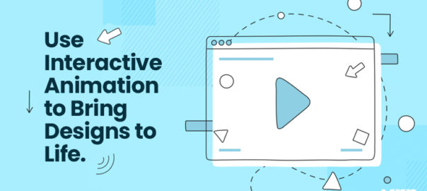
Undoubtedly interactive animation gains a lot of attraction nowadays because of the active expressions and interactivity. Creative designers can build great user experiences through dynamic animation crafts. People love to experience beautiful animation, especially if it is interactive. We will discuss more interactive animation and its advantages in this article.

What is Interactive Animation?

In the simplest terms conceivable, interactive animations are any animation that enables viewers to engage with the work in ways beyond merely watching it. There are numerous opportunities for participation for viewers. These are most frequently seen in highlighted reels and drop-down menus.

The Advantages of Interactive Animation Over Standard Ones

An interactive animation encourages viewers to engage actively with the experience. They enable viewers to choose the direction a movie or infographic will go as it progresses. The likelihood that your audience will choose your business will improve when their level of interaction increases to this stage. Interactive animation designers with their expertise will help you in giving direction to your business.

The Advantages of Interactive Animations Include The Following List:

Through the use of interactive animations, it is possible to make a movie or advertisement in a way that is specifically tailored to the viewer, increasing conversion rates.

Interactive animations commonly motivate users to stay on a website for longer periods, lowering bounce rates.

Engagement is higher as the spectator has a choice over what they watch and what they skip.

Interactive animations can create higher levels of responsiveness since they are enticing, compelling, and convincing.

Verify That You Have The Necessary Tools:

If you’re looking for an interactive graphics end-to-end pipeline that is made for quick and effective real-time animation, there are many great tools to start with. These tools will give you everything you need to create interactive animations that are not only aesthetically pleasing but also flawlessly executed conceptually.

Only Use Animations On Purpose And When Important:

Interactive animation should only be used to provide help, never as a means of showcasing one’s talents. You do not need to animate every single element on your stage. Understanding when and where to use interactive animations is essential for successfully incorporating them into your designs. Keep things as simple as you can, and pick your animations wisely to keep your audience’s attention when animating.

When in doubt, if something appears to be clean and effective in its current state, the best course of action is to do nothing with it.

Test Repeatedly

It is crucial to test your interactive animations before releasing them to the public, just like you would with any other design element. Test them across browsers and mobile devices to ensure that your designs function as intended. Keep a close eye on how users interact with your animations, and make changes as needed.

Interactive animations will help you in creating websites, games, and apps as you want. You can unlock many tools and create captivating interactive animations as you desire. Hire an efficient creative design agency to help you out.

Categories
Brand & Identity Design Trends UI Design UX Design

Color Trends That Will Go Big In 2023

Whether we talk about graphic designing, web designing or any digital design, colors are one of the most important factors that influence the overall appeal of the design. Every year or month, new colors are doing rounds and are loved by a wider audience. But how do you know these colors will work? By understanding the value of color trends and different trendy colors. Often color trends are influenced by everyday affairs, and all that is happening around the world. For instance, cultural shifts, inflationary trends, world market, political scenarios, etc., people express these emotions via colors and designs. From cool colors to warm colors, every year new trends are followed to attract an audience and enhance the value of designs through graphic design services. If you are looking for design trends to be followed in 2023, this guide will help you. 

Here Is The List of Color Trends That Shall Prevail In 2023: 

#1 Bold Reds: Red is already taking over the runways by the end of this year. As per many designers, Red is going to be one of the influential colors in 2023. Worn by many celebrities, Red is going to be a major attraction for graphic designers. Even one of the largest luxury brands Dior’s Fall campaign has models posing with red backdrops. Reds are making a comeback in color trends in 2024. Red color signifies power; it is one of the most attention-demanding colors that grab eyeballs quickly. 

#2 Soft shades of bold colors: In 2023, people will continue to find pastels or soft shades more attractive. This time it is going to be soft shades of bold colors such as dark blues or dark browns, etc. Using soft shades of gold colors will help you make monochromatic looks more easily. Monochromatic Colors with soft shares bring a sense of consistency and help emphasize drawing attention towards significance. So, a creative design agency can use soft shades to put focus on key elements next year. 

#3 70s color hues: 70s color schemes are going to be on the top of color trends in 2023. Web and graphic designers are looking back into 70s color options and combinations. 70s color scheme inspirations such as earthy browns, mustard yellow, greens, etc are top of the options. These colors are the best way to bring nostalgic feelings and bring back memories of simple times, comfort, and familiarity. 70s color schemes majorly reflect calmness, cool color combinations, and a simple environment. 

#4 Pretty Pink- Prom Queen: Prom Queen Aesthetics are back in trend again in 2023. Do you remember those pink Barbies in different vibrant colors of clothes? Yes! That era of prom aesthetics is back in 2023. You might see a pop of pink shades everywhere from clothes to graphic designing, pink is going to be a trendy color. Bright pink combinations reflect color, and brightness, and will attract people. The nostalgic effect of Barbie colors will be trendy. 

#5 Warm Mediterranean: The desire to jump into post-COVID traps will reflect in warm Mediterranean color options. The color options include grey clay tones, dusty pink, dusty red, browns, etc. will give calmness to your design. The colors that you can usually find in a ceramic shop will become more common and trendy in graphics. Soft and warm tones giving gentle vibes from Mediterranean colors will bring relaxation and calmness to your designs. When everyone else will go for bold colors like reds and 70s combinations, there should be a balance with gentle colors like these. 

#6 Dark Academia or Dark Sci-fi tones: In a world where sci-fi is trending everywhere, these colors are going to be chartbusters. The dark sci-fi or academia colors will represent the dark side of the world and the inclination towards technology. Moreover, these colors will reflect the darker times humans are going through such as inflation, wars, climate, etc. The combinations will reflect the dark misery and the need to find the light at the end of the tunnel. 

Conclusion

These are some of the most trendy color schemes and colors you will see in the coming year. From dark sci-fi to 70s color schemes, these trends are reflecting current times and our need or desire to find nostalgic simple times before the pandemic. The color schemes are going to be a part of major graphic designs in 2023 by graphic design services. Let our experts know to choose a best color theme for your brand.

Read more about how you can boost your web design through different colors here.

Categories
Brand & Identity Design Marketing Trends

Why Do You Need to Use Faces in Your Ads?

You probably already know that you need to find the most effective ways to interact with your customers to see success in your marketing efforts. You are already aware of this. You have probably even heard that human faces or characters should be used in your marketing campaigns and advertisements, a strategy that many of the most well-known corporations in the world have adopted. However, why is that a crucial marketing puzzle piece in the first place?  

So many effective marketing efforts feature a faces because it makes it possible for firms to build a strong emotional bond with their audiences. Marketing campaigns can be used to establish this link. Regardless of the industry you are in or the size of your company, connecting with your audience on a human level can help you increase engagement and generate conversions.

The Faces Are All That Matters

A study states that 91.7% of commercials with a face receive more attention than those without a face. We can detect faces at a rate that is at least twice as fast as that of many other forms of stimuli because our brains are physically wired to do so. Nobody should be surprised by the findings that showed increased brand and ad identification with face advertising since paying attention helps memories stick.

Humans are social creatures. Thus we are compelled to look at other people’s faces. We want the sense of community that comes with belonging; in the end, our prosperity correlates with our ability to work with others around us. Because of this, incorporating human faces in your ads can help them stand out and develop a connection with their target audience despite the abundance of advertising stimuli. For the same you can also look for quality based animation designing services for your company to make the best out of your marketing campaigns.

Make a persona for yourself

How is the persona related to the brand? If you select a persona representing your brand, your business will have a unique identity. While your logo can (and should be used) to identify you, if it lacks a face, your customers may perceive you as impersonal and even cold to them.

The truth is that people do not interact with logos like they do with other people or objects that resemble humans. This is so because logos are devoid of human traits. So, a smart strategy to portray your brand as being pleasant and approachable is to give it a face that people can immediately identify and relate to human traits.

You end up developing into a more reliable brand

How to gain recommendations and trust of new clients? The opinions of their peers are more likely to be trusted by consumers than businesses. Customers will therefore be more likely to believe in you and your products if your brand can convey human qualities. When you gain their trust, they will be more likely to use your products and recommend you to their friends and relatives.

It offers a chance for interaction

Interactive content is quite popular nowadays. Nothing engages customers with a company like a genuine conversation, and when your marketing strategy includes a human face, customers feel as though they are conversing with someone they already know. This familiarity not only increases the possibility that customers would buy from you but also encourages participation in the social media campaigns you undertake. Look for a company offering graphic design services to create the content for a completely new campaign for you if your team lacks the time or resources to address the issue that your ads are not doing as well as they could. 

Wrapping up 

Even if your competitor’s product is trustworthy and has an interesting backstory, having a human face that identifies with your brand and creates a relationship with your audiences will set you apart. You will stand out if you have a human face that gives your brand a personality and establishes a connection with your audience. Whether you decide to utilize a real person or a fictional character, this is a strategy you should use in your marketing if you want to build the strongest connection with your target audience. Contact Our Experts today to get more insight on how and which faces you can use in your brand’s Ads

Read more about how to establish a strong brand identity here.

Categories
Brand & Identity Trends

Email Design Trends For 2023

New email design trends that can be included in your email templates appear when another year begins. While some patterns from the previous year are predicted to persist, there are also more chances for brands to use creativity to engage customers in the best ways.

However, creativity is needed to stand out from the multitude of emails and newsletters being sent out on a global scale. In this article, you’ll learn how companies create email design plans using templates created with the latest email trends in mind. In 2023 and beyond, popular design trends like minimalism, dark mode, vibrant colors and typography, and smart use of white space will help you grow your email newsletter subscriber base, foster client loyalty, and boost click-through rates.

Embracing the New Email Design Trends for 2023

In 2023, the email design landscape will continue to change as more businesses prioritize personalized communications, responsive email design, artistic images, interactive components, and minimalistic design.

Subscribers desire genuine interaction with the businesses they follow, and every email is an opportunity to provide a distinctive and personalized experience. Each element—from the selection of colors and images to the layout of the content—is essential to telling a brand’s story. These components make up an essential whole when combined. Choose a perfect designing service to keep you updated with the trends.

Marketers must remember that email design trends change and advance in response to the diverse tastes and preferences of their clients if they are to meet these objectives. If you want to stay competitive, you must keep up with the latest changes in email design and email marketing because what worked yesterday may not work today. Tracking trends will help you do this.

Ultra-personalization

Personalization will become a new trend in 2023. The level of personalization in the email directly correlates with its likelihood of success. The elements of customization are as follows:

  • A split-up database
  • Utilizing the name property in the email’s body using smart tags to improve the relevancy of the material
  • Utilizing powerful visual aids like images, videos, and illustrations.

Creating a unique user experience that is enhanced for both desktop and mobile platforms

The fact that ultra-personalization goes beyond design should not be shocking. A significant change must be made in the email’s design and approach to be as relevant and direct to the recipient as humanly possible. 

Look at the “Year in review” emails from various service providers. The information and statistics offered to the user in these emails are also personalized with their name. This approach will help you sort through the chaos.

Animated GIFs

Animated GIFs and interactive elements have rapidly gained popularity over the last several years, and they will continue to be a big trend in email in 2023. Particularly animated GIFs can significantly contribute to the delivery of messages, the inclusion of humor, and the enhancement of conversion rates. They promote action and may improve the visual attractiveness of regular emails, which are primarily text-based and encourage reading.

Animated GIFs also improve user experience and can be a successful conversion-boosting tactic. A countdown offer is one promotion that encourages customers to click on the offered link. In addition, a GIF of a slot machine with a spinning wheel improves the likelihood of winning the contest for the player.

Dark mode

Due to its popularity, Dark Mode is now receiving attention from most email marketers. To give subscribers a flawless experience, email specialists are now trying to understand Dark Mode and the effects of utilizing it.

Dark Mode can be conceptualized as an inverted color scheme with white text in its most basic form on a dark background. Several advantages of using dark mode in emails are listed below:

  • Relaxing to the eyes, even in situations with little natural light.
  • Wonderful for extending the life of the battery
  • Enhancements made to the content’s legibility and readability
  • A refined demeanor and appearance

Designing emails compatible with Dark Mode will improve your sender’s reputation by increasing email engagement and click-throughs. It will signal to inbox service providers that your subscribers want to receive your emails, which will raise their level of interaction with them. As a result, subscribers will receive your emails in their inbox, eventually becoming a self-feeding mechanism.

Bold typography:

While certain emailer design trends emphasize simplicity and minimalism, others are getting bigger and bolder. Font design is one of these. It must capture the reader’s attention because it is the primary means of communication within the email. There are a few ground rules, though:

Decide against making the entire text bold and huge. Make sure your headlines are well-chosen and elicit a positive and emotional response from the reader.

There are better choices than combining an enormous and bold font with a gigantic and bold color scheme. On occasion, it goes too far. Keep the color scheme neutral and let the text take the stage.

Refrain from attempting to cram everything into such a small space. Please give it some more room, and make sure the readability is acceptable on all systems.

Take advantage of a responsive design opportunity. The font must be readable on both large screens and mobile devices; otherwise, it will turn off viewers and make everything appear crowded.

In the past, the image would command attention in an email’s visual layout. Not anymore, sadly.

Animated GIFS

Animated GIFS can be used to deliver your key message, the most recent product update, or the most recent campaign to email subscribers in a fun and captivating way. Additionally, smart brands prefer animated emails for a reason—it has been repeatedly shown that they can increase conversions when used in conjunction with the right message and tonality.

Several businesses use GIFs in their email correspondence to increase interaction with their target consumers. You may send emails that are distinctive, innovative, and bursting with personality with the help of this web design fad. Users will be able to watch GIFs regardless of the device they use, be it a smartphone, a tablet, or a desktop computer because they are compatible with the vast majority of browsers and gadgets.

In Conclusion

The effectiveness of email marketing activities is anticipated to be significantly influenced by email design this year. They must be memorable, catch people’s attention, and elicit strong feelings. There are numerous design trends available today, and there is no approach that can be used to handle every one of them. When writing an email, the receiver should always be in mind. It all depends on the tastes of the individuals who have signed up to receive your emails, whether that means including a video, developing a very visual, low-copy email, or using animated GIFs. Contact Us today to plan out email designs for upcoming year.

Read more about change in behaviour of marketing here.

Categories
Design Logo Design UI Design UX Design

5 Designing Rules Every Web Designer Should Know

It is well known that results received by websites with high-quality web design and those with low-quality web design differ noticeably. An intelligently designed website will often have higher page views, lower bounce rates, higher conversion rates, and higher consumer engagement. On the other hand, a poorly designed product will almost always show a negative response across all of these indicators.

Here are some of the designing rules that every web designer should follow while designing websites:

Optimize The Graphics to Have Quick Page Load Timing

Learn how to select the best format for your graphics and minimize their file size as much as possible to get the most out of your graphics on your website. Even though more individuals are switching to broadband connections, many people use dial-up connections. Page load times brought on by the size of photo files can turn your potential clients away from a website, as many mobile networks only sometimes have speeds similar to that of broadband.

A general guideline for choosing the right file format is as follows: images with solid colors should be saved as GIFs and PNGs, whereas images with continuous colors, like photographs, should be saved as JPGs.

Designing Rules: Navigation

The website’s navigation system is one of the important elements because visitors can leave the page immediately without it. Some elements that should be considered when designing the navigation system include placement, style, technology (will it use JavaScript or CSS), usability, and online accessibility. Your navigation design must work without CSS because some browsers only support text.

Without the need to scroll down the page, any user can tell if a website has good navigation as soon as the page loads. It is crucial to keep things as simple and uncomplicated as possible because users may need clarification on a complex or unconventional design.

Designing Rules: Keep Your Design Simple and Clean

A web design is regarded as high quality if it is successful in terms of usability and aesthetic appeal. A web design that is clear and simple to grasp is more likely to get a high usability rating and be easy to browse. You risk distracting website users’ attention from the website’s main goal when there are too many website features and components on one page.

Additionally, even though it could be fantastic to develop a novel idea or interface design pattern for your website, you should ensure that the layout is simple for your visitors. People are accustomed to standard site features, interaction patterns, and web interfaces; therefore, if you want your design to stand out from the competition, you must make sure it is simple enough and easy to comprehend. Don’t be afraid to let your creativity go wild, but keep things simple.

Font Size

Despite the thousands of fonts available, you can only use a few (at least until major browsers fully support CSS3). The use of web-compatible fonts should be a top priority. If you don’t like web-safe fonts, consider executing an ever-improving web design that uses Cufon or sIFR.

Use the same font throughout the website. Make sure the paragraph text and the headings can be distinguished visually. Leave lots of white space, modify the line height, font size, and letter spacing, and utilize bullet points whenever possible to produce content that is simple to read and pleasant to skim.

One of the things that web designers could need to correct the most frequently is font sizes. Sometimes they reduce the font size to try to fit as much information as possible onto a web page. If possible, strive to keep the font sizes at or above 12 pixels, especially for paragraph material.

Flexible and Low-Maintenance design

A talented web designer makes sure a site can be easily updated or changed in the future when creating it. A skilled web designer may create websites that are simple to modify and don’t need much maintenance. Your work will be as modular as possible if you keep the style and structure separate.

Please be aware that the web design industry is still developing, and there is a fast pace of change. This concept should be kept in mind while you construct adaptable web designs. Contact our experts to know more.

Read more about how to use web designing rules for accessibility here.

Categories
Brand & Identity Design UI Design

Why Is Good Design Important in B2B Marketing?

In a digital era, wherein over 65% of the global population is connected through the web, a captivating design is essential. But why do some B2B company owners fail to see the significance of good design? Unfortunately, many graphic design components are neglected by businesses in their pursuit of faster outcomes and higher returns on investment (ROI) from their b2b marketing initiatives. However, numerous studies have shown that consumers acquire an impression about the brand in as little as 50 milliseconds, and the businesses with innovative design outperform those with mediocre design by a ratio of 219%.

Whether you’re targeting B2B or B2C customers, a solid design is essential to the success of your brand. It is the doorway to acquiring and engaging new customers; it is your trump card and a means to represent your company’s identity in a hypercompetitive market. While it’s understandable that maintaining an in-house design staff may be expensive for you, failing to invest in graphic design services for designing B2B brands might prove disastrous.

The Importance of Design in B2B Marketing

Make Yourself Noticeable

Many B2B companies probably already have websites in your industry. You may set yourself apart from the competition with an eye-catching design for your business-to-business website. To compete for commercial business, you may hire a website designing agency to make your website look professional. This holds true regardless of the size of your business, whether you want to offer products or services online, or whether you are operating as a sole proprietor.

Boost Your Walk-Ins

When it comes to B2B websites, it’s not just about driving online traffic; they also drive offline foot traffic. This is because many individuals and organizations now conduct their initial searches for brick-and-mortar stores online. Potential customers may be impressed enough to visit your physical location after viewing your creative B2B website. Likewise, it could prompt them to contact you directly for a price or consultation via phone or email.

Increase Conversions and Return on Investment

More than merely making your content more noticeable and attractive, great design may greatly enhance your b2b marketing efforts. With the right layout, you can increase the number of conversions, which in turn will bring in more consumers and boost your ROI. It has been scientifically established that exposure to human faces enhances empathy. According to studies, people connect more strongly with pictures that include people than with pictures that don’t.

Establish Brand Identity, Appearance, and Emotion

Some of the most recognizable businesses in the world are easily identifiable thanks to their distinctive logos, color palettes, and even typography. These successful firms didn’t just stumble upon the perfect logo, color palette, and font combinations; rather, a lot of work and research went into establishing these elements.

Psychological researches have been undertaken to determine how individuals perceive various colors, and marketers employ these concepts in their branding to convey quality or a distinct message. Colors have the power to evoke a wide range of emotions, from joy to melancholy, and even to stimulate hunger or quell thirst.

Improved User Experience

Designing a website well involves more than just making it seem nice; it also needs to be well-structured and easy to navigate. Customers should be able to quickly locate not only general information about your firm and its service, but also more specifics like feature descriptions, pricing, guidelines, and so on. Wondering, how to do that?

Prioritize clarity and simplicity in the sitemap and user flow designs. Do not immediately go on to the aesthetic aspect of the design after you have thought out these elements. Spend some time making editable and explorable wireframes so you can put your ideas to the test with a real audience and iteratively improve depending on their comments.

Conclusion

Making a positive first impression, establishing trustworthiness, and nudging potential customers to take the next step in initial connection are all aided by thoughtful web design. To avoid missing out on your website’s potential as a potent sales and marketing tool, don’t underestimate the significance of a good design. Contact Us today to know more.

Read more about importance of design in marketing campaigns here.

Categories
Brand & Identity Design Mobile Apps

How to Create Great Mobile App Icons?

An app’s design, features, and performance all greatly affect how long it lasts. It serves as the application’s long-term success indicator. But the icon also plays a significant part in this. Even in our regular activities as consumers, we typically find ourselves drawn to things that appear attractive and alluring. The same applies to app icons. It has much to do with how many buyers would click on it, from beauty to aesthetics.

If the app icon is compelling enough, users will be drawn to click on it and continue using it. Here, the emphasis must be on creating a distinctive icon design.

Creative designing would be beneficial. Therefore, all that is left to do is focus your designing efforts on getting as many users to download and utilize your app as possible. Let’s examine what you can do to make your app icons and design stand out.

Curate a Design that Stands Out- Make Your App Icons and Design with These Tips

1. Strive to be very unique

The main distinguishing characteristics of the present are individuality and USPs. You must be competitive and, most importantly, distinctive if you want to succeed. Here, your app’s icon and design should be based on a thorough market analysis to determine which trends are currently in use and how you can adapt to them.

Instead of making it more recognized by everyone, try to make it as one of a kind as possible to make it impossible for your rivals to replicate.

Develop a symbol that expresses authenticity and individuality by using your creativity. The best designing agency will take care of everything for you in this stance.

2. Take note of hues

The appearance of your icon has a lot to do with colors. It should be nothing less than a flower with nectar that draws bees. Select a hue that stands out and draws attention in a way people find difficult to resist. Pick a vibrant color that looks stylish and attractive.

If you select any muted colors, the user may have a tougher time spotting them in the chaos of the home screen. The on-brand app icon design and selected colors must not impair performance or functionality. Add gradient and contrasting colors to make the icons stand out more. Nurture the icon design to its best.

3. Exercise consideration as you shape.

The design must be original and considerate. Most people need more time to read the long app descriptions when browsing the Play Store. In this case, the app’s symbol needs to say a lot without using words. The form or shape itself implies the app’s functionality. The symbolic message will be most clearly expressed when the shape is crisper and superb.

To define the shape more sharply, you can add certain 3-D and gradient effects. Just keep moving forward while trying to stand out.

4. Concentrate on graphics

Some creative design services might reduceyour tension on this issue. At present, photos are scaled less. Graphics typically look nice in all contexts and sizes.

Graphics have apparent features and crafted forms. The design of the app icons is much more in line with the idea that less is more practical and appealing. A graphical representation is more memorable and clearer. Therefore, use the best programming and creative designing services to make your app more unique.

5. A border frame can do some finishing

Your following advice will be to give the design a little polish. Your design efforts could never suffer from a cleverer tiny design trick. Some completed touch or border will be the best design choice of the day if you want to adorn your app’s design so that it never exhausts the user’s memory.

Increase the shape’s visibility and outline it clearly, so it doesn’t blend into the background of color.

Always aim for a well-defined shape and texture. So, pick a shape contour that is more definite and accurate.

Testing and Implementation Goes Hand in Hand

Before you create and launch the application, it is always a good idea to conduct some trial-and-error testing. Make numerous iterations of your icon, then test each one. You may need to invest some time and money in this, but it will be well worth it.

A/B testing should be used to evaluate the app on Android. The best action for iOS icons and apps is to execute social media campaigns or display advertisements.

Wrapping Up

You become more innovative by using your resources as efficiently as possible. To get started, you must engage professionals from the renowned network of creative design services. Take advantage of a chance to seize a profitable market and create an exceptional app with the help of a top design firm. Contact Us today to know more.

Read more about how you can improve app design through micro-interactions here

Categories
Design UI Design UX Design Web Design

Five Fundamentals of a Good Website Design

Usability and functionality should be self-evident in an good website design. It should do everything in its power to effectively convey the intended message. It is essential to understand the exact goal that is intended to be accomplished.

Here, a top website design agency can make it simple for you if you want to make your website design good and stand out. A website is supposed to stand out in a variety of ways, including simplicity, images, typography, and much more.

There are several elements that must be considered while building a website for it to be interpreted correctly. A good website design depends on a few key components. Let’s learn more about them.

Essentials of a Good Website Design

1. Content

Since content is king, you must be active in your approach. It is imperative in the world of SEO, often known as search engine optimization.

All you have to do is choose top-notch web design services that lay a lot of emphasis on content generation and placement. To make a website more interesting, it should include a video with high-quality resolution and graphics.

2. Functionality and usability

To be used, your website must be as easy to use as feasible. The audience should have an easy time using your website, and there should be fewer bounce rates. The navigation of the website is exceptionally essential for keeping audiences. Visitors may only quit the website if the navigation isn’t easy to understand, which would defeat the website’s objective.

3. Aesthetics

Being fiercely competitive means having a visually appealing website that draws attention from all angles. The brand image needs to be highlighted in the greatest possible way, taking aesthetics into consideration.

It should be strongly related to the audience and visually speak for itself. Not only does it increase brand recognition, but it also strengthens credibility. A well-designed website keeps you competitive and at the forefront of your sector.

4. Structure

The website’s layout keeps the content organized. Always strive to maintain a grid-based website design, so the content is well-organized and easy to understand. The grid is helpful in aligning into a straight, tidy structure. Additionally, it keeps the portions balanced and lines them appropriately. The webpage continues to be devoid of filler.

5. Speed or the load time

The more quickly it loads, the more effective it is. Visitors will leave your website if you wait for it to load. Two seconds is the minimum intended response time, and any longer will result in visitors leaving the website. Image size optimization, in this case, would improve website speed.

Hire Top-notch Experts for Cutting-edge Solutions

It’s crucial to make your business and website a good stand out. It’s time to stand out with the aid of a leading web design company in order to make your website competitive. Hire experts right away to give your attention to detail a more committed and laser-like focus. Make your website more visually appealing, engaging, and dynamic to draw widespread notice. Contact Us today to know how!!!

Read more about transforming your website design into code, here.

Categories
Brand & Identity Design UX

10 Archetypes of Design and Branding

Present-day competition demands a deep understanding of the brand archetype. It only not assists in representing the identity better but also assists in creating a deeper connection with potential customers. Brand archetypes are based on the study performed by Carl Gustav Jung during the 1890s. 

After that, some modification was performed by Carol S. Pearson to sort brand archetypes as per the 19th century. They are still used for developing a marketing strategy to boost a company’s earnings. Let us discuss the top 10 branding archetypes with proper details in this post.

The Creator

This archetype talks about creativity and innovation. Normally, the brands that come under this category are the creator or inventors of the latest technology. 

The major motive of these brands is to eliminate a problem by launching something previously not present in the world. 

Premier examples of this approach are YouTube, Adobe, and Pinterest who have changed lives of millions. 

The Hero

As the name suggests, this one is considered a sign of inspiration, and brands following it works to improve the world. Such brands are very common in the outdoor and sports industries.

This approach has assisted numerous brands in achieving success that very few have. 

A few notable examples of this archetype are American Red Cross, Accenture, Nike, and Marvel.

The Caregiver

The brands that work to provide advice and services for the welfare of the community comes under the caregiver category. 

They are known for passion, generosity, efficiency, and sacrifice, which make things convincing. 

The premier examples of this archetype are Johnson’s, Marriott, and Volvo. 

The Rebel

These brands prefer freedom, stay away from conformity, and allow customers to show their unorthodox identity. 

It mainly works for brands related to tattoos and motorcycles in the real world.

Some examples of the Rebel archetype are Harley-Davidson and Diesel, which are very popular for such attitudes. 

The Explorer

This archetype focuses on the audience’s wishes to travel and find new communities and places. The explorers always look for paths using which self-fulfillment can be attained with proper freedom. They have a huge curiosity to let the world knows about them. 

In the Explorer archetype, there is a huge value given to self-discovery for extra uniqueness. Although the market attaches this archetype to the adventure, it isn’t the only method for marketing this technique.

Some notable examples of this archetype are Red Bull, NASA, Timberland, National Geographic, North Face, and Jeep. All of them have successfully implemented this technology with great results. 

The Ruler

This archetype work on the philosophy of dominance, superiority, and control. The Ruler is the one who wishes for success and wants it for everyone who follows them. 

Their major traits are confidence and responsibility, which they never want to miss at any cost. This industry is ruled by brands related to high apparel, luxurious cars, premium watch companies, and hotels. 

The names like Rolex, American Express, Apple, and Qantas are prime examples of The Ruler archetype branding. 

The Sage

This archetype represents truth and wisdom in various sectors, like schools & universities, media & news outlets, search engines, etc. The main motive of this strategy is responding to the needs of consumers and respecting their knowledge.

The brands that follow the Sage understand the layered meanings and well-researched information. 

Well-known examples of this technology are CNN, Mayo Clinic, Google, BBC, The New York Times, and TED. 

The Lover

The Lover archetype is followed by brands that target aesthetic appeal and become strong beauty advocates. Their main motive is to create a desire in their customers for intimacy and passion. 

Whether it is about creating sensual short films or a chocolate company, the main motive is to develop feelings with their products or services. 

Some examples of the Lover archetypes are Godiva, Loreal, Victoria’s Secret, and Alfa Romeo. 

The Regular Guy

The Regular Guy is a low-cost strategy for targeting the general public instead of a particular audience. They try to build emotional connections with their customers.

The major characteristics of this archetype are sincerity, common sense, and hard work, which are common among the general audience. 

It is used by many known brands, like GAP, Walmart, Levi’s, and Budweiser. 

The Magician

We believe many people should have understood from the name of this archetype that their main motive is transforming dreams into reality. The brands always offer transformative experiences to their customers using this approach. 

They have a huge focus on creativity and imagination to deliver idealistic and spiritual experiences. 

Many well-known brands, like Dyson, Disney, Mary Kay, and Polaroid, have used this technology for success. 

Wrapping up

We strongly believe the information about major archetypes of design and branding has been acknowledged in this post. Always understand that selecting the right archetype is key to success in the market. 

Want to say something regarding these archetypes? Feel free to write back to us

Read more about avoiding mistakes in branding here.