NYX Ditech

Categories
Blog Design Trends UI Design Web Design

Looking For a Killer Graphic Design? Get Inspiration to Dominate the Web World

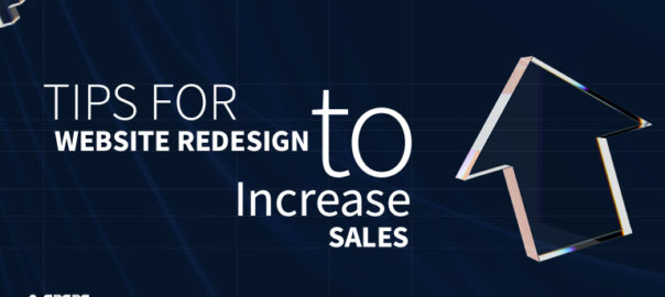
“People eat with their eyes,” and if you also agree with this statement, maybe you are already convinced that you need graphic design inspiration for your business through agency.

Deploying interactive graphics in every stage of the marketing funnel is a new business trend.

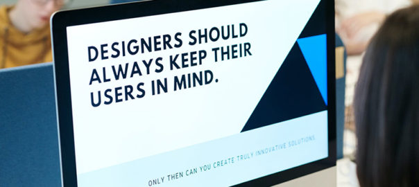
After all, aesthetics are the best medium to change a customer’s perception. It is a source to silently communicate with customers and create a big influence on their buying behavior.

With almost every business activity happening online, graphics have become an enduring topic.

But, How To Identify the Best-Suiting Graphic Design?

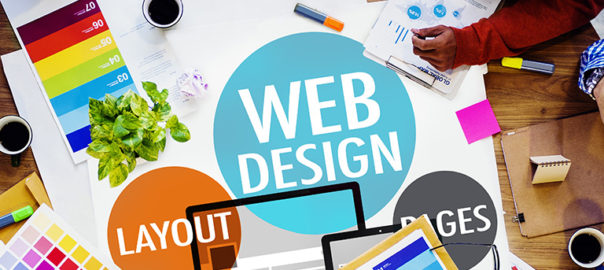
If you are in online business, eventually you’ll need website design services. But most importantly, you need a well-crafted sales page that effectively ignites a sense of excitement deep in a viewer’s mind and, in turn, fulfils your business goals.

For the accomplishment of this vision, you can’t make any choice ambiguously. Indeed, you should better have a look at these suggestions that are a great inspiration.

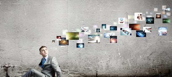
Interesting data visualization

With graphics, we basically meant with an ecosystem that put forward your achievements, your ideas first. Statistics, research findings, impact-expressed facts and figures, charts, and maps are the best and finest graphical instruments to tell a story and showcase your achievement like a professional. Post-pandemic, data visualization has seen outstanding growth. Some of them became incredibly useful to the audience, while others served merely for promotional objectives.

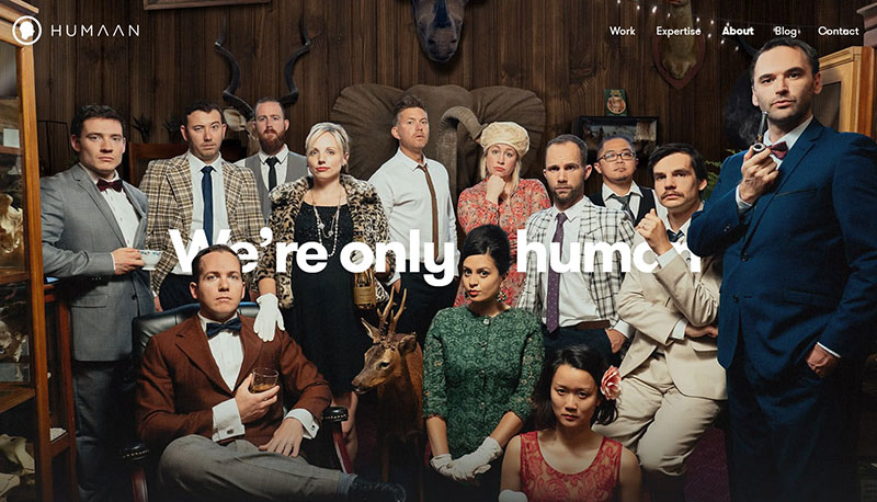
Yes, sleek design is timeless.

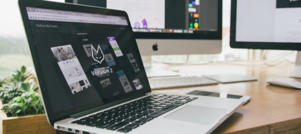
Trends come and go, and this is also true for design. Most graphic designs have been quite popular for a long time. If you are also a new design enthusiast, you may be able to capitalize on new trends more effectively. Beyond a doubt, they are helpful in keeping your brand bright and fresh. But not if they aren’t conveying your brand’s motives and hampering the key vision. Either if you are moving to website renovation, sleek design should be a top priority.

Bold, abstract shapes

Interesting shapes, like blobs, ellipses, or ovals, with topping of some bright colors are making rooms in the modern graphic designs. Abstract surrealism and geometric patterns can serve a rich user interface (UI) and user experience (UX). With several eye-catching moving on-screen elements, graphics can become visually striking. However, cutting unnecessary work is necessary.

Dark-mode friendly graphics

Over 81.9% of users run their device in dark mode. One of the reasons is that it can significantly alleviate potential eye strain. Amid the growing popularity of dark mode, unfortunately, most graphic designs might fail to serve the intended purpose. The world’s leading social media giants, Apple and Facebook, are adjusting to the dark mode interface requirements of their audiences. So you can ask your graphic design services provider to work on the dual-scheme visuals.

Final Words on Graphic Design Inspiration

A compelling graphic is good, but well-informed selection for design provides you an edge over the competition, yields outstanding marketing outcomes, and eventually builds the odds for you to stand out from the crowd. Graphics sets your business apart from others in the competition, but not until it informs the audience who you are, so there must be no room for errors and faults. Contact Us today to know more.

Read more about rules of Visual Hierarchy here.

Categories
Blog Brand & Identity Design UI Design Web Design

Website Redesign Tips To Amplify Sales

The holiday season is a wonderful time to wrap up a successful business year and set the tone for a prosperous new year. This time of year is ideal for owners of online stores to increase revenue and surpass their profit targets. Therefore, if you want to conclude the year on a high note and keep expanding your online marketplace, take advantage of the holidays by website redesign.

You must, however, understand how to profit from online holiday shopping. You need to learn how to succeed in the face of intense holiday season competition. Today, we’re going to discuss with you how to prepare your website for the festive season, so you may recognize this year as a resounding success and enter the next year with confidence.

Create An Efficient Strategy

Find out what you hope to accomplish before you start. To develop an effective plan for redesigning a website, you need measurable and specific targets. Goals can include improving lead conversion by a certain number, boosting traffic statistics for better SEO, publishing more adverts, and much more. Each objective requires a unique strategy that can be formulated with the assistance of a website design agency

Evaluation Of Existing Website For Redesign

Finding what needs fixing in the layout is the first step in making the necessary adjustments. Spend some time conducting an audit of the website and establishing priorities for necessary modifications. Try asking yourself, “What about it is so unappealing?” or “Why is it so difficult to use?” and then analyze the answers.

The research will show you what should be left out of the website redesign. Hence, you may fine-tune your plan for optimal results, which will allow you to make better decisions in the future.

Define Your Targeted Audience

Even with the most intuitive user interface possible, site performance will suffer if the layout doesn’t work for the target audience. Understanding your target audience is essential. Remember that the point of posting online is to have others consume your work.

For instance, online art galleries that are ostensibly meant to display works of art typically feature just photographs. But will a brand that attempts to sell paintings online succeed if its website design doesn’t do anything to draw attention to the paintings it sells? Some websites, like news blogs, have found success by adhering to a strict format designed to attract visitors with a particular interest.

Observe Your Competitors Closely

There are a number of factors, including industry, niche, and target audience, that can affect the layout of a website. Competing brands’ websites can look identical to one another. Since you’re competing for the same customers as them, it’s a smart move to study how they’ve succeeded.

Make A List Of Your Requirements for Website Redesign

Knowing your intended audience, the constraints of your present website and other variables will help you properly prioritize your list of necessary features. Add-ons that cater to a certain audience or expand the site’s capabilities are examples of this.

The criteria for an “excellent” website should be established by your needs. Having a well-defined plan in place now will make it much simpler to incorporate all the necessary elements during development.

Implement The Redesign of Website

Implementing the new design for the website is the last phase, and it must be done precisely. If you employ someone or try to handle it yourself, be sure that progress is being made according to the plan. If you’re hiring web design services, be sure you’re able to convey all of your needs clearly to them.

Bottomline

Small businesses, in particular, have a great chance to make a splash and establish a reputation for themselves over the Christmas and New Year’s holiday seasons. Putting these suggestions into practice on your website can have a profound effect, boosting both its performance and the number of customers it converts.

Categories
UI Design Web Design

Try These 5 Web Design Principles To improve Your Conversion Rate

Every business wants to grow and increase its sales. Companies put a lot of time, effort and money into devising marketing strategies to boost their revenues. A website is one way to market their offerings to the people using the internet (which, by the way, is huge in number). A lot of marketers boast the importance of SEO, social media, creating lead magnets that convert, etc. Yet, creating a brilliant website is the first and most important step. 

Stanford University’s research stated that 46.1% of people say a website’s design is the top criteria for deciding a company’s credibility. Therefore, it’s highly critical that your design looks professional. This article will share five web design principles that will boost your conversion rate, thereby creating more revenue for our business.

1. The 8-Second Rule

Studies have suggested that you only have 8 seconds, on average, to get a visitor’s attention. The human attention span on the internet is too short. There’s a very tiny window of opportunity for you to engage a user once they land on your website; every second count. Here’s what you can do:

  • Use a crisp, benefit-driven, pin-pointed headline in large font
  • Include multimedia such as audio, video or other interactive content.
  • Use eye-catching, attention-drawing imagery to convey the prime purpose of your page
  • Use the imagery as a guide to the call-to-action button
  • Make signup buttons large, simple and straightforward.
  • Write powerful copy to entice and engage users.
  • Use hover effects on your buttons 
  • Use animated exit popups to re-engage visitors who are on the verge of bouncing off

2. The Rule of Thirds

One of the key web design principles is to follow the famous photography principle – The Rule of Thirds. To apply this rule, you’re supposed to visually divide an image (in this case, your website page) into thirds, both vertically and horizontally, giving you nine equal squares. The rule says, the four middle intersections are key, strategic places of interest. It creates the most impressive image or design when objects are placed at these points.

Remember that you don’t need to design your entire website strictly by the rule of thirds. Only use it as a tool to help you perfectly place crucial elements. Take a screenshot of your website, only above the fold part or just your header section; divide it into nine equal squares. Analyze it according to the principle and take a call if you want to make any changes or not.

3. The Hick’s Law

Hick’s Law is a famous theory cited by many individuals for various purposes; it is also frequently referenced in web designing. The law is named after a British psychologist, William Edmund Hick. The law states that the time it takes for an individual to decide is directly proportionate to the possible choices they have. In other words, by decreasing the number of choices, the decision time is also decreased and vice-versa.

Using this principle in web design, you can boost conversions by restricting the number of choices users have. And, where do you offer the most number of choices on your website? In the navigation bar. Don’t offer too many links to the users; it makes it challenging for them to choose. The user will lose interest in them altogether. 

4.The KISS Rule

This one is a common rule, being applied in several fields. It means Keep It Short And Simple and applies to web designing too. Simplicity is super essential when it comes to improving conversions. pThe moment you create a page, ask yourself whether you can make it more simple or the simplest. The results are more aesthetically pleasing, and conversions are increased.

It is similar to the earlier discussed Hick’s Law. However, simplicity is more than just limiting the options. The aim is to create a clean overall design that is uncluttered and minimizes distractions. Like Hick’s Law, people can only handle a limited amount of information at one time. Visually stuffing the website will overwhelm and bother users. Creating a great user experience on your website requires you to eliminate everything that unnecessary to the design.

Apple is one of the most significant examples of simplicity in web design. Countless other brands have followed their style for its effectiveness.

5. Negative Space

Whitespace is often referred to as negative space in web design. Positive space includes all the elements on your site, while negative space is the empty space in between. Don’t go by the name. Negative space is actually a good thing in web design; without negative space your website would be unusable and unreadable.

Negative space doesn’t just refer to the space between your page’s larger elements, such as the space between your header and your content or space between your sidebar and your content. It also refers to the space between all the more minor elements on your page – the space between lines of text, the space between paragraphs, and even the space between letters. Pay attention to the negative space on your site, in all forms, to keep everything legible, scannable and easy on the eyes. All of this leads to increased conversions.

Conclusion

Now that you understand these five web design principles, put them to good use by taking a hard look at your existing design. A thorough evaluation of your website will let you know the strengths, shortcomings, and areas of improvement. Need an expert opinion? Talk to our team.

READ MORE: Here are 5 pro tips that will come in handy while designing a visually stunning and user-friendly website

Categories
Brand & Identity Design UI Design Web Design

Web Designing For Accessibility: Tips And Guidelines To Follow

The world is evolving faster than ever, and humans are becoming more and more dependent on technology. The Internet has changed the world, and today all of us depend on the internet for almost everything. Be it searching for a job, ordering a pizza, booking a dentist appointment, learning, and whatnot? The internet may be an ever-present resource for most people, but connectivity to the resource is a challenge for people living with disabilities. Although there are programs and devices, like screen readers, that make it possible for people with disabilities to access websites, web designing for accessibility is still a practice less followed.

According to data from 2012, almost one in five Americans live with a disability of some kind. Close to one billion people in the world, or 15 percent of the world’s population, lives with a disability. Out of all kinds of disabilities, conditions like visual impairment, autism, difficulty grasping objects, and deafness, just to name a few, can severely limit an individual’s ability to use a computer or smartphone without assistance and support.

There’s a myth that web designing for accessibility is difficult and expensive; it’s not true. Making your website more accessible doesn’t mean adding extra features or content; therefore there shouldn’t be an additional cost and effort.

Here are a few tips that will help you in web designing for accessibility in accordance with the AA level of the Web Content Accessibility Guidelines (WCAG 2.0), and will allow your website to work on the most commonly used assistive technologies — including screen readers, screen magnifiers, and speech recognition tools.

Maintain a Proper Contrast Ratio

Color contrast is an important aspect of web designing. But, it is often neglected as a web accessibility problem. People with low vision could find it difficult to read text from a background color if it has low contrast, whether on a plain background or text embedded within an image. A movie with subtitles is a good example. The text often appears without anticipating the background. It happens when white text appears in a brightly lit scene. It is unreadable, and the audience is left not knowing the dialogue.

It is critical to consider the sufficient contrast between text and background. According to the W3C, the contrast ratio between text and its background should be at least 4.5 to 1 (conformance level AA.) The ratios become more forgiving with larger and heavier fonts since they’re easier to read at lower contrast. If your type is at least 18 pt or 14 pt bold, the minimum contrast ratio drops to 3 to 1. You can use tools like Contrast Checker to see how your planned font and background colors work together.

Don’t Just Rely On Colors 

When you’re communicating something important, showing an action, or prompting a response, don’t use color as the only visual cue. People with low visual acuity or color blindness will have a hard time understanding your content. Try to use an indicator other than colors such as text labels or patterns.

Elements with more complex information like charts and graphs can be especially hard to read when you only use color to distinguish the data. Use other visual aspects to communicate information like shape, labels, and size. A good trick is to print your graph in black and white and see if you can still understand everything in it.

Keep Your Navigation Predictable

The navigation system your website uses should be consistent across its pages. This includes the icons you use and the way visitors get to different pages within the site. if your homepage has a top header bar with drop-down menus, each of your other pages should have this arrangement, too. Similarly, the icons you use across your website need to be consistent.

You should also stay away from any kind of automatic navigation and auto-playing music and videos. not only are they annoying, but it’s also difficult for a user with a screen reader to determine how to pause them. And when a slideshow or carousel scrolls through content at a rapid rate, users can become confused and frustrated.

Support Keyboard-Only Navigation

Web designing for accessibility is not restricted to the elements on the screen. Keyboard accessibility is one of the most critical aspects of web accessibility. Especially for the ones who are blind and rely on screen readers. Also, for people who don’t have precise muscle control; they can’t grasp a mouse or keep their hand steady on a laptop’s touchpad. These users rely on their keyboards to navigate websites. 

These users typically use the Tab key on the keyboard to navigate through interactive elements on a web page – links, buttons, or input fields. The order of the interactive elements is essential, and the navigation must be logical and intuitive. The tab order should follow the visual flow of the page – left to right, top to bottom.

Add Appropriate Alt-Tags To Images

Alt tags are brief descriptions of the images you use that get buried in the site’s HTML. Most users never see these descriptions, but site visitors using screen readers rely on them since they “hear” the content. These tools convert text to speech so that the person can hear the words on a site. Alternative text, or alt tags, can be presented in two ways –  within the <alt> attribute of the image element, or within the context or surroundings of the image itself. 

Alt tags aren’t just useful for your visually impaired audience; they’re for your benefit too. Well-crafted alt tags improve your site’s SEO, drawing more relevant site traffic and improving conversions.

Use Labels Or Instructions With Form Fields And Inputs 

Using placeholder text as labels are one of the biggest mistakes when designing a form. Placeholder text is usually gray and has low contrast, so it’s hard to read. People who use screen readers usually navigate through a form using the Tab key to jump through the form controls. The <label> elements are read for each form control. Any non-label text, as placeholder text, is usually skipped over.

Always help people understand what they should do and write in a form. It’s best if labels don’t go away, even when the person is filling an input. When designers hide descriptions or directions in their forms, they’re sacrificing usability to attain simplicity. That said, we don’t want you to clutter your design with unnecessary information, just make sure to provide essential cues.

Web designing for accessibility is a new and growing trend. While these tips will certainly help you in creating websites that are much more accessible for people with disabilities, there is still a lot of scope in terms of improving the user experience for this set of audience. As designers, we all need to grow and master the art of accessibility since technology is usable for all – regardless of their abilities. Looking to improve your web design? Talk to our experts.

Looking for 2020 Design Trends? Click Here to Know More

Categories
UI Design Web Design

7 Handy Tips To Improve Your Website Design

It is a known fact that today’s business is conducted online. From shopping to marketing, to communicating with providers, people depend on the Internet to help them perform everyday tasks. Without a website, businesses, blogs, and brands can’t be successful. That’s the reason why everyone is on the internet today. With millions of websites, it becomes extremely challenging to stand out from the crowd. A website usually has 4-5 secs to create an impression on visitors; that’s very little time. Therefore, website designers must ensure that they create a website design that ensures a delightful, user-friendly experience.

We often talk about the latest design trends, user experience enhancement, interface enhancement, and a lot of other things. The idea is always to keep improving the website experience by offering the best. However, a lot of times, we tend to forget some basic actions which can elevate the website design and experience to a whole new level. Here are a few tips.

Use White Space

First things first – Whitespace doesn’t mean a lot of white color, its the way designers term the empty space or negative space. Research and studies suggest that the use of white space in the left and right margins, and in between paragraphs, increases reader comprehension by almost 20 percent. Adding white space means more user interaction, the page looks better, and you can highlight your CTAs with more ease if you have enough white space to go around. It balances the visual elements by creating a visual hierarchy. Whitespace increases content legibility and acts as a separator.

Optimize The Page Speed

Website speed has long been discussed in the world of marketing, and it’s one of the main reasons why a lot of visitors bounce off from certain websites. People are impatient on the internet. They don’t like to wait and expect instant responses to their queries. If your website doesn’t load within a few seconds, to be honest, 2-3 seconds at the max, the visitors will most likely bounce off looking for other options. 

You can check your page load speed through a Google-free service, where you can get information on your page speed. Google will also offer you some suggestions for improving your page load time on Mobile and Desktop. 

To improve your page speed, start by compressing all your images before loading them onto your website. The image file size is one of the leading causes of a slow page speed — using websites like compressor.io can help you dramatically speed up each webpage you own. There are several ways to optimize page speed.

Create a Responsive Website Design

With the revolutionary advancement of mobile and other devices, your website is most likely to be accessed from devices other than PCs and laptops. It’s critical that your website is mobile-friendly and easy to navigate no matter what type of device your audience uses to access it. 

Google started penalizing sites that aren’t optimized for mobile devices from 2015, making the need for responsiveness even more crucial. This is probably the most valuable way to improve your website’s usability. A responsive design will do wonders for your website in terms of SEO and will help you position yourself higher in SERPs. So, create a mobile version of your website, use mobile plugins, and convert your website into a Responsive Web Design (RWD).

Make a Clear Call To Action

Some interesting facts – SAP found that orange CTA buttons boost conversion rates by 32.5%, while Performable found that red CTA buttons boost rates by a whole 21%. In creating buttons for your website you should think about color and the psychology of color. Different colors evoke different messages. Think about the message that you want to evoke for a user (trust, experience, intelligence) and choose your colors wisely. 

A second thing to consider is the actual words you use for your buttons. The words should include a verb or an action word that excites the user to do something. Use actionable words in them such as discover, start, learn, etc. Calls to actions (CTAs), clearly marked with an action word enable your website users to more easily navigate your site and get exactly what they want in the location they expect to find it.  

Utilize Social Media To The Fullest

22 percent of the world’s population is on Facebook, Instagram has 800 million active monthly users, Linkedin has more than 540 million user profiles, and Twitter has 100 million daily active users. These figures are staggering, which is why it’s important for your website to offer social buttons to your visitors. There’s a chance that they will like what they see, share their thoughts on their profiles, and boost your presence even further. 

Any website improvement ideas should involve taking advantage of social sharing and social following. Social sharing options are a fantastic way to improve website design. Use social media icons of different social media sites to allow users to share your content. The idea is to get guests to share your content when they like what they read. Sharing content puts it out for everyone else to see without you having to do any work. This will allow your website to become more popular and gain site visitors that would have never known about you otherwise.

Use Eye-Catching Images In Website Design

People across the Internet are getting smarter and faster at judging company websites before deciding if they want to browse the site further. When they first visit your site, they can easily pick out a generic stock photo they’ve already seen elsewhere or that resembles the non-personal style of stock photography. Using stock photography can decrease trust and also stand out as generic and non-unique.

With an audience that only has an attention span of 5-6 seconds, you need to create a lasting first impression that easily gets the main points across. This should be done with short, powerful sections of content and applicable photographs/icons that are sectioned off by clear and concise headers.

Website design is the foundation of user experience and needs constant attention and improvement. Are you looking to revamp your website? Or, need help in deloping your website from scratch? Talk to our experts now!

Categories
Brand & Identity Design Mobile Apps UI Design Web Design

‘Meet The Team’ Pages: The Human Element Of Your Website

While designing a website, designers categorize all the pages into three major categories – most important, important, and least important. Their focus and efforts on improving the user experience and elevating the aesthetics of the pages majorly depend upon the categorization. One of the pages that are often overlooked and incorrectly categorized is the ‘Meet the Team’ page. It may sound insignificant, and a very small element of a website, but plays a crucial role in the user experience journey. According to various studies, the ‘Meet the Team’ page is often the most visited page of websites that do have it.

Meet the Team

It is a small section on a website that introduces the team behind your brand and business. It is a way of recognizing individuals who allow your business to bloom and prosper. It may not seem too important, however, it helps a lot to create a positive image of your brand.

The ‘Meet the Team’ not only presents the faces of workers, but it also allows users to know more about the company and its work culture. Be it the pictures of the faces, or a large panorama of the entire group, team pages are there to show the quality and commitment of business.

The personalities, qualities, and ethics of people that make up a company are equally important as are the company’s achievements. Creating a team page that offers meaningful insight into a company’s culture and character enhances the human quotient. Users want to interact with your website as they are interacting with real human beings, and this page is a perfect platform for you to develop that kind of relationship with them. It greatly adds to the credibility that builds trust with customers, partners, and clients.

Best Practices

1. Put a Face and Personality 

Most companies include professional photos of key team members on their team page so that the customers, partners and other agencies quickly connect with the team. It is the most popular way of showing the team. However, the reverse approach has also shown tremendous results. Websites that used personal photos of team members, with friends and family, instantly connected with the audience. Multiple photos of the team at social functions and office gatherings are also a unique way of displaying bonding, teamwork and the fun that the group has together.

2. Create a Mix of Professional and Personal Information

Mostly the profiles include the name, designation and bio information. But, that’s a subtle and traditional way of displaying the team. Although, professional info should be mixed with personal, fun info as well. Include fun, personal passions, and interests that make individuals approachable and showcase personalities. Details like ‘favorite moments’ or ‘fun facts’ allow their staff to highlight skills, areas of expertise and personal attributes. The key point is that it portrays the company as a group of real people.

3. Include Personal Social Media Handles

A company’s team and its philosophy are important and must shine through its ‘Meet the Team’ page. A lot of times the team members personally contribute via their personal blogs, relevant publications, and other platforms. The information shared through an employee’s personal social channels is a reflection of the company’s expertise as a whole. Including an employee’s personal social handles or links is a great way to encourage readers to get to know your staff and the knowledge they offer.

4. Include Testimonials of Team Members

Testimonial quotes of fellow team members provided for each individual’s bio page not only represent who the employee is as an individual but also the strength of their individual role and the incredible value they bring to the team. Team bio and about pages are one of the most important components of any website. Adding a human touch can help build credibility and position your company and its representatives not only as thought leaders but partners that clients and prospects will respect. 

Characteristics of a Strong Meet the Team Page

  • It has personality
  • It is full of quality images and /or graphics, including headshots.
  • It stands out from other cookie-cutter designs.
  • It highlights the people who make up your team in a professional, personal and unique way.

Read more about other pages/screens here which should be designed cautiously

Here are some awesome ‘Meet the Team’ pages

Advantix-digital
Advantix-digital
Humaan - Our Team
Humaan
Mayple - Team
Mayple
Mimosa - Meet The Team
Mimosa

Wrap up

Creating a “Meet the Team” page expresses your company’s identity. It increases brand awareness and definitely this is something that helps your brand to grow. Contact Us Today if you think your brand’s team page needs tuning 🙂

Categories
Blog Technology UX Design

Top 10 User Testing Software To Improve Your Website

Testing is an integral part of the web development process. You may have designed a good UI and may feel confident in delivering a great user experience, but it can only be assured through proper testing. The process of user testing is pretty exhaustive and takes much time; especially when you are conducting in-house testing. Thanks to the technological advancements, today, many user testing software and tools can help you to monitor user behavior and collect vital feedback to make your design more productive. 

In this article, we’ll take a look at the top 10 user testing software, not in any particular order, which can assist you in improving the user experience of your website.

1. Userbrain

UserBrain

Userbrain is a widely-used, easy solution to monitor how users react to your website. On signing up, you get access to real-time videos of people interacting with your website. Additionally, Userbrain provides access to a big team of testers, which means you don’t need to recruit testers; neither you would need to manage and pay the users for participating in the test. 

2. Loop 11

User Testing: Loop 11

Loop11 offers usability testing for websites, wireframes and prototyping and accessibility. It aims to simplify user testing with a minimum requirement of technical knowledge. You don’t need to be a pro in HTML or CSS; however, a JavaScript solution is available for the pro developer minds. 

You can test on mobile devices, create custom themes and conduct multiple tests for all the elements. Moreover, users can get real-time reporting, look at heat maps, view clickstream analysis and watch session videos to analyze what users are doing. The best part is that Loop11 can be easily integrated with many prototyping tools, including Axure, JustInMind, and InVision.

3. Lookback

LookBack

Lookback is a simple UX recording software that can record a user’s computer or mobile device in-house or remotely. Interestingly, you can join the live testing sessions and communicate with the user while they’re exploring your design. This way, you can ask live questions or can even interview them to get first hand, real-time inputs. It is a unique feature and is absent from many user testing software. 

4. TryMyUI

TryMyUI

TryMyUI is a usability testing service that helps in discovering the ways to improve your website or mobile app by setting up your own custom test with specific tasks for users. It allows you to find out the correct user base through a wide range of demographics. There’s an option that allows you to watch the recording of the users while conducting the tests you’ve set, or you can use the TryMyUI Stream service. The service allows you to find the drawbacks in your design which results in a bad UX, using the Stream’s AI frustration finder. 

5. Crazy Egg 

User Testing: CrazyEgg

Using Crazy Egg is like monitoring your visitor interactions through x-ray glasses. It is a user testing heat map software that helps you understand what people are doing on your website and why visitors may not be converting into repeat customers. Heat maps identify the elements of your website, which are clicked on and the source of traffic. One of the highlights of Crazy Egg is the scroll map, which identifies how far visitors scroll down a page before they bounce off. It also offers the ability to monitor the numbers of clicks on each element of a page and perform A/B testing.

6. Hotjar

HotJar

Another popular user testing tool to analyze and get useful insight for your website is Hotjar. Just like Crazy Egg, Hotjar also uses heat maps to provide useful feedback. It allows you to monitor those parts of your interface that draw user attention and gets the majority of impressions and clicks. With Hotjar you can watch users’ recordings and people’s mouse trails to monitor exactly how they’re navigating on your website. The Conversion Funnels is another feature of Hotjar that lets you know at which point people are abandoning a purchase or leaving the sign-up process. Other hot features include form analysis and feedback polls.

7. Inspectlet

Inspectlet

Inspectlet closely monitors visitors’ activities on your website. It monitors what links they click on, users’ mouse movement, scrolling, and key-presses. In addition to recording user interaction on your website, it includes a heat map, which allows you to identify the most visited sections of your website. The heat map also includes eye-tracking, information on elements clicked, and how far visitors scroll down pages. The analytics tool highlights the pitfalls and trouble areas.

8. Reflector

Reflactor

Reflector is a screen mirroring app designed specifically for usability testing and it monitors how your app design works on mobile. This tool allows you to access your mobile or tablet screen through your PC wirelessly. Just like the other mentioned tools, Reflector allows you to watch how people use your app. It also includes recording capabilities so that you can review your testing sessions anytime later.

9. UserTesting

UserTesting

UserTesting is one of the best and simple ways to record and monitor users’ interactions on your website. With UserTesting, you can select your target audience and assign them tasks to perform on your website. The tests can be run on a desktop, tablet or mobile phone. UserTesting records real people sharing their thoughts and feedback while interacting with your website or app.

10. UserZoom

User Testing: UserZoom

UserZoom is an enterprise-level, adequately packaged user experience research and analytics platform. Besides capturing user interaction, it also provides robust analytics data. UserZoom allows you to test websites and prototypes, perform market research, create UX benchmarking and offer insightful reports with user actions, unique views, click information, heat maps and more.

Do you know UI and UX are connected? Read here to know more

Wrap up

These tools are perfect for getting started. Your choice of tool depends on your requirements. The best way is to use the free trial versions at the beginning to see how well each one suits your needs. Want to discuss more on user testing? Speak to our experts.

Categories
Brand & Identity Design UI Design Web Design

5 reasons To Not Use Stock Images On Your Websites

At the time of building a website, it is important to only select components that will positively impact your brand and support the objectives of the website. It especially holds true when it comes to choosing the right images for the website. It is important to understand and acknowledge the worth of custom photography and its positive impact on the brand. Some people might argue that custom photography is very costly as compared to stock images, but in reality, the initial higher cost is totally worth the investment in the long run. Here are some key reasons why custom photography is preferable over using stock images.

1. Clash of visions

No matter how professional the stock photo, it will always reflect someone else’s vision. The interpretation of the idea, concept, and emotion that you wish to convey will always differ from others. A picture is worth a 1000 words, but those words need to be yours. With custom photography, you have control over what thoughts and emotions your website conveys. 

From a marketing perspective,  that provides a great advantage. It is important to connect with prospective buyers on an emotional level. Whether it is a personal purchase decision or one for business, emotions and feelings always have an impact on decisions. Emotions drive people to take decisions, and that’s why you need to convey your emotions and vision through your pictures. If you use stock photos, your vision may be misinterpreted, and you may never strike where you wish to. 

2. It weakens your brand’s authenticity

An authentic brand is one that presents itself with honesty and transparency. When visitors interact with your brand, through your website, they must feel as if they are interacting with a human. Authentic brands are relatable, trustworthy, and thus successful. According to a study, 83 percent of consumers surveyed said that trust drives their loyalty to a brand.

Using stock photography is easy, but putting up actual photos of your business or employees will strengthen your connection with your visitors. Opting for meaningless stock photos showcase a very gloomy and dicy brand image. It runs you into a risk of losing out on customers. Instead of stock images, make choices for your visual content that will cultivate a deeper relationship with your clients and customers. Professional, well-lit photos of your real employees doing their real jobs will carry more value and build more trust than yet another stock photo.

3. Short-term cost vs long-term cost

It’s an obvious fact that hiring a professional photographer will incur larger initial costs than using stock photos. Plus, there are additional expenses involved like hiring professionals, arranging the equipment, or outsourcing the entire project to shoot. But, stock images also come with additional costs other than the licensing fee, which by the way are also very high. 

The recurring loyalty charges can be quite high depending on the quality of the image and how often you want to use it. Additionally, there’s also the time costs – it’s a tiresome job to look through hundreds and thousands of photos to find the “perfect photos” for your website. 

When you use custom photography, you create your personal library of images that you own. These images can be used in the future without any cost being involved. With stock photography, there are often limitations on how you can use the image and for how long.

4. Similar photos can create confusion

Imagine the same lady posing as a customer support executive on hundreds of websites, under the contact us or support section. Even if not on hundreds of websites, there’s always a possibility that your competitor and you like the same stock photo. Or you both choose the same stock art to create your logos. The customers may get confused and that’s not good for your customers. 

The confusion can make people refer to a competitor’s brand to their friends and families. This can blindly divert your business. Losing customers is bad news.  But, it’s especially painful to lose customers to such an easily avoided misstep. That’s not all, what if your competitor does something unethical and his or her reputation takes a hit, your reputation might be impacted as well.

That’s why it’s a good practice to use customized photos for artwork. A unique logo and authentic photos of your products, services, and employees help you stand out from the competition.

5. Copyright issues

We have saved the most dangerous con for the last. Lawsuits are tricky and can get you in some serious trouble. And, they are costly too. So, if your goal is to save money by using stock art, be aware of the possible legal dangers. Stock art can end up costing way more than real images, once you fall into a legal trap.

You can’t trademark most images that include stock art. Attempting to do so could get you in trouble. And, stock art licenses include more potential pitfalls than just trademark issues. You open yourself up to litigation if you violate the specific terms of use for the stock art you purchase. Worse than that, copyright law is no-fault.

Read More About Web Designing With Type On Image

Therefore, instead of stock art, hire a professional photographer to take original pictures for your business. And, hire professional graphic designers to create a logo and visual assets for your brand. If that sounds way too much for you, hire a professional company to do everything for you. Have a word with our experts and learn more.

Categories
Blog Design Technology UI Design Web Design

Hiring A Web Designer? Look Out For These Essential Skills

Being a Web Designer in today’s world is both fascinating and challenging. The world of web designing is growing every day; there’s plenty of scope for a Web Designer to learn and grow. The learning process should not stop at any point in time, and a Web Designer must pick up new skills while fine-tuning the basic skills. So, what are these essential skills that are required to become a Good Web Designer? Here’s a list of some essential skills that you must consider while hiring a web designer.

Technical Skills

The most important skills to possess are technical skills. Stronger the technical skillset, better the web designing output.

Visual Design Principles

One of the key skills for a web designer, that will help them do well is their visual designing skills. It might seem pretty obvious and straightforward that you need advanced design knowledge to be a successful web designer, but visual design targets digital products, so that’s a tad different. 

Visual design principles determine the look and feel of a website. Setting up visual design principles involves creating mood boards and type hierarchy, by playing around with web fonts and color palettes. Visual design principles have more to do with the kinesthetic elements; that said, it’s very closely linked to user experience.

Color Theory

As a web designer, it’s essential to be familiar with the color wheel. Basic understanding of how complementary, contrasting, and analogous colors work together, is a must. Knowledge of combining primary colors to create new colors will help you create a pleasing, appealing color palette.

One of the most common mistakes committed by web designers is the use of clashing colors. A little bit of visual disparity can lead to an exciting design. Still, conflicting hues can also lead to an ugly and unreadable layout. Everything including text, calls to action, and headers should use colors that go with the overall theme and has a strong sense of legibility. A web designer needs to know when to use lights and darks, how to use contrast and saturation so that they excel in their work.

UX

UX refers to User Experience; it is the experience that a person has when they interact with your website. It is how people feel when they use a website. A web designer must have UX knowledge to approach web design from a user-first perspective. The objective is to design a website that helps users to get what they need.

A lot of factors can be improved – the content, the navigation, the colors, the CTAs, and more. The better the web designer is at UX, the more useful the website gets designed.

UI

Very closely connected to UX is the user interface (UI); it is the series of screens, pages, and visual elements like buttons and icons, that enable a person to interact with a product or service. These elements guide and navigate the user through the design, overcoming any obstructions, offering a smooth experience. UX is more about the broad aspects of how design affects someone, while UI focuses on specificity. UI elements include navigational elements, intuitive interfaces, and calls to action that guide people to do what you want them to do in the shortest amount of time.

Graphic Designing

Website and graphic design are very similar in terms of creativity. Both are artistically crafting visual elements. However, web designing is a medium where ongoing changes and updates are a part of any project. On the other hand, graphic designing is about creating visuals with lastingness. Designing website elements fall under web designing while designing a logo falls under graphic design. Both are different design disciplines but are a part of branding. 

Graphic design skills will enhance the skill set of web designers. If they can hand-draw typography, custom illustrations, and other creatives, it will undoubtedly improve their web designing work.

Non-technical Skills

Apart from the technical skills, there are some other skills that elevate a web designer’s performance.

Communication

A web designer must have the capability to get their point across to the various stakeholders effectively. They’ll have to interact with product managers, marketing teams, clients, and even pitch ideas to potential clients. Therefore, good communication skills are a must for any Web Designer. Moreover, explaining your vision for a project in a way that non-designers or people with minimum technical knowledge understand is essential.

The role of a Web Designer has evolved over the last few years. Today, they do a lot more than just designing. They contribute to copywriting, editing for sites, developing presentations and more. Good communication skills will always be handy for them.

Time-management

Whether you work for a design agency or work on your own, managing various design projects require effective time management skills. A Web Designer needs to stay on top of their schedule to make their project stand out. They should be aware of various productivity apps like task lists or calendars, or project tracking tools like Trello or JIRA, to better manage a project. The world of web designing is hustling; mastering the art of prioritizing and tracking your work will be crucial to a Web Designer’s success. 

A Web Designer has to respect deadlines and provide regular progress reports to all the stakeholders. Their time-management and self-discipline skills often define their reputation as a true professional.

Proactivity and Creativity

Creativity is ‘The Game’. If a Web Designer doesn’t have a creative mind and can’t come up with new ideas to design, all the technical knowledge goes down the drain. Proactive and creative Web Designers take ownership of their projects and share responsibilities with the Project Manager. As a professional web designer, you should understand the project’s scope, purpose, and standards, acknowledge your client’s expectations, and continuously come up with constructive, out-of-the-box ideas.

Here are some tips to become a successful web designer

Like many modern-day job roles, a web designer’s role also demands a wide array of skills. Personal skills, along with sound technical knowledge, not only helps a Web designer to grow personally, but it also benefits the company. The next time you hire a Web designer, look for these skills. If you require our web designing services, talk to our team now!