Single-page websites were once not a real favorite of web designers. However, things have changed over the past decade, and single-page sites have gained popularity owing to its ease of creation, simplicity and potential to deliver a rich user experience. That said, which one is better – multi-page or single-page website, is a never-ending debate. A single-page website is faster and easier to develop, but it still requires a lot of creative thinking and thorough planning.
Single-page website
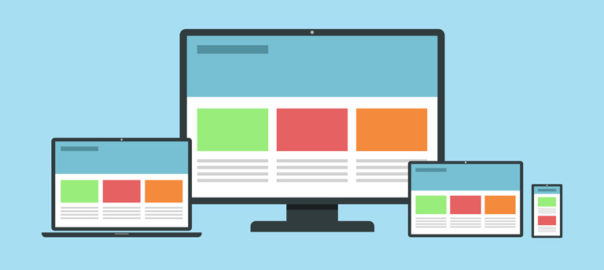
No prizes for guessing, a single-page website is a website that contains a single HTML page. The entire content of the site is placed on one page. When users click on a navigation link, they are directed to an HTML anchor on the very page.
Single-page websites are responsive and provide better mobile UX. It offers a lot of freedom to web designers in terms of layouts and visual effects. They do have a few drawbacks as well, like it is not SEO friendly. You cannot index several web pages with various keywords and meta descriptions, which will negatively affect organic traffic performance. The key is to understand the target audience, their expectations, and the company’s long-term goals.
A single-page website is best suited for personal websites, portfolios, landing pages, brochure websites, single-product websites, resume pages, one-time events etc.
Single-page websites: Best practices
Break Down The Content
A single-page website is a right choice for you if you don’t have much text to display. Though less text doesn’t mean less information. Therefore, you need a clear and easy-to-follow visual structure. Create a story and break the content into small chunks and sections using different header styles, background colors, overlays etc. Well-written content along with appealing visual effects will ensure that users don’t stop scrolling on your website.
As you only have one page, try not to feed too much information to users. Use multiple sections and keep the messaging clear and concise. More importantly, ensure that you maintain a continuous and sequential flow of content. Another way to keep users following your point is to tell a story using both visual and textual content. Storytelling is a powerful way of delivering content.
Create A Visual Hierarchy
Visual hierarchy tools used for web design include size, color, contrast, proximity, and repetition. A common belief states that people read in the F-pattern when they are served a large amount of textual content, while the Z-pattern suits pages that have less text. But, it is suggested to use both of these patterns for different sections, as a single-page website contains numerous sections, and it’s essential to diversify the site structure.
The single-page visual hierarchy should be concise yet encouraging. Before selecting a particular page structure, identify your needs and keep in mind that you only have one page to scroll.
Add Alternative Navigation
Single-page websites are all about scrolling and sometimes about endless scrolling. At times, this can leave the users clueless and stranded, with no idea where to go. If your site has a complex structure and with a lot of blocks, you should think of alternative navigation.
Use a sticky navigation bar that stays on top of the page, no matter how deep you scroll. This will allow users to move to the section they are looking for quickly. Also, use anchor links and a back-to-top button to keep the UX pleasant and intuitive. Always keep the users on track. Try to combine scrolling with a traditional navigation system. Don’t forget to put a “back to the top” button if you have a long single-page website.
Add A Compelling Call-to-Action Button
A call to action button is the most influential factor in a conversion. A well-designed CTA influences users to take the desired actions; be it a mobile app download, order placement, demo request, email signup or as simple as a contact form submission. The exceptional quality of a call to action increases the chances of conversion.
Single-page websites are perfect for a CTA. Because of their structure, single-page sites are more focused as compared to multiple-page sites. The design and placement of the CTA must be around the specific purpose of your website.
Keep It As Simple As You Can
Take a look at any of the traditional, multiple-page websites and you will notice that they are created based on a particular design theme. A few templates of inner pages are added to this basic design theme to complete the overall design. However, it is much more challenging to design a single-page website.
With the recent developments in CSS3, HTML5 and Javascript, the opportunities to create a simple and engaging website are as vast as you can stretch your imagination. Adding little details, like animations and smooth transitions, also contribute to enhancing the user experience.
Don’t make It Heavy
A lot of times the goods about a single-page website are washed out by its slow load speed.
Since there is only one page to deliver the content, all information is stuffed onto one page, making it really heavy and takes ages to load. Be selective, don’t stuff the website with unnecessary information and heavy animations. Saving a user’s time should be paramount. Slow loading will also hurt your website’s SEO.
Analyse the pros and cons of a single-page website, and then make an informed choice. In case you would like to know more about it, talk to our experts now.