NYX Ditech

Categories
UI Design Web Design

Try These 5 Web Design Principles To improve Your Conversion Rate

Every business wants to grow and increase its sales. Companies put a lot of time, effort and money into devising marketing strategies to boost their revenues. A website is one way to market their offerings to the people using the internet (which, by the way, is huge in number). A lot of marketers boast the importance of SEO, social media, creating lead magnets that convert, etc. Yet, creating a brilliant website is the first and most important step. 

Stanford University’s research stated that 46.1% of people say a website’s design is the top criteria for deciding a company’s credibility. Therefore, it’s highly critical that your design looks professional. This article will share five web design principles that will boost your conversion rate, thereby creating more revenue for our business.

1. The 8-Second Rule

Studies have suggested that you only have 8 seconds, on average, to get a visitor’s attention. The human attention span on the internet is too short. There’s a very tiny window of opportunity for you to engage a user once they land on your website; every second count. Here’s what you can do:

  • Use a crisp, benefit-driven, pin-pointed headline in large font
  • Include multimedia such as audio, video or other interactive content.
  • Use eye-catching, attention-drawing imagery to convey the prime purpose of your page
  • Use the imagery as a guide to the call-to-action button
  • Make signup buttons large, simple and straightforward.
  • Write powerful copy to entice and engage users.
  • Use hover effects on your buttons 
  • Use animated exit popups to re-engage visitors who are on the verge of bouncing off

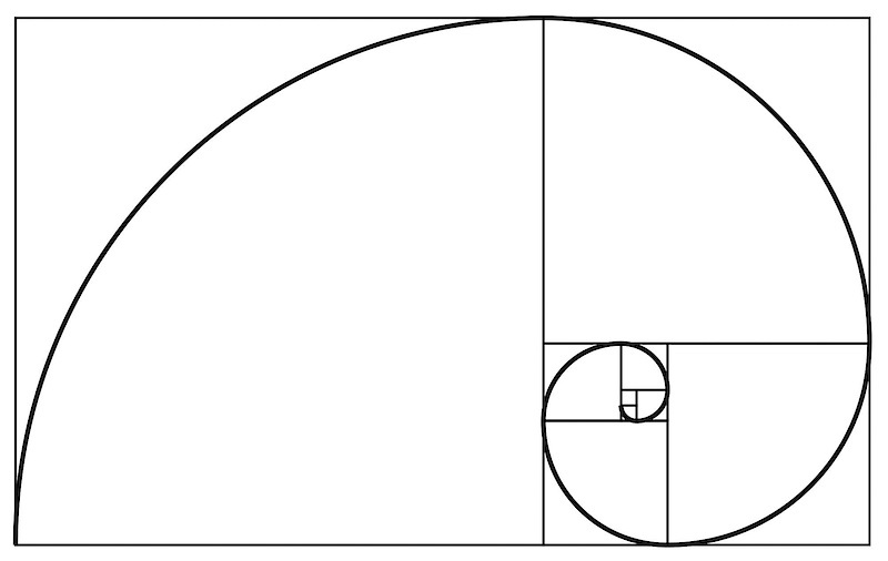
2. The Rule of Thirds

One of the key web design principles is to follow the famous photography principle – The Rule of Thirds. To apply this rule, you’re supposed to visually divide an image (in this case, your website page) into thirds, both vertically and horizontally, giving you nine equal squares. The rule says, the four middle intersections are key, strategic places of interest. It creates the most impressive image or design when objects are placed at these points.

Remember that you don’t need to design your entire website strictly by the rule of thirds. Only use it as a tool to help you perfectly place crucial elements. Take a screenshot of your website, only above the fold part or just your header section; divide it into nine equal squares. Analyze it according to the principle and take a call if you want to make any changes or not.

3. The Hick’s Law

Hick’s Law is a famous theory cited by many individuals for various purposes; it is also frequently referenced in web designing. The law is named after a British psychologist, William Edmund Hick. The law states that the time it takes for an individual to decide is directly proportionate to the possible choices they have. In other words, by decreasing the number of choices, the decision time is also decreased and vice-versa.

Using this principle in web design, you can boost conversions by restricting the number of choices users have. And, where do you offer the most number of choices on your website? In the navigation bar. Don’t offer too many links to the users; it makes it challenging for them to choose. The user will lose interest in them altogether. 

4.The KISS Rule

This one is a common rule, being applied in several fields. It means Keep It Short And Simple and applies to web designing too. Simplicity is super essential when it comes to improving conversions. pThe moment you create a page, ask yourself whether you can make it more simple or the simplest. The results are more aesthetically pleasing, and conversions are increased.

It is similar to the earlier discussed Hick’s Law. However, simplicity is more than just limiting the options. The aim is to create a clean overall design that is uncluttered and minimizes distractions. Like Hick’s Law, people can only handle a limited amount of information at one time. Visually stuffing the website will overwhelm and bother users. Creating a great user experience on your website requires you to eliminate everything that unnecessary to the design.

Apple is one of the most significant examples of simplicity in web design. Countless other brands have followed their style for its effectiveness.

5. Negative Space

Whitespace is often referred to as negative space in web design. Positive space includes all the elements on your site, while negative space is the empty space in between. Don’t go by the name. Negative space is actually a good thing in web design; without negative space your website would be unusable and unreadable.

Negative space doesn’t just refer to the space between your page’s larger elements, such as the space between your header and your content or space between your sidebar and your content. It also refers to the space between all the more minor elements on your page – the space between lines of text, the space between paragraphs, and even the space between letters. Pay attention to the negative space on your site, in all forms, to keep everything legible, scannable and easy on the eyes. All of this leads to increased conversions.

Conclusion

Now that you understand these five web design principles, put them to good use by taking a hard look at your existing design. A thorough evaluation of your website will let you know the strengths, shortcomings, and areas of improvement. Need an expert opinion? Talk to our team.

READ MORE: Here are 5 pro tips that will come in handy while designing a visually stunning and user-friendly website

Categories
Blog

Top 10 Features Of The Latest Photoshop 2020

If you’re a designer, you know how vital is Photoshop for professionally editing pictures. With loads of editing options, Photoshop opens the door to a huge number of image editing possibilities, which can enhance the visual appeal of pictures. The latest version of Adobe’s Photoshop 2020 comes packed with updated, new features to improve your image editing experience. Here’s a list of top 10 features of the latest Photoshop version, in no particular order.

1. Improved ‘Select Subject’

The Select Subject tool has been improved dramatically in terms of accuracy and speed. Users do experience a slow processing speed while using the ‘Select Subject’ tool on older Photoshop versions, like 2018 and 2019 ones. Even in terms of quality, one can clearly spot the low-quality edges, and the selection accuracy was also below par. However, the option is faster, cleaner, and much more accurate in Photoshop 2020.

Photoshop 2020 - Improved Select Subject

2. ‘Object Selection’ tool

The ‘Object Selection’ tool is one of the biggest new features of Photoshop 2020. It is similar to the ‘Select Subject’ option, however, where you get to select the areas you want Photoshop to focus on. Normally, when you use the ‘Subject Selection’ feature, Photoshop scans the entire image and determines everything which it feels is a subject. In many cases, these subjects can be more than one. So, what to do when you wish to select just one subject? That’s when the ‘Object Selection’ option comes to rescue. Navigate to the ‘Quick Selection’ group, click on ‘Object Selection’ and make a selection around the thing that you want to select. You can make a freehand selection, using the Lasso mode, or a rectangular selection, using the rectangle mode.

Photoshop 2020 - Object Selection Tool

3. Pixel layer properties

The Pixel Layer properties have also been greatly improved with a couple of new, essential features. The properties section now has way more information as compared to the previous versions. The Align and Distribute actions, quick actions like Remove Background, and Select Subject are very handy. You can make alignments according to the selection or the canvas.

Photoshop 2020: Pixel Layer Properties

4. Zoom to Layer Content

This feature is very useful, especially when you’re retouching or compositing. As the feature name suggests, it is basically zooming into the layer content. Hold the ‘Alt’ key or the ‘Option’ key and click on the element layer you want to zoom. It will zoom into the selected element, and you can work on the selection. This option not only helps you zoom into the particular layer content but also helps you in smoothly navigating through your image. Even switching from one zoomed element to another gets simplified. Instead of zooming out from one element, then selecting and zooming into the other element, you can simply hold the Alt or Option key and select the particular layer to zoom.

Layered Content

5. Photoshop 2020 – Animated GIF support

When you go to ‘File > Save as’ in Photoshop 2020, it now offers an option of saving your file in an Animated GIF format. The GIF saving options can be customized, as per your convenience. The file is directly saved in .gif format, inside the designated folder, and can be accessed directly. 

Animation GIF Support

6. Photoshop 2020 – Enhanced Transform Warp

The Transform Warp is way more advanced than before. It offers more control and allows you to add control points anywhere, or divide your image with a customizable grid. You can also transform by individual nodes or a larger selection area. You can choose ‘Split Warp Horizontally’ or ‘Split Warp Vertically’ to create a custom grid. It’s way advanced than the older versions.

Wrap

7. The updated Lens Blur

The Lens Blur is now faster than before, uses more GPU, and has a couple of new features, making it easier to work with. The access path is ‘Filter > Blur > Lens Blur’. Once the source is selected, you can enable ‘Set Focal Point’, which will allow you to click and focus on any part of the image. Click on the area, and the area will be focused, with everything else blurred out. The focus and blur can be manually controlled using the ‘Blur Focal Distance’ slider. The Lens Blur is way faster in Photoshop 2020, as compared to the previous versions.

Lens blur

8. The fancy crop tool

If there’s some distraction which we cannot get rid of by using Photoshop tools and features, we simply crop it. The crop tool has been re-designed in the 2020 Photoshop version and looks a bit fancy now. It seems much more refined and futuristic, even as the functionality remains unchanged. 

Crop Tool

9. New Text Layer Properties

A lot of new additions have been made to the text layer properties. It has so many things that the user can control. The Character, Paragraph, Type options, and the new Stylistic Sets option make it much more comprehensive. Also, you can now directly convert your text into a vector with just a click. 

Text Layer Properties

10. Support For Cloud Documents in Photoshop 2020

This is an interesting new feature and can prove very useful when you are traveling, using different computers, or working in a team. Photoshop 2020 supports cloud documents. When you go on to save your file, it will now open a new window, providing you with two options – ‘On your computer’ and ‘Cloud documents’. When the latter is selected, your file is saved as a cloud document on Adobe’s cloud. This will allow you to access the file on different devices, using the cloud. Adobe has also hinted that in future releases you’ll be able to use your files on the cloud to collaborate with others.

Cloud Document

Adobe has always tried to better its products, especially Photoshop, and the latest 2020 version proves it again. With added features and improved functionality, designers have much more freedom to play around with images and bring out the best. If you wish to create stunning graphics, speak to our creative team of designers, and get started.

You might be interested in reading a few tips for effortless UI Design. Read Here

All Picture Courtesy: PiXimperfect

Categories
Brand & Identity Design Mobile Apps UI Design UX Design Web Design

5 Factors That Influence Readability and Legibility of a UI

No matter how exciting and compelling your story is, it will not be able to create an impact on users if it isn’t presented in a clear and readable layout. People generally focus more on the content than its packaging. No doubt content is the king, but packaging plays a crucial role in determining its success. Readability and legibility are two key aspects of user experience design. To simply put – app and web users will not read your content if it doesn’t look clean, clear, and consumable. In this article, we will cover the factors that influence readability and legibility in user interfaces and why it’s important to care about them.

Readability

As the name suggests, readability is the ease of written content perception. It refers to the comprehension of the text content. It includes – the simplicity of words and sentences, ease of consuming information, and clarity of thoughts. Readability is determined by considering your website’s typeface, which takes font size, font style, line length, and line-height into account.

Legibility

Legibility is a much narrower concept than readability. It refers to how easily your audience can recognize and differentiate between individual characters in lines of copy on your website. Legibility is determined primarily by your typeface design. We can say that legibility is one of the components to fall under the bigger umbrella of readability. It is generally analyzed by examining users’ reading speed in terms of words-per-minute.

Factors Influencing Readability and Legibility

There are plenty of factors that directly impact the readability and legibility of the content. Here are the five most important ones:

1. Typography

Typography refers to the font style. There are some fonts that are easy on users’ eyes and create a delightful reading experience. On the other hand, some fonts are not so pleasing. The choice of fonts directly impacts the readability and legibility of your copy. Font size, width, color, and text structure – every single element matters. Fonts also add to the visual element, just like images. Typography in design is the art of balancing the aesthetic aspect of the text and the ability to read it quickly.

Negative space, alignment, tracking, the spacing between baselines of text, line length, etc. are all key elements to clear typography and comprehendible content. Designers must avoid too little space between the words, very less distance between the lines or letters, tiny font size, and non-contrasting text and background colors.

2. Background

Just like printed books and newspapers, the background color has a significant impact on the ability to read and comprehend the content on websites. It allows readers to distinguish both interactive elements and content. For instance, black text on white or light background appears more significant than the white text on a dark background. An improper color scheme will mostly result in reduced readability, leading to poor user experience. Relevant content or useful data that is unreadable is of no use; users will most likely not read it.

The nature of the content also plays a role in selecting the color scheme. Text-heavy interfaces aimed at reading as the main activity should use color schemes based on light backgrounds. In contrast, the image-heavy interfaces should use dark backgrounds to amplify the pictures’ performance.

3. Writing

The UX writing must be clear, concise, useful and consistent. Text is a vital part of the visual design and user experience. The best you can do with the written content on your website, app, or blog is to make it human-like communication. When you interact with your users through text, at any level, they must feel as if they are interacting with a real human being and not a bot. 

Remember – users don’t read on the web, but scan through the content. Be short and consistent in your written copy. An extended form of writing pushes off users. You must also build a solid text hierarchy so that users can quickly scan your page content. Use numbers, marked elements, and textual variants to catch attention. Marking out specific information by using bold and italic fonts, unusual text sizes, different colors, highlighting, etc. has worked well for years and still holds its significance; however, avoid overdoing it.

4. Visual Hierarchy

Visual hierarchy refers to prioritizing the content into different levels. It is based on the Gestalt theory that deals with the psychology of visual perception of elements. The theory shows how people tend to group visual elements. It organizes UI components so that the brain could distinguish the objects based on their physical differences, such as size, color, contrast, style, etc.

As mentioned earlier, people scan content over the web. So, if we take an example of a blog, they will first notice the headline, then subheadings and only then copy blocks. This is a typical pattern. Users scan the headline and subheadings to understand if the article is interesting and useful to them. Only then will they read the entire blog. The headline and subheadings should be framed in a way that is both informative and enticing. On the other hand, if users see the vast and long sheet of text, they will be scared to read it.

To build an effective visual hierarchy, the text is divided into three levels:

  • The primary level – It includes the biggest type like in headlines. 
  • The secondary level – This is the type of element that supports scannability, such as subheaders or captions.
  • The tertiary level – This one is for the body text and additional data. 

5. White space

White space or negative space is the area of the layout that is left empty. It can be either around the objects you place in the layout or between and inside them. Negative space provides breathing space for all the objects by clearing the unwanted clutter from the page. White space is a strong tool to improve the readability of your text and thereby enhancing the user experience. It also helps in creating a connection between the text and non-text elements of a user interface. 

Many more factors influence the readability and legibility of the content of a user interface; however, these are the most important ones. If you feel like discussing them further in detail, our team of experts will be more than happy to assist you.

Categories
Blog Design Technology UI Design

The Golden Ratio For Balancing Your UI Design

The key element of an effective design is a clear UI Design. Each and every element must be well-balanced and placed in sync so that users could easily perceive the information on the screen and interact with a product without efforts.

Art, science, and basic mathematical theories, all come in handy when it comes to creating an efficient design composition. Amongst the most commonly used tools for designing is a mathematical proportion known as the ‘golden ratio’. In the article, we’ll define this technique and check out the benefits of using this ratio in design.

The Golden Ratio

The Golden Ratio is a formula that has been derived basis a general observation that everything designed by mother nature has a specific shape that’s near perfect. People enjoy everything which has a natural touch. In pursuit of discovering the secrets of shapes and the mystery behind creation, mathematicians calculated a formula that appears in the majority of things on the Earth.

In simple words, the golden ratio is a mathematical proportion between the elements of different sizes which is thought to be the most aesthetically pleasing for human eyes. The golden ratio equals 1:1.618, and it is often illustrated with seashell-shaped spirals.

UI Design Golden Ration

The golden ratio is believed to be followed for 4000 years now. The likes of Leonardo Da Vinci and Salvador Dali were known to use the golden ratio theory in their artworks.

Use Of Golden Ratio In UI Design

Striking the right composition and balance is a core part of any design. The elements need to work well with each other and complement each other to maximize the viewing experience. Also, the elements should be created with a balance within themselves. 

Graphic designers are keener to apply the golden ratio as it is a great way to understand how to work with proportions. Designers use this ratio to create various graphics, especially for the small but meaningful design elements such as a logo. The golden ratio allows creating illustrations where each element is placed in harmony and appropriate proportion to the others.

The UI design needs to have a clear visual presentation of the components so that people could use a product without problems. The golden ratio is often applied to place UI Design elements effectively. First of all, it can be used at the stage of wireframing. This way you can plan a structure for the layout placing and sizing user interface components according to the golden proportion. In addition, the golden ratio scheme can help professionals to crop images for web design so that it could make sure the composition of the photo remains balanced.

Advantages of The Golden Ratio

Well-balanced content

Designers often face the situation when a product needs to contain a great amount of various content and each part of it is vital and cannot be replaced. To unite all the components in a pleasant composition, the golden ratio can be applied. Divide the layout into different sections using a proportion of 1:1.618 and put the content in the sectors according to their importance. Such a content composition is sufficient for users’ perception and it helps to organize all the components.

Effective visual hierarchy

Speaking of the content organization, we can’t forget about visual hierarchy. As we mentioned in our previous articles, it’s a technique of efficient structuring content components. Combining principles of these two techniques designers maximize the chances of building a powerful UI design composition.

Powerful typography levels

To create efficient typography, designers need to divide copy content into different levels. They usually include various kinds of copy including headers, subheadings, body copy, caption, etc. Applying golden ratio professionals can quickly define an appropriate proportion between the typographic levels, for example, you can choose a certain size for the header and then divide it by 1.618. The result will show you the most appropriate size for subheaders.

Pleasing first impression

When users try a product for the first time, they scan the user interface to understand if they like it or not. The psychology principle known as a visceral reaction states that people decide whether they like something or not within a few seconds of looking at something. This reaction goes faster than our consciousness so we don’t even realize it. That’s is why it’s vital to make sure the first impression of a product will be pleasing. UI Design created by using the golden ratio has a positive influence on users’ minds and their visual perception and it works from the first sight at a product.

Appropriate white space

White space is the area between elements in design composition. Designers always need to care about the amount of white space in the UI since the unity of composition highly relies on it. The golden ratio can make the process of spacing much easier and faster. Applying golden proportions you will be able to define the right white space which will work well for the UI design.

To discuss more on your design needs, talk to our team of experts.

Categories
Brand & Identity Design UI Design UX Design Web Design

7 Tips for Designing Effortless User Interfaces

The fact that simplicity is the ultimate elegance is an eternal truth. The power of simplicity can elevate any design for web and mobile interfaces. Moreover, a simple design is highly human-centric and thus creates a delightful user experience. But, a lot of times designers misunderstand ‘simple’ and interpret it as empty or monofunctional. Instead, it means clear, intuitive and helpful. The website with simple user interfaces not only solves user’s problems but also reduces their efforts.

Websites and apps are generally defined in terms of their appearance, functionality, or content. They are rarely defined in terms of respect. Often neglected, respect for the user’s time and energy is one of the vital goals that designers should aim at. In this article, we throw light on some tips and techniques which could help you in designing effortless user interfaces that reduce the time and effort of users, thereby creating an unforgettable user experience.

1. Put the essential information in headers

Quick and easy navigation is vital for any website. Website headers play a critical role in grabbing a user’s attention and stabilizing connection with the website. Clear, eye-catching details should be included in headers. Being on the top of the web page, users first see the header, before scrolling the page.

The biggest problem is to decide on what is key information? This challenge grows larger in cases of websites with a vast amount of data, like big e-commerce websites, news platforms or multi-theme blogs. The header is the first thing people notice before scrolling the page during the first few seconds of their interaction with the website. Being a sign of invitation, the header should provide the key information that users could scan it in a few seconds.

2. Use visual content to encourage actions

Strong visuals, including photography and videos, are an easy way to grab user attention, and when paired with an actionable element, it can help generate an immediate click. Various visual elements can be used to define the brand style. Guiding the user from point A to point B using visuals is an excellent way of saving time. 

Let’s understand this with the example of an e-commerce website. A user sees a pair of sunglasses on Facebook and clicks on the image to get to the website. A time-saving design would show the shoes with a button to buy now. Use the same image for off-site and on-site promotions. A different picture of those same sunglasses might not register as quickly with the user as the same image. Images are processed faster than text and thus reduces the time for users.

3. Design clear, distinct, and bold CTAs

The call-to-action (CTA) must be instantly noticeable and unmissable by the users. CTA elements are the interactive controls that enable users to take the intended actions. Common types of such interactive elements in the layout are buttons, tabs, or links. In all kinds of user interfaces, CTA elements play a crucial role in usability and navigability. When all the path of interaction and transitions are built clearly for users, but CTA element is not well designed, users are bound to get confused and need additional effort to achieve their goals. 

Bright colors and elements that are oversized can help users see what they are supposed to do with the design immediately. Further, provide content within buttons that tells users exactly what to do and what will happen when they “click here.” A CTA should have plenty of contrast so that it doesn’t blend in with surrounding elements and draws attention to itself.

4. Use numbers, not words

According to a study conducted by Nielsen Norman on user behavior, the eye-tracking studies revealed that numbers often stop the wandering eye and attract fixations, even when they’re enclosed within a mass of words that users otherwise ignore. People subconsciously associate numbers with facts, stats, sizes and distance – something potentially useful for them. So they are hooked with the numbers included in copy while words representing numerals can be missed in the bulk of the text. 

5. Cut down user forms

It is very common to end up asking way too much information from the users while they fill any form on the website. One of the easiest ways to make the design quicker for users is to cut down on asking for information that you don’t need. Forms don’t have to ask for layers of information. Always aim to collect basic, valuable information.

Only ask essential information, such as name and email address, and follow up later for forms designed to generate leads. Use forms that validate data so users know if they’ve entered something wrong, and can quickly correct. Also, minimize the typing efforts and use buttons or checkboxes in forms where possible. Lastly, don’t ask for repetitive data.

6. Be consistent

Consistency is the key to simplicity and drastically reduces a user’s efforts and time taken to perform actions. A consistent design consists of repeated elements, actions, and interactions that work in the exact same way throughout the design. In simple words, it means that a button should always look like a button, have the same color and font, same hover state and work in the exact same way no matter where the button leads the user.

It would be best if you repeated this idea for any element in the design that gets used multiple times. Not just the design elements, but other things like headlines, body text, and image usage should also follow a consistent style. Consistency ensures that the user never has to guess or experiment to figure out how something works.

7. Talk to users in their language

The copy is an integral part of user design and contributes to reducing the overall efforts of a user. It plays a crucial role in communicating with the user. Not just the aesthetics but the style, structure, and vocabulary used in the copy should also correspond to the user’s expectation from a page. 

Usage of too formal or business-like style in an entertainment app for teenagers or vice versa won’t work. A website wherein the copy doesn’t follow business goals, as well as the habits and needs of a target audience, brings down the overall user experience. That kind of content inconsistency is confusing and moves the users away from the website or app. Want some more tips on how to design effortless user interfaces? Talk to our team now!!

Read more about user interfaces here

Categories
Blog Design UI Design

Checkout These 10 Useful UI Design Tools For 2020

The two key ingredients to create something spectacular are knowledge and tools. A creative, knowledgeable UI designer is helpless if they don’t have the right tools to implement their ideas. UI Design Tools allow designers to design accurate, hi-fi wireframes, mockups, and prototypes and render minimally viable products. UI designing has evolved a lot over the past few decades, and a lot of powerful UI Design Tools have surfaced. In this article, we list 10 useful UI Design Tools that help designers in creating spectacular designs.

1. Adobe XD

UI design tools - Adobe XD

The suite of Adobe products enjoys massive popularity in the world of design. Their kingdom of design products rules the creative cloud. Adobe XD offers vector-based tools to create prototypes and mockups with an interface that’s mostly like other Adobe products. The long list of features, along with real-time collaboration, makes it a go-to tool for many UI designers.

Not only does the Adobe XD has an array of tools, but it is also stocked with what designers need to improve interactions and other dynamic elements that can be integrated into prototypes or mockups.

2. Sketch

UI design tools - Sketch

One of the popular design tools for UI designers is Sketch. There’s a long list of features that make it such a useful tool. Designers can make universal changes using Sketch. Whether it’s through their library of symbols, text styles, layer styles, or through its flowing resizing and alignment features. It’s a real time-saver for designers while they deliver consistent prototypes. The tedious parts are eliminated by the tool, which allows designers to focus more on the creative aspects. Additionally, there are loads of easily integrable third-party plugins available with the tool.

3. InVision Studio

UI design tools - InVision Studio

InVison offers a full suite of applications that packs a bundle of UI design tools required to create fully functional prototypes with dynamic elements and animations. Apart from the UI design tools, they also provide accessible collaboration features that let developers share their work as they design it, receive feedback, and make documented changes at each step. They also offer a digital whiteboard that allows team members to pen down their ideas, interact with each other and sign-off before moving forward.

4. Craft

Craft

Craft is a plugin offered by InVision that works in tandem with your projects on Photoshop or Sketch. It comes with a sync function that facilitates the updating of your ongoing work; this saves much time. Craft also offers everything you need for prototyping and collaboration. Changes in styling, edits, and other tweaks gets updated across the board so that everyone is referring to and working from the same version.

5. Axure

Axure

Axure is mainly useful in prototyping and keeping track of the workflow. It provides a smooth interface for documentation as you move forward in the project. Axure has almost all the features which come with popular prototyping and UI design tools. Testing of functionality can be performed using Axure, and the tool puts everything together for a smooth developer handoff. It also furthers communication so that all the involved team members are up-to-date with the progress and changes.

6. Proto.io

Proto.io

Proto.io claims that using their UI design software results in “Prototypes that feel real”, and we can’t agree more. They provides designers with what they need to create, organize, integrate, and test accurate mockups. Like other popular tools, it also strengthens the collaboration and communication between team members through comments and video feedback, as well as integrating with some of the well-known testing products, like Lookback, Userlytics, and Validately.

7. Marvel

Marvel

Whether you’re a seasoned UI designer or just starting your design career, Marvel’s design platform simplifies the designing process for you. With the ability to create both low-detail and hi-fi wireframes, interactive prototypes, and do user testing, it gives a UI designer everything they need, all of it packed into an intuitive interface. One of its key features, called the Handoff, provides all the HTML codes and CSS styles to the developers, which are required to start the development process.

8. Figma

Figma

Figma allows designers to build dynamic prototypes and mockups, even test them for usability, and can sync up all of the progress. Multiple people can work on or view a project at the same time, much like Google Docs. Users can see who’s working on what. It’s also browser-based, making it accessible to everyone in an instant. The best part is that it’s free for individual use, so you can check it out and get familiar with the tool.

9. Framer X

Framer X

Experienced designers know that Framer X was a code-only prototyping application back in the days. However, it has evolved a lot since then, and today it offers a host of UI tools for building functional prototypes and testing for usability. Its ability to work with React makes it ideal for UI designers who like to stay on top of the newest web design innovations.

Framer X also comes with a variety of plugins, which allow UI designers to integrate social media channel players for embedding a variety of media, grids, and other useful components.

10. Origami Studio

Origami Studio

Origami was initially built by and for Facebook designers. Today, Origami Studio has become an advanced prototyping tool. This platform has the tools you need to build complete prototypes that are powered by a sophisticated patch editor, allowing designers to integrate advanced functionality. Prototypes end up looking and working like a real app or webpage. It also integrates well with Sketch. If you’re working in parallel with Sketch, it lets you bring in layers and copy and paste them directly without any hang-ups.

We hope that this list of UI design tools is enlightening for you. If you wish to discuss your UI design needs in detail, feel free to get in touch with our team of design experts.

To know the difference between UI and UX designer, Read Here

Categories
Brand & Identity UI Design UX Design Web Design

Latest Logo Designing Trends For 2020

A logo is an integral part of branding for any business. It acts as the unique identity of a company and plays a vital role in creating brand recall. The style and pattern of logos have evolved significantly over the past years. Every year certain new themes gain popularity and some of the ongoing trends fade out. So, what are the latest logo designing trends which will shape the designing of stunning, effective, impressive logos in 2020? Let’s check out.

1. 3D Gradients

Looking at the current developments in the field of logo designing, we predict that the popular gradient trend will evolve and merge with the 3D trend in 2020. This would be a tailored fit for our smartphone society. Gradients are a great way to turn any group of colors into a dynamic spectrum of color that feels like it has life and energy. In 2020, designers will boost the latest evolution of gradients creating depth and 3D effects in logos. Particularly, tapered gradients are set to top the 2020 logo design trend charts.

Don’t forget, 3D gradient logos are tough to print. That’s why they’re apt for screens. Brands that don’t need to worry too much about how their logos look in print are the ones that can best use 3D gradient logos. We expect to see designers explore the full potential of gradients this year. They can create captivating 3D effects, shadows, and depth as never before.

2. Motion graphics and videos

It’s a common assumption that that logos are still and stationary. Whether they’re on product packaging or on a business card, we think of them as images only. However, that’s soon going to change with the evolution of video and animation. Motion logos are becoming an integral part of visual branding. The popularity and use of video logos are only going to rise in 2020.

The growing popularity of social media platforms, and them becoming central points for marketing, calls for creating more engaging advertisements. Brands need to push themselves and need to switch from plain image logos to more engaging ones, like the motion and gif logos.

3. Bye-bye grids

Over the past few years, brands have been playing it all safe, when it comes to logo designing. They have been using the grids to place colors and designing the logos. But, it’s 2020, and designers are ready to take a bit of risk. There is a time and place for using a grid to guide your logo designs—it ensures your composition is symmetrical and visually balanced. But in 2020, we’re likely to see a move towards more abstract logo designs that push the boundaries.

Now you must be wondering how do you incorporate this design trend without ending up with a messy and chaotic logo? Even though you’re not using a traditional grid, it’s all about making sure the visual elements you use are distributed in an aesthetically pleasing way. The focus must be on the hierarchy of elements and negative space that makes the overall design look poised.

4. Raw, not-so-perfect logos

On one hand, there are digitally designed gradient and 3D logos which will gain popularity in 2020, and on the other hand, we feel that hand-drawn, free-flowing logos will also become immensely popular amongst designers this year. These logos reject the sleek, perfect look made possible with design programs and take us back into sketchbooks where there are asymmetry, uneven lines and shading techniques like cross-hatching and contour shading.

Just like other 2020 logo trends, raw, imperfect logos have been on the rise for a while. This year, they’re getting grittier and more sketch-like and stamp-like as brands continue to embrace the homegrown, organic look. With all the digital perfection out there people are craving the raw imperfections of hand-drawn logos. Brands can use the hand-drawn look to show off their authenticity and give their logos the personality their customers want to see.

5. Responsive logos

Functional and user-friendly design is one such trend that will always be popular. We all have seen the rise of responsive websites, and now is the time for responsive logos. Today, the brands want to be unique, they want to create an impact on their customers, they want to revolutionize their industry. Responsive logos are bold, powerful and really showcase a business’s innovation and expertise as leaders in their fields.

A responsive logo is one that adapts to different screen sizes. Generally, this will require a designer to create versions at various dimensions, to optimize their performance. That way, whether you’re viewing it on desktop, smartphone or tablet, it will always look its best. Anyone can jump on the responsive logo trend and it’s an excellent way to ensure your brand stands out as being polished and professional. The best way to use this in your own designs is to find out the correct size for that device, and use custom dimensions tool to create a logo that fits.

Read about the stories behind the logo of these famous brands

Designing the right logo is critical for a business. There’s a lot of thinking which goes behind the process. Logo designing is a process that requires an amalgamation of the brand’s vision and design trends. It has to be done right to create an impressive and effective logo. Talk to our experts and learn more about logo designing.

Categories
Blog Brand & Identity Design SEO Web Design

Top 10 Hacks To Create Effective Exit Popups

Most people don’t like popups. They feel popups are spammy and deplete the user experience. However, times have changed and exit popups are no longer the annoying spammy ads. Today, if you move the cursor to the top right or left corner of your screen, with an intent to leave the page, the website senses that you are moving away from the page and displays a last-minute popup using Javascript. These popup ads are called exit-intent popups.

These might belong to the not-so-popular popup ad family but are the most powerful and effective digital marketing tool in today’s time. And, we are not glorifying exit popups for no reason. Studies show that you can recover more than 50 percent of your abandoning visitors by implementing an exit-intent popup. It helps in reducing cart abandonment, increasing downloads, getting email signups, and a lot more.

Considering the importance and effectiveness of exit popups, here’s a list of exit popup hacks to boost engagement, sales, and subscribers.

1. Offer A Discount

Who doesn’t like discounts? The moment you offer a discount to your visitors, the majority of them will stop and at least consider your offer. The discount can be offered in many ways. A lot of websites offer a discount coupon in return of email id, signing up for newsletters, or subscribing to their email campaigns. Others may choose to simply offer a discount code that users can use upon purchasing from the website. The bottom line is that users love discounts, and thus it’s a great way to retain them

2. Personalize Your Message

Personalization creates a powerful impact. Be it email campaigns, or generic messages. It always works. Capture the name of your visitors even before you attempt to make a sale and when they are about to abandon your web page, grab their attention by exit popups with their name on it. Personal messaging will create a positive impact and users will feel more connected to your website.

3. Offer Content Upgrade

Another great way of reducing abandoning customers is by offering them an upgraded version of the content that they were reading. A more in-depth version of a particular blog post. So for instance, if your blog post is a ‘how-to’ tutorial, your visitors may want to read it in full but may leave as the content is too long to be read in one go. As they go to close the browser, present them with a free download of a PDF version of the post. Most likely they will download it for later use and will subscribe to your newsletters as well.

4. Provide Them Options

The real problem with unsuccessful popups is that they don’t really offer what the users want. This happens because the business a lot of businesses have many different buyer personas and each one of them will respond differently to a particular offering. The solution to this problem is to offer them multiple choices and allowing them to choose the one that they want. Once they select an option, an opt-in form can be used to capture the lead.

5. Add Pictures To The Offer

Images create a greater impact and make a big difference to any online campaign. A good quality offer image along with other essential information will entice the users and will increase the chances of acceptance. 

6. Optimize The Exit Popups

The user is ready to leave the page and a delay of even one second in displaying the exit popups can be the game-changer. Therefore, it’s essential to optimize the popup message and design, so that it pops up instantly. Remove heavy images and graphics, don’t use special effects, and cut down on the content.

7. Overcome Objections

One of the major roadblocks to a purchase is also one of the best exit popup hacks, especially for eCommerce products and checkout pages. A lot of times the customer is on the verge of purchasing your product but is stopped by one small objection. 

One of the biggest objections that shoppers have is the Buyer’s Remorse. Do they get doubts in their mind like what if this is not the right product for me? What if I have to return it back? Offer money-back offers, 30-day free trials, and easy returns to the customers, in exit popups, so that they can purchase with confidence.

8. Provide A Simple Reminder

Sometimes just a reminder can make a difference. When customers are abandoning your website, they must be reminded of the products left in their carts. The reminder creates a strong and irresistible desire to close the purchase. Use solid copy to create more impact. Wait! are you sure you don’t want to buy. Wait, you still have some items in your cart. Don’t leave without your items. These are some examples that you can use.

9. Offer Free Shipping

It is a fun fact that shipping cost is one of the primary reasons for customers abandoning their shopping carts. Therefore, using free shipping exit popups is a great way to retain customers. Discount coupons or direct discounts on shipping along with the link to the product they wanted to buy. 

10. Create A Sense Of Urgency

The scarcity of something makes it more desirable. If customers are informed that there are only a few units of their favorite products are left, they won’t want to miss it. Hurry up!! Only two left in stock, or Hurry up! you get it at this price only today, is something that you can use in your exit popups copy.

Few tips to Reduce the Bounce Rate of your site. Read Here

The above-mentioned hacks will surely help you in retaining your customers and increasing conversions. If you want to know more about how to create exit popup campaigns, you can talk to our team now.

Categories
UI Design UX UX Design Web Design

10 Great Examples of Creative Landing pages

The landing pages are the first and foremost introduction of your website and plays a vital role in marketing your brand on the web. it introduces the specific offers, your services, products and key elements of your business. Therefore it’s necessary to give a good thought behind designing a visually attractive, intuitive and user-friendly landing page. The goals behind the landing page design can be different. 

Landing pages are not just about selling and buying. They are also used to present and promote mobile applications, educational resources, communities, make special announcements, etc.

The design process for any landing page must start by setting a clear and concise target to be achieved. An ideal landing page must feature a clear visual hierarchy, bold and highly readable typography, a short scannable tagline, an instantly visible call-to-action element, and a readable and concise description.

Today, we have collated a list of 10 amazingly designed landing pages featuring a variety of products and offers. Take a look and draw inspiration from each one of them.

1. Photomate – A Photo Service

Landing Pages Example 1 - Photomate

Photomate is a digital product for photography lovers. It’s design is created for the direct purpose of web promotion. The app lets users keep their photos in an organized gallery and albums. They can find photos quickly and improve their looks with an AI-based editor. This landing page is a good example of using custom hero illustrations to boost storytelling, add originality and enhance the effectiveness of marketing efforts.

2. Cleanerz – An Innovative Car Wash Service

Landing Pages Example 2 - Cleanerz

The focus of digital products has shifted from selling, offering, informing, or educating to just connecting people who can help each other solve their problems. This design is a perfect example of connecting people. It is the landing page for a service that provides innovative car cleaning and let people join and earn money. This particular page is targeted at people who are looking to be hired as cleaners. The hero illustration is both cute and catchy. It creates a positive mood and informs about the nature of the service with readable and clear content placed on the light background.

3. Let’s Read Together – The Subscription Page

Landing Pages Example 3 - Let's Read Together

This is the subscription page of an online bookstore selling children’s books. Its conversion goal is to engage users and make them subscribe to the newsletters. The simple tagline and description that explains the benefits, with the hero illustration, instantly creates the proper aura and encourages users to subscribe. The dark background here doesn’t hurt readability in any way due to the thoughtful choice of fonts.

4. Checkbags – A Luggage Delivery Service

Checkbags

If you are a frequent traveler or you have to constantly move, you must be aware of the luggage challenge. This app aims to overcome this challenge and that’s the point behind the service presented in this design concept. The app picks up clients’ luggage from the desired location and delivers it to the chosen destination. The bright and catchy hero image along with a subtle color palette instantly sets the right mood. Color accents effectively unite the layout composition and the tagline fits great.

5. Flober – A Hair Accessories Store

Flober

One of the basic rules of e-commerce websites is to display the offered item at its best. This landing page demonstrates how to do it in the case of an e-commerce website. The page is designed for an online store selling exclusive hairclips and accessories. The illustration is very much prominent and artistic, which instantly sets the theme, gives aesthetic pleasure and creates a strong emotional appeal. The sophisticated typography nicely compliments the design.

6. Secure – A Security Service

Secure

This is another landing page that promotes a mobile app. The security application helps a user quickly contact the nearest police station and cares about the safety of the neighborhood. The visual contrast of a hero illustration, with irregular curves and thin lines makes the landing page stand out. Also, the bold solid Druk font creates an instant impact.

7. Carbonex – An Environment Protection Community

Landing Pages Example 7 - Carbonex

People are becoming more and more environmentally aware and concerned with every passing day. The seeking for solutions related to environmental problems is growing at a rapid pace. Carbonex is a web page designed for the website of the eco-aware community consulting businesses and manufacturers as well as launching projects devoted to environmental protection. The composition and color palette of the hero illustration supports the emotional appeal and creates an instant message about the theme. Visual hierarchy features easy scannability to make the major information. The infographics and CTA are also instantly visible.

8. Commo – A Social Network Management App

Commo

This catchy web page is designed to promote an application that allows users to manage all their social accounts in one place. The illustration has a dynamic composition that best reflects the fast-paced communication in social networks. The page has a split background with a light part for the graphics and the dark part for the text. The CTA button unites the general composition as white elements in dark. 

9. Smartmap – An Interactive Mapping App

Landing Pages Example 9 - Smartmap

Today, websites and apps are much more than just sources of information and communication. They are used for various purposes and often act as our virtual assistants. This landing page was designed to promote an app that allows users to build interactive maps for their smart homes, offices and even public spaces. The catchy and concise layout with an artistic hero image becomes reflects a strong brand image.

10. EasyShops – A Shopping Delivery Service

Landing Pages Example 10 - EasyShops

This is the landing page of a local delivery service, the one that helps shoppers who don’t have the time to shop. It uses catchy 3D graphics set in combination with a unique color palette which gives a trendy look to the page. It helps the brand to stand out. As the website is targeted at local clients, the CTA is designed for a quick call as a priority action.

Read more about UX tips on Landing Pages here

The web is full of such inspirations. It is just the trick to zero-down on the message that you want to convey, the way you want to convey and knowing exactly the brand perception that you want to build in your target audience’s mind. Wanna create a WOW landing page for your business? Talk to our experts.

Categories
Brand & Identity Design UX Web Design

CX vs UX: What’s the Difference?

CX vs UX: User experience or UX is a well-known term. Designers, even non-designers, are well versed with the meaning of UX. But, have you heard of the term CX? It’s not as commonly used as its counterpart – UX, but is soon growing in popularity. CX or customer experience is often mistaken to be the same as UX. However, the truth of the matter is that both these terms are fundamentally different and need to be treated as two separate entities. 

It all starts with how we address and define our clientele. Our users are our customers and vice versa. That’s where we start believing that user experience is similar to customer experience. So let’s clear this confusion once and for all. Let’s understand CX vs UX.

User Experience

The concept of user experience is specifically connected to your product; be it the app, software, or website. The experience of users while interacting with that product is user experience.

The design, interface, usability, navigation, visual hierarchy, information architecture, etc. are all contributors to the user experience. It can either be positive or negative for the product’s users. 

Similarly, UX design is the process of designing products that are intuitive, easy, enjoyable to use, and solve problems. The aim is to develop something that solves user problems in the simplest and most user-friendly manner possible. Success rate, error rate, task time, click to completion and abandonment rate are some of the metrics used to measure UX.

Read about UX trends of 2019

Customer Experience

Customer experience, on the other hand, is a much broader concept. It encompasses all the interactions a user has with your brand and not just your product or service. CX interactions occur across multiple touchpoints, like your advertising, marketing materials, social media channels, pricing, sales process, customer service, and your actual product. 

Customer experience is concerned with customers’ perceptions of the organization and its services as a whole, not just the usability and functionality of its products. Overall satisfaction, Net Promoter Score (NPS) and loyalty are some of the metrics that define CX.

CX vs UX

CX vs UX: The above image clearly explains that UX is a subset of CX. User experience is the experience your customers have with your product, whereas customer experience is the experience those users have with your brand as a whole.

Importance of UX and CX

Both UX and CX are equally important in today’s world. Overall customer satisfaction is no longer dependent only on the quality of the product or service; it goes far beyond that. The experience and process of buying must be a satisfying one. Not just that, even the after-sales service and support plays a crucial role in setting the brand image.

Studies reveal that more than one-third of consumers walk away from a brand they love after one bad experience, and more than half of the consumers do the same after two bad experiences. Consumers are willing to pay more for a better experience, and this fact needs to get its due importance.

The good UX design is important because users will decide within just a few seconds whether your app, software or website is worth their time or not. On the other hand, good CX is important because it goes beyond the usability and functionality of your product, and serves as a key differentiator in a competitive market. 

Both CX and UX are independent, and therefore there can be scenarios where either one of them is good. For example – Good UX and bad CX, or, bad UX and good CX. Let’s understand this with two scenarios:

1. Good UX and bad CX

Tom wants to buy a music system. He goes onto an e-commerce portal. The online store has a fantastic UI and UX. The search engine is accurate and helps Tom to reach to his desired models within no time. He compares a few models and selects the best-suited one for him. The checkout process is also seamless. Within a few clicks, Tom selected a payment method and made the payment. Great!! His new music system is on its way.

But, when he received the package, he was unpleasantly surprised. The packaging was awful, and he received the wrong product. The model which he selected and the one that was delivered were completely different. He rang the customer support and was pushed from pillar to post before he could reach the correct department. The team was not able to track his order and told him that he would receive a call back within 12 hours. No phone call for two days. He got a call on the third day and was advised to send back the music system at his own expense, then only the replacement could be initiated. The entire process took three weeks.

Tom’s experience after placing his order was nothing short of disastrous. He poured out his grievances on the company’s social media handles, product page, and many other places. No matter how good the UX was, he has no reason to remember it now.

2. Bad UX and good CX

Now let’s see the flipside. Haunted by his previous experience, Tom decided to try some other e-stores to buy a professional camera. He browses a new portal that has a poor UX. The search engine wasn’t accurate; there was no option to compare products, and lacked details on the product pages. It took him a lot of time to buy the product, but he did it finally.

However, history repeats itself, and Tom again gets the wrong product. He called customer support and was delighted with their response. The team apologized for his inconvenience and quickly arranged a pickup of the product. In the meantime, they initiated the replacement process. Within two days, Tom received the camera that he ordered. Moreover, the company gave him a 30 percent discount voucher to make him feel valued. John is unlikely to remember the lacking user experience and is highly unlikely to leave negative feedback in the comments section of the site.

UX is one of the strongest influences on the whole CX, but both CX and UX play a crucial role in the ultimate success of a business. Lacking in any of the two areas can lead to a bad overall impression of the brand. Therefore, companies must optimize both of them to stay ahead in this competitive market. Have more questions? Talk to our experts.