NYX Ditech

Categories
Blog Brand & Identity Design UI Design Web Design

Website Redesign Tips To Amplify Sales

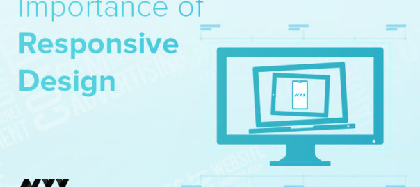
The holiday season is a wonderful time to wrap up a successful business year and set the tone for a prosperous new year. This time of year is ideal for owners of online stores to increase revenue and surpass their profit targets. Therefore, if you want to conclude the year on a high note and keep expanding your online marketplace, take advantage of the holidays by website redesign.

You must, however, understand how to profit from online holiday shopping. You need to learn how to succeed in the face of intense holiday season competition. Today, we’re going to discuss with you how to prepare your website for the festive season, so you may recognize this year as a resounding success and enter the next year with confidence.

Create An Efficient Strategy

Find out what you hope to accomplish before you start. To develop an effective plan for redesigning a website, you need measurable and specific targets. Goals can include improving lead conversion by a certain number, boosting traffic statistics for better SEO, publishing more adverts, and much more. Each objective requires a unique strategy that can be formulated with the assistance of a website design agency

Evaluation Of Existing Website For Redesign

Finding what needs fixing in the layout is the first step in making the necessary adjustments. Spend some time conducting an audit of the website and establishing priorities for necessary modifications. Try asking yourself, “What about it is so unappealing?” or “Why is it so difficult to use?” and then analyze the answers.

The research will show you what should be left out of the website redesign. Hence, you may fine-tune your plan for optimal results, which will allow you to make better decisions in the future.

Define Your Targeted Audience

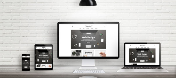
Even with the most intuitive user interface possible, site performance will suffer if the layout doesn’t work for the target audience. Understanding your target audience is essential. Remember that the point of posting online is to have others consume your work.

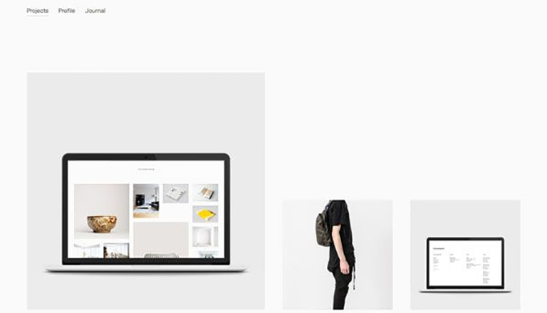
For instance, online art galleries that are ostensibly meant to display works of art typically feature just photographs. But will a brand that attempts to sell paintings online succeed if its website design doesn’t do anything to draw attention to the paintings it sells? Some websites, like news blogs, have found success by adhering to a strict format designed to attract visitors with a particular interest.

Observe Your Competitors Closely

There are a number of factors, including industry, niche, and target audience, that can affect the layout of a website. Competing brands’ websites can look identical to one another. Since you’re competing for the same customers as them, it’s a smart move to study how they’ve succeeded.

Make A List Of Your Requirements for Website Redesign

Knowing your intended audience, the constraints of your present website and other variables will help you properly prioritize your list of necessary features. Add-ons that cater to a certain audience or expand the site’s capabilities are examples of this.

The criteria for an “excellent” website should be established by your needs. Having a well-defined plan in place now will make it much simpler to incorporate all the necessary elements during development.

Implement The Redesign of Website

Implementing the new design for the website is the last phase, and it must be done precisely. If you employ someone or try to handle it yourself, be sure that progress is being made according to the plan. If you’re hiring web design services, be sure you’re able to convey all of your needs clearly to them.

Bottomline

Small businesses, in particular, have a great chance to make a splash and establish a reputation for themselves over the Christmas and New Year’s holiday seasons. Putting these suggestions into practice on your website can have a profound effect, boosting both its performance and the number of customers it converts.

Categories
Design UI Design Web Design

Best Resources for Graphics Design for 2021

Either you’re working on a new project with limited money or have been given a strict budget by the customer; there are several free graphics design tools that can assist you. However, utilizing free pictures, typefaces, tools, and other assets frequently comes with a cost. They might be of poor quality. Or, even worse, they might’ve been taken from their legitimate authors, who never meant them to be freely available.

However, we have simplified things for you. In this blog, you’ll discover free design materials that are consistent with excellent quality and legally available for download. Whether you’re looking for photos or videos, typefaces, or design tools, you’re certain to find them here. Let’s take a look at the best graphics design resources of 2021:

Kuler

Adobe’s Kuler is the finest resource for all graphics designs involving a lot of colors. It will assist you if you’re attempting to choose colors for an existing palette or if you’re beginning from scratch. By dragging the points around the color wheel, you may pick from a wide variety of analogous shades and custom colors, and Kuler will provide you with the RGB and HEX codes necessary to create a masterwork.

Book Cover Archive

This is the ideal location for anybody interested in book design. This site features a gallery of book covers created by some of the world’s most recognized artists. Here, you can simply arrange book covers by photographers, artists, authors, and genres; the website would attract you and inform you a lot about new ideas.

The Noun Project

The Noun Project is an outstanding repository of iconography. This site is a goldmine for designers seeking icon creativity or stock icons. Furthermore, if you are an icon creator, you may sell your icons. It has over 100,000 icons with a variety of themes.

Graphics Fuel

Graphics Fuel is an online platform that offers free Photoshop templates and graphics design together with their actual source files. PSD file type, backdrops, logos, and font styles; you can find everything here.  Rafi is a graphic artist who invests a significant amount of time developing high-quality graphics only to give them free of charge – so be sure to check out his creative collections.

Pixeden

Are you seeking a comprehensive collection of free visuals and online resources in one location? Pixeden provides something for everyone. With an abundance of graphics design and online design templates, vector icons, and a dedicated area for printing and web graphics, you can name it and get it. Anyone can join for free, but if you’re looking for something a bit more, you can also subscribe to one of their paid packages.

Dafont

It’s an incredible resource for free typefaces. The interface is fantastic – it displays all of the typefaces in large, bold letters. This website contains loads of different fonts for download. Moreover, you can enter your custom text to compare typefaces – ideal for selecting logo and header fonts.

Dexigner

It is the preeminent online destination for designers, engineers, illustrators, technologists, artists, and other creatives. It is the finest source for product design industry news and information since it provides the newest design news, conferences, contests, publications, and resources.

Logoed

It is a website dedicated to showcasing visually appealing and relevant logo designs. As this website has been for almost a decade, it has amassed an extensive collection of logos. It has basic and clean layouts, as well as thumbnails for each design. They are vertically structured, requiring visitors to just tap on each for further details and inspiration.

Awwwards

Do you wish to market your work? If you answered yes, you’ve come to the right place. This site will allow visitors to vote on designs and then declare the day’s, month’s, and year’s best. Along with showcasing your work to millions of individuals, you can also explore an almost infinite number of some very breathtaking designs.

Contact Us today for all your graphics design needs!!

Categories
Design UI Design UX Design

Modern Vintage Graphic Designs Are Back In Trend!

Whenever we talk about material goods, “vintage” refers to any contemporary designs that is more than 20 years old but less than 100 years – to be considered antique. The term can be used more freely in design, although it still refers to an earlier style created during previous times. Now and again, we see a revival of classic designs in a variety of sectors. The majority of them evoke memories of decades – or perhaps centuries ago.

When appropriately used, vintage elements and marketing strategies attract high-value consumers. It compels people to participate in your old storyline and maintains their loyalty. What is it about them that make them so enticing to the audience? What makes them popular? Let us investigate!

How Is Vintage Designs Defined?

By definition, the term “vintage” refers to a period when anything of value was created or to a high-quality product, idea, or philosophy developed in the past. At the moment, the term “vintage” refers to anything that evokes memories of a bygone era or fashion style. Vintage designs use features, colors, and items that reflect popular styles of a particular age.

Distinguishing Retro From Vintage Designs

Many individuals do not take some time to grasp the distinctions between these phrases properly, and as a result, the terms are commonly misinterpreted. Retro is a term that refers to something relatively modern (a commodity, a style) that emulates something from the past. Retro is not original but is influenced by the original to seem authentic. Vintage denotes something unique, original, and has a lifespan of between 20 and 100 years. It is scarcer and hence more valuable than its retro cousin.

What Are Modern Vintage Designs?

Modern Vintage Designs incorporate aspects from the past and present, as well as a touch of futurism. This technique may help modern audiences connect with antique designs or perhaps serve as a center point for older and younger generations.

Modern Vintage Graphic Designs enable us to create and make use of the best of all worlds. We can approach current and antique eras from a variety of angles. This creates limitless opportunities for creativity to develop. For instance, we may reproduce old images from the 1980s or 1990s in contemporary surroundings and give Gen Z the same vibe.

Why is Vintage Design Becoming So Popular?

Individual Appearance – There are several explanations behind vintage popularity. One of them is that customers think conventional fashion has lost its individuality and supermarket fashion has become too generic. Vintage has an inherent quality that elevates it above things picked for their fitting, authenticity, and design value.

Trends That Never Fade – Consumers recognize that antique clothing may be adapted to current trends while still serving as timeless classics that can become wardrobe mainstays. It’s one of the primary reasons vintage has gained popularity.

Personality and Expression – Being unique is a critical component of looking trendy. It reveals a great deal about your character and lifestyle. Vintage clothes enable individuals to express themselves while also aiming to create a fashion contradiction.

Soul and History – Vintage clothing encompasses much more than simply worn-out garments. They are historically and artistically significant, and they are brimming with the tales and experiences of those who came before us and wore them. Possessing and wearing antique clothes help preserve those individuals, their heritage, and their talent alive.

Conclusion

Vintage clothing never fades away. Retro styles are constantly resurfacing. Whether your firm is in fashion, information technology, travel, education, or another area, you will occasionally need to adapt to modern vintage graphics. Contact Us today to know more.

Categories
UI Design Web Design

Try These 5 Web Design Principles To improve Your Conversion Rate

Every business wants to grow and increase its sales. Companies put a lot of time, effort and money into devising marketing strategies to boost their revenues. A website is one way to market their offerings to the people using the internet (which, by the way, is huge in number). A lot of marketers boast the importance of SEO, social media, creating lead magnets that convert, etc. Yet, creating a brilliant website is the first and most important step. 

Stanford University’s research stated that 46.1% of people say a website’s design is the top criteria for deciding a company’s credibility. Therefore, it’s highly critical that your design looks professional. This article will share five web design principles that will boost your conversion rate, thereby creating more revenue for our business.

1. The 8-Second Rule

Studies have suggested that you only have 8 seconds, on average, to get a visitor’s attention. The human attention span on the internet is too short. There’s a very tiny window of opportunity for you to engage a user once they land on your website; every second count. Here’s what you can do:

  • Use a crisp, benefit-driven, pin-pointed headline in large font
  • Include multimedia such as audio, video or other interactive content.
  • Use eye-catching, attention-drawing imagery to convey the prime purpose of your page
  • Use the imagery as a guide to the call-to-action button
  • Make signup buttons large, simple and straightforward.
  • Write powerful copy to entice and engage users.
  • Use hover effects on your buttons 
  • Use animated exit popups to re-engage visitors who are on the verge of bouncing off

2. The Rule of Thirds

One of the key web design principles is to follow the famous photography principle – The Rule of Thirds. To apply this rule, you’re supposed to visually divide an image (in this case, your website page) into thirds, both vertically and horizontally, giving you nine equal squares. The rule says, the four middle intersections are key, strategic places of interest. It creates the most impressive image or design when objects are placed at these points.

Remember that you don’t need to design your entire website strictly by the rule of thirds. Only use it as a tool to help you perfectly place crucial elements. Take a screenshot of your website, only above the fold part or just your header section; divide it into nine equal squares. Analyze it according to the principle and take a call if you want to make any changes or not.

3. The Hick’s Law

Hick’s Law is a famous theory cited by many individuals for various purposes; it is also frequently referenced in web designing. The law is named after a British psychologist, William Edmund Hick. The law states that the time it takes for an individual to decide is directly proportionate to the possible choices they have. In other words, by decreasing the number of choices, the decision time is also decreased and vice-versa.

Using this principle in web design, you can boost conversions by restricting the number of choices users have. And, where do you offer the most number of choices on your website? In the navigation bar. Don’t offer too many links to the users; it makes it challenging for them to choose. The user will lose interest in them altogether. 

4.The KISS Rule

This one is a common rule, being applied in several fields. It means Keep It Short And Simple and applies to web designing too. Simplicity is super essential when it comes to improving conversions. pThe moment you create a page, ask yourself whether you can make it more simple or the simplest. The results are more aesthetically pleasing, and conversions are increased.

It is similar to the earlier discussed Hick’s Law. However, simplicity is more than just limiting the options. The aim is to create a clean overall design that is uncluttered and minimizes distractions. Like Hick’s Law, people can only handle a limited amount of information at one time. Visually stuffing the website will overwhelm and bother users. Creating a great user experience on your website requires you to eliminate everything that unnecessary to the design.

Apple is one of the most significant examples of simplicity in web design. Countless other brands have followed their style for its effectiveness.

5. Negative Space

Whitespace is often referred to as negative space in web design. Positive space includes all the elements on your site, while negative space is the empty space in between. Don’t go by the name. Negative space is actually a good thing in web design; without negative space your website would be unusable and unreadable.

Negative space doesn’t just refer to the space between your page’s larger elements, such as the space between your header and your content or space between your sidebar and your content. It also refers to the space between all the more minor elements on your page – the space between lines of text, the space between paragraphs, and even the space between letters. Pay attention to the negative space on your site, in all forms, to keep everything legible, scannable and easy on the eyes. All of this leads to increased conversions.

Conclusion

Now that you understand these five web design principles, put them to good use by taking a hard look at your existing design. A thorough evaluation of your website will let you know the strengths, shortcomings, and areas of improvement. Need an expert opinion? Talk to our team.

READ MORE: Here are 5 pro tips that will come in handy while designing a visually stunning and user-friendly website

Categories
Brand & Identity Design UI Design Web Design

Web Designing For Accessibility: Tips And Guidelines To Follow

The world is evolving faster than ever, and humans are becoming more and more dependent on technology. The Internet has changed the world, and today all of us depend on the internet for almost everything. Be it searching for a job, ordering a pizza, booking a dentist appointment, learning, and whatnot? The internet may be an ever-present resource for most people, but connectivity to the resource is a challenge for people living with disabilities. Although there are programs and devices, like screen readers, that make it possible for people with disabilities to access websites, web designing for accessibility is still a practice less followed.

According to data from 2012, almost one in five Americans live with a disability of some kind. Close to one billion people in the world, or 15 percent of the world’s population, lives with a disability. Out of all kinds of disabilities, conditions like visual impairment, autism, difficulty grasping objects, and deafness, just to name a few, can severely limit an individual’s ability to use a computer or smartphone without assistance and support.

There’s a myth that web designing for accessibility is difficult and expensive; it’s not true. Making your website more accessible doesn’t mean adding extra features or content; therefore there shouldn’t be an additional cost and effort.

Here are a few tips that will help you in web designing for accessibility in accordance with the AA level of the Web Content Accessibility Guidelines (WCAG 2.0), and will allow your website to work on the most commonly used assistive technologies — including screen readers, screen magnifiers, and speech recognition tools.

Maintain a Proper Contrast Ratio

Color contrast is an important aspect of web designing. But, it is often neglected as a web accessibility problem. People with low vision could find it difficult to read text from a background color if it has low contrast, whether on a plain background or text embedded within an image. A movie with subtitles is a good example. The text often appears without anticipating the background. It happens when white text appears in a brightly lit scene. It is unreadable, and the audience is left not knowing the dialogue.

It is critical to consider the sufficient contrast between text and background. According to the W3C, the contrast ratio between text and its background should be at least 4.5 to 1 (conformance level AA.) The ratios become more forgiving with larger and heavier fonts since they’re easier to read at lower contrast. If your type is at least 18 pt or 14 pt bold, the minimum contrast ratio drops to 3 to 1. You can use tools like Contrast Checker to see how your planned font and background colors work together.

Don’t Just Rely On Colors 

When you’re communicating something important, showing an action, or prompting a response, don’t use color as the only visual cue. People with low visual acuity or color blindness will have a hard time understanding your content. Try to use an indicator other than colors such as text labels or patterns.

Elements with more complex information like charts and graphs can be especially hard to read when you only use color to distinguish the data. Use other visual aspects to communicate information like shape, labels, and size. A good trick is to print your graph in black and white and see if you can still understand everything in it.

Keep Your Navigation Predictable

The navigation system your website uses should be consistent across its pages. This includes the icons you use and the way visitors get to different pages within the site. if your homepage has a top header bar with drop-down menus, each of your other pages should have this arrangement, too. Similarly, the icons you use across your website need to be consistent.

You should also stay away from any kind of automatic navigation and auto-playing music and videos. not only are they annoying, but it’s also difficult for a user with a screen reader to determine how to pause them. And when a slideshow or carousel scrolls through content at a rapid rate, users can become confused and frustrated.

Support Keyboard-Only Navigation

Web designing for accessibility is not restricted to the elements on the screen. Keyboard accessibility is one of the most critical aspects of web accessibility. Especially for the ones who are blind and rely on screen readers. Also, for people who don’t have precise muscle control; they can’t grasp a mouse or keep their hand steady on a laptop’s touchpad. These users rely on their keyboards to navigate websites. 

These users typically use the Tab key on the keyboard to navigate through interactive elements on a web page – links, buttons, or input fields. The order of the interactive elements is essential, and the navigation must be logical and intuitive. The tab order should follow the visual flow of the page – left to right, top to bottom.

Add Appropriate Alt-Tags To Images

Alt tags are brief descriptions of the images you use that get buried in the site’s HTML. Most users never see these descriptions, but site visitors using screen readers rely on them since they “hear” the content. These tools convert text to speech so that the person can hear the words on a site. Alternative text, or alt tags, can be presented in two ways –  within the <alt> attribute of the image element, or within the context or surroundings of the image itself. 

Alt tags aren’t just useful for your visually impaired audience; they’re for your benefit too. Well-crafted alt tags improve your site’s SEO, drawing more relevant site traffic and improving conversions.

Use Labels Or Instructions With Form Fields And Inputs 

Using placeholder text as labels are one of the biggest mistakes when designing a form. Placeholder text is usually gray and has low contrast, so it’s hard to read. People who use screen readers usually navigate through a form using the Tab key to jump through the form controls. The <label> elements are read for each form control. Any non-label text, as placeholder text, is usually skipped over.

Always help people understand what they should do and write in a form. It’s best if labels don’t go away, even when the person is filling an input. When designers hide descriptions or directions in their forms, they’re sacrificing usability to attain simplicity. That said, we don’t want you to clutter your design with unnecessary information, just make sure to provide essential cues.

Web designing for accessibility is a new and growing trend. While these tips will certainly help you in creating websites that are much more accessible for people with disabilities, there is still a lot of scope in terms of improving the user experience for this set of audience. As designers, we all need to grow and master the art of accessibility since technology is usable for all – regardless of their abilities. Looking to improve your web design? Talk to our experts.

Looking for 2020 Design Trends? Click Here to Know More

Categories
Design UI Design UX Design Web Design

Top Web Design Trends For 2020

As we bid goodbye to another rocking year, we are all set to embrace new web design trends in 2020. The last few years have been quite fascinating in terms of the progress of the way websites are designed. With an increased focus on UX and UI, designers have moved their focus on improving the user experience from merely designing visually appealing designs. So what does 2020 hold for web designers? Let’s checkout the latest web design trends that will rule the charts in 2020.

1. Impressive animations

A lot of people believe that complex animation is heavily dependent on the hardware and that it is useless to produce it for the mass, using slow processors. However, there are many competent animation products that can work very well on slow hardware. Companies nowadays are producing plugins and dev tools for interactive animation, suitable for the mass systems. They optimize the process of implementing interactive projects to work on nearly any device – efficiently and as smooth as you can think. Motions are always better storytellers than words. It’s all about putting a substance into the animation.

2. Asymmetrical layouts and split screens

Looking at the present scenario, we predict that asymmetry is bound to make a strong comeback in 2020. This is one such web design trends that we feel is a safe bet. The block layout has been in the trend for ages but still holds its charm. It portrays an easily digestible flow of information, especially when the concepts have defined boundaries. It helps in adding to the completeness of the design making the design structure less complex. Blocks mean symmetry. However, there’s an asymmetrical trend that is always there but never makes it to the mainstream. Especially with today’s wide desktop screens.

Split-screen was originally used to display two different sets of information on one single screen. However, that has changed and now split screens are simply used to display any sort of information.

3. Low-key gradients

Technology is moving towards automation at a rapid pace. AI delegation, less is more and other things are slowly creeping in. The visual elements attributed to that kind of design is making its way into what is still a heavily-human job. Subtlety in colors, along with simplification, minimization and reduction is gaining popularity. The idea that something is smart and automated rings many bells. The blue and purple gradients were very popular in 2018, and even in 2019, the softer versions of blue and purple were amongst popular web design trends. We foresight the continuation of low-key gradients in 2020 and the years to come.

4. Writing for humans

The responsibilities of writers have increased over the last three to four years with an increased focus on writing for a better user experience UX writing is one such web design trends that have elevated the standard of so many designs in terms of delivering delightful user experience. Text is no longer merely an aid to the design, it is a vital part of the design. Human writing allows the reader to judge, choose, and relate to the product.

5. Designing – Developing

A lot of times designers are made to deliver projects within a very strict timeline. In such conditions designers do a lot of jobs which are beyond their usual scope, to deliver something which is almost impossible to implement within a specific timeline or budget, or team. In the process, some designers learn to code. They know what they are doing to an extent, but don’t have a mastery over it, or in simple words, they aren’t at par to the actual developers. This creates a difference of opinion.

This difference of opinions has to end in 2020. With tools like Webflow, the gap between designing and developing should narrow down. Basically, it’s a visual tool that allows you to design whatever you want as long as it can be done in HTML and CSS. Every pixel move is a code change, which makes this approach a perfect way for designers to start coding.

When everything is gearing towards interaction-based design, it gets harder to explain how the interaction should work and look. The importance and the need for a visual tool like that are hard to overstate.

6. Increasing use of white space

When the web pages are stuffed with elements, it becomes very difficult for any of them to grab attention. They all fight for attention, but none of them is successful in achieving it. On the other hand, when there is too much attention on one element, it gets all the attention and rest everything gets overshadowed. Depending on the message the UI is delivering, it’s important to provide some breathing space to elements to let that message sink.

There are micro and macro empty spaces, text and paragraph spaces, they can be active and passive, and all of them scale. It’s much more sensible if we process and consume condensed information for long and with less comprehension. Surrounding the core idea with an ample amount of empty space is a great way to make the idea stand out. That said, ensure that the idea which you are placing under the spotlight is worth it.

Read more about the importance of white spacings here

7. Varying user experience

Your users have different personas and online behaviors. Since ages, we identify and cater to a specific segment of the audience, which we consider to be our average users, in an average context, with an average engagement level. But we must understand that there is a big possibility of changing the experience for an infinite number of people based on their behavior on sight. Modern analytics allows us to determine who you are dealing with. It can be a casually browsing wanderer, a not-so-sure lead, or a potential buyer. Depending on the amount of time they spend on a screen or the scroll speed, a website behaves differently.

It will take an aggressive stance on user research and might not be an option for service design but brand designers will have the experiences tailored. That means understanding the scene, the mood, and the repercussions of the actions a user is taking.
Some trends are low-key and prevail for a small time. On the other hand, some trends are in for the very long term. Identifying future trends help in formulating a long term strategy. It also ensures that you remain up-to-date and don’t fade out. Want to discuss more about emerging web design trends? Talk to our experts now!

Categories
Brand & Identity Design UX Web Design

Web Designing While Accounting Human Errors

We often hear the phrase ‘To err is human’, and it can’t be truer in every aspect of our lives. We all make mistakes. Users on your websites are no different. Sure, you can’t stop them from making mistakes, but, can you follow some aspects of web designing while designing your website in a way that it leaves a scope of making mistakes?

Even the most careful and diligent users are bound to make mistakes at some point in time; others will make more mistakes. Therefore, it is critical to consider this fact while designing your website. The errors in web designing can be as simple as mistyping a URL, providing incorrect information in a sign-up form, adding info in wrong fields, etc. The mistakes could even be as disastrous as accidentally sending thousands of dollars to the wrong person via PayPal. So, here are a few tips that you can follow to account for human error while designing your websites. 

1. Provide Straightforward Instructions

A lot of times, we assume that the users are by default aware of the most basic instructions. Thus, we don’t feel it necessary to provide these basic instructions to them. Moreover, people often see basic directions as a bit snooty. It’s human to assume you know everything you need to know for a simple-seeming task. This causes errors.

Don’t assume they know what you mean. An imperative when delivering clear instructions is not to assume the recipient knows what you mean. This can be for anything from commonly used acronyms to simple navigation instructions.  Mixed messages, assumptions and multiple options mean that the message received might differ from what we actually meant.

2. Give Clear Warnings During

Just like the instructions, users must get a clear understanding of the consequences of actions taken on the website. And, sometimes they need to be informed and explained the implications, that too in detail. Still, there would be users who would keep ignoring your warnings, but there’s not much you can do for them in any case.

There’s also a second web designing approach which you can proceed with. A majority of people will leave your site when they face a warning message which they don’t fully understand. Else, they may look for help to understand the warning, which again may lead them to bounce off. You’ll have to decide whether you would rather deal with potential inaction from some customers, or more errors. Both approaches have their pros and cons.

3. Always Confirm Actions While

You may think that all users are completely sure of what they are doing on the website, or they may get annoyed with questions asking them to confirm their actions. A confirmation dialog may seem like an irritating and useless extra step; however, the truth of the matter is a quick “Are you sure you want to do that?” message can be invaluable. The user may be taking action for the first time, or the tenth time, it’s irrespective. A confirmation will only increase chances that the user takes the correct, intended action.

4. Validate Forms

Form validation may not be a full-proof solution, but a potent tool, and a great way to gently guide the user in the right direction. While proper form design can help keep users from simply putting the wrong text in the wrong form, form validation is excellent for double-checking information and catching typos and forgotten fields.

Improper validation of form data is one of the leading causes of security vulnerabilities. It exposes your website to attacks such as header injections, cross-site scripting, and SQL injections. It is important to note that client-side validation is beneficial, but it is not enough. If you’re going to implement client-side validation, it would be good to have some of the server-side too, just to be safe.

5. Use Appropriate Form Labels

In our last article, we listed out some essential tips for selecting the right button labels. The labels on the forms are equally important and can lead users to commit an error, if not used properly. There are tonnes of websites on the Internet with so many vaguely-labeled forms. Worse are the forms that use industry jargons on a client-facing website. In some of the sites, the labels and input fields are even misaligned. That’s just a strict NO-NO!

6. Improve Usability Through Color and Contrast

The colors and contrast are often used on a website most simplistically. People only go as far as using red and its shades to portray bad, and green and its shades to show good. But that’s not enough. It doesn’t necessarily help differently-abled users. A website should be usable by everyone, so various disabilities should be kept in mind. Disabilities can include but are not limited to, the inability to use a mouse or see the screen.

When someone has low visual acuity, specific color palettes on websites may make it difficult for that person to see and understand the website content fully. You must find a way to add contrast to your elements, in such a way, that they’re clearly and easily distinguished from each other. Pay special attention to this if two options use similar text, but do radically different things.

7. Provide ‘Undo’ Option Where Possible

We all know how handy the ‘Ctrl+Z’ option comes in every day while performing various tasks. The ability to undo an action is such a boon to everyone. We wish we had an undo button for our lives. Coming back to reality though, if you’re building a web app, you might seriously consider implementing some sort of “Undo” function for just about every action with permanent consequences.

You cannot ensure error-free browsing on your website; neither can you take a generic call on the abilities of your users. But, considering human errors while web designing, will increase the chances of good user experience and fewer errors. Speak to our experts to discuss more on it.

Categories
Brand & Identity Design UX Web Design

Design Arrest: A New Way To Design Your Dreams

To grow an in-house design team or get the services from a professional design agency is a heated topic of discussion. While there are still people who believe that it’s best to have an in-house team, the majority of experts from the industry strongly believe that a professional design agency is the best option and drives the business growth.

With changing times, the design needs, trends and philosophies have also witnessed a makeover or revamp. With these changes, the process to cater to design needs also needs to upgrade, in order to provide 360-degree design solutions in the most viable manner.

Design Arrest is one such creative job-stop that revolutionizes the process of designing graphics. It is a creative agency that aims to transform your ideas and thoughts into captivating designs. Here are a few differentiating factors of Design Arrest which make it stand out from other creative agencies.

Personal Graphic Designer

The biggest challenge while dealing with creative agencies is to find a single point-of-contact. Often the person working on your request is different from your point-of-contact. Moreover, multiple people work on your project which makes it difficult to strike consistency in the design language. It’s a tiresome and time-consuming task to again and again convey your thought behind designs, brand vision and requirements to different people, every time when you make a fresh request. At Design Arrest, you don’t need to sweat it out. A personal, dedicated Graphic Designer is assigned to you, who will be available round the clock to fulfil unlimited design requests.

Design Your Dreams


Flat Rate

Generally, the cost of every design request is calculated basis the type of request, required efforts, time required and nature of the request. This leads to variable costing and often shakes the planned budget for designing. Design Arrest understands the importance of budget-forecasting and values your money. They charge a flat fee, $300 per month, for all your design requirements. There are no hidden charges, taxes, or service charges at any given point-in-time. They believe in clarity, trustworthiness, and developing mutually benefitting, long-term relationships.

Flat Rate

Unlimited Requests / Revisions

Here comes the best part. There are absolutely no bars on the number of requests you raise or the number of times you request revisions. Until you are fully satisfied with their work, the team will not rest. The objective here is to completely satisfy the design needs. Putting a cap on the number of requests will require clients to hand pick the requests, normally the most critical and significant would be passed on, however, a lot of essential requests may not come through only because of the restriction on the number of requests. But, with unlimited requests and revisions, all your design requirements are bound to be fulfilled.

Daily Output

The design process is not a one day job. Some projects last for weeks or months, and some may even be a continuous task for years to come. It becomes difficult for project managers to track the progress and status of the design requests, especially when there’s a provision of shooting unlimited requests. The team at Design Arrest allows you to raise requests every business day and get them served with desired output on a daily basis. This makes your job easy to track the progress and analyze how the work is going on.

No Commitment, No Contract

Unlike many creative agencies, Design Arrest doesn’t bind you in any kind of contract. In case you find any reason to end its services, you’re free to discontinue from that moment itself. You are not at all bind by any regulations or conditions. You are billed on a monthly basis, get the services on a monthly basis and can stop any time you want. Everything that is created by Design Arrest for you is completely editable and belongs to you. They claim no ownership even after you discontinue its design services. Also, they do not disclose or share any information related to your project or business with anyone else.

One-Stop Design Hub

Design Arrest simply designs everything. Be it websites, banners, downloadable, brochures, or anything on web or print media, they design it for you. No matter how diverse or intricate your design needs are, you are sure going to get the solution, with its widespread services ranging across logo design, business collaterals & literature, promotional merchandises, mobile apps, web pages, e-stores, social media creative, presentations and infographics.

Design Arrest certainly stands out in terms of delivering high-quality design solutions at a reasonable price with feasible payment options, and is backed by result-oriented, trend-driven, highly enthusiastic creative brains who are striving to create a difference. You can check out their work here.

Categories
Blog Design Web Design

Efficiently Using White Backgrounds in Website Design

There were days when dark-colored themes and flashy colors were all over the internet. However, over the last few years, designers have identified the importance of blank spaces, white spaces and have been increasingly using the white color. White backgrounds have gained huge popularity these days. Gone are the dark backgrounds and patterns that have been a big part of the design process for a while. Using a white background may seem like the easiest and the safest path to a clean website design, but that’s not the case. White backgrounds need to work with both your text and image choices. They need to sync in with the overall Website Design and should not look like an afterthought. So what should designers do to best use white backgrounds? Let’s check it out.

Why Use a White Background?

Using a white background is fairly an easy way to go about designing as it is the default setting when working in HTML and CSS, however, colors did gain popularity over a period of time. White as a background color for blogs and e-commerce sites is a staple, but nowadays more and more designers are using white backgrounds for different projects which are more on the creative side. A couple of years ago, the trend was to use a black or dark-colored background, but that trend has surely flipped, and there’s not one particular reason for that.

White backgrounds have a strong correlation with Responsive designs and Flat & Minimal styling. White background regained popularity because it is easy and always looks natural. In some responsive layouts, sites lock to certain pixel-width grid stops and everything outside of those shows a background edge. With a completely white background, this edge becomes invisible without any extra design thought. Simple is still a major trend and a white background is the epitome of simple. White also makes it easy to pair and use many of the bright, bold colors that are symbolic of flat design styles.

Website Design

More About ‘White’

White is a simple color, or we can say it is the absence of color. While it has some meanings of its own, it can take on the context of its surroundings. White is the color of purity, faith, light, cleanliness, possibility, softness and generally denotes positivity. As a background color though, white is more of in a supporting role. White maintains some of its own color associations, but the hue also absorbs what is around it, allowing the full meaning of the design around it to come through. For example, when a white background is paired with pink and script typefaces, it takes on feminine attributes. White as a background color emphasizes clarity and removes visual obstacles and clutter. The hue is used to add visual emphasis to other important parts of the design like color, text or images. It is frequently a part of the overall visual aesthetic that is simply designed and minimalistic.

Other Shades of White

Other colors or words that represent hues that are white or almost white include snow, milk, ivory, pearl, paper, corn silk, seashell, linen, cream and alabaster. These include a pinch of another color, typically black, to soften white with an undertone for reading on screens. Some users and designers argue that pure white is harsh on the eye. However, in print projects, pure white is often standard.

Website Design

Tips to Use White Background

Keep it simple: The essence of white is simplicity. To create a powerful, beautiful impact, choose a simple or minimally-styled design scheme.

Create contrast: Choose dark or bright colors against the white background to create a meaningful visual impact which will entice the users. Black is the most common and preferred choice for type on a white background; even dark gray creates an almost equal impact. Black and dark gray over a white background enhances the readability and is easy on viewers’ eyes. The same goes for images as well. Select images that aren’t overly white in focus or consider using a black border around images to set them apart from the whitish background.

Use simple images: Photos, graphics and illustrations should blend smoothly within the overall design. Refrain from using complex, loud, confusing images. Use simple images which are easy to comprehend and do not stress out viewers.

Wisely choose the types: Beautiful type is of the utmost importance in a design outline where everything is simple. A visually appealing font will accentuate the simplicity of the overall design. It will help in creating a visually stunning white-based website.

Plenty of space: Remember, white backgrounds are part of an overall look and trend. Wisely use them and give plenty of room to everything that is displayed on the screen. Add extra space around objects if required, leave wider margins between text and menu items and focus on the space as much as the objects within it.

Focus on an accent color: Pick an accent color and use it against white backgrounds with black type to create a visually appealing website. The splash of colors brings focus to certain parts of the design in a more subtle way. Moreover, this works with any hue.

Conclusion

White backgrounds aren’t new, they have been around for years now. Only the way of using them has changed and opened new doors to visually enhance web designs working on white backgrounds. This can bring a modern, sleek and clean feel to almost any type of web design project. So go for it! We’d love to see what you are working on. Share your thoughts with us and discuss your design needs with our experts.