NYX Ditech

Categories
Web Design

Avoid These 5 Things In Your Website Design To Stay Up To Date

If your website was designed a few years ago, there’s a bright possibility that there are a few elements which are unpleasant guests. They are outdated and need to be removed immediately from the website so that the website doesn’t look outdated. The world of web keeps changing every day and it’s essential that your website also keeps itself abreast with the new developments and advancements. This calls for a removal of certain outdated trends and practices. Here’s a list of 5 Don’ts that you should keep in mind while finalizing your website design.

1. Never Keep Social Media Icons In The Header

The header of your website is one of the most important areas of your website. This area gets the utmost attention and must be filled with the critical elements to which you want users to focus the most. Keeping flashy social media icons right at the top of your website layout is only inviting trouble in a quiet way. It takes a lot of efforts to get users on to the website, and by placing social media icons you’re guiding them to bounce off from your website to your social media handles. That will result in a high bounce rate.

Instead, you should use social media widgets which allow users to like your page etc. all within the environment of your website. That’s just a smarter way of letting people interact with you through social media.

2. Avoid Stock Photos

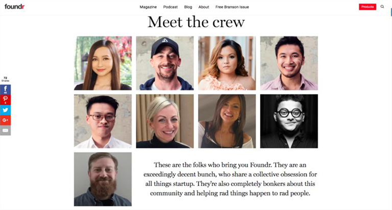
Pictures play a huge role when it comes to convincing users. Studies have shown that pictures have an excellent positive impact in terms of conversion as well. However, if they are not authentic and are simply obvious stock photos, users are not going to buy them. By obvious stock photos, we mean a smiling pretty girl’s face, the corporate handshake, the light bulb and much more. People have started undermining these stock photos and more than often make fun of the websites that use them.

When people will come across these stock photos on your website, they will not only find it cliched, they will also lose faith in your company. Instead, you can use custom photography and use real photos of your office, staff, and leaders. These are impossible to fake and are bound to create a solid impression

3. Get Rid Of The Email Links

If you have anything like staff Bio Pages, a very common practice is to use a little link to send email to that particular person. This is not the best of the practices. Firstly, it attracts email spamming. Spam marketers are always on a lookout for this kind of things. Secondly, it’s a real disaster when it comes to User Experience. Think about when you click on one of those. It opens up some kind of native email program on your computer like Microsoft Outlook or Apple email program. That’s just annoying.

Instead, you should use email sending forms. They are trackable, you can route them to different folders and subfolders using email programs, and can easily bifurcate client requests, internal queries etc.

4. Disable YouTube Suggested Videos

With the ongoing trends in website designing, videos have become a crucial part of any website design and YouTube is undoubtedly the biggest source of it. If you use videos anywhere on your website, you must disable the YouTube suggested videos option. What happens is that when a Youtube video plays, it makes some interesting suggestions about other videos that might be related to the video that you just watched. But, at best these videos might be simply unrelated and at worst they might be videos about your competitors.

Either way, it acts as a distraction for your users and has no connection whatsoever with what you want the users to do when they are on your website. This option can be disabled by going to the Share option, then to the embed option, then Show More and unchecking the Show suggested videos when the video finishes option.

5. Bye Bye PDFs

PDFs were used to be a workaround for the non-content managed websites for long. For example, if you need to add a new document or add a new menu on to your website you make a new PDF, upload it and replace the other one so that people can download and get the newest information.

But, these days almost every website is content managed using tools like WordPress where you can quickly log in and change information without actually touching the code. So basically, these PDFs are completely irrelevant today. Still, there are a lot of websites, especially restaurant websites which frequently change their menu by changing PDFs rather than actually changing on the website which is a complete NO NO.

Conclusion

If you’re playing the game of web, you cannot be stagnant. Trends which are super cool today may find a need to be thrown away tomorrow. The key is to understand what is working today, what needs to be forgotten, and predicting what future holds for us. Get in touch with our design experts to get more insight regarding the same.

Categories
Design UX

Human Faces Can Be A Great Tool To Increase User Experience

In a quest to increase and better the User Experience, designers try to use plenty of techniques and new ideas. However, they often neglect the fact that human faces can be a compelling tool in a designer’s toolbox. Human faces are bound to get more attention as compared to any other visual graphics. Moreover, they evoke human emotions which can lead to an emotional interaction and increased engagement. The reactions and behaviors of users can be easily influenced by the use of human faces. Here are a few factors that highlight how faces can be very effective in enhancing UX of any website.

1. Creates A Stunning First Impression

No matter what kind of content you have on your web page, images of faces will draw immediate attention as compared to other content. Many eye tracking studies have confirmed this fact and has also stated that the users keep moving their attention back and forth between these face images and other content. A face will create a solid first impression of your website on users. It doesn’t take a long for users to form an opinion about a website during their first interaction. 50 milliseconds approximately. That’s really quick and therefore a face can act as a powerful tool to create a significant impact.

wix

Pic Courtesy: Wix.com

2. Effectively Guides a Visitor’s Line Of Sight

Once a user’s attention is grabbed you can also guide his line of sight with proper placement and use of face images. As humans, we have a tendency to follow the line of sight of other people. It simply means that if a face image is looking in a particular direction or towards a particular section, users will also shift their focus in that direction. Designers can use a strategically placed face image to direct users’ attention to important content and call-to-action buttons.

audi

Pic Courtesy: Audi.com

3. Facial Expressions Evoke Emotional Responses

We all have come across the saying “A picture is worth a thousand words ” and this could not be truer in case of a face image. The human face is capable of expressing and showcasing a large number of emotions. A designer can convey emotions through facial expressions on human faces. The expression on the faces of images used can evoke similar emotions in users. If users view a genuinely happy face, they will most likely develop the same emotion which will influence their feelings for your website or the brand as a whole. Studies confirm that emotions in designs directly impact the conversion ratio.

spotify

Pic Courtesy: Spotify.com

4. Builds Trust

Building trust among users is very critical to the success of any business. Human faces can help a lot in establishing a sense of trust. Trust is the foundation of any successful and loyal customer base. The digital world is full of products, services, and brands. Users are always skeptical and don’t trust anyone easily. Showcasing real faces on the website portrays your openness and trustworthiness. A lot of companies have followed this and have opted a new kind of personalized ‘About Us’ section. They depict faces of CEOs, teams, and other members of the company to boost up trust. It is very useful for industries like medicine, childcare etc. where trust is a big factor.

founder

Pic Courtesy: foundr.com

5. Generates Visual Appeal

To a great extent, a product’s success is related to its visual appeal. A poorly packaged product might not get the sales it deserves. Same is the case with websites. No one wants to see an ugly design. Everyone prefers an attractive design. Human faces are a great way to enhance the aesthetic aspects of your design. Human faces provide a personal touch to users and they feel more connected. A website with human faces makes the users believe that there are real people behind this design. A lot of websites lack this personal touch which cost them deeply in terms of conversion ratio.

dove

Pic Courtesy: Dove.com

To Sum It Up

The effective use of human faces in UX design can create a huge impact on user experience. They are a great source to catch eyeballs immediately, evoke emotions, build trust and influence the behavior of users. Designers must use human faces more often while designing a website to shape up the overall experience of users. We have a team of experts who constantly infuse similar design tricks to scale up the user experience. Have a word with them and get a stunning website design.

Categories
Web Design

5 Indications Shouting “You Must Redesign Your Website”

Things change with a drop of a hat and the only thing that remains constant is change itself. Tune back your mind 10 years ago and try to compare today’s digital world and the Digi world back then. You would probably be smiling, noticing the changes and developments in the world of technology over the last decade. The world of technology changes at a much swift pace as compared to any other thing across the planet. With every morning marking the dawn of a new technological advancement, it becomes essential for businesses to mold their business strategies. This process might require a change in the marketing techniques, brand makeover or even a website revamp. Now, the question arises, how would you now that it’s time to redesign your website? Here are a few common indications that you should look for and decide whether your website needs a revamp or not.

1. Your Website Takes Ages To Load

Every user on the web is super impatient; to a level as if he is sitting on a hot pan. If your web page takes ages to load, you are calling for trouble. The user is not going to wait for ages and within a few seconds will look for other available options. The margin of error in this situation is extremely low. Also, Google doesn’t particularly like web pages who take an eternity to load. Page loading time is an important criterion while deciding a page’s ranking.

So, if your web page takes a lot of time to load, you are bound to lose potential clients and also will slide down the Google ranking list. It’s best you revamp your website by analyzing the factors squeezing the time and eliminating them.

2. Your Website Still Has a 90’s Structure

Believe me, there are tons of websites that still look like they are time stuck in 90’s. Back in the 90’s, web pages were a lot more static and they just displayed information about services and contact details. There was no option to administer the web site to change text and images. Those days are well gone by. The world today is so dynamic that the content on your web pages may require a constant change. Inability to change the content is a serious threat to your website today and thus you must revamp your website by implementing latest tools and techniques.

3. You Don’t Have A Responsive Web Design

A responsive web design enables the web page to be displayed with consistency across all screen sizes on various devices. Websites were designed originally with a vision that they will be viewed only on desktops or laptops. However, times have changed and the majority of people access your website through other devices like tablets, mobiles etc. Therefore, it is pivotal that your web design must be responsive so the user doesn’t face any problem while viewing it on any kind of a device.

4. Your Website Has A Low Conversion Ratio

What is the ultimate goal of a website? To attract users and convert them. A conversion is the ultimate goal of the business. A conversion can be shopping, downloading a file, watching a video, sharing content, leaving a comment, contacting the company etc. If there is no conversion or a very low conversion rate for a website, it’s no good to the business.

If you notice that the conversion ratio of your website is very low, it’s certainly the right time for you to redesign your website. Analyse the causes for the low conversion ratio through web page analytics and work on the new design.

5. Your Website Has A Negative User Experience

User Experience (UX) is the key factor in deciding the success of your business and high conversion ratio. If a user doesn’t find your website user-friendly and gets bugged while using your website, it seriously creates a bad impression. You’re bound to get a blow on your brand’s reputation as well as sales. No matter how catchy the content of your website may be, it’s important for a user to find a proper way to follow and complete the ultimate task (the goal of your business). At no point in time, he should feel lost and must be clearly guided by the web design and structure at all places.

Analyse the flow and structure of your web site. Identify the flow challenges, ambiguous directions, roadblocks etc. and revise your web design overcoming these challenges to create a smooth and delightful user experience.

To conclude, every business owner must understand the ultimate fact that change is constant and they must swim with the tide. Sticking to an old web design can seriously hamper your business and brand in the long run. So keep yourself abreast with the latest trends in the web design world and be proactive to ride on the changes. Talk to our experts and analyze whether your website needs a revamp or not?

Categories
Web Design

How To Effectively Implement Long Scrolling While Designing Lengthy Web Pages?

A lengthy web page or infinite scrolling was considered bad from a design perspective and even from a user experience perspective. However, lengthy web pages have gained a good amount of popularity over the years. The exponential increase in the use of mobiles is the key propeller of long scrolling design. Smaller screens support long scrolling and thus an infinite scrolling design best suits for users on these devices.

Long scrolling helps in creating more engagement amongst users. The content appears more engaging when the user needn’t focus on navigation options on the page. Here are a few important rules which should be followed to effectively implement long scrolling while designing lengthy web pages:

1. Introductory Content Must Be Strong And Compelling

The common saying “First impression is the last impression” holds full value in case of a web page as well. The natural tendency of users makes them scroll down the page right when they land on a page. However, it’s very important that the most engaging and compelling content is always placed at the top of the page. If the content at the top is good, it increases chances of a user to scroll down the page. Use attractive images along with strong content to create interest among users.

2. Use A Sticky Menu

Even when you are creating a long scrolling web page it is important to provide the location and directions to the users. With no proper directions or lead to navigate around the page, they will most likely bounce off the page. Long scrolling becomes troublesome when the top navigation menu disappears on scrolling down the page. The user shouldn’t be scrolling all the way up to find navigation options. Use a Sticky Menu which will show the current location and will sit at a convenient location all the time.

3. URL Must Change Based On Scroll Position

One of the biggest challenges of long scrolling is the constant URL. The user’s scroll position is not reflected in the URL which makes it impossible for them to switch between devices and continue browsing from the same spot.
However, starting from HTML 5 it’s possible to change the URL without reloading the page. The history.pushState() function allows the change in the URL which enhances the user experience in terms of scrolling.

4. Provide Jump -To Options

It’s common for a user to get disoriented in a long scrolling design pattern. The amount of content is huge and is often broken down into chunks. It creates a problem when all the chunks contain equally important content. It’s possible that a user might have seen something important previously on the page and wants to go back to that content. However, he might not get a proper direction to reach back there. A “Jump To Option” is the solution to this problem. A Jump Down and a Jump Up option would solve the navigation problems for users.

5. Optimize The Page Loading Time

Another challenge with long scrolling pages is slow loading time. It’s very critical for any website to manage a decent or rather quick page load time else it can be fatal for their website. According to a research, 57% of the users exit from a web page if it doesn’t load in 3 seconds. Page-loading time should be optimized for long scrolling web pages using certain effective sequential loading techniques. Lazy loading is one such technique that enables users to access the most basic content swiftly. It loads only the basic content at the first go and while a user browses through the basic content, rest of the content on the web page is loaded.

In short, if the user’s browsing experience is delightful, then they won’t really mind scrolling down a long web page. Start thinking from a user’s perspective and design for their utter comfort. Talk to our design experts today and get the best advice on design aspects.

Categories
UX

5 Best Scrolling Practices To Follow

There was a time when scrolling didn’t enjoy a respectable position in terms of web designing. But scrolling has risen from the ashes. More and more people have shown their love towards websites where scrolling is a necessity. Today scrolling has become a primary element of design interaction. Having said that, it becomes extremely important that web designers understand the importance of scrolling and implement it effectively in their designs. Here are some of the best scrolling practices going around which designers must follow:

Although long scrolling and parallax effects are still fresh practices but some of the below-mentioned practices are tried and tested when it comes to long scrolling.

1. Inspire Users To Scroll

It’s a known fact that people start scrolling down the moment the page loads up. But, the initial content displayed at the very beginning is as crucial as any other part. Provide interesting content right from the word “GO”. It will create an initial impression and user would form a quality expectation. Provide them with a good introduction, interesting facts, and engaging imagery.

2. Navigation Must Match Scrolling

Talking about user experience, navigation is something super critical. It’s essential that the user has ease of access on a web page and at no point in time, he gets lost. He must exactly know where to click and where to go. Long scrolling is a bit troublesome for users if not implemented properly. The navigation bar must never lose its visibility. Use of sticky navigation is highly advisable. A jump-to-action button is also a must have especially in cases where the actual content is split into different sections.

3. Mix Long Scrolling And Short Scrolling

It’s not necessary to take a one-way stance when it comes to scrolling. No book defines any rule to strictly follow a certain pattern only. Be smart! Use both long and short scrolling as and when required. Let the content decide the scrolling pattern. It’s a popular technique to use short scrolling on homepages and long scrolling on landing pages.

4. Avoid Providing Too much Information

Even while you are following long scrolling, don’t follow it literally. Long scrolling doesn’t mean thousands of pages of continuous content. Don’t shove your content right down a user’s throat. Tell your story in a flow with pauses at the right instances. You start it, then stop, and then start again. Many popular websites follow this approach and keep their scrolling restricted to only a few pages.

5. Take Help Of Animations To Improve Long Scrolling

The average attention period of a user on the web is just 8 seconds. That’s too short and you need to provide something which can grab a user’s attention and he stays on your web page. Visuals play the lead role in grabbing attention. Effectively used animations act as a guide during the long scrolling process. Use of Parallax effect (involves the background moving at a slower rate to the foreground producing a 3D effect), Scroll-Triggered animations and providing visual feedback while the content gets loaded are a few methods which are very effective.
Long scrolling isn’t going anywhere and is here to stay for the long run. So it’s essential that designers follow these guidelines in order to create the most delightful user experience while users scroll through the web pages. It’s not all about shortening the length of the content, but it’s about making the wait more enjoyable. Talk to our design experts to know more about creating a delightful user experience.

Categories
Design

5 Best Practices To Design Exceptional Buttons

When we start listing down the elements to consider while designing a web page, the list surely goes on and on. There are numerous basic elements and then there are the complex ones. A designer always tries to cover most of the elements contributing to the user experience. However, often in a quest to get his hands on every element, the most vital elements are missed out. Consider Buttons; they are one of the most common elements of an interactive design. Even though they are the most basic ones, they are surely the most important ones. Here are 5 important tips to design better buttons.

1. Buttons Should Look Like Buttons

It’s pivotal that the users recognize a button in the first look itself. Visual cues guide users to determine clickability of an option. When it comes to shapes, a square/rectangular shape is universally used and is probably the safest bet. A square/rectangle with round corners is another popular variation. You can experiment with other shapes (round, oval, triangle etc.) as well, but the risk factor is slightly higher with these options.

Regardless of the shape that you select, the key factor is to maintain consistency across the interface controls. The consistency might not add wonders in terms of design, but users will surely get a familiar experience which is critical. Use Drop-shadows to make the element stand out against the background to make it identifiable as a clickable or tappable element.

2. Label The Buttons Appropriately

Another important thing to remember while designing buttons is to label them properly. A button must clearly send a message as to what will happen if someone clicks on it. Avoid vague labels like “Submit” or labels that don’t provide clear information. Users must know exactly what will happen when they click on the button. For example – “Create Account” button during the new sign up procedure clearly indicates the specific task.

fb-create account
Image Credits: Facebook

3. Place The Buttons Properly

Users should never waste their time in looking out for buttons on your website. Place the buttons exactly where users expect them to see. In case of a native app, you should follow platform GUI guidelines while selecting a proper order and location for buttons. Applying a consistent design in terms of user expectations saves their time.

While designing web-based apps, you should try to figure out which placement works best for your users. Use testing methods to determine the same.

Apple Insider
Image Credits: appleinsider.com

4. Keep The Interaction Between Users And Buttons Very Simple

Visual feedback and size of a button play the most important role in user interaction. The size of a button should be in relation to other elements on the page. At the same time, it should also be large enough for people to interact. According to a study, the average size of fingertips is 8–10mm, average size of finger pads is between 10–14mm that makes 10mm x 10mm a good minimum touch target size.

Usually, a button has multi-states, and thus providing visual feedback to users indicating the current state should be an utmost priority task.

5. Primary action Button Must Have Strongest Visual Weight

The most important buttons must be clearly identifiable with the help of visual distinction. If there are two or more buttons in your view, (e.g. dialog box), the primary action must have strongest visual weight. Distinguish between the two options clearly, by using different visual weight for each button.

Let’s get this straight! Buttons are not just Buttons for heaven sake. They represent more than mere boxes and tabs. Explore more about buttons and web designing from the User Experience point of view. Talk to our experts today.