NYX Ditech

Categories
Blog Design Technology UI Design

The Golden Ratio For Balancing Your UI Design

The key element of an effective design is a clear UI Design. Each and every element must be well-balanced and placed in sync so that users could easily perceive the information on the screen and interact with a product without efforts.

Art, science, and basic mathematical theories, all come in handy when it comes to creating an efficient design composition. Amongst the most commonly used tools for designing is a mathematical proportion known as the ‘golden ratio’. In the article, we’ll define this technique and check out the benefits of using this ratio in design.

The Golden Ratio

The Golden Ratio is a formula that has been derived basis a general observation that everything designed by mother nature has a specific shape that’s near perfect. People enjoy everything which has a natural touch. In pursuit of discovering the secrets of shapes and the mystery behind creation, mathematicians calculated a formula that appears in the majority of things on the Earth.

In simple words, the golden ratio is a mathematical proportion between the elements of different sizes which is thought to be the most aesthetically pleasing for human eyes. The golden ratio equals 1:1.618, and it is often illustrated with seashell-shaped spirals.

UI Design Golden Ration

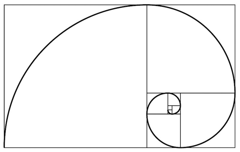
The golden ratio is believed to be followed for 4000 years now. The likes of Leonardo Da Vinci and Salvador Dali were known to use the golden ratio theory in their artworks.

Use Of Golden Ratio In UI Design

Striking the right composition and balance is a core part of any design. The elements need to work well with each other and complement each other to maximize the viewing experience. Also, the elements should be created with a balance within themselves. 

Graphic designers are keener to apply the golden ratio as it is a great way to understand how to work with proportions. Designers use this ratio to create various graphics, especially for the small but meaningful design elements such as a logo. The golden ratio allows creating illustrations where each element is placed in harmony and appropriate proportion to the others.

The UI design needs to have a clear visual presentation of the components so that people could use a product without problems. The golden ratio is often applied to place UI Design elements effectively. First of all, it can be used at the stage of wireframing. This way you can plan a structure for the layout placing and sizing user interface components according to the golden proportion. In addition, the golden ratio scheme can help professionals to crop images for web design so that it could make sure the composition of the photo remains balanced.

Advantages of The Golden Ratio

Well-balanced content

Designers often face the situation when a product needs to contain a great amount of various content and each part of it is vital and cannot be replaced. To unite all the components in a pleasant composition, the golden ratio can be applied. Divide the layout into different sections using a proportion of 1:1.618 and put the content in the sectors according to their importance. Such a content composition is sufficient for users’ perception and it helps to organize all the components.

Effective visual hierarchy

Speaking of the content organization, we can’t forget about visual hierarchy. As we mentioned in our previous articles, it’s a technique of efficient structuring content components. Combining principles of these two techniques designers maximize the chances of building a powerful UI design composition.

Powerful typography levels

To create efficient typography, designers need to divide copy content into different levels. They usually include various kinds of copy including headers, subheadings, body copy, caption, etc. Applying golden ratio professionals can quickly define an appropriate proportion between the typographic levels, for example, you can choose a certain size for the header and then divide it by 1.618. The result will show you the most appropriate size for subheaders.

Pleasing first impression

When users try a product for the first time, they scan the user interface to understand if they like it or not. The psychology principle known as a visceral reaction states that people decide whether they like something or not within a few seconds of looking at something. This reaction goes faster than our consciousness so we don’t even realize it. That’s is why it’s vital to make sure the first impression of a product will be pleasing. UI Design created by using the golden ratio has a positive influence on users’ minds and their visual perception and it works from the first sight at a product.

Appropriate white space

White space is the area between elements in design composition. Designers always need to care about the amount of white space in the UI since the unity of composition highly relies on it. The golden ratio can make the process of spacing much easier and faster. Applying golden proportions you will be able to define the right white space which will work well for the UI design.

To discuss more on your design needs, talk to our team of experts.

Categories
Blog Design UI Design

Checkout These 10 Useful UI Design Tools For 2020

The two key ingredients to create something spectacular are knowledge and tools. A creative, knowledgeable UI designer is helpless if they don’t have the right tools to implement their ideas. UI Design Tools allow designers to design accurate, hi-fi wireframes, mockups, and prototypes and render minimally viable products. UI designing has evolved a lot over the past few decades, and a lot of powerful UI Design Tools have surfaced. In this article, we list 10 useful UI Design Tools that help designers in creating spectacular designs.

1. Adobe XD

UI design tools - Adobe XD

The suite of Adobe products enjoys massive popularity in the world of design. Their kingdom of design products rules the creative cloud. Adobe XD offers vector-based tools to create prototypes and mockups with an interface that’s mostly like other Adobe products. The long list of features, along with real-time collaboration, makes it a go-to tool for many UI designers.

Not only does the Adobe XD has an array of tools, but it is also stocked with what designers need to improve interactions and other dynamic elements that can be integrated into prototypes or mockups.

2. Sketch

UI design tools - Sketch

One of the popular design tools for UI designers is Sketch. There’s a long list of features that make it such a useful tool. Designers can make universal changes using Sketch. Whether it’s through their library of symbols, text styles, layer styles, or through its flowing resizing and alignment features. It’s a real time-saver for designers while they deliver consistent prototypes. The tedious parts are eliminated by the tool, which allows designers to focus more on the creative aspects. Additionally, there are loads of easily integrable third-party plugins available with the tool.

3. InVision Studio

UI design tools - InVision Studio

InVison offers a full suite of applications that packs a bundle of UI design tools required to create fully functional prototypes with dynamic elements and animations. Apart from the UI design tools, they also provide accessible collaboration features that let developers share their work as they design it, receive feedback, and make documented changes at each step. They also offer a digital whiteboard that allows team members to pen down their ideas, interact with each other and sign-off before moving forward.

4. Craft

Craft

Craft is a plugin offered by InVision that works in tandem with your projects on Photoshop or Sketch. It comes with a sync function that facilitates the updating of your ongoing work; this saves much time. Craft also offers everything you need for prototyping and collaboration. Changes in styling, edits, and other tweaks gets updated across the board so that everyone is referring to and working from the same version.

5. Axure

Axure

Axure is mainly useful in prototyping and keeping track of the workflow. It provides a smooth interface for documentation as you move forward in the project. Axure has almost all the features which come with popular prototyping and UI design tools. Testing of functionality can be performed using Axure, and the tool puts everything together for a smooth developer handoff. It also furthers communication so that all the involved team members are up-to-date with the progress and changes.

6. Proto.io

Proto.io

Proto.io claims that using their UI design software results in “Prototypes that feel real”, and we can’t agree more. They provides designers with what they need to create, organize, integrate, and test accurate mockups. Like other popular tools, it also strengthens the collaboration and communication between team members through comments and video feedback, as well as integrating with some of the well-known testing products, like Lookback, Userlytics, and Validately.

7. Marvel

Marvel

Whether you’re a seasoned UI designer or just starting your design career, Marvel’s design platform simplifies the designing process for you. With the ability to create both low-detail and hi-fi wireframes, interactive prototypes, and do user testing, it gives a UI designer everything they need, all of it packed into an intuitive interface. One of its key features, called the Handoff, provides all the HTML codes and CSS styles to the developers, which are required to start the development process.

8. Figma

Figma

Figma allows designers to build dynamic prototypes and mockups, even test them for usability, and can sync up all of the progress. Multiple people can work on or view a project at the same time, much like Google Docs. Users can see who’s working on what. It’s also browser-based, making it accessible to everyone in an instant. The best part is that it’s free for individual use, so you can check it out and get familiar with the tool.

9. Framer X

Framer X

Experienced designers know that Framer X was a code-only prototyping application back in the days. However, it has evolved a lot since then, and today it offers a host of UI tools for building functional prototypes and testing for usability. Its ability to work with React makes it ideal for UI designers who like to stay on top of the newest web design innovations.

Framer X also comes with a variety of plugins, which allow UI designers to integrate social media channel players for embedding a variety of media, grids, and other useful components.

10. Origami Studio

Origami Studio

Origami was initially built by and for Facebook designers. Today, Origami Studio has become an advanced prototyping tool. This platform has the tools you need to build complete prototypes that are powered by a sophisticated patch editor, allowing designers to integrate advanced functionality. Prototypes end up looking and working like a real app or webpage. It also integrates well with Sketch. If you’re working in parallel with Sketch, it lets you bring in layers and copy and paste them directly without any hang-ups.

We hope that this list of UI design tools is enlightening for you. If you wish to discuss your UI design needs in detail, feel free to get in touch with our team of design experts.

To know the difference between UI and UX designer, Read Here

Categories
Brand & Identity UI Design UX Design Web Design

Latest Logo Designing Trends For 2020

A logo is an integral part of branding for any business. It acts as the unique identity of a company and plays a vital role in creating brand recall. The style and pattern of logos have evolved significantly over the past years. Every year certain new themes gain popularity and some of the ongoing trends fade out. So, what are the latest logo designing trends which will shape the designing of stunning, effective, impressive logos in 2020? Let’s check out.

1. 3D Gradients

Looking at the current developments in the field of logo designing, we predict that the popular gradient trend will evolve and merge with the 3D trend in 2020. This would be a tailored fit for our smartphone society. Gradients are a great way to turn any group of colors into a dynamic spectrum of color that feels like it has life and energy. In 2020, designers will boost the latest evolution of gradients creating depth and 3D effects in logos. Particularly, tapered gradients are set to top the 2020 logo design trend charts.

Don’t forget, 3D gradient logos are tough to print. That’s why they’re apt for screens. Brands that don’t need to worry too much about how their logos look in print are the ones that can best use 3D gradient logos. We expect to see designers explore the full potential of gradients this year. They can create captivating 3D effects, shadows, and depth as never before.

2. Motion graphics and videos

It’s a common assumption that that logos are still and stationary. Whether they’re on product packaging or on a business card, we think of them as images only. However, that’s soon going to change with the evolution of video and animation. Motion logos are becoming an integral part of visual branding. The popularity and use of video logos are only going to rise in 2020.

The growing popularity of social media platforms, and them becoming central points for marketing, calls for creating more engaging advertisements. Brands need to push themselves and need to switch from plain image logos to more engaging ones, like the motion and gif logos.

3. Bye-bye grids

Over the past few years, brands have been playing it all safe, when it comes to logo designing. They have been using the grids to place colors and designing the logos. But, it’s 2020, and designers are ready to take a bit of risk. There is a time and place for using a grid to guide your logo designs—it ensures your composition is symmetrical and visually balanced. But in 2020, we’re likely to see a move towards more abstract logo designs that push the boundaries.

Now you must be wondering how do you incorporate this design trend without ending up with a messy and chaotic logo? Even though you’re not using a traditional grid, it’s all about making sure the visual elements you use are distributed in an aesthetically pleasing way. The focus must be on the hierarchy of elements and negative space that makes the overall design look poised.

4. Raw, not-so-perfect logos

On one hand, there are digitally designed gradient and 3D logos which will gain popularity in 2020, and on the other hand, we feel that hand-drawn, free-flowing logos will also become immensely popular amongst designers this year. These logos reject the sleek, perfect look made possible with design programs and take us back into sketchbooks where there are asymmetry, uneven lines and shading techniques like cross-hatching and contour shading.

Just like other 2020 logo trends, raw, imperfect logos have been on the rise for a while. This year, they’re getting grittier and more sketch-like and stamp-like as brands continue to embrace the homegrown, organic look. With all the digital perfection out there people are craving the raw imperfections of hand-drawn logos. Brands can use the hand-drawn look to show off their authenticity and give their logos the personality their customers want to see.

5. Responsive logos

Functional and user-friendly design is one such trend that will always be popular. We all have seen the rise of responsive websites, and now is the time for responsive logos. Today, the brands want to be unique, they want to create an impact on their customers, they want to revolutionize their industry. Responsive logos are bold, powerful and really showcase a business’s innovation and expertise as leaders in their fields.

A responsive logo is one that adapts to different screen sizes. Generally, this will require a designer to create versions at various dimensions, to optimize their performance. That way, whether you’re viewing it on desktop, smartphone or tablet, it will always look its best. Anyone can jump on the responsive logo trend and it’s an excellent way to ensure your brand stands out as being polished and professional. The best way to use this in your own designs is to find out the correct size for that device, and use custom dimensions tool to create a logo that fits.

Read about the stories behind the logo of these famous brands

Designing the right logo is critical for a business. There’s a lot of thinking which goes behind the process. Logo designing is a process that requires an amalgamation of the brand’s vision and design trends. It has to be done right to create an impressive and effective logo. Talk to our experts and learn more about logo designing.

Categories
Blog Design Technology UI Design Web Design

Hiring A Web Designer? Look Out For These Essential Skills

Being a Web Designer in today’s world is both fascinating and challenging. The world of web designing is growing every day; there’s plenty of scope for a Web Designer to learn and grow. The learning process should not stop at any point in time, and a Web Designer must pick up new skills while fine-tuning the basic skills. So, what are these essential skills that are required to become a Good Web Designer? Here’s a list of some essential skills that you must consider while hiring a web designer.

Technical Skills

The most important skills to possess are technical skills. Stronger the technical skillset, better the web designing output.

Visual Design Principles

One of the key skills for a web designer, that will help them do well is their visual designing skills. It might seem pretty obvious and straightforward that you need advanced design knowledge to be a successful web designer, but visual design targets digital products, so that’s a tad different. 

Visual design principles determine the look and feel of a website. Setting up visual design principles involves creating mood boards and type hierarchy, by playing around with web fonts and color palettes. Visual design principles have more to do with the kinesthetic elements; that said, it’s very closely linked to user experience.

Color Theory

As a web designer, it’s essential to be familiar with the color wheel. Basic understanding of how complementary, contrasting, and analogous colors work together, is a must. Knowledge of combining primary colors to create new colors will help you create a pleasing, appealing color palette.

One of the most common mistakes committed by web designers is the use of clashing colors. A little bit of visual disparity can lead to an exciting design. Still, conflicting hues can also lead to an ugly and unreadable layout. Everything including text, calls to action, and headers should use colors that go with the overall theme and has a strong sense of legibility. A web designer needs to know when to use lights and darks, how to use contrast and saturation so that they excel in their work.

UX

UX refers to User Experience; it is the experience that a person has when they interact with your website. It is how people feel when they use a website. A web designer must have UX knowledge to approach web design from a user-first perspective. The objective is to design a website that helps users to get what they need.

A lot of factors can be improved – the content, the navigation, the colors, the CTAs, and more. The better the web designer is at UX, the more useful the website gets designed.

UI

Very closely connected to UX is the user interface (UI); it is the series of screens, pages, and visual elements like buttons and icons, that enable a person to interact with a product or service. These elements guide and navigate the user through the design, overcoming any obstructions, offering a smooth experience. UX is more about the broad aspects of how design affects someone, while UI focuses on specificity. UI elements include navigational elements, intuitive interfaces, and calls to action that guide people to do what you want them to do in the shortest amount of time.

Graphic Designing

Website and graphic design are very similar in terms of creativity. Both are artistically crafting visual elements. However, web designing is a medium where ongoing changes and updates are a part of any project. On the other hand, graphic designing is about creating visuals with lastingness. Designing website elements fall under web designing while designing a logo falls under graphic design. Both are different design disciplines but are a part of branding. 

Graphic design skills will enhance the skill set of web designers. If they can hand-draw typography, custom illustrations, and other creatives, it will undoubtedly improve their web designing work.

Non-technical Skills

Apart from the technical skills, there are some other skills that elevate a web designer’s performance.

Communication

A web designer must have the capability to get their point across to the various stakeholders effectively. They’ll have to interact with product managers, marketing teams, clients, and even pitch ideas to potential clients. Therefore, good communication skills are a must for any Web Designer. Moreover, explaining your vision for a project in a way that non-designers or people with minimum technical knowledge understand is essential.

The role of a Web Designer has evolved over the last few years. Today, they do a lot more than just designing. They contribute to copywriting, editing for sites, developing presentations and more. Good communication skills will always be handy for them.

Time-management

Whether you work for a design agency or work on your own, managing various design projects require effective time management skills. A Web Designer needs to stay on top of their schedule to make their project stand out. They should be aware of various productivity apps like task lists or calendars, or project tracking tools like Trello or JIRA, to better manage a project. The world of web designing is hustling; mastering the art of prioritizing and tracking your work will be crucial to a Web Designer’s success. 

A Web Designer has to respect deadlines and provide regular progress reports to all the stakeholders. Their time-management and self-discipline skills often define their reputation as a true professional.

Proactivity and Creativity

Creativity is ‘The Game’. If a Web Designer doesn’t have a creative mind and can’t come up with new ideas to design, all the technical knowledge goes down the drain. Proactive and creative Web Designers take ownership of their projects and share responsibilities with the Project Manager. As a professional web designer, you should understand the project’s scope, purpose, and standards, acknowledge your client’s expectations, and continuously come up with constructive, out-of-the-box ideas.

Here are some tips to become a successful web designer

Like many modern-day job roles, a web designer’s role also demands a wide array of skills. Personal skills, along with sound technical knowledge, not only helps a Web designer to grow personally, but it also benefits the company. The next time you hire a Web designer, look for these skills. If you require our web designing services, talk to our team now!

Categories
UI Design UX UX Design Web Design

10 Great Examples of Creative Landing pages

The landing pages are the first and foremost introduction of your website and plays a vital role in marketing your brand on the web. it introduces the specific offers, your services, products and key elements of your business. Therefore it’s necessary to give a good thought behind designing a visually attractive, intuitive and user-friendly landing page. The goals behind the landing page design can be different. 

Landing pages are not just about selling and buying. They are also used to present and promote mobile applications, educational resources, communities, make special announcements, etc.

The design process for any landing page must start by setting a clear and concise target to be achieved. An ideal landing page must feature a clear visual hierarchy, bold and highly readable typography, a short scannable tagline, an instantly visible call-to-action element, and a readable and concise description.

Today, we have collated a list of 10 amazingly designed landing pages featuring a variety of products and offers. Take a look and draw inspiration from each one of them.

1. Photomate – A Photo Service

Landing Pages Example 1 - Photomate

Photomate is a digital product for photography lovers. It’s design is created for the direct purpose of web promotion. The app lets users keep their photos in an organized gallery and albums. They can find photos quickly and improve their looks with an AI-based editor. This landing page is a good example of using custom hero illustrations to boost storytelling, add originality and enhance the effectiveness of marketing efforts.

2. Cleanerz – An Innovative Car Wash Service

Landing Pages Example 2 - Cleanerz

The focus of digital products has shifted from selling, offering, informing, or educating to just connecting people who can help each other solve their problems. This design is a perfect example of connecting people. It is the landing page for a service that provides innovative car cleaning and let people join and earn money. This particular page is targeted at people who are looking to be hired as cleaners. The hero illustration is both cute and catchy. It creates a positive mood and informs about the nature of the service with readable and clear content placed on the light background.

3. Let’s Read Together – The Subscription Page

Landing Pages Example 3 - Let's Read Together

This is the subscription page of an online bookstore selling children’s books. Its conversion goal is to engage users and make them subscribe to the newsletters. The simple tagline and description that explains the benefits, with the hero illustration, instantly creates the proper aura and encourages users to subscribe. The dark background here doesn’t hurt readability in any way due to the thoughtful choice of fonts.

4. Checkbags – A Luggage Delivery Service

Checkbags

If you are a frequent traveler or you have to constantly move, you must be aware of the luggage challenge. This app aims to overcome this challenge and that’s the point behind the service presented in this design concept. The app picks up clients’ luggage from the desired location and delivers it to the chosen destination. The bright and catchy hero image along with a subtle color palette instantly sets the right mood. Color accents effectively unite the layout composition and the tagline fits great.

5. Flober – A Hair Accessories Store

Flober

One of the basic rules of e-commerce websites is to display the offered item at its best. This landing page demonstrates how to do it in the case of an e-commerce website. The page is designed for an online store selling exclusive hairclips and accessories. The illustration is very much prominent and artistic, which instantly sets the theme, gives aesthetic pleasure and creates a strong emotional appeal. The sophisticated typography nicely compliments the design.

6. Secure – A Security Service

Secure

This is another landing page that promotes a mobile app. The security application helps a user quickly contact the nearest police station and cares about the safety of the neighborhood. The visual contrast of a hero illustration, with irregular curves and thin lines makes the landing page stand out. Also, the bold solid Druk font creates an instant impact.

7. Carbonex – An Environment Protection Community

Landing Pages Example 7 - Carbonex

People are becoming more and more environmentally aware and concerned with every passing day. The seeking for solutions related to environmental problems is growing at a rapid pace. Carbonex is a web page designed for the website of the eco-aware community consulting businesses and manufacturers as well as launching projects devoted to environmental protection. The composition and color palette of the hero illustration supports the emotional appeal and creates an instant message about the theme. Visual hierarchy features easy scannability to make the major information. The infographics and CTA are also instantly visible.

8. Commo – A Social Network Management App

Commo

This catchy web page is designed to promote an application that allows users to manage all their social accounts in one place. The illustration has a dynamic composition that best reflects the fast-paced communication in social networks. The page has a split background with a light part for the graphics and the dark part for the text. The CTA button unites the general composition as white elements in dark. 

9. Smartmap – An Interactive Mapping App

Landing Pages Example 9 - Smartmap

Today, websites and apps are much more than just sources of information and communication. They are used for various purposes and often act as our virtual assistants. This landing page was designed to promote an app that allows users to build interactive maps for their smart homes, offices and even public spaces. The catchy and concise layout with an artistic hero image becomes reflects a strong brand image.

10. EasyShops – A Shopping Delivery Service

Landing Pages Example 10 - EasyShops

This is the landing page of a local delivery service, the one that helps shoppers who don’t have the time to shop. It uses catchy 3D graphics set in combination with a unique color palette which gives a trendy look to the page. It helps the brand to stand out. As the website is targeted at local clients, the CTA is designed for a quick call as a priority action.

Read more about UX tips on Landing Pages here

The web is full of such inspirations. It is just the trick to zero-down on the message that you want to convey, the way you want to convey and knowing exactly the brand perception that you want to build in your target audience’s mind. Wanna create a WOW landing page for your business? Talk to our experts.

Categories
Brand & Identity Design Mobile Apps Technology UX

Differentiating Between Wireframes, Mockups, And Prototypes

If you have ever worked with a developer, you would have heard the above-mentioned statements, or something similar to it. I have seen people scratching their heads and looking puzzled encountering these typically used project status terms, while an app is under development. A lot of engineers, marketers, and even senior managers use different design deliverables synonymously, as they don’t know when to use ‘wireframes’ or when to go with ‘prototype’? They assume that a wireframe, prototype, and mockup are exactly the same thing. It’s no more than a greyish, boxy sketch representative of an ingenious idea, which is definitely not the case.

“The wireframe is ready.”

“We are working on the mockup.”

All the design deliverables are different from each other as they are used to communicate different functions and aspects of the design. They do represent the final product, but the depictions are different.

Process of designing an app

Below-mentioned is a typical development journey. It is essential to follow these steps each time you create a new product.

Sketches > Wireframes > Mockups > Prototype

Start with a simple sketch on a blank piece of paper. Then, make a wireframe that organizes the content and features of your app. For mockup, add colors, icons, pictures, and logos to your wireframes. Add interactive elements into the mockups to inject life in it and come up with the prototype.

1. Sketch

It’s basically just a raw freehand drawing on a piece of paper, that gives you a low-fidelity representation of your app. It is the fastest way to represent your idea and getting ready for brainstorming. Believe me, even a simple sketch can describe your idea better than words. Go freestyle – work on different ideas, change details, visualize what you have on your mind; it’s all up to your imagination. This step is essential for getting to the wireframe stage. The best way to go about it is on a pen and paper.

2. Wireframes

A wireframe is equivalent to the skeleton or simple structure of your website/app. It should clearly show the main group of contents and the placement/structure of the information. It describes the functionality of a product, as in, what will happen when you click a certain button? The decisions on what and where on the website or app (in terms of content/features) are usually made during this stage. Remember, This step does not cover the product’s design.

Wireframes are not just meaningless sets of grey boxes, though they may look exactly like that. They are literally the backbone of your design. It’s a fact that you don’t need to deep dive into too many details, but you need to create a solid representation of the final design that won’t miss out any important piece of it. With a wireframe, you’re designing a roadmap for the whole project and all the stakeholders — developers, copywriters, project managers, etc. A well-created wireframe communicates the design in an easy, clear way and sets a path for the whole team.

Wireframes are typically used as the documentation of the project. Since they are static and simplistic, you could include short notes to explain the interaction, or maybe even technical documentation.

3. Mockup

A mockup is a middle to high fidelity, static, design representation. Very often a mockup is a visual design draft or even the actual visual design. It’s a good practice to never start development before mockups are completed. Add colors, fonts, dummy text, images, logos and anything else that will shape your wireframe. Your result is a static map of the app.

A well-crafted mockup helps you to finalize the product’s color schemes, visual style, typography, etc. A mockup is a playground where you can play with various visual aspects to see what looks best.

Mockups are particularly useful if you want to get early buy-in from stakeholders. Due to their visual nature, mockups don’t have the resistance of the low fidelity deliverables and can be created much quicker than prototypes. They are a good feedback-gatherer which smoothens the development journey.

4. Prototype

A prototype, often confused with a wireframe, is a middle to high fidelity representation of the final product, which simulates user interface interaction. It’s like a mockup enriched with UX pieces, interactions, animation and anything else you’d like to experience when clicking buttons. It should allow the user to experience content and interactions with the interface and test the main interactions in a way similar to the final product.

Prototypes are very useful when performing user testing. It allows you to check the usability of the interface before the development begins. This substantially reduces the development costs until the UI is approved. Once the prototype is tested, the team can start coding. The only thing missing in a prototype is functionality. It can give you a feeling of using a real app, but they are only images connected with each other.

You might find this article useful for creating a better UX Design

Why is it important to know the difference between Wireframes, Mockups and Prototypes?

These design deliverables help you define your expectations, save money on developers and describe clearly what you need to get built. You can confidently pitch to investors, first customers, and co-founders using the appropriate design deliverables. Before you choose a means of communication in the design process you need to consider your product and team; think about what works best for all of you. To know more, have a quick chat with our design experts.

Categories
Brand & Identity Design Technology UX Web Design

Benefits Of A Copy-First Approach In Designing

It has been a little over six years now that I have been writing for websites, and every now and then I find myself participating in the never-ending debate between Designers, Product Managers, and Writers – Copy-first approach or Design first approach? Many writers feel that the designers should get the ball rolling and based on the design, the words should be tailored. However, I stand on the opposite side of this belief. For me, a copy-first approach to any kind of design project is the best way to go about it. 

Read More: Content Or Design First

The very first step of a design project, of any nature, or size, is to construct and shape the thought behind it. Thoughts are also content; words in our mind form the base of the very-first content, which needs to be articulated through the copy. Jeffrey Zeldman, the famous entrepreneur, and web design expert, once said “Content precedes design. Design in the absence of content is not design; it’s decoration.” This may sound a bit harsh, especially to my designer friends. However, one thing is clear to me, be it a stand-alone page, a new website, or a website re-design, the copy-first approach can make your project more efficient. Let’s discuss some key benefits of a copy-first approach to website designing.

Better Timeline Setting and Deadline Planning

The initial content doesn’t need to be written by the Content Writer or the Content Strategist. It can come straight from the client or any other team member, which can be further validated and polished by the Content Writer. If the copy and a content plan are ready, right at the beginning of the project, it allows you to think on realistic timelines. You can set accurate deadlines based on it.

There are a lot of tools available which can be used to manage tasks and their progress. High-level tasks must be clearly outlined in order of operations to move the project smoothly, and not jumping from idea to idea. No matter which software you use, the entire team should be able to see the task list, to be on the same page.

A rough draft at the beginning is good to kick-off the project. The final and complete copy takes some time, depending upon the size of the project. Moreover, it isn’t required to create all the content assets in one go. A simple indication of where you want to use a photo, or mentioning when the photo shoot may take place in the project timeline is enough to start with.

Proper Site Planning

This majorly benefits larger projects, like new websites or full-blown corporate website redesigns. Preparing the copy and content plan upfront helps the team to plan the project and lets you focus on the overall strategy. It allows you to estimate the scope of the project; it lets you understand how extensive the website and its different pages are. 

On the other hand, in case of a small project, like a single page, looking at the copy and the content plan shows how extensive the page could be. Here, you can check the user flow and analyze how well it fits into the scheme of the existing website.

With copy written upfront, we know exactly what the header, footer, and other sections will look like. We know what kind of images we need to source or create, where the CTAs will be placed, and what they were going to say. In short, we have an excellent plan for the page right from the start.

Having a site map early in the project is very fruitful; irrespective of the way it is documented, the important thing is that everyone involved must have access to it. A sitemap is the best way to keep content organized, linked, and accessible. It presents a better picture to you of what’s missing, what needs immediate attention, and what’s ready to move on to the next stage.

Offering Concise Content

Deciding what amount of copy is a good amount of copy is a very tricky and challenging task. Besides, there are specific sections on a webpage or website which needs to have more copy as compared to other sections and vice versa. Steve Krug, the author of the famous UX book ‘Don’t make me think’ once said: “Get rid of half the words on each page, then get rid of half of what’s left”. That’s a powerful statement; however, studies have suggested that too much text on web pages isn’t suitable for any of the following – user experience, usability, readability or site metrics.

That said, we still come across websites that are stuffed with the copy. Trimming the copy by more than 50 percent is a strategic move and results in some serious decluttering. Decluttering improves user flow, site map, sales funnel, and navigation. If the path to purchase is improved and becomes more accessible, removing a whole page or a whole section is worth it.

Constant Comparison Against Set Goals

As the project is moving along, you should also be always able to check the content against your set goals; both user goals and business goals. On a large scale, you’d be checking content alignment with the intended user and business goals; and if each page aligns to the goals? Similarly, on a smaller level, check if individual sections and sentences also align.

If you find deviations in the planned copy and content, from those goals, it’s best that you re-write them. Even if the content deviation is minor, this allows you to start optimizing it. Re-wording the copy and adjusting content assets to be more direct is a great way to strategize. It leads to higher conversion rates and lower bounce rates.

Clearly Defined Visual Design

A copy-first approach helps to define and set up the visual design. It helps with a variety of design aspects, especially layout. The copy-first approach is a highly collaborative process. The designers, copywriters and marketers, all need to work together while deciding the content. Even developers actively participate in the process. The plus point is that these conversations start at the early stage of the project. This leads to better collaboration and results. The copy-first approach lets the visual designing process kick off from the very first step.

Because of the collaborative and planning nature, the copy-first approach helps to eliminate revisions and strengthens the UX. By the time the visual and UI design stages come, all the pages and sections are already agreed upon, by everybody involved in the project. It’s a great way to lead design projects most effectively. Talk to our design experts to discuss more on the same.

Categories
Brand & Identity Design UX Web Design

Design Arrest: A New Way To Design Your Dreams

To grow an in-house design team or get the services from a professional design agency is a heated topic of discussion. While there are still people who believe that it’s best to have an in-house team, the majority of experts from the industry strongly believe that a professional design agency is the best option and drives the business growth.

With changing times, the design needs, trends and philosophies have also witnessed a makeover or revamp. With these changes, the process to cater to design needs also needs to upgrade, in order to provide 360-degree design solutions in the most viable manner.

Design Arrest is one such creative job-stop that revolutionizes the process of designing graphics. It is a creative agency that aims to transform your ideas and thoughts into captivating designs. Here are a few differentiating factors of Design Arrest which make it stand out from other creative agencies.

Personal Graphic Designer

The biggest challenge while dealing with creative agencies is to find a single point-of-contact. Often the person working on your request is different from your point-of-contact. Moreover, multiple people work on your project which makes it difficult to strike consistency in the design language. It’s a tiresome and time-consuming task to again and again convey your thought behind designs, brand vision and requirements to different people, every time when you make a fresh request. At Design Arrest, you don’t need to sweat it out. A personal, dedicated Graphic Designer is assigned to you, who will be available round the clock to fulfil unlimited design requests.

Design Your Dreams


Flat Rate

Generally, the cost of every design request is calculated basis the type of request, required efforts, time required and nature of the request. This leads to variable costing and often shakes the planned budget for designing. Design Arrest understands the importance of budget-forecasting and values your money. They charge a flat fee, $300 per month, for all your design requirements. There are no hidden charges, taxes, or service charges at any given point-in-time. They believe in clarity, trustworthiness, and developing mutually benefitting, long-term relationships.

Flat Rate

Unlimited Requests / Revisions

Here comes the best part. There are absolutely no bars on the number of requests you raise or the number of times you request revisions. Until you are fully satisfied with their work, the team will not rest. The objective here is to completely satisfy the design needs. Putting a cap on the number of requests will require clients to hand pick the requests, normally the most critical and significant would be passed on, however, a lot of essential requests may not come through only because of the restriction on the number of requests. But, with unlimited requests and revisions, all your design requirements are bound to be fulfilled.

Daily Output

The design process is not a one day job. Some projects last for weeks or months, and some may even be a continuous task for years to come. It becomes difficult for project managers to track the progress and status of the design requests, especially when there’s a provision of shooting unlimited requests. The team at Design Arrest allows you to raise requests every business day and get them served with desired output on a daily basis. This makes your job easy to track the progress and analyze how the work is going on.

No Commitment, No Contract

Unlike many creative agencies, Design Arrest doesn’t bind you in any kind of contract. In case you find any reason to end its services, you’re free to discontinue from that moment itself. You are not at all bind by any regulations or conditions. You are billed on a monthly basis, get the services on a monthly basis and can stop any time you want. Everything that is created by Design Arrest for you is completely editable and belongs to you. They claim no ownership even after you discontinue its design services. Also, they do not disclose or share any information related to your project or business with anyone else.

One-Stop Design Hub

Design Arrest simply designs everything. Be it websites, banners, downloadable, brochures, or anything on web or print media, they design it for you. No matter how diverse or intricate your design needs are, you are sure going to get the solution, with its widespread services ranging across logo design, business collaterals & literature, promotional merchandises, mobile apps, web pages, e-stores, social media creative, presentations and infographics.

Design Arrest certainly stands out in terms of delivering high-quality design solutions at a reasonable price with feasible payment options, and is backed by result-oriented, trend-driven, highly enthusiastic creative brains who are striving to create a difference. You can check out their work here.

Categories
Brand & Identity Design UX Web Design

UX and UI: Connected, But Completely Different

User Experience, or more commonly known as UX is not a new term for the world of graphics and designing. It has been around for as long as the modern day revamping of the design techniques, ideas, tools and philosophy has evolved; so is the case with User interface or UI. They both do compliment each other and often go hand-in-hand, however, a lot of us think that they are the same thing, which is not true. User interface is, let’s say, a part of user experience. Not clear yet? Let’s clear the smoke and try to understand what are the basic differences between UX and UI designs. Let’s go!

User Experience

It refers to a person’s interactions with a product, application, website, or operating system. Which means, creating a UX design involves defining the way a product operates and how it meets a user’s needs. Some of the obvious benchmarks are that a UX should be clear, comfortable and user-friendly. Moreover, a great UX is cautious and elaborate; you will most probably won’t even notice it while browsing through a website.

A good UX aims at simplifying the user journey. It makes the website navigation simple; simple enough that even a layman finds it a walk in the park. If a user finds it difficult to perform some of the most basic functions on a website, like to sign up, change their password, or get to their shopping cart, then there’s a clear problem with the UX. An effective UX smoothly guides a user through a website or an application.

A UX designer is responsible for all aspects of a user’s interaction, which means a UX designer is not just responsible for the technology behind a product, but they’re responsible for how a user interacts with a company, both online and offline, including customer service and other aspects.

User Interface

While User Experience is the accumulation of tasks specifically focused on the optimization of a product for enjoyable and effective use, User Interface Design is its complement; the look and feel, the presentation and interactivity of a product. User interface (UI) is anything a user may interact with to use a digital product or service. This includes everything from screens and touchscreens, keyboards, sounds, and even lights.

A UI designer’s responsibilities are more cosmetic than a UX designer’s. A UI designer is mostly responsible for the presentation of a product. That said, it’s not that a UI designer randomly picks some pictures and logos and use them blindly.

A UI Designer takes care of the Interface design, prototyping design, interaction design, user testing and optimal design. Towards the end of development, a UI designer takes control over the app’s appearance, including on-screen forms, images, buttons, links and icons. Without a user interface designer’s intervention, a design would not appear beautiful and appealing.

Key Differences

UX enhances the usability, UI enriches the visual appeal

The core objective of UX design is to make the product more useful for users. UX designers are responsible for ensuring that the company delivers a product or service that meets the needs of the customer and allows them to seamlessly achieve their desired outcome. On the other hand, UI designers are more inclined towards creating a visually appealing and aesthetically pleasing website design for users. Additionally, UI design must help users navigate through the website by designing buttons in different sizes, to show priority. UI designers take care of minute visual details to make the site look attractive.

UX Design is first, followed by UI

Normally, UX design and research is the first thing that designers dive into when deciding whether to build a product or application. They start with a competitive analysis and market research to come up with insights which improve site functionality. UI design comes much later; once the prototype has gone through several iterations and is almost finalized, all the wireframes are in place, then the UI designer steps in. Here is where the creative spirit of designers is put to test. They work on the visual design and micro-interactions.

UX pertains to products, services and interfaces, but UI only pertains to interfaces


The scope of UX is much broader than UI. UX design is garnering a lot of attention and is becoming more popular day-by-day. It’s no longer restricted to the companies with a web presence, but many others that develop products or provide services are identifying the importance of researching the market, users and validating them before they build. The scope of UI is however restricted only to user interfaces. That said, it doesn’t mean that UI is limited to graphical user interfaces of computers, tablets and mobile devices. A lot of other products also need a touch of UI designing these days, like watches, washing machines, car dashboards, vending machines etc.

UX has a social component, UI has an artistic component

UX is more about people; it has a social component as it deals with market research, analysis, identifying a customer’s pain points and how the product will solve these problems. User personas, journey maps and product user scenarios are accounted through UX research like contextual interviews, focus groups and prototyping, involving people. UI design has an artistic component as it relates to the design and interfaces with the product. It is about the aesthetic value and visuals. It affects what the end-user sees, hears, and feels.

Concluding notes

It is evident that UX and UI are completely two different things and focus on different aspects. But, they both complement each other and go hand-in-hand. It is almost impossible to bail out UI from UX and UX from UI. In a nutshell, UX design helps users accomplish meaningful tasks across platforms and services, while UI design makes compelling and aesthetically pleasing interfaces that connect with humans.

Categories
Design

Infuse Innovation In Design Patterns: Why and How?

A lot of researches have proved that human behavior happens in patterns and humans largely use the default, familiar patterns to interact with technology, without seeking a new way to do so. Having identified the substantial influence of patterns over human behavior, it is a wise step to use established design patterns in your work. That said, repetition can also kill innovation. It’s nearly impossible to design something new for your audience if you only concentrate on what’s been already done.

In this article, you will learn how you can use innovative ideas with established design patterns to meet the need of your end-users.

What are Design Patterns?

Design patterns are established solutions to recurring problems. Established design patterns are extremely useful for interface designers. One of the best examples of UI design trends can be positioning the login call to action at the upper right-hand corner of the navigation. People are familiar with this type of positioning because they’ve used the same behavior to log in or check their profile for years. They expect the login button to be there.

Tax Zar
Image source:Taxjar

People enjoy the familiar and are reluctant to anything that they don’t know, or is unexpected. When an interface matches the user’s expectations, it reduces cognitive load, saves users’ time, and makes the software more intuitive.

While we are discussing how to bring out originality and infuse innovation in design works, patterns do have a number of advantages for your design process.

Utilizing a pattern saves time as you don’t have to design an interface from scratch, everytime you start a project. You would be building on a solution that has been successful and has worked well in the past. However, relying heavily on design patterns can easily drive you towards an under-researched design.

Before you start customizing patterns, make sure you select the right pattern for the job. Yes, design patterns are usually reliable solutions to recurring problems, but if you don’t choose the right one, your design could actually reduce clarity for your audience. There are various repositories that offer examples of important design patterns. You can choose the most suitable one for you from there. Once you have your patterns in place, it’s time to get into the innovation mode. Here, innovation means specific changes in a few parts of the interface, not spinning the entire thing on its head. The fundamental design still fits a pattern, but new ideas are added to better help your users understand the interface, satisfy their needs, and accomplish their goals.

Cresent Heights
Image source: crescent heights

Ways to Innovate

There are two most commonly used, tried and tested techniques which can be used to infuse innovation in existing design patterns.

Mental Models

A mental model refers to an established belief someone has about how a system should look or function. This principle states that people find something challenging to use if the interface doesn’t function as they have already decided it should. How designers perceive a product or website and how users perceive the same is often poles apart. This discrepancy is the biggest pathway to poor design.

A couple of research methods like Usability testing and card sorting can be used to uncover what’s on your users’ minds. In Usability testing, people verbalize what they’re thinking as they interact with your site, while in card sorting, users group types of data based on categories, which can help you understand where in the interface people expect to find content.

Empathy Maps

An empathy map is a qualitative research method that visualizes specific needs and actions of your users. Using data collected from user interviews, surveys, and field studies, empathy maps typically categorize user needs in four sections: Says, Thinks, Does, and Feels. This kind of research helps in identifying what users feel versus what they do. These conflicts will help you identify what elements to highlight or hide in your UI design.

Innovation has always led to great things, however, it’s not really wise to only depend on innovation and everytime crafting something completely new, without the essence of tried and tested solutions. It should always be a combination of new ideas and established design patterns. Know more about the same by speaking to our design experts.