NYX Ditech

Categories
Brand & Identity Design UI Design Web Design

Web Designing For Accessibility: Tips And Guidelines To Follow

The world is evolving faster than ever, and humans are becoming more and more dependent on technology. The Internet has changed the world, and today all of us depend on the internet for almost everything. Be it searching for a job, ordering a pizza, booking a dentist appointment, learning, and whatnot? The internet may be an ever-present resource for most people, but connectivity to the resource is a challenge for people living with disabilities. Although there are programs and devices, like screen readers, that make it possible for people with disabilities to access websites, web designing for accessibility is still a practice less followed.

According to data from 2012, almost one in five Americans live with a disability of some kind. Close to one billion people in the world, or 15 percent of the world’s population, lives with a disability. Out of all kinds of disabilities, conditions like visual impairment, autism, difficulty grasping objects, and deafness, just to name a few, can severely limit an individual’s ability to use a computer or smartphone without assistance and support.

There’s a myth that web designing for accessibility is difficult and expensive; it’s not true. Making your website more accessible doesn’t mean adding extra features or content; therefore there shouldn’t be an additional cost and effort.

Here are a few tips that will help you in web designing for accessibility in accordance with the AA level of the Web Content Accessibility Guidelines (WCAG 2.0), and will allow your website to work on the most commonly used assistive technologies — including screen readers, screen magnifiers, and speech recognition tools.

Maintain a Proper Contrast Ratio

Color contrast is an important aspect of web designing. But, it is often neglected as a web accessibility problem. People with low vision could find it difficult to read text from a background color if it has low contrast, whether on a plain background or text embedded within an image. A movie with subtitles is a good example. The text often appears without anticipating the background. It happens when white text appears in a brightly lit scene. It is unreadable, and the audience is left not knowing the dialogue.

It is critical to consider the sufficient contrast between text and background. According to the W3C, the contrast ratio between text and its background should be at least 4.5 to 1 (conformance level AA.) The ratios become more forgiving with larger and heavier fonts since they’re easier to read at lower contrast. If your type is at least 18 pt or 14 pt bold, the minimum contrast ratio drops to 3 to 1. You can use tools like Contrast Checker to see how your planned font and background colors work together.

Don’t Just Rely On Colors 

When you’re communicating something important, showing an action, or prompting a response, don’t use color as the only visual cue. People with low visual acuity or color blindness will have a hard time understanding your content. Try to use an indicator other than colors such as text labels or patterns.

Elements with more complex information like charts and graphs can be especially hard to read when you only use color to distinguish the data. Use other visual aspects to communicate information like shape, labels, and size. A good trick is to print your graph in black and white and see if you can still understand everything in it.

Keep Your Navigation Predictable

The navigation system your website uses should be consistent across its pages. This includes the icons you use and the way visitors get to different pages within the site. if your homepage has a top header bar with drop-down menus, each of your other pages should have this arrangement, too. Similarly, the icons you use across your website need to be consistent.

You should also stay away from any kind of automatic navigation and auto-playing music and videos. not only are they annoying, but it’s also difficult for a user with a screen reader to determine how to pause them. And when a slideshow or carousel scrolls through content at a rapid rate, users can become confused and frustrated.

Support Keyboard-Only Navigation

Web designing for accessibility is not restricted to the elements on the screen. Keyboard accessibility is one of the most critical aspects of web accessibility. Especially for the ones who are blind and rely on screen readers. Also, for people who don’t have precise muscle control; they can’t grasp a mouse or keep their hand steady on a laptop’s touchpad. These users rely on their keyboards to navigate websites. 

These users typically use the Tab key on the keyboard to navigate through interactive elements on a web page – links, buttons, or input fields. The order of the interactive elements is essential, and the navigation must be logical and intuitive. The tab order should follow the visual flow of the page – left to right, top to bottom.

Add Appropriate Alt-Tags To Images

Alt tags are brief descriptions of the images you use that get buried in the site’s HTML. Most users never see these descriptions, but site visitors using screen readers rely on them since they “hear” the content. These tools convert text to speech so that the person can hear the words on a site. Alternative text, or alt tags, can be presented in two ways –  within the <alt> attribute of the image element, or within the context or surroundings of the image itself. 

Alt tags aren’t just useful for your visually impaired audience; they’re for your benefit too. Well-crafted alt tags improve your site’s SEO, drawing more relevant site traffic and improving conversions.

Use Labels Or Instructions With Form Fields And Inputs 

Using placeholder text as labels are one of the biggest mistakes when designing a form. Placeholder text is usually gray and has low contrast, so it’s hard to read. People who use screen readers usually navigate through a form using the Tab key to jump through the form controls. The <label> elements are read for each form control. Any non-label text, as placeholder text, is usually skipped over.

Always help people understand what they should do and write in a form. It’s best if labels don’t go away, even when the person is filling an input. When designers hide descriptions or directions in their forms, they’re sacrificing usability to attain simplicity. That said, we don’t want you to clutter your design with unnecessary information, just make sure to provide essential cues.

Web designing for accessibility is a new and growing trend. While these tips will certainly help you in creating websites that are much more accessible for people with disabilities, there is still a lot of scope in terms of improving the user experience for this set of audience. As designers, we all need to grow and master the art of accessibility since technology is usable for all – regardless of their abilities. Looking to improve your web design? Talk to our experts.

Looking for 2020 Design Trends? Click Here to Know More

Categories
SEO UI Design Web Design

The Importance of Content in Web Designing

Designers around the globe may argue that the most essential aspect of a web design’s success is its visual appeal, and that content is secondary. But, the truth of the matter is that no matter how good and appealing your website may be, it will not be able to achieve success unless it is designed and developed based on solid, useful content in web designing. Great content is what sets your website apart from the masses and delivers the right message to your audience. 

The success of your website is determined primarily by its content. All other components of your website (design, visuals, videos, etc.) provide a secondary support role. The key to a successful website is having clear, relevant, and keyword-rich content that delivers the right message with power and conviction. The content for web designing should target your audience, engage them, and persuade them to take action.

Before you get started with the web design process, make sure that you have the content ready with you. The reason being, your website needs to be built around the content, not the other way round. Here are a few reasons why content is more important than it looks.

SEO

One of the benefits of publishing good content is that it will increase the number of people who find your website through search engines. Search engines love content, especially frequently updated content. Content is the most significant catalyst when it comes to boosting your SEO. Google checks the content quality of a website to determine its ranking. It reviews the relevancy and authenticity of the content to the subject topic. 

There are so many websites on the internet that have amazingly beautiful homepages, but no relevant content at all. In most of the cases, the homepage is the most frequently visited page of a website and therefore it should contain information about what you do, who you are and what you offer. This is one of the main reasons why scrolling websites have become so popular in recent times. If your site contains less information and content, it will be difficult for Google to identify what your website is about, and it will impact your ranking in search results. Visitor traffic, business visibility, and sales will all increase with higher search engine rankings, which is only possible by creating and offering high-quality content while web designing.

User Experience

High-quality website content enhances usability. Usability can range from the navigation of your site to the ease of use for visitors, to the accessibility of your content and to the interconnection between relevant pieces of content. When relevant and useful content is easy to locate, it results in better user experience and more satisfied visitors. If visitors don’t find your website easy to use, then they are more likely to bounce off and visit competitors’ sites instead. A high bounce rate means a loss to the business.

No matter how good the design and functionality of a website is, if the content is poor, the overall user experience will be disappointing. Visitors come to your website for information; to seek answers to their queries. They also want to find out about you, your services, and/or products. They want to know how are your offerings are unique and different from your competitors. They want to know your contact details, your business hours, the experience of clients using your products/services, and a lot more. This is all content and must be available for visitors. Importantly, the content must be available at convenient locations, where people expect it to be. If they have to search rigorously on your website to seek their answers, that’s negative user experience.

Sales generation

Building trust is a vital part of sales generation for any business. One of the important ways of creating that trust is by establishing yourself as an industry thought leader and authority, through the content you produce. In terms of sales generation, good content can be especially useful if you know how to drill down on your targeted demographics and guide them to the purchase.

An estimated 77% of consumers read online content before making a purchase decision. Publishing product-specific content such as FAQs, product reviews, and instructional videos or blog posts can help reassure potential customers and lead to sales. Add screenshots to reviews and include videos where possible. Videos create a next-level impact. Always use a conversational tone while writing and create blog posts on trending, relevant topics. Provide links between the content which can lead the reader to the related product or service. It is an effective way of generating sales.

Competitive Edge

The sole purpose of a website is to showcase a business and its offerings. We all want to attract customers and words play a vital role in enticing potential buyers or clients. People buy from people, and you are more likely to stand out over your competitors by making a connection with your customers by offering them the right content.

As a business, you would have to do things differently and bring your personality at the forefront to attract customers; do this through your website copy. Use your website content to highlight what makes you different, and why a potential client should choose you over someone else in your industry. Make valuable connections with your website visitors to gain a competitive advantage.

Content Is More Than Just Text

Content doesn’t always come in the form of text. Visuals, especially videos, on websites are changing the way important messages are communicated. Visitors expect to get the information they need effortlessly. Custom videos provide a great way to engage audiences and drive essential messaging in a format that requires less effort than reading large amounts of text. Additionally, illustrations, infographics, diagrams, and interactive presentations are often used to explain difficult concepts and help users in taking decisions.

Market Your Content

Even great content will not be able to become effective content, if not marketed properly. Content Marketing involves the creation and sharing of media and publishing content to acquire customers. This information can be presented in a variety of formats, including blog posts, news, videos, white papers, infographics, case studies, how-to guides, photos, etc. Content Marketing is one of the best methodologies for marketing your website and your business. Posting relevant, valuable, and frequently updated information on your website will also boost your search ranking and will allow you to build long-lasting relationships with your audience.

Conclusion

Good quality content while web designing is pivotal to the success of your website. It helps in achieving better Google search rankings, enhanced user experience, and leads to more sales. An aesthetical appeal is also important, but the content is the base of any website. Just like web designing, copywriting also requires expertise. Therefore, you must consider hiring a professional copywriter to create your content. Talk to our team of experts now!

Read more about how to design a content-heavy website

Categories
Blog Design Technology UI Design

The Golden Ratio For Balancing Your UI Design

The key element of an effective design is a clear UI Design. Each and every element must be well-balanced and placed in sync so that users could easily perceive the information on the screen and interact with a product without efforts.

Art, science, and basic mathematical theories, all come in handy when it comes to creating an efficient design composition. Amongst the most commonly used tools for designing is a mathematical proportion known as the ‘golden ratio’. In the article, we’ll define this technique and check out the benefits of using this ratio in design.

The Golden Ratio

The Golden Ratio is a formula that has been derived basis a general observation that everything designed by mother nature has a specific shape that’s near perfect. People enjoy everything which has a natural touch. In pursuit of discovering the secrets of shapes and the mystery behind creation, mathematicians calculated a formula that appears in the majority of things on the Earth.

In simple words, the golden ratio is a mathematical proportion between the elements of different sizes which is thought to be the most aesthetically pleasing for human eyes. The golden ratio equals 1:1.618, and it is often illustrated with seashell-shaped spirals.

UI Design Golden Ration

The golden ratio is believed to be followed for 4000 years now. The likes of Leonardo Da Vinci and Salvador Dali were known to use the golden ratio theory in their artworks.

Use Of Golden Ratio In UI Design

Striking the right composition and balance is a core part of any design. The elements need to work well with each other and complement each other to maximize the viewing experience. Also, the elements should be created with a balance within themselves. 

Graphic designers are keener to apply the golden ratio as it is a great way to understand how to work with proportions. Designers use this ratio to create various graphics, especially for the small but meaningful design elements such as a logo. The golden ratio allows creating illustrations where each element is placed in harmony and appropriate proportion to the others.

The UI design needs to have a clear visual presentation of the components so that people could use a product without problems. The golden ratio is often applied to place UI Design elements effectively. First of all, it can be used at the stage of wireframing. This way you can plan a structure for the layout placing and sizing user interface components according to the golden proportion. In addition, the golden ratio scheme can help professionals to crop images for web design so that it could make sure the composition of the photo remains balanced.

Advantages of The Golden Ratio

Well-balanced content

Designers often face the situation when a product needs to contain a great amount of various content and each part of it is vital and cannot be replaced. To unite all the components in a pleasant composition, the golden ratio can be applied. Divide the layout into different sections using a proportion of 1:1.618 and put the content in the sectors according to their importance. Such a content composition is sufficient for users’ perception and it helps to organize all the components.

Effective visual hierarchy

Speaking of the content organization, we can’t forget about visual hierarchy. As we mentioned in our previous articles, it’s a technique of efficient structuring content components. Combining principles of these two techniques designers maximize the chances of building a powerful UI design composition.

Powerful typography levels

To create efficient typography, designers need to divide copy content into different levels. They usually include various kinds of copy including headers, subheadings, body copy, caption, etc. Applying golden ratio professionals can quickly define an appropriate proportion between the typographic levels, for example, you can choose a certain size for the header and then divide it by 1.618. The result will show you the most appropriate size for subheaders.

Pleasing first impression

When users try a product for the first time, they scan the user interface to understand if they like it or not. The psychology principle known as a visceral reaction states that people decide whether they like something or not within a few seconds of looking at something. This reaction goes faster than our consciousness so we don’t even realize it. That’s is why it’s vital to make sure the first impression of a product will be pleasing. UI Design created by using the golden ratio has a positive influence on users’ minds and their visual perception and it works from the first sight at a product.

Appropriate white space

White space is the area between elements in design composition. Designers always need to care about the amount of white space in the UI since the unity of composition highly relies on it. The golden ratio can make the process of spacing much easier and faster. Applying golden proportions you will be able to define the right white space which will work well for the UI design.

To discuss more on your design needs, talk to our team of experts.

Categories
Blog Design Technology UI Design Web Design

Hiring A Web Designer? Look Out For These Essential Skills

Being a Web Designer in today’s world is both fascinating and challenging. The world of web designing is growing every day; there’s plenty of scope for a Web Designer to learn and grow. The learning process should not stop at any point in time, and a Web Designer must pick up new skills while fine-tuning the basic skills. So, what are these essential skills that are required to become a Good Web Designer? Here’s a list of some essential skills that you must consider while hiring a web designer.

Technical Skills

The most important skills to possess are technical skills. Stronger the technical skillset, better the web designing output.

Visual Design Principles

One of the key skills for a web designer, that will help them do well is their visual designing skills. It might seem pretty obvious and straightforward that you need advanced design knowledge to be a successful web designer, but visual design targets digital products, so that’s a tad different. 

Visual design principles determine the look and feel of a website. Setting up visual design principles involves creating mood boards and type hierarchy, by playing around with web fonts and color palettes. Visual design principles have more to do with the kinesthetic elements; that said, it’s very closely linked to user experience.

Color Theory

As a web designer, it’s essential to be familiar with the color wheel. Basic understanding of how complementary, contrasting, and analogous colors work together, is a must. Knowledge of combining primary colors to create new colors will help you create a pleasing, appealing color palette.

One of the most common mistakes committed by web designers is the use of clashing colors. A little bit of visual disparity can lead to an exciting design. Still, conflicting hues can also lead to an ugly and unreadable layout. Everything including text, calls to action, and headers should use colors that go with the overall theme and has a strong sense of legibility. A web designer needs to know when to use lights and darks, how to use contrast and saturation so that they excel in their work.

UX

UX refers to User Experience; it is the experience that a person has when they interact with your website. It is how people feel when they use a website. A web designer must have UX knowledge to approach web design from a user-first perspective. The objective is to design a website that helps users to get what they need.

A lot of factors can be improved – the content, the navigation, the colors, the CTAs, and more. The better the web designer is at UX, the more useful the website gets designed.

UI

Very closely connected to UX is the user interface (UI); it is the series of screens, pages, and visual elements like buttons and icons, that enable a person to interact with a product or service. These elements guide and navigate the user through the design, overcoming any obstructions, offering a smooth experience. UX is more about the broad aspects of how design affects someone, while UI focuses on specificity. UI elements include navigational elements, intuitive interfaces, and calls to action that guide people to do what you want them to do in the shortest amount of time.

Graphic Designing

Website and graphic design are very similar in terms of creativity. Both are artistically crafting visual elements. However, web designing is a medium where ongoing changes and updates are a part of any project. On the other hand, graphic designing is about creating visuals with lastingness. Designing website elements fall under web designing while designing a logo falls under graphic design. Both are different design disciplines but are a part of branding. 

Graphic design skills will enhance the skill set of web designers. If they can hand-draw typography, custom illustrations, and other creatives, it will undoubtedly improve their web designing work.

Non-technical Skills

Apart from the technical skills, there are some other skills that elevate a web designer’s performance.

Communication

A web designer must have the capability to get their point across to the various stakeholders effectively. They’ll have to interact with product managers, marketing teams, clients, and even pitch ideas to potential clients. Therefore, good communication skills are a must for any Web Designer. Moreover, explaining your vision for a project in a way that non-designers or people with minimum technical knowledge understand is essential.

The role of a Web Designer has evolved over the last few years. Today, they do a lot more than just designing. They contribute to copywriting, editing for sites, developing presentations and more. Good communication skills will always be handy for them.

Time-management

Whether you work for a design agency or work on your own, managing various design projects require effective time management skills. A Web Designer needs to stay on top of their schedule to make their project stand out. They should be aware of various productivity apps like task lists or calendars, or project tracking tools like Trello or JIRA, to better manage a project. The world of web designing is hustling; mastering the art of prioritizing and tracking your work will be crucial to a Web Designer’s success. 

A Web Designer has to respect deadlines and provide regular progress reports to all the stakeholders. Their time-management and self-discipline skills often define their reputation as a true professional.

Proactivity and Creativity

Creativity is ‘The Game’. If a Web Designer doesn’t have a creative mind and can’t come up with new ideas to design, all the technical knowledge goes down the drain. Proactive and creative Web Designers take ownership of their projects and share responsibilities with the Project Manager. As a professional web designer, you should understand the project’s scope, purpose, and standards, acknowledge your client’s expectations, and continuously come up with constructive, out-of-the-box ideas.

Here are some tips to become a successful web designer

Like many modern-day job roles, a web designer’s role also demands a wide array of skills. Personal skills, along with sound technical knowledge, not only helps a Web designer to grow personally, but it also benefits the company. The next time you hire a Web designer, look for these skills. If you require our web designing services, talk to our team now!

Categories
Design UX

Human Faces Can Be A Great Tool To Increase User Experience

In a quest to increase and better the User Experience, designers try to use plenty of techniques and new ideas. However, they often neglect the fact that human faces can be a compelling tool in a designer’s toolbox. Human faces are bound to get more attention as compared to any other visual graphics. Moreover, they evoke human emotions which can lead to an emotional interaction and increased engagement. The reactions and behaviors of users can be easily influenced by the use of human faces. Here are a few factors that highlight how faces can be very effective in enhancing UX of any website.

1. Creates A Stunning First Impression

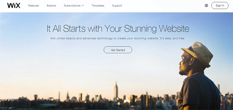
No matter what kind of content you have on your web page, images of faces will draw immediate attention as compared to other content. Many eye tracking studies have confirmed this fact and has also stated that the users keep moving their attention back and forth between these face images and other content. A face will create a solid first impression of your website on users. It doesn’t take a long for users to form an opinion about a website during their first interaction. 50 milliseconds approximately. That’s really quick and therefore a face can act as a powerful tool to create a significant impact.

wix

Pic Courtesy: Wix.com

2. Effectively Guides a Visitor’s Line Of Sight

Once a user’s attention is grabbed you can also guide his line of sight with proper placement and use of face images. As humans, we have a tendency to follow the line of sight of other people. It simply means that if a face image is looking in a particular direction or towards a particular section, users will also shift their focus in that direction. Designers can use a strategically placed face image to direct users’ attention to important content and call-to-action buttons.

audi

Pic Courtesy: Audi.com

3. Facial Expressions Evoke Emotional Responses

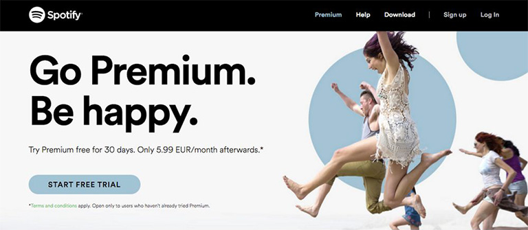
We all have come across the saying “A picture is worth a thousand words ” and this could not be truer in case of a face image. The human face is capable of expressing and showcasing a large number of emotions. A designer can convey emotions through facial expressions on human faces. The expression on the faces of images used can evoke similar emotions in users. If users view a genuinely happy face, they will most likely develop the same emotion which will influence their feelings for your website or the brand as a whole. Studies confirm that emotions in designs directly impact the conversion ratio.

spotify

Pic Courtesy: Spotify.com

4. Builds Trust

Building trust among users is very critical to the success of any business. Human faces can help a lot in establishing a sense of trust. Trust is the foundation of any successful and loyal customer base. The digital world is full of products, services, and brands. Users are always skeptical and don’t trust anyone easily. Showcasing real faces on the website portrays your openness and trustworthiness. A lot of companies have followed this and have opted a new kind of personalized ‘About Us’ section. They depict faces of CEOs, teams, and other members of the company to boost up trust. It is very useful for industries like medicine, childcare etc. where trust is a big factor.

founder

Pic Courtesy: foundr.com

5. Generates Visual Appeal

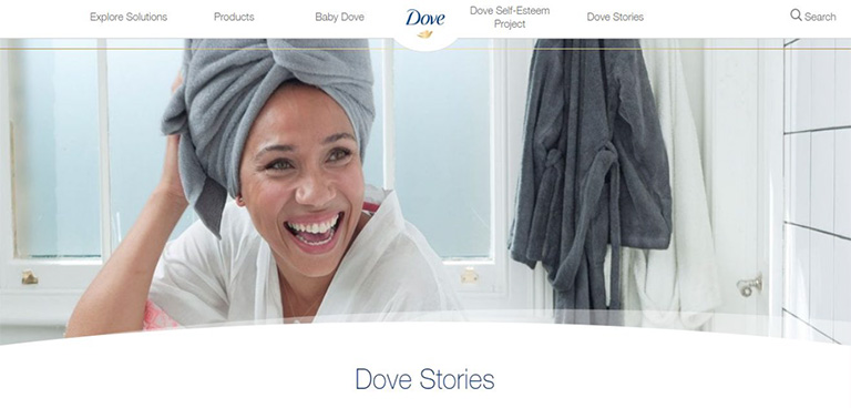
To a great extent, a product’s success is related to its visual appeal. A poorly packaged product might not get the sales it deserves. Same is the case with websites. No one wants to see an ugly design. Everyone prefers an attractive design. Human faces are a great way to enhance the aesthetic aspects of your design. Human faces provide a personal touch to users and they feel more connected. A website with human faces makes the users believe that there are real people behind this design. A lot of websites lack this personal touch which cost them deeply in terms of conversion ratio.

dove

Pic Courtesy: Dove.com

To Sum It Up

The effective use of human faces in UX design can create a huge impact on user experience. They are a great source to catch eyeballs immediately, evoke emotions, build trust and influence the behavior of users. Designers must use human faces more often while designing a website to shape up the overall experience of users. We have a team of experts who constantly infuse similar design tricks to scale up the user experience. Have a word with them and get a stunning website design.