NYX Ditech

Categories
Design UX Web Design

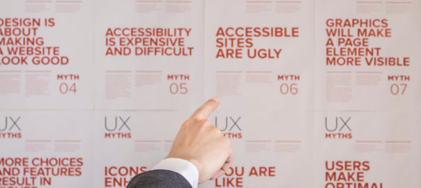
Top 5 UX Myths Busted

The world of UX design is full of terms, trends and principles. However, often the things which we consider to be true, or the principles which we believe in, are mere myths or UX Myths which we will be discussing. These can be hurtful to your overall user experience. In this article, we will highlight some of the top UX myths that must be busted for good.

Myth 1: Simplicity and Minimalist Design are the same

Simplicity is the key to exceptional and innovative product design. However, it is often considered similar to minimalist design, which is not the case. Simplicity is the reduction of complexity, while a minimalist style is more of reducing the elements. As a matter of fact, simple looking, minimal product UIs often bring hidden complexity. In a quest to reduce, a lot of design decisions can easily add more friction and cognitive load, leading to a much more complicated user experience.

Like icons without text labels are difficult to understand, non-standard gestures provide no obvious affordance. There are proven instances, not one but many, where the hamburger menu has performed poorly.

Striving for simplicity is must, but we must refrain from overdoing it, just for the sake of minimalism.

Myth 2: White space is wasted space

White space or negative space refers to the empty space between and around elements of a design or page layout. A lot of times designers undermine its importance and neglect it. Their argument is that this space is wastage of valuable screen estate. That’s absolutely not true. White space is an essential element in web design and must be considered as an active element, rather than a passive background.

White space is responsible for readability and content prioritization. It plays a vital role in the visual layout and brand positioning. It guides users on a page by enhancing readability and scannability.

Space around graphics and images, line-spacing and letter-spacing within text content, Margins, paddings and gutters, space between columns are few of the important elements of White Space.

Myth 3: You can design a website without content

A lot of designers create wireframes and comps with “lorem ipsum” filler text. Using dummy text often results in an aesthetically pleasing design, but the design is often an unrealistic one. Moreover, it creates the impression that content is secondary and has no major impact on the user experience, which is false.

The fact is that users come to the website, and stay on the website, for content and not the design. Content is by far the most important element in user interface design. A webpage with a simple structure but superior quality content is likely to perform far better in terms of usability in comparison to a visually pleasing page with subpar text.

Using dummy content or fake information in the web design process can negatively impact websites; it leads to unrealistic assumptions and potentially serious design flaws.

Myth 4: People don’t normally scroll

Gone are the days when people don’t use to scroll on websites. The scenario and user pattern have changed drastically over the last decade. Nowadays it’s absolutely natural to scroll. Specifically, for websites with lengthy content, like an article or a tutorial, scrolling provides better usability than dividing the text to several separate screens or pages.

You don’t have to squeeze everything into the top of your homepage or above the fold. That said, it is important to follow certain design principles to ensure that people scroll down. The utmost important thing is to provide appealing and intriguing content to readers; content that keeps your visitors interested.

But let’s not forget that the content above the fold will still get the most attention. Therefore, it is necessary to that piece of content to get people engaged. The quality of that content will decide whether your page is worth reading at all or not.

Myth 5: People read on the web

Not a lot of reading takes place over the internet. Users are always in a hurry. The time span of their attention is minimal. If you want users to read word-by-word, your content must be interesting.

They usually skim the pages looking for specific keywords, meaningful headings, short paragraphs and scannable list. Since they’re in a hurry to find the very piece of information they’re looking for, they’ll skip what’s irrelevant for them. So avoid long text blocks, unnecessary instructions, promotional writing and small talks. Get straight to the point and offer the relevant information as quickly as you can.

To conclude

When you’re flooded with a plethora of old-school design principles, and new ones getting added to the list every day, it gets difficult to duck the myths. Hopefully, this list will be of help for you next time you start a design project. For more info and insights on web designing, speak to our experts.

Categories
Blog Design Technology Web Design

Tips To Choose A Website Builder for Your Next Project

Every business needs a compelling website these days. We come across loads of websites on the internet, some of which we find very attractive, some not so much. A lot of these websites are developed using website builders, which are great assets and expedite the process of designing and developing a website. A website builder is an effective tool to design a corporate website, blog, landing page, an eCommerce portal and a lot more.

A good website builder is easy to understand for even novice web designers. It typically provides templates and features that are based on web design best practices. But, what should you look for in a website builder to zero down on the best one for you? In this article, we will discuss exactly on that. Irrespective of the size of your business, this article will help you choose the best website builder platform for your website.

Set Your Budget

First and foremost, examine and ascertain your affordability. There is a website builder for every pocket. Start by considering the other costs involved in building your professional website. While deciding on the budget, consider the other costs involved as well, like domain registration and hosting. The images and copy for your website will also require some investment.

A lot of website builders offer a free plan, but that has its own limitations. Mostly the services cost somewhere between $5 to $40 a month, for plans that offer features required by businesses. If your budget is limited, you can save money by looking for plans that bundle different website services you need.

Prioritize Your Needs

Every business and website will have different needs. Based on these needs, a suitable website builder can be selected. Before you can decide on the best website builder platform, you need some idea of what you want your website to do and be like. Consider the level of experience you have in designing. Most websites builders are made for people that don’t have much experience with design or website coding. Still, some of them are easier to understand and get used to.

If you’re a newbie and would be starting from scratch, then look for a builder that offers website theme templates and drag-and-drop design options. If you want a lot of options and flexibility in designing your website, then go for a website builder which offers plenty of templates and further flexible editing options.

For instance, if you’re developing an eCommerce website, think if your website will include videos? A photo gallery? A blog? A map that shows where your store is located? Make sure your website builder supports the types of content formats you plan to include.

Also, Make sure the website builder you pick provides responsive website templates or other options to make your website mobile friendly.

Look For Ease Of Use

You don’t want to scratch your head figuring out how to use your website builder. Make sure the builder you select is one which can be easily interpreted. The key thing is ease of use for your comfort and at your skill level.

If you have a background in coding and want customization, you may use slightly advanced tools like the most popular builder – WordPress; you can also buy customizable templates. The templates also vary in ease of use, so choose wisely.

To be fair, almost all independent website builder platforms are easy enough to use. However, the features provided by the builder creates a huge difference. Always go for a feature-rich website builder as it adds to the ease of use.

Consider After Sales Service And Support

A quality website builder will have a solid support and troubleshooting team in place. The team would promptly answer your queries and troubleshoot if anything goes wrong.

Generally, customer service levels vary, based on the pricing plan you choose, but is an important consideration before choosing a website builder.

The support is offered at various levels, email support, priority support via email, chat support, or phone.

Check Out The SEO Features

No matter how good your website is, it’s of no use if people are not able to find you on the web. Once you’re done building your website, you want people to easily find you. Your website should not get lost in the deep sea of countless websites over the web.

For that, you need to implement SEO best practices along with the design of your website. A good website builder should include SEO features that simplify on-site optimization. You must be able to update all the SEO meta elements, on each page, without any hassles, so as to provide your sitemap to the search engines.

On-site optimization is just one part of SEO, but surely a significant one. An SEO feature-rich website builder will help you in successfully implementing your SEO strategy into the design right from the very start.

In nutshell, the best website builder for you is the one which is easy to use, offers plenty of features, meets your specific needs, has a strong support team, and is easy on your pocket. Sounds too much of information? Don’t worry, leave your design requirements to us. Discuss with our design gurus and get your dream website designed cost-effectively.

Categories
Blog Design Technology Web Design

Want To Be A Successful Web Designer? Here Are The Skills You Must Have

The fast-paced growth of the internet over the last few decades has created new career opportunities in Web Designing and development. The rising popularity of the internet has motivated a lot of people to learn web designing and make a career out of it. Today, you can find web designers in every nook and corner of the world. More the number of web designers, more is the competition, and that’s why it is important to differentiate yourself from the crowd and be a good or great web designer.

So, what do you do to differentiate yourself? You learn and master a specific set of skills. What are these skills you ask? Let’s checkout.

The skill set is not purely technical, it is a blend of personal traits, soft skills and technical skills. First things first, the technical skills:

1. HTML

HyperText Markup Language is the most basic requirement for a web designer. It lays the foundation on which the websites are built. Therefore, it is of utmost importance that a web designer is proficient in HTML. Even if you intend to use editors or a CMS for most of your time creating websites, knowledge of HTML will give you an understanding of how those tools work and you will be much more in control over what you do.

If at all in future, you need to work outside these editors, you won’t be in a tight spot. Take a look around, you will notice that all the pro designers have a solid understanding of HTML.

2. CSS

Another important aspect of web designing is knowledge of CSS. While HTML dictates the structure of sites, Cascading Style Sheets or more commonly known as CSS handles their visual appearance. Therefore, its a vital tool for web designers, especially front-end designers. If you learn and develop your skills over HTML and CSS together, it will be much more useful to you, as these two languages are really the magical combination that builds the structure and style basis for any web page.

3. UX

UX stands for user experience, and it is one of the most influential factors that define a website’s success in today’s world. It is the feeling that a visitor gets from interacting with a website. UX plays a vital and decisive role in determining if the user will stick onto your website or not.

A web designer who understands UX practices will approach his designs from a user-first perspective. Every designing step will be lead by a question – How can I make the user feel wonderful at all times on the website?

The navigation, content, colors, CTAs and many other factors play a role in determining the overall user experience. An improvement to any or all of these factors can elevate the user experience. If you’re good with UX, you will be appreciated across the market as a multi-purpose web designer.

4. Javascript

JavaScript is an important interactive element of a website and web developers should have a basic understanding of it, especially how it interacts with HTML and CSS. Although, web designers need not master JavaScript, unless they are doing front-end development, but a basic understanding of it gives them an upper hand. Anyone engaged in back-end development is likely to be very comfortable with JavaScript.

JavaScript works with XML files and communicates asynchronously with a web server through an approach called Ajax. With Ajax, websites load faster and various embedded objects may update without requiring a complete page reload.

5. Programming Languages – PHP, ASP, Java, Perl, or C++

In order to program web pages, you must learn at least one or two programming languages. PHP is the most common programming language used across the web today, mostly because it is an open-source language and is embraced by a strong community. It is strongly advisable to learn more than one language, however, if you choose to learn and master only one language, it should be PHP.

You can opt for a converse approach as well. Look out for languages which are less popular than PHP, but bestill are in demand across the world of web. If you are proficient in one of these languages, chances are that you will become a premium asset.

6.Design Sense

Technical skills can be learned with all the resources available to you. What really is difficult is to develop traits which can’t be learned from a book, open source, or a repository. Having a good sense of design is very important for web designers. Web design is more than just making pretty-looking websites. You must have an understanding of design elements such as typeset, images, and other basic design tools such as grid systems, typography, color psychology, web fonts, type hierarchy, and color palettes.

7. Proactivity and Creativity

An employer or client will always want inputs and proactive actions from his designer. A good web designer never fails to take the first step and contributes with his own ideas and solutions. Proactive and creative web designers can take away a lot of responsibility from the project manager, and that is exactly why they’re so appreciated.

As a professional web designer, you should understand the project’s purpose and standards, understand and fulfill a client’s expectations, and constantly come up with out-of-the-box ideas.

8. Problem-solving Skills

Working on web designing tasks you will always face roadblocks, challenges and problems. You may think of a brilliant visual element, but it might not be practical enough to be implemented. A logical problem-solving approach is a key to be a successful web designer. Every aspect, the pros and cons, usability, compatibility, synchronization between various elements etc. must be duly considered before deciding on the solution to a problem, to get the best possible solution.

9. Attention to Detail

A web designer must keep an eagle eye on every minor design element across the website. It is important to understand that even the smallest of the design elements may be decisive in determining a user’s experience and success of a website. Always be careful and give due attention to each and every element so that nothing escapes from your watchful eyes. Successful web designers pick things which average web designers fail to spot.

10. Never stop learning

Yes! It’s absolutely true for web designers as much it is for any other professional. The day you start thinking you know everything, your career starts moving southwards. The web design world is fast-paced. New technologies, design patterns, design principles and trends keep emerging at the scene every single day. A successful web designer never stops learning and keeps enhancing their knowledge to flourish and grow more.

Want to learn more?
Speak to our design experts now!

Categories
Blog Design Technology Web Design

Atomic Design Framework And Its Benefits

Design systems have gained massive popularity over the last few years have progressed in terms of technical ability and of course popularity. Design systems are a method to translate a consistent experience and visual language across a product when working on different touch-points. If you are a front-end developer, you have probably heard of a design system known as Atomic Design. These design principles were introduced by Brad Frost. Atomic Design is a methodology that involves breaking down a website layout into its basic components, which are then reused throughout the website.

The Atomic Design framework helps companies to build consistent design systems. The methodology breaks down a page design into five distinct stages:

  1. Atoms – In chemistry, atoms are the basic building blocks of all matter. Each chemical element has distinct properties. In the design world, atoms comprise of all foundational building blocks or the basic assets of the product. These include basic HTML elements like forms, fields, inputs, buttons, type, labels, colors, spacing and others, that can’t be further broken down.
  2. Molecules – Molecules are a group of atoms put together to take on new properties or to complete a function. In design systems, Molecules are simple groups of UI elements functioning as a unit. For example, a search box, which includes two atoms, an input field and a button.
  3. Organisms – Atoms and molecules are simple functional forms in our design systems that can be reused across a product. However, organisms are a bit more complex. It comprises groups of molecules or atoms which tend to form more distinct sections of an entire interface. A header of a website is an example of an organism.
  4. Templates – Organisms can further be used to create various templates of larger layouts containing multiple features. Templates are page level structures that form a layout. Templates must always focus on the page’s core structure and not on the final content of the page.
  5. Pages – The final and polished state are pages. It must include content, all visual designs, and the final UI.

There is a whole bunch of benefits of using Atomic Design. Some of the most important ones are stated below:

Re-usability

Once the components are split into basic atoms, it’s easy to see which parts of the website can be reused, and how other molecules or organisms can be developed by playing around with these atoms. This method is less time-consuming than re-designing so many elements. Also, it helps a designer to focus on the style, rather than the re-designing aspect. The designs can easily be shared within the team to help everyone collaborate on the project.

Let’s say a website only contains five atoms: a large image, a small image, a paragraph, a list item and a link. You could create a very usable web page by duplicating or using the atoms in various combinations.

Simplicity

If a site is developed from scratch using Atomic Design principles, all the atoms and molecules can serve as a basic style guide. Even if these principles are introduced at a later stage of development, it isn’t difficult to identify and extend the basic components. they can be combined together in different combinations to construct more pages. However, it is suggested to create a site atomically from the beginning, rather than trying to introduce Atomic Design principles later on. It simplifies the process of style guide creation.

The code of an atomically designed website is typically much easier and simpler to read than one created in a conventional way. It not only implies during the start of creating a website, but even years after, when the site is being looked back on for references or minor changes.

The designing process is simplified and proper documentation about the use and location of atoms, molecules and organisms is maintained. this makes it easy to interpret the code. Due to the simplicity of the code, it is easier to explain to a new developer.

Easy to update

If the website is designed using Atomic Design, the entire website will contain similar basic elements, which we call atoms. Therefore, it’s kind of easy to keep the project up to date. We can update every atom the way we want. Change something at one place and it automatically changes everywhere in the project.

The effect of specific changes on the entire project can be easily shown to the team, without having to change it everywhere. Appropriate feedback can be collected regarding the changes, and if required, the changes can easily be rolled back with minimum efforts. This saves a lot of efforts and time.

Consistent code

In an Atomic Design, identified and pre-defined atoms are used to develop the layout. Hence, it is easy to locate components at different places, across the website. Consistency of the code increases multiple folds and chances of writing a duplicate code decreases substantially.

For example, someone creates a site without using Atomic Design and they need a black button in future. They would need to search the entire website. Once found, they will have to copy and paste that code to the new instance. In case, they don’t find one, they would have to create one. That’s a tiresome process and wastes a lot of time and energy. However, with Atomic Design, it is easy to go back and review the list of atoms to find that exact black button.

Modular file structure

Although Atomic Design is very common when it comes to markup (HTML), these techniques can also be used for CSS, JavaScript etc. Atomic Design can work with any language used to create websites, to make the overall code more modular and reusable.

That said, with the arrival of things like HTML components it is suggested to separate CSS and JavaScript specific to an atom into its own folder along with the HTML. So, if a need arises and you need to delete or update anything, you know exactly where to go and what to change.

Atomic design is here to stay. Breaking down big projects into molecules, organisms and templates is an efficient way of working. It is time efficient and serves the purpose of remotely working on the project with different team members. Speak to our team of experts and learn how you can design more efficiently.

Categories
Blog Design UX Web Design

Design To Delight Your First-time Users

Design To Delight: The world of web is getting bigger and bigger with every breath we take. There are millions of websites, apps and businesses over the internet and everyone is hustling to differentiate itself from the other. This has resulted in fierce competition. In order to cope up with competition and make a unique identity, it’s very important that you’re able to create a solid first impression when you introduce yourself to the world. No matter how good your product or solution may be, first-time users will still need a lot of reasons to stick around.

In this article, we will discuss the importance of creating a delightful first-time experience that makes users stick around. Designing to delight first-time users can help in creating a long-term association with your users.

1. Introduction and Onboarding

As stated earlier, creating a wonderful product or solution is not enough to sell it into the market. Unless the user is told about the value creation, and how he will be benefited by using your app or solution, they are not going to be around for long.

Every new user will have some basic questions, which must be answered as early as possible when they interact with your app. They would be curious and will question themselves – is this the app I want? What does it actually do? How does it work? Where should I start from? The purpose of onboarding is to offer a quick intro to your product, and it’s key features.

The best answer to these questions is a welcome screen and onboarding process that draws a user into your product’s experience right away. The first thing a user will see is your launch screen, so it shouldn’t be an afterthought during the design process. Your launch screen is also significant for first-time users because it’s where you’ll put any legal disclaimers or age restrictions that may be necessary. This transparency avoids any surprises for users.

2. Onboarding Flow

Users are usually very impatient. They’ll quit if it takes too much effort to get what they want. According to a report, an average app loses 77 percent of its daily active users within the first three days of installation. Users just want to figure out what your product is supposed to do and how to do it.

Make the learning process as smooth as possible for new users. Offer them info in chunks, which they can easily digest. Strictly avoid offering too many first choices as it will only result in a confused user.

Collect basic information from the users, like their first name, so you can add it automatically to the intro content. This will give a personal touch to the onboarding process and the user will feel much more comfortable while moving forward. You can create a virtual tour guide to step-by-step introduce users to the app. Also, it’s important to periodically let new users know how much longer it will take to get started.

3. Minimum Information Collection

In today’s world, users are not reluctant to provide their personal information. However, they provide info only when they see the value, and only to get something in return. Remember, this is the first time they are interacting with you, so go easy on them. Don’t bombard them with questions seeking too much information.

Adding more functionality to the onboarding process will also give scope to users to get acquainted with your app. It gives first-time users a chance to get comfortable with your app, before you ask for a full sign-up. Yes, this would require more coding, but the extra effort will increase the chances of your success.

4. Filler Graphics and Animation

It is possible that an app’s dashboard is set to empty when a new user first downloads it. But, this can make the users feel that the app is not personal or useful to them. To counter this situation, filler graphics should be used as they can effectively minimize emptiness.

The other way to resolve this problem is to use animation during the onboarding process. This is a great method to show the potential of your product to first-time users. For example, you can show an animated app intro about how the app will look like when friends list, message notifications and dashboards are populated. Pop-up prompts can also be used to remind new users to invite friends to download the app.

5. Outside App Interactions

The user interactions must not be restricted to the app; outside app interactions play an important role in enhancing the overall user experience. Once you have initial user info, keep your first-time users engaged with follow-up emails. If you’re offering discounts on specific paid features, let them know this. A well-designed and friendly welcome email can also encourage new users to become regular users.

Following up with the users make them feel valued and keep them well-informed about your product, its features and benefits. It increases the chances of a long-term association with your product. However, you should be very careful about the content and frequency of the follow-up emails. There is a very thin line between an informative, inquisitive email and a spammy one.

Conclusion

Adjustments and improvements is a continuous process and they can be always be done at a later stage. But that doesn’t mean you should jump in with something which is not just good enough. You must design to delight right from the word go. Remember, the majority of users will decide to stay with you or uninstall (and maybe never come back) basis their initial interaction. Therefore, try to make the first interaction unforgettable and delightful. Reach out to our design experts to discuss more on designing for user experience.

Categories
Blog Design Technology Virtual Reality

A Guide For Designers To Design Virtual Reality

Let’s get back to reality. We sure would have heard this term one or more times in our lives. As humans, we once in a while try to break out of the shell of reality and try to fly into the unrealistic world. That’s really been the foundation of the growing, trending virtual reality. For designers, the arrival of virtual reality poses some unique challenges, as there is really no set rules to design for VR. That said, this leaves room for innovation and new possibilities for greatness.

VR Design

VR design is the creation of a simulated world, which people can experience and immerse themselves in, using hardware, like headsets, or even a software. The origins of VR goes back decades, however, it has become a sensation only in the last decade or so. It has been previously used for practical applications like NASA flight simulations and even for entertainment purposes, but today, it has become more achievable and profitable than ever. Recent tech advances in VR suggest it will eventually spread out across all industries.

Virtual reality’s application range from physical therapy to educational aids, cancer research, employee training, remote communication, image modeling for architects and a lot more. Design gurus of the world suggest that VR will play a transformational role in the world of web designing by contributing to the creation of more immersive websites. It will potentially change the way we browse the web.

How To Design ‘Reality’?

If we draw a comparison, VR design is closest to video game design, or we can safely say that both of them are almost the same. Web designers will see some familiarity in interactivity and specifics of the UX, but visually, it is one level above video game designing. There’s a lot of unique visual problems in virtual reality design, like changing depths, recognizable cues, and including functional controls within the environment. So how do you design for virtual reality? We have compiled a list of best practices that will get you started with designing for the VR, if you’re planning to master the art.

Interactivity

The top priority for interactivity is controls. There are no different buttons for different actions in VR design. Most of the controls must be gestures. Primarily, there are two types of controls – semantic and responsive. Semantic gestures are common movements like walking, nodding etc. On the other hand, responsive gestures are how we interact with our environment, like picking things up, pushing buttons, etc.

The key here is that the fewer controls your user has to learn, the easier it will be for them to immerse themselves. The main objective is to duplicate reality so try to rely on as many natural gestures as possible. Another challenge is to make users understand what they can interact with, and how. Proper and prompt cues based on the real world must be offered for this. Acknowledgement and constant feedback are also necessary so that the users know once an action has been completed.

Designers need to be very careful about the distance while designing for VR. You don’t want your user to look back and forth between something close and something far away, which leads to a shift in focus. In VR, asking your users to browse items both near and far would cause too much eye strain.

Visual and Audio

Remember, our own sight is curved. Therefore, one should always use concave text and images in the VR design. This lends itself better to the visual immersion and will look smoother when the user turns their head. VR still relies on a 2D display model rather than three-dimensions, like in real life. Showcasing spatial relations is particularly very challenging in VR. Techniques like isometrics, lighting and shadows can help create realistic 3D spaces.

As far as the audio is concerned, speakers are best for audio immersion as you can change the direction the sound comes from; headphones limit this advantage. It’s best to design for speakers to create the most realistic audio possible.

Human Designing

Ultimately, we are designing for humans, and it is important to note that we humans don’t move in straight lines; we move in arcs. VR design’s body movements must resemble real life. Talking about movement, the excessive head movement gives some users motion sickness; we don’t want that to happen for sure. It’s best to keep interactive elements between desk height and eye level, commonly known as the ‘Goldilocks’ zone.

All the VR designs must include hand movements. When the user can see their hands in the virtual environment, it’s easier to interact with objects. This may require creative problem-solving, but sometimes it’s just as simple as having them carry around an object.

VR’s success completely depends on designers. It’s more about the length of designers’ imagination and less about the technical aspects. Yes, being an uncharted territory it’s difficult to get started, but that creates a chance of endless opportunities. The aforementioned information will surely be sufficient to guide you towards the right path; if you want to discuss more on VR design, feel free to get in touch with our experts.

Categories
Blog Design Technology UX Web Design

Learn and Become a UX Designer By Following These 5 Steps

The importance of UI and UX has accentuated tremendously over the last few decades. UX Designer is quickly becoming one of the most popular career choices in the design industry. The design heads of the industry have realized that creating a positive user experience for a product or service is crucial to achieving their brand and business goals.

There are a lot of perks attached to being a UX designer; you get to do a lot of creative work, flexible working hours, and not to mention the attractive salary. Now we know why people get enticed by the job role of a UX designer. However, most of them are confused about how to get started. If you’re curious about becoming a UX designer, but have no idea where to start, you are not alone. In this article, we will guide you on how to start your journey of becoming a UX designer, and that too a successful one.

Who Can Become A UX Designer?

First things first, anyone can become a UX Designer. One of the biggest myths out there is that you need to be a born artist or some kind of design prodigy, but that’s simply not true. There is no specific professional or educational background necessary. Yes, you need a certain skill set, but that can be learned.

It’s not necessary that you start your career as a UX designer. Many people get into UX designing quite late in their career. However, it is very important to understand that UX is a very diverse field and before you take the first step, it’s important to understand the diversity of the field, to see if the various skills you’ll require complement your current skill-set and interests.

This is how you can start learning UX and become a successful UX designer:

1. Choose Your UX Design Field

The field of UX design is absolutely vast and it is essential to zero-down your focus on certain UX areas or fields. Decide what parts of user experience you want to learn and focus on. Ask yourself, what type of designer you want to be? The answer can be anything from an interaction designer, UI designer, motion designer, or product designer?

There may be a case that you want to focus on both design and research. It’s absolutely critical to understand the difference between various disciplines by exploring them and focus on the ones you enjoy the most or are keen to learn.

2. Get Educated – Read and Watch

Whenever you start learning something, it’s important to learn how to do it properly. There are several popular ways you can learn UX design, like academic learning at a university, applying for a UX training program, self-learning, etc. Breaking a common myth here – You don’t necessarily need a university degree to become a UX Designer.

While you can opt self-learning or go to a university, applying for a training program is a better option. A training program can help you learn the theory behind UX practices in a structured manner which will make the process of learning UX more straightforward.

Other resources to gain knowledge are social media channels, podcasts, Youtube channels, blogs etc. If you follow social media sources, you might end up being overloaded with information, and not all of it is useful. It can create a lot of confusion and may even lead you in a direction that you don’t want to go. Try to stick to 1-3 sources at the max. Follow verified and renowned industry experts. Prepare a list of 10 best UX blogs and subscribe to them to get regular learning material.

3. Get Involved in The Community

Meeting people and getting in touch with the design community will help you in not just learning the art, but also understanding how things are done in this industry. Join slack communities, local communities, participate in conferences, industry meetups, UX seminars, events etc. to get started. You will be able to share your thoughts and understand what other people think, who have been in the industry for some time now. Get into conversations with people across the UX community to understand what you actually want to learn or improve.

⁣Find mentors who can help you with your questions. Finding yourself a mentor is great advice, no matter what industry you want to break into. Especially in UX, where project work is so important, a mentor can really help you to improve your work and educate you about industry standards.

4. Master the Right Tools

In terms of software, it’s absolutely crucial that you get apt prototyping software. In a research, it was concluded that problem-solving skills are the most important skills which hiring managers look for while hiring a UX designer, followed by knowledge of UX tools. That said, it’s not easy to choose the right tools. There’s a plethora of tools available in the market and often the best option is unclear.

The task of choosing a tool can be even harder for someone who has only taken their first step into the field of UX. It’s advisable to select a tool that will help you iterate your design; a design tool should allow you to swiftly move from a rough low-fidelity prototype to a high-fidelity implementation.

5. Get Advanced

Once you have gained the basic knowledge of UX designing, learned whatever you could from various resources, it’s time to deep dive in the vast ocean of UX. Put some of this new-found knowledge into practice and find a way to apply UX in actual project work. This will help you gain vital experience. You can take on small UX projects in your current company, find a local non-profit organization and offer to design for free, or even redesign your favorite online service.

With enough practical experience, you will be ready to take up a full-time UX designer role in a design house or a company. To further enhance your skills and career, you may opt for a Master’s degree specializing in UX designing. Once you get a specialized degree in UX design, there are various avenues to explore. You may choose to specialize in UX research, information architecture, or even voice design.

The time is almost perfect to get into the field of UX designing. The world of designing has long identified the importance of creating a pleasing user experience through design. Therefore, the opportunities for a UX designer have grown multiple folds. Still have questions? Talk to our UX experts.

Categories
Brand & Identity UX Web Design

Some Tips to Get Rid of the UX Debt

A lot of times you will find yourself facing a situation wherein your product will show an inconsistent behavior or performance. This occurs due to the long-term sacrifices you have made over time for short-term gains, or what we call ‘UX debt’. In our previous article, we discussed Design Debt. We covered what it really means, its identification, impact and common causes. In this article, we will cover the ways through which you can erase UX debt most effectively and efficiently. It’s very common for a company to release a bunch of features in one go to gain market share as they focus on quick user acquisition. As a result, the cleanup work gets delayed and is pushed back for later sprints.

Getting rid of the UX debt takes time, and cannot be completed in one go. If you think that you can get rid of the UX debt in your next release, then you probably need to re-think. It’s best to create a plan and follow it meticulously to eliminate your debt. Follow the below-mentioned points to erase your UX debt:

Make a UX Debt Inventory

The first step towards erasing UX debt is to understand the debt. Whether you are a new hire or an existing team member, you must be aware of what you’re up against. This starts with creating an inventory.

For this, you need to roll up your sleeves and get your hands dirty. Use the product yourself and highlight anything you find unintuitive or confusing. Keep noting down your comments as you use the product. Another great way of performing this activity is by maintaining a spreadsheet within your team’s cloud folder and evaluating the heuristics together. The team can review the system based on some important criteria including findability, accessibility, clarity of communication, usefulness, credibility, learnability, overall aesthetics, persuasive design etc.

Evaluation process

You can create a clear picture of UX gaps by involving the whole team. The evaluation process may last a couple of weeks. Once the evaluation process is over, make sure you keep a realistic and manageable target date to slowly fill up the UX gaps.

This exercise is highly informative, however, you’re not the intended user. After conducting a UX debt inventory, you need to validate your findings by observing actual users and subject matter experts. This will help you better prioritize the work with product managers for the payback sprints or the backlog.

Prioritize Your Work

Once the UX debt inventory is ready, you must prioritize the tasks in order to address them in realistic stages.

The selection must consider a few factors:

1. How severe is the issue?

The severity of an issue must be the first factor to be considered as it may create a huge impact. How critical and big is the issue? Is it stopping users from doing their work? Is there a safety or security risk? If the issue is causing a potential customer to turn around and look to a competitor’s product, then you know that it is super critical. These kinds of issues must be right at the top of the to-do list.

Now, look at the flip side. It’s not necessary that only problems and roadblocks should be considered on high priority. If some improvements save hours of time in the course of a month, reduce errors and substantially add to the user experience, they must also be considered on high priority.

2. How long is it going to take to fix?

If all you have to do is tweak the CSS, you might slip it into the next build. On the other hand, if it’s going to require a significant amount of development or will have to be thoroughly regression tested, it may make sense to hold off until it can be resolved with other issues requiring similar treatment.

3. Who will be tasked with addressing the issue?

If the task has to be done by the UX team, and they have the bandwidth, it may be given a high priority. If it requires the attention of a specific developer who is already assigned to other high-priority work, then it will have to wait.

Make And Follow a Schedule

After prioritizing your debt, the next step is to work with product management to get it into your release schedule. Agile is the most popular approach to software development these days.

If You Aren’t Using Agile –

If you’re not using Agile, your work is most likely planned basis a release cycle. The management of your organization takes a call on what will go in the next release. They consider various factors like development effort, need of the feature, selling points, what bugs exist and how bad they are, etc.

It is recommended that UX debt issues must be handled as bugs. The real benefit of this approach is that the debt items can be entered and tracked using the same tools and business processes as bugs. This ensures timely review and treatment. Ideally, a representative from the UX team should work closely with product management when releases are scheduled.

If You Are Using Agile –

Companies that employ a healthy Agile process to prioritize debt and other types of works find it easy to manage everything. They don’t face any problems in prioritizing debt with other types of work, assigning it story points, and fitting it into sprints.

UX debt should be understood as the responsibility of the entire organization and not just the UX group. There must be a great synergy between all the teams. That said, the best way to eliminate UX debt is always avoiding it in the first place. Our UX designers will be happy to discuss your UX, UI and other design requirements; talk to them now!

Categories
Blog

All You Need To Know About Design Debt

It’s a bit unusual to connect an economic term ‘debt’ with the world of design and development. But, debt is an important term and concept here. Cutting corners with technology and releasing software too quickly can result in additional costs after the launch. We choose to quickly develop the code when a better path is available but would take longer. Technical debt is helpful for software development, where it’s about borrowing time. Technical debt supports fast iterations and experiments before the borrowed cash runs out. Design debt is a similar concept.

What is Design Debt?

In simple terms, design debt is all the good design concepts or solutions that you skipped in order to reach short-term goals. Cutting corners during or after the design stage is termed as design debt.

Debt can also increase naturally over time as the original design can’t handle additional features. The original UX was designed to create a cohesive experience around a specific set of features. The addition of new features over time breaks that cohesion, reducing consistency and creating a UX that feels increasingly disjointed. In some cases, design debt is consciously maintained within an existing product because there’s a fear that changing the status quo will upset users.

Identifying Design Debt

Design debt is somewhat necessary and is present most of the times while designing a software product. If you have zero design debt, you may be not learning or hesitant of adapting to changing needs. The design teams are the experts and can advise on when design debt needs to be actively managed down, but others on the team can also contribute to identifying this debt. A lot of times the sales teams will find that competitors are beating them in an overall sense of professional user experience and they can flag it up.

Impact of Design Debt

Too much technical debt can slow down the development process and likewise, too much design debt can reduce the selection of new features and slow growth. Existing users find it more difficult and time-consuming to use the product, while new users are frustrated by the learning curve.

As design debt builds, designers will be tempted to exceed timelines and insist on many more revisions to the work than anyone else wants. Designer’s woes grow with their inefficiency. They should focus on bigger impact stuff, but instead, they try to track down and update every small feature.

Even in the case of an established product whose users complain about any change, it will become increasingly difficult to fit-in new features without changing the design.

Common Causes

It is important to regularly refactor the design. Numerous disjointed and unrelated elements in a single field of view, all of which are competing for the user’s attention. Projects that are especially at risk for this commonly include a few of the following characteristics:

Fire drills:

When teams are dealing with aggressive goals and tight deadlines, they’re likely to cut together elements and test them in a quest to quick, short-term wins. This comes at the expense of long-term viability and it incurs substantial design debt. Making sure that you set reasonable deadlines and expectations can be really helpful in this situation.

Competing teams:

Particularly as organizations scale, they may have multiple teams working on different areas of a single product. When these teams suffer from competing goals, conflicting opinions, or poor communication, they’re very prone to build designs that are inconsistent and lack cohesion. Having a clear alignment on design goals, strong leadership, and healthy communication can help solve this.

Feature testing:

When a product doesn’t have a clear direction, teams are more prone to test abundances of features. This is to see what works and what doesn’t work. This is great for closing in on product-market fit, but as more features are tested, more debt is incurred. For early products, this can be avoided and the best remedy is regular refactoring. For older products, there is still room for this

Technical Debt:

Saving on the codebase can also have effects on the integrity of the design. This is especially the case when organizations try to solve infrastructure problems through design. Whenever a design change is recommended, it should first be determined whether or not the problem at hand is best served by a design solution.

Adopting an iterative and experiment-driven process is undoubtedly one of the best ways to learn about an audience and develop a design that truly works. By all measures, designers should be doing more of it. But it’s important to always consider the debt that can be taken on by a design over time, and plan for refactoring as necessary. Talk to our design experts to learn more about design debts.

Categories
Blog Design Technology

Top Features Of The Latest Photoshop CC 2019

The designers, digital photographers and illustrators across the world can rejoice as Photoshop CC introduced its latest version 20.0 in October, which packs a bundle of new exciting features. Photoshop is now more convenient for design purposes, owing to the new changes and improvements. Adobe claims this release is a fully new built of tools and not just an old application with newly added features. Many tools have been reworked or recoded to make them work better now and in the future. There are both small and big updates; some of the updates even target the already existing tools. There are a lot of changes and improvements which has improved the Photoshop experience and simplified the life of users. Let’s dive straight into the top features of the Photoshop CC 2019.

1. You can continue to go back in history stares with Command/Control + Z

Like zillions of other software, Photoshop also used the command or control + Z to go one step back in history. The similar combination allowed users to return to the original state of the work done. However, things have changed now. In the latest version, the company has introduced the new multiple-undo mode, which is enabled by default. You would need to use the following key combinations to undo, redo and toggle last state:

Undo: Moves one step back in the undo chain. Use the shortcut keys: Control + Z (Win) / Command + Z (Mac).
Redo: Moves one step forward. Use the shortcut keys: Shift + Control + Z (Win) / Shift + Command + Z (Mac).
Toggle Last State: Works the same as in the legacy undo mode. Use the shortcut keys: Control + Alt + Z (Win) / Command + Option + Z (Mac).

2. Proportional transform is now default

Until now, every single time you have to scale an object up or down, you had to hold down the shift key while dragging a corner handle of your object. In this way, you could transform the object’s size, while keeping its proportions. However, this was not the most user-friendly way of performing the task. By updating to Photoshop CC 2019, you would no longer need to hold down any keys to scale your object or image up and down. Using the shift key now enables un-proportional transform.

3. Ability to lock your workspace

It is recommended that you normally work with a customized workspace, and when you are working with a customized workspace you are probably using some floating panels. These floating panels are either connected to each other or are separate from each other, but close in space. A lot of times you may accidentally drag out a panel from a bar because you slightly missed the button or fly-out. With the PS 2019, you can now lock your workspace elements in place.

To access this option, choose Window > Workspace > Lock Workspace

4. Auto-commit changes

Whenever you crop, transform or place in Photoshop, you had to actively commit. However, you won’t have to do it anymore. Now you can simply click outside of the object’s boundaries and your changes are committed. Neither you need to hit the ‘Enter’ key nor you need to go all the way up to the options bar and manually commit your changes. This will be a great blessing to the editors and will surely save a lot of time and efforts.

5. Live preview of blend modes via mouse hover

The most recent update of the Photoshop CC 2019 comes with the ability to see changes in blending modes in real time. It has been quite a while since Adobe introduced live preview for fonts and this recent update was surely long due.

Even though it looks easy, it was very tedious in the past to commit to a blending mode, then open the fly-out menu again, commit to another one. Also, it was difficult to compare two blending modes, as you needed to go into the menu again, select your blending mode, commit, and so on. It was a tedious process and needed a way around. This is the most welcoming change in Photoshop 2019 and would be much appreciated by the users.

Besides these top new features and changes the other notable updates include:

Content-Aware Fill

Photoshop CC’s latest version comes with an updated Content-Aware Fill feature which now includes new controls for selecting source information as well as adapting content based on rotation, scale and mirroring. This helps to create a better match when filling in areas of a photograph.

Paint summary options

The Radial and Mandala Paint symmetries have been fully integrated into the symmetry options for painting in Photoshop CC 2019. Mirroring and repeating paint strokes around your desired axis is very easy to do now; access the new color wheel in Photoshop CC.

New Frame Tool

The new Frame tool enables quick “clipping” of content to a shape. You can place images, drag and drop from the OS or other applications such as Lightroom or, use the Libraries panel to quickly add a photo within a rectangle, ellipse, or any shape converted to a frame. This comes in very handy, particularly while designing newsletters and similar designs in Photoshop.

The CC 2019 release now requires macOS X 10.12 Sierra or higher. If you’re not running the latest macOS yet, then you can get a free upgrade from Apple to the latest version of macOS 10.14 Mojave. On PC, Windows 10 (version 1703 or higher) will work for most Creative Cloud applications. But note that Windows 7 is no longer supported for the CC. For more Photoshop hacks feel free to talk to our experts. They would be happy to know your design requirements.