NYX Ditech

Categories
Brand & Identity Design Technology UX Web Design

Investigating Various Types of Dark UX Patterns

There are two aspects to designing a website – a company’s marketing objective and users’ needs. One of the most challenging decisions a designer has to make is to strike a balance between the two. Boosting a company’s reach and profits is a common reason why brands use Dark UX Patterns.

What is Dark UX?

Dark UX Patterns are interfaces designed carefully to deliberately mislead users to choose a path they didn’t want to take. They are purposely designed to reach a company’s objectives without taking care of ethics and users’ needs. Dark UX came to light in 2010 after the boom of eCommerce industries on the web. To generate more sales, hit target numbers and get more subscriptions, etc., designers and business associates started creating misleading user interfaces to manipulate users.

Good user experience design is all about offering seamless and enjoyable interactions to users. User’s best interest should be of utmost priority, and there is no place for a deceptive or sneaky user experience design. 

Here are some of the most commonly used Dark UX patterns that designers should not be ideally designing, and of which the users must be careful.

Get in-depth information about innovation in UX patterns here

Bait and Switch

Bait and switch is a sales (especially retail) tactic, which is no short than a blatant fraud. Baiting and switching usually consist of offering customers an enticing item at an attractive, affordable price. This lures users to perceive it as a good deal (that’s part one of the trick – the bait), but later turning the offer into a less desirable deal (that’s the second part of the trick – the switch). Although the deal is not as appealing as it was previously, the users are likely to take it to minimize their perceived loss.
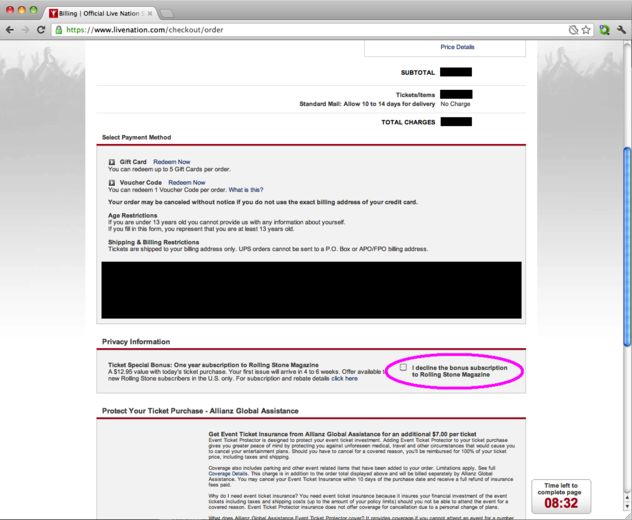
Bait and Switch - Dark UX

Confirmshaming

Confirmshaming is the act of creating a feeling of guilt and regret, forcing the users into doing something, which they may not like to do in the first place. The option to decline is written in such a way as to shame the user into an agreement. The most common use is to get a user to sign up for a mailing list. It is also often found in exit-intent modals and other popups. Confirmshaming has made its way into retail, shaming users who don’t want to be bothered with a pop-up by assuming they’d rather pay full. Take a look at the following example:

Confirmshaming - Dark UX

Friend Spam

A lot of mobile apps seek various permissions when installed. One of the most commonly asked permission is to get access to your contacts on the pretext that they will use it for a desirable outcome (like finding friends to join you). However, in reality, it spams all your contacts in a message that claims to be from you.

Friend Spam - Dark UX

Disguised Ads

As the name suggests, this pattern is adopted so that ads are disguised on the page, as if they were a part of the regular content or navigation. Considering the ads as regular content, users click them more often. Companies often run advertisements that look like a download button, tricking users into clicking on the ads rather than getting what they want.

Disguised Ads - Dark UX

Trick Questions

It’s a common situation in case of pop-ups with a confirmation. You read, and you don’t know whether to press OK or CANCEL. You respond to a question, which, when glanced upon quickly appears to ask one thing, but if read carefully, ask another matter entirely. They are cheap tricks that take advantage of the fact that people browse through web and app pages, instead of reading the content carefully. Users want to complete their tasks as quickly as possible, and that’s where they fall to these tricky questions.

Trick Questions - Dark UX

Hidden Costs

You get to the last step of the checkout process, only to discover some unexpected charges have appeared, e.g. delivery charges, tax, etc. That’s not a new situation. A lot of E-retailers are trying to be transparent about it. However, you can still site examples of E-retailers, now and then, who use it to boost their profits. The designers should stay away from such practices. We checked out GoDaddy, a leading domain and web service provider, and found out an example of hidden costs.

Hidden Costs - Dark UX

Forced Continuity

Read the small print; many free trials end with continuing charges. When your free trial with a service comes to an end, your credit card silently starts getting charged without any warning. You are then not given an easy way to cancel the automatic renewal. To avoid this dark pattern, don’t provide payment for anything that’s free.

Forced Continuity - Dark UX

Misdirection 

Misdirection occurs when the user’s attention is guided to a specific place. This is done so that they won’t notice something else that is happening. This dark pattern design forces you to focus on one thing just to distract you from another. Your reflex actions could send you far, far away from what you had in mind. So, take a good look and read the message before you click

Misdirection - Dark UX

Roach Motel

This type of dark pattern is pretty standard and reasonably relatable by all. The design makes it very easy for the user to get into a specific situation but then makes it hard for them to get out of. Once you have signed up, you are suddenly not given an easy way to cancel the automatic renewal, unsubscribe or opt-out of a service.

Roach Motel - Dark UX

You may be interested in a few golden rules for UX designs

The designers’ community must take the same guard altogether and should advocate honest designs. There shouldn’t be any frauds, misleading communication or any form of trickery. Want to hear more about Dark UX patterns? Have a quick chat with our designers.

Categories
Brand & Identity Design UX Web Design

Web Designing While Accounting Human Errors

We often hear the phrase ‘To err is human’, and it can’t be truer in every aspect of our lives. We all make mistakes. Users on your websites are no different. Sure, you can’t stop them from making mistakes, but, can you follow some aspects of web designing while designing your website in a way that it leaves a scope of making mistakes?

Even the most careful and diligent users are bound to make mistakes at some point in time; others will make more mistakes. Therefore, it is critical to consider this fact while designing your website. The errors in web designing can be as simple as mistyping a URL, providing incorrect information in a sign-up form, adding info in wrong fields, etc. The mistakes could even be as disastrous as accidentally sending thousands of dollars to the wrong person via PayPal. So, here are a few tips that you can follow to account for human error while designing your websites. 

1. Provide Straightforward Instructions

A lot of times, we assume that the users are by default aware of the most basic instructions. Thus, we don’t feel it necessary to provide these basic instructions to them. Moreover, people often see basic directions as a bit snooty. It’s human to assume you know everything you need to know for a simple-seeming task. This causes errors.

Don’t assume they know what you mean. An imperative when delivering clear instructions is not to assume the recipient knows what you mean. This can be for anything from commonly used acronyms to simple navigation instructions.  Mixed messages, assumptions and multiple options mean that the message received might differ from what we actually meant.

2. Give Clear Warnings During

Just like the instructions, users must get a clear understanding of the consequences of actions taken on the website. And, sometimes they need to be informed and explained the implications, that too in detail. Still, there would be users who would keep ignoring your warnings, but there’s not much you can do for them in any case.

There’s also a second web designing approach which you can proceed with. A majority of people will leave your site when they face a warning message which they don’t fully understand. Else, they may look for help to understand the warning, which again may lead them to bounce off. You’ll have to decide whether you would rather deal with potential inaction from some customers, or more errors. Both approaches have their pros and cons.

3. Always Confirm Actions While

You may think that all users are completely sure of what they are doing on the website, or they may get annoyed with questions asking them to confirm their actions. A confirmation dialog may seem like an irritating and useless extra step; however, the truth of the matter is a quick “Are you sure you want to do that?” message can be invaluable. The user may be taking action for the first time, or the tenth time, it’s irrespective. A confirmation will only increase chances that the user takes the correct, intended action.

4. Validate Forms

Form validation may not be a full-proof solution, but a potent tool, and a great way to gently guide the user in the right direction. While proper form design can help keep users from simply putting the wrong text in the wrong form, form validation is excellent for double-checking information and catching typos and forgotten fields.

Improper validation of form data is one of the leading causes of security vulnerabilities. It exposes your website to attacks such as header injections, cross-site scripting, and SQL injections. It is important to note that client-side validation is beneficial, but it is not enough. If you’re going to implement client-side validation, it would be good to have some of the server-side too, just to be safe.

5. Use Appropriate Form Labels

In our last article, we listed out some essential tips for selecting the right button labels. The labels on the forms are equally important and can lead users to commit an error, if not used properly. There are tonnes of websites on the Internet with so many vaguely-labeled forms. Worse are the forms that use industry jargons on a client-facing website. In some of the sites, the labels and input fields are even misaligned. That’s just a strict NO-NO!

6. Improve Usability Through Color and Contrast

The colors and contrast are often used on a website most simplistically. People only go as far as using red and its shades to portray bad, and green and its shades to show good. But that’s not enough. It doesn’t necessarily help differently-abled users. A website should be usable by everyone, so various disabilities should be kept in mind. Disabilities can include but are not limited to, the inability to use a mouse or see the screen.

When someone has low visual acuity, specific color palettes on websites may make it difficult for that person to see and understand the website content fully. You must find a way to add contrast to your elements, in such a way, that they’re clearly and easily distinguished from each other. Pay special attention to this if two options use similar text, but do radically different things.

7. Provide ‘Undo’ Option Where Possible

We all know how handy the ‘Ctrl+Z’ option comes in every day while performing various tasks. The ability to undo an action is such a boon to everyone. We wish we had an undo button for our lives. Coming back to reality though, if you’re building a web app, you might seriously consider implementing some sort of “Undo” function for just about every action with permanent consequences.

You cannot ensure error-free browsing on your website; neither can you take a generic call on the abilities of your users. But, considering human errors while web designing, will increase the chances of good user experience and fewer errors. Speak to our experts to discuss more on it.

Categories
Blog Design Technology Web Design

Atomic Design Framework And Its Benefits

Design systems have gained massive popularity over the last few years have progressed in terms of technical ability and of course popularity. Design systems are a method to translate a consistent experience and visual language across a product when working on different touch-points. If you are a front-end developer, you have probably heard of a design system known as Atomic Design. These design principles were introduced by Brad Frost. Atomic Design is a methodology that involves breaking down a website layout into its basic components, which are then reused throughout the website.

The Atomic Design framework helps companies to build consistent design systems. The methodology breaks down a page design into five distinct stages:

  1. Atoms – In chemistry, atoms are the basic building blocks of all matter. Each chemical element has distinct properties. In the design world, atoms comprise of all foundational building blocks or the basic assets of the product. These include basic HTML elements like forms, fields, inputs, buttons, type, labels, colors, spacing and others, that can’t be further broken down.
  2. Molecules – Molecules are a group of atoms put together to take on new properties or to complete a function. In design systems, Molecules are simple groups of UI elements functioning as a unit. For example, a search box, which includes two atoms, an input field and a button.
  3. Organisms – Atoms and molecules are simple functional forms in our design systems that can be reused across a product. However, organisms are a bit more complex. It comprises groups of molecules or atoms which tend to form more distinct sections of an entire interface. A header of a website is an example of an organism.
  4. Templates – Organisms can further be used to create various templates of larger layouts containing multiple features. Templates are page level structures that form a layout. Templates must always focus on the page’s core structure and not on the final content of the page.
  5. Pages – The final and polished state are pages. It must include content, all visual designs, and the final UI.

There is a whole bunch of benefits of using Atomic Design. Some of the most important ones are stated below:

Re-usability

Once the components are split into basic atoms, it’s easy to see which parts of the website can be reused, and how other molecules or organisms can be developed by playing around with these atoms. This method is less time-consuming than re-designing so many elements. Also, it helps a designer to focus on the style, rather than the re-designing aspect. The designs can easily be shared within the team to help everyone collaborate on the project.

Let’s say a website only contains five atoms: a large image, a small image, a paragraph, a list item and a link. You could create a very usable web page by duplicating or using the atoms in various combinations.

Simplicity

If a site is developed from scratch using Atomic Design principles, all the atoms and molecules can serve as a basic style guide. Even if these principles are introduced at a later stage of development, it isn’t difficult to identify and extend the basic components. they can be combined together in different combinations to construct more pages. However, it is suggested to create a site atomically from the beginning, rather than trying to introduce Atomic Design principles later on. It simplifies the process of style guide creation.

The code of an atomically designed website is typically much easier and simpler to read than one created in a conventional way. It not only implies during the start of creating a website, but even years after, when the site is being looked back on for references or minor changes.

The designing process is simplified and proper documentation about the use and location of atoms, molecules and organisms is maintained. this makes it easy to interpret the code. Due to the simplicity of the code, it is easier to explain to a new developer.

Easy to update

If the website is designed using Atomic Design, the entire website will contain similar basic elements, which we call atoms. Therefore, it’s kind of easy to keep the project up to date. We can update every atom the way we want. Change something at one place and it automatically changes everywhere in the project.

The effect of specific changes on the entire project can be easily shown to the team, without having to change it everywhere. Appropriate feedback can be collected regarding the changes, and if required, the changes can easily be rolled back with minimum efforts. This saves a lot of efforts and time.

Consistent code

In an Atomic Design, identified and pre-defined atoms are used to develop the layout. Hence, it is easy to locate components at different places, across the website. Consistency of the code increases multiple folds and chances of writing a duplicate code decreases substantially.

For example, someone creates a site without using Atomic Design and they need a black button in future. They would need to search the entire website. Once found, they will have to copy and paste that code to the new instance. In case, they don’t find one, they would have to create one. That’s a tiresome process and wastes a lot of time and energy. However, with Atomic Design, it is easy to go back and review the list of atoms to find that exact black button.

Modular file structure

Although Atomic Design is very common when it comes to markup (HTML), these techniques can also be used for CSS, JavaScript etc. Atomic Design can work with any language used to create websites, to make the overall code more modular and reusable.

That said, with the arrival of things like HTML components it is suggested to separate CSS and JavaScript specific to an atom into its own folder along with the HTML. So, if a need arises and you need to delete or update anything, you know exactly where to go and what to change.

Atomic design is here to stay. Breaking down big projects into molecules, organisms and templates is an efficient way of working. It is time efficient and serves the purpose of remotely working on the project with different team members. Speak to our team of experts and learn how you can design more efficiently.

Categories
Blog Design UX Web Design

Design To Delight Your First-time Users

Design To Delight: The world of web is getting bigger and bigger with every breath we take. There are millions of websites, apps and businesses over the internet and everyone is hustling to differentiate itself from the other. This has resulted in fierce competition. In order to cope up with competition and make a unique identity, it’s very important that you’re able to create a solid first impression when you introduce yourself to the world. No matter how good your product or solution may be, first-time users will still need a lot of reasons to stick around.

In this article, we will discuss the importance of creating a delightful first-time experience that makes users stick around. Designing to delight first-time users can help in creating a long-term association with your users.

1. Introduction and Onboarding

As stated earlier, creating a wonderful product or solution is not enough to sell it into the market. Unless the user is told about the value creation, and how he will be benefited by using your app or solution, they are not going to be around for long.

Every new user will have some basic questions, which must be answered as early as possible when they interact with your app. They would be curious and will question themselves – is this the app I want? What does it actually do? How does it work? Where should I start from? The purpose of onboarding is to offer a quick intro to your product, and it’s key features.

The best answer to these questions is a welcome screen and onboarding process that draws a user into your product’s experience right away. The first thing a user will see is your launch screen, so it shouldn’t be an afterthought during the design process. Your launch screen is also significant for first-time users because it’s where you’ll put any legal disclaimers or age restrictions that may be necessary. This transparency avoids any surprises for users.

2. Onboarding Flow

Users are usually very impatient. They’ll quit if it takes too much effort to get what they want. According to a report, an average app loses 77 percent of its daily active users within the first three days of installation. Users just want to figure out what your product is supposed to do and how to do it.

Make the learning process as smooth as possible for new users. Offer them info in chunks, which they can easily digest. Strictly avoid offering too many first choices as it will only result in a confused user.

Collect basic information from the users, like their first name, so you can add it automatically to the intro content. This will give a personal touch to the onboarding process and the user will feel much more comfortable while moving forward. You can create a virtual tour guide to step-by-step introduce users to the app. Also, it’s important to periodically let new users know how much longer it will take to get started.

3. Minimum Information Collection

In today’s world, users are not reluctant to provide their personal information. However, they provide info only when they see the value, and only to get something in return. Remember, this is the first time they are interacting with you, so go easy on them. Don’t bombard them with questions seeking too much information.

Adding more functionality to the onboarding process will also give scope to users to get acquainted with your app. It gives first-time users a chance to get comfortable with your app, before you ask for a full sign-up. Yes, this would require more coding, but the extra effort will increase the chances of your success.

4. Filler Graphics and Animation

It is possible that an app’s dashboard is set to empty when a new user first downloads it. But, this can make the users feel that the app is not personal or useful to them. To counter this situation, filler graphics should be used as they can effectively minimize emptiness.

The other way to resolve this problem is to use animation during the onboarding process. This is a great method to show the potential of your product to first-time users. For example, you can show an animated app intro about how the app will look like when friends list, message notifications and dashboards are populated. Pop-up prompts can also be used to remind new users to invite friends to download the app.

5. Outside App Interactions

The user interactions must not be restricted to the app; outside app interactions play an important role in enhancing the overall user experience. Once you have initial user info, keep your first-time users engaged with follow-up emails. If you’re offering discounts on specific paid features, let them know this. A well-designed and friendly welcome email can also encourage new users to become regular users.

Following up with the users make them feel valued and keep them well-informed about your product, its features and benefits. It increases the chances of a long-term association with your product. However, you should be very careful about the content and frequency of the follow-up emails. There is a very thin line between an informative, inquisitive email and a spammy one.

Conclusion

Adjustments and improvements is a continuous process and they can be always be done at a later stage. But that doesn’t mean you should jump in with something which is not just good enough. You must design to delight right from the word go. Remember, the majority of users will decide to stay with you or uninstall (and maybe never come back) basis their initial interaction. Therefore, try to make the first interaction unforgettable and delightful. Reach out to our design experts to discuss more on designing for user experience.