NYX Ditech

Categories
Web Design

5 Things You Can’t Ignore When Recasting a Website into a Mobile App

It was the time when owning a website became the need of the hour and going online was the next profitable move for businesses to reach new heights. The advancement of technology has once again asked business houses to take a step forward in adopting new methodologies and matching the market’s demand. And that’s where recasting a website into a mobile app comes into picture.
The demand here we are talking about is a mobile app for your business. It is certainly one important thing, which cannot be ignored in this consumer-focused market. It’s a requisite to have in this modern era and it is probably time to recast your website into a mobile app but only after you go through the following aspects carefully.

1. Answer The Whys And Hows

Following the trend is no bad but realizing the value it adds to your business and to your audience is what makes you successful. Just because everyone is moving to mobile doesn’t mean you also should. To make this clear you need to answer several whys, one being why your business requires a mobile app? How it’ll add value to your users’ lives? Proceed, once you have answers to all the popping questions in your head.

2. Layout

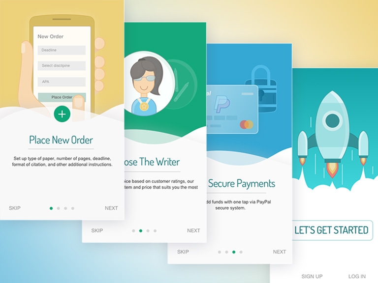
Experience a user gets while on the website is completely different from a mobile app. A mobile app is more of scrolling to the end with all necessary facets covered along the way while in the case of a website you have sections to display content. Also, space is more in the case of a website and content can be displayed elegantly to the users. While an app has limited screen space, different controls and gestures to make users understand the purpose of your business. It’s important that you plan well in advance about what to be shown and what not to so that a clean, understandable interface is at the users’ disposal.

3. Features

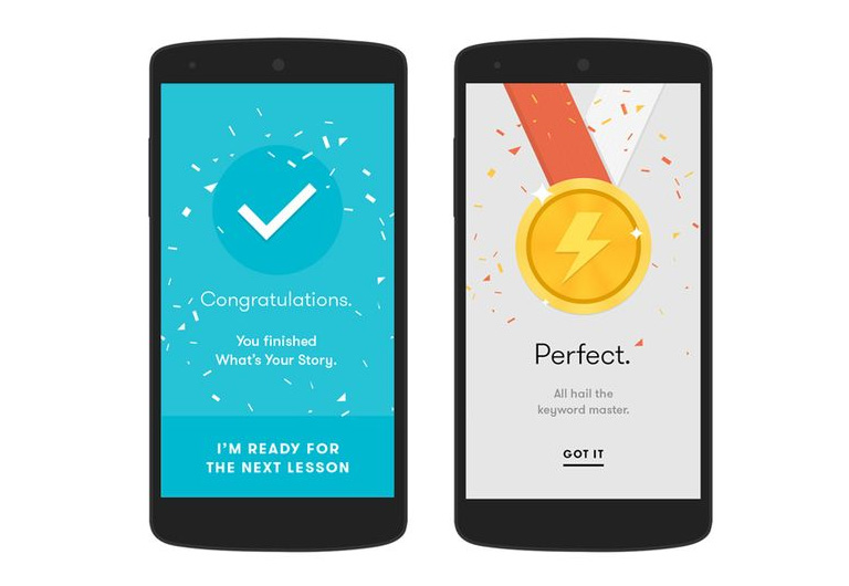
A mobile app is all about intuitiveness and simplicity. Build an app keeping these facets in mind and users won’t regret downloading it. Don’t overload your app with features that can be easily avoided and try to think from the user’s perspective before you come to a conclusion. Incorporate features that add value to the end users, which eventually entice them to come to your app more often. Present the things in the right way and build an interactive piece for improved user engagement and business growth.

4. User Permissions For Data Access

The basic idea behind mobile apps is to make everything available and accessible while the user is on the move. Mobile apps need to access user data for improving the experience and also for devising better-personalized marketing plans. Data like location, contacts, camera, microphone and more need to be accessed, which demand permission. Make sure you ask for it in the politest manner possible and also provide them with the reason for the same.

5. Design

It is one of the most important aspects of a mobile application. Make sure to get a skillful team to work on this aspect because a neat and sort out design impresses your users, which is certainly more important than the feature list. A poor and clustered design can have a reverse impact on the end users making them abandon your app at once. So ensure you design that leaves a lasting impression on the users- making them come back to your app.

Closure

Moving from a website to a mobile application isn’t a cakewalk. It requires a thoughtful ploy to make things work as intended. For which you got to research well and equip yourself with necessary resources, skills and manpower. So reach out to our experts today and get the best directions.

Categories
Blog

5 Features Your Social Media App Should Embrace in 2017

A notion that’s prominent in the technology sphere suggests that it’s essential to load your social media app with lots of features in order to succeed. It is believed that users like fully-loaded apps than the ones with basic functionalities. However, these beliefs don’t compliment the success rate of a social media app as more features are likely to confuse users by deceiving them of the real purpose.
A research states that an average adult interacts with seven apps a month. This means you should have solid grounds backing your product from the outset. You can steal the show by adding a tinge of innovation to your app that incorporates the requisite elements. Here is a rundown of features that your social media app should have.

1. Easy login

Social media adds a sense of ease in our lives making it extremely facile to connect to our peers, family and friends regardless of their location. Users like that ease while drawing in the app. By including easy login options you’d not only simplify lives of the end users but would give them a reason to come back to your app, since it’s easy, quick and effective.

2. Profile customization

Leveraging users to update their profile as per their wish can not only uplift their mood but can play in your favour. The sense of authority or a feeling of control over their profiles adds value to their lives. Customization makes the profile lively while at the same time add credibility, which is important to keep spammers at bay.

3. Engrossing news feed

Users like to express themselves on social media platforms be it their views or opinions on a trending topic or their last travel experience. News feed is a place where content pieces get collected for your friends and connections to like, comment and share. Hence, the layout of the same should be absorbing to keep users engaged and glued to the app.

4. Push notifications

Push notification is a powerful medium to get users back to your app. All you need to do is, encompass your push messages with insightful articles, latest market trends, user-specific content, personalized promotions and information likewise. You can also notify your user base of a new update or inclusion of a new feature to the app.
Lately, it has been observed that users tend to interact with push notifications more than any other marketing channel including emails and text messages- making it a worthy feature to incorporate in your social media app from the word go.

5. Safety and security

With real people using the app, the information being shared is personal, which means developers need to be on toes all the time to safeguard the same. The content can be in any form, personal write-ups/experiences/opinions, pictures, videos or anything of that sort. Hence, it’s crucial for a development firm to take care of the same and impart the highest degree of security to the app. The hacking community is pretty active so in order to protect your data from getting breached you need to take advanced measures keeping your users’ data safe and secure. The important thing to note here is that users won’t hesitate in abandoning your app if their privacy is at risk. So ensure you have the best team onboard to do the needful.

Final thoughts

Apart from these, there are certain areas that demand attention when you build a social media app. These include selecting the right platform, analyzing the market, competition, target audience, getting associated with the right personnel, embedding the right features to the app and more. It is recommended to cover the necessary aspects first and once the things start rolling, you can include more features to the app.
So, without a delay get in touch with our experts today to make things work.

Categories
Design UX

4 Brainy Ways To Use Illustrations In UI Design

It’s an accepted fact that as human beings we are more attracted towards visuals. Any visual information grabs our eyeballs faster than any other means of communication. Almost 90 percent of all the information that our brain interprets is in form of visuals. Due to this fact, it’s easier to convey information through visuals as compared to a complex and lengthy block of text. Pictures have always been part of a good interface. However, use of illustrations has interestingly increased recently. Illustrations provide a lot of freedom to designers to produce creative effects. Moreover, they have added control on content and technical aspects as well. Here are 3 smart ways to implement illustrations in UI design effectively.

1. Illustrations On Homepage

No matter how brilliant your product may be, it is bound to be a failure if it is poorly packaged. Similarly, people judge your company and the quality of your product by the look and feel of your website. Thus it’s imperative that your website must look stunning and provide an unforgettable experience. That’s why designers take a lot of efforts in order to provide a visual delight to the customers.

This is where homepage illustrations come into the picture. It provides an aesthetic and imaginative touch to the entire website. You can customize your illustrations to strike a personal connect with your customers. This works wonder in terms of creating a strong brand recall.

intercom

Pic Courtesy: Intercom.com

2. Onboarding And Tutorial Illustrations

Illustrations provide help using visuals. They provide clarity in messaging by drilling down concepts into very basic visuals. Pictures create a far better impact and accelerate the overall experience. This is what makes illustrations so prominent for on-boarding and tutorials.

Onboarding screens propose the key features and benefits of the app to users. Illustrations help in providing context and add clarity in information for the user. This smoothly leads him towards the next step. Illustrations can really help in conveying the core message with the minimum use of copy.

An engaging and interactive onboarding instantly creates interest in user’s mind. It generates eagerness among the users and also creates a sense of happiness. A tutorial is usually a boring manual which can often kill interest among users. Using illustrations is a much better way to engage users during this initial process.

pinterest

Pic Courtesy: Pinterest.com

3. Illustrations On Reward Screens

We all have played video games at some point in time of our life. Be it mobile games, TV video games or any other type of games. Almost every game has a feature of rewarding the player on an achievement of certain criteria. Terms like level unlocked, stage unlocked, power unlocked etc. go hand in hand with these games. But why is rewarding so important? It’s because rewarding provides a human touch to the interface experience. The user feels as if he is interacting with a real human rather than a machine.

It stimulates a positive emotion among the users and they feel more connected. It helps in creating a positive engagement between the users and the app. Users tend to overlook the flaws of your app when they receive a rewarding experience from your side.

pmbr

Pic Courtesy: pmbr.tn

4. Character Illustration

Character Illustrations in simple terms means using a person, animal or cartoon character to illustrate your brand and website. The character can act as a mascot for your brand as well. The best example of character illustration can be cited at Mailchimp. The company uses an appealing chimp as their brand mascot who is present in almost every part of the website. Characters can be used in designing the logos of your brand as well.

mailchimp

Pic Courtesy: Mailchimp.com

However, Character illustration requires more efforts in order to seize and display the real personality of the character. But we believe it’s worth it as it ensures that your brand stands out distinctively from the crowd.

Illustrations act as a very impressive and imperative way to enhance user experience and create positive engagement. These are some of the best ways to use them. However, it’s not limited to only these 4 ways neither there is any set of rules on how to use them. The soul purpose is to display the desired information in the most basic visual manner so that users can easily interpret it. Talk to our design experts and understand more about the use of illustrations and other design requirements for your business.

Categories
Blog Technology

5 Tricks To Use Your Error 404 Page Effectively

It would amuse you that people do spend a part of their browsing time on an error page and especially Error 404 page. It is one of the most common errors that people encounter while browsing the Internet. What is Error 404 exactly? It simply means that the page you are trying to access doesn’t exist. This error page is very scary for website owners and developers. However, if you follow these simple tricks, you can use this error page to your own advantage.

1. Engage Users By Providing Them Your Best Content

An Error 404 page shouldn’t act as a dead end for your users. Yes, they couldn’t find what they were looking for but you can use this opportunity to redirect them to some of your best content. Provide them options and links to the best of your content. The possibility of spending more time on your website increases many folds if you give them options. It’s very much possible that the query entered by some user is not exactly what he was looking for and he might find the information on any other page of your website. This is something which must be followed on any website.

Amazon 404 Page

2. A Search Box Is A Must

Many times the content that the user is looking for is referred in the older web pages of the website and has been removed. It’s best that you provide them with a search box so that the user can explore the entire website and fetch information related to his keywords. It works as a guide for the users and directs them towards the correct or at least most related information on the website.

Twitter Error

3. Add A Direct Contact Form

When your business model is highly dependent on generating new leads, a contact form becomes essential for your website. Placing a contact form on an Error 404 page is a bit unconventional but is very effective. It serves multiple purposes and provides a platform for users to directly contact the management. It also allows them to report any issues on the websites, errors or even bugs in some cases. In this manner, you can keep improving your website and be future ready.

4. Stay Away From Humor

There are a lot of designers who practice and preach a humorous approach when it comes to designing an Error 404 page. However, it is advisable not to use humor as a weapon. Let’s get one thing straight, if someone is looking for some information it will be obviously be something important. And, instead of getting the desired information he lands on an error page. Not really funny. Even broken pages are not in the funny list of a majority of users. It also shows the attitude and tone of your company and creates a bump in that.

404 Page

5. Offer Freebies To Your Users

Well, who doesn’t like freebies? Use certain freebies in order to lure your customers in sharing their details with you. This is another way of creating leads. He might not find what he was looking for but may find some valuable information which can help him in future. You can offer some beneficial information or a digital download as a freebie for providing their email address. For many professionals like lawyers, dentists, doctors etc., one customer can yield them a hefty revenue. Thus, it’s quite sensible to take every effort in order to hold on to every website visitor and try to turn them into a customer.

The aforementioned tips are very handy and can really help your website. The soul purpose here is to convert a negative into positive and ensuring that the visitors never reach a dead end. But it’s important to understand that all of these tricks cannot be implemented on the same Error 404 page. You need to understand which one of the above suits you the best. That will depend upon the nature of your business, your brand image, and your business objectives. Reach out to our experts and discuss with them how you can get an exceptional website designed.

Categories
Blog UX

5 Tips To Design A Great Dashboard?

The digital world is revolutionizing every day. Every new day we come across new gadgets, technology, and innovation. Look around and you will see tons of websites offering you umpteen services and products. With the technological revolution, the importance of design has also increased multiple folds. A lot of time and creativity is invested to ensure that a user gets a delightful experience. However, only the front end design gets all the limelight while an unsung hero quietly sits in the background and works vigorously without any buzz. It’s the Dashboard.

The amount of data that we touch base is increasing day by day which makes the Dashboard design a very vital aspect. A great design provides solidity to the Dashboard and makes it more efficient. It helps users to maneuver around data, interpret it, and use it to understand the real picture. So how to design a great Dashboard? Here are top 5 tips that will help you in designing a great Dashboard.

1. Design For Users

If you emphasize purely on data and try to design a great dashboard, you will never succeed. At the end of the day, data is just some numbers. Always keep users at the top while designing a Dashboard. The soul objective of a Dashboard is to provide information to users which they seek and which can help them to understand the position at any given point in time. Analyze what questions will users be asking, which information will be required on a daily basis, and which is the best way of presenting the desired information. You should actually interact with the end users in order to understand them and their requirements.

2. Provide A Concise Overview

It’s very important that a user gets the most important information right on the front page. So the Dashboard design should display a front page should have different parts containing the most valuable information through which a user can drill deep down in any particular section. This ensures that the user is not bombarded with everything in the first go itself. It helps them to not get lost while looking out for information.

admin-tool

3. Use Visuals To Help Users

It’s a proven fact that visuals have a greater impact on users as compared to any other element. Data visualization is a wonderful way to provide information to users. Use graphs, charts, plots etc. to help them analyze the data. Graphs are better than a pie chart but there isn’t any thumb rule. Also, avoid using over the top graphics like an exploding pie or a stacked graph. The objective is to provide neat and clean visuals rather than complicating things for the user.

chart

4. Maintain An Uncluttered Dashboard

The primary sign of a great Dashboard is that it’s very neat and uncluttered. It should not contain any unnecessary image, graphics, text or other elements. Good design practices like white space, grouping, and alignment must be followed religiously. It will help the user to visually connect to the related information eliminating all the noise and clutter.

5. Provide Guidance Where Necessary

Ideally, a Dashboard should be quite self-explanatory and the user must not require additional help. However, there will be some instances where he might need a little explanation. There is a possibility that the Dashboard is rarely used or at least for once there would be a new user. Provide contextual help where required. Like, provide info that describes a particular data visualization, or to explain data values shown. It’s best to show the help text in context upon clicking or hovering over a help icon or link.

Following these tips will definitely help you in designing a great dashboard. However, the bottom line is “it starts with users and ends at users only”. Keep taking feedback from the end users and use them to improve the design. Talk to our designers and discuss your digital requirements. Our team of experts will strive to provide you the best solutions.

Categories
Technology

Google Lens Is Revolutionising The Way A Camera Works

Decades ago Google reformed the way to search on the internet and since then it has only taken leaps in revolutionizing the entire internet experience. Google was the forerunner when it comes to search the internet using images. We still use the option of “Search Google for image ” on a regular basis to get information related to an image. But in a recent announcement, the company introduced Google Lens which is completely a new way of searching over the internet: Through your camera.

It was Snapchat who made a big impact on Augmented Reality by applying digital filters like a flower crown on people’s head. Now Google will make its own mark by providing digital information about real flowers. Google’s CEO Sundar Pichai said, “With Google Lens, Google will understand what you’re looking at and help you take action”.

So How Google Lens Works?

Google Lens is actually image search in reverse. You click a picture using your phone camera and Google Lens gets you all the information related to it. The AI-powered computer vision is not a brand-new concept and has been around for quite some time now. But, Google Lens pushes it to another level. It is a more powerful successor of the company’s previously introduced features like Google Goggles and World lens. It brings Google’s use of Artificial Intelligence into the real world. The camera acts as a search box and fetches all the information for you. This is Google’s attempt to mold its search methodology according to the younger internet users who love to communicate through pictures rather than text.

So let’s say you take a picture of a restaurant. Google Lens can do a lot more than merely identifying it as a restaurant or giving you the name of the restaurant. It can actually pull up the menu, look for reservation options and check the availability of a table on a particular date. If you click a picture of a plant or flower. It will not just tell you the name of the flower. It will tell you its species, suitable environment for plantation, whether it requires direct or indirect sunlight etc. Wow!! Isn’t that exciting?

Google Lens

At first, it will work with Google Photos so that it can scan all the previously stored data. It’s also coming to Google Assistant where it will interact with new searches and images, and gradually it will come to all Google products. There is no official word on when it will be available with all Google products, but it’s expected to be done by the end of this year. Google has taken a different approach in creating its mark in the world of Augmented Reality. Snapchat, Facebook, and Instagram use AR to make people laugh. They use funny filters to allow users to create funny videos, pictures etc. But Google Lens is an ambitious attempt by Google to use Augmented Reality for a utility purpose. As Google is applying its technology through widely used android phones, it has a huge set of an audience once it’s launched.

The future of AR is very bright and no doubt it’s the next big thing for the years to come. Television might just vanish with a pair of AR glasses. Everything you might want to know can be right in front of your eyes. Just look at it and get the information. The scope of AR is unimaginable. Technology giants have realized this fact and are all geared up to use AR in the best possible way. Google can be a leader of this revolution with everything that it knows about you, me and the world.

Stay updated with the latest technology and utilize it to boost your business. Speak to our technology experts and discuss your digital solutions requirement.

Categories
UX

5 Golden Rules To Create An Excellent User Interface

Over the last few years, the world has digitized so rapidly and drastically that it becomes a little hard to believe. Digital interaction and experience have become a part of our daily routine. This raises the importance of user experience to a whole new level. User Interface is associated with us practically everywhere. Be it on our mobiles, websites, car displays, thermostat control in our offices/homes and the list goes on and on. But what differentiates a quality UI from an ordinary UI ? Let’s find out the answer by discovering 5 key elements of an excellent UI.

1. The Design Must Be Simple:

As simple as it sounds. Simplicity has its own charm and it never fails to impress. Don’t clutter a page with unnecessary elements and options. Furthermore, the target is to provide only essential elements and options which are required by the user to complete their task. Rest of the elements can take a step back. A lot of designers push in a bunch of “can be neglected” elements in the page design which defeats the purpose of providing best user experience.

This Toader Photography website is a brilliant example of simple user interface.

Toader Photography
Pic Courtesy: toaderphotography.com

2. Users Must Sense Familiarity:

When a user lands on a web page, at no point in time he should think “What to do now?” Neither he should be greeted with something unexpected. The interface must be intuitive in nature so that users easily understand it. This will create a sense of familiarity in a user’s mind. A great example – A lot of restaurants and food joints are using a food article icon (like a burger or a pizza slice) on their app and websites. This instantly tells the user where the menu is?

In another example, see how Zappos has placed all the familiar tabs at familiar positions.

zappos

Pic Courtesy: zappos.com

3. The Messaging Must Be Clear:

The first point emphasized on being simple and ditching the complexity. But, it’s equally important to be clear and concise. Save your users from the trouble of reading lengthy messages, labels, and descriptions. It will really annoy a user and would only lead him towards the “X” button. Cut to the chase and be point blank. Users like it. Moreover, it’s all about providing a delightful user experience and stretched messaging is a roadblock in this process.

4. Be consistent:

Never loose on consistency throughout the user experience journey. People like consistent interfaces as it smoothens the entire experience. They develop usage patterns and later rely on these patterns which further improves their experience. The process is simple. They learn about your design pattern and want to use the learning in their future interactions. An inconsistent interface will make it hard for users to understand how things really work on your website or app.

5. Create A Visual Hierarchy:

This is a very critical element in terms of user interfaces. However, most of the designers overlook it. It is quintessential to focus on the important elements. Never try to make every element look important. It clutters everything and the user gets confused in taking any action. A proper distinction between colors, shapes, and placement of elements must be maintained to guide the user towards the action. If the visual hierarchy is properly implemented in a design, it kills complexity and helps users in performing their tasks more efficiently and swiftly.

Look how Decathlon has highlighted the “Season Clearance” tab by coloring it bright red. This instantly grabs attention and leads the user towards the action.

decathlon

Pic Courtesy: decathlon.com

Times have changed and so have the users. They demand a satisfying user experience more than just a transaction. Therefore, designers should dig in deep and try to understand each and every aspect related to user experience to create a user-friendly interface. Talk to our experts and fulfill your design requirements.

Categories
UX

5 Best Scrolling Practices To Follow

There was a time when scrolling didn’t enjoy a respectable position in terms of web designing. But scrolling has risen from the ashes. More and more people have shown their love towards websites where scrolling is a necessity. Today scrolling has become a primary element of design interaction. Having said that, it becomes extremely important that web designers understand the importance of scrolling and implement it effectively in their designs. Here are some of the best scrolling practices going around which designers must follow:

Although long scrolling and parallax effects are still fresh practices but some of the below-mentioned practices are tried and tested when it comes to long scrolling.

1. Inspire Users To Scroll

It’s a known fact that people start scrolling down the moment the page loads up. But, the initial content displayed at the very beginning is as crucial as any other part. Provide interesting content right from the word “GO”. It will create an initial impression and user would form a quality expectation. Provide them with a good introduction, interesting facts, and engaging imagery.

2. Navigation Must Match Scrolling

Talking about user experience, navigation is something super critical. It’s essential that the user has ease of access on a web page and at no point in time, he gets lost. He must exactly know where to click and where to go. Long scrolling is a bit troublesome for users if not implemented properly. The navigation bar must never lose its visibility. Use of sticky navigation is highly advisable. A jump-to-action button is also a must have especially in cases where the actual content is split into different sections.

3. Mix Long Scrolling And Short Scrolling

It’s not necessary to take a one-way stance when it comes to scrolling. No book defines any rule to strictly follow a certain pattern only. Be smart! Use both long and short scrolling as and when required. Let the content decide the scrolling pattern. It’s a popular technique to use short scrolling on homepages and long scrolling on landing pages.

4. Avoid Providing Too much Information

Even while you are following long scrolling, don’t follow it literally. Long scrolling doesn’t mean thousands of pages of continuous content. Don’t shove your content right down a user’s throat. Tell your story in a flow with pauses at the right instances. You start it, then stop, and then start again. Many popular websites follow this approach and keep their scrolling restricted to only a few pages.

5. Take Help Of Animations To Improve Long Scrolling

The average attention period of a user on the web is just 8 seconds. That’s too short and you need to provide something which can grab a user’s attention and he stays on your web page. Visuals play the lead role in grabbing attention. Effectively used animations act as a guide during the long scrolling process. Use of Parallax effect (involves the background moving at a slower rate to the foreground producing a 3D effect), Scroll-Triggered animations and providing visual feedback while the content gets loaded are a few methods which are very effective.
Long scrolling isn’t going anywhere and is here to stay for the long run. So it’s essential that designers follow these guidelines in order to create the most delightful user experience while users scroll through the web pages. It’s not all about shortening the length of the content, but it’s about making the wait more enjoyable. Talk to our design experts to know more about creating a delightful user experience.

Categories
SEO

Top 5 Reasons Why Websites Have A Low Conversion Ratio

Every day we see tons of new businesses and new ideas arising in the market. Companies invest a lot of money and time on shaping their ideas and finally their startup is launched. Once the startup is up and running then they wait for customers and revenue but often fail. In an urge to get users they spend a fortune on PR and marketing activities which gets them a decent number of users. But, it again doesn’t suffice the end goal and hardly any of the users convert into customers. Here are top 5 reasons why some websites have a low conversion ratio despite decent traffic:

1. Lack Of Trust On Your Brand

This is the most common reason for a visitor to be skeptical about becoming a customer. It’s a human tendency to bend towards a renowned and mass favorite brand. This is the reason why people prefer market giants like amazon, Walmart, Tesco etc.

What to do?
You need to try and build your trust in any and every possible way. Use customer feedbacks, images of real people and display your associations to make your brand look more personal and trustworthy.

2. You Are not Able To Portray Your Offerings

In a quest to differentiate their product and brand, many people use jazzy messaging, imagery, and gibberish taglines. This provides a negative impact to your brand and confuses your customer. The approach should be fairly simple and the user must be able to crackdown your offering.

What to do?
Take 5-6 people from your target audience to make a focus group. Ensure that they are not aware of your brand and products. Show them your website for 10 seconds and then ask “What does the product do and for whom is it for ?”. If you don’t get the correct response for either one of your questions then you need to modify your messaging and imagery. Repeat this exercise until you get it correct (Of course with a different focus group every time).

3. High on Claims, Low on performance

It’s very easy and a routine job for a creative writer to come up with 10-20 excellent one-liners to market your product. These flattering lines can lure visitors but if your product performance is nowhere near to your claims then you are calling trouble.

What to do?
Be honest. Honesty creates an everlasting trustworthy impression. Flaunt the actual good bits of your product or service and how it can benefit users. Stay away from glittering but unreal product descriptions and false enhanced images.

4. They Simply Don’t Want it

Sometimes the reason for no conversion could be as simple as the fact that they just don’t want it. Your product or service can address their requirement or problem but may be your solution is not the type of solution they want.
For example, you may have identified obesity as a problem and weight loss as a solution. Here the identified problem is correct and logical and you might offer 20 Kg weight loss through intense training and fitness program. However, the customer might actually be looking to lose weight through diet and weight reducing beverages etc.

What to do?
It should always be a primary exercise before starting any business to identify the need/requirement/problem and what is the most popular type of solution for that problem. This helps in zeroing down on the type of solutions you want to offer. If this exercise was not done initially then it’s highly recommended to perform it.

5. A Guarantee or Replacement Option Is Missing

Who doesn’t love a sense of satisfaction and safety? Consumers will always feel more secure when they are treated with options which provide safety of their purchase. A lack of these options will definitely create second thoughts for users and the products might rest in their cart forever.

What to do?
Provide guarantee options to users. Options like 100% money back, 30-day free return, free replacement if product not the same as displayed etc. will give a great sense of safety to the users and they will become happy customers for you.

If your website conversion ratio is constantly low or dropping day by day instead of decent traffic then you must really identify the root cause for the same. If you will not understand the problem you will never be able to do anything about it and will end up wasting huge money on PR, marketing, and other less relevant things. Even if you have a low traffic on your website, don’t run behind the traffic and focus on improving your conversions for a better ROI.

Talk to our experts today for your digital requirements.

Categories
UX

Have You Heard Of UX Writing?

Content writing is not a new term in the industry. Companies have identified content writing as a vital force to boost their brand presence, increase customer interaction, and eventually push their business. There is a new term which is creating quite a buzz these days. We are talking about UX writing. It wouldn’t be incorrect to label it as an extension to digital content writing. But what really is UX writing? Let’s explore it:

What is UX writing?

UX writing is basically writing a copy for user-facing touchpoints. This copy must not only speak about the organization but should also be user-centric and useful for users.
Here’s a very good example – One smart UX writer once thought that when a user sends a newsletter through MailChimp, they’re a bit anxious. To make them feel better about what they’ve just sent, he designed a success message “High Five! Your campaign is in the send queue and will go out shortly”. This simple message gave assurance to the user and also congratulated him. It certainly makes a user relaxed and happy.

Today, organizations have realized that copywriting is not something that only the marketing team takes care of. User experience must be infused in copywriting to make it more connecting and effective. With this, a new role has emerged in the market known as UX Writer. Be it Amazon, Google, Dropbox, PayPal or MailChimp. There’s requirement of a UX writer everywhere. Here are the common job responsibilities of a UX writer:

Research

UX writers are full-fledged members of the UX team. As a member of the UX team, they are expected to actively conduct or participate in audience and user related research. One thing is for sure that a UX writer is not just a writer. He is more of a user experience expert who will use his expertise to understand what the user feels at different stages on the website and design a copy to touch on those emotions.

Writing

Well, this goes without saying that the ultimate responsibility of a UX writer is to write an impressive copy. And, it’s not about mere good writing. It’s about great writing. An UX writer should be able to explain his every single choice of word and must be able to justify it. He should be a wordsmith at the peak of his art.

Collaboration

Cross-team collaboration is one of the most critical responsibilities attached to this job role. Anyone who has written something professionally will agree to the fact that everyone has their own choices and viewpoint when it comes to words. The marketing team might stick to something which the UX team totally dislike and vice-versa. So it’s essential to strike the balance by justifying your choice of words.

These are the core job responsibilities of a UX writer. Other responsibilities include executing editorial strategy, building content strategy, writing marketing copy, and writing user-friendly training material.

An efficient UX writer can really do wonders for your brand. It can provide an edge to your business and solidify your connection with users. But, it’s not that easy or pocket-friendly for companies to get one. That’s where NYX ditech comes to your rescue. Our team has some of the best UX writers who can work along with our development and marketing team to give you best digital solutions. Share your requirements with us today.