NYX Ditech

Categories
Brand & Identity UI Design UX UX Design

Understanding the Effects of Color on Design Outcomes

Choosing the right color on design for a project is one of the most significant aspects of its design. Because everyone is different and has varied tastes in colors, it’s tough to determine which one is the most effective. There is a lot of room for interpretation when it comes to this form of UI designing. And that’s why design is such a compelling career choice.

A user interface designer doesn’t just conjure up graphic ideas out of thin air. Instead, he does extensive research on the tastes of his target audience. This indicates that color on design selection is never the result of sheer chance. Conversely, it’s the product of extensive study and careful consideration of all available options. To get the desired impact in design, we’ll go through all the information you need to know about color.

Colors on Design and Their Symbolic Values

Red

This is among the most captivating hues. The color red is associated with passion, warmth, and excitement, yet it also has a tendency to be abrasive. In addition to Coca-Cola and Red Bull’s use of it in their logos, numerous other well-known businesses utilize it as well. Don’t be afraid to use a few red accents to your items if you’re catering to a younger demographic.

Blue

The color blue symbolizes wisdom and trustworthiness. It is dependable and demonstrates a calm demeanor and rationality. When a brand uses this shade in its graphics, it demonstrates that it is reliable and trustworthy. American Express, BMW, and Boing are just a few of the well-known companies that you can rely on. Blue is the most popular color, and it’s a safe choice for businesses. It’s a no-brainer if you don’t want to run any experiments.

Yellow

If you would like to project a sense of optimism, inventiveness, and self-confidence, this is the tone for you. It elicits strong emotional responses, which is why it is often used in conjunction with a complementary or contrasting color. IKEA, McDonald’s, and DHL are just a few of the companies that love the color yellow. Yellow, as opposed to blue, has the potential to be a huge liability in visual presentations. Yet, a few experienced website designing professionals might occasionally take the risk when no one else sees the possibility.

Just because you’ve figured out the basics of color theory doesn’t imply your work is done. In addition, you must be able to put colors together in logical sequences. Colors on the opposing ends of the color wheel are known as complimentary colors.  Another option is to utilize colors close to each other in the color scheme as an analogous approach. 

You can, for example, combine blue and green or yellow and orange. You should not shy away from using this approach if you want to develop designs that are accessible to the general public and appeal to their aesthetic sensibilities. As an example of others, there are triad and split-complementary models. If you can think of a creative way to incorporate one of these into your design, you can use it.

Aspects Of Color on Design and Cultural Diversity

In addition to the broad meanings of colors, there are also specific connotations based on factors like age, gender, and cultural preferences. There are situations when a well-designed product will not operate in a certain context. Wondering why? You most likely did not factor these factors into your analysis:

Cultural Preferences

The color black has long been associated with death and grief in Western culture. The converse is true in China, where white connotes death. What individuals think about it depends on numerous things, including their own country’s history and customs. Make sure to take cultural preferences into consideration if you want your design to be flawless.

Age And Colors

It’s no secret that one’s taste in colors changes with age. In surveys, it was found that older individuals prefer blue or white, whilst children choose a variety of greens, blues, reds, and yellows. It’s all about the energy that each hue carries and how that energy is perceived by different people at different points in their lives. Make sure you don’t use too much brown in your designs if you’re targeting young people. A 60-year-old teacher, on the other hand, is likely to think it’s a fantastic shade for his clothing or any other item he wants to buy.

Gender Differences

Color on design are seen differently by men and women. Blue is the most popular choice for both parties, although the preference for purple among women outweighs the preference for green. Even if these distinctions seem insignificant, consider trying to sell a pink football shirt to the ordinary American football fan. One of the most important aspects of color theory is gender disparities, and you may have observed this already.

In Conclusion

Choosing the appropriate colors on design for your company’s logo may make or break your company. Although it seems enticing, this is not that simple to accomplish. To come up with new and intriguing designs, designers need to be well-versed in every nuance of color theory, correlation, and symbolism. Contact our experts today to know more

Read more about how to design UI for color blind, here.
Categories
Brand & Identity Design Technology Web Design

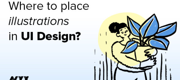
Using Custom Illustrations To Improve Your Brand’s Marketing

Illustrations are more than mere drawings. They may symbolize your brand and communicate who you are. You may make use of them to make your audience aware of your intentions, goals, and vision. This blog will provide you with suggestions on how and where to include illustrations in your User Interface design as a part of your brand’s marketing strategy.

What Are the Benefits of Using Illustration Design in Business?

  • Illustrations created by graphic design services may be a wonderful way to portray a varied range of body kinds, sizes, and ethnicities without having to set up a business photoshoot or pay various models and actors.
  • Illustrations are an effective tool for IT businesses to describe how their program works in a way that isn’t limited to words or photographs alone.  Products, services, and characteristics that would be practically hard to capture in any other manner can be showcased in this approach.
  • Each artist has their own style and personality. In order to make your content shine out and increase your brand’s visibility or recognizability, you should seek a UI designing professional whose style is similar to that of your company.

How to Use Illustrations to Build Your Brand’s Reputation

Creative Brand Storytelling

Audiences are more likely to remember your brand if it has a compelling story behind it. If you’ve got a strong narrative or marketing campaign, custom illustrations might be a brilliant addition. Illustrations made by a web graphic design company may be used to amplify the feelings of a storyline, unlike a simple design.

You may also utilize custom illustrations to stimulate the imaginations of your audience. That way, when consumers see your brand, they’re more likely to feel the way you want them to.

To Create More Appealing Infographics

Leveraging infographics requires planning. When implemented right, they must provide your facts in a clear and honest manner. As a result, your brand’s reputation will be improved significantly. However, a chart or table might quickly become too difficult to comprehend. It’s a good idea to incorporate illustrations into your infographics. As a bonus, it may also add a sense of fun and clarity to the overall design.

As Images In Blog Posts

Blogs are a great way to keep your customers up to date on the latest news about your company. However, reading a wall of text might be tedious for most of us. If the content isn’t aesthetically appealing, people will merely scan it.

Visualizations assist in “dressing up” the article. A customized illustration, on the other hand, will give it more flavor. Ideally, it should be something both related to the topic and intriguing to the reader. If you combine the two, you may assist your readers to become more involved and better comprehend your subject matter.

For Email Newsletters

You may have a hard time persuading the recipient to open and read your company’s email newsletter, though. They’ve probably already received far too many emails. So, if you want to convey that your business is unique, you may use custom illustrations. There is a chance that it will alter the way the client interacts with the email and lead them to learn more.

For Welcome Screens In Applications

Developing a new app or service? Providing a tour with no visual appeal might be boring. In addition, it is the first time consumers interact with your app. Therefore, it’s important to make these pages as interesting as possible.

Customers are more inclined to get involved in the design process if they find it amusing. Incorporating illustrations into the onboarding process makes it a lot more friendly and uncomplicated.

For Innovative Social Media Posts

When done correctly, social media marketing can be a powerful tool for your business. People who use social media are looking for content that is easy to consume. As they get to know your brand, it’s critical that you do this successfully. 

Incorporating illustrations prevent you from overdoing it with the textual information. It also implies that the photos you use might assist your target market to connect with your company’s image. It’s a great method to get the word out about the company without going over the top.

For Product Packaging

It’s essential to keep your brand’s statement consistent with a well-designed package. Every excellent brand narrative pays attention to the details. Your product packaging provides an additional chance to continue conveying this storyline. Enhancing your brand’s image by including images that correspond to the storylines of your brand is possible through illustrations. 

For Advertisement Banners and Posters

The power of compelling visuals is undeniable. Advertising banners and posters are constrained by their size. That’s why having a compelling image to draw attention to your offer is critical. When it comes to graphics, that’s where the flexibility of illustrations comes in. You may use them to convey information that is amusing, quirky, or thought-provoking.

Wrapping up 

The use of brand illustrations may help convey complicated concepts in a clear and concise manner. Using personalized illustrations enhances the impact of your message. Your brand’s unique personality may be displayed via the usage of these graphics, which can be used on both your website and other marketing mediums. Contact Us today to learn more about brand illustrations.

Read more about the branding mistakes you should avoid here.

Categories
Blog Technology Trends Web Design

Tailwind CSS Vs Bootstrap: Choosing the Perfect Framework for Your Website

Creating a top-notch website counts on fluid design, flexible layout, and interactive styles. The idea is to build CSS in such a way that the website removes any potential chaos during subsequent development phases, considerably reducing effort as the program size increases. Bootstrap, Bulma, and Foundation are the most popular UI kits for creating responsive designs. However, what if you wish to use a unique user interface design? Is Tailwind CSS the way to go? Let’s explore.

Tailwind CSS: Overview 

Tailwind CSS was created by Adam Wathan and launched on November 1, 2017. It is a low-level framework that prioritizes utility for CSS applications. It implies that you won’t have to create a lot of CSS. Instead, you’ll have to create a slew of classes for the HTML components you create.

Tailwind CSS has a lot to offer in terms of customization. You have the ability to design and create your own user interfaces from scratch. Interestingly, it won’t need a significant amount of coding time. You may easily use the style of each component individually in the way that your UI requires it to be utilized. It’s also possible to create custom micro-interactions UI designing that may be expanded as needed.

Tailwind CSS allows you to change the “look and feel” of the components in a variety of ways. Writing a large number of classes may seem inconvenient to you. That’s where the extraction of components comes from. It’s up to you how you want to organize these classes into a single package. It’s akin to designing a Bootstrap-like framework.

These are some of the reasons why Tailwind CSS has attracted so much interest. Tailwind CSS isn’t going to be able to compete with Bootstrap, but it does give a lot of versatility for a lot of work. Custom components, on the other hand, make sense because they are not based on code conflicts but are instead designed from scratch.

Bootstrap CSS Framework: Overview

Midway through 2010, Bootstrap was created as a branch of Twitter’s internal design tools, and on August 19, 2011, it was released as an open-source framework. Object-Oriented CSS provides the basis for this. Website templates may be designed and developed more rapidly by UI design services with this component-based architecture.

Aside from that, it is a breeze to pick up across a variety of platforms. Just a few tweaks are needed to make the 12-column grid, components, and layouts responsive. With both fluid-width and fixed-width layouts, you may offset and nested columns. With the help of responsive utility classes, it is possible to conceal or display content depending on the size of the screen.

Tailwind CSS vs. Bootstrap

Using Bootstrap For Development

Bootstrap is built on the Object-Oriented CSS method and is one of the most accepted and applied techniques of handling stylesheets and classes. Before OOCSS, we created different classes and styles for every component with a distinct visual look.

For instance, if your application had 10 buttons, each button would have its own class. As an alternative, Object-Oriented CSS would include several classes to control aspects of the button’s appearance and behavior. The outcome would be a more modular and DRY stylesheet because you wouldn’t have to create a new class for every button size variation.

Additionally, Bootstrap employs one of the most significant and widely renowned CSS preprocessors, Sass. If you’re not acquainted with Sass, it’s a stylesheet language that lets you utilize variables and functions. If your primary color is red, the same color would be used in all declarations in a conventional CSS file. As a result of Sass’s ability to transform these properties into variables, a simple modification to the color red will have an impact on the entire program.

Using Tailwind CSS For Development

Tailwind CSS is a utility-oriented CSS framework. This implies that you will be creating many classes rather than a great deal of CSS for the HTML components. It’s possible to create a class in Tailwind CSS for just about every sort of formatting property you might possibly need.

Is It the Right Time To Switch?

Using Tailwind CSS, you can create a site from the ground up with rapid UI development using predesigned widgets, while using Bootstrap, you get a prestyled responsive, mobile-first component set that comes with a clear UI kit.

The fundamental problem with Bootstrap is that developers are forced to rely on a limited set of abstracted patterns. It forces you to use custom CSS instead of the framework, which negates the whole point of utilizing a framework in the first place. Sites built using Bootstrap adhere to a common design pattern, making them all seem the same. It unquestionably impairs the ability to successfully incorporate innovation. In addition, the Bootstrap JS, Bootstrap Popper.js, and jQuery files together take up a total of 308.25kb.

On the other hand, a more flexible user interface may be created using Tailwind CSS’s set of utility classes. It is easier to apply the design using pre-designed widgets since there is no need to worry about one aspect impacting another. Using classes, for example, you may establish focus states, hover, and active. PurgeCSS may be used to remove unnecessary classes from your CSS file, further shrinking it. Tailwind, on the other hand, only requires the primary CSS file to be up to 27kb in size for a lightweight project.

Is Tailwind CSS Easier To Use Than Bootstrap’s Stylesheets?

Bootstrap is a component-based framework, which means that it comes with a variety of pre-built components and capabilities for manipulating display stacking, spacing, and other such things. Tailwind, on the other hand, is a CSS framework that puts functionality first. In many ways, utilizing Tailwind CSS is like creating regular CSS. Unlike Bootstrap, it doesn’t contain any pre-built components

As Bootstrap has prebuilt components, there is not much CSS to write. Therefore, even little design tweaks might have a negative impact. Tailwind CSS allows you to style your elements from the ground up utilizing the styling syntax. Changes may be made more quickly and easily using Tailwind CSS because just a few CSS classes have to be removed.

The learning curve and the context in which it is used have a significant effect. If you’ve previously learned CSS, you’re well on your way to mastering Tailwind CSS. The vast majority of projects will benefit greatly from using Tailwind CSS because of this.

Conclusion 

If your project doesn’t wander too far from usual layouts or if you’re more of a backend developer, Bootstrap may be the preferred framework. However, you must opt for Tailwind if your project requires extensive front-end modification, doesn’t adhere to a predetermined layout, or if you’re more familiar with CSS. Contact Our Experts Today to Learn More

Read more about what skills you should develop to become a successful front end developer. here.

Categories
Brand & Identity UX UX Design

Tips to Enhance Your Website’s User Experience

You need to make sure your website presents your company in the best light possible. However, when a website is published and made available to the public, it is possible that few User Experience elements are often overlooked. This will have a detrimental effect on the website’s navigation, which will cause people to leave. As a result, it is critical that you eliminate any design errors by employing UX designing services and Enhance offering your visitors a stunning design.

Follow These Tips To Enhance User Experience Of Your Website

#1 Boost Page Loading Times

The poor loading time of a website is one of the most aggravating factors that utterly distract a visitor. In today’s world, there are a plethora of websites dedicated to a specific subject matter. Consequently, consumers will choose a website that loads quickly and provides the information they need to do their job. All UX design ideas that slow down a website must be avoided while developing a website.

Slow page load times not only frustrate your site’s users but also hinder your website’s SEO efforts. Customers will begin to explore elsewhere on the internet for better solutions, which is bad for your company’s bottom line.

#2 Examine The Broken Links

Increasing numbers of people are turning to their smartphones and tablets to get information on the web. We can thus say that creating websites that are mobile-friendly is essential, and no web designer can afford to ignore this requirement. A responsive website will guarantee that consumers enjoy a consistent or seamless experience regardless of the device they are using. The user experience (UX) of a website may be greatly enhance by making it mobile-friendly.

#3 Include Attractive CTAs

These “Call to Action” (CTA) buttons can be finicky. The click-through rate can be dramatically boosted or impacted by a few little adjustments. According to one case study, user experience designing services that used contrasting colors for their CTA buttons saw an increase in click rates of 122%. Moreover, it is crucial to consider the location. The closer a button is to the top of the page, the more likely it is to be clicked.

#4 Design Consistently and Simply

It’s always a good idea to redesign your website to include new design features. However, you must be careful not to drastically alter the appearance of your website in the process. Changing a considerable amount of the design will cause the users to believe that they’ve arrived at the wrong site.

Moreover, your website’s components must be clearly and easily seen by your visitors in order to maintain a consistent design. Texts, pictures, a nice contrast ratio, and a slew of other things fall within this category. Your site’s users shouldn’t have to exert extra effort to understand anything displayed to them.

#5 Reduce The Number Of Ads That Are Shown

Ads are an excellent method of generating revenue, but the brutal reality is that everyone dislikes them. These adverts take up valuable space on your website, which might have been used to provide additional information to your visitors. Ad blockers are commonly used by online users to avoid being bombarded with intrusive advertisements. An improved user experience may be achieved by providing users with full access and control over a website’s content.

#6 Colors Matter

Colors have a great deal of significance in terms of branding. Using a consistent color palette may boost brand awareness by as much as 80%. Various psychology studies have shown that when a company uses colors, buyers attach different meanings to them. For example, blue inspires a sense of trust and honesty, whereas orange conveys a sense of originality. Make sure that the colors you choose for your brand are consistent with the message you want to convey.

#7 Avoid 404 Error

404 or page not found messages bother everyone. If any user receives this notification, he may hesitate to visit your site in the future, which speaks to the quality of your website user experience. It’s pointless to maintain a website if you can’t lead the visitor to the appropriate page. 

Conclusion

Even the smallest and most subtle adjustments can have a significant influence on UX design. In addition to these design tips, there are a slew of additional approaches that may be used to enhance the user experience on a website. However, the suggestions mentioned in this blog are regarded as some of the best for drastically enhancing your website’s UX. Contact our User Experience experts today to enhance your brand’s identity.

Learn more about hoe you can become a UX Expert here.

Categories
Blog Brand & Identity Design

Effective Ways Of Getting Feedback To Improve User Experience

When creating a new product or making improvements to an existing one, it is imperative that you have a thorough understanding of the intended audience. Why is it being used? What’s the purpose of it? To put it another way, you must consider the product from the viewpoint of the end consumer. The most efficient method for achieving this objective is to collect information directly from them. User feedback is a crucial component of the product design process and user research in general. Without this direct input, it is impossible for a UX designer to determine what works and what does not for your users.

Best Practices For Obtaining Feedback From Users

#1 Establish Your Goals

Your design approach isn’t going to benefit much from feedback if it isn’t related to your broader company objectives. As a result, consider your goals before starting any sort of feedback process. There are two things you can do to assist you and your team stay on track with this:

Consider the business objectives: Do you have specific goals in mind for this product? Are there any features that are absolutely necessary for this to work? What type of feedback do you need to accomplish your objectives? Is there anything that the correct kind of criticism may help you solve?

Consider the user objectives: What will your product be used for? What is it about your product that makes people want to use it? What are the features that are going to be of the most benefit to the users? When it comes to learning more about your customers, what type of feedback are you looking for?

#2 Share A Survey Link On Social Media

The best way to get client feedback is to connect with them on social media. The survey link may be included in a blog post, Facebook status updates, Tweet, or Instagram post. In order to get more people to participate in the survey, you may use any social media site to share it with your friends and colleagues.

Using social media has its advantages and disadvantages. One of the disadvantages is the response bias. Engaged consumers that opt to complete the survey are often those who wish to express their opinion about your product. 

#3 Incorporate Social Media Competitions Into Your Campaigns

UX design services can obtain more consumer feedback if they have a greater level of customer interaction. When it comes to boosting social media engagement, competitions are a great option. Competitions engage your audience, and then you can ask them to participate in a survey. 

#4 Use Instagram Stories For Feedback

In the past, companies have been reluctant to utilize Instagram since it’s more than just a photo-sharing network. If you want to get feedback on one of the world’s most popular apps, use Stories. In the app, you may ask questions or take a poll.

#5 Utilize A Well-Defined Procedure For Soliciting Input From User

Customers may think of ways to improve your site while they’re using it, but they don’t usually contact your support service for small bugs or annoyances. Instead, they just become annoyed and leave the site. They will only contact you if the issue is significant enough for them to do so. You can’t rely on surveys to find the problem, but they may be able to help. As a result, you must encourage your consumers to provide feedback on the little things. The most convenient time for them to accomplish this is while they’re actually using your app or website. As a user experience designer, how can you capture their thoughts and concerns? A feedback box is a good place to start.

Make it as simple as possible to utilize the feedback box so that everyone may inform you about even the smallest annoyances. To avoid losing a customer, fix each issue before it gets out of hand. Remember that you must respond to each and every piece of feedback. Even if you don’t know exactly what they’re trying to inform you about, respond swiftly and politely.

#6 Monitor Social Media Channels

You’ll learn a lot about your company’s reputation and web user experience designing if you interact with your followers, send them messages, and answer their comments. Having resources available to monitor all channels is a must. This is a useful tool for keeping tabs on industry-relevant trends and events.

#7 Offer An Incentive In Exchange For Feedback

When a consumer has a bad experience, they are more inclined to give a negative review than a favorable one. Offering rewards in return for client feedback is a great way to get more feedback.

Free delivery, future purchase discounts, free samples, and gift cards are all acceptable forms of compensation. If you’re offering an incentive, don’t use it as a chance to upsell your customers. Make sure your tone conveys that this is a real attempt to enhance customer service rather than a bribe.

#8 Request Feedback On The Order Confirmation

After a consumer has made a purchase, the best moment to ask for feedback is just after the transaction is complete. Be sure to ask about their experience surfing your site to discover the desired product and if they were satisfied with the alternatives offered. Ask whether the site has been improved or if there have been any issues.

#9 Establish An Online Community

Creating a forum on your website or social network is straightforward and may generate feedback. Monitoring and moderating are necessary. An important part of the moderator’s job is reacting to both good and negative criticism, beginning conversations, and keeping users on topic. This type of interaction not only improves your business ties with your clients but also generates new ideas and feedback.

#10 Take Feedback On Abandoned Carts

Ask the consumer why they didn’t check out by putting up a popup with a little text box on the page To make it easier for the consumer to respond, you might build a multiple-choice list to explain the reason for cart abandonment.

Conclusion

Collecting feedback from customers is no longer optional in today’s customer-centric society. Your product’s success depends on your ability to maintain a strong relationship with your customers. What you’re doing correctly, what you’re doing incorrectly, and what aspects of your product you need to improve may all be discovered through feedback from your end-users. Contact our experts to know more.

Read more about how to use customer infraction to improve your brand’s UX. Here

Categories
Brand & Identity UI Design UX UX Design

How to Use a Customer Survey to Improve UX Design

User research is a collection of tools and techniques for determining who your users are, what their goals are, what they think of your product, and more. One of the most critical steps for product designers in developing a product or service is carrying out user research. In the designing of a UX survey, there is no such thing as perfection; rather, there is always room for improvement and learning. To help you get started, we’ve put up a few tips to help you create a user-friendly UX designing survey.

UX Survey: Overview 

User experience (UX) surveys gather information on how a website or digital product is being used by actual users, both quantitatively and qualitatively. It’s important to know what your customers want and need in order to improve your products and services. These user experience design surveys can supply information and guidance for the development of new and creative goods, as well as produce user feedback that confirms whether or not updates and modifications are meeting the needs of consumers.

Best Practices for Conducting UX Surveys

#1 Recognize Your Goal

Before writing the questions, we must have a clear understanding of what we hope to discover about the customer from this particular survey. You and your team should know exactly what you’re trying to accomplish.

#2 Keep It Simple and Short

Be concise and straightforward in your survey questions if you want to make them as simple as possible for respondents to complete. Do not add extraneous background information unless it is required to comprehend the subject at hand, and only ask questions you want to analyze and are crucial for what you are seeking to find.

#3 Arrange The Questions

The questionnaire should be organized in a way that minimizes the burden on the mind. Start with simple questions, progress to more difficult ones, and finish with easy ones. Put together a list of relevant questions. Each area should have its own segmentation if necessary.

#4 Test Out With Pilot Users

Before finalizing the survey, it’s usually a good idea to conduct a test run. You may test with coworkers to see whether it’s simple for them to grasp what you’re saying. In order to better understand the challenges and difficulties that users face, interface designers can conduct a pilot test.

#5 Incorporate both Close-Ended and Open-Ended Questions

It’s critical to think about the advantages of using both open-ended and closed-ended questions when conducting a UX survey in order to get as much information as possible on how your customers are really using your product or service.

Closing-ended queries tend to generate clearer answers. With the data at your fingertips, it’s much easier to figure out what works and doesn’t for your clients. Open-ended questions, on the other hand, allow respondents to elaborate on their responses, which can produce thought-provoking suggestions on how to enhance a product or resolve an issue reported by many of your consumers.

#6 Set a Screener

It is possible that your survey might reach the wrong people when you distribute it. When we say “wrong audience,” we’re referring to those who aren’t aware of your product or service. You don’t need their input or responses anyhow.  With the use of screener questions, you may narrow down your target audience and reject individuals who do not suit the profile you are attempting to achieve.

Screening questions come in two varieties. Screening questions based on behavior are known as behavioral screeners. For instance, suppose you are seeking website feedback and wish to poll your most regular visitors. Using a screening question like “How frequently do you visit this website?” would tell if someone visits daily, weekly, monthly, or never.

#7 Avoid Any Bias

Even the most meticulously crafted surveys can be tainted by bias. For instance, you may inquire, “How challenging is it to utilize this product?” This phrase is considered a leading question because it discreetly leads the user to the concept of difficulty. Instead, you might question, “Is this product easy or difficult to use?” and offer a variety of alternatives to select from.

#8 Incentivize the Users

Respondents appreciate being rewarded with vouchers, discounts, free trials, and early access. It improves the quality of the data since the user may be more inclined to provide thoughtful responses. However, it might potentially backfire owing to the user’s assurance of an incentive.

Conclusion 

When it comes to designing survey questions, there are no hard and fast rules, but it’s important to keep in mind the environment in which you’re trying to analyze user behavior. You may personalize the questions to your product, or you can even add additional questions to the survey if you need to do so.

However, as previously said it is best to keep it brief and focused. We hope that these best practices have assisted you in gaining a better grasp of the types of questions you should ask your users in a UX survey.

Contact our experts today for more in-depth analysis

Read more about how UI and UX connected with each other here.

Categories
Brand & Identity Typography Web Design

How To Use Textures In UI Design?

When you think about texture, what comes to mind? Most of us associate texture with the sensation we experience when running our fingers over an object. It resembles a silky pashmina or a polished stone. In physical art, the materials employed, such as paint or carved stone, define the texture. When it comes to graphic designing textures, artists aren’t constrained by the materials they may utilize. Instead, they employ a wide range of methods and technologies, including photography, textured backdrops, overlays, and more to get the optimal results.

Graphic design is tailored to transmit a message with the goal of capturing the viewer’s attention. Texture in UI design relates to the sense of touch, feeling, and actualization. Graphic design’s typical use of texture enhances the impact of other visual components such as patterns, colors, images, and other written content. For a visually appealing and meaningful UI, web graphic designers never compromise on the quality of texture.

What Are The Benefits Of Using Texture In Graphic Design?

There are several ways to add significance to a picture by using texture in graphic design. A viewer’s attention may be grabbed and engaged using this powerful weapon. To put it simply, textures are used by UI designing services to:

Adding visual appeal 

Texture is related to a sensation of touch, which pulls the physical and mental focus of all viewers to the images. This implies that incorporating it into your visual designs might help you communicate a certain message and evoke specific feelings in your intended audience.

Induce an emotive response

Texture may be used in a variety of ways to connect with your audience. Certain textures can elicit modest emotional responses, while others thrill the senses. Appropriate use of texture may give off an air of seriousness while still conveying a softer side.

Create your identity

Designing your website and social media material with texture might help you establish a distinct brand. In order to convey a certain message to your audience, your UI designs should be consistent with your brand identity.

What You Need To Know About Textures In Graphic Design

Design With Organic Texture To Get That Vintage Look

The use of organic textures evokes a sense of nature and is a current trend. Colorful images on large screens should be accompanied by nature-inspired textures. When you use natural textures, you may create a virtual environment that resembles the real world and encourage clients to explore their own imaginations.

Experiment With New Ideas Using Artistic Textures

If using natural textures doesn’t fit your company objectives, you might look for inspiration in fabricated patterns. It is possible to generate creative textures, which is exactly what is required for graphic design. Many creative things include patterns or designs that may be used as inspiration for your own graphic design if you use current crafts, old patterns, or both.

In order to add a modern flair to a graphic design, you may use 3D visualization technologies or software such as Maya. Keep in mind that the mix of an artificial texture with different typefaces, logos, or other visual elements will provide an important component of your graphic design.

Mixing Up Is An Excellent Attempt

Numerous things around you may be represented graphically as textures, and simply combining them creates a beautiful design. Consider using a backdrop with textured patterns and adding one or two graphic components in a sophisticated way. Incorporating appropriate visual components into your graphic design is a good idea, and choosing immersive artwork is the best way to accomplish it.

Inspire Yourself Through Photography

Photographers who choose to immortalize certain situations serve as a source of inspiration. Your consumers will be wowed by the combination of stunning photography and enthralling graphic design, all of which are complemented by flawless textures.

If you use high-quality images, your audience will be amazed and will spend a few moments looking at them. Choose a color that complements your photograph’s texture and use text to draw attention to your message or business.

Make It Multidimensional

Want to put your technical abilities to work in graphic design? Of course, the simplest way to achieve this is to use texture in a unique way. Graphic design may be enhanced by simply adding a 3D effect to simple and static visual elements. A three-dimensional image of any graphic will excite viewers, who will be able to see it from numerous perspectives.

Use High-Quality Textures

When creating a website’s graphic design, you must strike a balance between the site’s responsiveness and the quality of the site’s texturing. Even if your website runs quickly, skipping out on high-quality textures for your graphic design can be a significant mistake since it will make your site appear drab and out of date without it. Keep the quality high while also speeding up the website load time by using repeating textures as a background.

Using Texture In Typography

The combination of subtle texture and typeface produces stunning and distinctive artworks. The intricacy of these patterns gives a modern spin to minimalist aesthetics. Texture and font may work together to create a unique artwork that doesn’t need to be overly complicated.

Conclusion

When it comes to incorporating texture, there are numerous options for adding alluring effects to a UI design that will entice viewers. Texture, along with varied patterns, gradients, typographies, motifs, and other design elements, will be the “icing on the cake” for your UI design. Contact Us today to know more on how you can achieve great textures on your web pages.

Read more about how to design custom fonts here.

Categories
Design UI Design UX UX Design Web Design

Outsourcing Web Design: Why Should You Opt For It?

Professional web designers can develop a site that is both user-friendly and visually appealing in order to hook and retain clients. The question now is where can you find such a team in a cost effective way? An easy solution is to outsourcing web design!

Have you ever wondered why certain websites are so enticing, while others make you want to leave immediately? This is because of the “brand reception value”, which determines whether or not a person stays on the website. Many studies have demonstrated that a pleasing visual design and simple navigation produce a favorable initial impression of the brand. In contrast, a poorly designed or poorly navigable site will be ignored, regardless of the quality of the content that is presented therein.

Why Is Web Design So Crucial?

#1 Creates The Initial Impression

Your website is the first impression your audience has of your business on the digital space. They will form an opinion about your company or brand by landing on your website. Your customers will have an unfavorable opinion of your company as soon as they see an unimpressive or outdated website. They will leave your page if they do not find your website appealing. You’ll lose out on potential customers since they’ll switch to a competitor’s site instead of yours.

#2 Boosts Your Search Engine Marketing

There are several web design aspects and practices that have an impact on how search engine spiders explore and index your website, which in turn impacts your website’s SEO. Web designing services that incorporate SEO services as part of their package are the greatest approach to ensure good web design practices.

#3 Conveys Credibility to Your Customers

Websites that are poorly executed are seen as untrustworthy by the general public. People aren’t going to trust your site if they see a shoddy design or outdated information. You might be perceived as shady or deceptive since your website does not have an up-to-date look.

A professional website, on the other hand, communicates authority and credibility to your visitors. They’ll have faith in your company and be more open to checking it out. In order to keep visitors on your site, you need to establish a relationship of trust with them first. The more time a visitor spends on your site, the more chances your business has to grab that lead.

#4 Develops Consistency

Your brand is an important part of your marketing strategy when you’re looking for new customers. If you want your customers to pick you when they’re ready to buy, you need to make them aware of your brand and educate them about your services. It is critical to employ the best website design services and have a unified look and feel for your website’s online presence.

Every page on your website should have the same fonts, styles, and layouts. Having a distinct design on each page will make your site appear amateurish. Moreover, it might be more difficult to create brand awareness, as your audience will not know which colors to connect with your business.

Why Should You Outsource Web Design Work?

Creating interactive designs and performing quality control on them may be beyond the capabilities of in-house teams. In contrast, outsourcing firms employ QAs who closely monitor the project, project managers who oversee the work of the programmers, and UX designers whose job is to enhance usability and accessibility while also ensuring that customers are satisfied. As a result, web design outsourcing may provide you with everything you want.

#1 Innovative Approaches to Challenges

You might get new insights and innovative ideas for your project by working with outsourced web development and design team. Those who design websites on a regular basis are creative problem solvers who can come up with novel solutions to complicated issues. To keep their clients satisfied, they consistently perform at a high level.

#2 Increased Productivity

You’ll undoubtedly agree that time is money in today’s digital environment. As a result, every player in the market must move to a more beneficial position as quickly as feasible. And outsourcing can do the same for you.

In the first place, outsourcing your project to a web designing agency saves you time in finding and training new programmers. Second, remote software development teams with specialized expertise are in high demand. They have a lot of work to do, and they want to get it done as quickly as possible. These all speed up the time it takes to build and advertise your website.

#3 Support Available Round-the-Clock

A solid outsourcing staff will be accessible to assist your organization seven days a week, 24 hours a day, if necessary. When your in-house staff is unable to operate due to conflicting time zones, you can fall back on an offshore crew. As a result, your company’s operations will run smoothly.

#4 Updated Resources and Methods for Getting Things Done

To keep up with today’s fast-paced consumer demands, technology is always improving. Unless your company’s major business is a web design, your staff may not have up-to-date knowledge of the newest web design tools and solutions.

Outsourcing web design services allow you to take advantage of professionals that are up to date on the latest trends. For the greatest possible outcome, they know exactly when to employ established technology and when to try out something new. Moreover, they know when to employ established technology and when to try something new in order to get the greatest results.

#5 A More Extensive Range of Knowledge

An external web design company may have greater expertise and a wider range of talents than your in-house staff; therefore it is advisable to outsource this work. With regards to constructing large-scale websites, knowledge and skills are crucial.

#6 Access To A Larger Pool Of Talent

Outsourcing web development or web design opens the door to a vast selection of specialists, each with their own set of talents. For short-term projects that demand specialized abilities that your organization will not need in the future, it makes little sense to employ in-house web designers.

#7 Expanded Performance and Flexibility

Agile approaches, in which projects are split down into smaller chunks, are used by the majority of professional outsourced software development organizations. In this way, clients obtain results more quickly and have more influence over the project. 

It is considerably easier to manage a dedicated web development team than to manage a web development crew on site. In the first scenario, the remote team has the option of adding extra employees based on production and peak hours. It is also more cost-effective for clients to switch projects than to pay internal personnel on a monthly basis.

#8 Saving Money

Cost reductions are a major benefit of outsourcing any work to a third-party source. Your cost will cut down if you hire web designers in a country where rates are lower and taxes are more favorable.

The hourly fee for web design outsourcing company professionals in the United States is typically $100-150 per hour. For a Philippine or Indian designer with the same skills, you can expect to pay between $35 and $56 per hour.

Endnote

A company’s website design should be one of its first priorities when preparing to launch the site. Providing a great user experience that motivates people to return to your site is essential because buyers equate website design with the reputation of a company or product. Contact our creative team today to analyse your brand’s design.

Read more about what to consider while hiring an agency to for web design outsourcing here

Categories
Brand & Identity Design Trends UI Design

Dashboard Design: Best Practices To Follow

In today’s data-driven era, the capability to consolidate and present data while making it understandable and practical is more critical than ever. Dashboards are being used by everyone from data analysts to the highest-ranking executives for comprehensive analysis of information and to gain insight into it. The goal of a good dashboard design is to bring together all the data needed to achieve a certain goal.

In this blog, we have compiled the best practices followed by product designers while designing dashboards for any application.

Types of Dashboard Design

Operational Dashboard

An operational dashboard aims to provide users with an overview of what is currently taking place. With real-time data updates and displays, these dashboards enable speedy responses from users. An example of an operational dashboard use case is software monitoring, in which the dashboard user seeks immediate notification when something goes wrong.

Analytical Dashboard

With the help of analytical dashboards, it is possible to track trends over longer periods of time and utilize that information to make better business decisions. These dashboards provide data that is less time-sensitive and will not demand immediate action. A good dashboard developed by interface designers should make it easy for consumers to dive down and investigate any data that piques their interest.

Strategic Dashboard

Strategic dashboards are a higher-level sort of dashboard that is used for long-term planning and strategy. They may be used to monitor the outcomes of long-term business initiatives and industry-wide developments. The user experience design of this dashboard is to make it easier for executives to grasp the concept without having to go into depth.

Dashboard Design: Top 5 Best Practices To Follow

Information Hierarchy

Your dashboard’s data should be arranged in a sensible fashion. This implies that the most significant facts and insights should be placed at the top left of your dashboard so that they have the highest opportunity of attracting the attention of the user. All other information on the dashboard should be prioritized accordingly. It’s important to include supporting information or trends in the footnotes. 

A Consistent Design Pattern

Having a uniform dashboard-style makes it easier for users to receive the information they need quickly and efficiently. Whether it’s the dashboard itself or the charts, this applies to all aspects of UX designing. All of the chart’s labels, legends, axis style, and other tools should be located in one location.

A dashboard allowing a sales representative to have a rapid overview of a client account is a great example. In an ideal world, the dashboard should appear the same for all clients in terms of the layout so that a sales professional can still obtain a rapid overview of a firm even if they are new to the organization.

Provide Context

Dashboard users should never have to assume or make assumptions about what they’re seeing. Make sure charts include names and maybe subheadings to describe what they’re showing. To make it clear to the audience what the data represents, legends and labels should be included.

Interactive components, such as tooltips that appear when a user hovers over a data point, are an excellent approach to add extra insight without clogging up your charts. People only see extra information when they choose to.

5-Second Rule

When it comes to dashboards, the general rule of thumb is that the user should be able to locate any information they need in less than five seconds. If not, the user will immediately shift to alternate solutions. To begin, eliminate all visualizations that aren’t directly related to the dashboard’s primary goal in order to declutter it. As a second approach, you could arrange the dashboard by adding labels and names on the essential areas so that people can quickly discover what they need.

After making these adjustments, if the dashboard is still too complicated, you should breakdown it into numerous smaller dashboards, each with a distinct focus.

Performance

The performance of dashboards is often overlooked while developing dashboards. It doesn’t matter how good the design is if the performance is awful, such as slow loading speed, the end-user will not appreciate it.

Final words

There are many challenges in data visualization and designing dashboards is one of the most useful skills for designers to have. However, if you keep the aforementioned guidelines in mind while designing any dashboard, you’ll have a solid starting point. Contact our design expert today to evaluate your dashboard’s design.

Read more about styles you should follow while designing frontend, here.