NYX Ditech

Categories
Brand & Identity Design UI Design UX Design

Importance of Graphic Design for Modern Day Businesses

While a picture is worth more than a thousand words, the value of a well-designed graphic may be in the millions. More than simply a form of aesthetics, graphic design is essential for communicating with your customers. Companies utilize graphic designing services at every level of the sales funnel to educate, attract, and ultimately convince buyers to buy an item or perform the desired action.

Local residents can be made aware of a forthcoming workshop via flyer design. The use of an eye-catching email series can help consumers discover new products and services. With a well-designed sales page, you can successfully advertise the debut of your new product. A graphic design company with a strong sense of originality can help your branding strategy achieve its intended goals. With that said, here are some of the benefits graphic design may provide for your organization.

Makes a Strong First Impression

Businesses of all sizes, regardless of industry, are competing for customers. Creating a strong first impression on potential clients or members of your target market is essential for you to succeed in this environment. Customers are more likely to remember your goods and brand if they have a favorable opinion.

Such an impression is impossible to achieve without the help of imaginative graphic design. Apple, Samsung, Microsoft, and Lamborghini wouldn’t exist if their designs weren’t strong enough.

Creates a Distinctive Brand Identity

Your marketing effort will benefit significantly from the strong brand identification that may be created through graphic design. Your company’s logo is a prime illustration of a strong sense of identity, and creating a memorable logo is the first step in attracting new clients to your business. 

Consistency is Equal to Credibility

There is no company or profession that isn’t going to benefit from using good graphic design. The more you can help your consumers solve their problems and alleviate their pain points, the more likely they will see you as a reliable leader in your sector.

Let’s imagine you provide great social media posts that your audience enjoys, but you don’t adhere to a brand standard for consistency. Existing readers may be aware of your content’s value as a gold mine, but newbies will be put off by the visual inconsistency. Brands with a consistent appearance and feel will appear more authoritative and genuine.

In marketing and advertising, the same idea applies: If you develop content that helps someone deal with a problem or alleviate a pain point in their lifestyle, they will most likely look to you for guidance again when faced with a similar scenario in the future.

Effective Idea Communication

You may use an infographic to summarize facts that might otherwise go unnoticed by your target audience. Infographics that integrate pictures and text are five times more captivating than text-only information. As humans are highly visual creatures, including appropriate pictures into text can aid in the comprehension and retention of detailed and complicated information.

Innovation Kills Competition

As competition grows, it’s more critical than ever to improve the company’s competitive edge. When it comes to creating personalized, high-quality content nowadays, hundreds of free design tools are available online. However, if you want to be one step ahead of your competition, you’ll need to be innovative in approaching your brand’s direction.

Bring innovation to present new ideas, resolve existing issues, or alleviate client complaints through your content. Graphics may help you connect with your customers by visually showing them what life could have been if your service or product had addressed their pain points.

Graphic Design Helps in Story-Telling

If you’re in business, you should have a story to tell. Everyone is interested in learning more about your business, whether you’re a solopreneur selling handmade jewelry online or an experienced serial entrepreneur launching your next project. The goal of graphic design is to tell your present and potential consumers about your brand’s distinctive story through visual means.

Conclusion 

There are several reasons why graphic design is critical to the success of any company. It is possible to provide your firm with a competitive advantage and grab attention by employing excellent graphic design services. As a bonus, these services assist you in developing your company’s unique brand identification as well! Contact Us today to get more insight on Graphic Design.

Read more about importance of Graphic Design here.

Categories
Trends UI Design UX UX Design

2022 Icon Trends: What You Need to Know

UX designers have been using icons since their inception in 1981, and they’ve explored creative methods to evolve their designs through them. Icon designs are all around us these days, and our brains have been conditioned to recognize them without having to think about them twice. For instance, when we see an envelope icon, we know it indicates an email, whereas locks and keys signify online security.

Top Icon Design Trends In 2022

Minimalistic

As the logo design became more minimalistic, so did the icon design. A minimalistic approach to design helps designers to produce simple, distinctive artworks that don’t rely heavily on either the color palette or the layout.

Despite the fact that their representations aren’t necessarily accurate, simple symbols are easy to interpret, allowing designers to express themselves freely. Even websites that formerly used intricate designs and symbols are now gravitating toward a more straightforward visual style of their content, which is reflected in the icon design.

Circular

The circle is the earliest, simple, and most perfect geometric form seen in nature and design. This style of symbol may be used in a variety of ways, from flat icons in a circle to 3D spheres, and designers are more inclined to incorporate them.

The problematic element of circular icon design is that circles don’t often mesh well with other forms in the design, such as app icons, which are typically square.

Flat Icons

The emphasis on flat design appears to be fading in all areas except icon design, which is probably owing to flat design’s simplicity, which lends itself well to the expression on a tiny scale.

A flat design is a style of user interface design that emphasizes the use of basic, two-dimensional objects and vibrant colors. Using a flat design lowers the number of variables like textures and shadows, which gives a simple and clean image.

Line Style

Choosing line icons is usually a good idea because they go well with just about every other design element or overall aesthetic. The new trend adds a dash of color to the look, making it more appealing to the eye.

The color can either completely fill the symbol or float in the backdrop, which unifies the icon’s components and emphasizes the brand color.

3D Gradients

Over recent years, the 3D gradient has gained a lot of traction in many elements of design, including icon design, and it’s becoming increasingly popular. This style, which includes anything from enhancing the color of the components in the icon to creating a pop effect to monochrome icons on a full gradient-colored backdrop, looks trendy and attractive.

Abstract

Abstract icons, as the name indicates, are meant to represent a wide range of ideas and feelings in a single image. A company’s personality, ideals, and product offerings may all be represented by an abstract icon.

Abstract symbols can influence consumer perceptions of a brand even if they don’t depict a real product or have a defined meaning. Freelancing networks and social networking sites, for example, frequently make use of this kind of design to link individuals and businesses together.

Hand-Drawn

Icons that are drawn by hand are more real and distinctive. An artist’s style may range from simple forms and lines to more intricate depictions. The wonder and delight that may be evoked by both colorful and black-and-white hand-drawn artwork are evident in both. If you’re looking to highlight the emotional side of your business, this design is ideal for you.

Bright Colors

As bright colors capture the viewer’s attention and provoke pleasant emotions, it’s unsurprising that they’re trendy in many areas of design, especially icon design. Icons with gradients, monochrome icons, and full-color components may all benefit from these hues.

Bright color icons may enhance the characterization of a brand or product by creating a sense of optimism. Yellow, blue, green, and purple are some of the most popular hues used by designers because they work well together and produce beautiful color schemes.

Conclusion 

Since the beginning of time, humans have relied on signals and illustrations, and icons are the core elements of this communication. In the digital era, designers are finding new techniques to reinterpret aesthetic icons by creating new styles or re-inventing older ones. Contact Us today to know more about evaluating your web/app’s icons.

Read more about How Can You Effectively Simplify Your Website Design here.

Categories
Blog Brand & Identity UI Design

UI Design Learnability: Making Things Simple

The objective of UI design learnability is to provide an intuitive user experience that everyone can pick up and use right away. Ideally, there should be no need for documentation to explain to your clients how to utilize your product. There are several ways to make an interface that is easy to understand. This article discusses some of the best practices used by web designing professionals for creating an easier-to-learn user interface.

What Is the Importance of Learnability?

An easy-to-understand interface and an engaging user experience are essential components of any good application. Poorly designed user interfaces may be frustrating to use, causing users to abandon your site. However, well-designed user interfaces by web design services simplify tasks for users, allowing them to accomplish their tasks more rapidly and efficiently. 

This highlights the critical nature of effective UI/UX design. Users will be more inclined to stick around if you make it easy for them to interact with your website 

Best Practices For Learnability in UI and UX Design

Make A Well-Thought-Out Learning Strategy

Your product should not be assumed to be intuitively understandable. You should instead devote the time and effort to creating an in-depth learning strategy for your product. This strategy should encompass everything from simple controls and gestures to more advanced capabilities.

Keep Things Simple

Users will simply feel annoyed and confused if you give them too many options or features at once. Instead, make it easy for customers to get started with your product by breaking it down into smaller, more manageable components.

Design for a Wide Range of Audiences

A good learning strategy should be relevant to a wide range of learners. Young and elderly, tech-savvy and not so tech-savvy, are all included in this group. Since most consumers lack sophisticated degrees in computer science and engineering, they just want tools that operate without a lot of hassle.

Avoid Using Commands and Hidden Options

Make sure your UI doesn’t hide crucial controls or features that users might never be able to discover. All controls and settings should be clearly visible and accessible so that they may be used when necessary.

Use the Correct Structure

It’s important to employ adequate scaffolding when introducing new features or activities to your consumers. In order to prevent users from being overwhelmed or disoriented, it is necessary to provide clear instructions and assistance.

Use Appropriate Feedback Mechanisms to Improve Performance

Utilize suitable feedback systems (audio or visual) to alert consumers of their present condition and any problems that may arise. As a result, they will be more educated and less likely to get frustrated.

Avoid Using Technical Language

It is best to avoid technical jargon and industry language when communicating with users since this will only serve to further confuse them. Simple language rather than technical jargon will make your feedback processes more accessible to the general public.

Offer Guidance through Error Messages

A proper error message might help customers understand why your product couldn’t accomplish a task as intended. These messages should be easy to read and present users with useful information that they may act on in order to rectify the issue swiftly.

Use Contextual Help 

Contextual support is essential when it comes to complex features or activities. So, for example, when asking people to upload a picture of themselves, add some instructions (“Please share a snapshot that clearly reveals your face”).

Show Progress

Don’t leave your users in the dark about what’s going on in the background. This might lead to annoyance and uncertainty, especially if anything unexpected happens. Rather than that, demonstrate to users their progress toward accomplishing a task or action. 

Conclusion

Web designing companies may build UIs that are both simple and satisfying to use by adhering to these best practices in learnability. This, in turn, encourages clients to continue with your service and suggest it to others. Contact Us today to learn more.

Read more about what is Zero UI, here.

Categories
Blog Design Technology Trends

Everything You Need To Know About The Implementation Of Moving Backgrounds

No one can question the popularity of video content. TikTok is rocketing to the top of the application charts, and short videos are being shared most frequently on Facebook. Video’s appeal isn’t just restricted to social media; it’s a powerful medium for graphic design professionals to boost conversion rates. As per various surveys, videos in moving backgrounds may boost home page conversions by up to 80%. 

Making use of video on your website is a smart move. Even yet, that doesn’t imply that you should make your homepage into a mini-movie theater. In web design, it’s all about achieving the right balance between what’s visually appealing and what’s actually useful for the intended audience.

When Is It Appropriate to Use Moving Backgrounds?

A moving background may be really powerful, but it isn’t always the best choice. They might be distracting as well as slow down your website.

If you’re marketing a complicated product, a video is more likely to divert your audience’s attention. If you’re providing something more professional, such as financial planning, classified documents, or anything related to healthcare, a video feels out of place. 

Luxury lifestyle companies typically make effective use of moving backgrounds, as buyers purchase into an experience rather than a commodity. Likewise, seminars, spas, conferences, vacation rentals, and so on all fall under this category. The following is a list of 3 reasons why animated backgrounds are beneficial:

  • To set the right tone
  • To give off the impression of one’s way of life
  • To provoke a response from the audience

How to Integrate Moving Backgrounds Into The Home Page Successfully?

#1 Don’t Let Your Website Slow Down

Visitors will leave your site if it loads slowly, which affects your traffic statistics. Here are three things you can do to speed up your website:

  • Make sure your photos are well-optimized.
  • Compress your data and manage your own cache.
  • Your video should be looped. When looping your video, keep in mind that longer clips will cause your site to slow down. You may speed things up by having a short clip that loops. Opt for a clip of duration between 5–10 seconds, and then loop it perfectly and continually to make it appear longer than it really is.

#2 Your Call to Action Needs to Be Clearly Stated

Moving backgrounds visual have the advantage of attracting the viewer’s attention, which is helpful for establishing a mood and enhancing dwell time. However, if your CTA has to compete for attention or gets neglected due to your changing background, you’ll have issues. Avoid placing your CTA at the top of your video, since this will make it difficult for viewers to focus on the vital information.

#3 Maintain the Readability of your Content

If your animated backdrop is complex and comprises all of the hues and tones, merely choosing a contrasting color may not be sufficient. If the contrast is too high, ask the graphic design experts to use a bright, dark, or colored overlay to make your text stand out.

#4 Pick A Backdrop That Complements Your Message

Animated backgrounds have a tendency of stealing the show. For this reason, they’re one of the favorites! However, if they divert attention away from your primary message or objective, you may quickly find yourself in trouble.

Don’t merely choose the most visually appealing video while crafting your backdrop. Your overall theme or brand should be the driving force behind what you choose. Your home page’s changing backdrop should complement, not detract from, its message.

#5 Be Cautious With Audio 

When you click on a website, you don’t expect it to start playing a song or sound effect without your permission. Particularly if you’re in a quiet environment, such as an office. As a result, auto-playing audio is strictly prohibited. If the video has sound, ensure that it loads silently so that the user has the option of turning the sound on or off.

Final Thoughts

An excellent strategy to improve your brand’s message and entice visitors is to employ dynamic backdrops. They have the ability to increase engagement, raise conversion rates, and provide an immersive experience that is irresistible. However, be cautious while using them. Do keep the above-mentioned points in mind before implementing them on your website. Contact Us today to learn more about how to implement it on your website.

Read more about role played be videos and movements in UX design, here.

Categories
Brand & Identity UI Design Web Design

Website Redesigning: Why and How To Do It?

As the online face of your organization and its services, your website is a vital part of your brand identity. If your website doesn’t provide the proper information in visually appealing packaging, your brand is doomed to fail against the competition. However, the good part is that website redesigning can always be done by getting in touch with a web design agency to restructure and modify the look and feel of your old website.

Why Website Redesigning?

The Website is Obsolete

With design concepts changing every few years, a site that is two or three years old might easily appear out of date when contrasted to its competition that has a website that adheres to the newest design trends. Website designing services can assist you in developing a simple and minimalist website like that of Apple or Microsoft.

The Website is Slow

Slow-loading web pages annoy users. People demand rapid and easy access to information. If your website takes too long to load, you may lose out on potential customers to your competitors.

Website Isn’t Optimized for Mobile

In today’s world, mobile-friendliness is essential. People are continuously using their mobile phones to perform business searches. If you want people to visit your site and stay for an extended period of time, you must ask your web designing company to focus on a responsive design.

Your Brand Is No Longer Accurately Represented by the Website

If you want people to take your business seriously, you need a powerful brand image that truly reflects your firm and conveys the spirit of your branding on your website. With a strong brand image, small firms and entrepreneurs may rise above their larger rivals in the marketplace.

A Step-by-Step Guide to Redesigning a Website

Create a successful plan of action

Before you start, ask yourself why you’re putting in the time and effort. To come up with an effective website redesign plan, you’ll need measurable and quantifiable goals and objectives. For example – In accordance with the type of website you run, you may want to increase lead conversions by a specified number, monitor traffic numbers to optimize your SEO or create more advertising campaigns.

Perform a review of the present site

To modify the layout, the first step is to identify the areas that require attention. Prioritize the modifications you wish to make to the website by doing a thorough audit. You should be able to answer queries such, as “What makes the current website unappealing?” or “Why is it so difficult to navigate?” You’ll have a better idea of what elements of the website redesign should be omitted after doing the analysis. 

Get to know your audience

Even with the finest user interface, a website’s performance will suffer if the design does not appeal to its target audience. The ability to have a deep understanding of your customers is critical to your success. After all, the content you upload to the website is intended for consumer consumption.

For example, a virtual gallery site is meant to promote art, and hence is nearly entirely photo-centric. When it comes to selling paintings online, if a company can’t even promote its products because of inadequate website design, its site is of no value.

Maintain an eye on your competitors

A website’s design can be influenced by its market, niche, and target audience. If you look at the websites of competitor brands, you’ll notice that they have certain commonalities. As the audience is often the same, it is a good idea to take inspiration from your competitors.

Create a list of your specifications

Making a list of necessary features will be easier after you have a better grasp of your target audience, the constraints of your present website, and any other relevant aspects. Additional features that enhance the website’s functioning and overall user experience are included in this category.

Your specifications should specify what constitutes an ‘excellent’ website in your eyes. It will be simpler to merge all of your ideas into a finished product if you have a clear picture of what you want to accomplish.

Implement the new design

Execution is the final element of the website redesign strategy, and it requires precision. Make sure the blueprint is being followed whether you employ someone to do it or do it personally. If you’re working with a professional, be sure to convey all of your needs clearly to minimize delays and alterations.

Conclusion 

That concludes our to-do list for a website revamp! It’s not always simple to obey the rules, especially when schedules are tight. However, adhering to it as strictly as possible can assist you in transforming your new website into the traffic and lead-generating engine you’ve always desired. Contact Us today to redesign your website with current trends.

Read more about when and how to redesign your website here.

Categories
Logo Design Technology UI Design

Best Logo Fonts and How to Choose One for Your Logo

There are a lot of variables to consider when it comes to typefaces and typography in a logo. A lot of time and work is required from both the logo designing professionals and the entrepreneurs at this crucial stage of the design process. Essentially, the logo fonts you pick for your brand identification design, as well as the primary typeface you select, will be critical in capturing the consumer’s attention.

Design components like colors, typefaces, and typography have the power to create or destroy a logo’s success. If the typeface used by a logo designing agency doesn’t match the color theme, structure, or symbolize the company’s ideals, then the audience may be unsure of what they’re viewing. Most consumers are unlikely to be enthralled or enthused by the brand if they cannot decipher what it stands for.

Types of Logo Fonts

For the most part, there are four sorts of typefaces available. Each font type employed by logo designing services has distinct features that contribute to the communication of a brand’s personality.

#1 Serif Logo Fonts

Serif typefaces are a time-honored classic that exudes style and refinement. Logo fonts with a serif typeface provide a sense of timelessness and heritage. Serif typefaces are used in the logos of luxury brands such as Rolex, Mercedes-Benz, and Prada.

#2 Sans Serif Logo Fonts

Sans serif fonts, which are easy to read and modern, work well with a variety of formats and styles. Best logo designers make use of this typeface if you want to create logos that are simple and clear. The clear readability of sans serif fonts makes them popular with tech giants. Since they’re so simple, they’re quite potent. Examples of this include the logos for Google and Netflix.

#3 Script or cursive logo fonts

Cursive typefaces have a formal, beautiful, and feminine feel to them. However, keep in mind that logo scaling might have a negative impact on readability. It is best to keep logos in this typeface simple so that they are readable. These fonts have a lively spirit, but they aren’t appropriate for all businesses. Ensure that the script font chosen by your graphic designers for the logo should be consistent with the image you want to project. The logos of Hallmark, Ray-Ban and Virgin fall within this group.

#4 Display logo fonts

Many companies want to develop their own typeface to distinguish themselves apart. Display or artistic typefaces exist in a variety of styles and are one-of-a-kind. A distinctive typeface for your logo may help you stand out from the competition and connect with your target market. The greatest example of a display or aesthetic logo is Walt Disney’s trademark logo.

Choosing the Correct Font for Your Logo: Some Guidelines

Understand the Symbolism of Different Fonts

Typefaces, like colors, have a symbolic value and can elicit strong emotional reactions in viewers. Prior to selecting type and font, you must determine what your audience will think and feel when they view your logo.

Several logos in the transportation and electronics sectors, for example, employ Sans Serif because of its sleek and futuristic design. Stability, strength, and advancement are conveyed by its use. Sans Serif fonts have been used by some of the world’s most well-known businesses, including Panasonic, Toyota, and Microsoft.

Should Be Appropriate

Choosing a typeface that is suited for your brand’s message and values is essential. Let’s look at it like this: If your firm is in finance or health, a quirky, decorative, or lavish typeface may be inappropriate and may wind up distracting your customers. A Serif typeface is likely to be the best choice for a logo for a business in this industry. When it comes to choosing a typeface for a certain industry, you’ll need to conduct research and examine your competitors’ offerings.

There is no need to avoid experimenting or employing unconventional typefaces in your logo design. However, you must exercise caution in selecting a logo that can be related to your company for the long term without confusing or impressing potential clients.

For example, if you own a firm like Walt Disney, you may use a playful and youthful typeface in your logo.

Keep It Simple

When choosing a typeface, you must ensure that the audience can clearly read it and understand what it is saying. It’s possible that your message will be misunderstood if the typefaces are congested. Using a bespoke or distinctive typeface is a great approach to differentiate your business, but don’t go overboard.

Consider two well-known companies: Coca-Cola and IBM. While the beverage company’s wordmark features a flowing script that is distinctive to the brand, IBM chose a simple, solid typeface. The creators of these logos had to be extremely careful to avoid distracting the viewer’s attention from the brand’s core message by not utilizing too many different fonts and typefaces.

Typeface Combination 

You may successfully match two distinct typefaces in your logo. When designing a brand identity, it’s best to keep things simple and avoid going over the top. If your logo merely contains the company name and no tagline or motto, you can use your primary typeface.

However, you can use a combination of typefaces and fonts like Serif with Sans Serif or Slab Serif if there are any taglines. It might be a successful blend of modern and classic elements that enhances the logo’s attractiveness. KFC had its famous motto in a pleasant display font alongside the company’s letters in Serif typeface.

Check the Scalability 

A logo’s typeface should be scalable to ensure that it is easily readable no matter where it is used. Branding will be hampered if the typeface doesn’t have the same impact across print and digital platforms and products like clothing, bags, and stationery.

The typeface used for your logo should be scalable, otherwise, you may find yourself in a scenario where your audience cannot identify your logo while seeing it on a computer screen or in a magazine. While serif and sans serif fonts function well against a variety of backgrounds, certain script and slab serif styles may lose their attractiveness on curved surfaces or in congested areas.

Investigate Your Competitors

Fonts that appear too similar to other companies in the same industry are a no-no when choosing a logo typeface. Make sure you do comprehensive research. Examine the typefaces and styles that your rivals employ in their logos to see how well they are doing.

While you may use a sans serif logo font like your competitors, it is crucial to choose a distinguishing typeface. There’s no way you want consumers to mistakenly associate your brand with that of your competitor.

Conclusion 

When it comes to selecting a font, it might be difficult to know what to look for and how to proceed, but by adopting these practices you can increase your chances of making the appropriate decision. It is possible to avoid frequent blunders and design a logo that is both timeless and instantly recognizable by following basic rules. Contact Us today to evaluate your brand’s logo.

Read more about difference between cheap and expensive logo design here.

Categories
Blog Brand & Identity Technology

A Guide on Print Design for Creative Professionals

Graphic designers are typically self-motivated individuals who prefer working alone and demonstrating their professional ingenuity with every piece of work. Since they are largely digital beings, it might be difficult for them to grasp the complexities of the actual world when they are so immersed in their own digital lives. Despite the continual attention paid to the digital work of a creative designer, print design services are just as critical to the success of a project.

Print Design vs. Digital Design 

Digital and print media have many similarities. As a result, they both have the same motive: connecting with an audience. Print media, like digital media, follows the same design principles. However, print design is distinct from digital design in a number of fundamental ways as well. When it comes to print design, strict adherence to parameters and a focus on pixel-perfect perfection are essential skills.

This also raises another question: Is printing more expensive than designing digitally? Definitely. Errors in a digital design project may not result in additional costs to the client. However, reworking print design tasks costs a lot of money. While it’s possible to proofread and print off a design for printing before finalizing an order, there’s a limit to how much you can do.

Print designers must also be careful to work within clearly defined constraints, which may be both a blessing and a curse for them. When it comes to advertising, for example, there are limits on banner sizes or the number of words that may fit on a journal page. It is the responsibility of a print designer to be aware of these constraints at all times and to work intentionally to avoid making stupid mistakes in the design.

Things To Keep In Mind While Designing Print Media

Print Design Variations

Although the print design may be seen in almost every aspect of our daily lives, we tend to overlook it. To raise brand awareness of a company’s products or services, classic methods of advertising like print media are still used in business marketing. A well-designed fashion magazine can make or break a brand in the fashion business, while billboards are a great way to promote sports teams. Print is essential in every industry. A graphic designer should be familiar with the following types of print design, just to mention a few:

  • Business collaterals
  • Billboards and banners
  • Signages
  • Calendars and menu cards
  • Merchandise and book cover designs 

CMYK and RGB

Using a desktop application to generate color on the screen is not the same as using a printer. The RGB (red, green, and blue) color scheme is used in computer graphics. Printers, on the other hand, use the cyan, magenta, yellow, and black (CMYK) color set.

The RGB system provides a wider color gamut than most printers can generate. Your application must be set to RGB if your creations will only be used digitally. CMYK is required for printing purposes.

Resolution

Resolution may not be an issue when working digitally. High-resolution files are usually advised when it comes to printing so that you can get the best results. If you don’t utilize a high-resolution file, your print may seem pixelated, blurry, incomprehensible, and muddy.

The most critical unit of measurement for a designer is the DPI, or dots per inch. This measure, as its name implies, indicates the maximum number of dots that may be printed on a square inch of the printing surface. Ideally, the DPI should always be set at 300 dots.

Scaling

While your design may appear flawless on a computer screen, what if it had to be put on a billboard? Or, perhaps, on a small business card? No matter whatever setting you choose, using a pixel size that is the same size as your screen will not work.

Typography is also a crucial part of creative design services. In order to ensure that the writing on a business card is understandable, you should pick typefaces that are either large or strong. Readability and size should be considered at all times.

Bleed

Understanding that a printer may not have control over how paper is sliced is essential to print design. As a result, leaving gaps around the outside of your design makes perfect sense. This maintains a margin of safety. This additional area is referred to as a ‘bleed,’ and all reputable software includes recommendations indicating the start and end of a bleed. Your printer’s manual will inform you about how much bleed is required by your printer. Bleed needs vary from printer to printer.

Conclusion 

Print design can be challenging, but we’ve covered a lot of ground here to give you some helpful hints. When it comes to creating something that’s going to be shared with the world, we understand that it might be intimidating. Therefore, make use of the suggestions discussed above in your future project. Contact Us today to learn more about print design of your brand

Read more about points to consider while building style guide of your brand here.

Categories
Brand & Identity Typography Web Design

Understanding the Psychology of Fonts That Drive Emotions

For years, design professionals have employed bold typefaces to impart a certain mood and feel to their work, but the potential psychology of fonts to affect consumers’ responses to a brand or logo has only recently been fully appreciated. When it comes to giving a brand’s identity an emotional punch, digital creators typically resort to typefaces that elicit a strong emotional response in the viewer’s mind.

Understanding the Psychology of Fonts

Psychology of fonts involves the science of how typography affects the mind, altering decision-making and emotional signals. A creative design agency may influence the emotional reaction of the audience by making smart decisions regarding the characteristics of a design, such as colors and fonts since people respond to visual art in an emotional sense.

The psychology of typefaces is becoming a major area of study and practice in branding and advertising. Even though this was traditionally the domain of major organizations, small businesses are increasingly beginning to see the importance of employing the psychology of typefaces in marketing and branding. Different typefaces have been shown to have remarkable impacts on the human psyche, with some strong fonts capable of altering the flavor of food or fueling societal upheaval.

It is essential for designers and companies to understand the psychology of fonts in order to create distinctive brands and a positive consumer experience. Brands must take into account not just how the text looks, but also how various typefaces make the reader feel when they look at a design. It is possible for a graphic design company to alter the perception of a brand by changing the typeface used in a design, for example by using an emotive font or a bold font.

Typography’s Influence on Our Mood

Choosing the right typeface to use on your site, social media images and marketing content may have a significant influence on how people perceive your brand. There are, however, many more factors that might have a significant influence on how a person views a piece of content.

Font Size

The web’s font sizes have steadily increased over time. Smashing Magazine’s 2009 poll indicated that the most popular web body copy height was 13pt. After two years, they changed their mind and now chose 16pt. To a certain level, larger font sizes need less effort to read. Moreover, they’re more flexible when it comes to adjusting to different screen sizes.

Line Length

When it comes to improving readability on your website, line length, which is influenced by the size of your text as well as the size of its frame, is a minor but critical component. In general, a line should be between 50 and 75 characters long, so that the reader may quickly get into the flow of the story without having trouble locating the appropriate spot on the page or screen.

Spacing

Font design also includes considerations for line-height (sometimes known as “spacing”). If the lines are too close together, your eyes may have a tough time locating the correct row when you come across a slender paragraph. More spacious paragraphs are simpler to read, and the additional white space gives readers a more friendly and inviting sense.

Fonts and Their Meanings

Sans Serif – Straightforward, logical, and Uncomplicated

Sans serif fonts are perceived as clean and simple in a modern style by the general public. They empower the message to speak for itself—straight and to the spot in an impartial manner. In digital design, sans serif typefaces have a reputation for being modern and relevant, no matter at what point of time, or year you are using them.

Script – Feminine and Personal

Elegance, grace, and a sense of femininity are all conjured up by script typefaces. These fonts are seen by audiences to be personal, imaginative, and really passionate because handwriting is frequently utilized in professions of love and devotion.

Display – Charming, Unique, and Quirky

Due to their massive size, display typefaces are known for having strong personalities that entice readers to read them. Since display typefaces have to be so bold, they’re generally made to be pleasant or humorous in order to pique the interest of viewers.

Modern – Smart, up-to-date, and Visionary

Modern typefaces are favored by viewers because they are trendy, stylish, and just plain attractive all at the same time. They have a wide range of personalities, ranging from abrasive and aggressive to intellectual and futuristic. They aren’t simply a reflection of the present, but they also define trends, and the businesses who use them carry the same image with viewers. Modern typefaces are a reflection of what the future holds.

Decorative – Diverse, Distinct, and Informal

Decorative typefaces are hyper decorative and unconventional, injecting a sense of passion and adventure into a design and providing an informal mood for viewers. They are best evaluated on an individual basis due to the fact that the significance of the design varies per typeface.

Familiarity Breeds Confidence

Choosing a typeface that your audience is acquainted with will increase their trust in you and your content. With so many fonts available, many designers adhere to the basics like Helvetica or Impact.

This doesn’t mean you have to use the same typefaces as everyone else, but it does imply that people are more likely to accept your work if they are acquainted with it. Instead of utilizing Helvetica directly, you might use one of the numerous typefaces developed from or inspired by Helvetica to stand apart while still relying on your viewer’s familiarity with the font.

To Conclude 

Understanding typeface psychology entails more than simply being aware of the emotional baggage associated with particular font families. Moreover, a typeface might have subconscious impacts on the brain. Understanding how the human brain decodes and interprets a typeface can assist you in maximizing its potential or avoiding any potential issues that could obstruct your message. Contact Us today to learn more.

You might be interested in designing in custom fonts. Read it here.

Categories
UI Design UX UX Design Web Design

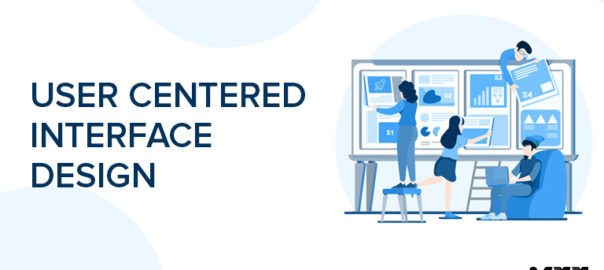
User-centered Interface Design: Know the Top Five Principles

Any software, website, application, or other software must have a user interface. User interface design is concerned with the interface’s structure in front of the user. The most effective design is one that does not appear to be one. Yes, you read that correctly; there is no mistake.

UI designdoes not have to look good to operate well. And designs that operate well will look and feel fantastic by default. Many factors influence the creation of such designs. Your target audience, industry, and operational niche are just a few examples.

Creating visually appealing interfaces is critical, but User Interface design services go well beyond that. When using an app, it should be simple to use—you should be able to do your tasks without assistance. On a website or app, you should be able to tell where you are. When you press a button or flick a switch, you should be able to predict what will happen. User Interface designers employ visual clues to assist users through the interface. It also needs to be user-friendly and welcoming. Users should be able to operate and understand the interface regardless of their ability, age, color, gender identity, or background. This could include choosing a font that is easy to read and can be translated into several languages or choosing colors that are visible to color-blind people.

UI Roles and Tasks

As a User Interface designer, you’ll be in charge of creating the appearance and feel of digital products as well as how people will interact with them. This can include a variety of responsibilities and decisions, such as:

  • Layouts and the right spacing of page elements on a page
  • Existing design environments are being improved and modernized.
  • Assuring those designs can be adapted to a variety of device types (adaptive design)
  • Button, slider, toggle, icon, drop-down menus, and text fields are examples of interactive components.
  • Color palettes, fonts, and typesetting are all things to consider.
  • Creating style guides to ensure that the company’s brand identity is constant.

While all of the variables must be considered, there are a few user interface principles or golden standards that may be used to construct designs and direct the designer to the best combination of essentials.

Precision & Prominence: 

This may seem obvious, but when we analyze client websites, we frequently find that a large quantity of vital content is misplaced or hidden behind a bad user interface. In a world where your rival is just a click away, you don’t want to confuse your user by forcing them to seek the information they came to your website for because they’ll immediately close the tab and go to your competitor’s. As a result, make sure you understand your clients’ requirements and provide them with vital information that is easily visible and accessible.

Reliability: 

This may seem obvious, but when we analyze client websites, we frequently find that important content is misplaced or hidden behind a bad user experience. In a world where your rival is only a click away, you don’t want to confuse your user by forcing them to search for the information they came to your website for because they’ll immediately close the tab and go to your competitor’s website. As a result, ensure that you are aware of your clients’ requirements and that vital information is readily available to them.

Learnability: 

Every interface has a design system, and the user should be able to quickly and easily grasp it. Learnability takes into account how much time and effort users will have to put in to become proficient at utilizing the interface and navigating the product. Colour coding, signposting, functions, and symbols are examples of aspects that can help you develop a predictable and intuitive interface in which users can execute fundamental activities the first time they see the design but also find their way around easily when they return.

Simplicity: 

A good UI design agency is practically imperceptible to the user; it avoids distracting features, animations, and clicks. Labels and calls to action that employ plain language that guides the user toward completing their goal. Designs that are simple and elegant will never go out of vogue. There are two characteristics of an easy-to-use interface:

  • Visual cues: It’s important to let the user know where they are and what they’re interacting with. Give them indicators that will make it easier for them to navigate the UI. 
  • Prediction: When your consumers use the interface, it gives them a sense of being ahead of the game. When you buy a product or create a profile, for example, there are headlines at the top that describe the procedure. When users click the Next button, it informs them of what will happen next.

Feedback

This is where the user and the UI communicate:

  • I’m not sure where I am.
  • Is it still downloading?
  • What will happen next in the future?
  • What happened in terms of outcomes and outcomes?

Providing feedback reassures the user that they are on the correct track, and they will most likely continue! As a result, create unambiguous feedback for every action the user is likely to take; examples of good feedback include green ticks, red crosses, page navigation, and confirmation notifications.

We’re all attracted to a well-designed website. However, the truth is that, in the end, a site’s visual aesthetics will almost certainly have little bearing on its success or failure. If a site looks excellent, it captures my interest, and we can enjoy the design, but it quickly boils down to whether the site can perform what I want it to do for me. The usability and utility of a website are important considerations in determining its success. Of course, content is king, but it must be found and accessed.

So, in your current and future projects, we hope you will consider these five golden principles of User Interface designers. Contact Us today to get started.

Read more about designing effortless user interface designs here.

Categories
Blog Brand & Identity Design

Effective Data Visualization: 7 Fundamental Principles

Technology has made it possible for us to have access to a large amount of information. However, the complexity of this data has grown steadily over time. The real trouble arises when we are unable to effectively manage and utilize this enormous data resource. Thus, creative designing professionals have come up with the notion of data visualization in order to overcome this challenge encountered by firms today. 

Presenting data in visual form has become critical for everyone. Unfortunately, the task is a bit challenging, and we need best practices for successful data management using data visualizations.

Data Visualization: Overview

Data visualization has become more popular as a means of conveying information visually. This style of visual communication enables a web design agency to produce, examine, and communicate data graphically, allowing the viewer to easily comprehend complicated information based on its relevance and importance. Data visualizations allow us to visually portray information in the form of graphs and other illustrations, making it easier to share that data.

What is the Importance of Data Visualization?

When presented in the form of charts or graphs, the human brain is able to assimilate information more rapidly. As a result, in today’s fast-paced world, it is essential to provide complex information and analysis in the form of tables and charts. Concepts are conveyed quickly and readily through unique data visualizations by organizations. Hence, data visualization and infographics have become standard practices for modern marketers.

Data Visualization Has Several Advantages:

  • Assists you in identifying areas that require improvement or attention.
  • Allows you to better understand the elements that influence consumer actions.
  • Enables us to know where to position the various products.
  • Helps you to forecast sales volumes.

7 Fundamental Design Principles For Data Visualization 

#1 Identifying Your Ideal Audience

First and foremost, the designer must be aware of their intended audience. This is critical at the start of the design process. An understanding of what they want to communicate is essential for a successful design. Designers also need to know who their intended audience is and what degree of literacy they possess. Ethnic and cultural values should also be considered.

#2 Focusing on the Essentials

The primary goal of data visualization is to provide a visual hierarchy or to narrow the emphasis to relevant sections. In other words, the most critical information should be shown in the most visible manner. Designing a visual hierarchy is as simple as using size, color contrast, and positioning.

#3 Keeping Things Simple

Keeping things simple is the third principle. It is critical to break down data into smaller chunks. Making data visualizations that are easy to grasp at a glance is an important part of the design process.

#4 Balance in Layouts

The next step is the layout, which refers to the way information is organized or presented. The best presentations are well-balanced and visually appealing. A grid is commonly used as the design’s framework to accomplish this. Columns, like those found in newspapers, periodicals, and documents, are a typical way to arrange the information.

#5 Coordinating Alignment

Grouping relevant information and isolating unrelated information is the fifth rule. Connections and related items are commonly displayed using lines, backdrops, and boxes. Compartmentalize elements that are connected, and do the reverse with those that aren’t.

#6 Creating Stability

There must be a uniformity in the design. Standardizing fonts and point sizes, using colors consistently across graphics, and keeping an eye out for visual hierarchy consistency are all examples of what this may involve. We can’t overlook the themes. The design should adhere to a well-considered standard in every aspect. This is something that the designer would keep in mind if they were working with a company or brand.

#7 Escalating Engagement

Interactivity and mobility are essential considerations for designers. For a campaign to be a success it must keep its audience engaged and involved in the message. The desired message will not be conveyed if the visualization is not appealing.

Conclusion 

When it comes to data visualization, the goal is to make a data set more understandable to the intended audience by using visual elements. Using graphs and charts, today’s audiences are better able to grasp complicated subjects. Therefore, to present the most effective visualizations and easily comprehensible data, adhere to the aforementioned standards and best practices. Contact Us today to learn more.

Read more about importance of Data Visualization here.