NYX Ditech

Categories
Brand & Identity Design Mobile Apps Technology

A Comprehensive Guide for eWallet App Designing

Following the COVID-19 epidemic, digitalization has taken hold across the globe. The use of digital components has become prevalent in every sector. People all across the world are beginning to use mobile payments as a means of making purchases. According to a survey by Market Research Future, the e-wallet market is expected to reach about $2100 billion in revenue by 2023, growing at a CAGR of 15%. It may be quite complex to design a eWallet app with the finest functional traits and service features. Product design experts for eWallet apps must provide the most practical and intuitive user interface designing as smartphones are becoming more capable. It’s now imperative that designers revisit the design of their eWallet app to ensure that it is easy to use and secure enough to be used on a daily basis.

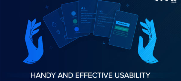
Components of E-wallet App Design

Numerous components must be incorporated into the design of the eWallet application to provide a spectacular look and experience. It takes time and a skilled eWallet app developer to create a stunning design that will captivate your users.

Background

It’s critical for small and large web design firms alike to establish their brand and make an impact. The app’s design must reflect the company’s unique personality in every way. UI, symbols, and logos, among other things, must be incorporated appropriately into the design of an e-wallet application.

Animation

User engagement must be at an extremely high level if a eWallet product application designers want to provide a high-quality product to its customers. A variety of eWallet software panels and features may be animated to provide the user with an enhanced level of engagement. 

Color Scheme and Gradient

When it comes to apps, the color theme is the most significant aspect. A majority of users are drawn to an app based on its color palette. The combination of hues has a calming effect on the psyche. This demands the use of a color gradient in the application’s design.

Isometric Style

To help customers relax and focus on the components, a clean and balanced design is essential. It is possible for the app’s welcome page to include balance, pay bills, and transaction information as well as buttons to recharge your phone, make mobile payments, and other incentive offers. Digital product designing services can suggest a cost-effective solution template for putting together a feature set.

Process For Designing an eWallet App

Doing a Market Analysis

Some of the most popular eWallet apps on the market provide a wide range of features and an extremely high degree of security. Major providers like Gpay and Samsung Pay have amassed significant market share and have a devoted following of users. In order to choose the best developers for your eWallet application, you must first conduct thorough market research.

Personas for Users

Understanding the user’s persona is critical to meeting the user’s needs. There is no one-size-fits-all solution for every user. However, it’s always a good idea to divide your customers into a variety of categories. Successful eWallet app developers know what it takes to create a popular app. Companies may gain a better understanding of user behavior by grouping people into many categories and subcategories.

Development of the User Flow

Flow is a term that refers to how a user moves through a process to accomplish a goal. The design of an eWallet must be simple and easy to use for the end-user. The user flow assists in determining which features are most likely to meet and exceed users’ expectations. The user’s journey is determined by the user’s profile; however, your application must choose the path that is most convenient for the majority. Make sure that you select a workflow that will work well for the majority of your team members.

Wireframing

Wireframing is the process of sketching out the eWallet’s interfaces. This is to ensure that all functionalities, in addition to basic functions such as login identification and registration, are provided. This also assists in comprehending the logical sequence of steps that must occur within your application.

UX Research and Testing

An improved customer experience may be achieved by using UX Lab. It seeks to analyze the app’s numerous processes to see how simple or complex it is for users to complete activities. Moreover, it ensures that the app’s design is in accordance with the original concept and that its functionality is in accordance with the intended user flow.

Top Features for eWallet App Design

Summary of Financial Transactions

The summary, which includes a financial transaction, is critical since it enables customers to monitor their entire financial situation from the home screen. This feature enables people to access their balance at any time, as well as the flow of cash, evaluate transactions, etc.

Analyses of Spending

The spending analysis tool is a critical component of an eWallet’s functionality. This tool aids users in keeping tabs on their spending patterns, such as how much they spend on movies, clothes, and other items. Having this information easily available on the application makes it much easier for customers to build a budget and keep track of their expenditures.

Convenient and Effortless Orders

One of the most important aspects of mobile wallets is their speed. Transactions are expected to be completed in the smallest amount of time feasible. Any delays might have a negative impact on the customer experience. As more and more applications are accessible for booking taxis, buying meals, and other activities that involve money transactions, this functionality has become increasingly important.

A Bill Paying Option

eWallets may be used to make electronic payments such as online purchases and bill payments. It’s no longer necessary for consumers to lug around a wallet full of cash or credit cards. This benefits users by allowing them to earn cashback, discounts, and other rewards while also facilitating improved financial management.

Chatbots

Chatbots are virtual assistants that converse in the same way that people do. Providing users with effective and cost-effective customer care ensures high-quality service and rapid resolution of issues. There has been a dramatic increase in the ease with which enterprises may communicate with chatbots. 

Near Field Communication (NFC)

NFC is integrated into the eWallet design so that consumers can just touch their smartphones on a device to make a payment at a business. NFC transactions are more secured than credit card payments, so users may rest assured of their safety. Additionally, NFCs are compatible with other payment systems and serve as a versatile platform for numerous forms of safe payment. Transactions are simplified and expedited since users no longer need to take cash or credit cards with them everywhere they go.

QR Codes

Adding QR codes to an eWallet is a smart move. This enables users to connect to other individuals online simply by scanning their QR codes, eliminating any necessity for cards or bank details. Also, QR codes have simplified the process of tracking money flows from one individual to another.

Conclusion 

eWallets are becoming increasingly popular since they are accepted in more locations, provide improved security, and open up new avenues for making. Contact Us today with your requirements.

Read more about why your business needs a mobile app here.

Categories
UI Design UX Design Web Design

Gestalt Design Principles: How Psychology Affects Perception

Gestalt Design Principles are visual recognition concepts that describe how we put similar parts together, discern patterns, and simplify complicated pictures as we view objects. Using gestalt design principles, any creative design agency may create user interfaces that are both visually appealing and intuitive to use. Let’s take a closer look at these design principles in this blog.

Similarity

It is natural for humans to group similar items together. Visually comparable elements are grouped according to gestalt design principles, regardless of how close they are to one another. Color, shape, and size are all valid ways to organize them. In a design, similarity may be utilized to connect items that aren’t directly adjacent to each other.

If you want anything to stand out from the crowd, of course, you may make it different from the others. So, in order to draw the visitor’s attention to the required action, call to action buttons are frequently made to stand out from the background color of the website.

Continuation

According to the rule of continuity, no matter how lines are drawn, the human eye will always follow the smoothest path. When the intention is to drive a visitor’s gaze in a specific direction, this continuation may be a useful tool. For this reason, it is important to make sure that all of the most important components of the page are within their reach.

Placement along a line naturally draws attention from one object to the next because of the eye’s tendency to follow a line. Horizontal sliders and similar product displays on sites like Amazon are two examples of this.

Closure

One of the most fascinating gestalt concepts is the notion of closure. It’s the assumption that your brain will fill in the gaps in a design or image to produce a complete picture. One of the most well-known examples is the dotted outline where individuals are more likely to notice an overall form rather than individual lines.

Other examples include the logos for Sun Microsystems, USA Network, and Adobe. The closure is a common theme in logo design. Using a fade-out graphic to remind users that there’s more to be discovered if they swipe left or right is a great example of how to utilize closure in UI and UX.

Proximity

Proximity refers to the distance between two or more objects. Even when overlapping subjects have the highest proximity effects, just putting things together into a single region can still have a significant proximity impact. Of course, the inverse is also true. Even though the features of the two elements are identical, you may create a sense of difference by separating them by putting space between them.

Logo design experts commonly employ proximity to encourage the grouping of items without the need for physical borders. If you group similar things together and leave space between them, the audience will quickly notice the hierarchy you’re trying to convey.

Conclusion 

As long as you follow the basics of Gestalt design principles, it’s possible to transform a disorganized site into one where visitors are guided toward taking the desired action by a smooth and natural experience. Contact Us today to know more.

For Further Readings: 5 Web Design Principles To Improve Conversion Ratio

Categories
UI Design UX UX Design

Practical Tips for Effective UI/UX Writing

Writers that specialize in UX writing create UI text that helps users navigate a product and engage with it. A UI copy created by UI designing services contains buttons and menu labels, error warnings, safety notes, terms of service, and other product usage instructions. UI UX writing’s primary goal is to facilitate interaction between users and digital products.

It’s becoming more and more common for businesses to realize that the words they use on their websites are crucial to their success, and this has led to a rise in the importance of UX writing. UI UX writing has a critical role to play in ensuring a positive customer experience by helping to alleviate major causes of consumer dissatisfaction.

The goal of a UI copy developed by user interface designers should be to keep your visitors informed, entertained, and engaged during their time on your site. To provide the best possible user experience for your customers, it is critical to conduct an assessment of your website and redesign UI copy if required.

Tips To Improve UI/UX Writing

Understand Your Customers

Your UI text should be written with an eye toward the demands of your visitors in mind. A lot of people overlook this and instead focus on attempting to please Google’s algorithms rather than the user. In order to create content that appeals to your intended audience, you must first have an understanding of who they are. Collect as much first-party data as possible while being subtle or intrusive.

Your users should be rewarded for their time by participating in market research, such as surveys. Execute media advertising both online and offline, analyzing which methods generate the most interaction and engagement.

Understand the Purpose and Flow of Your Work

You must be able to forecast how your product or feature will be used by customers. The flow of content and its ultimate worth may be determined by studying the consumer journey and its many hurdles along the way. Your writing should always provide the user with the information they require to interact with your content. Write in a hierarchical order to improve web scanning. Your first fold should begin with the most important information.

Be Direct and Short

At times, we may wish to express a number of vital points at the same time. This is the most important part: reducing the amount of information but never restricting it. Choosing to write in a more succinct manner implies omitting unnecessary details. Make sure you’re conveying the most important points and then assess whether or not you need to include everything.

Reduce the number of words you use without sacrificing the message’s significance. Ensure that every word on the screen has a purpose in helping people navigate a product.

Keep Jargon to a Minimum

One of the most important characteristics of a well-written UX design document is simplicity. It’s best to keep away from technical jargon in favor of more widely understood, reasonable language when writing for a public audience. All things considered, it’s imperative to avoid language that conveys ambiguous or contradictory ideas.

Learn to Play Around with Grammar

Grammar and punctuation are the building blocks of high-quality writing. However, whether you’re writing copy for a software product or a 140-character tweet, things are a little different. As a result, you’ll need to be flexible when it comes to grammar.

Get People Involved

Have you ever shopped online and come across articles or images that made you laugh or smile? When it happens, you leave with a positive impression of the brand. It is certain that you will return to the site or app, and you may even spread the word about it to your friends, therefore increasing brand loyalty.

Make sure you remember that, even if you can’t make your customers laugh, if you aren’t happy with the quality of the writing, your consumer will probably be unhappy as well.

Set Up A Conversation That Feels Natural

Always write as though you’re conversing with a colleague when you’re creating user-interface copy. Consider the user as a friend who expects to be simple. When writing an essay or a book, using synonyms is a great way to make your writing stand out and be unique. They may, however, have a negative impact on the user’s experience by making users work harder to uncover the relationship between synonymic phrases rather than simply reading text to find solutions to their problems.

Accessibility Shouldn’t Be Forgotten

We live in a culturally varied society, and web design must take this into consideration at every step. UI UX writing must be thorough and attentive to the needs and limitations of persons with special requirements or disabilities. The colors you pick in your design should be carefully chosen. Color-blind people may not be able to distinguish some colors, so be sure to mention them or provide audio warnings alongside images for some of your most important information. 

Conclusion

These were some UI design tips to assist you in enhancing your UX authoring skills. Most significantly, your product or website should always aim to improve user engagement and increase customer satisfaction.

Contact Our Expert Today To Get You Your UI UX Writing Analysed and Done.

Read More About How UI and UX are Different HERE

Categories
Brand & Identity Design UI Design UX Design

Essential Components for a Successful Product Design

Developing a product from ideation to execution is a massive task for product design agencies. A successful product is more than simply aesthetically pleasing or functionally sound. There are other variables and forces at play. A good design can never be defined too narrowly. Product design is all about innovation, and there are numerous examples to illustrate that. But there are a few components in successful product design that we’ll cover in this blog.

Key Components of Product Design

Aesthetics

Most people will notice how well a product is created by its appearance, which is one of the most evident aspects of its design. People are more likely to be drawn to a product based on its appearance than its features, usability, or ability to accomplish a task. When it comes to making a purchase, this is frequently the decisive factor.

Don’t be afraid to keep up with the latest design trends across the board and in your own business. It’s crucial to know how your buyers want your products to look like and for that you may take the help of creative design services.

Ergonomics

This is when it’s critical to put utility first. If a product is complicated or annoying to use, customers will quickly forget about the product’s stunning appearance. Assuring that the product is intuitive and simple to use should be the primary goal. Having a convenient, easy-to-use product but is less than perfect in terms of appearance is preferable to a product that appears wonderful but is difficult to use.

Materials

When it comes to product design, the material from which it is manufactured is an apparent factor to take into account. Product use, estimated life span, and environmental conditions must be thoroughly analyzed to assure the product’s viability. You must extensively investigate the materials and their vulnerabilities before using them.

Manufacture

It’s simple to assume that in today’s technologically advanced world, we can produce everything we desire. That isn’t necessarily the case, though. CNC machining, for example, has limitations when it comes to undercuts of all shapes and sizes. While intricate forms and goods can be manufactured, it is frequently necessary to separate the product into smaller pieces so that it can be cast or machined and then assembled.

Modularity

There are several designing professionals who use this strategy of breaking down a product into smaller bits. As a starting point, the goal is to create a single component that can be used in several products. The product should be designed to be modular as future units and improvements get simpler to manufacture, and mending items becomes as easy as replacing the broken ‘module.’

Sustainability

Make sure the materials and components you use in your product design are readily available. Many firms have been forced to shut down their doors since the components for their main product were becoming more scarce. The items and materials you use should be readily available, well-established, and easily interchangeable.

Protection

Water and dust may easily cause industrial products to fail if they aren’t IP rated. Maintain the essential environmental and user protection for your product so that it may be used for an extended period of time.

Assembling and Putting Together

After the aesthetics, the packaging and assembly are the next things a buyer will see when they are interacting with your products. You must pay particular attention to the unboxing experience.

Conclusion

The way you accomplish things in real-time is what defines your design process. Throughout various phases, you should always explore integrating new technology and methodologies into your product design. Reach out to our experts today to evaluate components of your product.

Do you know there is a process to follow design validation. Click here to read more about it.

Categories
UI Design UX UX Design Web Design

UX Design Principles for Smarter Decision Making

UX design is a dynamic and ever-changing industry that embraces new ideas, but there are certain fundamental principles that every new designer should know. These guiding principles will aid User Experience design services in making decisions based on the way users interact with distinct applications.

Basic Principles of UX Design

#1 Hierarchy

A product’s hierarchy is a designer’s best tool for making it easier for customers to navigate. The information architecture of the website or app is the initial level of the pyramid. The top level of the pyramid is generally a major navigation menu that comprises the most important components. When you initially launch an app or go on a website, this is the first menu you’ll see. In addition to the main menu, you may notice submenus when you click or linger over each item. These submenus allow you to go even further down the information structure.

Items like images and cards will be towards the bottom of the list of hierarchal priorities. We, as users, tend to take this hierarchy for granted since it feels so natural. However, it is critical to a seamless user experience.

Using a visual hierarchy, a UX designing agency may make a section or page easier to access for consumers. Important information should be more prominently displayed in order to establish a hierarchy. The font and weight of headers and titles, for example, should be distinct from that of the rest of the text.

#2 Consistency

Customers look for products that are the same as those they’ve used in the past and can rely on. Users will have a better overall experience with your product if they are more familiar with it. If you’re a designer, this is wonderful news since it means you don’t have to start from scratch for every aspect of your work.

#3 Confirmation

When it comes to becoming a designer, mistake prevention is a top priority. Users’ experiences are ruined when they unintentionally delete or pay for something they didn’t plan to. Requiring approval for each activity that is critical or irreversible is one of the greatest methods to avoid these mistakes.

The ability to undo an error or reconsider a decision is one of the primary benefits of this sort of confirmation. A frequent example is an order confirmation page that allows you to see all of the specifics of order before completing a purchase online.

#4 User Control

While user control is a key component of the overall user experience, it’s especially important to provide the user control over where they are in and what they are executing. User control is all about making it easy for people to go back and fix mistakes. It’s important to include a way for users to return to the top of the hierarchy if they’ve gone more than a few levels below. Similar to canceling an email or an appointment, a cancel option should be available when a user begins a new task.

Control can also be enhanced by providing more sophisticated users with strategies to increase their productivity. Using keyboard shortcuts, templates, and macros is a fantastic method to speed up the process of doing the same thing over and over again. Integrating features and services enable users to move material more effectively, and improved searching enables users to locate what they’re seeking for more quickly.

#5 Accessibility

The term “accessibility” in digital product design refers to making a product easier to use for people who have challenges. Product design is all about making something that can be utilized by a wide range of individuals. As a UX designer, one of your primary goals should be to make the product as easy to use as possible for users, regardless of how long they will be using it. As an added benefit, implementing accessibility principles tends to lead us toward the best user-friendly design.

One excellent illustration of how accessibility benefits everyone is the practice of placing instructions outside of text entry areas rather than within them. Similarly, strong contrast between text and backdrop colors aids in reading text on the screen for those with visual impairments and for people in low light conditions.

Conclusion 

The principles of UX design described above guarantee that the user’s interaction with the product is flawless to the point they don’t even notice any bugs. To put it another way, your product should induce a sense of flow in user interaction. Reach out to our experts today to know more.

You might find this article interesting about how UX Design evolved over the time. Read here.

Categories
Brand & Identity Design Mobile Apps UX Design

How User Experience (UX) Significantly Influences eLearning

There’s no denying that eLearning has several advantages over traditional classroom teaching, including accessibility, cost savings, and improved teamwork. UX design has a significant impact on training efficacy. For example, a platform that is difficult to use is unlikely to attract many visitors. User Experience design for remote learning has been shown to have a major impact on how effectively students learn. The lack of it will lead to students being puzzled, dissatisfied, and furthermore distracted.

What is the impact of UX on eLearning?

eLearning’s User Experience (UX) is frequently shaped by a variety of elements, such as the efficiency, design, and interaction of the course material. However, the main concern here is what effect does UX has on the distance learning process?

The goal of any UX designing agency is to provide a unique constraint for all of the elements that go into creating a positive user experience. Design, interaction, speed, and even brand awareness are all examples of what is included in this category. Whenever it comes to distance education, each of these factors is critical. Here are several ways UX may improve or ruin an eLearning experience:

#1 User Experience Can Help eLearners Retain More Information

Visual aids used by User Experience designers can boost learning by as much as 400%. As a result, students will retain more of the content they learn when it is presented to them in the form of visual elements like charts, graphs, and interactive movies. Better understanding allows students to apply their knowledge and skills more quickly and effectively.

Duolingo is an excellent illustration of how UX can affect remote learning. A large part of the platform’s popularity is due to its user-friendly layout, which makes it easier to remember new vocabulary and grammar rules as you learn a new language. Additionally, the interface assists learners in learning more quickly, owing to their ability to comprehend the visual clues provided by the platform.

#2 You Can Make Learning Fun Using UX Design

It’s been shown that students remember more information and have more fun with their lessons when they have a positive impression of the eLearning experience. They will thus study for longer lengths of time, gain a greater amount of information, and have a more positive outlook on the topic.

A great example of how UX can be used to enhance online learning would be any online gamification platform. Gamification, quizzes, and even interactive lessons may help students get more out of their distance learning experiences and achieve their goals. They add levity to the process, which encourages students to stay on the platform longer and use it more frequently.

#3 User-Centered Design Makes eLearning Easier

When learners can easily retrieve their information, it becomes more relevant to them. This means that students with impairments or who do not know the language of the eLearning platform may have difficulty navigating it. However, an experienced UX designer can assist you in overcoming these obstacles and drastically improve users’ online experience with the appropriate UX strategies.

Most prominent EdTech platforms contain functionalities that can be used on a variety of devices and platforms since they are standardized. This makes it easy for users to access eLearning content and information on a wide range of devices and ecosystems. 

#4 UX May Speed Up The eLearning Process

Enhancing the UX can assist learners in enhancing their speed and overall comprehension. Navigations can be quicker and more efficient when the UI is simple and straightforward to use.

This also aids creative design agencies in the creation of relevant content. This means that students may spend more time studying and less time waiting for items to load on an eLearning platform.

#5 UX Can Improve the Relationship between eLearners and Teachers

Students will engage more with one another and understand more if an eLearning platform is easy to use and attractive to look at. This may lead to greater connections among community members and more training in the long run.

UX can have a significant influence on distance learning, and YouTube is a prime example of this. A user-friendly and quick video hosting platform makes it simple to exchange videos and gain knowledge from one another. This also has an influence on the social component of learning, as users may share what they’ve learned with other community members or voice their questions via the comments box.

eLearning UX Design Tips & Tricks

Minimize Distractions, Increase Value

Users who enroll in a course or program on your platform do so because they are interested in the content. Because it’s online, they’ll have to put in more effort to get the most out of it. Distracting students with animations or music that aren’t relevant to the lesson will only lead to lower levels of engagement and, ultimately, decreased scores.

Swift Navigation

Navigability is a critical consideration in the creation of an effective eLearning course. You should utilize controls that are easy for anyone to understand and navigate since they make it easier for everybody to find the information they need. Focusing on navigation also increases student involvement and participation, allowing them to concentrate more on taking in content rather than figuring out how to move on to the next activity. 

All of this can help students better retain and apply what they learn in the classroom. Having an easy-to-navigate course helps students to absorb the knowledge and progress at their own speed.

Adaptive Design For All Platforms

Making sure that content can be accessed via mobile applications is as important as designing for diverse devices and platforms. But it’s even more crucial to maintain a consistent user experience across all of your platforms. Responsive web design is a great way to do this. In other words, your platform should be responsive to the device from which it’s being used, and the user interface components should adapt to the screen size of the user.

Identify Your Ideal Customer

When it comes to developing an engaging eLearning course, taking the time to analyze an individual student’s character might be helpful. Don’t forget to consider the age group of the intended buyer while developing a product. UX and UI will be impacted as a result of this consideration. More information is always better. Consider their long-term and short-term objectives, abilities, mindsets, requirements, and patterns of conduct.

Accessibility

When it comes to UX design, accessibility can be portrayed in a variety of ways. Make sure the typefaces are understandable by paying attention to their size. Big fonts are simpler to read on mobile devices, such as smartphones and tablets. In order to make the platform’s most critical features stand out, they should be given more importance.

Another factor to consider is cognitive fatigue. When the amount of knowledge needed to perform a task exceeds one’s ability to process, this is known as cognitive overload. This is especially important in online design since it has an effect on the bounce rate, reduces conversion, and cuts down the number of returning users. The design shouldn’t be too flamboyant. Keep your focus on the content and let it do the talking.

Conclusion

Designing for eLearning is a lengthy and complicated process that requires careful consideration. Due to the fact that remote learning is a relatively new idea, the majority of platforms place a premium on user experience. Enhanced customer experiences lead to more positive social interactions as well as better learning results in the vast majority of situations.

The most effective strategy is to match the demands of your intended audience and empower them to achieve their goals. As a result, they’ll be more eager to use your platform and pick up new skills, hence increasing the learning experience as a whole. Contact Us today to learn more and get started.

Read more about frictionless UX Experience here.

Categories
Blog Design Technology Web Design

Best Design Practices for Low-Code & No-Code Application Development

No-code and low-code application development services are all in rage these days. Each week, it appears as though a new low-code product is released. While some low-code products focus on a narrow market segment, others aim to eliminate the need for coding across a wide array of applications, programs, and tools altogether. With low-code and no-code development, it’s easier for any UX design agency to create applications and tools, and this is also great news for budding entrepreneurs with great ideas but no money to invest.

What’s the Difference Between No Code and Low Code Application Development?

User interfaces and database connectivity to back-end services are significantly reduced by low-code platforms, which speed up app development for the best UX design companies. These tools generate code that may be passed on to other teams to complete the application.

No-code platforms make it possible for everyone in a company to create apps using a WYSIWYG-style visual interface. When creating an app, most traditional “no-code” platforms give detailed instructions on how to follow these standards, ensuring that the app may be used without the assistance of a developer.

How Do Low-Code and No-Code Application Development Methodologies Work?

An app or website may be built using a simple drag and drop builder on a low-code platform. Text, graphics, widgets, and other modes of navigating the site are all included in this category. Users may also retrieve data from a database, define actions and transitions, and more in each of these components.

No-code platforms employ each component as a widget to build an application or a website. Hosting solutions are available for several no-code platforms, so the user does not have to bother about uploading the code and choosing an ideal hosting environment.

Benefits of Low-Code and No-Code Application Development

Speed – To build applications quickly, you need low-code development. Even a basic program might take days to turn into a working product by developers. It might take weeks or months to develop more complicated apps.

Reduced cost – When developing applications and websites, architecture is one of the most expensive aspects of the overall process. Security, for example, necessitates the use of costly and time-consuming expert engineering abilities.

Easy deployment – A single click is typically all it takes to launch and host on a low-code platform! There are a lot of problems when it comes to running an app or website, especially if you don’t have any experience with servers or hosting infrastructures.

Concept testing – Low-code platforms are great for entrepreneurs to design an inexpensive solution or test a concept. Startups may be able to gain essential seed-stage funding with the support of a successful proof of concept.

UX Design Tips For Low-Code & No-Code Platforms 

These design practices for low-code and no-code platform UX design must be kept in mind by all user experience designing services to release an effective application.

Hierarchy is Key

Ideally, you must enable your customers to have an easy time navigating your site. Since typography and consistent hierarchical practice are essential, they should be prioritized. For example, you cannot make the headline text grey or tiny just because you believe it is not necessary and that people are already aware of it. Rather than that, you must choose the appropriate type size to convey the value of the information you are presenting to your users.

Distinctive CTAs

Use CTAs in your designs, no matter what type of platform you’re designing. This design idea may be used for both low and no-code platforms, as well as websites and mobile apps.

Users should be made aware of the most important call to action (CTA) and the key activity you want them to do when accessing your platforms. Use contrast, hue, or modify the text’s size in relation to the rest of the content to make the CTA stand out.

Make User-Friendly Content

When developing a low-code or no-code solution, keep in mind the importance of content. Error messages should be written in a way that is understandable to human beings and not robotic. When you write like a human, your readers will feel at home. The best way to help your users is to provide them with the correct guidance through customer-centric content.

Using Progress Bars with Relevant Data

Your platform’s users don’t want to experience any stress while using it. There’s a way to calm their doubts by showing them a progress bar with a clearly defined beginning and ending points, as well as actual supported data pulled from the backend.

Wrapping Up

The fundamental gap between the delivered software and the business’s demands may be bridged with low and no-code solutions. However, like with any new technology, businesses must take advantage of it to its greatest potential. We hope the design tips that we have included in our blog will assist you in developing enterprise-class, effective solutions that will propel your firm to the next level of success. Contact Us today to know more from our application development experts.

Read more about what to consider before hiring a application development agency here

Categories
Blog Brand & Identity Design Trends

How To Design Attractive Pinterest Posts?

Pinterest is the world’s largest visual search engine, allowing your content to be seen by more than 90 million people. As long as your photographs are eye-catching, you’re good to go. A pin graphic or picture does not have a fixed format. Pinterest allows you to post any type of image, regardless of its size, style, or color, and it will appear in a user’s search results.

However, there are a few strategies that creative design services adopt to ensure that your pins get clicked rather than the pin just adjacent to you, which we will detail below:

Orientation

The images you upload to Pinterest must be vertical. Vertical pins perform the best, and Pinterest’s required dimensions for the arrangement of their feed include all vertical pins.

Choose a Top-Notch Photograph

Although it may seem apparent, you should always use high-quality images for your Pinterest Pins. It is best to look for photographs with a width of 736 pixels without any distortions. Image pixelation is an immediate turn-off for users.

Attempt to focus on tall pictures, as they remain on the screen for a considerable length of time while people scroll by. Don’t go overboard with the length of your photographs, even if they’re great.

Choose an Image That Is Relevant

Depending on the subject matter, some pins place more focus on the image, while others place more attention on the text. When a photo is included, it can assist people to understand what the post is about and so increase the number of people who see it.

A photograph is not usually required if you’re in the corporate world. Many companies only utilize text and leave a lot of white space. But if your website is a lifestyle or other type of business, you’ll likely want to incorporate a picture to entice readers.

Color Combinations: What to Use and What Not to Use

Take into account the colors and fonts you’ll be utilizing while designing your Pins. Don’t be hesitant to play around with your basic colors, even if they’re often more appealing to your audience.

For example, creative design services may use blue and pink because they’re right close to each other on the color wheel. Your target audience will appreciate your work more if you use only one primary and one accent color.

Incorporate a Call To Action

Visitors may admire your Pin, but they may be unsure about what you want them to do when they see it. As a result, each Pin should have a clear Call To Action.

It’s still a good idea to include the link in the description, even if it’s already embedded in the image. This simple change can lead to a substantial boost in traffic, resulting in a significant rise in sales.

Pins Should Be Properly Branded

It’s important to put your brand front and center when creating Pinterest Pins. Include the colors, logo, and/or tagline of your business.

Your logo should accurately reflect the essence of your business so that users can instantly recognize what your firm is all about when they see your Pins. Maintaining a basic and adaptable logo is the best way to make your pins stand out.

Use Pinterest to Your Advantage

Your firm will surely benefit from the exposure Pinterest Pins provide. You’ll see a massive increase in visitors if you put these strategies to use. In addition to generating more leads and increasing your conversion rates, you will also increase the credibility of your brand! Contact Us today to get Pinterest pins designed for your brand.

Read more about marketing collaterals for your business here.

Categories
Design UI Design Web Design

Handy and Effective Usability Heuristics for User Interface Design

When it comes to UI design, the goal isn’t so much to make something visually appealing as it is to build a process from concept to implementation that is supported by data and evidence for the benefit of your consumers. Otherwise, you’re shooting in the darkness and hoping to strike the target with your hopes and dreams in the sky. Fortunately, instead of depending on blind forecasts, usability heuristics exist to help web design professionals in effective designing.

What are Usability Heuristics?

The word heuristics, which means “to find or discover,” is derived from Greek. When it comes to problem-solving, the term “heuristic” refers to a rule of thumb based on past experience. There are no hard and fast rules when it comes to using heuristics in the design process. Heuristics might be considered “quick fixes” or “shortcuts” that can save time and effort for creative agencies in the long run when dealing with complex situations.

Effective Usability Heuristics for User Interface Design

Visibility of the state of the system

Users should constantly be kept in the loop about what’s going on in the system by providing timely feedback that’s appropriate for the situation. When a person is waiting for anything to load, their internet speed is a major factor in how long it will take. So, if there is no response from the system to indicate what to do after an activity, they would be unsure of what to do next.

This heuristic states that you must respond to the user within a fair length of time. To let the user know how much longer the task will take, you may show a progress bar, loader, color change, or send a push message.

The compatibility of the system with the real world

Your software “should be able to communicate with people on a level they can understand.” Extremely technical explanations should be avoided in favor of notions from the user’s everyday life. There should be no ambiguity in the instructions. A better user experience is made possible by icons that are instantly identifiable.

User control and freedom

Mistakes happen all the time. Consumers require a clearly indicated “emergency exit” that allows them to exit the unwanted conduct without going through a lengthy process. A sense of liberation and confidence is fostered when it’s easy for individuals to abandon a process or undo an activity. Escape routes enable users to maintain control of the system, preventing them from becoming stranded and dissatisfied.

Standardization and consistency

A consistent user experience across all platforms is vital in today’s increasingly device-agnostic environment. It’s easier to show your application on numerous sites if it has a dynamic layout and content size.

All web pages on a website designed by a web design and development company should have a uniform structure and internal flow to ensure that the site is accessible on the majority of platforms.

Prevention of errors

To ensure a positive user experience, it’s important to inform consumers of their mistakes clearly and concisely. It’s much better if you can avoid the error from happening in the first place.

For instance, if you use the term “attachment” or “attached” in your email without really adding the file, Gmail notifies you that you failed to attach the file and confirms if you want to send the email anyway. That’s an example of using a feedback-based error-prevention strategy.

Recognition over Recall

When a user interface is well-designed by graphic designers, users don’t have to keep remembering things all the time. Instead, it provides all the information and alternatives necessary to make a decision. It’s far easier to rapidly look through icons or a text menu and choose the desired feature than to try to recollect it from the memory and then put it into some terminal-like text interface, which is time-consuming.

For example, if you’re looking for camping and hiking gear on Amazon, you’ll see a variety of navigation choices at the top of the page and in the sidebar.

Flexibility and Efficacy

There is no one-size-fits-all solution for a user’s demands and abilities. In the same way, every job requires a separate controller for its specifics.

Organize the app’s interface to make it easier to use. There should be no unnecessary UI components or instructions on display at all times. For example, when you’re creating a document on Google Docs you’ll see that there are just a few controllers associated with text editing. However, when you choose to add an additional chart, a fresh palette of options dedicated to assisting you with this process become available.

Minimalist and stylish design

Your design should be both informational and minimalistic at the same time. It’s a fine line to walk, but consider graphical input rather than lengthy verbal instructions. There should be no unnecessary information on a single page for a specific task.

Conclusion

User Interface (UI) design is evaluated and improved via the use of usability heuristics, which you may use to assist your design team. It’s critical to remember that these heuristics are meant to serve as broad guidelines rather than absolute laws. Contact Us today for auditing your brand/website for latest standards

Read more about Myths of UX design here.