NYX Ditech

Categories
Blog Technology UX Design

Top 10 User Testing Software To Improve Your Website

Testing is an integral part of the web development process. You may have designed a good UI and may feel confident in delivering a great user experience, but it can only be assured through proper testing. The process of user testing is pretty exhaustive and takes much time; especially when you are conducting in-house testing. Thanks to the technological advancements, today, many user testing software and tools can help you to monitor user behavior and collect vital feedback to make your design more productive. 

In this article, we’ll take a look at the top 10 user testing software, not in any particular order, which can assist you in improving the user experience of your website.

1. Userbrain

UserBrain

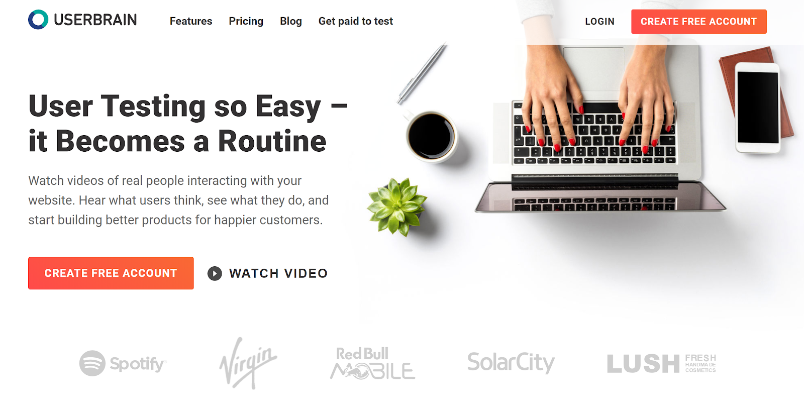
Userbrain is a widely-used, easy solution to monitor how users react to your website. On signing up, you get access to real-time videos of people interacting with your website. Additionally, Userbrain provides access to a big team of testers, which means you don’t need to recruit testers; neither you would need to manage and pay the users for participating in the test. 

2. Loop 11

User Testing: Loop 11

Loop11 offers usability testing for websites, wireframes and prototyping and accessibility. It aims to simplify user testing with a minimum requirement of technical knowledge. You don’t need to be a pro in HTML or CSS; however, a JavaScript solution is available for the pro developer minds. 

You can test on mobile devices, create custom themes and conduct multiple tests for all the elements. Moreover, users can get real-time reporting, look at heat maps, view clickstream analysis and watch session videos to analyze what users are doing. The best part is that Loop11 can be easily integrated with many prototyping tools, including Axure, JustInMind, and InVision.

3. Lookback

LookBack

Lookback is a simple UX recording software that can record a user’s computer or mobile device in-house or remotely. Interestingly, you can join the live testing sessions and communicate with the user while they’re exploring your design. This way, you can ask live questions or can even interview them to get first hand, real-time inputs. It is a unique feature and is absent from many user testing software. 

4. TryMyUI

TryMyUI

TryMyUI is a usability testing service that helps in discovering the ways to improve your website or mobile app by setting up your own custom test with specific tasks for users. It allows you to find out the correct user base through a wide range of demographics. There’s an option that allows you to watch the recording of the users while conducting the tests you’ve set, or you can use the TryMyUI Stream service. The service allows you to find the drawbacks in your design which results in a bad UX, using the Stream’s AI frustration finder. 

5. Crazy Egg 

User Testing: CrazyEgg

Using Crazy Egg is like monitoring your visitor interactions through x-ray glasses. It is a user testing heat map software that helps you understand what people are doing on your website and why visitors may not be converting into repeat customers. Heat maps identify the elements of your website, which are clicked on and the source of traffic. One of the highlights of Crazy Egg is the scroll map, which identifies how far visitors scroll down a page before they bounce off. It also offers the ability to monitor the numbers of clicks on each element of a page and perform A/B testing.

6. Hotjar

HotJar

Another popular user testing tool to analyze and get useful insight for your website is Hotjar. Just like Crazy Egg, Hotjar also uses heat maps to provide useful feedback. It allows you to monitor those parts of your interface that draw user attention and gets the majority of impressions and clicks. With Hotjar you can watch users’ recordings and people’s mouse trails to monitor exactly how they’re navigating on your website. The Conversion Funnels is another feature of Hotjar that lets you know at which point people are abandoning a purchase or leaving the sign-up process. Other hot features include form analysis and feedback polls.

7. Inspectlet

Inspectlet

Inspectlet closely monitors visitors’ activities on your website. It monitors what links they click on, users’ mouse movement, scrolling, and key-presses. In addition to recording user interaction on your website, it includes a heat map, which allows you to identify the most visited sections of your website. The heat map also includes eye-tracking, information on elements clicked, and how far visitors scroll down pages. The analytics tool highlights the pitfalls and trouble areas.

8. Reflector

Reflactor

Reflector is a screen mirroring app designed specifically for usability testing and it monitors how your app design works on mobile. This tool allows you to access your mobile or tablet screen through your PC wirelessly. Just like the other mentioned tools, Reflector allows you to watch how people use your app. It also includes recording capabilities so that you can review your testing sessions anytime later.

9. UserTesting

UserTesting

UserTesting is one of the best and simple ways to record and monitor users’ interactions on your website. With UserTesting, you can select your target audience and assign them tasks to perform on your website. The tests can be run on a desktop, tablet or mobile phone. UserTesting records real people sharing their thoughts and feedback while interacting with your website or app.

10. UserZoom

User Testing: UserZoom

UserZoom is an enterprise-level, adequately packaged user experience research and analytics platform. Besides capturing user interaction, it also provides robust analytics data. UserZoom allows you to test websites and prototypes, perform market research, create UX benchmarking and offer insightful reports with user actions, unique views, click information, heat maps and more.

Do you know UI and UX are connected? Read here to know more

Wrap up

These tools are perfect for getting started. Your choice of tool depends on your requirements. The best way is to use the free trial versions at the beginning to see how well each one suits your needs. Want to discuss more on user testing? Speak to our experts.

Categories
Brand & Identity Design UI Design UX Design Web Design

7 Tips for Designing Effortless User Interfaces

The fact that simplicity is the ultimate elegance is an eternal truth. The power of simplicity can elevate any design for web and mobile interfaces. Moreover, a simple design is highly human-centric and thus creates a delightful user experience. But, a lot of times designers misunderstand ‘simple’ and interpret it as empty or monofunctional. Instead, it means clear, intuitive and helpful. The website with simple user interfaces not only solves user’s problems but also reduces their efforts.

Websites and apps are generally defined in terms of their appearance, functionality, or content. They are rarely defined in terms of respect. Often neglected, respect for the user’s time and energy is one of the vital goals that designers should aim at. In this article, we throw light on some tips and techniques which could help you in designing effortless user interfaces that reduce the time and effort of users, thereby creating an unforgettable user experience.

1. Put the essential information in headers

Quick and easy navigation is vital for any website. Website headers play a critical role in grabbing a user’s attention and stabilizing connection with the website. Clear, eye-catching details should be included in headers. Being on the top of the web page, users first see the header, before scrolling the page.

The biggest problem is to decide on what is key information? This challenge grows larger in cases of websites with a vast amount of data, like big e-commerce websites, news platforms or multi-theme blogs. The header is the first thing people notice before scrolling the page during the first few seconds of their interaction with the website. Being a sign of invitation, the header should provide the key information that users could scan it in a few seconds.

2. Use visual content to encourage actions

Strong visuals, including photography and videos, are an easy way to grab user attention, and when paired with an actionable element, it can help generate an immediate click. Various visual elements can be used to define the brand style. Guiding the user from point A to point B using visuals is an excellent way of saving time. 

Let’s understand this with the example of an e-commerce website. A user sees a pair of sunglasses on Facebook and clicks on the image to get to the website. A time-saving design would show the shoes with a button to buy now. Use the same image for off-site and on-site promotions. A different picture of those same sunglasses might not register as quickly with the user as the same image. Images are processed faster than text and thus reduces the time for users.

3. Design clear, distinct, and bold CTAs

The call-to-action (CTA) must be instantly noticeable and unmissable by the users. CTA elements are the interactive controls that enable users to take the intended actions. Common types of such interactive elements in the layout are buttons, tabs, or links. In all kinds of user interfaces, CTA elements play a crucial role in usability and navigability. When all the path of interaction and transitions are built clearly for users, but CTA element is not well designed, users are bound to get confused and need additional effort to achieve their goals. 

Bright colors and elements that are oversized can help users see what they are supposed to do with the design immediately. Further, provide content within buttons that tells users exactly what to do and what will happen when they “click here.” A CTA should have plenty of contrast so that it doesn’t blend in with surrounding elements and draws attention to itself.

4. Use numbers, not words

According to a study conducted by Nielsen Norman on user behavior, the eye-tracking studies revealed that numbers often stop the wandering eye and attract fixations, even when they’re enclosed within a mass of words that users otherwise ignore. People subconsciously associate numbers with facts, stats, sizes and distance – something potentially useful for them. So they are hooked with the numbers included in copy while words representing numerals can be missed in the bulk of the text. 

5. Cut down user forms

It is very common to end up asking way too much information from the users while they fill any form on the website. One of the easiest ways to make the design quicker for users is to cut down on asking for information that you don’t need. Forms don’t have to ask for layers of information. Always aim to collect basic, valuable information.

Only ask essential information, such as name and email address, and follow up later for forms designed to generate leads. Use forms that validate data so users know if they’ve entered something wrong, and can quickly correct. Also, minimize the typing efforts and use buttons or checkboxes in forms where possible. Lastly, don’t ask for repetitive data.

6. Be consistent

Consistency is the key to simplicity and drastically reduces a user’s efforts and time taken to perform actions. A consistent design consists of repeated elements, actions, and interactions that work in the exact same way throughout the design. In simple words, it means that a button should always look like a button, have the same color and font, same hover state and work in the exact same way no matter where the button leads the user.

It would be best if you repeated this idea for any element in the design that gets used multiple times. Not just the design elements, but other things like headlines, body text, and image usage should also follow a consistent style. Consistency ensures that the user never has to guess or experiment to figure out how something works.

7. Talk to users in their language

The copy is an integral part of user design and contributes to reducing the overall efforts of a user. It plays a crucial role in communicating with the user. Not just the aesthetics but the style, structure, and vocabulary used in the copy should also correspond to the user’s expectation from a page. 

Usage of too formal or business-like style in an entertainment app for teenagers or vice versa won’t work. A website wherein the copy doesn’t follow business goals, as well as the habits and needs of a target audience, brings down the overall user experience. That kind of content inconsistency is confusing and moves the users away from the website or app. Want some more tips on how to design effortless user interfaces? Talk to our team now!!

Read more about user interfaces here