
The world is evolving faster than ever, and humans are becoming more and more dependent on technology. The Internet has changed the world, and today all of us depend on the internet for almost everything. Be it searching for a job, ordering a pizza, booking a dentist appointment, learning, and whatnot? The internet may be an ever-present resource for most people, but connectivity to the resource is a challenge for people living with disabilities. Although there are programs and devices, like screen readers, that make it possible for people with disabilities to access websites, web designing for accessibility is still a practice less followed.
According to data from 2012, almost one in five Americans live with a disability of some kind. Close to one billion people in the world, or 15 percent of the world’s population, lives with a disability. Out of all kinds of disabilities, conditions like visual impairment, autism, difficulty grasping objects, and deafness, just to name a few, can severely limit an individual’s ability to use a computer or smartphone without assistance and support.
There’s a myth that web designing for accessibility is difficult and expensive; it’s not true. Making your website more accessible doesn’t mean adding extra features or content; therefore there shouldn’t be an additional cost and effort.
Here are a few tips that will help you in web designing for accessibility in accordance with the AA level of the Web Content Accessibility Guidelines (WCAG 2.0), and will allow your website to work on the most commonly used assistive technologies — including screen readers, screen magnifiers, and speech recognition tools.
Maintain a Proper Contrast Ratio
Color contrast is an important aspect of web designing. But, it is often neglected as a web accessibility problem. People with low vision could find it difficult to read text from a background color if it has low contrast, whether on a plain background or text embedded within an image. A movie with subtitles is a good example. The text often appears without anticipating the background. It happens when white text appears in a brightly lit scene. It is unreadable, and the audience is left not knowing the dialogue.
It is critical to consider the sufficient contrast between text and background. According to the W3C, the contrast ratio between text and its background should be at least 4.5 to 1 (conformance level AA.) The ratios become more forgiving with larger and heavier fonts since they’re easier to read at lower contrast. If your type is at least 18 pt or 14 pt bold, the minimum contrast ratio drops to 3 to 1. You can use tools like Contrast Checker to see how your planned font and background colors work together.
Don’t Just Rely On Colors
When you’re communicating something important, showing an action, or prompting a response, don’t use color as the only visual cue. People with low visual acuity or color blindness will have a hard time understanding your content. Try to use an indicator other than colors such as text labels or patterns.
Elements with more complex information like charts and graphs can be especially hard to read when you only use color to distinguish the data. Use other visual aspects to communicate information like shape, labels, and size. A good trick is to print your graph in black and white and see if you can still understand everything in it.
Keep Your Navigation Predictable
The navigation system your website uses should be consistent across its pages. This includes the icons you use and the way visitors get to different pages within the site. if your homepage has a top header bar with drop-down menus, each of your other pages should have this arrangement, too. Similarly, the icons you use across your website need to be consistent.
You should also stay away from any kind of automatic navigation and auto-playing music and videos. not only are they annoying, but it’s also difficult for a user with a screen reader to determine how to pause them. And when a slideshow or carousel scrolls through content at a rapid rate, users can become confused and frustrated.
Support Keyboard-Only Navigation
Web designing for accessibility is not restricted to the elements on the screen. Keyboard accessibility is one of the most critical aspects of web accessibility. Especially for the ones who are blind and rely on screen readers. Also, for people who don’t have precise muscle control; they can’t grasp a mouse or keep their hand steady on a laptop’s touchpad. These users rely on their keyboards to navigate websites.
These users typically use the Tab key on the keyboard to navigate through interactive elements on a web page – links, buttons, or input fields. The order of the interactive elements is essential, and the navigation must be logical and intuitive. The tab order should follow the visual flow of the page – left to right, top to bottom.
Add Appropriate Alt-Tags To Images
Alt tags are brief descriptions of the images you use that get buried in the site’s HTML. Most users never see these descriptions, but site visitors using screen readers rely on them since they “hear” the content. These tools convert text to speech so that the person can hear the words on a site. Alternative text, or alt tags, can be presented in two ways – within the <alt> attribute of the image element, or within the context or surroundings of the image itself.
Alt tags aren’t just useful for your visually impaired audience; they’re for your benefit too. Well-crafted alt tags improve your site’s SEO, drawing more relevant site traffic and improving conversions.
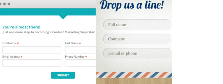
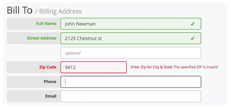
Use Labels Or Instructions With Form Fields And Inputs
Using placeholder text as labels are one of the biggest mistakes when designing a form. Placeholder text is usually gray and has low contrast, so it’s hard to read. People who use screen readers usually navigate through a form using the Tab key to jump through the form controls. The <label> elements are read for each form control. Any non-label text, as placeholder text, is usually skipped over.
Always help people understand what they should do and write in a form. It’s best if labels don’t go away, even when the person is filling an input. When designers hide descriptions or directions in their forms, they’re sacrificing usability to attain simplicity. That said, we don’t want you to clutter your design with unnecessary information, just make sure to provide essential cues.
Web designing for accessibility is a new and growing trend. While these tips will certainly help you in creating websites that are much more accessible for people with disabilities, there is still a lot of scope in terms of improving the user experience for this set of audience. As designers, we all need to grow and master the art of accessibility since technology is usable for all – regardless of their abilities. Looking to improve your web design? Talk to our experts.
Looking for 2020 Design Trends? Click Here to Know More