NYX Ditech

Categories
Design UI Design UX Design Web Design

Top Web Design Trends For 2020

As we bid goodbye to another rocking year, we are all set to embrace new web design trends in 2020. The last few years have been quite fascinating in terms of the progress of the way websites are designed. With an increased focus on UX and UI, designers have moved their focus on improving the user experience from merely designing visually appealing designs. So what does 2020 hold for web designers? Let’s checkout the latest web design trends that will rule the charts in 2020.

1. Impressive animations

A lot of people believe that complex animation is heavily dependent on the hardware and that it is useless to produce it for the mass, using slow processors. However, there are many competent animation products that can work very well on slow hardware. Companies nowadays are producing plugins and dev tools for interactive animation, suitable for the mass systems. They optimize the process of implementing interactive projects to work on nearly any device – efficiently and as smooth as you can think. Motions are always better storytellers than words. It’s all about putting a substance into the animation.

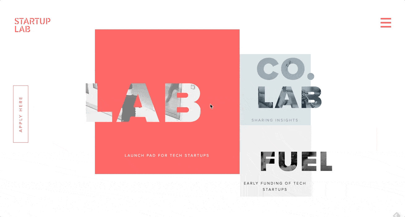
2. Asymmetrical layouts and split screens

Looking at the present scenario, we predict that asymmetry is bound to make a strong comeback in 2020. This is one such web design trends that we feel is a safe bet. The block layout has been in the trend for ages but still holds its charm. It portrays an easily digestible flow of information, especially when the concepts have defined boundaries. It helps in adding to the completeness of the design making the design structure less complex. Blocks mean symmetry. However, there’s an asymmetrical trend that is always there but never makes it to the mainstream. Especially with today’s wide desktop screens.

Split-screen was originally used to display two different sets of information on one single screen. However, that has changed and now split screens are simply used to display any sort of information.

3. Low-key gradients

Technology is moving towards automation at a rapid pace. AI delegation, less is more and other things are slowly creeping in. The visual elements attributed to that kind of design is making its way into what is still a heavily-human job. Subtlety in colors, along with simplification, minimization and reduction is gaining popularity. The idea that something is smart and automated rings many bells. The blue and purple gradients were very popular in 2018, and even in 2019, the softer versions of blue and purple were amongst popular web design trends. We foresight the continuation of low-key gradients in 2020 and the years to come.

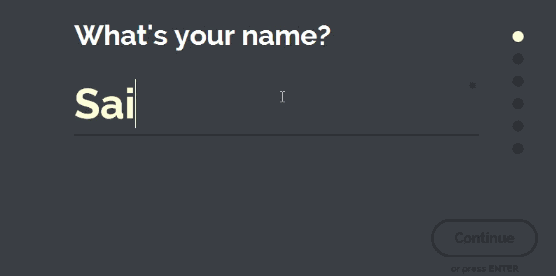
4. Writing for humans

The responsibilities of writers have increased over the last three to four years with an increased focus on writing for a better user experience UX writing is one such web design trends that have elevated the standard of so many designs in terms of delivering delightful user experience. Text is no longer merely an aid to the design, it is a vital part of the design. Human writing allows the reader to judge, choose, and relate to the product.

5. Designing – Developing

A lot of times designers are made to deliver projects within a very strict timeline. In such conditions designers do a lot of jobs which are beyond their usual scope, to deliver something which is almost impossible to implement within a specific timeline or budget, or team. In the process, some designers learn to code. They know what they are doing to an extent, but don’t have a mastery over it, or in simple words, they aren’t at par to the actual developers. This creates a difference of opinion.

This difference of opinions has to end in 2020. With tools like Webflow, the gap between designing and developing should narrow down. Basically, it’s a visual tool that allows you to design whatever you want as long as it can be done in HTML and CSS. Every pixel move is a code change, which makes this approach a perfect way for designers to start coding.

When everything is gearing towards interaction-based design, it gets harder to explain how the interaction should work and look. The importance and the need for a visual tool like that are hard to overstate.

6. Increasing use of white space

When the web pages are stuffed with elements, it becomes very difficult for any of them to grab attention. They all fight for attention, but none of them is successful in achieving it. On the other hand, when there is too much attention on one element, it gets all the attention and rest everything gets overshadowed. Depending on the message the UI is delivering, it’s important to provide some breathing space to elements to let that message sink.

There are micro and macro empty spaces, text and paragraph spaces, they can be active and passive, and all of them scale. It’s much more sensible if we process and consume condensed information for long and with less comprehension. Surrounding the core idea with an ample amount of empty space is a great way to make the idea stand out. That said, ensure that the idea which you are placing under the spotlight is worth it.

Read more about the importance of white spacings here

7. Varying user experience

Your users have different personas and online behaviors. Since ages, we identify and cater to a specific segment of the audience, which we consider to be our average users, in an average context, with an average engagement level. But we must understand that there is a big possibility of changing the experience for an infinite number of people based on their behavior on sight. Modern analytics allows us to determine who you are dealing with. It can be a casually browsing wanderer, a not-so-sure lead, or a potential buyer. Depending on the amount of time they spend on a screen or the scroll speed, a website behaves differently.

It will take an aggressive stance on user research and might not be an option for service design but brand designers will have the experiences tailored. That means understanding the scene, the mood, and the repercussions of the actions a user is taking.
Some trends are low-key and prevail for a small time. On the other hand, some trends are in for the very long term. Identifying future trends help in formulating a long term strategy. It also ensures that you remain up-to-date and don’t fade out. Want to discuss more about emerging web design trends? Talk to our experts now!

Categories
Design UI Design Web Design

All You Need To Know About Website Header Designs

The landing page of your website is where the users first interact with you. It is your chance to create a solid first impression by creating impressive Website Header Designs. Undoubtedly, some areas of the webpage or mobile screen are particularly important and effective as compared to others; the header is one such area. 

In this article, we will discuss the functions of a header and different types of website header designs. 

What is a website header?

The header is the top part of the webpage. It is the area that users see for the first seconds of their introduction to the website before they scroll down or jump onto a particular section. The header should provide the core information about your business and offerings so that users could scan it in seconds. Headers are called “Site Menus” and are positioned as a key element of navigation in the website layout.

What can a website header design include?

Headers can include many layout elements  – 

  • Brand identity elements like logo, brand name, slogan, mascot, etc.
  • Search box
  • Core categories and sections of the website
  • Copy block around the theme of the product
  • Contact information
  • Language selector, in case of multi-lingual interface
  • links to the most important social networks

And many more.

That said, It’s not necessary to include all the above-mentioned elements in one web page header. You don’t want to stuff and overload your header with too much information. Too many elements and objects distract the user’s attention. Strategically pick the important elements, list them out, and choose the focused ones.

Why is the Website Header important?

There are several reasons why the header is a critical element of any website. Firstly, let’s consider the eye-scanning models which show how users interact with a webpage in the first few seconds of their interaction. When people visit the website, especially for the first time, they do not explore everything on the page. They scan it to look for attention-catching elements that convince them to spend some time on the website. 

The Nielsen Norman Group has researched extensively on determining the most common patterns in which users generally scan a webpage. Experiments on user eye-tracking showed that there are certain models along which visitors usually scan the website. Out of these, the most common patterns were the Z-Pattern, Zig-Zag pattern and F-Pattern. 

The similarity in all the three patterns is that users start the scanning process at the top horizontal area of the webpage. Displaying the core information and branding on the header helps readers quickly scan the key data. It also allows retaining users if the information is displayed properly.

Readability And Visual Hierarchy

The aspect of readability plays a huge role in the header. Therefore, a lot of thinking must go into deciding the typefaces for headers and the background color. The user must be able to scan and notice this basic information as fast as possible without any stress or distractions.

Also, remember that there are various ways for a header to transform while scrolling the page down. Some websites use a fixed header, which always stays and shows up at any point of interaction with the website; others hide the header during the process of scrolling. Some websites do not fully hide or fix the header but shrink it in size in the process of scrolling. All the secondary information is hidden and only the core elements of the layout are left active at all times.

Types of Website Headers

Hamburger Menu

Hamburger menus have gained a lot of popularity over the last few years. It is a great design solution that hides the basic links of data categories behind the hamburger button. The horizontal lines of the icon look like a typical hamburger, and that’s why the name.

This button is mostly placed in the header and is a typical element of user interaction. Today, most of the users are familiar with the Hamburger menu and expect the core categories of data under it. So, there’s no need for additional explanations and prompts. Hamburger menu leaves a lot of free space to place other important layout elements, and also provides a minimalistic design feel. This design technique benefits the responsive and adaptive design as it hides the navigation elements so that the interface looks the same on different devices.

Although hamburger menus are widely used as header elements, they are still a debatable issue of modern web and app design. A lot of design experts argue that a hamburger menu can be confusing for people who do not use websites regularly. So the decision of using a hamburger menu should be based on extensive research on users and target audience’s needs.

Fixed Header

Fixed headers is another header design trend that boosts usability if applied effectively. There are a lot of websites nowadays that use a fixed header. Take an example of Facebook. When you’ve logged into Facebook and scroll down you still see the header with the search bar and some other core functions at the top. 

The benefit of a fixed header is that if the user needs to use a function they can easily jump to the header without the need to scroll up, as would be required for a non-fixed header. However, if there is more content then users might lose some space because the header occupies some permanent screen real-estate. It enables to provide users with navigation area available at any point of interactions, which can be helpful in terms of content-heavy pages with long scrolling.

These tips might be helpful for you for designing headers

Double menu

The double menu in the header can present two layers of navigation. We have shown the example of such a trick in one of the recent case studies for a bakery website.

The bottom line is that the header is a vital zone of interaction for any website and needs careful design consideration. Each website header designs requires its own approach which fits for a specific target audience. User research is the key, based on which the decision can be made, whether to follow the traditional forms of header design or they need a new perspective. Want to know more? Ask our design experts.

Categories
Web Design

Elevate Your Web Design With These Popular Forms of Animations

There were times when a webpage was just about text, a few hyperlinks, some images and perhaps a form. But over the course of time websites have evolved drastically. That’s primarily because the users’ expectation from web pages has evolved a lot. They have become overly demanding and want to have an interactive experience every single time they visit a webpage. The process of web designing has kept pace with this increasing demand by taking the visual storytelling process to a whole new level and in the process, animations have become an integral part of the whole design philosophy. Today’s animations are smoother, sophisticated, and more mobile-friendly than ever owing to the advanced ways of CSS3, HTML5, SVG elements and lightweight JavaScript.

Benefits Of Using Animations In A Web Design

Of all the visual elements present on a webpage, animations particularly stand out and helps in drawing attention onto a particular webpage element. It guides visitors from one step to another during the journey through the website. Also, animations are very effective in storytelling and in keeping the visitors engaged on a webpage. It adds to the overall user experience of visitors on a webpage or website.

Types Of Animations

There are different kinds of animations ranging from simple hover states to large ones which are almost like a video. Simple animations are more catchy and attract the user’s attention to important web page elements. That said, larger animations, when used sparingly and on the right project, can offer an incredibly interactive experience to the users.

type of animation

There are many types of animations like hover effects, notifications, progression loads, form validation, parallax scrolling, typography animations, content fading, screen transitions, walk-throughs, hidden navigation menus, scrolling galleries etc. In this article, we have listed four most popular types of animations that can add a visual appeal to your website.

1. Hover Effects & Tool Tips

One of the traits of a good website interaction is that it must provide feedback to users. Simple CSS animations, like the ones that are found on animate.css, provide a subtle feedback on any type of hover action, including image or button hovers. Moreover, hover actions and tool tips add to the user experience with navigation and additional information. One point that the designers must remember is that these animations won’t work on mobile or touchscreen devices, therefore all the valuable information must be exhibited in other ways.

Check out this 3D hover effect:

3Dhover

2. SVG Animations

Scalable Vector Graphics (SVGs), are dynamic vector elements that are scalable, artwork-based and responsive. These are smaller in size compared to images and rasterized graphics. A lot of animated SVGs can be produced using only the CSS3 and no JavaScript. Be it a simple vector icon or an advanced illustration, everything can be animated and scaled using SVGs.

SVG-Animation

3. Parallax

Parallax animations is a great way of visual storytelling and is a very effective tool to engage users. They create depth, add layers to the design, and provide a more dynamic and interactive web experience. Take a look at the page and navigation transitions of startuplab.no.

Parallax-Animation
Instead of loading a typical static new page it uses a subtle page transition effect to reveal the new page. A few of the elements are collapsed and a few are expanded, unlike typical pages that clear the screen to reload.

4. Interactive Forms

The goal of a web form is not just to encourage visitors to fill it but further engage with your brand. Interactive forms increase the possibility that users will start engaging with your brand and continue the relationship. One of the trending form designs is a single-field form interface. Instead of showing all the fields that a user has to interact with, this minimal form interface only shows one text input at a time.

Interactive Forms
It’s neat and there’s no clutter or distractions. Moreover, a few subtle visual cues like the tiny progress bar and a number that indicates the number of input fields to be completed add to the user experience.

It’s very important to keep users engaged with the brand and provide them a delightful user experience. Animations are a good resource and if used properly can elevate any web design to a next level. Talk to our design experts and discuss how you can use animations in your web design.