It is a known fact that today’s business is conducted online. From shopping to marketing, to communicating with providers, people depend on the Internet to help them perform everyday tasks. Without a website, businesses, blogs, and brands can’t be successful. That’s the reason why everyone is on the internet today. With millions of websites, it becomes extremely challenging to stand out from the crowd. A website usually has 4-5 secs to create an impression on visitors; that’s very little time. Therefore, website designers must ensure that they create a website design that ensures a delightful, user-friendly experience.
We often talk about the latest design trends, user experience enhancement, interface enhancement, and a lot of other things. The idea is always to keep improving the website experience by offering the best. However, a lot of times, we tend to forget some basic actions which can elevate the website design and experience to a whole new level. Here are a few tips.
Use White Space
First things first – Whitespace doesn’t mean a lot of white color, its the way designers term the empty space or negative space. Research and studies suggest that the use of white space in the left and right margins, and in between paragraphs, increases reader comprehension by almost 20 percent. Adding white space means more user interaction, the page looks better, and you can highlight your CTAs with more ease if you have enough white space to go around. It balances the visual elements by creating a visual hierarchy. Whitespace increases content legibility and acts as a separator.
Optimize The Page Speed
Website speed has long been discussed in the world of marketing, and it’s one of the main reasons why a lot of visitors bounce off from certain websites. People are impatient on the internet. They don’t like to wait and expect instant responses to their queries. If your website doesn’t load within a few seconds, to be honest, 2-3 seconds at the max, the visitors will most likely bounce off looking for other options.
You can check your page load speed through a Google-free service, where you can get information on your page speed. Google will also offer you some suggestions for improving your page load time on Mobile and Desktop.
To improve your page speed, start by compressing all your images before loading them onto your website. The image file size is one of the leading causes of a slow page speed — using websites like compressor.io can help you dramatically speed up each webpage you own. There are several ways to optimize page speed.
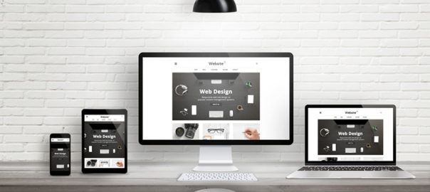
Create a Responsive Website Design
With the revolutionary advancement of mobile and other devices, your website is most likely to be accessed from devices other than PCs and laptops. It’s critical that your website is mobile-friendly and easy to navigate no matter what type of device your audience uses to access it.
Google started penalizing sites that aren’t optimized for mobile devices from 2015, making the need for responsiveness even more crucial. This is probably the most valuable way to improve your website’s usability. A responsive design will do wonders for your website in terms of SEO and will help you position yourself higher in SERPs. So, create a mobile version of your website, use mobile plugins, and convert your website into a Responsive Web Design (RWD).
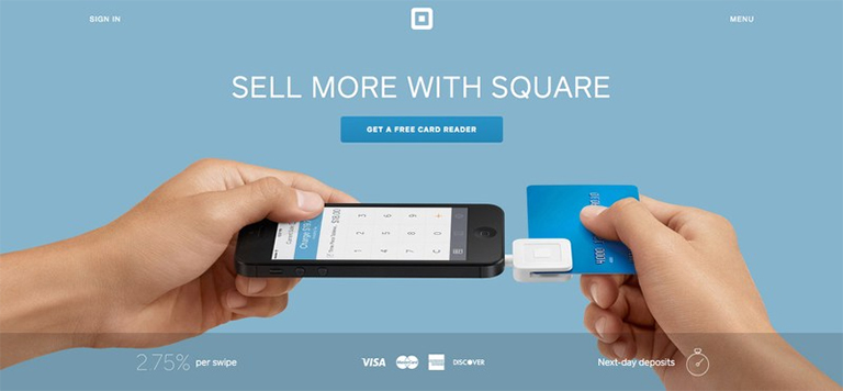
Make a Clear Call To Action
Some interesting facts – SAP found that orange CTA buttons boost conversion rates by 32.5%, while Performable found that red CTA buttons boost rates by a whole 21%. In creating buttons for your website you should think about color and the psychology of color. Different colors evoke different messages. Think about the message that you want to evoke for a user (trust, experience, intelligence) and choose your colors wisely.
A second thing to consider is the actual words you use for your buttons. The words should include a verb or an action word that excites the user to do something. Use actionable words in them such as discover, start, learn, etc. Calls to actions (CTAs), clearly marked with an action word enable your website users to more easily navigate your site and get exactly what they want in the location they expect to find it.
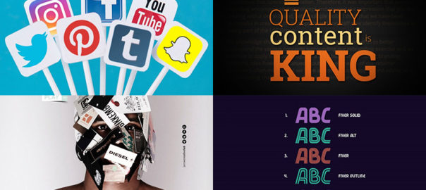
Utilize Social Media To The Fullest
22 percent of the world’s population is on Facebook, Instagram has 800 million active monthly users, Linkedin has more than 540 million user profiles, and Twitter has 100 million daily active users. These figures are staggering, which is why it’s important for your website to offer social buttons to your visitors. There’s a chance that they will like what they see, share their thoughts on their profiles, and boost your presence even further.
Any website improvement ideas should involve taking advantage of social sharing and social following. Social sharing options are a fantastic way to improve website design. Use social media icons of different social media sites to allow users to share your content. The idea is to get guests to share your content when they like what they read. Sharing content puts it out for everyone else to see without you having to do any work. This will allow your website to become more popular and gain site visitors that would have never known about you otherwise.
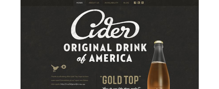
Use Eye-Catching Images In Website Design
People across the Internet are getting smarter and faster at judging company websites before deciding if they want to browse the site further. When they first visit your site, they can easily pick out a generic stock photo they’ve already seen elsewhere or that resembles the non-personal style of stock photography. Using stock photography can decrease trust and also stand out as generic and non-unique.
With an audience that only has an attention span of 5-6 seconds, you need to create a lasting first impression that easily gets the main points across. This should be done with short, powerful sections of content and applicable photographs/icons that are sectioned off by clear and concise headers.
Website design is the foundation of user experience and needs constant attention and improvement. Are you looking to revamp your website? Or, need help in deloping your website from scratch? Talk to our experts now!


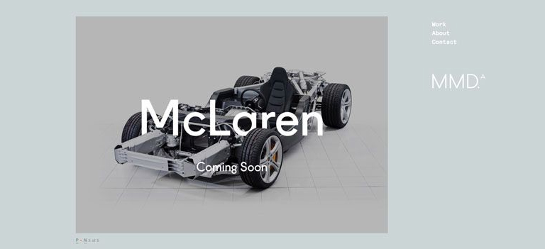 source:Mclaren
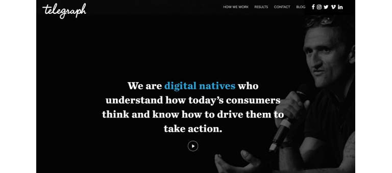 source:Telegraph
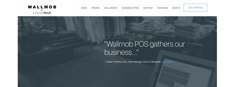 source:Wallmob
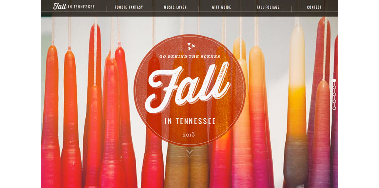
 source: square