NYX Ditech

Categories
Brand & Identity Design UI Design Web Design

5 reasons To Not Use Stock Images On Your Websites

At the time of building a website, it is important to only select components that will positively impact your brand and support the objectives of the website. It especially holds true when it comes to choosing the right images for the website. It is important to understand and acknowledge the worth of custom photography and its positive impact on the brand. Some people might argue that custom photography is very costly as compared to stock images, but in reality, the initial higher cost is totally worth the investment in the long run. Here are some key reasons why custom photography is preferable over using stock images.

1. Clash of visions

No matter how professional the stock photo, it will always reflect someone else’s vision. The interpretation of the idea, concept, and emotion that you wish to convey will always differ from others. A picture is worth a 1000 words, but those words need to be yours. With custom photography, you have control over what thoughts and emotions your website conveys. 

From a marketing perspective,  that provides a great advantage. It is important to connect with prospective buyers on an emotional level. Whether it is a personal purchase decision or one for business, emotions and feelings always have an impact on decisions. Emotions drive people to take decisions, and that’s why you need to convey your emotions and vision through your pictures. If you use stock photos, your vision may be misinterpreted, and you may never strike where you wish to. 

2. It weakens your brand’s authenticity

An authentic brand is one that presents itself with honesty and transparency. When visitors interact with your brand, through your website, they must feel as if they are interacting with a human. Authentic brands are relatable, trustworthy, and thus successful. According to a study, 83 percent of consumers surveyed said that trust drives their loyalty to a brand.

Using stock photography is easy, but putting up actual photos of your business or employees will strengthen your connection with your visitors. Opting for meaningless stock photos showcase a very gloomy and dicy brand image. It runs you into a risk of losing out on customers. Instead of stock images, make choices for your visual content that will cultivate a deeper relationship with your clients and customers. Professional, well-lit photos of your real employees doing their real jobs will carry more value and build more trust than yet another stock photo.

3. Short-term cost vs long-term cost

It’s an obvious fact that hiring a professional photographer will incur larger initial costs than using stock photos. Plus, there are additional expenses involved like hiring professionals, arranging the equipment, or outsourcing the entire project to shoot. But, stock images also come with additional costs other than the licensing fee, which by the way are also very high. 

The recurring loyalty charges can be quite high depending on the quality of the image and how often you want to use it. Additionally, there’s also the time costs – it’s a tiresome job to look through hundreds and thousands of photos to find the “perfect photos” for your website. 

When you use custom photography, you create your personal library of images that you own. These images can be used in the future without any cost being involved. With stock photography, there are often limitations on how you can use the image and for how long.

4. Similar photos can create confusion

Imagine the same lady posing as a customer support executive on hundreds of websites, under the contact us or support section. Even if not on hundreds of websites, there’s always a possibility that your competitor and you like the same stock photo. Or you both choose the same stock art to create your logos. The customers may get confused and that’s not good for your customers. 

The confusion can make people refer to a competitor’s brand to their friends and families. This can blindly divert your business. Losing customers is bad news.  But, it’s especially painful to lose customers to such an easily avoided misstep. That’s not all, what if your competitor does something unethical and his or her reputation takes a hit, your reputation might be impacted as well.

That’s why it’s a good practice to use customized photos for artwork. A unique logo and authentic photos of your products, services, and employees help you stand out from the competition.

5. Copyright issues

We have saved the most dangerous con for the last. Lawsuits are tricky and can get you in some serious trouble. And, they are costly too. So, if your goal is to save money by using stock art, be aware of the possible legal dangers. Stock art can end up costing way more than real images, once you fall into a legal trap.

You can’t trademark most images that include stock art. Attempting to do so could get you in trouble. And, stock art licenses include more potential pitfalls than just trademark issues. You open yourself up to litigation if you violate the specific terms of use for the stock art you purchase. Worse than that, copyright law is no-fault.

Read More About Web Designing With Type On Image

Therefore, instead of stock art, hire a professional photographer to take original pictures for your business. And, hire professional graphic designers to create a logo and visual assets for your brand. If that sounds way too much for you, hire a professional company to do everything for you. Have a word with our experts and learn more.

Categories
Design Mobile Apps UX

5 Key Uses of Animation in Mobile App UI

The advancement of technology has led to several new improvements and trends in web and mobile designing. Animation was once a visual luxury but has now become a functional requirement. Users expect to face animations at some stage while browsing a website or an app. Animation infuses life into interfaces and makes them more rousing and visually appealing.  The proper use of animations accentuates the responsiveness of an app. In this article, we will discuss five critical applications of animation within a mobile app UI design.

Animation infuses life into interfaces and makes them more rousing and visually appealing.  The proper use of animations accentuates the responsiveness of an app. In this article, we will discuss five critical applications of animation within a mobile UI design.

1. System Status

There are plenty of tasks and processes like downloading and uploading data, calculations etc. that continuously run in the backdrop while the app is running. While these processes run in the background, users often feel that the app is frozen, as there is no activity at the front end. You must always indicate the status of all the ongoing processes through visual signs of progress. It provides a sense of control over the app to the users.

Page loading time is unavoidable, however, it is a very stressful time for users. Using animations can’t shorten the loading time, but can provide comfort to the users while they wait. Creative progress indicators can reduce a user’s perception of time. If users can watch something visually pleasing, while they wait, they are more likely to divert their mind on the animation, rather than the wait time.

Similarly, “pull down to refresh” is also a well-known system status indicator that reloads the page. Pull-to-refresh animations should match the design outline of the app. Movement and visually pleasing items naturally draw attention and create interest. Animating your notifications is a pleasant way to notify users about things, without hampering their experience.

2. Visual Feedback in Mobile App UI

Visual feedback is critically important for any user interface. It helps users to know and understand their current context in the system at any given time. User interface elements like buttons and controls should appear to be tangible, as they interact with them in the real world.

But, bridging the gap between the physical world and on the web is challenging. Visual and motion cues must immediately recognize the input and animate in ways that appear to be direct guidance. Animations enhance various points of interaction and reinforce the actions taken by a user.

3. Structuring Information

Animation allows proper structuring of information across the app. An animation draws users and shows what content to look for and where can it be found. The menu bar is one of the most common places where this can be implemented. 

There are many elements on the main screen of the app. When we activate one of them, the app should change the picture and display a whole new app section based on the selection. Animation helps users to know that it is the same element but with different form and scale.

4. Navigation & Transitions in Mobile App UI

Usually, users take the help of menu bar to navigate inside an app. A lot of apps have a complicated structure to show the list of app sections or features, which is confusing for users. Animation works as a visual navigator. 

A user should notice a changing picture on the screen while selecting or changing app sections. This lets them know that they are navigating to a different section or using a feature. Animation is a great way to transport users reasonably between navigational contexts. 

Read more about Mobile App Navigation

5. In-app Guide

Some apps have a more complex structure compared to others. If you don’t want to scare-off or irritate your app subscribers, you should clearly explain to them how an app works at the very beginning. Animation comes in handy here. A user gets brief instructions about the app in very less time via animations. Usually, an animated guide opens up when the app runs. However, users should have access to the guide whenever they need.

Animations are really pretty, but as mentioned earlier there role is no longer confined to adding beauty to an app. So make animations with purpose and use it in the app UI design to simplify user interaction with the user interface.

Let us know if you are looking for designing your new or existing mobile app. Our UI and UX team will be happy to assist. Contact Us today

Categories
Blog Brand & Identity SEO Web Design

5 Annoying Things To Avoid In A Web Design

Competition over the Web Design internet is fierce. Today, there are a large number of individuals and businesses who spend money and time on digital marketing and SEO to rank higher on Google searches. It has become tough to differentiate from rivals and get users to visit a particular website over others.

Since acquiring new visitors is very difficult, providing a delightful user experience gains importance and is pivotal to retain each hard-earned customer. If a website offers an unpleasant experience to its users, forget about winning repeat visits, they might never come back on the website. Here are some of the most common things in a web design which leaves users in frustration and thus must always be avoided.

Slow Website Speed

With the boom in technology, everything has become super quick. Everyone has a smartphone these days, and access to the internet is just a tap away. Even half-baked questions or half-remembered trivia get instant answers from Google. People can contact each other, sitting halfway across the globe in a matter of seconds. Today, the speed and responsiveness of our hyper-connected world have spoiled us all. Therefore, when we click on a search result, and the page keeps loading even for only three to four seconds, it is equivalent to eternity for users.

Remember, you’re not the only one providing an answer to a query or serving what a user is looking for. If your page doesn’t load within a blink of an eye, they will click on other best available options. Get rid of all the unwanted elements which are dragging down the speed of your website. Ensuring a good page load speed is critical to create new visitors and retain them.

Too Many Popups

It’s a shared experience, wherein we click on a link in our Google search results, and we are directed to a webpage which is full of popups. So much as so that we are not even able to read the actual content available on the page. Moreover, they keep popping up, even after you close them.

Combined with a browser alert that “this website would like to send you notifications”, the overall effect is one of being barraged with irrelevant information. It ultimately kills the actual content you were trying to reach.

Some advocate the fact that popups significantly improve conversion rate, while others get put-off by their potential of pestering the users. No matter which side we stand, one thing is for sure that popups are badly planned, throwing information and content which is not relevant for users. Therefore it is better to stay away from them.

Not Mobile-friendly

According to Statistic, 52.2 percent of internet traffic was generated through mobile phones in 2018. That’s a considerable ratio, and thus it’s pivotal that the website is responsive and mobile friendly. We are in 2019, yet we come across many mobile sites where items aren’t aligned properly, overlapping, strangely formatted or subject to some additional oversight from the designer. It creates a negative impression on users. They might feel that your company doesn’t take the time to go over little details.

Coupled with the recent change in Google’s algorithm to prioritize mobile-first indexing, there is now no reason at all to ignore the mobile experience of your website. A low-quality mobile site can negatively affect your SEO performance as well as the experience of your users, so it’s essential to get it right.

Animation Overdose

We like animations. Yes, they do look good and enhance the aesthetic value of a website. A few smooth transitions, transforms, appearances, and well-deployed animation can infuse vital life into an otherwise static and dry layout.

However, animation should be used sparingly, as and when required. Overdoing it can distract the audience. The key role of animations is to draw user attention to key content and call-to-action buttons. Users should not feel confused to read the actual text.

Animated introductory screens, too, are great attention-grabbers when users first reach on to your website, but avoid making them sit through the same animation every time they want to return to the homepage. Their beautiful presentation shouldn’t dictate the function of website elements.

Users shouldn’t be waiting for an element to appear or to become interactive. Using a lot of moving parts or content that flashes can pose problems for users. Some users may have an attention deficit disorder, making it very difficult for them to concentrate on the content.

Video Autoplay

Videos are an essential aspect of your online marketing efforts. They are a good source of explaining your products, brand message and other aspects, better than text can. Designers are often tempted to put the video on autoplay when they place them on the website. There are ways to do it tastefully, but it’s so often misused and creates a negative user experience.

Many sites place a video next to the body text. Usually this is entirely irrelevant to the content of the page. Even if you close it before navigating to another page, it quickly reappears. That’s really annoying.

Even worse, many sites preface these videos with automated advertisements which, given that the videos themselves are generally advertisements in one form or another. Some web users also hate auto-play as it can ruin their user experience and would rather prefer reading the information on the page without a distraction. It is more polite and effective to let the video be turned off until the audience chooses to play it.

To wrap up

Everything which we have mentioned above is basically issues of a bad UX design. It is important to consider every element and its effect on the overall user experience. If something hinders the user in finding what they’re looking for or detract them from the actual content of the page, it should be avoided. Speak to our design experts to know more about it.

Categories
Web Design

Elevate Your Web Design With These Popular Forms of Animations

There were times when a webpage was just about text, a few hyperlinks, some images and perhaps a form. But over the course of time websites have evolved drastically. That’s primarily because the users’ expectation from web pages has evolved a lot. They have become overly demanding and want to have an interactive experience every single time they visit a webpage. The process of web designing has kept pace with this increasing demand by taking the visual storytelling process to a whole new level and in the process, animations have become an integral part of the whole design philosophy. Today’s animations are smoother, sophisticated, and more mobile-friendly than ever owing to the advanced ways of CSS3, HTML5, SVG elements and lightweight JavaScript.

Benefits Of Using Animations In A Web Design

Of all the visual elements present on a webpage, animations particularly stand out and helps in drawing attention onto a particular webpage element. It guides visitors from one step to another during the journey through the website. Also, animations are very effective in storytelling and in keeping the visitors engaged on a webpage. It adds to the overall user experience of visitors on a webpage or website.

Types Of Animations

There are different kinds of animations ranging from simple hover states to large ones which are almost like a video. Simple animations are more catchy and attract the user’s attention to important web page elements. That said, larger animations, when used sparingly and on the right project, can offer an incredibly interactive experience to the users.

type of animation

There are many types of animations like hover effects, notifications, progression loads, form validation, parallax scrolling, typography animations, content fading, screen transitions, walk-throughs, hidden navigation menus, scrolling galleries etc. In this article, we have listed four most popular types of animations that can add a visual appeal to your website.

1. Hover Effects & Tool Tips

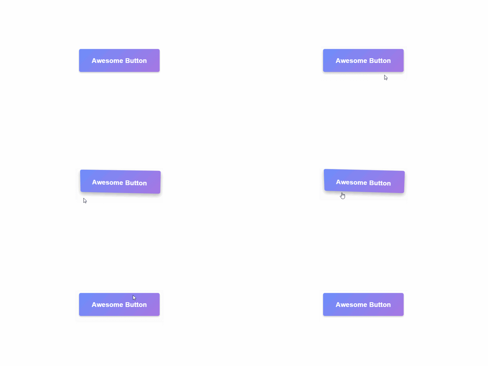
One of the traits of a good website interaction is that it must provide feedback to users. Simple CSS animations, like the ones that are found on animate.css, provide a subtle feedback on any type of hover action, including image or button hovers. Moreover, hover actions and tool tips add to the user experience with navigation and additional information. One point that the designers must remember is that these animations won’t work on mobile or touchscreen devices, therefore all the valuable information must be exhibited in other ways.

Check out this 3D hover effect:

3Dhover

2. SVG Animations

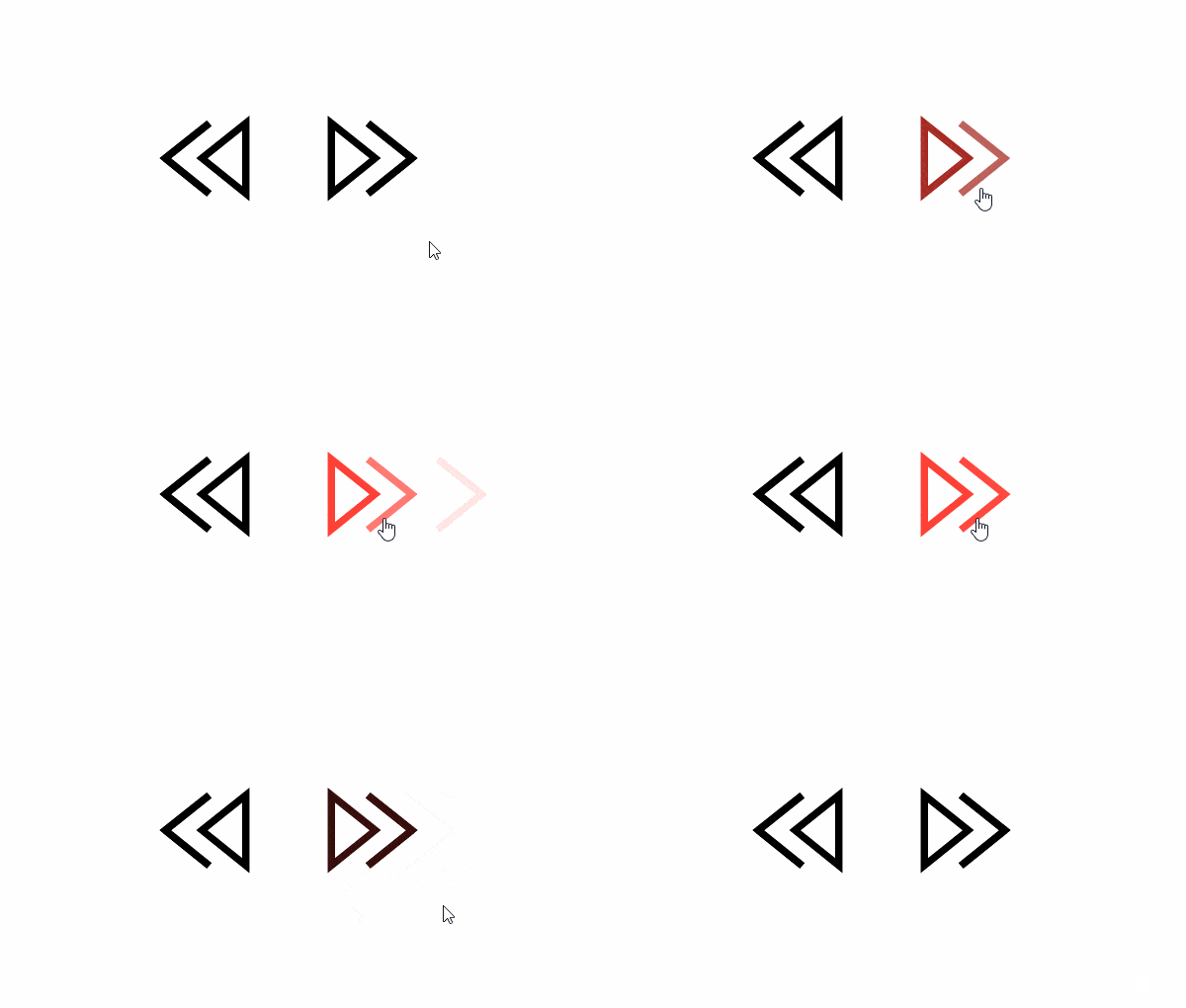
Scalable Vector Graphics (SVGs), are dynamic vector elements that are scalable, artwork-based and responsive. These are smaller in size compared to images and rasterized graphics. A lot of animated SVGs can be produced using only the CSS3 and no JavaScript. Be it a simple vector icon or an advanced illustration, everything can be animated and scaled using SVGs.

SVG-Animation

3. Parallax

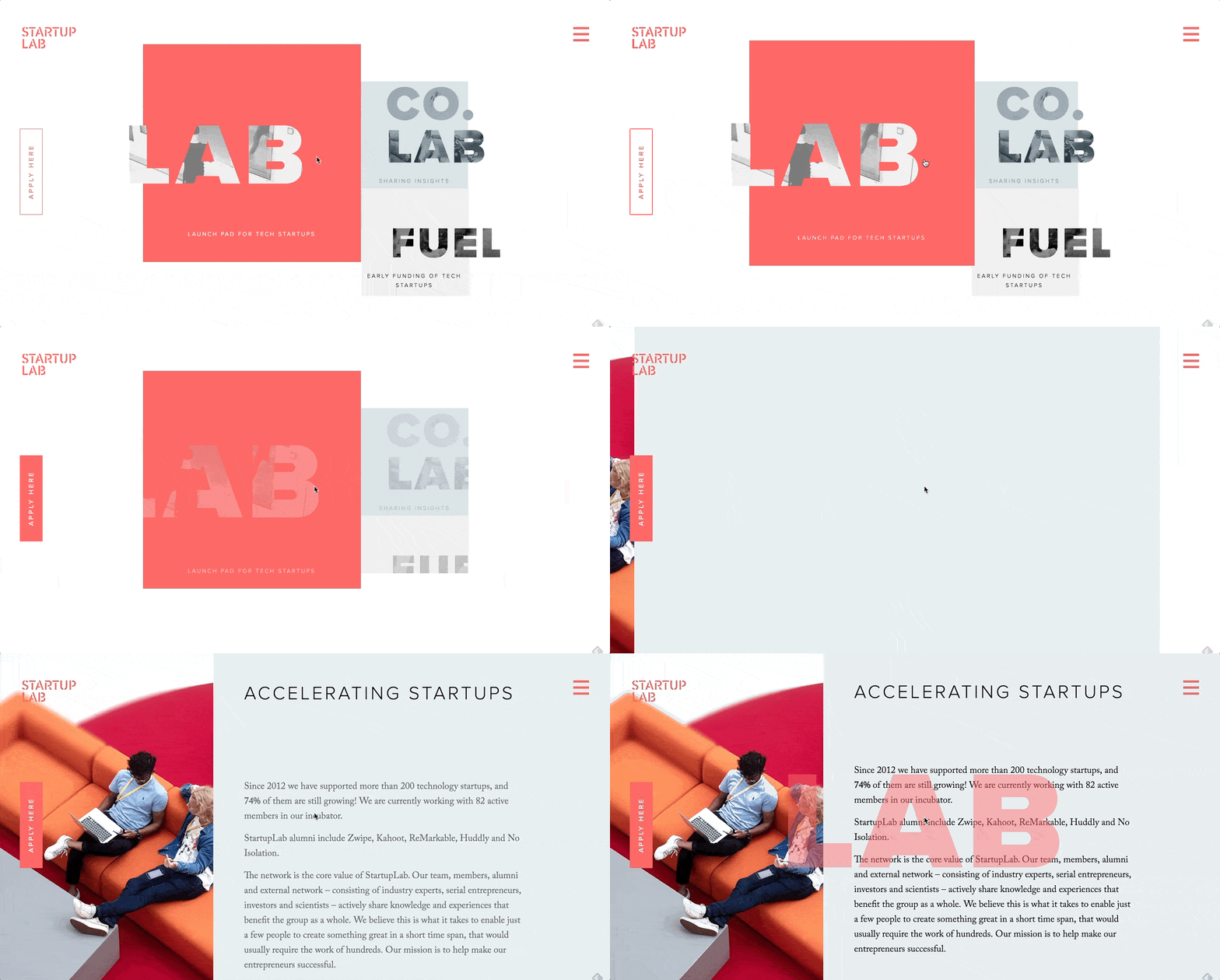
Parallax animations is a great way of visual storytelling and is a very effective tool to engage users. They create depth, add layers to the design, and provide a more dynamic and interactive web experience. Take a look at the page and navigation transitions of startuplab.no.

Parallax-Animation
Instead of loading a typical static new page it uses a subtle page transition effect to reveal the new page. A few of the elements are collapsed and a few are expanded, unlike typical pages that clear the screen to reload.

4. Interactive Forms

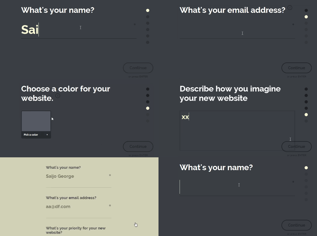
The goal of a web form is not just to encourage visitors to fill it but further engage with your brand. Interactive forms increase the possibility that users will start engaging with your brand and continue the relationship. One of the trending form designs is a single-field form interface. Instead of showing all the fields that a user has to interact with, this minimal form interface only shows one text input at a time.

Interactive Forms
It’s neat and there’s no clutter or distractions. Moreover, a few subtle visual cues like the tiny progress bar and a number that indicates the number of input fields to be completed add to the user experience.

It’s very important to keep users engaged with the brand and provide them a delightful user experience. Animations are a good resource and if used properly can elevate any web design to a next level. Talk to our design experts and discuss how you can use animations in your web design.