NYX Ditech

Categories
Web Design

8 Golden Rules Of Visual Hierarchy

It’s a known fact that visuals create maximum impact on viewers. The art of website designing also follows the same principle and the entire process of web designing aims at creating something which is visually appealing. It’s important to create something visually attractive, but it’s also important to add an order and structure to the design, which is done by following a visual hierarchy. Visual hierarchy helps in guiding the human eye from one element to the other while eliminating visual fatigue and helps them to notice vital information. Here are 8 golden rules to follow in order to effectively implement visual hierarchy in a website design.

1. Focal Point

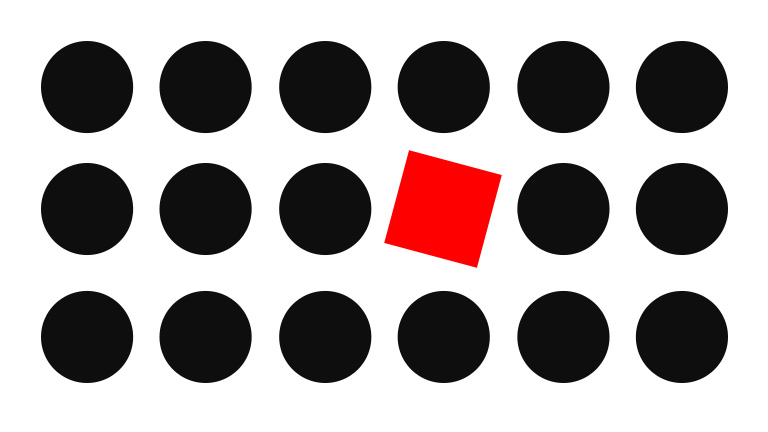
Focal points are areas of interest, emphasis or difference within a composition that captures and holds the viewer’s attention. The focal points in your design should stand out of the clutter and must be easily noticeable. Focal points must be designed with some differentiating elements like a different color, size, shape etc. so that it becomes the first thing a human eye will notice while gliding through the webpage.

focal-point

2. Movement

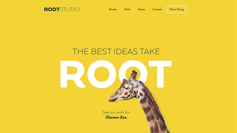
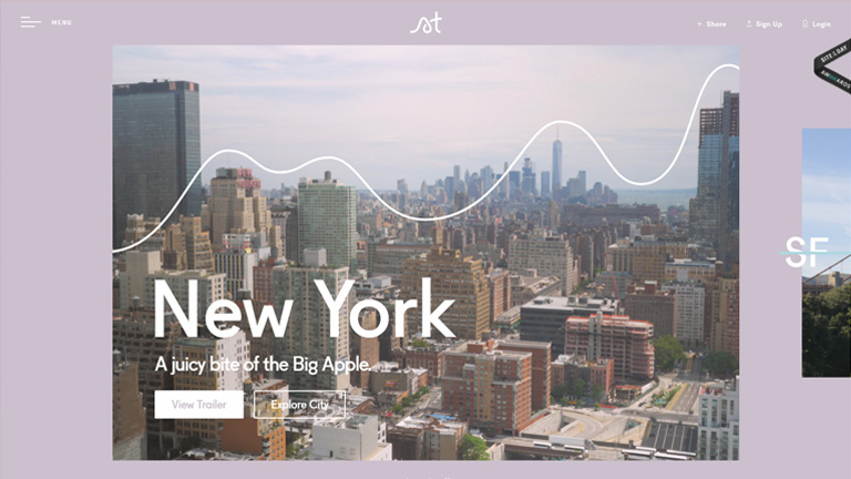
A viewer’s vision is automatically drawn to certain specific places and they follow a particular movement of vision. It does differ from individual to individual, however generally the viewers follow an F-pattern or a Z-pattern. If the text and design is implemented keeping the movement pattern in mind, its more likely that the content will be better comprehended. However, if the viewer is not moving the way you want them to, then perform the A/B testing of layouts.

build-website

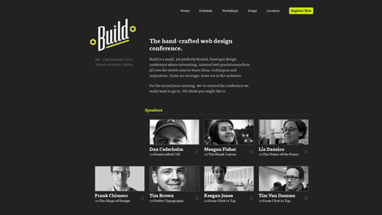
The build website uses a Z-pattern movement

3. Golden Ratio

In simple words, it is a mathematical proportion of the elements of different sizes which is thought to be the most aesthetically pleasing for human eyes. The proportion equals 1:1.618 and it is often illustrated with seashell-shaped spirals. Designers often apply golden ratio at the stage of wireframing. It helps to plan a structure for the layout placing and sizing user interface elements in the right proportion which will be soothing for users’ eyes.
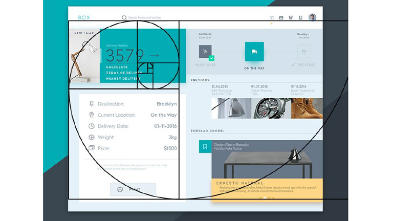
box-UX-planet

Source: UX Planet

4. Repetition

Repetition helps in creating a unity which boosts understanding and recognition. Style repetition provides consistency across the website which leads to a unified web design. Repetition of some elements like fonts, colors, shapes or sizes throughout the entire composition clearly defines the visual hierarchy of any design. At times repetition is used to give elements a new meaning altogether. Like when you see blue underlined text stand out on a page you instantly recognize the font as a hyperlink. Repeating this style in a design tells your audience where to click for more info.

Repetition

Source: Visme

5. White Space

Every aesthetically-pleasing design requires its fair share of clutter-free negative space, often referred to as “white space”. A lot of designers overlook the importance of white space as a design component in the scheme of visual hierarchy. The idea is, more the white space surrounding an element, more it will catch attention. White space improves focus, cuts through the clutter easily, and creates amazing balance in a web design.
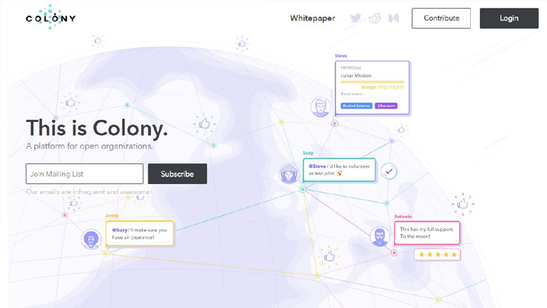
White Space

Source: Colony

6. Typeface

It is essential that you convey your message loudly and clearly through a clear typeface, that kills any ambiguity. The major headings should stand out with large font size followed by medium sub-sections, and smaller details. Using different type sizes helps in emphasizing important details. Also, the overall design looks more systematic and arranged. Various text sizes, weights, and spacing can be used to create typeface hierarchy.

Typeface

7. Randomness

It’s not necessary to follow the grid always. Some designers break the grid and place various elements randomly across the page to stand out from most of the gridlocked text. Although the concept is called randomness, simply scattering elements across a page without a strategy or reason will not yield the desired results. Every move of randomness must be a calculated one backed by analytical facts.

randomness

8. Alignment

Alignment is part of the structure by which elements are placed in a design. It dictates that visual components, whether they be text or images, are not positioned arbitrarily throughout a composition. Some visual designs are centered or justified so that they share both the left and right margins. In F-pattern designs, objects are generally aligned to the left, while Z-patterns often employ a combination of left, center and right alignments. Designs featuring text are often aligned to the left margin while simple visual designs are mostly center aligned to strike balance.

alignment

Source:Visme

Creating and implementing a visual hierarchy can do wonders for your overall web design. These rules, when followed and implied correctly, will surely enhance the aesthetic appeal of your website while providing order and symmetry. Talk to our experts and understand how they use these rules and other design tricks to create stunning websites.
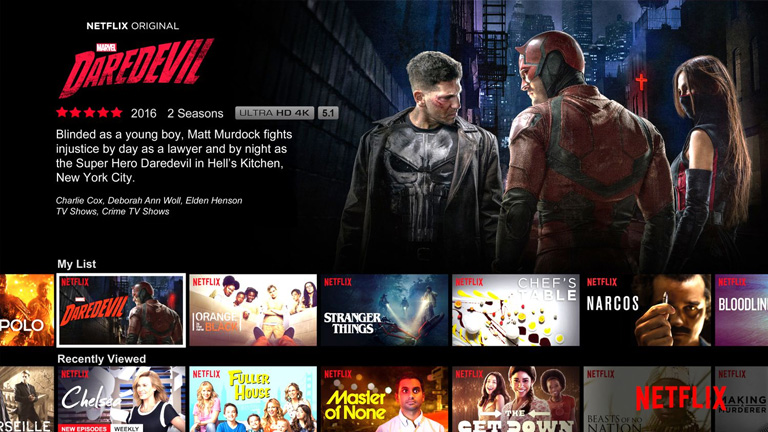
Categories
Web Design

5 Trending Ways To Boost Your Web Design Through Colors

Color is one of the main elements when we talk about visual impact. Colors are everywhere around us and also on every single website that we visit. The interesting part is that some of the websites are able to create a stunning impact and appeal through the use of colors while others fail to capture our attention even while using a lot of colors. Designers these days are not hesitant of using bold colors and that too in non-conventional methods. Let’s discuss how colors can be effectively used to boost your web design.

1.Create a Solid Background With Bright Colors

The trend of using solid backgrounds started a few years ago but is still going strong. A colorful and powerful background in a good design can help in focusing towards a specific section. In addition to a minimalist design style, the background is an important design element. A proper mix and match of bright colors in harmony of dark complimenting colors is a great way of highlighting the page design.

root-studio

2. Make A Bold Statement

The days of subtleness and sophistication are gone by. Today, designers are using bold colors to make a bold statement. Take a look at this landing page of Uber. The orange gradient background is really eye catching. The core objective of this page is to teach basic sign language which highly relies on visual cues. A bold color scheme along with a bold punchline boosts the superiority of a brand.

uber

3. Better Storytelling

One of the most important element of storytelling is color. One great way of depicting a story is by using a single color to highlight important sections rather than using different colors. For example, this homepage of Bloom Protocol uses an electric blue color throughout the design. The visual elements along with the color blue helps in guiding the user effectively from the header to the footer. Use of different colors would have broken the flow of the story.

bloom

4. Bursts of Interest and Personality Addition

It’s not necessary that large and bold colors need always to be at the forefront or the center for them to be effectively used . Sometimes a color is used specifically to add an interest to a design. Qards landing page uses all sorts of small color bursts to make the landing page look more appealing and pleasant to eyes. The little color bursts create an engagement without making the bright red background look over the top.

5. Pump Up The Branding Of Your Product and Company

Branding of a company is very critical and most of the companies stick to the traditional methods while branding. However, critical use of colors for branding is a newly evolving trend. A lot of websites use heavy colors in some of the sections and not in other sections to balance. Like in the landing page of Stripe. They use gradients between neighbouring colors like blue and green. The design is prominently blue but several other colors like green, pink, orange, and purple are sparingly used.

stripe

Conclusion

The time has changed and so have the web design trends. Companies are using bold colors, making bold statements with bright colors, and even branding themselves through colors. This shows how critical colors are when it comes to effective web designing. Moreover, color is a tool that brings out the personality of a company. The use of colors in a web design will only grow with time. Talk to our design experts and see how you can create a stunning website with effective use of colors.

Categories
Design

Looking To Design An Impressive POS Display? Follow These Latest POS Design Trends

No matter how strongly you market your product or opt for an aggressive advertising campaign, more than 90 percent of the actual buying decisions are taken when the customer is in the store. Having said that, it becomes critical to ensure that the customers don’t miss out on your products. Designing a stunning and alluring POS display and other POS material can maximize your chances of conversion. Take a look at some of the latest POS design trends which you can use in your next design.

1. Addition of Dramatic Images

Everyone loves a bit of drama! You must not shy away from using bold aspects in your design. Bold colors, fonts, and images often grab more attention. A lot of designers nowadays include some dramatic images to catch attention instantly. Take a look at this Seagate POS display.

The explosive image of a soldier along with a quirky punchline is bound to make heads turn around.

2. Product Based Design

It creates a great appeal when the design layout of your POS features the design of your product. There’s a direct impact on customer’s mind when he looks at the product itself as a whole. See how Duracell designed this POS display in the shape of the battery itself.

3. Minimum Yet Impactful Content

Keep the content in your design to a bare minimum highlighting only the important points. Use tables and bullets to stack the content in a crisp and concise manner. Don’t forget to highlight the benefits and rewards for the customers. Customers are most interested in reading them. Highlight the pointers and also use icons to draw attention.

4. Using Real People Photographs

Human faces create a great impact and are very effective in drawing attention. It’s not necessary that your POS material design should only focus on the product. Photography can be included in your POS design to provide a personal touch that will surely get more attention. Make sure that you use models or people that fit your target audience and customer base.

5. Inclusion Of Digital Media

Images and videos create the maximum impact on customers. Thus, it’s a thoughtful step to involve some kind of digital media to blend in with your overall design. A large number of POS displays are nowadays equipped with a screen that plays a video commercial on loop. The continuous movement on the screen will capture people’s attention and it’s also the best way to impart a lot of information that you may wish to provide to your customers.

An impactful POS design is a must in order to boost your business. However, this element is often neglected by businesses only to regret it later. Talk to our design experts to get the best design solutions for your POS displays.

Categories
Web Design

5 Valuable Tips On Effective And Persuasive Web Design

The ultimate goal of any website is to draw user’s attention and to influence his behavior on the website through web design. While this is a well-known fact, most of the website designers end up focusing more on the visually appealing factors and sideline the critical aspects of website designing. We have collected a few important tips which will help you focus on designing influential and effective websites. Take a look!

1. Keep A Check On The Text Length

The optimal length is 100 characters per line. However, for a likable reading experience make it between 45 and 72 characters. This is because people prefer reading shorter lines. To be more precise, people don’t really read on the web but they only browse through the text. Keeping an optimal length of text will ensure that the users don’t hurry through the text but actually read it.

2. Avoid Providing Unnecessary Distractions To Users

You may think that humans can multitask by keeping the same level of concentration on each task, you are probably not correct. Users don’t really do multitasking, they do switch-tasking. When a user is switch tasking he cannot properly remember or pay attention to everything.

Make sure that you don’t let your customers focus on 3 different things at a time. Arrange your sequence of information, the layout of your images, and copy carefully without unnecessary distractions. This is especially important for your vital pages like the sign-up page and the main product page.

3. Pair Your Colors Well

Never try to be too flashy and experimenting with colors. When it comes to selecting the color scheme of a website, the classic color schemes are the best. I have seen designer pairing Red & Green, or Red and Blue. These pairings are too hard on eyes.

They create an optical illusion of colors jumping out, making it very tiring for the user’s eyes to look at. Go with pastel backgrounds while choosing colors for your website. Don’t go too strong on the colors. A dark font on a light background is highly recommendable.

4. Break Down The Content For Easy Reading

Despite all the new technology available in the world, reading text online is still a tedious job and can cause fatigue. For the simple fact that our eyes are not meant to read text online. So for an easy reading experience break down your copy into bullet points, shorter paragraphs, and categories.

Use of images is also a great way to ensure better user experience. Also, it’s not advisable to be too experimental with the shapes and fonts of the text. Use clear and readable fonts. Shy away from skinny fonts and use big and round ones. The best size is 14 or 16.

5. Always Remember The 3 To 4 Rule

3 is an important number. Humans can remember 3-4 things at a time and that too for about 20 seconds before they disappear into an unexplored world. But, this doesn’t mean that you can only give 3-4 options to your customers. Simply stack your information into groups of 3s and 4s.

This is especially important for your navigation bar. By giving more than 3 to 4 options to your users, you will make it difficult for them to choose or even take any action. Also, avoid keeping too many tabs and categorize all the information under 3-4 tabs.

Conclusion

These simple, effective and useful considerations will make a huge difference in how your customers will experience your website. These tips will also boost your chances of selling being a content, product or idea. Talk to our design experts and learn more such tricks on designing.

Categories
Web Design

How Can You Effectively Simplify Your Website Design?

We all want that our website must create a stunning impression on every user right from the word GO. We try all the tricks in our bag to create a website that’s unique and stands out from the crowd. However, often while doing so we forget the fact that simplicity has its own appeal. The design interface must be simple to understand and use. Unwanted elements overpopulate the design and act as a roadblock in a user’s journey towards the desired action. Here are a few essential tips on how you can simplify your existing website design or build your new simple website based on these tips.

1. Placement Of Call To Action Buttons

Your website must have an end goal and as soon as the user lands on your website, he must be able to identify it. Thus, the Call To Action buttons must be placed at the most focused spots on your webpage. These buttons must be large enough for users to clearly cite them and should also be placed in various positions to ensure that users click on them.

Placement Of Call To Action Buttons

2. Less Color Is More Color

In an effort to make a visually stunning website, designers often try and experiment with a lot of colors. This may look charming but as per user experience, fewer colors have a greater impact. Stick to a color palette with only 2 or 3 colors. A monotone color palette is even better. You can use different tones and tints of the same color. A large number of colors cause mental stress for users and must be avoided. A website looks neat and well organized under a monotone for fewer colors.

3. Consolidate Your Content Into Manageable Portions

If your website has a lot of content to offer, it is quintessential to streamline it into manageable parts. Don’t offer the entire content in one go to the users. Arrange all the related content under one section to enhance readability.

stripe

4. Use The UI Elements With A Purpose

A designer will have a lot of UI elements like icons, elements, images etc. in his bag. But, that doesn’t mean that all of them must be used without any reason. Make sure that when a user clicks on any of the icons he reaches to a page that he is expecting to go to. Plan the UI elements in advance and use them only if they serve any purpose in the overall design.

5. The Visuals And The Copy Must Go Hand In Hand

While the font style, type, and size are some of the important elements of a web design, what actually is written is of greater importance. Your copy must compliment the visuals on your website so that there is a synergy between all the design elements. Keep editing the copy and try to eliminate the unwanted text. Your aim is to connect to the users through the copy in a clear and concise manner. Also, create a proper tone with the design elements and use of connected words.

6. Never Forget The 80-20 Rule

It is one of the most important rules to follow while designing a website. There are 2 important factors under this rule.

I. Always remember that 20 percent of the elements on your website will result in 80 percent of the desired user actions. Which means, a few calls to actions, buttons, and other user interface elements will generate the majority of user interaction.

II. Focus on the top 20 percent of your content to make 80 percent of changes when changing a design. This 20 percent includes elements that generate the most clicks – CTAs, traffic funnels, and images.

It’s not necessary that we implement complex design elements in a website to make it more appealing or user-friendly. Often a simplistic web design strikes perfectly and enhances User Experience. Follow these tips in order to simplify your web design and achieve great results. You can also reach out to our design experts to discuss your website designing requirements.

Categories
Technology Web Design

These 5 Tips To Design Ecommerce Product Pages Are Absolutely Gold

The whole and sole purpose of any eCommerce website is to achieve higher conversion rate and thus generate a bigger revenue. Therefore, they focus extensively on the checkout process for users. Right from the time they add a product to the cart, to the time they complete the purchase. However, it’s not only the checkout process that is important. The product pages also hold equal importance. The product pages must be designed in a manner that customers get all the information that they seek in the most convenient way. Here are a few tips to enhance user experience on Ecommerce product pages.

1. Clear Mention Of Price And Features

The first thing that customers look on a product page is the price. Display the price as early as possible. Display it at the very top of the page and to the side of the product title as well. It’s better that you display the overall price of the product including all the applicable taxes and also mention the shipping charges if any. The prominent features like different colors or sizes should also be clearly mentioned. If the price of the product changes with any color, pattern or size, the change should reflect right when the variant is selected. The aim is to be as transparent as possible while dealing with the price.

Price And Features

Image Credit: levis.com

2. Display Sellable Images

Images play a huge role in increasing the sale of any product. It’s a proven fact that products with great images sell faster and more than other products. The number of images to display is however arguable. 10 images or just 1 great image. Both can create the desired impact. The idea is to give customers a digital taste of what the product actually looks like. Features like ‘Click To Zoom’ and ‘Thumbnail Galleries’ provide added advantage.

Display Sellable Images

Image Credit: amazon.com

3. Product Description At A Glance

People over the web don’t really read everything written on the web pages and simply browse through them. That’s why it’s not a good idea to stack up long features list in different sections. Rather, you should present prominent features of the product in a skimmable format right beneath or beside the main product. Keep the list short, segmented in pointers, with a crisp one-line description. Make the heading ‘features’ eye-catching by enlarging its font and tweaking the font style. Trust us, you will grab more eyeballs.

Product Description

Image Credit: dollarshaveclub.com

4. Always Display Customer Reviews

Customer reviews are a great way of building trust among your ‘to be’ customers through testimonies of your existing customers. These reviews help potential buyers in making a wise choice and a lot of their doubts are cleared through them. It’s not necessary to display the full reviews right at the top. They can be displayed under a separate section preferably at the bottom of the page. However, overall average rating through star system must be displayed at the top of the page.

Display Customer Reviews

Image Credit: amazon.com

5. A Clear And Easily Accessible ‘Add To Cart’ Button

Once the customer has finally decided to buy a product, then begins the ultimate process of checkout. This process is generally guided by a CTA button (Add To Cart in this case). The CTA button must be very clear, easily accessible, and available at any given point in time. The button must be designed to be distinct by use of strong colors, different font style, and button text. It’s advisable to place it at the top of the product page.

Accessible Add To Cart Button

Image Credit: Hayneedle.com

Conclusion

The Ecommerce space is huge and is filled with tons of products. Every product is different and may demand a different design concept. Nonetheless, these basic UX concepts can fit for almost every product page on a broader level. Apply the aforementioned tips along with little tweaks of your own and you will get the results. Have a little chat with our design experts and tell them your design requirements.

Categories
Web Design

7 Essential Elements Every Homepage Must Have

They say ‘First impression is the last impression’. Well, maybe not the last impression but it surely is the most crucial one. A solid first impression helps people to build faith in you and form positive notions about you. Same is the case with your website. The moment users land on your homepage, they start judging your business and brand. Users only take a few seconds to form an opinion about you and this opinion highly influence their behavior. Thus, it’s very crucial to have an appealing and intuitive homepage to impress the users and make them stay on your website.

There are a few very important elements which are the foundation of a successful homepage and designers must always include them while designing any homepage.

1. Value Proposition

Tell your visitors who you are? What do you do? And Whom do you cater to? right at the very beginning. Until and unless users clearly get answers to these questions, they are not likely to stick around. Besides telling them what you do, also mention how you do it differently. This will help users to distinguish you from your competitors. Be clear and concise. Avoid twisted language or use of phrases which are difficult to understand.

value-proposition

Pic Courtesy: Slack.com

2. Instinctive Navigation

The majority of users on your website will be new and will not know what is where. Therefore the navigation on the homepage must be so simple that even a newbie can get information that he seeks. At no point in time, users should get stuck or get confused while looking for information. You should also anticipate typical user behavior and place the content and sections based on that. Like if your blog page gets most of the traffic then no point in hiding it somewhere in the footer section. Place it where it gets maximum visibility.

instinctive-navigation

Pic Courtesy: Storytrail.com

3. Use Of Videos

The visual appeal of images and videos is far more than words or any other content. While it’s not really mandatory to include videos on your homepage, but it’s a great way to increase user engagement. A video showcasing what you do, your distinctive features, your office, staff etc. can be a huge hit. This interactive way of increasing user engagement can never go wrong especially with the new users.

useofvideos

Pic Courtesy: Koozai.com

4. Social Media Links

Your objective is to grab as many eyeballs as you can and social media is the biggest platform to do so. Well, almost all the websites include social media links on their homepage, but the placement of these links is crucial. Place these links at the most convenient locations and at places where people expect to find them. Connecting to users through social media ensures increased engagement and reach which will surely pump up the business.

social-media-links

Pic Courtesy: Latitudegroup.com

5. Contact Us Section

Ever been in a situation where you try to contact the tech support or customer service executive for something important and not able to find the contact details? Most of us do face this situation some or the other time. Don’t let your customers face a similar situation. Visitors must easily find contact information on the homepage. Most commonly this information is placed at the bottom of the homepage and thus visitors do expect this information right there. The Contact Us section must include an email Id, Phone No., and address at least.

contact us section

Pic Courtesy: Achieve3000.com

6. Real High-Resolution Images

Get one thing straight – Stock images will never be able to achieve credibility no matter how beautiful and attractive they may be. It’s best to avoid stock images and instead use high-quality real images to increase credibility and user engagement. Use photos of your staff, office setup, and your leaders to create a realistic impression on users. Real human faces can be a great tool to increase user experience.

real high-res images

Pic Courtesy: Foundr.com

7. Services/Features Section

The video and value proposition may give only a highlight about your services and products. However, it is must that detailed information about the services/features/products is provided to users on the homepage itself. This not only help users who are looking for full information right at the start, it also boosts your page ranking.

services-features-section

Pic Courtesy: Latitudegroup.com

When you go out on your first date you ensure that you put your best foot forward. Properly groomed, neat clothes, and etiquettes right in place. You leave no stone unturned to create that perfect first impression. The situation is similar when a new user lands on your homepage. Talk to our design experts and leave nothing behind to create a stunning first impression.

Categories
Web Design

Avoid These 5 Things In Your Website Design To Stay Up To Date

If your website was designed a few years ago, there’s a bright possibility that there are a few elements which are unpleasant guests. They are outdated and need to be removed immediately from the website so that the website doesn’t look outdated. The world of web keeps changing every day and it’s essential that your website also keeps itself abreast with the new developments and advancements. This calls for a removal of certain outdated trends and practices. Here’s a list of 5 Don’ts that you should keep in mind while finalizing your website design.

1. Never Keep Social Media Icons In The Header

The header of your website is one of the most important areas of your website. This area gets the utmost attention and must be filled with the critical elements to which you want users to focus the most. Keeping flashy social media icons right at the top of your website layout is only inviting trouble in a quiet way. It takes a lot of efforts to get users on to the website, and by placing social media icons you’re guiding them to bounce off from your website to your social media handles. That will result in a high bounce rate.

Instead, you should use social media widgets which allow users to like your page etc. all within the environment of your website. That’s just a smarter way of letting people interact with you through social media.

2. Avoid Stock Photos

Pictures play a huge role when it comes to convincing users. Studies have shown that pictures have an excellent positive impact in terms of conversion as well. However, if they are not authentic and are simply obvious stock photos, users are not going to buy them. By obvious stock photos, we mean a smiling pretty girl’s face, the corporate handshake, the light bulb and much more. People have started undermining these stock photos and more than often make fun of the websites that use them.

When people will come across these stock photos on your website, they will not only find it cliched, they will also lose faith in your company. Instead, you can use custom photography and use real photos of your office, staff, and leaders. These are impossible to fake and are bound to create a solid impression

3. Get Rid Of The Email Links

If you have anything like staff Bio Pages, a very common practice is to use a little link to send email to that particular person. This is not the best of the practices. Firstly, it attracts email spamming. Spam marketers are always on a lookout for this kind of things. Secondly, it’s a real disaster when it comes to User Experience. Think about when you click on one of those. It opens up some kind of native email program on your computer like Microsoft Outlook or Apple email program. That’s just annoying.

Instead, you should use email sending forms. They are trackable, you can route them to different folders and subfolders using email programs, and can easily bifurcate client requests, internal queries etc.

4. Disable YouTube Suggested Videos

With the ongoing trends in website designing, videos have become a crucial part of any website design and YouTube is undoubtedly the biggest source of it. If you use videos anywhere on your website, you must disable the YouTube suggested videos option. What happens is that when a Youtube video plays, it makes some interesting suggestions about other videos that might be related to the video that you just watched. But, at best these videos might be simply unrelated and at worst they might be videos about your competitors.

Either way, it acts as a distraction for your users and has no connection whatsoever with what you want the users to do when they are on your website. This option can be disabled by going to the Share option, then to the embed option, then Show More and unchecking the Show suggested videos when the video finishes option.

5. Bye Bye PDFs

PDFs were used to be a workaround for the non-content managed websites for long. For example, if you need to add a new document or add a new menu on to your website you make a new PDF, upload it and replace the other one so that people can download and get the newest information.

But, these days almost every website is content managed using tools like WordPress where you can quickly log in and change information without actually touching the code. So basically, these PDFs are completely irrelevant today. Still, there are a lot of websites, especially restaurant websites which frequently change their menu by changing PDFs rather than actually changing on the website which is a complete NO NO.

Conclusion

If you’re playing the game of web, you cannot be stagnant. Trends which are super cool today may find a need to be thrown away tomorrow. The key is to understand what is working today, what needs to be forgotten, and predicting what future holds for us. Get in touch with our design experts to get more insight regarding the same.

Categories
Technology

5 Factors To Consider While Linking A Payment Gateway With Your Mobile App

It’s astonishing how every possible day-to-do activity has shifted to mobiles from everything else. People including you and me cannot simply think about life without our mobile phones. From a task as basic as booking a cab to complex tasks like banking transactions or booking an abroad vacation, everything is taken care of by our little pocket superhero. According to a report, about 40 % of the orders received by business until the end of 2018 will be through mobiles. The impact of mobile apps is increasing every single day. Mobile apps have broadened their horizon in terms of the services that they offer. They have a huge array of services and products to offer, which leads to the need of collecting payments as well. That creates the need for a payment gateway.

Payments is a crucial step in the consumer journey and hence apps should ensure a seamless and advanced payment experience. There are a number of things to be considered before integrating a payment gateway with a mobile app. Here are a few important considerations listed for you.

1. The Integration Process Must Be Simple

The process of integration must be kept as simple as possible. Developer SDKs must be very easy and must take minimal developer time for integration. The updates should also be simple so that the merchants can handle it and that too without any major fuss. Keep the SDKs light so that they don’t eat a lot of space on user’s mobile. Large apps are more prone to get deleted by users. It’s quintessential that the SDKs provide support for your required platform and framework. Select a gateway that offers multi-platform and multi-framework support (like Android, iOS, Cordova, React Native, and Ionic.)

2. Maintain A Consistent UI

The UI offered by the payment gateway cannot be in contrast with your overall brand language. It should merge in and compliment your brand language. The payment process through the payment gateway must be a cake walk without any barriers or friction. Another important aspect to consider here is the total number of steps involved in the payment process. The less the merrier in this case. Prefer payment gateways that offer you customized checkouts that can include your brand logo, image etc.

3. Payment Received Communication

It’s always advisable to send payment confirmation communications through email or SMS to the customers. It boosts the trust of the customer and encourages them to use the payment gateway more often. The payment gateway has a direct and most updated status of the payments, thus they are the best people to send the most accurate status information. So choose a payment gateway that has the facility to send timely communications to customers.

4. Quick Payment Settlement Cycles

Customers are the king and their convenience comes before anything. Thus, quick payment cycles are a must. Moreover, quick payment cycles ensure smooth functioning of the business. A typical settlement ranges between a few days and utmost a week, depending on the size of your business and your business industry. Gather all the information regarding the settlement period from the payment gateway merchant to analyze if it suits your business model.

5. Comprehensive Customer Support

This is one of the key elements which often gets neglected while integrating a payment gateway. Customer support is crucial both during the integration process and handling post-integration payment related queries. A payment gateway must provide effective customer support through various means like chat, email, call etc. for all payment related queries. The support must not be restricted to merchants, but must be extended to the end users as well to address their queries in the shortest span of time.

Conclusion

Integrating with a suitable payment gateway is very important for the success of your business and brand. People drop into a different level of comfort zone when they glide through the overall payment process without any hassles or delays. The above-mentioned points are very handy while selecting a payment gateway for your mobile app. If you want to know more about the same, our experts will be more than happy to assist you.

Categories
Design

Looking To Personalize Your Website Design? Here Are The Pros & Cons

Web designers are always on a lookout for options that can enhance the user experience and the visual appeal of a website. A lot of new philosophies have surfaced over the years related to website design. Personalizing the design of a website is one of the examples. Designers across the world have mixed feelings about the whole personalization process of a website. Some look at it as a success mantra, while others feel that all the research and hassles are not worth it.

Before we move further into details, let’s first understand what exactly is website personalization? Website personalization is another way of offering personalized marketing. In this strategy, the company or brand serves personalized content and recommendations to users. The personalization is based on different techniques like data collection and analysis, user behavior studies, automation and even algorithms in some cases.

Personalization has done wonders for many big guns like Amazon and Netflix. But, that doesn’t guarantee its success when it comes to your own website. In this article, we will discuss the Pros and Cons of personalization in your website design so that you can take an informed decision.

Look who has done it successfully.

netflixNetflix.com


Amazon.com

Let’s start with the positives.

PRO #1

A Personalised Experience For Every User
What could be better than a personalized experience in the world of the web that is brimming with so many websites that provide a generic experience. People feel more connected to your brand and website when they receive a personal experience and are most likely get addicted to it. It can be the game-changing differentiator for your website.

User’s name, specific recommendations based on behavior pattern & past selections, promotional offers matching customer requirements, authority to tweak the look and feel of the website (color scheme, background images, font size etc.) are some of the key elements of a personalized experience.

PRO #2

Inflates Conversion Ratio & Customer Loyalty
Studies have suggested that the brands that offer a personalised experience to its customers enjoy increased revenues. Customers that receive customized experience are less likely to look for other options which means low customer attrition rate and high customer loyalty. Even the conversion ratio is increased substantially as the customers are offered exactly what they need and precisely in the manner they personally prefer.

PRO #3

Offers Consistency Across Devices
A personalized website experience builds consistency even when the customers access the website through different devices. This comforts his experience and pushes the user experience to a new level altogether. Take the example of Kindle, you start reading something on your mobile, you can pick it up from the same place on your tab or laptop later on. Even the look and feel of the app is absolutely same across all devices and therefore the user doesn’t need to adjust for even a bit. This is a prime example of providing personalized website design experience.

Now Let’s dig into the disadvantages.

CON#1

Cost Is Increased Heavily
When you are eyeing to provide a different and personal experience to every user be sure that there would be a lot of efforts and technological implementations involved. That’s why it will be expensive. You will need tools to collect & analyze data, algorithmic technology, automation and a full team to keep generating personalizations. All this will be heavy on your pocket and therefore it isn’t everyone’s cup of tea.

CON #2

Can Raise Privacy Concerns
Collection of personal information is the base of personalization. A lot of personal information is collected at different levels from the users which is then processed and used to provide customized offerings. This can raise privacy concerns among users. Not everyone will be comfortable with the fact that you know so many things about them. Moreover, they will also be concerned about how you use all the personal information that is collected. It’s best to be upfront and disclose what all information you collect, how you store it, and for what all purposes you use it.

CON #3

It’s A Very Tedious Process
A lot of time needs to be invested in order to create a personalized experience on your website. An immense amount of research and analysis is required to prepare a single wireframe and the process doesn’t stop there. It continues even after the website is launched. Keeping up with user wants and preferences is a time consuming full-time effort. In order to maintain a set of working personalizations, a lot of regular revisions, constant updates and plenty of data storage is required. Personalization looks very attractive but demands a lot of time and intensity.

Conclusion

So we have learned that personalization of website design is really a boon and improves revenue, sales, customer retention, and conversion ratio. However, it’s costly and time-consuming too. So, it’s best to take a midway while creating your website. With the help of a good email or referral program, you can route customers to a semi-personalized page which offers them tailor-made content. While this isn’t a fully-individual experience, the method can still provide desired results without digging a big hole in your pocket.

No need to scratch your head while thinking about the details of designing a website. We are here to help you. You can talk to our design experts and discuss your design requirements in detail. We would be glad to assist you.