NYX Ditech

Categories
Brand & Identity Design Mobile Apps UI Design UX Design Web Design

5 Factors That Influence Readability and Legibility of a UI

No matter how exciting and compelling your story is, it will not be able to create an impact on users if it isn’t presented in a clear and readable layout. People generally focus more on the content than its packaging. No doubt content is the king, but packaging plays a crucial role in determining its success. Readability and legibility are two key aspects of user experience design. To simply put – app and web users will not read your content if it doesn’t look clean, clear, and consumable. In this article, we will cover the factors that influence readability and legibility in user interfaces and why it’s important to care about them.

Readability

As the name suggests, readability is the ease of written content perception. It refers to the comprehension of the text content. It includes – the simplicity of words and sentences, ease of consuming information, and clarity of thoughts. Readability is determined by considering your website’s typeface, which takes font size, font style, line length, and line-height into account.

Legibility

Legibility is a much narrower concept than readability. It refers to how easily your audience can recognize and differentiate between individual characters in lines of copy on your website. Legibility is determined primarily by your typeface design. We can say that legibility is one of the components to fall under the bigger umbrella of readability. It is generally analyzed by examining users’ reading speed in terms of words-per-minute.

Factors Influencing Readability and Legibility

There are plenty of factors that directly impact the readability and legibility of the content. Here are the five most important ones:
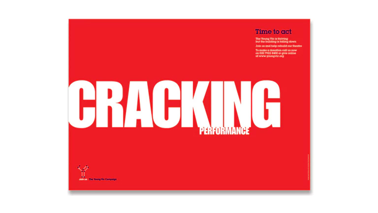
1. Typography

Typography refers to the font style. There are some fonts that are easy on users’ eyes and create a delightful reading experience. On the other hand, some fonts are not so pleasing. The choice of fonts directly impacts the readability and legibility of your copy. Font size, width, color, and text structure – every single element matters. Fonts also add to the visual element, just like images. Typography in design is the art of balancing the aesthetic aspect of the text and the ability to read it quickly.

Negative space, alignment, tracking, the spacing between baselines of text, line length, etc. are all key elements to clear typography and comprehendible content. Designers must avoid too little space between the words, very less distance between the lines or letters, tiny font size, and non-contrasting text and background colors.

2. Background

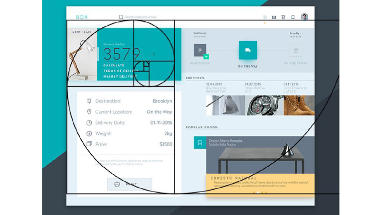
Just like printed books and newspapers, the background color has a significant impact on the ability to read and comprehend the content on websites. It allows readers to distinguish both interactive elements and content. For instance, black text on white or light background appears more significant than the white text on a dark background. An improper color scheme will mostly result in reduced readability, leading to poor user experience. Relevant content or useful data that is unreadable is of no use; users will most likely not read it.

The nature of the content also plays a role in selecting the color scheme. Text-heavy interfaces aimed at reading as the main activity should use color schemes based on light backgrounds. In contrast, the image-heavy interfaces should use dark backgrounds to amplify the pictures’ performance.

3. Writing

The UX writing must be clear, concise, useful and consistent. Text is a vital part of the visual design and user experience. The best you can do with the written content on your website, app, or blog is to make it human-like communication. When you interact with your users through text, at any level, they must feel as if they are interacting with a real human being and not a bot. 

Remember – users don’t read on the web, but scan through the content. Be short and consistent in your written copy. An extended form of writing pushes off users. You must also build a solid text hierarchy so that users can quickly scan your page content. Use numbers, marked elements, and textual variants to catch attention. Marking out specific information by using bold and italic fonts, unusual text sizes, different colors, highlighting, etc. has worked well for years and still holds its significance; however, avoid overdoing it.
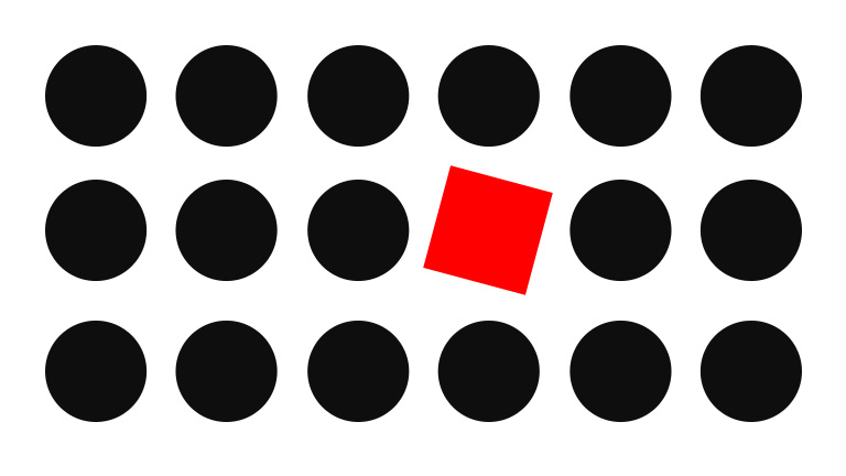
4. Visual Hierarchy

Visual hierarchy refers to prioritizing the content into different levels. It is based on the Gestalt theory that deals with the psychology of visual perception of elements. The theory shows how people tend to group visual elements. It organizes UI components so that the brain could distinguish the objects based on their physical differences, such as size, color, contrast, style, etc.

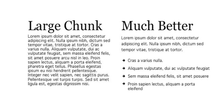
As mentioned earlier, people scan content over the web. So, if we take an example of a blog, they will first notice the headline, then subheadings and only then copy blocks. This is a typical pattern. Users scan the headline and subheadings to understand if the article is interesting and useful to them. Only then will they read the entire blog. The headline and subheadings should be framed in a way that is both informative and enticing. On the other hand, if users see the vast and long sheet of text, they will be scared to read it.

To build an effective visual hierarchy, the text is divided into three levels:

  • The primary level – It includes the biggest type like in headlines. 
  • The secondary level – This is the type of element that supports scannability, such as subheaders or captions.
  • The tertiary level – This one is for the body text and additional data. 

5. White space

White space or negative space is the area of the layout that is left empty. It can be either around the objects you place in the layout or between and inside them. Negative space provides breathing space for all the objects by clearing the unwanted clutter from the page. White space is a strong tool to improve the readability of your text and thereby enhancing the user experience. It also helps in creating a connection between the text and non-text elements of a user interface. 

Many more factors influence the readability and legibility of the content of a user interface; however, these are the most important ones. If you feel like discussing them further in detail, our team of experts will be more than happy to assist you.

Categories
Blog Design Technology UI Design Web Design

Hiring A Web Designer? Look Out For These Essential Skills

Being a Web Designer in today’s world is both fascinating and challenging. The world of web designing is growing every day; there’s plenty of scope for a Web Designer to learn and grow. The learning process should not stop at any point in time, and a Web Designer must pick up new skills while fine-tuning the basic skills. So, what are these essential skills that are required to become a Good Web Designer? Here’s a list of some essential skills that you must consider while hiring a web designer.

Technical Skills

The most important skills to possess are technical skills. Stronger the technical skillset, better the web designing output.

Visual Design Principles

One of the key skills for a web designer, that will help them do well is their visual designing skills. It might seem pretty obvious and straightforward that you need advanced design knowledge to be a successful web designer, but visual design targets digital products, so that’s a tad different. 

Visual design principles determine the look and feel of a website. Setting up visual design principles involves creating mood boards and type hierarchy, by playing around with web fonts and color palettes. Visual design principles have more to do with the kinesthetic elements; that said, it’s very closely linked to user experience.

Color Theory

As a web designer, it’s essential to be familiar with the color wheel. Basic understanding of how complementary, contrasting, and analogous colors work together, is a must. Knowledge of combining primary colors to create new colors will help you create a pleasing, appealing color palette.

One of the most common mistakes committed by web designers is the use of clashing colors. A little bit of visual disparity can lead to an exciting design. Still, conflicting hues can also lead to an ugly and unreadable layout. Everything including text, calls to action, and headers should use colors that go with the overall theme and has a strong sense of legibility. A web designer needs to know when to use lights and darks, how to use contrast and saturation so that they excel in their work.

UX

UX refers to User Experience; it is the experience that a person has when they interact with your website. It is how people feel when they use a website. A web designer must have UX knowledge to approach web design from a user-first perspective. The objective is to design a website that helps users to get what they need.

A lot of factors can be improved – the content, the navigation, the colors, the CTAs, and more. The better the web designer is at UX, the more useful the website gets designed.

UI

Very closely connected to UX is the user interface (UI); it is the series of screens, pages, and visual elements like buttons and icons, that enable a person to interact with a product or service. These elements guide and navigate the user through the design, overcoming any obstructions, offering a smooth experience. UX is more about the broad aspects of how design affects someone, while UI focuses on specificity. UI elements include navigational elements, intuitive interfaces, and calls to action that guide people to do what you want them to do in the shortest amount of time.

Graphic Designing

Website and graphic design are very similar in terms of creativity. Both are artistically crafting visual elements. However, web designing is a medium where ongoing changes and updates are a part of any project. On the other hand, graphic designing is about creating visuals with lastingness. Designing website elements fall under web designing while designing a logo falls under graphic design. Both are different design disciplines but are a part of branding. 

Graphic design skills will enhance the skill set of web designers. If they can hand-draw typography, custom illustrations, and other creatives, it will undoubtedly improve their web designing work.

Non-technical Skills

Apart from the technical skills, there are some other skills that elevate a web designer’s performance.

Communication

A web designer must have the capability to get their point across to the various stakeholders effectively. They’ll have to interact with product managers, marketing teams, clients, and even pitch ideas to potential clients. Therefore, good communication skills are a must for any Web Designer. Moreover, explaining your vision for a project in a way that non-designers or people with minimum technical knowledge understand is essential.

The role of a Web Designer has evolved over the last few years. Today, they do a lot more than just designing. They contribute to copywriting, editing for sites, developing presentations and more. Good communication skills will always be handy for them.

Time-management

Whether you work for a design agency or work on your own, managing various design projects require effective time management skills. A Web Designer needs to stay on top of their schedule to make their project stand out. They should be aware of various productivity apps like task lists or calendars, or project tracking tools like Trello or JIRA, to better manage a project. The world of web designing is hustling; mastering the art of prioritizing and tracking your work will be crucial to a Web Designer’s success. 

A Web Designer has to respect deadlines and provide regular progress reports to all the stakeholders. Their time-management and self-discipline skills often define their reputation as a true professional.

Proactivity and Creativity

Creativity is ‘The Game’. If a Web Designer doesn’t have a creative mind and can’t come up with new ideas to design, all the technical knowledge goes down the drain. Proactive and creative Web Designers take ownership of their projects and share responsibilities with the Project Manager. As a professional web designer, you should understand the project’s scope, purpose, and standards, acknowledge your client’s expectations, and continuously come up with constructive, out-of-the-box ideas.

Here are some tips to become a successful web designer

Like many modern-day job roles, a web designer’s role also demands a wide array of skills. Personal skills, along with sound technical knowledge, not only helps a Web designer to grow personally, but it also benefits the company. The next time you hire a Web designer, look for these skills. If you require our web designing services, talk to our team now!

Categories
Web Design

Why Is Whitespace So Important In Web Designing?

The term whitespace is often perceived as white empty sidebars between which the content is squeezed. But that’s not the case. whitespace, also known as negative space is also the empty area around images or other elements on the web page in addition to the spacing between letters in your titles and text. Irrespective of the design style you follow, it is very important to include and use whitespace wisely to create a visual appeal. It may not eat a lot of your screen real estate, but surely makes your website look refined. Here are a few benefits of using whitespace in your design.

1. It Grabs Attention

We may get into a never-ending debate zeroing down on the best strategy to attract user attention online. However, one thing we all may agree on is to what doesn’t grab attention- emptiness, blank space, nothing. This simple fact helps in putting blank space to best use. whitespace can be used to draw and funnel attention to the important elements which you want to highlight.

Grabs-Attention

You may clutter a page with images and texts, and highlight the important page elements; you can choose to leave more space around vital images or even go for larger fonts to make them stand out. You can do this on your homepage, landing pages, portfolio pages, conversion funnels etc. Empty space around the key object eliminates distracting elements or clutter around it, thereby extracting all of user’s attention towards the object itself.

2. Demonstrates Visual Hierarchy

It’s very important to distinguish important elements from the ‘not so important’ ones. Mostly, this is done by playing around with the size of elements. In addition to the size of the elements, size of whitespace is also critical, especially from a design point of view. Vital elements have more whitespace around them and the size of whitespace keeps on decreasing with the importance level of elements. This establishes a visual order or visual hierarchy.

Demonstrates-Visual-Hierarchy

By implementing this hierarchy of visual priorities and effectively using whitespace, your design will exhibit a smooth visual flow that eliminates ambiguity. The viewer knows what’s important and where to go next. Landing pages are usually the best examples of this. There’s a large title with more whitespace than the text that will follow, and that test runs up till a large ‘Subscribe Now’, or ‘Buy Now’ button that has the most amount of whitespace around it.

3. Sets Groups Apart

A lot of minds think whitespace is really waste of space, but when used appropriately and wisely, it actually saves space. If you find yourself running out of screen real estate and still have a huge list of products, services, or anything else that you want your viewer’s attention towards, then you may end up placing items too close together. This will make items in that section appear to be similar and will not get the desired attention as they’ll blend in with the noise.

Sets-Groups-Apart

To rectify this, instead of highlighting your products, you just alter the size of them, change their layout and orientation, or combination of the two. This will create some whitespace between the objects, set them apart from each other, and make it easier for viewers to pick up on that.

4. Improves Readability

Whitespace is the backbone of text readability. You wouldn’t be able to read through this text if it was all crammed together with minimal spacing. Text looks all packed up and hard to read if you leave very little whitespace. That said, leave too much space and you end up wasting it. This is the reason why the world’s top designers emphasis so much on fonts and typography.

Different fonts employ different amounts of whitespace, depending on the font style. However, font size holds equal importance. Headings are larger and use more space in order to draw viewers’ attention. Some other areas that use whitespace to improve and enhance the reading experience include line spacing and paragraph margins.

If one has to describe whitespace in a poetic way, it could well be “a perfect amalgamation of art and science.” A scientific application of this art is required for the design to be effective. One can achieve beautification through simplification by effectively utilizing whitespace. Intrigued by learning this?  Talk to our experts to know more.

Categories
Web Design

8 Golden Rules Of Visual Hierarchy

It’s a known fact that visuals create maximum impact on viewers. The art of website designing also follows the same principle and the entire process of web designing aims at creating something which is visually appealing. It’s important to create something visually attractive, but it’s also important to add an order and structure to the design, which is done by following a visual hierarchy. Visual hierarchy helps in guiding the human eye from one element to the other while eliminating visual fatigue and helps them to notice vital information. Here are 8 golden rules to follow in order to effectively implement visual hierarchy in a website design.

1. Focal Point

Focal points are areas of interest, emphasis or difference within a composition that captures and holds the viewer’s attention. The focal points in your design should stand out of the clutter and must be easily noticeable. Focal points must be designed with some differentiating elements like a different color, size, shape etc. so that it becomes the first thing a human eye will notice while gliding through the webpage.

focal-point

2. Movement

A viewer’s vision is automatically drawn to certain specific places and they follow a particular movement of vision. It does differ from individual to individual, however generally the viewers follow an F-pattern or a Z-pattern. If the text and design is implemented keeping the movement pattern in mind, its more likely that the content will be better comprehended. However, if the viewer is not moving the way you want them to, then perform the A/B testing of layouts.

build-website

The build website uses a Z-pattern movement

3. Golden Ratio

In simple words, it is a mathematical proportion of the elements of different sizes which is thought to be the most aesthetically pleasing for human eyes. The proportion equals 1:1.618 and it is often illustrated with seashell-shaped spirals. Designers often apply golden ratio at the stage of wireframing. It helps to plan a structure for the layout placing and sizing user interface elements in the right proportion which will be soothing for users’ eyes.

box-UX-planet

Source: UX Planet

4. Repetition

Repetition helps in creating a unity which boosts understanding and recognition. Style repetition provides consistency across the website which leads to a unified web design. Repetition of some elements like fonts, colors, shapes or sizes throughout the entire composition clearly defines the visual hierarchy of any design. At times repetition is used to give elements a new meaning altogether. Like when you see blue underlined text stand out on a page you instantly recognize the font as a hyperlink. Repeating this style in a design tells your audience where to click for more info.

Repetition

Source: Visme

5. White Space

Every aesthetically-pleasing design requires its fair share of clutter-free negative space, often referred to as “white space”. A lot of designers overlook the importance of white space as a design component in the scheme of visual hierarchy. The idea is, more the white space surrounding an element, more it will catch attention. White space improves focus, cuts through the clutter easily, and creates amazing balance in a web design.

White Space

Source: Colony

6. Typeface

It is essential that you convey your message loudly and clearly through a clear typeface, that kills any ambiguity. The major headings should stand out with large font size followed by medium sub-sections, and smaller details. Using different type sizes helps in emphasizing important details. Also, the overall design looks more systematic and arranged. Various text sizes, weights, and spacing can be used to create typeface hierarchy.

Typeface

7. Randomness

It’s not necessary to follow the grid always. Some designers break the grid and place various elements randomly across the page to stand out from most of the gridlocked text. Although the concept is called randomness, simply scattering elements across a page without a strategy or reason will not yield the desired results. Every move of randomness must be a calculated one backed by analytical facts.

randomness

8. Alignment

Alignment is part of the structure by which elements are placed in a design. It dictates that visual components, whether they be text or images, are not positioned arbitrarily throughout a composition. Some visual designs are centered or justified so that they share both the left and right margins. In F-pattern designs, objects are generally aligned to the left, while Z-patterns often employ a combination of left, center and right alignments. Designs featuring text are often aligned to the left margin while simple visual designs are mostly center aligned to strike balance.

alignment

Source:Visme

Creating and implementing a visual hierarchy can do wonders for your overall web design. These rules, when followed and implied correctly, will surely enhance the aesthetic appeal of your website while providing order and symmetry. Talk to our experts and understand how they use these rules and other design tricks to create stunning websites.