NYX Ditech

Categories
Design

Evolution Of UX Design Principles Over The Years

Since the early 70s, designers and developers are working hand in hand to make screen-based user interfaces. At that time, actual user experience(UX Design) was least recognized and making everything work with a limited amount of processing power and a monochromatic screen was the sole goal. Slowly and gradually the hardware evolved which led to the growth of design possibilities.

Whether its a simple text on a screen or a fully-functional Graphical User Interface (GUI), its the UX designer who helps people to understand and draw sense from the technology. The early period of computing restricted the learning process to how to use windows, tabs and icons. While in the contemporary era, learning focuses more on making the most out of a tiny screen and touch gestures.

The iPhone Revolution

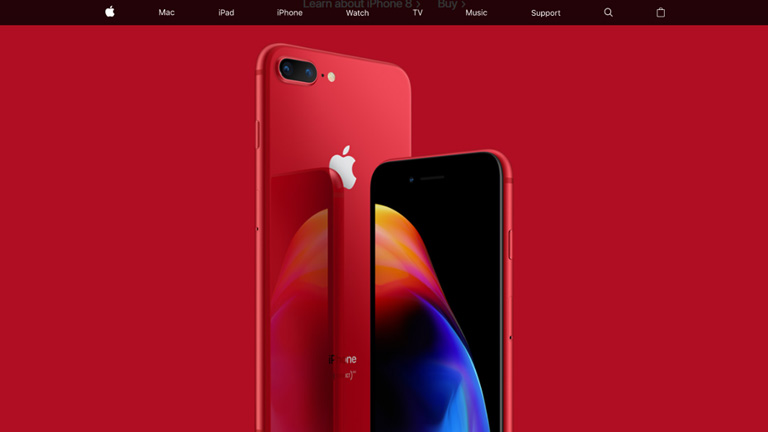
It all began with the iPhone which started a revolution and changed the principles of UX design. It was the iPhone which shifted our focus towards user experience and made it one of the most critical elements of any design. The use of button-free gesture control is iPhone’s best-known innovation and is the biggest contributor to its success.

iPhone Revolution

With the iPhone, users could control everything from the screen and there were no buttons like the other smartphones of that age. The iPhone looked clean, elegant and consistent. It completely transformed the use of smartphones. This design innovation made a smartphone more of a fully-functional computer. Although iPhone was not a leader in camera quality, memory, connection speed etc., it sure was a fully capable computer operating system.

Parallelly, UX design also evolved owing to faster processors and extended memory and in conjunction with that the iPhone suddenly opened up thousands of new possibilities for designers.

Responsive Design

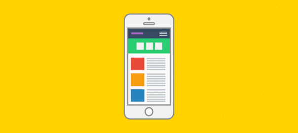
Designing was much simpler when you knew that most of your users were accessing your interface on a desktop computer. That was changed with the growth of smaller screens like a laptop, a tablet or a smartphone. A UX designer had to make sure that the interface looks good across every platform. Responsive design has changed the way companies think about UX design. A Responsive Design enables the different elements to act according to the size and configuration of the device.

Responsive Design

A menu can widen out across the desktop screen, giving users more choice, then shrink to essential navigation elements on a smartphone. Moreover, it has driven us towards a unification of user experience across devices and modes. Companies take extra efforts to ensure that their browser-based UX has the exact same workflow and feel as their app does. With a change in how people access the web now, mobile-first has dominated both web design and software development.
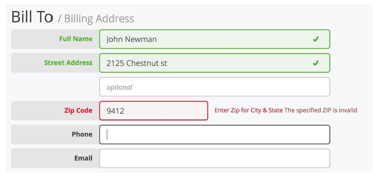
Data-Based Design

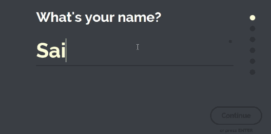
The design revolution posed new challenges which weren’t on the surface previously. Designers required to make complex user interactions clear and intuitive on both smaller and bigger screens. A list of tasks which previously required a 17-inch screen, keyboard and mouse must now be accessible with a 4-inch screen and a thumb. User demands were increasing day by day and designer had to live up to the expectations. This pushed the companies towards data-based design which involved user testing to get everything right.

It became common for companies to implement user testing in order to address issues like flow, accessibility and user design preferences. User testing allows a trial of multiple versions simultaneously, get user feedback and suggestions, make changes and retest without actually programming and reprogramming the app.

Data-Based Design

Not every company implies UX design testing in the best ways and can draw false conclusions or data. For example, many companies don’t really watch users while interacting with the software, so all they get is self-reported data. Another good example – users may be testing the app prototype sitting down at a desk, but in real time they are likely to use the actual finished app while walking around. This can lead to developers thinking their UX design principles are sound when they actually are flawed. Moreover, untrained testers can draw wrong conclusions from user data.

For UX designers it’s important to learn how to effectively integrate testing and other data sources into design decisions. Usability testing has already driven a refinement in UX design principles. Companies like Apple or Google carry out lots of testing and use their findings to create their own style guides, both for in-house work and apps carried in their store.

The pace of design evolution has been on an increase since past few decades and it wouldn’t be a surprise if the design principles which are trending today completely fade out in a few decades. It’s important for a designer to understand the changes in user experience fundamentals and incorporate it in the design. Talk to our design gurus for more insight.

Categories
Web Design

Elevate Your Web Design With These Popular Forms of Animations

There were times when a webpage was just about text, a few hyperlinks, some images and perhaps a form. But over the course of time websites have evolved drastically. That’s primarily because the users’ expectation from web pages has evolved a lot. They have become overly demanding and want to have an interactive experience every single time they visit a webpage. The process of web designing has kept pace with this increasing demand by taking the visual storytelling process to a whole new level and in the process, animations have become an integral part of the whole design philosophy. Today’s animations are smoother, sophisticated, and more mobile-friendly than ever owing to the advanced ways of CSS3, HTML5, SVG elements and lightweight JavaScript.

Benefits Of Using Animations In A Web Design

Of all the visual elements present on a webpage, animations particularly stand out and helps in drawing attention onto a particular webpage element. It guides visitors from one step to another during the journey through the website. Also, animations are very effective in storytelling and in keeping the visitors engaged on a webpage. It adds to the overall user experience of visitors on a webpage or website.

Types Of Animations

There are different kinds of animations ranging from simple hover states to large ones which are almost like a video. Simple animations are more catchy and attract the user’s attention to important web page elements. That said, larger animations, when used sparingly and on the right project, can offer an incredibly interactive experience to the users.

type of animation

There are many types of animations like hover effects, notifications, progression loads, form validation, parallax scrolling, typography animations, content fading, screen transitions, walk-throughs, hidden navigation menus, scrolling galleries etc. In this article, we have listed four most popular types of animations that can add a visual appeal to your website.

1. Hover Effects & Tool Tips

One of the traits of a good website interaction is that it must provide feedback to users. Simple CSS animations, like the ones that are found on animate.css, provide a subtle feedback on any type of hover action, including image or button hovers. Moreover, hover actions and tool tips add to the user experience with navigation and additional information. One point that the designers must remember is that these animations won’t work on mobile or touchscreen devices, therefore all the valuable information must be exhibited in other ways.

Check out this 3D hover effect:

3Dhover

2. SVG Animations

Scalable Vector Graphics (SVGs), are dynamic vector elements that are scalable, artwork-based and responsive. These are smaller in size compared to images and rasterized graphics. A lot of animated SVGs can be produced using only the CSS3 and no JavaScript. Be it a simple vector icon or an advanced illustration, everything can be animated and scaled using SVGs.

SVG-Animation

3. Parallax

Parallax animations is a great way of visual storytelling and is a very effective tool to engage users. They create depth, add layers to the design, and provide a more dynamic and interactive web experience. Take a look at the page and navigation transitions of startuplab.no.

Parallax-Animation
Instead of loading a typical static new page it uses a subtle page transition effect to reveal the new page. A few of the elements are collapsed and a few are expanded, unlike typical pages that clear the screen to reload.

4. Interactive Forms

The goal of a web form is not just to encourage visitors to fill it but further engage with your brand. Interactive forms increase the possibility that users will start engaging with your brand and continue the relationship. One of the trending form designs is a single-field form interface. Instead of showing all the fields that a user has to interact with, this minimal form interface only shows one text input at a time.

Interactive Forms
It’s neat and there’s no clutter or distractions. Moreover, a few subtle visual cues like the tiny progress bar and a number that indicates the number of input fields to be completed add to the user experience.

It’s very important to keep users engaged with the brand and provide them a delightful user experience. Animations are a good resource and if used properly can elevate any web design to a next level. Talk to our design experts and discuss how you can use animations in your web design.

Categories
UX Web Design

These Four Mega Navigation Menu Design Trends Are Here To Stay

It’s very common for websites these days to feature a mega menu and full-screen dropouts, especially content heavy websites with tons of links. But designing an effective mega navigation is a tricky thing to do. As its an emerging design trends, there are no strict Do’s and Don’ts. One must keep his eyes open to notice mega menu trends which are gaining popularity across the design world. That said, here are a few mega nav trends which are growing in popularity across the design world:

1. Deep Level Categories

The column structure is the most valuable design style for a mega navigation. Under the column structure, a designer can label “categories” for links and thus deeper links can be created without using multiple flyout menus. A mega navigation dropdown can cover the entire page and 3-4 columns can be easily squeezed in one dropdown. The below-mentioned image shows the home page of Puma.

The ecommerce shop has a columnar structure broken down into categories based on demographics and items. Inside each mega nav, there are columns featuring different types of items (featured items, shoes, clothing, accessories and sport). The columns have their own headers which are more prominent than the rest of the links.

Deep Level Categories

2. Full-Width Dropdowns

Not every site features this trend but it is gaining popularity these days. Huge mega navigation menus run across the entire width of the page hence creating enough room for desktop & laptop users. However, mobile users typically have hidden menus so the full effect is not visible anyways.

The below-mentioned image displays the menu of Pluralsight featuring a fullscreen mega menu. The content stays fixed at the same width as the page, however, the menu is spread across the screen. It’s a very eye-catching effect as it creates more room in the menu.

Full-Width Dropdowns

3. A mix of Images and Text

Visuals have a deeper impact as compared to any other type of content and hence adding more images to websites is a great idea. Visuals help in breaking the monotony of regular text we which we come across day in and day out. Needless to say, mega navigation menus work best on larger screens so there’s a lot of room for images.

Take a look at the Sears website.

A mix of Images and Text

They have smartly broken up their navigation into multi-level categories using links as well as images. A few of the top categories have images of kitchen appliances, mattresses, and home furniture. On the other hand, the deeper categories include direct links to items like cutlery and tableware.

4. Alternate Dropdown Techniques

There’s no harm in being a little experimenting with your mega navigations. It’s best to keep analyzing different techniques, methods etc. to understand what can best work in your case. Some websites don’t shy away from pushing the limits and add different aspects like animations, multiple columns, and even flyout menus that appear out of mega navs. The goal is to design a menu which is usable and works well.

The typical mega nav menu on The Open expands while hovering and the entire page gets pushed down to make room for the new menu. Unlike most of the mega navs, this one animates down while moving all the page content lower. It might not seem to be a perfect idea for every website but it’s definitely a unique one. You can run some A/B tests to compare the usability.

Alternate Dropdown Techniques


If you’re looking to design or redesign your content heavy website, talk to our design experts and understand how you can display your content in the best possible way using mega navigation menus.

Categories
Design

Importance of Graphic Design For Your Business

Designs are a part of our daily lives. Every single day we come across with logos, websites, books, magazines, flyers, advertisements etc. which are full of graphics and eye-catching designs. Still, a lot of people cannot digest the fact that graphic design is as important as any other arm of your business. This article highlights the importance of graphic design for any business and how it benefits a brand.

1. Boosts Sales And Growth of A Company

sales

Thoughtfully created and uniquely designed graphics help in attracting people towards your brand. Visually appealing marketing material, distinctly designed logo, attractive social media marketing images etc. help in drawing people’s attention to what you’re offering. Moreover, good quality graphics help people to perceive your brand as a brand that offers good quality products or services. This helps in building trust and increasing customer loyalty which in turn leads to increased sales and growth.

2. Creates A Strong Brand Recall

brand recall

Graphic designs are also helpful in establishing a company’s name in its niche market. When people look at an attractive logo, again and again, it reminds them of the brand associated with that logo. Similarly, advertisements, websites or business cards featuring good quality graphic designs also helps in creating brand awareness and ensure that people easily recognize your brand.

3. Conveys a Brand Message

Graphic design is also a great way of conveying a specific brand message to the target audience. A brand message makes the design extremely useful. A professional designer will first try to understand the message that needs to be delivered through the design. Based on the intended message, the designer picks specific colors and typefaces to evoke particular emotions. These emotions then become the message of the brand to its potential customers.

Take a look at the McDonalds logo.

McDonalds logo

It has red and yellow as its primary colors. These colors evoke feelings of passion and raw energy of young people and also portrays a feeling of socialization. This is exactly the message of this fast food giant as its target is young customers.

4. Displays Professionalism

Displays Professionalism

It’s difficult for companies to create an environment of competitiveness and professionalism amongst their employees, especially in startups and small companies. Graphic design makes a lasting impression on your clients and vendors. For example, a strategically designed and visually stunning logo design speaks volumes about its company’s ways of doing business. It gives an impression that the company is highly professional and is very serious about what they do. That can really be helpful in striking long-term client relationships which means steady growth of the company.

5. Enhanced Readability of Your Content

readability

A good graphic designer can even enhance the readability of the content that you generate to grab the attention of your audience. There are a lot of ways to do so like picking appropriate typefaces, colors, images, etc. The average reading time on the web is very low and most of your audience will simply scan your content rather than actually read it. If the designer is able to highlight your most important content through graphics, chances are more that your content will be read.

If you also want to amplify your brand image by using graphic designs than speak to one of our design experts NOW!

Categories
Design

10 Famous Logo Design And Their Hidden Meanings

For a lot of people, a logo is only a creative way of depicting your business name. However, there’s a lot more than this behind the concept of a logo design. Logos not only play an important role in the overall branding process, they also help people to identify and connect with a brand. That’s the reason why designers devote a good amount of time in carefully crafting a logo which communicates the brand’s language. While creating a logo, designers use their creativity in different ways and sometimes they squeeze hidden meanings in a logo design. Here are 10 famous brand logos which look very common but have a hidden meaning in its design:

1. Amazon

Amazon Logo
At first sight, the logo simply looks like the company name with an arrow. But, this arrow is not just to add an aesthetic appeal. The arrow starts from letter ‘A’ and goes till letter ‘Z’ which conveys that the company offers an A to Z variety of items across its online store. In addition to that, the arrow displays a smile which customers will pose as they will be satisfied by the wide range of products.

2. FedEx

FedEx Logo

The shipping giant’s logo is again no-brainer at first look. However, if you look closely, you will notice that the blank space between letters ‘E’ and ‘X’ shows an arrow representing speed and precision in company’s delivery.

3. Le Tour De France

LeTourFrance Logo

The most iconic cycle race across the globe is a world-class sports brand in itself. Again, there’s not much to think about when you first look at the logo. However, the designer has neatly fitted a cyclist in between through the letters ‘O’ ‘U’ and ‘R’ which clearly communicates what the brand is all about.

4. Beats

Beats Logo

The logo for Beats is pretty simple with letter ‘b’ enclosed in a circle, followed by the company name. But, the circle isn’t just a circle. It depicts a human head and the ‘b’ inside it represents a headphone which very effectively allows people to visualise themselves wearing company’s headphones.

5. Baskin Robbins

BaskinRobbins Logo

Interestingly, when Baskin Robbins was launched, it started off with 31 flavours of icecreams and the company very creatively highlighted this fact in their logo. The curve of letter ‘B’ represents number 3 while the stem of letter ‘R’ represents number 1.

6. London Symphony Orchestra

LondonSymphonyOrchestra Logo

This one is a little tricky and requires attention. The logo of London Symphony Orchestra shows the initials of the company written in a single freehand stroke. But that’s not it. There’s an orchestra conductor waving his baton in the logo. The joint of letter ‘S’ and ‘O’ represents the head of the instructor while the letter ‘L’ represents the baton.

7. Formula One

Formula1 Logo

Formula One is the world’s biggest and most renowned car racing championship. Its logo shows the initial of Formula and a race track. If you look closely the space between letter ‘F’ and the racetrack shows the digit 1, which completes the logo.

8. NBC

NBC Logo

NBC was once known as the Peacock Network and hence the bird was first used as its logo in 1956. The peacock has now evolved to this with its 6 colored tail representing the departments; News, Sports, Entertainment, Stations, Networks, and Productions.

9. Picasa

Picasa Logo

Picasa is an image editing and sharing site. The logo of Picasa features a colorful circle which represents a camera shutter. Also, the name itself has a hidden meaning. ‘Casa’ means home in spanish and thus Picasa means ‘home to your photos’. If you look closely, the space between the different colors features a house.

10. Sony VAIO

SonyVAIO Logo

Vaio is Sony’s brand line of laptops. The logo is not just a stylishly written brand name but refers to turning analog waves into a digital form too. The analog waves are represented in the ‘V’ and ‘A’ while the letters ‘I’ and ‘O’ refer to 1 and 0, which are the two digits used in the binary code, the digital language.

Looking to get a perfect logo designed for your brand? Talk to our design experts.

Categories
Web Design

5 Pro Tips To Master The Art of Web Designing

The web designing process is as vast as an ocean. There’s a plethora of design principles and trends that a designer needs to follow while pouring down his creativity in a web design. While it’s never harmful to experiment a bit here and there during the designing process, but it’s good to keep a few tried and tested tricks at the back of your mind. Here are 5 pro tips that will come in handy while designing a visually stunning and user-friendly website.

1. Always Left Align Your Logo

The logo of your brand holds great importance. Therefore, placing it in an appropriate spot on your website becomes a pivotal task. Designers think that centrally placing the logo will ensure that it gets maximum attention as it will become more visible, however, that’s not really the case. Studies have shown that a left aligned logo grabs a lot more attention than a right or center aligned one.

Users tend to start reading a webpage from the top left-hand corner, moving left to the right bottom corner, which means users will focus more on a left aligned logo. A right aligned logo portrays weeker brand image while a centrally aligned logo hinders navigation to the homepage. Moreover, a majority of languages across the world use left to right scripts.

Left Align Your Logo

2. Never Use Pure Black for Text or Backgrounds

Colors and Types are very important to enhance the visual appeal of any website and black is one of the most commonly used colors for texts and backgrounds. But, if you’re using pure black color for your text and backgrounds, you’re going down the wrong lane. A study has shown that pure black text and backgrounds with white can cause discomfort for the eye when users read the text over an extended period of time.

White has 100% color brightness and black has 0% color brightness, which leads to a huge disparity in the light levels users see. This is very discomforting for the eyes. Instead of black, use dark gray text on a white background so the change in brightness will not be as drastic.

Text Color

3. Use Single ‘Full Name’ Field In Your Forms

If your form has two separate fields for First Name and Last Name then you must change it. It’s not necessary that every user will be able to split the name into a first and last name. The cultural aspect comes into picture here. For example, Latin Americans generally have two last names, one from each of their parents, while Chinese people use their family name as their first name and their personal name as their last name.

Bifurcating the name field into two parts can cause confusion among users. Instead, use a single ‘Full Name’ field so that users can enter their name in the manner they pronounce and write it.

Full Name

4. Always Show Error Messages On The Right

While displaying any kind of error messages, always stick to the right side. The western reading system goes from left to right. When users move their sight from the input message to the error message towards the right, it’s a natural movement of their eyesight and thus takes minimum mental and visual effort.

On the other hand, when the error messages are placed on the left-hand side, it goes against the western reading flow and also breaks the natural reading flow of the user.

Error Message

5. Use A Ghost Button As A Secondary Button

A Ghost button is a button that has an outline but no solid fill. When used in the right context, they can clarify the priority of an action and increase task efficiency. When two buttons are used together, users think about which button to click. They depend on text labels to come to a decision, however, if visual cues are provided to them, they can decide faster.

A solid button for your main action and a ghost button for your secondary action will accelerate the user’s decision-making.

Button

For more such interesting design tips you can reach our design experts who would be more than happy to discuss your design requirements.

Categories
UX Web Design

How To Enhance The UX Design of A Hotel Website?

User experience is an essential element of any website. However, the hospitality industry is one such industry wherein the importance of user experience grows multiple folds right from the word GO! The heart of the entire hospitality industry goes in providing an amazing experience to its customers, especially when it comes to hotels. As a hotel owner, you wish to provide a memorable stay and experience to the guests and also offer them amazing user experience right from the first point of contact, which is your hotel website. So, here are 5 tips to enhance the UX design of your hotel website and create unforgettable experiences.

1. Optimization Of The Booking Flow To Boost Conversions

Conversion is the key. No matter how divine your website looks, or how delicious your food tastes, if the conversion ratio of your website is low, it all goes down the drain. To ensure that your conversion ratio is in place, you must streamline the booking process on your website.
Focus more on usability rather than the aesthetics of the booking window. Always place the booking window at a clutter-free and visible spot on the website.
Clearly highlight the room types and rate differences between the rooms. Also, support it through relevant high-quality images. This helps the user to quickly make an informed decision.
Gather only vital information upon checkout and refrain from asking unnecessary questions. Make sure that you provide a clear summary of the booking so that the customer can review and confirm the booking.

Source: Holiday Inn

2. Design For Mobile First

This needs no detailed explanation. Majority of the people these days access the internet through their smartphones and thus it’s pivotal that you design your hotel website for the mobile screens first. Moreover, the importance of mobile first design grows more as the users predominantly make bookings while on the go. There’s a sense of urgency in these cases, which means the design should be focused towards usability rather than functionality. In case you’re not able to provide the complete functionality of the website to mobile users, at least provide a link to your full website to them.

3. Make Your Website Visually Compelling

Users crave for high- resolution photographs of the hotel property. They want to take a virtual tour of the entire hotel through the images. So provide them high-quality photographs of every nook and corner including the rooms, bathrooms, lobby, view from the balcony, interiors, exteriors, swimming pool, banquet and all other facilities available in the hotel. That said, ensure that your images are optimized, else the loading time of your website will skyrocket, only to push up the bounce rate and drag down your business.

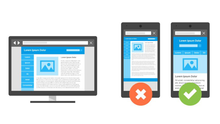
Source: Gleneagles.com

4. Offer Delightful Customer Experience Through The Website

User experience and customer experience are very closely connected and go hand in hand. Your website user experience can heavily influence the overall customer experience of your guests. So, it’s best to provide a delightful customer experience from the very first touchpoint which is your website. Online travel booking websites like Booking.com, Expedia etc. can never provide a personalized guest service, which is an advantage for you as a hotel owner.
Ensure that there are multiple ways for a customer to get in touch with your hotel administration, straight from your website. A landline phone number, skype, contact form for reservation related inquiries and special requests, as well as a live chat are must-haves on your website.
Offer special add-on services, which are not available on any other sales channel. It can be a complimentary welcome drink, a bottle of wine or perhaps a special discount. This will make the user feel the difference when booking with a hotel directly and will ensure repeat purchase directly from the hotel website.

Source:thelincolnhotel.com

5. Add Reviews From A Trusted Source

A study showed that almost 77% of travellers do reference review before booking an accommodation. Social proof is one of the most important factors to influence a buyer’s decision. In order to enhance your website’s credibility and provide social proof for your guests, showcase reviews from a trusted and well-known source like Tripadvisor. While adding a Tripadvisor review widget might not add an aesthetic appeal to your website, it surely is much more convincing than your own website testimonials.

Source: West Side Guest House

Developing a hotel website which is great in terms of both UX and marketing is a daunting task, and it might take more than one go to achieve the feat. But, these tips really come in handy during the design process and smoothens the path towards the ultimate goal. Talk to our UX experts, and learn more on how you can revamp your hotel website.

Categories
Blog

Follow These Simple Tricks To Create A SEO Friendly Web Design

The visual appeal of any website holds a lot of importance but isn’t the only criteria for its success. No matter how cool your website looks, it’s a complete waste if no one knows that it even exists. That’s when SEO comes into play. Search Engine Optimization helps in driving more and more customers towards a website thereby increasing the chances of conversion. That said, it’s important for website designers to keep SEO at the back of their head while designing a website in order to increase its effectiveness. In this article, we will learn 7 interesting tips to create an impressive SEO friendly website design.

1. Integrate Social Media

Search engines give a lot of importance to Social Media. Websites with social media elements enjoy higher search engine rankings which lead to more traffic on the website and eventually boosts the conversion. So, include social media icons of all your social media accounts on your website. Besides, don’t restrict yourself to Facebook and Twitter only. A lot of other social media platforms like Snapchat, Youtube, Instagram, Flickr etc. are gaining popularity these days and must not be left out. This helps in creating a personable image of your brand in front of visitors.

Integrate Social Media

2. Optimize The Images On Your Website

It’s not enough to optimize the text of your website to make it user-friendly. The same level of optimization must be done for the images as well. Ensure that the images you use are of good quality but small in size. Ideally, images must be between 30kb to 100kb and have a resolution of 72dpi. Large images will increase the page load time of your website which can hamper your search rankings. While selecting an alternative text for your images, ensure that you use relevant keywords. Furthermore, in order to enhance your search rankings, it’s best to use only relevant images and place them appropriately on the website.

Optimize The Images On Your WebsiteImage Source: SEO Rave

3. Create SEO Friendly URLs For Your Web Pages

A complicated web page URL can adversely affect your search engine rankings. For Example – http://www.myfashion.com/products/item2?=6541 is not an SEO friendly URL as it doesn’t help the search engine to understand what this page is about. Instead, http://www.myfashion.com/Men/Shoes/Casual is way better as it clearly explains the details about the page. That said, avoid using too many categories. Another best practice is to use a hyphen instead of an underscore to separate words in the URL.

seo urls

4. The Web Design Must Be Responsive

Your website design must be responsive and must be accessible from all the devices and across browsers. If visitors are not able to access the website from any particular medium, they are forced to bounce off and might not ever return back to your website. Also, the page loading time goes hand in hand with the accessibility factor. Eliminate any design elements that may cause the web pages to load slowly as it will hamper the search rankings directly.

responsive website

5. Don’t Overuse Javascript

It’s a common mistake done by web developers and designers to use Javascript in the entire site design. Search engines crawl through the website to index them and rank them accordingly. They will struggle to crawl through your website if your site heavily uses Javascript. Moreover, Javascript doesn’t perform very well especially in cases of mobile devices. Stay away from excessive use of Javascript and use it sparingly on your website to make your web design more user-friendly as well as SEO friendly.

javascript

6. Incorporate Keywords In The Entire Design

If you think that keywords can only be used in the copy of your website, then you’re sadly mistaken. Keywords can be easily incorporated into the entire website design. As mentioned earlier, keywords can be used as alternative text for images. Moreover, they can be used at many other places like in the title tag, H1 tags, website slogans, meta descriptions, meta keywords, navigation, H2 tags, bullet points, title attribute on links, H3 tags, breadcrumb trails, footer links, URL’s, file names, internal links and folder names.

7. Use A Sitemap

The sitemap becomes very critical for a website especially when you have a dynamic site or a site with thousands or lakhs of pages. All the content heavy websites with a large number of pages and dynamic sites face a lot of difficulties while being crawled by search engines. To overcome this problem XML sitemap is used. XML sitemap ensures that a website is crawled easily by search engines, even if there are a lot of content-heavy pages in it.

sitemap

Designing a website not merely playing around with different layouts, themes and color schemes. It’s way more complex than that. It’s very important for designers to understand each and every element of web designing in order to create a successful web design. Talk to our design experts and discuss more about effective website designing.

Categories
Web Design

Can’t Decide A Color Scheme For Your Website Design? Read This

A lot of planning goes behind developing a business strategy for launching any product/service and involves so many crucial decisions. One of these decisions is to choose a perfect color scheme for your website. One might think that this is not very important, but believe me, it’s as critical as any other element of your overall business plan. Your product/service must be presentable and people must recognize it, differentiate it, and most importantly recall it. Let’s understand the significance of different colors which will help you in choosing right color scheme for your website design.

Colors And Their Meanings

Every color has certain attributes attached to it and signifies something. Though, the significance differs from culture to culture. Here’s a brief description of the meaning and associations of color, particularly in relevance to the western culture.

RED – Shows passion, love and desire. Also used to show danger, strength, fire, and energy. Red quickly grabs attention & stimulates emotional reactions. Perfect for cars, sports sites and often used in food industry as it stimulates appetite. Must be avoided by sites related to finances, money lending etc.

PINK – Closely connected to femininity (women and young girls). It expresses sweetness, tenderness and finesse. It’s often used to portray romance and intimacy. Perfect for sites offering products related to women, babies or couples.

ORANGE – Orange is the color of joy, happiness and creativity. It’s very eye-catching and therefore often used as base color for call to action buttons as it attracts impulse buyers. Avoid using orange in excess as it shows desperateness to sell and that’s quite cheap.

YELLOW – In western culture, it’s often connected with happiness, warm feelings, optimism and cheerfulness. Again, a very eye-catching color, but must be used with caution as it can be a little harsh on eyes if used in excess or in a super bright shade.

GREEN – Color of nature, wealth, balance and harmony. It’s very pleasing to the eyes and often signifies prosperity. Green is suggested for sites related to money and finances.

BLUE – Both men and women equally love and prefer the color blue. It creates a feeling of stability and trust. Often used by banks, real estates and health institutions.

PURPLE – It symbolizes luxury, ambition and power. Since this color is very rare in nature it is also associated with mystery, magic and extravagance. It’s mostly used to advertise products for women and children. Also, purple is a good choice for businesses related to beauty & fashion, technology and education. However, it’s not advisable to be used in the food industry.

WHITE – White brings a feeling of safety, purity and cleanliness. It is a perfect base color especially for eCommerce sites since it help products to stand out. An information-friendly environment can be created by effective use of white space. It’s often used for medical websites.

BLACK – Black stands for class, royalty, luxury, wealth and sophistication. It is considered to be very elegant but also mysterious. Black is the safest bet for background color and is often used across businesses.

Ask these questions :

– What kind of age groups are you aiming at?
– Do you wish to sell your product to a specific gender?
– Which of their feelings do you want to engage?
– Do you want to trigger a specific emotional response?

It’s important to know your target audience, and then devote time to choose the best-related colors.

Colors By Gender

Joe Hallock did a study back in the year 2003 which compared color preferences among various demographics, here are a few results based on the observation:

  • Blue was the favorite color for both men and women
  • 23 percent of women chose purple as their favorite color while no men chose purple as their favorite color
  • Brown was the least favorite color for men while orange was the least favorite for women
  • 26 percent of the total participants considered orange as a cheap color

Another experiment conducted by Doctors Anya Hulbert and Yazhu Ling observed the following differences in how men and women perceive colors:

  • Women prefer soft colors while men like bright colors
  • Men are more tolerant towards achromatic colors as compared to women

Color Naming

Men like to keep it simple. What simply may be pink to men, could be Baby, Salmon or Magenta to a woman.

Choosing Colors For Your Website

Now that you have a basic understanding of colors, let’s dive into the details of how and what colors you can use on your website. There’s a rule of thumb when it comes to selecting colors for your website – You should not pick more than three colors for your website : Dominant, Accent, and Background.

Dominant Color

Dominant color is used at places where you want users to focus their attention. Remember, the purpose of Dominant colors is to differentiate certain section of your website so that users get attracted to those parts. Don’t overuse it as it will kill the purpose.

gimme

Image source: Gimme Delivery

Accent Colors

Accent colors are used to emphasize on certain elements like badges, sales banners & call to action buttons. Yes, they will hold importance but not as much as Dominant color. Avoid cluttering your website with too many accent colors. Less number of accent colors will help users to smoothly navigate throughout the entire web page. The eyes will naturally follow the path you want them to follow.

car repair workshop

Image source: Car Workshop

Background Color

The color of the background also depends on the purpose of your website. Like you shouldn’t pick orange as a base of wellness & spa websites, blue or green would be much better. Background colors can be used for storytelling. For example, suppose you want to create a strong and memorable impression on users, you should use darker shades and lighter tints of the dominant color across the website.

iceland
Image source:loveforiceland.com

Of course, color psychology is not engraved on stone. Color is something that people will classify through their own experiences and feelings. Don’t pick your colors at random. Think about your strategy and purpose more than once and determine what colors fit in the context appropriately. If you’re not very confident with your color coordination talk to our design experts, and they will be more than happy to assist you.

Categories
Web Design

7 Website Layouts To Highlight Your Content

It’s rightly said that ‘Content Is The King’ and therefore it becomes crucial to display content on a website in the most useful and intuitive way. Selecting a website layout is one of the very first steps taken by designers when they start any new project. They work hard to ensure that the layout of each and every website they work on, comes out to be unique in its own way. However, that’s not really necessary. Most of the popular websites on the internet use similar layouts, and that’s not a coincidence. These tried and tested layouts are familiar, usable and save a lot of money. Let’s take a look at the 7 most commonly used website layouts that highlight content in a great way.

1. Split Screen

ocean
Image source: Ocean

A split screen layout is perfect for a page that has two prime pieces of content both carrying equal importance and need to be displayed simultaneously. Split screen layouts are also perfect to portray two different variations of the user journey. A lot of designers use it to show a contrast between two items against each other. However, designers must not use a lot of content in split sections. If the design demands to display a lot of textual or visual information then don’t opt for a split screen. Use of animations helps in making a split screen layout more appealing.

2. Asymmetrical Layout

xplodemarketing
Image source: Xplode

An Asymmetrical layout features inequality between two sides of the layout. Do note that Asymmetry doesn’t mean imbalance. It is used to provide balance to a layout where it’s either impossible or impractical to use equal sections in a design layout. Designers can keep the visitors visually engaged by changing the width, scale, and color of each asymmetrical piece of content. This type of layout works best when designers really want to create something unexpected, while still guiding the eye from one element to another, even across emptiness.

3. Boxes

mporter

Image source: mporter

Another widely used website design layout is the Box layout. It features a large header-width box and a few smaller boxes placed below the header box taking a little portion of the large box’s on-screen area. The number of smaller boxes can range between two to five. Each box can contain a link to a separate page that contains detailed information. This layout works well with both individual portfolio-like sites and for corporate or e-commerce websites. It can be used for storytelling with the large box showcasing products while the smaller boxes offering further information on the product.

4. Grid of Cards

youtube

Image source: Youtube

Cards are the best way to present clickable information, especially when you need to present a lot of information in a consumable manner. The boxes usually contain an image along with a short description which helps visitors to get familiar with the type of content available in each of the box. Based on that they can choose the content they like and dive straight into the details by clicking or tapping on the card. Grids of cards work fantastically with responsive designs as the size, spacing, the number of columns, and the style of cards can vary based on screen size. A grid of cards layout is good for content-heavy sites.

5. Featured Image

featured image
Image source: Apple

It’s a fact that visuals are the most engaging and attracting type of content. This layout relies heavily on images to create an emotional connection with visitors. A big, bold photograph or illustration of an object makes a strong statement and creates a stunning first impression. Moreover, this layout is best in use when you need to demonstrate a single product/service and want your visitors to focus only on that. Designers must ensure that the image or the illustration used must be of high-quality and relevant to the message you wish to convey to your audience.

6. F-Shape Layout

wixcom

Image source: Wix.com

This type of layout is based on the way users read content on the web. According to studies, while browsing through the web, users typically move their sight in a particular pattern starting at the top-right corner of the page, moving horizontally, and then drop down to the next line. This is repeated until the user finds something interesting. This scanning pattern is relevant not only for desktop users but also for mobile users. The F-Shape layout is good for pages that need to present a lot of different options and allow users to scan them fast. It is perfect for a news site homepage or page that contains search results.

7. Z-Shape Layout

wixcom

Image source: UX Planet

The Z-shape layout is also based on the scanning habits of visitors. Unlike the F-Shape pattern, some site visitors start from the top-left corner, moving to the top right, forming a horizontal line, but instead of dropping down directly, as in the F-shaped pattern, their sight moves down to the left side of the page, creating a diagonal line and then they glance back across to the right again, forming a second horizontal line. The Z-shape layout is better suited for sites with a singular goal and less content. This pattern is effective at directing user attention to specific points by using well-placed visuals, text, and CTAs.

Content is the main ingredient of any website. Designers should ensure that the prime objective of any website design is to display the content in an easily consumable manner. They must select the appropriate website layout which makes their content shine outright. Speak to our design experts and know more about design layouts.