NYX Ditech

Categories
Design UI Design UX Design

Modern Vintage Graphic Designs Are Back In Trend!

Whenever we talk about material goods, “vintage” refers to any contemporary designs that is more than 20 years old but less than 100 years – to be considered antique. The term can be used more freely in design, although it still refers to an earlier style created during previous times. Now and again, we see a revival of classic designs in a variety of sectors. The majority of them evoke memories of decades – or perhaps centuries ago.

When appropriately used, vintage elements and marketing strategies attract high-value consumers. It compels people to participate in your old storyline and maintains their loyalty. What is it about them that make them so enticing to the audience? What makes them popular? Let us investigate!

How Is Vintage Designs Defined?

By definition, the term “vintage” refers to a period when anything of value was created or to a high-quality product, idea, or philosophy developed in the past. At the moment, the term “vintage” refers to anything that evokes memories of a bygone era or fashion style. Vintage designs use features, colors, and items that reflect popular styles of a particular age.

Distinguishing Retro From Vintage Designs

Many individuals do not take some time to grasp the distinctions between these phrases properly, and as a result, the terms are commonly misinterpreted. Retro is a term that refers to something relatively modern (a commodity, a style) that emulates something from the past. Retro is not original but is influenced by the original to seem authentic. Vintage denotes something unique, original, and has a lifespan of between 20 and 100 years. It is scarcer and hence more valuable than its retro cousin.

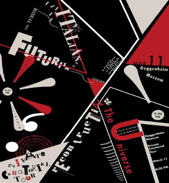
What Are Modern Vintage Designs?

Modern Vintage Designs incorporate aspects from the past and present, as well as a touch of futurism. This technique may help modern audiences connect with antique designs or perhaps serve as a center point for older and younger generations.

Modern Vintage Graphic Designs enable us to create and make use of the best of all worlds. We can approach current and antique eras from a variety of angles. This creates limitless opportunities for creativity to develop. For instance, we may reproduce old images from the 1980s or 1990s in contemporary surroundings and give Gen Z the same vibe.

Why is Vintage Design Becoming So Popular?

Individual Appearance – There are several explanations behind vintage popularity. One of them is that customers think conventional fashion has lost its individuality and supermarket fashion has become too generic. Vintage has an inherent quality that elevates it above things picked for their fitting, authenticity, and design value.

Trends That Never Fade – Consumers recognize that antique clothing may be adapted to current trends while still serving as timeless classics that can become wardrobe mainstays. It’s one of the primary reasons vintage has gained popularity.

Personality and Expression – Being unique is a critical component of looking trendy. It reveals a great deal about your character and lifestyle. Vintage clothes enable individuals to express themselves while also aiming to create a fashion contradiction.

Soul and History – Vintage clothing encompasses much more than simply worn-out garments. They are historically and artistically significant, and they are brimming with the tales and experiences of those who came before us and wore them. Possessing and wearing antique clothes help preserve those individuals, their heritage, and their talent alive.

Conclusion

Vintage clothing never fades away. Retro styles are constantly resurfacing. Whether your firm is in fashion, information technology, travel, education, or another area, you will occasionally need to adapt to modern vintage graphics. Contact Us today to know more.

Categories
Brand & Identity Design UX Web Design

Web Designing While Accounting Human Errors

We often hear the phrase ‘To err is human’, and it can’t be truer in every aspect of our lives. We all make mistakes. Users on your websites are no different. Sure, you can’t stop them from making mistakes, but, can you follow some aspects of web designing while designing your website in a way that it leaves a scope of making mistakes?

Even the most careful and diligent users are bound to make mistakes at some point in time; others will make more mistakes. Therefore, it is critical to consider this fact while designing your website. The errors in web designing can be as simple as mistyping a URL, providing incorrect information in a sign-up form, adding info in wrong fields, etc. The mistakes could even be as disastrous as accidentally sending thousands of dollars to the wrong person via PayPal. So, here are a few tips that you can follow to account for human error while designing your websites. 

1. Provide Straightforward Instructions

A lot of times, we assume that the users are by default aware of the most basic instructions. Thus, we don’t feel it necessary to provide these basic instructions to them. Moreover, people often see basic directions as a bit snooty. It’s human to assume you know everything you need to know for a simple-seeming task. This causes errors.

Don’t assume they know what you mean. An imperative when delivering clear instructions is not to assume the recipient knows what you mean. This can be for anything from commonly used acronyms to simple navigation instructions.  Mixed messages, assumptions and multiple options mean that the message received might differ from what we actually meant.

2. Give Clear Warnings During

Just like the instructions, users must get a clear understanding of the consequences of actions taken on the website. And, sometimes they need to be informed and explained the implications, that too in detail. Still, there would be users who would keep ignoring your warnings, but there’s not much you can do for them in any case.

There’s also a second web designing approach which you can proceed with. A majority of people will leave your site when they face a warning message which they don’t fully understand. Else, they may look for help to understand the warning, which again may lead them to bounce off. You’ll have to decide whether you would rather deal with potential inaction from some customers, or more errors. Both approaches have their pros and cons.

3. Always Confirm Actions While

You may think that all users are completely sure of what they are doing on the website, or they may get annoyed with questions asking them to confirm their actions. A confirmation dialog may seem like an irritating and useless extra step; however, the truth of the matter is a quick “Are you sure you want to do that?” message can be invaluable. The user may be taking action for the first time, or the tenth time, it’s irrespective. A confirmation will only increase chances that the user takes the correct, intended action.

4. Validate Forms

Form validation may not be a full-proof solution, but a potent tool, and a great way to gently guide the user in the right direction. While proper form design can help keep users from simply putting the wrong text in the wrong form, form validation is excellent for double-checking information and catching typos and forgotten fields.

Improper validation of form data is one of the leading causes of security vulnerabilities. It exposes your website to attacks such as header injections, cross-site scripting, and SQL injections. It is important to note that client-side validation is beneficial, but it is not enough. If you’re going to implement client-side validation, it would be good to have some of the server-side too, just to be safe.

5. Use Appropriate Form Labels

In our last article, we listed out some essential tips for selecting the right button labels. The labels on the forms are equally important and can lead users to commit an error, if not used properly. There are tonnes of websites on the Internet with so many vaguely-labeled forms. Worse are the forms that use industry jargons on a client-facing website. In some of the sites, the labels and input fields are even misaligned. That’s just a strict NO-NO!

6. Improve Usability Through Color and Contrast

The colors and contrast are often used on a website most simplistically. People only go as far as using red and its shades to portray bad, and green and its shades to show good. But that’s not enough. It doesn’t necessarily help differently-abled users. A website should be usable by everyone, so various disabilities should be kept in mind. Disabilities can include but are not limited to, the inability to use a mouse or see the screen.

When someone has low visual acuity, specific color palettes on websites may make it difficult for that person to see and understand the website content fully. You must find a way to add contrast to your elements, in such a way, that they’re clearly and easily distinguished from each other. Pay special attention to this if two options use similar text, but do radically different things.

7. Provide ‘Undo’ Option Where Possible

We all know how handy the ‘Ctrl+Z’ option comes in every day while performing various tasks. The ability to undo an action is such a boon to everyone. We wish we had an undo button for our lives. Coming back to reality though, if you’re building a web app, you might seriously consider implementing some sort of “Undo” function for just about every action with permanent consequences.

You cannot ensure error-free browsing on your website; neither can you take a generic call on the abilities of your users. But, considering human errors while web designing, will increase the chances of good user experience and fewer errors. Speak to our experts to discuss more on it.

Categories
Blog

Top-Notch Tips for Creating a Time-Saving Design

Users over the Internet have a very short attention span. They don’t really read everything and stick on every page, but scan through quickly. This makes it important to use design techniques that help users scan and get most of the information from your website in the shortest time possible.

It is critical to understand what users need to learn from the design at a glance and help them get that information so that they’ll stick around and explore your website. Here are a few tips to do so.

Minimal Thinking

A design without a lot of choices can be quick and easy for the user. While at first, “think minimally” might make you think about a minimal design style, it’s more about streamlining elements and effects. Overall, the goal is to limit information overload and the number of decisions a user has to make to meet the goal of the design. Keep simple navigation with a handful of choices, using simple typefaces that are easy to read at a glance.
Amp up the contrast between elements so that calls to action are easy to find. For every page, or scroll, in the design, stick to a single thought or action.

Use Visual Content to Encourage Actions

Strong visuals, including photography and videos, are an easy way to grab user attention and when paired with an actionable element, it can help generate an immediate click. It should be quick to move from one point to another within the design. Think about it in terms of e-commerce. A user sees a bag on social media, clicks to get to the website, where they must be able to see the item to keep interacting with the website.

A time-saving design would show the bag with a ‘Buy Now’ button. The user should easily understand how to get it or what is the next action, without having to fumble through multiple pages or clicks. Also, it’s a good practice to use the same image for off-site and on-site promotions. A different picture might not register as quickly with the user as the same image. This works because most people can process an image more quickly than reading words.

Divide Complicated Elements into Parts

Create a story so that you can break a complicated design into smaller, more digestible pieces. Smaller blocks and pieces of content are easier to understand quickly, thereby facilitating a users’ movement from one element to element. Try user interface elements such as “read more” links, card-style blocks and parallax scrolling animation to create engagement and break down complicated designs.

Cut Down Forms

One of the easiest ways to make the design quicker for users is to cut down on asking for not so important information. Forms must be simple and should only collect the essential information such as name and email address, and follow up later for forms designed to generate leads.

Use forms that validate data so users know if they’ve entered something wrong, so corrections are quick and easy. Minimize typing and use buttons or checkboxes in forms where applicable.

Use Bold and prominent CTAs

Make the design quick to use and easy to finish with a bold call to action design that users can’t miss. Bright colored, oversized elements can help users immediately see what they are supposed to do. Further, provide content within buttons that tells users exactly what to do and what will happen when they “click here.”

In order to be seen, a CTA should have plenty of contrast so that it doesn’t blend in with surrounding elements and draws attention to itself. (And don’t forget to make sure the CTA is easy to find on mobile screens as well.)

Review and Edit Multiple Times

Nothing saves users’ time, more than duly checking each and every element, multiple times before publication. Edit everything in the website design and then review it again. A time-Saving website design has written copy that’s easy to read and understand. This means that there are no spelling errors or typos, sentences use proper syntax, grammar, and sentence structure, with everything being organized in a logical manner.

Sometimes a good edit means bringing in a third party to read everything and ensure it makes sense to someone else. An extra set of fresh eyes can help you identify the hidden errors, or to analyse if the content is too complex, with too many jargons.

Consistency Is The Key

A consistent design includes repeated elements, actions, and interactions that work in the exact same way throughout the design. It simply means that a button should always look like a button, have the same color and font, same hover state and work in the exact same way no matter where the button leads the user. Repeat this idea for any element in the design that gets used multiple times, such as icons, the cart, forms, links and social media buttons. Be consistent with other elements also. Headlines, body text and images used should also follow a consistent style.

Conclusion

Whether you agree or don’t, users are looking to do things in a hurry on your website. They want to quickly finish tasks or meet their goals and move on to something else. The more your design saves users’ time, the more user-friendly your website will become. Talk to our experts to discuss how you can add to the UX of your website.

Categories
Web Design

8 Golden Rules Of Visual Hierarchy

It’s a known fact that visuals create maximum impact on viewers. The art of website designing also follows the same principle and the entire process of web designing aims at creating something which is visually appealing. It’s important to create something visually attractive, but it’s also important to add an order and structure to the design, which is done by following a visual hierarchy. Visual hierarchy helps in guiding the human eye from one element to the other while eliminating visual fatigue and helps them to notice vital information. Here are 8 golden rules to follow in order to effectively implement visual hierarchy in a website design.

1. Focal Point

Focal points are areas of interest, emphasis or difference within a composition that captures and holds the viewer’s attention. The focal points in your design should stand out of the clutter and must be easily noticeable. Focal points must be designed with some differentiating elements like a different color, size, shape etc. so that it becomes the first thing a human eye will notice while gliding through the webpage.

focal-point

2. Movement

A viewer’s vision is automatically drawn to certain specific places and they follow a particular movement of vision. It does differ from individual to individual, however generally the viewers follow an F-pattern or a Z-pattern. If the text and design is implemented keeping the movement pattern in mind, its more likely that the content will be better comprehended. However, if the viewer is not moving the way you want them to, then perform the A/B testing of layouts.

build-website

The build website uses a Z-pattern movement

3. Golden Ratio

In simple words, it is a mathematical proportion of the elements of different sizes which is thought to be the most aesthetically pleasing for human eyes. The proportion equals 1:1.618 and it is often illustrated with seashell-shaped spirals. Designers often apply golden ratio at the stage of wireframing. It helps to plan a structure for the layout placing and sizing user interface elements in the right proportion which will be soothing for users’ eyes.

box-UX-planet

Source: UX Planet

4. Repetition

Repetition helps in creating a unity which boosts understanding and recognition. Style repetition provides consistency across the website which leads to a unified web design. Repetition of some elements like fonts, colors, shapes or sizes throughout the entire composition clearly defines the visual hierarchy of any design. At times repetition is used to give elements a new meaning altogether. Like when you see blue underlined text stand out on a page you instantly recognize the font as a hyperlink. Repeating this style in a design tells your audience where to click for more info.

Repetition

Source: Visme

5. White Space

Every aesthetically-pleasing design requires its fair share of clutter-free negative space, often referred to as “white space”. A lot of designers overlook the importance of white space as a design component in the scheme of visual hierarchy. The idea is, more the white space surrounding an element, more it will catch attention. White space improves focus, cuts through the clutter easily, and creates amazing balance in a web design.

White Space

Source: Colony

6. Typeface

It is essential that you convey your message loudly and clearly through a clear typeface, that kills any ambiguity. The major headings should stand out with large font size followed by medium sub-sections, and smaller details. Using different type sizes helps in emphasizing important details. Also, the overall design looks more systematic and arranged. Various text sizes, weights, and spacing can be used to create typeface hierarchy.

Typeface

7. Randomness

It’s not necessary to follow the grid always. Some designers break the grid and place various elements randomly across the page to stand out from most of the gridlocked text. Although the concept is called randomness, simply scattering elements across a page without a strategy or reason will not yield the desired results. Every move of randomness must be a calculated one backed by analytical facts.

randomness

8. Alignment

Alignment is part of the structure by which elements are placed in a design. It dictates that visual components, whether they be text or images, are not positioned arbitrarily throughout a composition. Some visual designs are centered or justified so that they share both the left and right margins. In F-pattern designs, objects are generally aligned to the left, while Z-patterns often employ a combination of left, center and right alignments. Designs featuring text are often aligned to the left margin while simple visual designs are mostly center aligned to strike balance.

alignment

Source:Visme

Creating and implementing a visual hierarchy can do wonders for your overall web design. These rules, when followed and implied correctly, will surely enhance the aesthetic appeal of your website while providing order and symmetry. Talk to our experts and understand how they use these rules and other design tricks to create stunning websites.