NYX Ditech

Categories
Trends UI Design UX Design Web Design

Web Design Trends You Can Bet On For 2022

Web Design Trends You Can Bet On For 2022

What will be the most popular web design trends in 2022? When it comes to keeping your designs relevant and contemporary, what approaches and strategies should you know?

Design trends may influence anything from the way designers work to UI design and future versions of everything from web pages to manufacturing. It’s crucial to keep an eye on current trends so that you don’t wind up with a design that goes out of style too fast.

Top Trending Web Design Trends For 2022

Webpage With a Cinematic Feel

Many current websites include cinematic-style homepages, which are becoming increasingly popular. Videos that appear in full-screen mode rapidly immerse visitors in the website. It is the best design element for welcoming visitors to a site. It has the ability to captivate and enthrall consumers in a matter of seconds.

It’s also possible to personalize your cinema-themed homepage. As an example, you may add a slow-motion effect, vignettes, etc. to enhance its visual appeal. This capability reduces the quantity of text that web design services need to provide on a website’s homepage. For the year 2022, it’s a great design trends to follow.

Loading Smart Content

The User Experience (UX) is a critical aspect in determining the success of a website. It’s common for websites to be sluggish due to the significant graphics and third-party features that are incorporated into the design. Fortunately, creative design services can design a website that only displays the information which is necessary.

The most popular social media networks have been employing this strategy for some time now. By incorporating it into your website development strategy, you may improve the speed at which your website loads. Moreover, it will assure that you develop resource-efficient websites and maximize your investment’s return.

Customer-Specific Content

Providing content that is tailored to the customer’s interests, actions, and goals is a smart move. It can assist you in achieving outstanding outcomes and enhancing your business. According to Chromatix’s Irwin, web design these days must gain the trust of customers to achieve its intended goal of revenue generation.

Providing clients with personalized information increases their confidence and belief in your company. When designing websites in 2022, you should never miss out on this aspect. If you need help creating marketing content, you may work with a web design agency. Working with experts can assist you in developing content that matches the needs of your target audience.

Dark Mode 

This is another outstanding design component that should be included in your 2022 designs. Many website designers are unfamiliar with the benefits of allowing customers to switch between different modes. It’s one of the finest ways to improve the user experience on your website, even if you’re doubtful about it.

It is essential that your site design includes both bright and dark color combinations. This ensures that transitioning between modes has no effect on visibility. 

Design Elements That Intertwine

A great design trend, but one that should be used with caution. When it comes to modern design, it’s possible to mix and match different design aspects rather than putting them all in the same container. This design trend may help any web design company develop a professional and sophisticated website.

When it comes to overlapping designs, why do you need to be careful? While adopting this style, it is possible to jeopardize your website’s readability. You must make sure that all of the pages that overlap can be read. Also, make sure that the web pages are collapsible without impacting the readability of the document.

Chatbots

Chatbots powered by artificial intelligence (AI) should also be on your list of web development priorities. Today, all businesses are striving to make their customers’ experiences as easy as possible. Customers have benefited greatly from this trend throughout the years.

AI chatbots communicate with clients in the same way as real-life customer service representatives. They are able to discern a customer’s intent and track where they are in the purchasing process. As a result, they are viable options for obtaining leads, cultivating them, and moving potential consumers through the sales funnel.

Noticeable Borders

Web design thrives on creating an aura of elegance—or, at the very least, the impression that the content is perfectly organized by an unseen hand and floats freely in digital space. Of course, the fact is that websites are designed on a rigid grid and are kept together by code. For the year 2022, site designers are hoping to get a little more authentic with basic borders and frames that disclose their base.

The obvious advantage of a visible grid is that each portion can be clearly distinguished from the others. An easier-to-read layout allows for more information without making the page appear overcrowded. Websites with basic borders also have a nostalgic feel that goes nicely with other 90s-related trends that are making an upsurge at the same time.
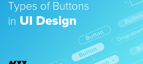
Big Buttons

Your website’s usability can be improved by incorporating large buttons within the design. Tiny buttons aren’t user-friendly for thumbs, especially on smaller screens. You may improve the user experience by making all buttons bigger. It will make it easier to find things and make them more accessible.

Colors can also be used to distinguish the buttons. As a result, there will be fewer instances where visitors accidentally engage with the wrong sections of your site. The benefits of large buttons cannot be overstated which makes it an excellent site design trend for the year 2022.

Minimalism

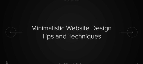
The most prominent web design concepts of 2022 have adopted a minimalist approach that decreases user interruption and friction. Various content columns, many widgets, and annoying pop-ups aren’t what visitors are looking for. If you can show them what they’re looking for as quickly as possible, you’ll be recognized.

Read more about minimalistic website design here.

Conclusion

Nowadays, the web is a big and crowded place. If you want to be successful, you first need to stand out. That’s why great web design is more than simply a luxury; it’s a necessity. Without a solid plan in place and an appealing web design, it’s difficult to deliver an exceptional customer experience.

It is possible to improve your website design by following the following trends listed above. The good news is that you don’t have to start from scratch to implement them. Contact Us Today to Learn More

Categories
Trends UI Design Web Design

Best Minimalistic Website Design Tips and Techniques

When someone says “less is more,” they are pointing towards the concept of minimalism. Minimalistic website design ideas are more than a design feature. It’s a way of thinking and an approach towards creating design elements or communication interfaces that emphasize on keeping the creatives restrained and nominal. 

Minimalism is attractive and compelling and is being approved by most of the designing professionals and users these days. 

Why is it so effective? Look at it this way: If you want to go to the summit of a mountain, you need to be as lightweight as possible. With only you and your essential equipment, you’ll have plenty of room and a great view of the world at the very top. Minimalism lets you get the most out of your trip by using the fewest resources possible.

That is the essence of minimalism.

Similarly, in the context of web designing, minimalism is all about providing seamless user engagements without the addition of unnecessary design components. With a focus on simplicity, you may create a website that appears polished and well-thought-out, as well as one that can accomplish more with less. Lower levels of distraction lead to higher levels of attention, involvement, and eventual conversions.

When it comes to your website, you don’t have to limit yourself to just one facet of minimalism. It’s all about making the most of what you’ve got. This blog discusses all aspects of minimalistic website designing employed by web design professionals and will guide you to implement one.

Best Practices for Minimalistic Website Design

1. Utilize the whitespace

There will be some free space left after removing some unwanted objects. The white space is often referred to as the negative space by web design professionals. Besides that, it serves as the foundation for all minimalist designs. It’s not required that it’s white, but it is without a doubt empty. Even when it’s empty, it still has an impact on how buyers see your brand.

First and foremost, it eliminates annoyances and interruptions. Second, it draws attention to itself and makes it easier for users to get to the content they need without having to contend with distracting aspects. Whitespace has been linked to a number of advantages, including the ones listed below.

  • It improves the user’s experience and directs their attention to the website’s content and your offering.
  • It provides a sense of equilibrium.
  • A web design company may use it to entice visitors to stay on your website longer by paying attention to the information that appears in the white space between your site’s primary content sections. 

One of the best ways to get a minimalist look is to use a lot of whitespaces.

2. Use of vivid colors

Even though bright colors might be exciting to look at, implementing them into a minimalist design can be difficult. Colorful backdrops grab the user’s attention and hold it for a long time. However, if the background is very colorful, it might go from being intriguing to being bothersome.

The usage of vivid colors should be paired with more subdued, relaxing hues. Include some typography in either black or white. If you follow these steps, you’ll end up with a stunning, eye-catching final result. Furthermore, inform the web design company you employed to avoid elaborate animations, strange typefaces, and abrupt transitions between content sections.

3. Experiment with typefaces

Beautiful, strong typefaces are a key design trend right now followed by many professional web design services. Your imagination is the only limit. Your user’s attention will be drawn to your content if the typeface is clear and easy to read.

To compensate for the restricted use of animations and pictures on your site, an effective typographic strategy may be used to make it aesthetically appealing. Using typefaces to establish hierarchy will help your site’s users better understand what information is most essential and how to get around your pages.

On smartphones, typefaces are projected in a way that affects the overall usefulness of your product. Using the “Sans Serif” font type for a minimalist website is one of the greatest options since it is crisp and clean to look at.

It’s important to keep the font size simple when there aren’t many things on the page. Using tiny fonts may be an excellent method to convey information without consuming a lot of space. However, you must take precautions because small writing can quickly go lost on a web page, creating an impression of clumsiness and distraction.

4. Flat textures

There are no gradients, shadows, highlights, or other graphic elements in these textures. Everything about the user interface in this scenario appears to be kept to a bare minimum and to the point. It’s important to keep in mind that a flat design isn’t the only way to get a minimalist personal website. Different types of flat and minimalist designs may be found. It’s not uncommon for them to co-occur, but be aware of the distinction.

Although it may include a stunning 3D animation in the middle, a simple website might still be considered minimalist. For the time being, some designers may find it simpler to minimize using flat structures. It is important to bear in mind the overall look and feel of your brand when selecting from various web design ideas.

5. Customize navigation

In order to achieve a minimalist aesthetic, it is essential to get rid of whatever you consider unnecessary. Some web designers, on the other hand, may take things a step further by eliminating the majority of the website’s navigational elements. Make sure that you don’t obscure navigational links that are critical to your users.

It’s best to leave the “menu” button intact while integrating the rest of the navigational buttons into the “menu.” The “homepage” button can be hidden within the logo of your firm. Moreover, you should highlight the buttons in such a way that your visitors understand they are clickable.

6. Grid layouts

Digital designers that want a minimalist aesthetic use grid layouts in particular. An additional benefit of this design is that it makes the page appear lighter. Even with a steady stream of fresh content, there is never a feeling of being overloaded.

You may also use grids to build a responsive version of your website, which normally requires an image that is drastically different from the desktop version.

7. Images should be carefully chosen

People’s emotions are greatly influenced by visually appealing graphics. That’s why an entire business has been devoted to designing.

Use high-definition images that are vivid and eye-catching to elicit a strong emotional response from your visitors. While photographs can be used as ornamentation, remember that they should also demonstrate the business or product you are delivering.

Bottom Line

For your minimalistic website design to be a success, you’ll need a clear vision, an inquisitive mind, and the willingness to go from cluttered to no-cluttered. But the payoff is worth it. Minimalism reduces your brand to its most basic elements, making it easier for potential consumers to meet and interact with you.

Contact Us today to get your website audited for UI and UX

Read About How To Use Colors In your Websites here.

Categories
Blog Brand & Identity Technology UI Design UX Design

Key Factors To Consider While Hiring A Web Design Agency

Most consumers these days begin their shopping journey on the web, thanks to the enhanced user experience and convenience it provides with help of a good web design agency. As a result, businesses must now have a digital presence by developing a website. Companies may easily reach millions of potential customers over the internet with the help of a website. 

Using a website as a marketing tool is a great way for businesses to penetrate markets and get their name featured in the functional mainstream. This can be best accomplished by working with a reputable web designing company.

Today, there are so many organizations offering web designing services that picking one that you can trust might be a difficult endeavor. So, how do you go about finding a web design agency that can create a quality web base for your business?

Key Factors To Consider While Hiring A Web Design Agency

Impressive Portfolio

A web development company’s success may be judged by the number of projects it has completed successfully. In order to show off their greatest work, a web designing company should put up a portfolio of their most impressive projects online. Ask for examples of their work that are relevant to your industry so you can get a better sense of what they can do. For those of you who are drawn to what they have to offer, they may be just what you need.

Focusing on Your Area of Expertise

There is no one-size-fits-all solution for a business website. Make sure that the UI design experts you choose specialize in producing websites for your sector before you sign on the dotted line. Hiring an agency that has handled comparable projects in the past might help you obtain the outcomes you want from your website. The agency should be able to apply the most up-to-date web development trends when creating your website. This is critical. Your website’s user experience (UX) might benefit from this.

Check the size and location of their office

Credibility and authenticity may be ascertained by looking at the web design agency’s physical location. A serviced office location may seem great, but it might be a clue that the company is a startup that hasn’t had a lot of experience in the field.

In case you’re unsure, you may either make an appointment to visit the agency’s office or check their Google page to see if they have any images of their location.

To ensure that the web design agency of your choice does not pose any danger of fraud while also providing a pleasant working environment for their employees is essential. Attempts like this reflect the company’s commitment to attracting and retaining high-value employees.

Is there a copywriter on staff?

When it comes to the best web designing services, it’s crucial to have a team of talented copywriters in addition to experienced front-end designers. Copywriting is viewed as the cornerstone of content because, as we constantly say, “Design attracts, copy sells.” This is what you need to keep people on your site and encourage them to convert.

With an agency’s in-house copywriting solutions, you can rest assured that your content will be original and tailored to your brand. Copywriters may rewrite and proofread your work, as well as come up with banner headlines or taglines if you don’t yet have them. Only with a professional online firm that employs in-house copywriters can you acquire such high-quality services.

How Much SEO/SEM Knowledge Do They Have?

There’s a lot of hype surrounding SEO services from most web design companies. But, it’s not clear how much they actually know. So, there is a question: Are they really specialists in their field?

One approach to see whether they are practicing what they teach is to see if they use SEO and digital marketing in their own business. How much, if any, digital advertising do they conduct? Are they optimizing their website?

You’re attempting to expand your organization, and in the competitive world of web marketing, you’re going to need every bit of assistance you can obtain. Look for another firm if the one you’re considering doesn’t seem to care about its own digital marketing and search ranking.

Is There a Social Media Presence for This Company?

The use of social media in digital marketing is becoming more prevalent. It’s a good idea to check out the social media presence of the web design agency you’re considering.

You may also get an idea of how they market themselves by checking out their social media accounts. Keep in mind that your website is the center of your own brand identity. Examine how do they portray themselves, and is it consistent with the picture they project on their website?

Make Sure to Verify Their Credentials and Reviews

Many people find online references and reviews invaluable, whether they’re seeking to find the best socks or the best restaurant for supper. When you hire a web designer, this is just as crucial.

If an agency has a lengthy history of bad ratings, it’s best to keep looking for better front-end designers. Reviewers have already made the mistake of employing them, so you do not have to make one yourself.

However, while reading customer testimonials for a firm, proceed with caution and suspicion. Disgruntled customers or ex-employees may post an untruthful review out of spite. However, there’s a chance that some of the most glowing testimonials are fraudulent.

Seek out a Web Design Firm That Offers Responsive Design Services

Using a smartphone instead of a PC to access the web is becoming more and more frequent. This implies that many potential clients will leave your site immediately if it isn’t mobile-friendly.

People’s preference for using their smartphones to access the internet isn’t going away any time soon. Almost three-quarters of the world’s population is expected to rely only on smartphones to connect to the internet by the year 2025.

The absence of responsive design from an agency’s portfolio is a bad indication. Hire a web designer that makes sure your website is compatible with various gadgets that people use to access the web because you’re spending so much time and effort on it.

How Much Does It Cost?

The cost of finishing the project must be taken into consideration when evaluating the quality of the work produced by UI design experts. It is important to keep in mind your budget while looking for a web designer, as this will help you narrow down the pool of options.

Be certain to ask about all of the charges associated with creating your new website before agreeing on a price. As a result, you’ll be able to pick a web design company that provides the most bang for your buck.

Do They Consider a Content Management System When Designing?

For a website to flourish, it must be updated often. Changes and updates are inevitable as time goes on in this dynamic digital era.

With no CMS in place, it may be difficult for you to make changes to your website without the help of your website’s developer. Seek out an agency that includes CMS into its company model and strategy.

Final Thoughts

Choosing a website design firm is one of the most essential decisions you’ll make for your organization. Having a well-designed and user-friendly website is essential since it serves as your business’s virtual office and serves as a gateway for your customers to connect with your offering. Make sure you take the right course of selection and pull off the entire attempt, picking on the best of research and judgment to hire the best web design agency. Contact Us today to talk to our experts.

Apart from keypoints, there are several reasons to hire a web design agency. Read details here.

Categories
Brand & Identity Design UI Design UX Design Web Design

How To Validate A Good Design

Designing graphics demands immersive artistic skills. Web and graphic designing professionals know how to demonstrate art and how to create its impact on the audience. However, even experienced eyes occasionally fail to appraise a design and require a checkpoint list to certify it.

For the most part, creative designers rely on their gut feelings to determine whether or not their work is excellent enough to be seen by a wider audience. However, there are ways to establish a more objective and dependable process to make sure that the design stands good from a broader perspective and gets a larger acceptance.

Appoint a Design Validation System Built On These Check-Points

#1 Is the design well-executed?

An issue that has to be solved is generally the driving force behind the requirement for a design. It could be anything from a website that demands to be more user-friendly to a product that has to appeal to a certain demographic to a new firm that requires a logo.

This is the initial checkpoint for determining the quality of a design. If it does not resolve the issue, there is no need to continue; the design is most likely not good. As long as its primary function is not met, how wonderful it appears doesn’t matter.

Understand the needs and desires of your target audience to ensure that your design will be successful. Start by asking the question “Why?” until you get a clear picture of what your design is supposed to accomplish. After a few inquiries, you may discover that the customer is actually looking for a different product than what they initially thought they were looking for. To be sure that you’re trying to tackle the appropriate problem, you need to first identify what that problem is.

#2 Is the tone conveyed correctly?

To determine whether or not a tone is acceptable, you’ll first need to know two things: the brand and the audience you’re targeting.

Brand

The term “brand” is typically linked with corporations, although it is not exclusive to them; many objects, including you, may have a brand. A person’s brand is the impression that others have, and the same holds true for businesses and other organizations.

When a corporation uses good design, they may regain control of their brand and change public perception in the direction they choose. This is what a professional digital branding agency does to build the right brand image to best serve businesses’ underlying communication and engagement objective. 

Audience

If a corporation has a specific audience in mind, it might be anything from a wide demographic range to a very specific niche. After knowing how the firm wants to be regarded and who the design is intended for, the only issue left is what type of design would be most suited for that organization.

To appeal to a larger audience, a company’s design typically has to be simpler and more conventional, which is why many organizations lose some of their “soul” as they develop. This occurs because some design tricks that work well for narrow niches would fall flat with a bigger audience, and thus the firm “sacrifices” them in order to attract more customers. 

However, if your target audience is limited and narrowly defined, you may rely on these gimmicks to enhance the design’s visual appeal and engagement value. 

A nice way to illustrate this is to compare McDonald’s to your neighborhood burger business. In essence, they’re selling the same item, but their methods of communication are vastly different.

#3 Will The Design Be Able To Withstand The Passage Of Time?

Although a timeless design would be ideal, it may not always be required or even recommended. It all relies on the purpose of the design and how long it will last.

There’s no harm in taking advantage of the current year’s trends if you are developing a website for a product that will be replaced or upgraded within two years. This will assist you in making your design appear trendy, modern, and relevant. Keep an eye on the trends and attempt to keep ahead of them.

There is nothing worse than riding the wave too late; this simply serves to make you appear awful as if you are attempting to catch up rather than initiating the trend.

A logo that’s meant to be there for several decades or more should absolutely avoid design trends that have a limited shelf life. You can see this pattern if you take a look at well-known logos like Starbucks, which have undergone several redesigns throughout the years.

#4 Is The Design Free Of Friction?

The term “friction” refers to anything that stands in the way of a person reading or utilizing something. Adding extra friction makes it more difficult for people to acquire what they seek from your product. Things like difficult-to-read language or a cumbersome website are the primary causes of friction. Many designers make the error of compromising readability and usability for the sake of making their designs “look better” despite the fact that this is an evident mistake.

In order to convey as much information as possible, it’s critical to thoroughly gauge your audience’s interest. Try to avoid information overload, since this will only serve to stifle your design.

#5 Are Typefaces Compatible?

Typography is an important component of practically every design. Fonts that are well-chosen have a significant impact on the overall appeal of a design project. The use of two or more fonts that are not complementary to one another causes a significant amount of distraction for the viewers.

For novices, it’s best to adhere to sans-serif and serif font typefaces at the start of the project design. When choosing a typeface, keep in mind the text’s overall mood and personality.

Final Thoughts

It is critical for graphic designers to thoroughly analyze their work to ensure that it has a positive influence and impact on users. It is the responsibility of every designer to ensure that the design’s emphasis is where it should be.

In short, excellent design is more than just how it appears; it’s a mix of intelligent decisions made with keeping the ultimate user in mind.

To get help with planning and implementing a design validation process, connect with the experts at NYX Ditech.

Read more about UX Design practices to avoid errors here.

Categories
Design UI Design UX Design Web Design

10 Traits Of A Poorly Designed Website

What separates the world’s largest and most prosperous organizations from those in the same industry who, despite their best efforts, have not achieved the same level of success? Regardless of how you want to say it, the answer can be summarized in two words: “User Experience”. When it comes to branding, your designed website is among the most significant weapons in your arsenal. It has limitless possibilities, and you’ll notice that quite a few firms have an advertising strategy that is entirely focused on their web design. In order to compete with the giants like Amazon, Apple, or Google, their rivals must learn from the success they’ve had with web or UX design.

As per E-consultancy research, 55% of businesses reported that they never conduct User Experience (UX) testing. This implies that mistakes are possible, which might degrade a site’s user experience. You must dodge these mistakes; yet, to avoid them, you must first understand what they are. Check out the following ten traits of poor design, each of which might have a detrimental influence on the UX of your website:

Offering a Broad Range of Superfluous Features

Incorporating too many features or overcrowding the layout with diverse design components may overload site visitors, making it harder for them to locate what they’re searching for. Visitors will be more likely to have a positive opinion of your site if it is kept basic while yet being visually appealing. This will encourage them to stay for a longer period of time.

Incomplete Social Integration

When someone visits your website, they have a certain goal in mind, and that goal is to communicate with your business. On your site, communication should not be one-way. Indeed, it should be a conversation for both you and your target audience.

Engaging in social media is one strategy to increase user engagement on your website. By integrating social media plugins such as social share buttons, Facebook or Google logins, and social comments into your website, you can seamlessly integrate social media interactions. This encourages visitors to engage with your site on a more personal level.

Contact Information Is Difficult to Locate

This may sound redundant, but we still come across websites that have their contact information buried deep within their pages on a regular basis. This is a sure-fire approach to prevent any communication with its visitors from taking place. Keep contact information prominently displayed on the website and make it as simple as possible for visitors to contact the company.

Content That Is Rarely Updated

There is nothing worse than a website that doesn’t appear to have been updated in some time. However, the relevant question is this: ‘How can you keep things new for your users?’ The website will eventually appear to be out of date! Yes, it will; however, the secret is to incorporate features that can be modified on a regular basis. 

For instance, you may always alter the photos on your website, and your blog could be updated periodically. You might upload fresh product videos or host a contest. If you do not make any changes, your website will not succeed. 

Excluding Google Maps From The Equation

Most people these days are always on the move, and the majority of them will rely on their cell phones as GPS navigation devices. If you do not have a map on your website, you will almost certainly lose a customer’s trust. Incorporate Google Maps into your website to assist your consumers in obtaining directions. This will also help your company rank well enough in the Google My Business listings.

Sites That Take a Long Time to Load

A design that is heavily reliant on photos, flash-based visuals, and animations would take an enormous amount of time to load. A bad user experience may ensue, raising the bounce rate of a website, which will have an adverse effect on its search rankings. Optimize pictures and fonts, and use the most up-to-date web technologies to ensure that your site loads as rapidly as possible.

Talking Only About Sales

Yes, the entire purpose of your website is to generate sales and marketing leads. However, the goal is to create a website that provides information rather than making a sales pitch for a product or service. Users should not be bombarded with promotional messages across your website. This will result in a negative user experience. 

In essence, what you’re doing is creating a website for the end-user. The user is looking for information, and the website must give them the impression that it is developed specifically to meet their requirements and not those of others.

Poor Navigation

Even if a website is visually stunning and includes highly relevant material, visitors will quit it if it is difficult to browse. According to studies, poor accessibility is one of the most common causes for a website’s failure to retain its consumers and visitors. Moreover, poor navigation makes it increasingly challenging for search engines to index a site, lowering its rating. For both site users and search engines, simple navigation that is properly arranged is vital.

No CTA

One of the most prevalent web design blunders is the absence of a CTA (Call To Action) button on the page. A prominent CTA that creates urgency and is strategically positioned on the web page is an important component of an efficient web design.

Non Resposnive Design

Yes, mobile phones are here to stay for the foreseeable future. In particular, more individuals are surfing the internet through their smartphones. When creating websites, it is critical for web designers to keep the responsive layout in mind so that they can keep up with this expanding trend.

Wrapping Up 

The traits of a web design stated above are stumbling blocks for a website that otherwise might be successful. By avoiding any of the design pitfalls listed above, you would be able to design a website that will increase site visitors while also increasing customer inquiries and conversions. Contact Us today to get started with website design for your brand.

Still searching for web design tools? Read here.

Categories
Design UI Design UX Design Web Design

Top 7 Principles Of Web Design

It is now quite simple to design an appealing website. Simply join up for one of the numerous free website builders, and you’ll have a clean web design and an appealing-looking site in minutes. However, although a website may seem appealing, it may be ineffective in functionality and suitability for the user’s requirements.

Generic, non-tailored websites that aren’t created with your specific end-user in mind are the polar opposite of good web design. Users and their interactions with a website define effective web design. An effective website design should accomplish its intended function by communicating its precise message to the visitor while also engaging the viewer in the process.

When designing a website, there are various important factors to consider that will impact how the website is perceived. Having a well-designed website may aid in the creation of trust and the conversion of visitors into paying customers. It is essential to ensure that your website design is optimized for usability and straightforward to use to provide a positive user experience.

With our top seven web design principles, you can ensure that your website makes the correct impression on your consumers.

1. A Clear Purpose Sets The Foundation

Every well-designed website meets the demands of its visitors. And having an apparent objective and purpose is the most excellent approach to creating a website that appeals to consumers. You should not make up a web design as you go along as a purpose will provide you with a clear strategy and drive your design and content production.

When identifying the goal of a website, knowing who your audience is and what information they want to receive is critical, and how will your website provide that information is essential to its success. The demographics and problems of your target audience might assist you in steering your website down the right road.

Websites that are overcrowded and over-designed do not operate. When there are too many items on a single page, it causes attention and confusion. An excellent web design is not just clean and simple, but it is also purposeful and made to match exactly what the user wants.

2. Hierarchical Visual Representation

What do you want your visitors to notice? Simply said, the goal at hand is to organize the material. Users have no idea where their emphasis should be on poorly designed sites since every feature shouts for attention. Website designers should consider piquing their audience’s interest and effectively accomplish this impact as a general guideline.

Building the design on the F-pattern – where a reader scans a page vertically followed by horizontally (e.g., as with Google search results) – or the Z-pattern – where a reader scans the header from left to right, reads the text in the bottom left, and looks for the ‘Register Now’ or ‘Sign Up Now’ button in the bottom right – are two valuable tips. Designers experiment with more granular features such as font size, typeface, spacing pattern, and the usage of white space to get the desired impact.

3. Readability & Typography

Typography is a container for expressions. The forms and stylization of letters, in addition to the actual words, communicate meaning. Typography functions similarly to a decoder ring, converting an author’s thoughts into a visual representation.

Fonts should complement both the location and tone of a design. Cursive fonts are helpful for headlines and ornamental reasons, but they are inconvenient for vast blocks of text. The ideal font size for ease of online reading is 16px, and you should keep your design as simple as possible by utilizing no more than three typefaces in no more than three-point sizes. 

Traditional fonts and those with more personality have a place in a design. A simple typeface is excellent for huge blocks of material and other significant information since it is easier to read. Stylized typography should be viewed as a potent spice that adds a little flavor to the site.

4. Content Gives Meaning

Quality content is helpful, clear, and directs your readers to the activities you want them to do. SEO should be taken into consideration and included into the content. SEO may be done intentionally and tastefully by using a conversational tone and having keywords and phrases that do not distract from your content.

Defining the objective of your site helps explain the material you need, and using a content-first approach means working with actual content from the start of the design process. If the information is accurate throughout, it is easier to identify modifications that need to be made along the way, rather than drowning in tweaks and overhauls at the conclusion of the journey. Deliver quality content that matches your audience’s demands.

5. Quick Load Time

Even if every component of your site has a function, it is effectively worthless to the user if it takes too long to load. The difficulty is that in our age of limited time and many options, if a website doesn’t load very immediately, very few visitors will stay around to wait.

Fortunately, designers and website owners may utilize no tools and tactics to optimize their sites’ loading speed to fulfill these customer expectations.

Some of the most effective ways for increasing website load times include optimizing image sizes, condensing code into a single CSS or JavaScript file, and minifying HTML, CSS, and JavaScript. Improving speed and performance is a continuous experiment, so use Google PageSpeed Checker to monitor any changes you make.

6. Mobile Compatibility

Because it is becoming more popular for people to access websites via various devices with varied screen sizes, it is vital to determine whether your website is mobile-friendly. If your website is not mobile-friendly, you have two options: rebuild it in a responsive style (which means it will respond to changing screen sizes) or construct a new mobile site entirely (a different website explicitly optimized for mobile users).

Making your website mobile-friendly is becoming more critical due to the rising popularity of smartphones, tablets, and even phablets (handheld computers).

There are a variety of web design studios or service locations where you may get your desktop design converted into a responsive and adaptable method for all screen widths. Following excellent UX and UI guidelines for mobile strategy, you may further improve your technique.

7. Communication

It is vital to communicate effectively and make your material easy to read and grasp for people using the internet since they want information quickly. For menus and graphical components, for example, this entails organizing information hierarchically for text involving using bullet points and subheadings appropriately.

As you can see, boosting your website’s communication isn’t always as simple as adding additional content. The finest websites convey their message with a few words and components as feasible.

Conclusion

By adhering to the aforementioned principles of excellent website design, you can easily create an aesthetically pleasing and practical website. It would be tough to go on a long trip without this basis. You can only succeed and develop a beautiful and functioning website with a clean and user-friendly design just by keeping these design factors in mind. Contact Us today with your design needs.

Read more about increasing conversion using web design principles here.

Categories
Brand & Identity Design UI Design Web Design

7 Basic Types of Buttons in UI Design

Buttons are an essential component in providing a happy and satisfied user experience. At its base, UI buttons are the stylized links that capture the User’s attention and guide them through an intended path. Button can take us to other sites or perform actions such as completing a form or making a purchase.

You may want the User to make a payment, contact your business, or learn about your services. And the CTA events that direct users to take such actions are made possible through buttons.

Here are the different types of buttons and various ways they are implemented and utilized: 

Hamburger Buttons

Here’s something we’re all familiar with: the Menu button. A hamburger or Menu button is a page element that appears towards the top of the page. It is typically depicted in the form of three horizontal bars stacked one over the other. It contains information on the site’s content and organization. Many people do not consider it a distinctive button since it stands out as a distinct and always important component of any UI design.

The hamburger button is a dropdown button, but it has a unique purpose: it displays the MenuMenu. This is a must-have element for any website or app, and not only because it has a long history of use. The hamburger button aids navigation, clears the page and may appear rather beautiful. As with any other design element, ensure that the primary navigation element is well-polished!

Dropdown Button

Dropdown button is a flat button that is often utilized. When you click or hover, a dropdown list of mutually exclusive options appears. It provides the User with an opening list to select any item.

You may decorate the component using CSS selectors and provide a smooth motion with customizable dropdown color. Did we mention that by simply adding a couple of pairs of anchors, you can add more and more things to the Menu Menu? This is one of the most adaptable UI components. You can’t afford to miss out on this.

Filled Buttons

These are the best call-to-action buttons. But shouldn’t all of the buttons do some action? Without a doubt. Filled button stand out due to their strong design, which can be seen in the content. They are color-filled and emphasized since users should notice and, of course, click on them as quickly as possible. Because of the rich style of this button, these are the primary CTA buttons, and users engage with them the most. So it all comes down to focus.

What you should remember is that full buttons attract and hold attention. As a result, they should be utilized to demand serious action. They are distinguished from FABs primarily by their rectangular form and text with a direct message in their design. When it comes to their intended purpose, filled buttons are not necessarily a call to usual or anticipated action.

Ghost Button

A ghost button is a translucent button that seems to be empty. That is why it is sometimes referred to as “empty,” “hollow,” or “naked.” Its visual recognition as a button is often supplied by a form surrounded by a very thin line around the button copy. When there are several CTA components, this button helps establish the visual hierarchy: The primary CTA is displayed as a filled button. In contrast, the secondary (still active) is displayed as a ghost button.

The ghost buttons are designed to be attractive and inconspicuous. People will first notice the filled and bold CTA, and then they will see their ghost companion, who will provide them with some supplementary information. Ghost buttons typically provide you with another alternative and more possibilities.

Floating Action Button

Floating action buttons (FABs) serve as primary information bearers. These buttons are scattered throughout the page’s content. They simply float over the material and capture the visitor’s attention. You simply cannot overlook those. It’s because they’re visually attractive and displayed on the top of every tier of the website. They even follow you around at times. 

So, how can you take advantage of these tenacious tiny design elements? Because they are the most memorable of them all, they should express the most crucial information to Users.

The position of FAB on the screen is usually defined by the factor of high visibility, although it may vary depending on the overall design idea of the app screens. To minimize focus loss, it is best to employ not more than one FAB per screen.

Raised Buttons

Raised (or “enclosed”) buttons are generally rectangular buttons that “rise” from the screen’s surface using a drop shadow. The shadow indicates that the button can be clicked or pressed. Raised buttons may provide depth to generally flat layouts while also emphasizing usefulness in busy, broad, or otherwise crowded areas.

Toggle Buttons

Toggle buttons are commonly used for two reasons: grouping similar options or highlighting a specific setting or action. In the former case, only one choice from a set of toggle buttons may be selected and activated simultaneously. As you select one option the other one is deselected automatically. The toggle button for the latter shows whether an action or setting is inactive or active.

To Conclude

Buttons are an unavoidable part of a user interface. They make a website easy to use and get the service to effectively interact with the users. Buttons may be thought of as a critical point around which the entire site’s content and purpose of communication rotates. What you should know is that there is a hierarchy between them that must be followed to make it ‘click’ for you! Contact Us today to know more about which buttons to use for your brand.

Read more about button labels here

Categories
Brand & Identity Design Technology Trends

What is Metaverse and Why it is the Next Frontier for Brands?

As far as buzzwords go, ‘The Metaverse’ is very remarkable. It has a futuristic, imaginative, and just massive ring to it. All of this is true. The Metaverse is already enormous and rapidly expanding, and it has an exciting future ahead of it. We have recently seen Facebook coming up with a whole new practicing entity around the idea of Metaverse. There’s a lot you will see coming around the phenomenon in the approaching times.

So, What Is the Metaverse?

The Metaverse is a collective name for all shared virtual environments, the majority of which are based on online video games. Moreover, it is linked to Internet 2.0, which is an apt description of its transformational character. It’s essentially a new domain of human connection in its infancy, similar to how social networking was in its infant stages.

The Metaverse, as a term, refers to a collection of interactions, locations, and experiences that gained traction during the pandemic’s digital revolution. Together, these emerging technologies provide a glimpse into the future of the web.

Why is Metaverse Taking Place?

It’s essentially a matter of human behavior. Wherever individuals gather for a specific reason, they will usually use that place for general social contact. While the purpose of a shopping mall is to facilitate shopping, it is also a gathering area for friends. The community basketball court serves as a gathering place as well as a place to score baskets. And because we all enjoy socializing, we’re willing to spend more time in these surroundings doing activities other than shopping or playing ball.

In multiplayer online games, the exact same stuff occurs. Individuals join a game but stick to socializing, making new friends, and engaging in various fun activities. And they do so at a billion-dollar scale. To be precise, 2.4 billion of them. That is the current global population of online gamers. And they remain for an extended period of time. On average, one hour and ten minutes every day.

Pick your preferred social networking platform. And we are all aware of how few incidents altered the course of those networking platforms. This is now occurring in the emerging Metaverse. By design, certain online games, such as Roblox, are channels for user-generated entertainment, while others, such as Fortnite, are rapidly evolving in that direction. 

As a result? They become open spaces for creation for both individuals and businesses or organizations seeking to interact with them.

Metaverse Is Beyond Gaming and Socializing

To be honest, the primary takeaway from gaming is that we all need interesting experiences. And businesses, corporations, sports organizations, and artists are realizing that offering epic and enduring experiences to their fans is an excellent way to communicate with them through the Metaverse.

The Metaverse has begun to host a variety of sponsored activities, including games, concerts, conferences, and product launches. Some Metaverse places are being used as work settings as a result of the Covid-19 pandemic. Why would anyone use Zoom if they can hold a conference at a pub in Red Dead Redemption’s environment? Why debate architectural drawings on Teams when you can explore a Minecraft-based virtual building?

Furthermore, let’s face it; people enjoy shopping regardless of their location, even the Metaverse. Virtual apparel is in high demand. From behemoths such as LV creating League of Legends outfits to pioneers such as RTFKT Studios simply selling virtual shoes for millions of dollars, the Metaverse’s importance as an e-commerce platform is expected to soar.

Why is the Metaverse the Brand’s Next Frontier?

Now that firms are attempting to attract Generation Z or Gen Z (those born between 1999 and 2013), also known as the next generation of customers, to be effective in attracting their focus, one must first have a thorough understanding of their primary characteristics. Researchers have shown that the average age of Gen Z’s first mobile phone purchase is 10. Many of them spent their childhoods tinkering with their parents’ smartphones or tablet PCs.

Thus, kids have essentially grown up in a hyperconnected environment, with cellphones playing a significant role in their lives. They are what we may refer to as real digital natives, having never experienced a world without the web.

It comes as no surprise that businesses and marketers seeking growth must be concerned about this next generation of consumers since they offer a big opportunity. Millennials are the workforce of the future and continue to be one of the fastest-growing segments of the consumer industry.

How Can You Leverage it for your Brand or Organization?

On a fundamental level, this means that you must take efforts to guarantee that your business has a minimal Metaverse presence. Indeed, if you were there when social media first became popular, you’ll know precisely what to do, as this is essentially the same thing, just in 3D.

However, in order to maximize it, you must go further. Develop a strategy that is consistent with your product, your audience, and your commercial objectives, and then collaborate with talented collaborators to select the appropriate platform and create unique interactions that would keep your audience engaged in this digital paradigm as well.

The Future

To begin, the Metaverse will expand. In relation to various platforms, the size of their user bases, and the proportion of time spent on them, people will surely want to try new things throughout this process. Their specific hobbies, like their social lives, will transcend into the Metaverse. This will result in a torrent of innovation that will culminate in content, events, and experiences which we cannot speculate at the moment.

As previously said, not all of the Metaverse’s applications will be centered around games, leisure, or entertainment. Work-related activities and trade will continue to grow in importance. As a consequence, the Metaverse would become as effortlessly consolidated into our daily routine as social media, if not more so.

The duration of this Metaverse adoption process is dependent on a number of things. A set of regulatory requirements that would enable users to maintain a consistent identity and certain graphical attributes across platforms would undoubtedly be beneficial.

And as the Metaverse gets more interwoven into our daily lives, perhaps the time has come for certain other technologies that were present but have been pushed to the sidelines for a while to bounce back. For example – wearable technologies equipped with augmented reality projections would enable us to integrate the Metaverse into the physical realm.

Contact Us today for your brand evaluation.

Read more about UX design here

Categories
Brand & Identity UI Design UX UX Design

How to Connect with Generation Z Through Good Design

Generation Z, or Gen Z for short, is maturing and navigating a rapidly changing digital environment. As 74% of Gen Z spends their leisure time online, they have the potential to have a significant impact on how your organization performs on digital channels. They are, nevertheless, difficult to satisfy since they are motivated by the basic principles of practicality, impartiality, and innovation. If you believe you can dismiss them, you are probably incorrect. With a yearly purchasing power of more than $ 40 billion, they have the ability to determine the future of your company.

Who Are Generation Z?

Many companies believe that Gen Z is simply an extension of Gen Y, yet this generation of digital natives views the world differently from millennials in several ways. Most significantly, their individual background and experiences shape their interactions with companies and their expectations for interaction. Understanding these subtleties is critical if you wish to engage with people and provide them with what they require at each touchpoint, whether through content or other kinds of communication.

Factors Affecting Generation Z’s Behavior

  • They Are Digital Natives – Generation Z views technology as a necessary tool, but they are strategic in their use. Most significantly, they are excellent at screening out online content and diversions that obstruct their progress toward their goal.
  • Their World Is Precarious – They’ve experienced dramatic events: school shootings, stalking, and economic collapse as a result of growing up at a period of chaos in history. As a result, they have developed a suspicious, worried, and fearful worldview. Hence, they are eager for stability and control.
  • Social Media Is Inextricably Connected – They are hyperaware of their social presence and view it as a critical aspect of their personal and professional presentation. As such, they manage their online identities to convey the appropriate message, and they seek to associate with individuals, businesses and causes that represent their intended identity.

How To Connect With Generation Z

  • Create Shareable and Digestible Content

Generation Z has an alarmingly short attention span.  They are more susceptible to distraction than any of their forefathers. If companies thought capturing the attention of their audience was difficult previously, Gen Z has taken it to a whole new level.

To accommodate their erratic and unpredictable norms of engagement, the most successful strategy is to design in their dialect. Short films, animations, photos with text overlays, and quotations can all assist in breaking through the clutter. Legible fonts that function across all media are required to enable ‘rapid takeouts’ and, as earlier mentioned, vivid, eye-catching color schemes that defy the norm.

Stereotypical design elements and graphics do not appeal to this demographic; they seek gender and age flexibility. Additionally, avoid making the design appear younger than the intended group, as this may discourage engagement.

  • Create a Design That Is Both Empowering and Exploratory

Gen Z design is not only about aesthetics; it must also focus on how a brand enables people to live more efficiently. The only way to earn their loyalty is through digital design that provides a sleek user experience. The design must be as digitally intuitive as possible. The content should be scalable, and frequently checked to ensure it is equally appealing when viewed across various devices.

  • Allow Generation Z to Finalize the Design

We have unmatched possibilities to analyze real-time customer behavior in the digital era, both within a brand’s ecosystem and across social media. Understanding Gen Z’s quirks are critical if you want to engage with them and help them find what they require at every contact point.

Therefore, you should disregard continuous user testing at your expense. To be really customer-centric and strike the sweet spot, the only way to know for certain if a product or design would elicit a favorable response is to assess it with actual users in real-time and then modify based on these findings.

  • A Need for Versatile Branding

Gen Z wants to associate with people, businesses, and causes that mirror the identities they cultivate through social media and online personalities.

While this may seem straightforward, keep in mind that everything is unpredictable in Gen Z’s environment. While research indicates that this generation is tolerant and varied, their individuality is dynamic. Often, there is no clear picture of a Gen Z’s ‘personality’; they do not perceive themselves as holding a single overarching defined function or feature.

To be competitive, brands must be adaptable. Incorporating a brand relaunch that includes a flexible system for staying up to date with the ever-changing Gen Z buyer requires maintaining a coherent brand identity that is deeply embedded in the brand’s values and is also backed by a set of regular guidelines that can adapt to the latest trend and routes.

With a scalable identity system, the entire brand may be refreshed without requiring a complete relaunch.

  • Display What You Genuinely Think-In

If you want to impress Generation Z, emphasize the principles and ideas that your business upholds. This is because 75% of Gen Z want businesses to be socially responsible, and 82% want to see greater diversity in marketing. Simply said, you must be more honest and empathetic in order to impress Generation Z. Bear in mind that being human is not only a projection; it is a strategy for gaining acceptance from the next generation of buyers.

Taking a position for social ideals and environmental concerns, referred to in marketing lingo as “Cause Marketing” will help young people or Gen Z appreciate and identify with your brand.

Conclusion

Gen Z has impacted digital marketing to bring in new possibilities and ideas to the online sphere. And if you’re going to develop a sensible design framework, you must understand how to successfully cater to evolving consumer trends that pivot around Gen Z. Contact Us today to know more!

Read more about importance of design in marketing here.