NYX Ditech

Categories
Apple Brand & Identity Design Mobile Apps

Mobile UI Design: 7 Most Common Types of Screens

There are over 2.7 billion smartphone users and 1.35 billion tablet users across the world. According to a study, on average, Americans check their phone every 12 minutes, and 90% of mobile time is spent on apps across the globe. Also, more than 6000 mobile apps are released every day. These figures are staggering and are sufficient enough to highlight the popularity of mobiles and their apps. The first thing a user notices while interacting with your app is its interface. So, it is crucial to have a pleasing mobile UI design to ensure that your user sticks around and enjoys browsing the app.

To build a useful mobile UI design, designers need to investigate its characteristics and learn their constituents and functionality thoroughly. Mobile applications indeed evolve with changing user needs. Thus, designers strive to add new functionalities every day to fulfill user needs. That said, there are still some screens that are default and are commonly used across a majority of apps. Here is a list of the top 7 most common types of mobile app screens.

1. Home & Menu Screen

The home screen is an essential part of any application. It’s the main screen from which users navigate to all the other sections and options of the application. Although home screens differ from one app to another, depending on the product and its purpose, still there are some common key elements of all home screens. Firstly, it has a search field so that users could easily search for what they are looking for. Secondly, it contains navigation elements providing access to the various content sections. There are two ways of presenting the menu in mobile applications – it can either be a part of the main screen or a separate screen. 

Note: It is advisable to keep the number of options in the menu under seven, featuring only the key sections. If the number goes beyond seven, use sub-categories to show them.

2. Log-in & Profile Screen

Creating personal accounts or profiles to sign into an app has become a standard norm these days. While this is a good way to ensure that your user gets a personalized experience, a lousy login screen could lead to people uninstalling your app. Designers must be able to understand how things work on login and profile screens. The key is to keep the login screen clear, uncluttered, and as minimalistic as it can be, to offer easy access to users. The amount of information has to be limited; otherwise, the profile screen may look too complicated. 

The UI must be intuitive, and at no point, users must be confused. The name and password sections, the confirmation button and a sign-up option must always be available on a login screen.

3. Product Screen

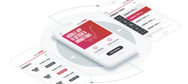
A product screen is most common in eCommerce apps. It displays the collection of products and when the user taps on the product they want, another screen displaying its specifications would pop up. 

The product screen shows the key information about the goods. It helps users to decide whether they want to buy the product or not. Designers usually place the product photograph at the center of the screen, with the description placed below it. The information is generally divided into small groups like size, material, weight, etc. so that users can get all the required info.

4. Catalog Screen

The primary objective of any e-commerce business is to sell products. For an e-commerce app, you would need a catalog screen to display all the products in one place. Visuals attract users and prompt them to make a purchase. So, designers must focus on designing a visually appealing catalog that will attract a user’s attention and encourage them to shop for a product. You can offer the user to scroll through the list, just like several other eCommerce websites and apps display it. The amount of merchandise/products in one row can be decided according to the width of the screen.

The product list in mobile apps can be similar to many e-commerce websites where the items are grouped and viewed via a vertical scroll. But, the products can also be displayed in a row with a horizontal scroll. To make the navigation intuitive, the last item in a horizontal row should be shown not in a full view to let the user see that this is the direction of scrolling. 

5. Check Out Screen

Nowadays, most of the shopping is done through smartphones. Therefore, it becomes crucial for companies to offer a smooth and convenient shopping experience to users. The checkout process is the final step during the buying journey of a user, and this has to be an easy task for them. 

The most fundamental aspect of a checkout screen is to have a form that captures all the personal data like name, address, contact number, card number, etc. Here, designers must ensure that their user data and sensitive information is secure. It can be callouts in a copy, icons of the famous brands who gave their approval or maybe even some certificate signs if there are such.

6. Splash Screen

The first impression may not be the last but is undoubtedly the most important impression. It influences the user’s opinion about a mobile application. When the user experience is pleasant from the very beginning of interactions with an app, there are more chances it’ll be more popular among users. That’s why splash screens should be given a lot of attention.

Splash Screen is the page in an app that demonstrates the main idea and features of the app. It must be minimalistic, displaying the logo, tagline, and name of a product. The fundamental elements must be kept in the middle of the screen for added visibility and a simplistic mobile UI design. The screen shouldn’t be shown for any more than 3-8 seconds. Users tend to get irritated after that. Also, it may be useful to show loading progress so that impatient users could know when the app will be launched.

7. Feed Screen

People typically use various social networking apps for communication and to remain updated with the news. You can take ideas from Facebook, wherein the feed is regularly refreshed, displaying the latest news and data related to the pages followed by the user. The mobile UI design should be simple and clear without a lot of fancy visual details. The stories can be presented one by one via a scroll. To make the navigation more intuitive, the next piece of news should be partially displayed.

We hope that these 7 most common UI screen designs will help you to get some clarity on how to get started with your app design. If you still have some doubts, talk to our experts NOW!!

Categories
Mobile Apps Technology

Top 5 Reasons Why Users Uninstall Mobile Apps

The number of mobile apps available for users today is staggering. Daily use, shopping, health monitoring, entertainment, sports, lifestyle, gaming, and whatnot? There’s an app out there for every possible thing that you can think of. The competition between similar mobile apps is cut-throat. Day-by-day it is becoming difficult for businesses to survive and ensure that the users not only use their app but at least not uninstall it. So what is that makes users uninstall any mobile app?

In this article we explore the top five reasons why users stop using a particular app and uninstall it:

1. They No Longer Use The App

This one is pretty straightforward. Once users build the impression that the mobile app is of no use, they will surely uninstall it. Not that they find a better replacement, but the simple fact that they don’t need it any longer. This indicates that your user engagement and retention efforts are not adequate. If your DAU (Daily Active Users) to MAU (Monthly Active Users) ratio is declining, it means that the frequency at which the daily active users are returning is very less. These are early signs of a possible increase in app uninstalls.

TIP: Track retention rate metrics and user engagement to make adjustments to the re-engagement campaigns, such as push notifications and in-app messaging. But don’t overdo push notifications as it could adversely affect the mobile app’s popularity and success.

2. The Mobile App Isn’t Helpful and Easy To Use

People install an app to find solutions to their problems and get what they need in the fastest way possible. If it takes too much time to get what they want, they are unlikely to return to your mobile apps and will look for a better and faster option. Mostly, this happens because developers spend a lot of time thinking ‘what the users want in an app?’, rather than thinking upon ‘how the users want to use the app?’. 

TIP: Spend time thinking about how do users want to search for products or solutions in your app. What is the level of urgency? Do they want to buy the product right away, or wish to save it for the future. Run usability tests to understand user behavior. Conduct a question and answer session with test users to understand their purpose and goals. These insights, in combination with the data collected from analytic tools, will guide you in developing an easy to use and helpful app.

3. Too Many Ads and Push Notifications

A vast majority of the apps available come with a free version. People expect the apps to be free and resist paying the price to download them unless it’s really essential. The primary method of earning revenue for a free app is through advertisements. People have come to terms with the truth that there will be ads popping up while using the free version of the app. However, they have become much more sensitive towards the ads. This sensitivity is a result of invasive and aggressive advertising tactics.

Similarly, too many push notifications also annoy users. Forget about using your app regularly, they start disliking you as a brand; so much that they eventually decide to get rid of your app. Nobody likes constant nagging. 

TIP: For ads, consider how they will interrupt the user experience and work around it. Track conversion rates and reactions triggered by advertisements and push notifications. Also, use platforms that allow intent-based segmentation. With a better understanding of user intent, you can effectively show relevant ads without spamming them.

As far as the push notifications are concerned, it is best to use common sense and to know how often you must communicate with your customers. The frequency of sending push notifications varies; it largely depends on the type of campaigns you run and the products or services you offer.

4. Bad User Experience in Mobile Apps

It’s not just a visually pleasing design that keeps users hooked on to an app. Creating a good user experience is equally important. If the app is not designed keeping users in mind, it baffles the user. They find it hard to navigate within the app, struggle to find what they need. Sloppy navigation, lack of search functionality, poor use of icons, illegibility of typography, unresponsive gestures, etc. are all ingredients of poor user experience.

TIP: Always keep the users in mind before starting to develop the app. The app must be intuitive and easy to navigate within. At no point in time, the user must get stuck in the whole buying (or conversion) process. Your users must be able to reach their destination with minimum clicks. It’s pivotal to provide a search option in the app. The search should be intuitive and must be leading users by using a predictive keyword algorithm. 

5. Security and Trust issues

The Facebook data scandal was one of the biggest data scandals of recent times. It made people think about how various apps store their personal information and how vulnerable they are. They have begun to believe that their data can easily get into the wrong hands at some point in time. If they don’t trust your app, they will uninstall it.

TIP: Ask and store only the required information. Be transparent with users and explain exactly why you want this information, where will you save it, and how will you use it. Your users must feel safe using your app. They should be assured that they can trust you with their credit card number and other vital, personal information.

Read more about Mobile Apps security here

The customer is the king. It’s a fierce battle out there in the world of mobile apps, and you need to ace your game to stay in the game. Keeping users engaged, respecting sensitivity to advertisements, and performing adequate software testing are some of the ways to avoid app uninstalls. Need to know more? Talk to our experts now!

Categories
Design Mobile Apps UX

5 Key Uses of Animation in Mobile App UI

The advancement of technology has led to several new improvements and trends in web and mobile designing. Animation was once a visual luxury but has now become a functional requirement. Users expect to face animations at some stage while browsing a website or an app. Animation infuses life into interfaces and makes them more rousing and visually appealing.  The proper use of animations accentuates the responsiveness of an app. In this article, we will discuss five critical applications of animation within a mobile app UI design.

Animation infuses life into interfaces and makes them more rousing and visually appealing.  The proper use of animations accentuates the responsiveness of an app. In this article, we will discuss five critical applications of animation within a mobile UI design.

1. System Status

There are plenty of tasks and processes like downloading and uploading data, calculations etc. that continuously run in the backdrop while the app is running. While these processes run in the background, users often feel that the app is frozen, as there is no activity at the front end. You must always indicate the status of all the ongoing processes through visual signs of progress. It provides a sense of control over the app to the users.

Page loading time is unavoidable, however, it is a very stressful time for users. Using animations can’t shorten the loading time, but can provide comfort to the users while they wait. Creative progress indicators can reduce a user’s perception of time. If users can watch something visually pleasing, while they wait, they are more likely to divert their mind on the animation, rather than the wait time.

Similarly, “pull down to refresh” is also a well-known system status indicator that reloads the page. Pull-to-refresh animations should match the design outline of the app. Movement and visually pleasing items naturally draw attention and create interest. Animating your notifications is a pleasant way to notify users about things, without hampering their experience.

2. Visual Feedback in Mobile App UI

Visual feedback is critically important for any user interface. It helps users to know and understand their current context in the system at any given time. User interface elements like buttons and controls should appear to be tangible, as they interact with them in the real world.

But, bridging the gap between the physical world and on the web is challenging. Visual and motion cues must immediately recognize the input and animate in ways that appear to be direct guidance. Animations enhance various points of interaction and reinforce the actions taken by a user.

3. Structuring Information

Animation allows proper structuring of information across the app. An animation draws users and shows what content to look for and where can it be found. The menu bar is one of the most common places where this can be implemented. 

There are many elements on the main screen of the app. When we activate one of them, the app should change the picture and display a whole new app section based on the selection. Animation helps users to know that it is the same element but with different form and scale.

4. Navigation & Transitions in Mobile App UI

Usually, users take the help of menu bar to navigate inside an app. A lot of apps have a complicated structure to show the list of app sections or features, which is confusing for users. Animation works as a visual navigator. 

A user should notice a changing picture on the screen while selecting or changing app sections. This lets them know that they are navigating to a different section or using a feature. Animation is a great way to transport users reasonably between navigational contexts. 

Read more about Mobile App Navigation

5. In-app Guide

Some apps have a more complex structure compared to others. If you don’t want to scare-off or irritate your app subscribers, you should clearly explain to them how an app works at the very beginning. Animation comes in handy here. A user gets brief instructions about the app in very less time via animations. Usually, an animated guide opens up when the app runs. However, users should have access to the guide whenever they need.

Animations are really pretty, but as mentioned earlier there role is no longer confined to adding beauty to an app. So make animations with purpose and use it in the app UI design to simplify user interaction with the user interface.

Let us know if you are looking for designing your new or existing mobile app. Our UI and UX team will be happy to assist. Contact Us today

Categories
Blog Brand & Identity SEO Web Design

5 Annoying Things To Avoid In A Web Design

Competition over the Web Design internet is fierce. Today, there are a large number of individuals and businesses who spend money and time on digital marketing and SEO to rank higher on Google searches. It has become tough to differentiate from rivals and get users to visit a particular website over others.

Since acquiring new visitors is very difficult, providing a delightful user experience gains importance and is pivotal to retain each hard-earned customer. If a website offers an unpleasant experience to its users, forget about winning repeat visits, they might never come back on the website. Here are some of the most common things in a web design which leaves users in frustration and thus must always be avoided.

Slow Website Speed

With the boom in technology, everything has become super quick. Everyone has a smartphone these days, and access to the internet is just a tap away. Even half-baked questions or half-remembered trivia get instant answers from Google. People can contact each other, sitting halfway across the globe in a matter of seconds. Today, the speed and responsiveness of our hyper-connected world have spoiled us all. Therefore, when we click on a search result, and the page keeps loading even for only three to four seconds, it is equivalent to eternity for users.

Remember, you’re not the only one providing an answer to a query or serving what a user is looking for. If your page doesn’t load within a blink of an eye, they will click on other best available options. Get rid of all the unwanted elements which are dragging down the speed of your website. Ensuring a good page load speed is critical to create new visitors and retain them.

Too Many Popups

It’s a shared experience, wherein we click on a link in our Google search results, and we are directed to a webpage which is full of popups. So much as so that we are not even able to read the actual content available on the page. Moreover, they keep popping up, even after you close them.

Combined with a browser alert that “this website would like to send you notifications”, the overall effect is one of being barraged with irrelevant information. It ultimately kills the actual content you were trying to reach.

Some advocate the fact that popups significantly improve conversion rate, while others get put-off by their potential of pestering the users. No matter which side we stand, one thing is for sure that popups are badly planned, throwing information and content which is not relevant for users. Therefore it is better to stay away from them.

Not Mobile-friendly

According to Statistic, 52.2 percent of internet traffic was generated through mobile phones in 2018. That’s a considerable ratio, and thus it’s pivotal that the website is responsive and mobile friendly. We are in 2019, yet we come across many mobile sites where items aren’t aligned properly, overlapping, strangely formatted or subject to some additional oversight from the designer. It creates a negative impression on users. They might feel that your company doesn’t take the time to go over little details.

Coupled with the recent change in Google’s algorithm to prioritize mobile-first indexing, there is now no reason at all to ignore the mobile experience of your website. A low-quality mobile site can negatively affect your SEO performance as well as the experience of your users, so it’s essential to get it right.

Animation Overdose

We like animations. Yes, they do look good and enhance the aesthetic value of a website. A few smooth transitions, transforms, appearances, and well-deployed animation can infuse vital life into an otherwise static and dry layout.

However, animation should be used sparingly, as and when required. Overdoing it can distract the audience. The key role of animations is to draw user attention to key content and call-to-action buttons. Users should not feel confused to read the actual text.

Animated introductory screens, too, are great attention-grabbers when users first reach on to your website, but avoid making them sit through the same animation every time they want to return to the homepage. Their beautiful presentation shouldn’t dictate the function of website elements.

Users shouldn’t be waiting for an element to appear or to become interactive. Using a lot of moving parts or content that flashes can pose problems for users. Some users may have an attention deficit disorder, making it very difficult for them to concentrate on the content.

Video Autoplay

Videos are an essential aspect of your online marketing efforts. They are a good source of explaining your products, brand message and other aspects, better than text can. Designers are often tempted to put the video on autoplay when they place them on the website. There are ways to do it tastefully, but it’s so often misused and creates a negative user experience.

Many sites place a video next to the body text. Usually this is entirely irrelevant to the content of the page. Even if you close it before navigating to another page, it quickly reappears. That’s really annoying.

Even worse, many sites preface these videos with automated advertisements which, given that the videos themselves are generally advertisements in one form or another. Some web users also hate auto-play as it can ruin their user experience and would rather prefer reading the information on the page without a distraction. It is more polite and effective to let the video be turned off until the audience chooses to play it.

To wrap up

Everything which we have mentioned above is basically issues of a bad UX design. It is important to consider every element and its effect on the overall user experience. If something hinders the user in finding what they’re looking for or detract them from the actual content of the page, it should be avoided. Speak to our design experts to know more about it.

Categories
UX

5 UX Trends and Mobile Designs To Boost Conversions In 2017

With great hopes and expectations, we warmly welcomed 2017. Every year is an opportunity to explore new realms in the sphere of technology and innovation. A lot of new design trends will swamp the designers this year as well. As a designer, it is a merry situation with so many options available at disposal. But, will any of these trends have a meaningful impact on the overall user experience and conversions. In this article, we will cover 5 UX trends and mobile designs which will ensure a better conversion in 2017.

1. Age Responsive Design

Let’s face it. You can’t serve the same dish to everyone. Audience from different age group will react differently to different content, layouts and aesthetics. With an availability of new kind of metadatas you can tweak the user experience based on their perceived age. It raises your chances to connect with your audience when and where it counts the most.

2. Shopping Cart Marketing

Did you know? Upsells and cross-sells are responsible for up to 30% of the overall eCommerce revenues. It is almost 10 times difficult to sell to a new customer as compared to converting a sale by upselling to an existing customer. By providing bundled offers, cross-sell offers and upselling options during checkout you can substantially increase your revenues.

3. Lively Call-To-Action Buttons

The CTA button is the star of any web page. It needs to be always placed at the best position on the web page. But that’s not all about it. By adding a slight animation to the button you can instantly draw attention. Having said that, avoid doing something over the top fancy. Subtle movements every few seconds works well and are highly recommended.

4. Persuader NOT Explainer Videos

Animated explanatory videos were the IN thing a few years ago. But its heydey is more than over and videos showcasing real people have made its way. By using real people in your videos you create a sense of authenticity. With the use of customer testimonials and product demos, you can easily overcome all sorts of customer apprehensions, objections and successfully close the sale.

5. Value Based Exit Overlays

We all can admit that when we’re ready to leave a site, and a pop-up appears on the screen, it’s really annoying at times. You are not in any mood to fill out a form and leave your details like email address, phone number etc. Unless you’re Really Really interested. How about an exciting bonus? A discount, freebies, free shipping, or any other gift will definitely grab your attention. Provided it has no catch to get you signed up for future marketing. These kind of offers are highly attractive and increase conversions.

Plenty of other design tricks and UX trends are bound to rule the charts in 2017. It’s not important just to know these trends, but to understand how these tricks and trends can be fit into your design structure to boost your conversions. Contact our design experts today and start a path-breaking discussion.