NYX Ditech

Categories
Brand & Identity Technology UI Design UX Design

How to Avoid Bad Branding Mistakes That Can Ruin Reputation

When most individuals hear the term “brand,” they immediately think of huge, well-established corporations such as Google, Adidas, or Apple. However, you must remember that these multibillion-dollar corporations were once small businesses, just like any other venture.

Although there are several factors that contribute to a business’s growth, having an effective branding plan is critical to its success. Creating a strong and visible brand is a lengthy process that requires time and effort.

Branding implies seizing every chance to convince people to choose your brand over the other. As a result, all means of communication — not just visual — are critical for strengthening this trust and keeping your brand at the forefront of your customers’ minds.

However, just as strong branding enhances your business’s value, poor branding detracts from it. That’s correct; even the tiniest branding mistakes may have a significant negative impact on your corporation’s brand and image. Let’s look at some of the most typical errors you must avoid while developing your brand strategy:

Lack of a Well-Defined Branding Strategy

To accomplish your business objectives, the first step should be to develop a strategy, especially with regard to your branding. If you enter the process of branding and marketing without a clear concept of what you want to accomplish, you’re likely to miss the point, creating uncertainty for both you and your consumers.

Before you begin developing your brand image, you should have a firm grasp of the idea and tone you wish to convey for your business. Are you a strong and commanding figure? Are you sociable and amusing? Are you a youthful and carefree entity? Whichever route you take, if you’re clear on the style, feeling, and tone you want to accomplish from the start, you’ll be able to develop branded content that accurately represents this.

Paying No Attention to Customer Experience

A strong brand image is unquestionably helpful. It might assist you in developing a favorable image with your consumers and make selling much easier. While branding can contribute to a favorable image for your goods, the experience of the consumer with your product is much more critical.

Unfortunately, many people incorrectly believe that a brand is defined by a logo, an advertisement campaign, or the aesthetics of product packaging. Eventually, your branding is the feeling a buyer has when considering your products. To enhance the customer experience, resolve the concerns of consumers promptly. Establish a timely response to consumers, whether it’s through a live chat feature on your site or by replying to emails within 24 hours.

Inconsistency Across Platforms

To establish a strong brand, you must boost your business as real, legitimate, and precisely who you claim to be. You must have a consistent voice, style, and purpose throughout all of your communication and social media platforms. If you neglect to do so, your consumers will never get a strong feeling for your business. This implies that if you mention something on your brand’s Social Media pages and something else on your website, your customers will be confused as to which is true.

Brand reliability begins with aligning all of your advertising campaigns across your brand’s touchpoints. This encompasses your visual identity, philosophy, beliefs, and business objectives. To assist you in maintaining a high degree of consistency, we propose that you develop a set of business-specific branding style standards. It is a collection of standards in which you may include your preferred color, typography, pictures, logo, and voice tone. 

These standards will ensure that anybody generating content for your brand maintains consistency across various platforms.

Choosing Low-Cost Alternatives

When you’re just getting started with your company, it makes perfect sense to be frugal with your spending. While it is prudent to be cost-effective, this does not imply you should forego factors that contribute to the identification and effectiveness of your branding efforts.

If you believe you can get away with having your friend’s cousin create your logo and construct your website at cheap rates, you are mistaken. While this may appear to be a fantastic deal for both parties, it will have a negative impact on your branding strategy in the long run. Whenever it comes to social media, everything is a matter of perspective. 

This implies that if you have a low-quality website having fewer features and an unattractive logo, it will reflect poorly on the services provided by your organization. Individuals who are unfamiliar with your company will see them and quickly connect your branding with being poor and unpleasant – a mistake that should be definitely avoided!

It’s good to spend on experienced designers and developers to produce something of exceptional quality, as this will result in the creation of an authentic, professional, and attractive brand to your intended audience.

Integrating Yourself with Your Rivals

While it may be simple to follow patterns whenever it is about branding, if you do so too precisely, you risk being indifferent to the rest of the businesses around you.

While it may be tempting to follow current branding trends, the purpose of effective branding is to differentiate you: to give your brand its unique voice, appearance, and personality. As a result, you must develop your distinctive style, as that’s what will truly differentiate you from your rivals.

Conduct research, determine your differential advantage, and utilize the results to develop a powerful brand image that emphasizes your individuality.

Focusing on Quantity, Not on Quality

Effective branding is not about how often your potential customers see your brand; it is about how they perceive it and the opinions they form about it as a result of what they can see. What counts is that you deliver valuable information to your audience, not how many posts, photos, or clips you publish featuring your brand. Quality should never be sacrificed for quantity in any marketing strategy.

Even though it is a widely held idea that regularly publishing and updating information is a method to differentiate yourself from your rivals, if the frequency of your posts and updates outweighs the quality of your content, it is all in vain. Instead of viewing the content of your brand, consumers look forward to, they’ll come to dislike your business as one that continually appears in their feed or mailbox with nothing significant to say.

This will certainly result in people unsubscribing your brand and discontinuing to connect with you. As a result, it’s critical that you guarantee each content you post with your brand is valuable to your audience.

Ignoring the Significance of Mobile Users

Whenever it’s about digital marketing, there is a growing trend towards mobile device use. Mobile phones currently account for 65 percent of overall digital media consumption and are gaining traction as technology advances and web browsing increases.

Regardless of your primary channel, mobile-friendly content must play a significant role in both your short- and long-term branding strategies.

Conclusion

Utilizing the potential of branding is no different from implementing any other marketing approach. By utilizing analytics, you can ensure that your business avoids costly branding errors. However, increasing awareness and holding the aforementioned guidelines in mind is one of the most effective methods to pave the road for your brand’s success.

Contact Us Today to For Your Branding Needs

Categories
Brand & Identity Design UI Design Web Design

5 reasons To Not Use Stock Images On Your Websites

At the time of building a website, it is important to only select components that will positively impact your brand and support the objectives of the website. It especially holds true when it comes to choosing the right images for the website. It is important to understand and acknowledge the worth of custom photography and its positive impact on the brand. Some people might argue that custom photography is very costly as compared to stock images, but in reality, the initial higher cost is totally worth the investment in the long run. Here are some key reasons why custom photography is preferable over using stock images.

1. Clash of visions

No matter how professional the stock photo, it will always reflect someone else’s vision. The interpretation of the idea, concept, and emotion that you wish to convey will always differ from others. A picture is worth a 1000 words, but those words need to be yours. With custom photography, you have control over what thoughts and emotions your website conveys. 

From a marketing perspective,  that provides a great advantage. It is important to connect with prospective buyers on an emotional level. Whether it is a personal purchase decision or one for business, emotions and feelings always have an impact on decisions. Emotions drive people to take decisions, and that’s why you need to convey your emotions and vision through your pictures. If you use stock photos, your vision may be misinterpreted, and you may never strike where you wish to. 

2. It weakens your brand’s authenticity

An authentic brand is one that presents itself with honesty and transparency. When visitors interact with your brand, through your website, they must feel as if they are interacting with a human. Authentic brands are relatable, trustworthy, and thus successful. According to a study, 83 percent of consumers surveyed said that trust drives their loyalty to a brand.

Using stock photography is easy, but putting up actual photos of your business or employees will strengthen your connection with your visitors. Opting for meaningless stock photos showcase a very gloomy and dicy brand image. It runs you into a risk of losing out on customers. Instead of stock images, make choices for your visual content that will cultivate a deeper relationship with your clients and customers. Professional, well-lit photos of your real employees doing their real jobs will carry more value and build more trust than yet another stock photo.

3. Short-term cost vs long-term cost

It’s an obvious fact that hiring a professional photographer will incur larger initial costs than using stock photos. Plus, there are additional expenses involved like hiring professionals, arranging the equipment, or outsourcing the entire project to shoot. But, stock images also come with additional costs other than the licensing fee, which by the way are also very high. 

The recurring loyalty charges can be quite high depending on the quality of the image and how often you want to use it. Additionally, there’s also the time costs – it’s a tiresome job to look through hundreds and thousands of photos to find the “perfect photos” for your website. 

When you use custom photography, you create your personal library of images that you own. These images can be used in the future without any cost being involved. With stock photography, there are often limitations on how you can use the image and for how long.

4. Similar photos can create confusion

Imagine the same lady posing as a customer support executive on hundreds of websites, under the contact us or support section. Even if not on hundreds of websites, there’s always a possibility that your competitor and you like the same stock photo. Or you both choose the same stock art to create your logos. The customers may get confused and that’s not good for your customers. 

The confusion can make people refer to a competitor’s brand to their friends and families. This can blindly divert your business. Losing customers is bad news.  But, it’s especially painful to lose customers to such an easily avoided misstep. That’s not all, what if your competitor does something unethical and his or her reputation takes a hit, your reputation might be impacted as well.

That’s why it’s a good practice to use customized photos for artwork. A unique logo and authentic photos of your products, services, and employees help you stand out from the competition.

5. Copyright issues

We have saved the most dangerous con for the last. Lawsuits are tricky and can get you in some serious trouble. And, they are costly too. So, if your goal is to save money by using stock art, be aware of the possible legal dangers. Stock art can end up costing way more than real images, once you fall into a legal trap.

You can’t trademark most images that include stock art. Attempting to do so could get you in trouble. And, stock art licenses include more potential pitfalls than just trademark issues. You open yourself up to litigation if you violate the specific terms of use for the stock art you purchase. Worse than that, copyright law is no-fault.

Read More About Web Designing With Type On Image

Therefore, instead of stock art, hire a professional photographer to take original pictures for your business. And, hire professional graphic designers to create a logo and visual assets for your brand. If that sounds way too much for you, hire a professional company to do everything for you. Have a word with our experts and learn more.

Categories
Blog

Role Of Color Psychology In An App Design

It’s tough for even great psychologists to really understand the human brain. It never fails to amuse and pops unanswered questions every now and then. Sometimes there is simply no reason or logic for a particular human behavior triggered through the brain. Talk about the color psychology. Interestingly, the human brain is more capable of noticing and remembering not so pleasant sights as compared to beautiful things. Let’s connect this attribute with visuals (basically app visuals). It basically means that the human brain will surely notice an ugly design or color scheme over a decent one and will most probably remember it. Colors used in an app form the basis of its visual appeal. If you get your color scheme correct, well and good. However, if you screw it up, then it can ruin even the most functional app.

Why Are Colors So Important?

Believe it or not, colors play a vital role in driving your emotions while using an app. Whenever we use any application there is a motive behind using it. It may be for financial transactions, entertainment, making reservations, checking scores etc. All these motives have a string of emotions attached to them. The color scheme of your app can either fuse with these emotions or may cause a negative impact towards these emotions.

Picking up an ideal color palette can be the game changer for your app. The color scheme, if picked up correctly can soothe down human anxiety, help them to relax, evoke happiness, calm down senses and can result in many other positives. On the other hand, if you mess up with the color scheme it can even provoke your user to bang the phone on the wall.

Here are a few colors and the emotions attached to each one of them:

White – Pure and simple, clean.
Black – Blunt and powerful, minimalist.
Red – Intense and important, focused.
Yellow – Energetic and positive, optimistic.
Blue – Calm and relaxed, trusted.
Green – Profitable and natural, earthy.
Purple – Luxurious and regal, trendy.
Orange – Bright and cheerful, childish.
Pink – Romantic and loving, feminine.

The Theory of Colors

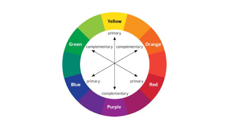
The subject of colors does not top the charts of complexity but still demands a basic understanding. The basics of color scheme can be best understood through a color wheel. There are 3 primary colors – Red, Yellow, and Blue which can be mixed to bring out secondary colors – Green, Purple, and orange. White (in various proportions) is used to create tints and Black is used in various proportions to create shades.

theory of color

There are certain pre-defined standard color schemes which are most commonly used.

1. Monochromatic

As the name suggests, monochromatic color scheme refers to the use of a single base color. Monochromatic colors work well in creating a soothing and calming effect. It also portrays a neat, simple and clean design.

qatarairwaysImage:Qatar Airways

2. Analogous

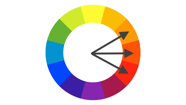
Analogous color schemes are created from related colors that are not completely opposite to each other. One of the colors is used as a dominant color while others are used to enhance the scheme. This scheme is quite easy to pull off as compared to other schemes. The only trick is in deciding which vibrancy of color to use, as it will be exaggerated.

analogou

3. Complimentary

This color scheme uses opposite colors to complement each other in a design. The opposite colors contrast each other very strongly and that grabs eyeballs instantly. When using a complementary scheme, it is important to choose a dominant color and use its complementary color for accents. For example, when the human eye sees an object full of different hues of greens, a bit of red stands out very well.

4. Custom Color Scheme

It’s not really mandatory to stick to one of the aforementioned color schemes. There is every possibility that the nature of your app and the persona of your brand may demand a different color scheme altogether. Customizing your own color scheme is not rocket science and can easily be adapted. Adding a bright accent color to an otherwise neutral palette is one of the easiest color schemes to create. Having said that, it’s also one of the most visually impressive.

Adobe Color CC, previously known as Kuler is your savior while deciding color schemes. It makes color selection extremely easy. Each and every color on the palette can be individually modified or selected as the base color with a few clicks only.

Your Color Scheme Must Reflect Your Brand’s Image

The standard color schemes act only as a guide while choosing the color scheme for your application. The most important thing to remember during this process is that the colors should speak the language of your brand. Your brand name, goal, objective, and persona must all be reflected through the colors. Every academic study conducted on this topic supports the argument that it’s very important for the brand’s color to support and co-relate to the brand’s personality. The focus must be purely on the brand image and the selection of colors must run primarily around it.

Colors have a decisive impact on user behavior and their emotions. If your design philosophy isn’t taking this into account, you are making a big mistake. You may not need to be strictly abiding by the common color scheme standards, but you cannot neglect the importance of colors in the overall user experience process. Be brave, play around with different shades, tints, and color combos. Never stick with one combination and try different combinations. You can perform an A-B testing using different combinations. Talk to our team and get enlightened about how you can improve the user experience by implementing the perfect color scheme in your app design.