NYX Ditech

Categories
Brand & Identity Design Mobile Apps UI Design Web Design

‘Meet The Team’ Pages: The Human Element Of Your Website

While designing a website, designers categorize all the pages into three major categories – most important, important, and least important. Their focus and efforts on improving the user experience and elevating the aesthetics of the pages majorly depend upon the categorization. One of the pages that are often overlooked and incorrectly categorized is the ‘Meet the Team’ page. It may sound insignificant, and a very small element of a website, but plays a crucial role in the user experience journey. According to various studies, the ‘Meet the Team’ page is often the most visited page of websites that do have it.

Meet the Team

It is a small section on a website that introduces the team behind your brand and business. It is a way of recognizing individuals who allow your business to bloom and prosper. It may not seem too important, however, it helps a lot to create a positive image of your brand.

The ‘Meet the Team’ not only presents the faces of workers, but it also allows users to know more about the company and its work culture. Be it the pictures of the faces, or a large panorama of the entire group, team pages are there to show the quality and commitment of business.

The personalities, qualities, and ethics of people that make up a company are equally important as are the company’s achievements. Creating a team page that offers meaningful insight into a company’s culture and character enhances the human quotient. Users want to interact with your website as they are interacting with real human beings, and this page is a perfect platform for you to develop that kind of relationship with them. It greatly adds to the credibility that builds trust with customers, partners, and clients.

Best Practices

1. Put a Face and Personality 

Most companies include professional photos of key team members on their team page so that the customers, partners and other agencies quickly connect with the team. It is the most popular way of showing the team. However, the reverse approach has also shown tremendous results. Websites that used personal photos of team members, with friends and family, instantly connected with the audience. Multiple photos of the team at social functions and office gatherings are also a unique way of displaying bonding, teamwork and the fun that the group has together.

2. Create a Mix of Professional and Personal Information

Mostly the profiles include the name, designation and bio information. But, that’s a subtle and traditional way of displaying the team. Although, professional info should be mixed with personal, fun info as well. Include fun, personal passions, and interests that make individuals approachable and showcase personalities. Details like ‘favorite moments’ or ‘fun facts’ allow their staff to highlight skills, areas of expertise and personal attributes. The key point is that it portrays the company as a group of real people.

3. Include Personal Social Media Handles

A company’s team and its philosophy are important and must shine through its ‘Meet the Team’ page. A lot of times the team members personally contribute via their personal blogs, relevant publications, and other platforms. The information shared through an employee’s personal social channels is a reflection of the company’s expertise as a whole. Including an employee’s personal social handles or links is a great way to encourage readers to get to know your staff and the knowledge they offer.

4. Include Testimonials of Team Members

Testimonial quotes of fellow team members provided for each individual’s bio page not only represent who the employee is as an individual but also the strength of their individual role and the incredible value they bring to the team. Team bio and about pages are one of the most important components of any website. Adding a human touch can help build credibility and position your company and its representatives not only as thought leaders but partners that clients and prospects will respect. 

Characteristics of a Strong Meet the Team Page

  • It has personality
  • It is full of quality images and /or graphics, including headshots.
  • It stands out from other cookie-cutter designs.
  • It highlights the people who make up your team in a professional, personal and unique way.

Read more about other pages/screens here which should be designed cautiously

Here are some awesome ‘Meet the Team’ pages

Advantix-digital
Advantix-digital
Humaan - Our Team
Humaan
Mayple - Team
Mayple
Mimosa - Meet The Team
Mimosa

Wrap up

Creating a “Meet the Team” page expresses your company’s identity. It increases brand awareness and definitely this is something that helps your brand to grow. Contact Us Today if you think your brand’s team page needs tuning 🙂

Categories
Brand & Identity Design UX Web Design

Web Designing While Accounting Human Errors

We often hear the phrase ‘To err is human’, and it can’t be truer in every aspect of our lives. We all make mistakes. Users on your websites are no different. Sure, you can’t stop them from making mistakes, but, can you follow some aspects of web designing while designing your website in a way that it leaves a scope of making mistakes?

Even the most careful and diligent users are bound to make mistakes at some point in time; others will make more mistakes. Therefore, it is critical to consider this fact while designing your website. The errors in web designing can be as simple as mistyping a URL, providing incorrect information in a sign-up form, adding info in wrong fields, etc. The mistakes could even be as disastrous as accidentally sending thousands of dollars to the wrong person via PayPal. So, here are a few tips that you can follow to account for human error while designing your websites. 

1. Provide Straightforward Instructions

A lot of times, we assume that the users are by default aware of the most basic instructions. Thus, we don’t feel it necessary to provide these basic instructions to them. Moreover, people often see basic directions as a bit snooty. It’s human to assume you know everything you need to know for a simple-seeming task. This causes errors.

Don’t assume they know what you mean. An imperative when delivering clear instructions is not to assume the recipient knows what you mean. This can be for anything from commonly used acronyms to simple navigation instructions.  Mixed messages, assumptions and multiple options mean that the message received might differ from what we actually meant.

2. Give Clear Warnings During

Just like the instructions, users must get a clear understanding of the consequences of actions taken on the website. And, sometimes they need to be informed and explained the implications, that too in detail. Still, there would be users who would keep ignoring your warnings, but there’s not much you can do for them in any case.

There’s also a second web designing approach which you can proceed with. A majority of people will leave your site when they face a warning message which they don’t fully understand. Else, they may look for help to understand the warning, which again may lead them to bounce off. You’ll have to decide whether you would rather deal with potential inaction from some customers, or more errors. Both approaches have their pros and cons.

3. Always Confirm Actions While

You may think that all users are completely sure of what they are doing on the website, or they may get annoyed with questions asking them to confirm their actions. A confirmation dialog may seem like an irritating and useless extra step; however, the truth of the matter is a quick “Are you sure you want to do that?” message can be invaluable. The user may be taking action for the first time, or the tenth time, it’s irrespective. A confirmation will only increase chances that the user takes the correct, intended action.

4. Validate Forms

Form validation may not be a full-proof solution, but a potent tool, and a great way to gently guide the user in the right direction. While proper form design can help keep users from simply putting the wrong text in the wrong form, form validation is excellent for double-checking information and catching typos and forgotten fields.

Improper validation of form data is one of the leading causes of security vulnerabilities. It exposes your website to attacks such as header injections, cross-site scripting, and SQL injections. It is important to note that client-side validation is beneficial, but it is not enough. If you’re going to implement client-side validation, it would be good to have some of the server-side too, just to be safe.

5. Use Appropriate Form Labels

In our last article, we listed out some essential tips for selecting the right button labels. The labels on the forms are equally important and can lead users to commit an error, if not used properly. There are tonnes of websites on the Internet with so many vaguely-labeled forms. Worse are the forms that use industry jargons on a client-facing website. In some of the sites, the labels and input fields are even misaligned. That’s just a strict NO-NO!

6. Improve Usability Through Color and Contrast

The colors and contrast are often used on a website most simplistically. People only go as far as using red and its shades to portray bad, and green and its shades to show good. But that’s not enough. It doesn’t necessarily help differently-abled users. A website should be usable by everyone, so various disabilities should be kept in mind. Disabilities can include but are not limited to, the inability to use a mouse or see the screen.

When someone has low visual acuity, specific color palettes on websites may make it difficult for that person to see and understand the website content fully. You must find a way to add contrast to your elements, in such a way, that they’re clearly and easily distinguished from each other. Pay special attention to this if two options use similar text, but do radically different things.

7. Provide ‘Undo’ Option Where Possible

We all know how handy the ‘Ctrl+Z’ option comes in every day while performing various tasks. The ability to undo an action is such a boon to everyone. We wish we had an undo button for our lives. Coming back to reality though, if you’re building a web app, you might seriously consider implementing some sort of “Undo” function for just about every action with permanent consequences.

You cannot ensure error-free browsing on your website; neither can you take a generic call on the abilities of your users. But, considering human errors while web designing, will increase the chances of good user experience and fewer errors. Speak to our experts to discuss more on it.

Categories
Blog

Role Of Color Psychology In An App Design

It’s tough for even great psychologists to really understand the human brain. It never fails to amuse and pops unanswered questions every now and then. Sometimes there is simply no reason or logic for a particular human behavior triggered through the brain. Talk about the color psychology. Interestingly, the human brain is more capable of noticing and remembering not so pleasant sights as compared to beautiful things. Let’s connect this attribute with visuals (basically app visuals). It basically means that the human brain will surely notice an ugly design or color scheme over a decent one and will most probably remember it. Colors used in an app form the basis of its visual appeal. If you get your color scheme correct, well and good. However, if you screw it up, then it can ruin even the most functional app.

Why Are Colors So Important?

Believe it or not, colors play a vital role in driving your emotions while using an app. Whenever we use any application there is a motive behind using it. It may be for financial transactions, entertainment, making reservations, checking scores etc. All these motives have a string of emotions attached to them. The color scheme of your app can either fuse with these emotions or may cause a negative impact towards these emotions.

Picking up an ideal color palette can be the game changer for your app. The color scheme, if picked up correctly can soothe down human anxiety, help them to relax, evoke happiness, calm down senses and can result in many other positives. On the other hand, if you mess up with the color scheme it can even provoke your user to bang the phone on the wall.

Here are a few colors and the emotions attached to each one of them:

White – Pure and simple, clean.
Black – Blunt and powerful, minimalist.
Red – Intense and important, focused.
Yellow – Energetic and positive, optimistic.
Blue – Calm and relaxed, trusted.
Green – Profitable and natural, earthy.
Purple – Luxurious and regal, trendy.
Orange – Bright and cheerful, childish.
Pink – Romantic and loving, feminine.

The Theory of Colors

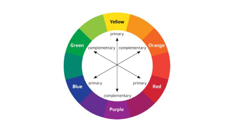
The subject of colors does not top the charts of complexity but still demands a basic understanding. The basics of color scheme can be best understood through a color wheel. There are 3 primary colors – Red, Yellow, and Blue which can be mixed to bring out secondary colors – Green, Purple, and orange. White (in various proportions) is used to create tints and Black is used in various proportions to create shades.

theory of color

There are certain pre-defined standard color schemes which are most commonly used.

1. Monochromatic

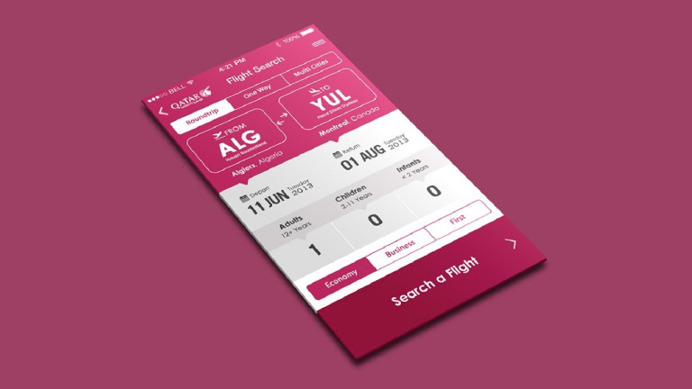
As the name suggests, monochromatic color scheme refers to the use of a single base color. Monochromatic colors work well in creating a soothing and calming effect. It also portrays a neat, simple and clean design.

qatarairwaysImage:Qatar Airways

2. Analogous

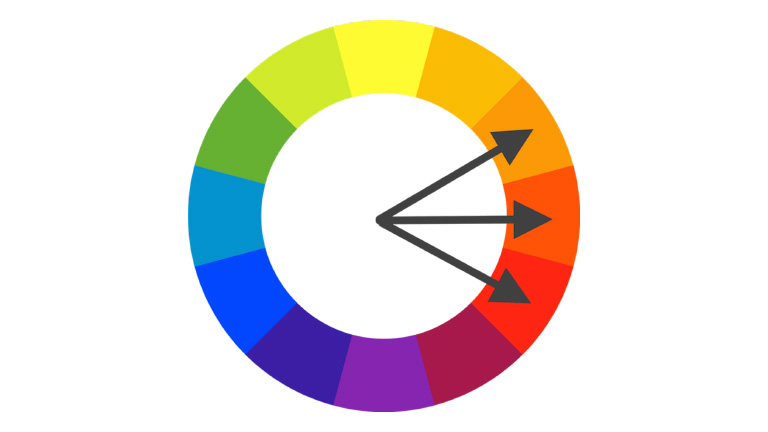
Analogous color schemes are created from related colors that are not completely opposite to each other. One of the colors is used as a dominant color while others are used to enhance the scheme. This scheme is quite easy to pull off as compared to other schemes. The only trick is in deciding which vibrancy of color to use, as it will be exaggerated.

analogou

3. Complimentary

This color scheme uses opposite colors to complement each other in a design. The opposite colors contrast each other very strongly and that grabs eyeballs instantly. When using a complementary scheme, it is important to choose a dominant color and use its complementary color for accents. For example, when the human eye sees an object full of different hues of greens, a bit of red stands out very well.

4. Custom Color Scheme

It’s not really mandatory to stick to one of the aforementioned color schemes. There is every possibility that the nature of your app and the persona of your brand may demand a different color scheme altogether. Customizing your own color scheme is not rocket science and can easily be adapted. Adding a bright accent color to an otherwise neutral palette is one of the easiest color schemes to create. Having said that, it’s also one of the most visually impressive.

Adobe Color CC, previously known as Kuler is your savior while deciding color schemes. It makes color selection extremely easy. Each and every color on the palette can be individually modified or selected as the base color with a few clicks only.

Your Color Scheme Must Reflect Your Brand’s Image

The standard color schemes act only as a guide while choosing the color scheme for your application. The most important thing to remember during this process is that the colors should speak the language of your brand. Your brand name, goal, objective, and persona must all be reflected through the colors. Every academic study conducted on this topic supports the argument that it’s very important for the brand’s color to support and co-relate to the brand’s personality. The focus must be purely on the brand image and the selection of colors must run primarily around it.

Colors have a decisive impact on user behavior and their emotions. If your design philosophy isn’t taking this into account, you are making a big mistake. You may not need to be strictly abiding by the common color scheme standards, but you cannot neglect the importance of colors in the overall user experience process. Be brave, play around with different shades, tints, and color combos. Never stick with one combination and try different combinations. You can perform an A-B testing using different combinations. Talk to our team and get enlightened about how you can improve the user experience by implementing the perfect color scheme in your app design.