NYX Ditech

Categories
Web Design

Designing A Single Page Website? Here Are Some Tips

Some websites don’t need multiple pages but just work better with single page designs. Single page website are typically portfolio pages, product sites, landing pages, and sometimes company pages too. You always want a site with little content but strong branding and clean navigation. But that’s not it. There are other trends which go into a strong single page layout. Adding to the user experience is one of the critical elements and a lot of thought should go into how can you design a single page that’ll offer the best user experience? There is no absolute “best” way to craft a single page site, however, here are a few tips and good practices which really work.

Auto-Scrolling Nav Links

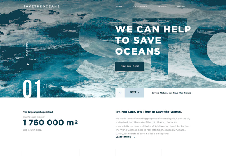
A very common feature you’ll find on single page designs is the automatic scrolling navbar. This is where you click a link and it’ll automatically scroll to that section of the page. It works just like a regular navigation menu except for the custom animation scroll effect which offers a really fancy user experience. But sometimes this animation might feel far too slow to some people and that’s one risk that you face when forcing a custom animation into the navigation. To combat that, you can use something that auto-loads different pages and scrolls down into new sections on the same page. The load times are faster with a much smoother transition. Designing a sleek, auto-scrolling nav effect ensures that page sections load into view very quickly and the navigation is also easy to read.

Side Navigation Labels

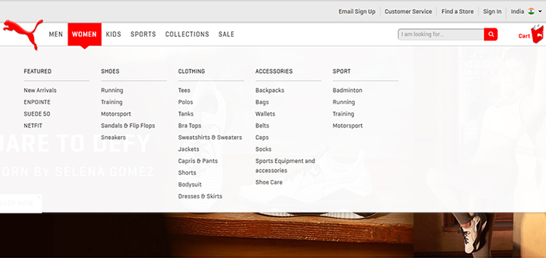
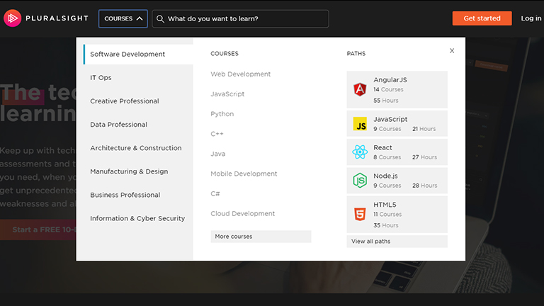
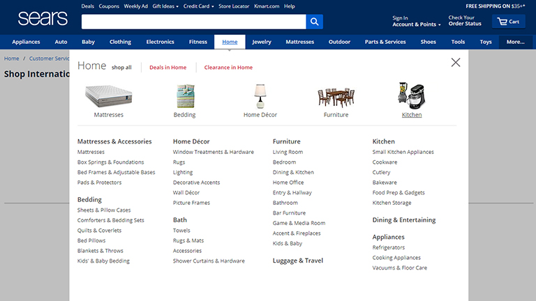
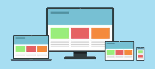
If you don’t want the navigation fixed to the top of the page you can always design vertical navigation. The links on either side follow the user along the page. They act similar to the typical nav bars, except they’re a bit out of the way and more accessible in that space. Side navigation is not the best fit if you have a lot of text or need to support smaller screens with the same vertical menu. Instead, you can try switching to a more mobile-friendly, accessible menu with responsive techniques. Many websites also use dot navigation links. These aren’t great because they don’t tell you which section of the page you’re currently viewing, but they do save a lot of space and look pretty sleek. Many companies use auto-animate through different sections which works well when you’re adding flashy graphics into custom-styled layouts. Vertical navs work well if you can fit them into your layout.

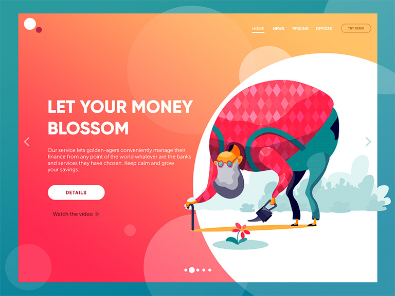
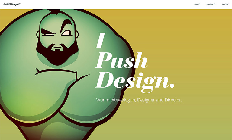
Portfolio Layout Ideas

If you’re designing a portfolio site then you need to consider a lot of things. Well, a portfolio site is mostly all about showcasing your work, but a great portfolio also reflects ‘you’ into the content. This can all be easier to consume if it’s on one page. It’s not necessary that every portfolio is always just a single page. However, a portfolio website design works well in a minimalist design sense. It’s important to keep the page design clean and simple, yet very fun to look at.

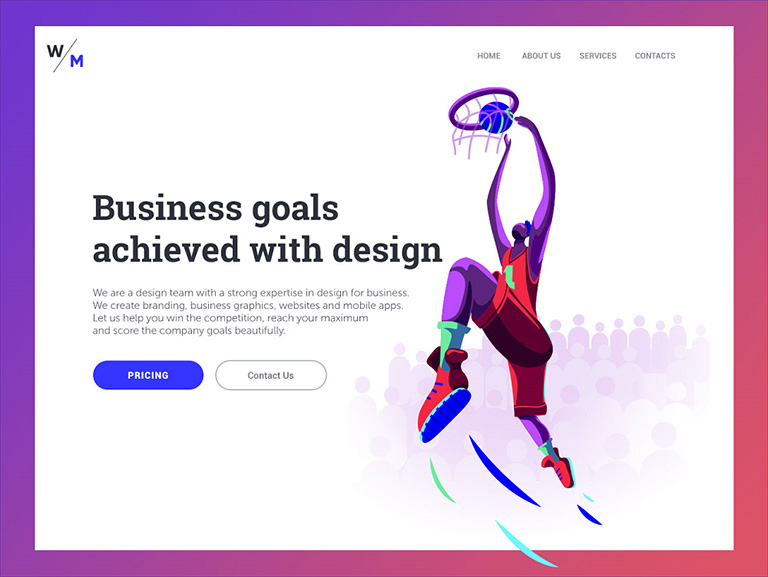
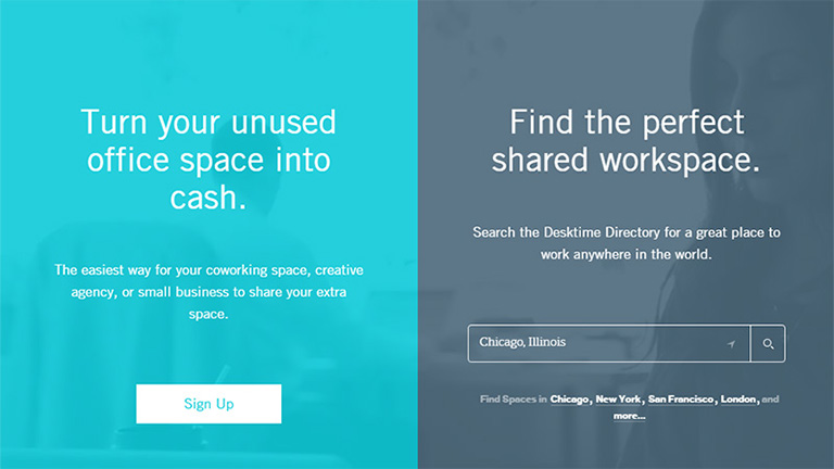
Add CTAs For Sales Pages

If you’re selling a product or digital course then it’s always smart to include a CTA somewhere on your page. This is especially true if you’re designing a landing page where it’s the only page someone might see. Like in single page designs. Try to keep the text as clean as possible, with simple icons and a really smooth design. You really don’t want to distract users, rather you want them to take the desired action. If you’re meeting your goals, then you know you’re on the right track. With great CTAs you’ll notice that font choice, size, position, and color all play a huge role. Those are bound to get people to click at first glance.

On-Scroll Page Animations

Based on the title of “on-scroll animations” you might think this is the same as nav animations. But it’s really its own category and it’s definitely a nice effect. You can easily add page elements that animate themselves throughout the page while scrolling. notice the different page elements animate into view. They’re pretty easy to watch so they don’t move too fast or too slow, but there is clear movement. The idea is to grab people’s attention. It works best with graphics and different page sections, specifically alternating page sections. This effect does not radically alter the page’s behavior or intent. This is mostly an aesthetic trend that just makes everything easier to look at.

Our design team will be more than happy to discuss more on single page designs. Have a quick word with them.

Categories
UX

5 UX Element Which Shined Throughout 2018

There’s no denying that user experience was big in 2017, and continued with the same pace in 2018 as well. Anticipating user expectations in future is tough and that’s why it’s a bit tricky to live up to user expectations. However, for designers, it’s important to at least be proactive to anticipate user expectations. The following 5 UX element have created a buzz throughout the year and can act as a guide for designing a satisfying and successful user experience in future.

1. Simplified Journey

There’s always some intention in a user’s mind when they interact with a website or mobile app; they want to achieve the intention as quickly as possible. To create a user-friendly application or website it is essential to simplify a user’s journey with time-saving designs. In simple terms, reduce the number of steps users have to take in order to achieve their goal. All the applicable information must be presented in an easy-to-use format and with a smooth navigational flow. Displaying only the most relevant information specific to the user context is instrumental in creating an optimal user experience.

2. Personalized Experience

Personalization is a technique embedded within the strategy of time-saving designs. It is important to recognize the need and importance of shifting from creating generic experiences to individually targeted experiences. To achieve this, designers need to identify the wants and needs of users on a deeper level. With the help of individualized data and advances in machine learning, technology is becoming capable of adjusting automatically for specific users. One of the best examples is the incorporation of personalized recommendations based on user behaviors. These suggestions increase chances of a user taking an action on your website.

3. Human Factor

Due to technological advancements like touch and voice recognition on smartphones and other digital devices, user expectations have changed a lot. People now expect to interact with digital products just like they would typically interact with another human. Therefore designers need to put pay attention on providing a more human experience to users while they interact with your websites. The popularity of humanizing digital experience is correlated to connecting with user emotions. Users should feel connected to their devices in an emotional way.

4. Focus on Content

Well-organized, comprehensive and readily available content plays a big role in making websites and mobile applications appealing to users. Recent trends concentrate on removing all unnecessary elements which can distract a visitor and places the spotlight on content. Content-centered experiences can be created in two ways – either using a design that highlights content or allowing the content itself frame the design. The ultimate goal is to ensure there are no obstructions in a user’s exposure to your website or application’s content. Start by removing excessive visible clutter, so that the message you want to convey easily reaches the visitors.

5. Voice-Based Interaction

Hardware devices that we use to access the web have become more streamlined, which calls for a more streamlined UX. With every new update, more and more buttons are vanishing from smartphones, tablets and even laptops. As a result of this progression, voice user interface (VUI) has surfaced. VUIs have become integrated into most major technologies, such as products from Google, Amazon, Apple, and Microsoft. A fair amount of web searches are performed through voice inputs. With your users most likely using tech from one of these innovative VUI pioneers, it is a good idea to analyze how your website can benefit from adapting.

It’s always a good idea to take cues from currently trending UX trends to anticipate future user expectations and tailor future UX based on it. For more insights on latest web design trends, talk to our design experts NOW!!

Categories
Design

Mid Year Round-Up of Latest UI Design Trends

Half the year has gone by and we can say this was a pretty interesting year in terms of web designing, especially UI designs. A lot of new design trends surfaced, while a few faded away. Here’s a list of the hottest UI design trends which were highly popular by far in 2018.

Storytelling with Character Design

The trend of custom graphics has opened doors for personalization and developing personalized special characters. Character design for storytelling in the interfaces is swiftly gaining popularity. More and more websites and mobile apps turn to specially designed characters for storytelling, setting the tone, conveying messages or showcasing the benefits in a way that matches the mood and voice of the platform. The interactions are more human-like when original characters are involved and thus creates a strong visual association with the real world. Moreover, the characters make the page or screen compelling and vibrant.

Full-Screen Background Images

More and more websites have now started using full-screen background images, be it photos or specially rendered visualizations. Use of these images not only visually enhance the websites, it makes them emotionally appealing. It is the most effective way of captivating visitor’s attention and sets the tone for an ideal user experience even when the site is loading, in addition to boosting the UI. Only high-quality images must be used as background images; the recommended background image size is 1250×800 or anything higher than that but with the same proportions.

Custom Digital Illustrations

Some trends continue to be popular for years. Custom digital illustrations are one of them; its presence on the web and mobile user interfaces is increasing every day. Custom graphics effectively support the quick perception of information provided on the page or screen; they set a solid ground for originality. Custom mascots, icons, illustrations are some of the most common forms of custom graphics which designers use to enhance the look of a page or screen, as well as boost usability and intuitive navigation. Another growing trend is creating digital illustrations as title images for blog articles.

Hero Images

A hero image is the first, main photograph or graphic that you see at the top of a web page. Its primary objective is to grab immediate attention and show visitors what your site, content is all about. They are flashy, pretty and keep visitors engaged. Moreover, as well as any other striking graphics on web pages, this is a kind of content which is both informative and emotionally appealing. This might be the reason why designers often turn to this technique to add diversity to landing pages.

Split Screens

One of the hot trends of this year is the active usage of split screens in both web and mobile interfaces. However, this trend is not really a new one. We have noticed that it fades away, only to make a comeback in various spheres of design, and looking at the year so far, it’s safe to say that it’s definitely back and alive. Split screen approach is believed to be more effective in responsive designs as you can work around with different content variations without missing the consistency. Additionally, it offers liberty to designers to try different color combinations and experiments. Some websites even use split screens to show two options of equal importance.

Multiple Interactive Layers

UI designers never shy away from experimenting and infusing creativity in their designs to find new, interesting ways of making the web page interactive and highly engaging. One of the growing trends is applying several interactive layers that make scrolling experience and interactions look original. By playing around with the positioning of various items on the scroll, they create an amazing parallax effect that provides a deeply layered experience.

Bold Typography

This UI trend has become very popular over the last few years and continues to do so in 2018. Bold and catchy typography can be seen all across the web and mobile layouts. In most cases, it becomes one of the key design elements and designers pay plenty of attention towards keeping it readable and scannable. Typographic hierarchy along with thoughtfully chosen fonts are among the core tasks of every UI design project.

Apart from these, there are many other UI design trends which have been the talk of the designer’s town. Share the ones you like in the comments section. Even better, talk to our design experts and know in-depth about the latest design trends.

Categories
UX Web Design

These Four Mega Navigation Menu Design Trends Are Here To Stay

It’s very common for websites these days to feature a mega menu and full-screen dropouts, especially content heavy websites with tons of links. But designing an effective mega navigation is a tricky thing to do. As its an emerging design trends, there are no strict Do’s and Don’ts. One must keep his eyes open to notice mega menu trends which are gaining popularity across the design world. That said, here are a few mega nav trends which are growing in popularity across the design world:

1. Deep Level Categories

The column structure is the most valuable design style for a mega navigation. Under the column structure, a designer can label “categories” for links and thus deeper links can be created without using multiple flyout menus. A mega navigation dropdown can cover the entire page and 3-4 columns can be easily squeezed in one dropdown. The below-mentioned image shows the home page of Puma.

The ecommerce shop has a columnar structure broken down into categories based on demographics and items. Inside each mega nav, there are columns featuring different types of items (featured items, shoes, clothing, accessories and sport). The columns have their own headers which are more prominent than the rest of the links.

Deep Level Categories

2. Full-Width Dropdowns

Not every site features this trend but it is gaining popularity these days. Huge mega navigation menus run across the entire width of the page hence creating enough room for desktop & laptop users. However, mobile users typically have hidden menus so the full effect is not visible anyways.

The below-mentioned image displays the menu of Pluralsight featuring a fullscreen mega menu. The content stays fixed at the same width as the page, however, the menu is spread across the screen. It’s a very eye-catching effect as it creates more room in the menu.

Full-Width Dropdowns

3. A mix of Images and Text

Visuals have a deeper impact as compared to any other type of content and hence adding more images to websites is a great idea. Visuals help in breaking the monotony of regular text we which we come across day in and day out. Needless to say, mega navigation menus work best on larger screens so there’s a lot of room for images.

Take a look at the Sears website.

A mix of Images and Text

They have smartly broken up their navigation into multi-level categories using links as well as images. A few of the top categories have images of kitchen appliances, mattresses, and home furniture. On the other hand, the deeper categories include direct links to items like cutlery and tableware.

4. Alternate Dropdown Techniques

There’s no harm in being a little experimenting with your mega navigations. It’s best to keep analyzing different techniques, methods etc. to understand what can best work in your case. Some websites don’t shy away from pushing the limits and add different aspects like animations, multiple columns, and even flyout menus that appear out of mega navs. The goal is to design a menu which is usable and works well.

The typical mega nav menu on The Open expands while hovering and the entire page gets pushed down to make room for the new menu. Unlike most of the mega navs, this one animates down while moving all the page content lower. It might not seem to be a perfect idea for every website but it’s definitely a unique one. You can run some A/B tests to compare the usability.

Alternate Dropdown Techniques


If you’re looking to design or redesign your content heavy website, talk to our design experts and understand how you can display your content in the best possible way using mega navigation menus.

Categories
Design

Top 5 Web Typefaces To Follow In 2017

Still early days of 2017, but a lot of new design trends have surfaced and look promising. The industry has shown fresh signs emphasizing on layouts and content. The year will be dominated by rich bright colors and bold typefaces. Having said that, the importance of typography would only increase to a brand new level altogether. Today, it’s extremely difficult to catch user’s attention and thus typography will play a pivotal role in the process. Let’s check out some of the most promising web typefaces that are bound to become mainstream in 2017.

1. Humger

Humger typeface flaunts a grunge style with capital letters. The lowercase option isn’t available in it and only uppercase letters are available. It’s inspired by an old-school style with dirty effects in the body. Its shape expresses a strong character of urban style featuring narrow texture, smudge effect, and an authentic vintage character. It’s a great option for artists who wish to create an everlasting impact on viewers. This typeface is best suited for headlines, titles, and infographics.

Humger typeface

2. Sophia

Sophia is distinguished by a hand-lettered style created by designer Emily Spadoni. In her own words, the typeface is “sweet, saucy, and little shabby” which makes it perfect for websites, infographics, and informal logos. Both uppercase and lowercase letters along with a set of special symbols are available. It portrays a perfect italic writing that induces a fresh feeling.

Sophia hand-lettered style

3. Tuna

Released in early 2017 by Felix Braden and Alex Rutten, Tuna has created quite a stir in the industry. Tuna is a serif typeface that can be used for magazines, books, and mobile applications with a well-defined calligraphic touch. The readability of Tuna is extremely good. There are five different weights (light, regular, medium, bold and heavy), available with italics. The serifs are a bit heavier and slightly arched ones, creating a dynamic structure and more contrast.

Tuna Font

4. Madelyn

Madelyn is a handwritten typeface which is very similar to real handwriting. It evokes a notion of individuality and style. The typeface replicates calligraphy pen writing along with some casual dry strokes. It includes both upper and lowercase characters, numbers, a large range of punctuation, and symbols. It’s perfect for logos, branding projects, greeting cards, posters, titles, and almost everything that calls for a personal touch.

Madelyn handwritten typeface

5. Proxima Soft

Designed by Mark Simonson, Proxima Soft shows off a rounded design that restyles the existing Proxima Nova. Proxima Soft includes 48 styles with eight weights in three widths and italics. It’s perfect when you are looking for something that is a bit more pleasant, more curvy, and playful than a traditional Sans Serif font. Considering the curvy style, this font is best suited for large headlines and eye-impacting words.

Proxima Soft

Trends will keep coming and impacting the overall lookout of the industry. It’s best to be abreast of the latest trends and use it to perfection. Talk to our experts today to know more about the latest happenings in the design industry and how you can use them to boost your business.