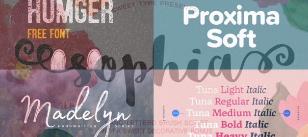
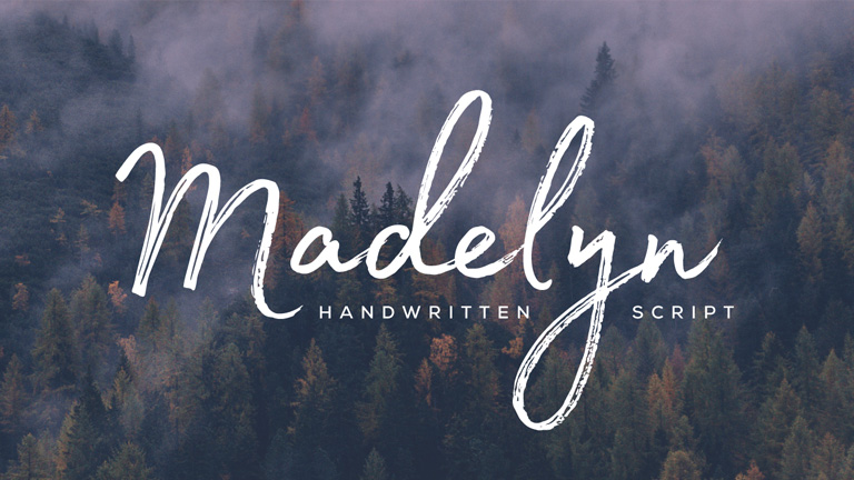
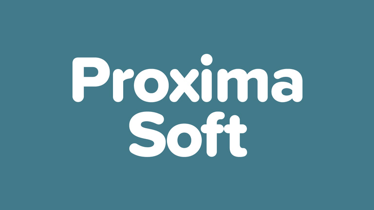
NYX Ditech

Categories
Brand & Identity Design Mobile Apps UI Design UX Design Web Design

5 Factors That Influence Readability and Legibility of a UI

No matter how exciting and compelling your story is, it will not be able to create an impact on users if it isn’t presented in a clear and readable layout. People generally focus more on the content than its packaging. No doubt content is the king, but packaging plays a crucial role in determining its success. Readability and legibility are two key aspects of user experience design. To simply put – app and web users will not read your content if it doesn’t look clean, clear, and consumable. In this article, we will cover the factors that influence readability and legibility in user interfaces and why it’s important to care about them.

Readability

As the name suggests, readability is the ease of written content perception. It refers to the comprehension of the text content. It includes – the simplicity of words and sentences, ease of consuming information, and clarity of thoughts. Readability is determined by considering your website’s typeface, which takes font size, font style, line length, and line-height into account.

Legibility

Legibility is a much narrower concept than readability. It refers to how easily your audience can recognize and differentiate between individual characters in lines of copy on your website. Legibility is determined primarily by your typeface design. We can say that legibility is one of the components to fall under the bigger umbrella of readability. It is generally analyzed by examining users’ reading speed in terms of words-per-minute.

Factors Influencing Readability and Legibility

There are plenty of factors that directly impact the readability and legibility of the content. Here are the five most important ones:

1. Typography

Typography refers to the font style. There are some fonts that are easy on users’ eyes and create a delightful reading experience. On the other hand, some fonts are not so pleasing. The choice of fonts directly impacts the readability and legibility of your copy. Font size, width, color, and text structure – every single element matters. Fonts also add to the visual element, just like images. Typography in design is the art of balancing the aesthetic aspect of the text and the ability to read it quickly.

Negative space, alignment, tracking, the spacing between baselines of text, line length, etc. are all key elements to clear typography and comprehendible content. Designers must avoid too little space between the words, very less distance between the lines or letters, tiny font size, and non-contrasting text and background colors.

2. Background

Just like printed books and newspapers, the background color has a significant impact on the ability to read and comprehend the content on websites. It allows readers to distinguish both interactive elements and content. For instance, black text on white or light background appears more significant than the white text on a dark background. An improper color scheme will mostly result in reduced readability, leading to poor user experience. Relevant content or useful data that is unreadable is of no use; users will most likely not read it.

The nature of the content also plays a role in selecting the color scheme. Text-heavy interfaces aimed at reading as the main activity should use color schemes based on light backgrounds. In contrast, the image-heavy interfaces should use dark backgrounds to amplify the pictures’ performance.

3. Writing

The UX writing must be clear, concise, useful and consistent. Text is a vital part of the visual design and user experience. The best you can do with the written content on your website, app, or blog is to make it human-like communication. When you interact with your users through text, at any level, they must feel as if they are interacting with a real human being and not a bot. 

Remember – users don’t read on the web, but scan through the content. Be short and consistent in your written copy. An extended form of writing pushes off users. You must also build a solid text hierarchy so that users can quickly scan your page content. Use numbers, marked elements, and textual variants to catch attention. Marking out specific information by using bold and italic fonts, unusual text sizes, different colors, highlighting, etc. has worked well for years and still holds its significance; however, avoid overdoing it.

4. Visual Hierarchy

Visual hierarchy refers to prioritizing the content into different levels. It is based on the Gestalt theory that deals with the psychology of visual perception of elements. The theory shows how people tend to group visual elements. It organizes UI components so that the brain could distinguish the objects based on their physical differences, such as size, color, contrast, style, etc.

As mentioned earlier, people scan content over the web. So, if we take an example of a blog, they will first notice the headline, then subheadings and only then copy blocks. This is a typical pattern. Users scan the headline and subheadings to understand if the article is interesting and useful to them. Only then will they read the entire blog. The headline and subheadings should be framed in a way that is both informative and enticing. On the other hand, if users see the vast and long sheet of text, they will be scared to read it.

To build an effective visual hierarchy, the text is divided into three levels:

  • The primary level – It includes the biggest type like in headlines. 
  • The secondary level – This is the type of element that supports scannability, such as subheaders or captions.
  • The tertiary level – This one is for the body text and additional data. 

5. White space

White space or negative space is the area of the layout that is left empty. It can be either around the objects you place in the layout or between and inside them. Negative space provides breathing space for all the objects by clearing the unwanted clutter from the page. White space is a strong tool to improve the readability of your text and thereby enhancing the user experience. It also helps in creating a connection between the text and non-text elements of a user interface. 

Many more factors influence the readability and legibility of the content of a user interface; however, these are the most important ones. If you feel like discussing them further in detail, our team of experts will be more than happy to assist you.

Categories
Web Design

Pro Tips For Web Designing With Type On An Image

Designers across the globe have unanimously accepted the fact that pictures speak way louder than words. Today, images play a vital role in every web design and when paired with the right text, they create a magical effect. Text on and around images is a growing trend, however, it’s not the easiest of the concepts to pull off. You need the perfect image, hard-hitting message and a complimenting typography. Moreover, you must be clear about your intentions and what you really want to achieve with that type on the image. Here are a few tips that will help you to master the art of designing with type on an image.

Insert Text Into The Image

One of the best ways to perfectly play while designing type on pictures is to make the text a part of the image itself. This doesn’t necessarily works all the time but is very fruitful in some cases. You can either use a simple image and introduce the text into it or use an image with text already in it. But, make sure that the message conveyed is exactly the one that you wish to.

Mclarensource:Mclaren

Use Contrast

No matter how powerful your message or text is, it needs to be readable to be successful. Make sure that the text varies in color, just enough to be seen in combination with the photo. If you have a photo with a dark background, opt for white or light colored text or vice-versa. Contrast can also refer to the size of the text in relation to what is happening in the image. Lettering should work with (not against) the image.

Telegraphsource:Telegraph

Follow The Visual Flow

Working with the visual flow of an image is one of the most important tips when it comes to working with text and photos. The words must fit into logical parts of an image and there shouldn’t be any text over important parts of an image, such as the main action, faces or the showcased product. In terms of visual flow, look for spaces where the subjects of the image would look. The text placed in the visual line of image is likely to be more impactful.

Blurred Background Image

One of the simplest tools that you can use is the ability to blur a part of an image or the entire image at times. Adding a little blur to the background of an image with a software can help your text stand out and create a stunning visual impact. Blur can also add focus to your overall concept and can bring the actual product and text into sharper focus for website visitors.

Wallmobsource:Wallmob

Text In A Shape

When the images that you choose to use has lots of color or differences between light and dark sections, putting text inside a shape can really make it stand out. Select a color for the box which provides enough contrast for the lettering to show. You can also use a frame with some transparency to give it a softer feel, a show through kind of image.


Source: fall

Text In Background

Another handy and impactful trick out there is to put the text in the background of the image rather than the foreground. Typically, backgrounds are less busy and easier to work with when placing text. Most of the backgrounds are single colored, making the text stand out easily and increases its readability. The end result is a natural-looking placement that does not require a lot of tricks or alterations to the main image. Subtle shading effects can also be used to get the desired output.

squaresource: square

Use Huge Fonts

When you’re really confused with what to do, place the safest bet by using large size fonts. This applies to both the image or the type itself. The size element instantly grabs users’ attention and with one element being large, it’s easier to create scale with the text and image. Using big images can help with shading and contrast differences while using big text can add enough weight to lettering where it will appear readable against almost any image.

Cider
Source: Cider

In addition to these tips, always remember to use simple typography and a straightforward image for the best results. Discuss more on your web designing needs. Talk to our experts right away.

Categories
Design

Top 5 Web Typefaces To Follow In 2017

Still early days of 2017, but a lot of new design trends have surfaced and look promising. The industry has shown fresh signs emphasizing on layouts and content. The year will be dominated by rich bright colors and bold typefaces. Having said that, the importance of typography would only increase to a brand new level altogether. Today, it’s extremely difficult to catch user’s attention and thus typography will play a pivotal role in the process. Let’s check out some of the most promising web typefaces that are bound to become mainstream in 2017.

1. Humger

Humger typeface flaunts a grunge style with capital letters. The lowercase option isn’t available in it and only uppercase letters are available. It’s inspired by an old-school style with dirty effects in the body. Its shape expresses a strong character of urban style featuring narrow texture, smudge effect, and an authentic vintage character. It’s a great option for artists who wish to create an everlasting impact on viewers. This typeface is best suited for headlines, titles, and infographics.

Humger typeface

2. Sophia

Sophia is distinguished by a hand-lettered style created by designer Emily Spadoni. In her own words, the typeface is “sweet, saucy, and little shabby” which makes it perfect for websites, infographics, and informal logos. Both uppercase and lowercase letters along with a set of special symbols are available. It portrays a perfect italic writing that induces a fresh feeling.

Sophia hand-lettered style

3. Tuna

Released in early 2017 by Felix Braden and Alex Rutten, Tuna has created quite a stir in the industry. Tuna is a serif typeface that can be used for magazines, books, and mobile applications with a well-defined calligraphic touch. The readability of Tuna is extremely good. There are five different weights (light, regular, medium, bold and heavy), available with italics. The serifs are a bit heavier and slightly arched ones, creating a dynamic structure and more contrast.

Tuna Font

4. Madelyn

Madelyn is a handwritten typeface which is very similar to real handwriting. It evokes a notion of individuality and style. The typeface replicates calligraphy pen writing along with some casual dry strokes. It includes both upper and lowercase characters, numbers, a large range of punctuation, and symbols. It’s perfect for logos, branding projects, greeting cards, posters, titles, and almost everything that calls for a personal touch.

Madelyn handwritten typeface

5. Proxima Soft

Designed by Mark Simonson, Proxima Soft shows off a rounded design that restyles the existing Proxima Nova. Proxima Soft includes 48 styles with eight weights in three widths and italics. It’s perfect when you are looking for something that is a bit more pleasant, more curvy, and playful than a traditional Sans Serif font. Considering the curvy style, this font is best suited for large headlines and eye-impacting words.

Proxima Soft

Trends will keep coming and impacting the overall lookout of the industry. It’s best to be abreast of the latest trends and use it to perfection. Talk to our experts today to know more about the latest happenings in the design industry and how you can use them to boost your business.

Categories
UX

5 UX mistakes That Can Kill Your Content

A great website is a mix of many things. You need to have a good design, awesome content and not to forget, a bit of luck too. While it all sounds pretty straightforward and obvious, a project can easily turn into something unexpected if not shabby. Here are 5 very common UX mistakes which can easily sidetrack a customer’s interest and ruin the intended actions of the interface:

Inconsistent alignment

A lot of people argue about which type of alignment is best from a design perspective. To be honest they have their own merits. The key is not the type of alignment, but the consistency in alignment. All the elements and types must fit properly within the grid. Also, there shouldn’t be any broken corners.

A poor alignment kills the visual flow and customer can’t easily move from one element to another of the design. An inconsistent alignment may easily push customers to miss out on the most important content.

Incomprehensible Typography

It’s a common practice these days to play around with fonts. A lot of bold typefaces are used these days. There isn’t anything wrong in that, but sometimes while going down this path people end up with unreadable content. I mean what’s the point if people can’t even read it.

There is a great possibility that a few characters and words might look good in a particular typeface while others may look really weird. Understand the content and see if the content has those kinds of characters. Another important thing to remember is that a fancy typography best works with lesser content. It’s better to stick with the most commonly used typography.

Poor Imagery

Imagery plays a very important role in terms of user experience. The images must always compliment your content. Poor or unrelated images will leave your customers confused and disinterested. Uninteresting images will overshadow the core content. Don’t use silly/unrealistic stock images, poor quality images, low resolution, and out of focus images. Audit your website and identify images that fall under any aforementioned NO NOs. You can simply remove these images without replacements unless you have a related one.

Crazy Colors

In an urge to create something unique and enticing, a lot of designers throw almost all the available colors in the palette. You might find some successful multicolored designs, but for every one such design there would be 100 failed designs. Too many colors hide the content and distract customers.

Select a very strong color palette. Start with a couple of dominant colors followed by secondary colors. If you wish to play around a bit, use shades and tints of same color.

Creating A Dead End

Even if you may have come up with the greatest of the designs for your landing page, it all goes in vain if the user finds himself asking himself what to do next?
The intention is to make the customer touch base with maximum amount of content.

Every page of the design must include the call to action option. Users should be able to easily interpret the objective of every page. Attractive icons/tabs should be used to entice customers into clicking on them. Crisp user instructions can also come in handy.

Sometimes smallest of the mistakes can be deal breakers. There are a plenty of other UX mistakes which prove fatal for the content. Talk to our design experts who understand the importance of minute UX design details and get a perfect web design.