NYX Ditech

Categories
Brand & Identity Design Mobile Apps UI Design UX Design Web Design

5 Factors That Influence Readability and Legibility of a UI

No matter how exciting and compelling your story is, it will not be able to create an impact on users if it isn’t presented in a clear and readable layout. People generally focus more on the content than its packaging. No doubt content is the king, but packaging plays a crucial role in determining its success. Readability and legibility are two key aspects of user experience design. To simply put – app and web users will not read your content if it doesn’t look clean, clear, and consumable. In this article, we will cover the factors that influence readability and legibility in user interfaces and why it’s important to care about them.

Readability

As the name suggests, readability is the ease of written content perception. It refers to the comprehension of the text content. It includes – the simplicity of words and sentences, ease of consuming information, and clarity of thoughts. Readability is determined by considering your website’s typeface, which takes font size, font style, line length, and line-height into account.

Legibility

Legibility is a much narrower concept than readability. It refers to how easily your audience can recognize and differentiate between individual characters in lines of copy on your website. Legibility is determined primarily by your typeface design. We can say that legibility is one of the components to fall under the bigger umbrella of readability. It is generally analyzed by examining users’ reading speed in terms of words-per-minute.

Factors Influencing Readability and Legibility

There are plenty of factors that directly impact the readability and legibility of the content. Here are the five most important ones:

1. Typography

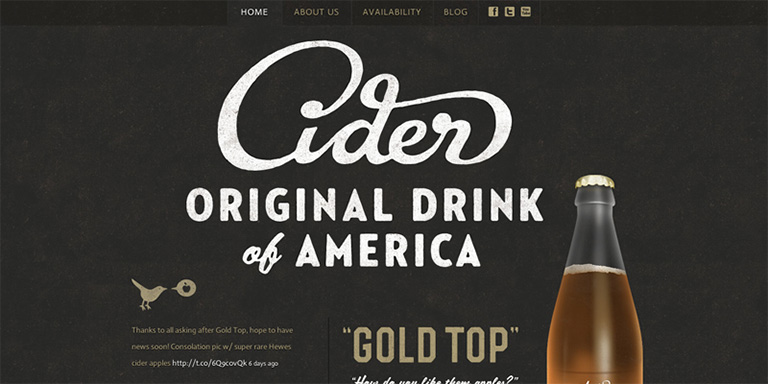
Typography refers to the font style. There are some fonts that are easy on users’ eyes and create a delightful reading experience. On the other hand, some fonts are not so pleasing. The choice of fonts directly impacts the readability and legibility of your copy. Font size, width, color, and text structure – every single element matters. Fonts also add to the visual element, just like images. Typography in design is the art of balancing the aesthetic aspect of the text and the ability to read it quickly.

Negative space, alignment, tracking, the spacing between baselines of text, line length, etc. are all key elements to clear typography and comprehendible content. Designers must avoid too little space between the words, very less distance between the lines or letters, tiny font size, and non-contrasting text and background colors.

2. Background

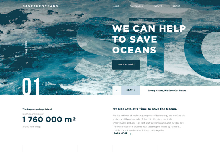
Just like printed books and newspapers, the background color has a significant impact on the ability to read and comprehend the content on websites. It allows readers to distinguish both interactive elements and content. For instance, black text on white or light background appears more significant than the white text on a dark background. An improper color scheme will mostly result in reduced readability, leading to poor user experience. Relevant content or useful data that is unreadable is of no use; users will most likely not read it.

The nature of the content also plays a role in selecting the color scheme. Text-heavy interfaces aimed at reading as the main activity should use color schemes based on light backgrounds. In contrast, the image-heavy interfaces should use dark backgrounds to amplify the pictures’ performance.

3. Writing

The UX writing must be clear, concise, useful and consistent. Text is a vital part of the visual design and user experience. The best you can do with the written content on your website, app, or blog is to make it human-like communication. When you interact with your users through text, at any level, they must feel as if they are interacting with a real human being and not a bot. 

Remember – users don’t read on the web, but scan through the content. Be short and consistent in your written copy. An extended form of writing pushes off users. You must also build a solid text hierarchy so that users can quickly scan your page content. Use numbers, marked elements, and textual variants to catch attention. Marking out specific information by using bold and italic fonts, unusual text sizes, different colors, highlighting, etc. has worked well for years and still holds its significance; however, avoid overdoing it.

4. Visual Hierarchy

Visual hierarchy refers to prioritizing the content into different levels. It is based on the Gestalt theory that deals with the psychology of visual perception of elements. The theory shows how people tend to group visual elements. It organizes UI components so that the brain could distinguish the objects based on their physical differences, such as size, color, contrast, style, etc.

As mentioned earlier, people scan content over the web. So, if we take an example of a blog, they will first notice the headline, then subheadings and only then copy blocks. This is a typical pattern. Users scan the headline and subheadings to understand if the article is interesting and useful to them. Only then will they read the entire blog. The headline and subheadings should be framed in a way that is both informative and enticing. On the other hand, if users see the vast and long sheet of text, they will be scared to read it.

To build an effective visual hierarchy, the text is divided into three levels:

  • The primary level – It includes the biggest type like in headlines. 
  • The secondary level – This is the type of element that supports scannability, such as subheaders or captions.
  • The tertiary level – This one is for the body text and additional data. 

5. White space

White space or negative space is the area of the layout that is left empty. It can be either around the objects you place in the layout or between and inside them. Negative space provides breathing space for all the objects by clearing the unwanted clutter from the page. White space is a strong tool to improve the readability of your text and thereby enhancing the user experience. It also helps in creating a connection between the text and non-text elements of a user interface. 

Many more factors influence the readability and legibility of the content of a user interface; however, these are the most important ones. If you feel like discussing them further in detail, our team of experts will be more than happy to assist you.

Categories
Blog Design Technology UI Design

The Golden Ratio For Balancing Your UI Design

The key element of an effective design is a clear UI Design. Each and every element must be well-balanced and placed in sync so that users could easily perceive the information on the screen and interact with a product without efforts.

Art, science, and basic mathematical theories, all come in handy when it comes to creating an efficient design composition. Amongst the most commonly used tools for designing is a mathematical proportion known as the ‘golden ratio’. In the article, we’ll define this technique and check out the benefits of using this ratio in design.

The Golden Ratio

The Golden Ratio is a formula that has been derived basis a general observation that everything designed by mother nature has a specific shape that’s near perfect. People enjoy everything which has a natural touch. In pursuit of discovering the secrets of shapes and the mystery behind creation, mathematicians calculated a formula that appears in the majority of things on the Earth.

In simple words, the golden ratio is a mathematical proportion between the elements of different sizes which is thought to be the most aesthetically pleasing for human eyes. The golden ratio equals 1:1.618, and it is often illustrated with seashell-shaped spirals.

UI Design Golden Ration

The golden ratio is believed to be followed for 4000 years now. The likes of Leonardo Da Vinci and Salvador Dali were known to use the golden ratio theory in their artworks.

Use Of Golden Ratio In UI Design

Striking the right composition and balance is a core part of any design. The elements need to work well with each other and complement each other to maximize the viewing experience. Also, the elements should be created with a balance within themselves. 

Graphic designers are keener to apply the golden ratio as it is a great way to understand how to work with proportions. Designers use this ratio to create various graphics, especially for the small but meaningful design elements such as a logo. The golden ratio allows creating illustrations where each element is placed in harmony and appropriate proportion to the others.

The UI design needs to have a clear visual presentation of the components so that people could use a product without problems. The golden ratio is often applied to place UI Design elements effectively. First of all, it can be used at the stage of wireframing. This way you can plan a structure for the layout placing and sizing user interface components according to the golden proportion. In addition, the golden ratio scheme can help professionals to crop images for web design so that it could make sure the composition of the photo remains balanced.

Advantages of The Golden Ratio

Well-balanced content

Designers often face the situation when a product needs to contain a great amount of various content and each part of it is vital and cannot be replaced. To unite all the components in a pleasant composition, the golden ratio can be applied. Divide the layout into different sections using a proportion of 1:1.618 and put the content in the sectors according to their importance. Such a content composition is sufficient for users’ perception and it helps to organize all the components.

Effective visual hierarchy

Speaking of the content organization, we can’t forget about visual hierarchy. As we mentioned in our previous articles, it’s a technique of efficient structuring content components. Combining principles of these two techniques designers maximize the chances of building a powerful UI design composition.

Powerful typography levels

To create efficient typography, designers need to divide copy content into different levels. They usually include various kinds of copy including headers, subheadings, body copy, caption, etc. Applying golden ratio professionals can quickly define an appropriate proportion between the typographic levels, for example, you can choose a certain size for the header and then divide it by 1.618. The result will show you the most appropriate size for subheaders.

Pleasing first impression

When users try a product for the first time, they scan the user interface to understand if they like it or not. The psychology principle known as a visceral reaction states that people decide whether they like something or not within a few seconds of looking at something. This reaction goes faster than our consciousness so we don’t even realize it. That’s is why it’s vital to make sure the first impression of a product will be pleasing. UI Design created by using the golden ratio has a positive influence on users’ minds and their visual perception and it works from the first sight at a product.

Appropriate white space

White space is the area between elements in design composition. Designers always need to care about the amount of white space in the UI since the unity of composition highly relies on it. The golden ratio can make the process of spacing much easier and faster. Applying golden proportions you will be able to define the right white space which will work well for the UI design.

To discuss more on your design needs, talk to our team of experts.

Categories
Brand & Identity UI Design UX Design Web Design

Latest Logo Designing Trends For 2020

A logo is an integral part of branding for any business. It acts as the unique identity of a company and plays a vital role in creating brand recall. The style and pattern of logos have evolved significantly over the past years. Every year certain new themes gain popularity and some of the ongoing trends fade out. So, what are the latest logo designing trends which will shape the designing of stunning, effective, impressive logos in 2020? Let’s check out.

1. 3D Gradients

Looking at the current developments in the field of logo designing, we predict that the popular gradient trend will evolve and merge with the 3D trend in 2020. This would be a tailored fit for our smartphone society. Gradients are a great way to turn any group of colors into a dynamic spectrum of color that feels like it has life and energy. In 2020, designers will boost the latest evolution of gradients creating depth and 3D effects in logos. Particularly, tapered gradients are set to top the 2020 logo design trend charts.

Don’t forget, 3D gradient logos are tough to print. That’s why they’re apt for screens. Brands that don’t need to worry too much about how their logos look in print are the ones that can best use 3D gradient logos. We expect to see designers explore the full potential of gradients this year. They can create captivating 3D effects, shadows, and depth as never before.

2. Motion graphics and videos

It’s a common assumption that that logos are still and stationary. Whether they’re on product packaging or on a business card, we think of them as images only. However, that’s soon going to change with the evolution of video and animation. Motion logos are becoming an integral part of visual branding. The popularity and use of video logos are only going to rise in 2020.

The growing popularity of social media platforms, and them becoming central points for marketing, calls for creating more engaging advertisements. Brands need to push themselves and need to switch from plain image logos to more engaging ones, like the motion and gif logos.

3. Bye-bye grids

Over the past few years, brands have been playing it all safe, when it comes to logo designing. They have been using the grids to place colors and designing the logos. But, it’s 2020, and designers are ready to take a bit of risk. There is a time and place for using a grid to guide your logo designs—it ensures your composition is symmetrical and visually balanced. But in 2020, we’re likely to see a move towards more abstract logo designs that push the boundaries.

Now you must be wondering how do you incorporate this design trend without ending up with a messy and chaotic logo? Even though you’re not using a traditional grid, it’s all about making sure the visual elements you use are distributed in an aesthetically pleasing way. The focus must be on the hierarchy of elements and negative space that makes the overall design look poised.

4. Raw, not-so-perfect logos

On one hand, there are digitally designed gradient and 3D logos which will gain popularity in 2020, and on the other hand, we feel that hand-drawn, free-flowing logos will also become immensely popular amongst designers this year. These logos reject the sleek, perfect look made possible with design programs and take us back into sketchbooks where there are asymmetry, uneven lines and shading techniques like cross-hatching and contour shading.

Just like other 2020 logo trends, raw, imperfect logos have been on the rise for a while. This year, they’re getting grittier and more sketch-like and stamp-like as brands continue to embrace the homegrown, organic look. With all the digital perfection out there people are craving the raw imperfections of hand-drawn logos. Brands can use the hand-drawn look to show off their authenticity and give their logos the personality their customers want to see.

5. Responsive logos

Functional and user-friendly design is one such trend that will always be popular. We all have seen the rise of responsive websites, and now is the time for responsive logos. Today, the brands want to be unique, they want to create an impact on their customers, they want to revolutionize their industry. Responsive logos are bold, powerful and really showcase a business’s innovation and expertise as leaders in their fields.

A responsive logo is one that adapts to different screen sizes. Generally, this will require a designer to create versions at various dimensions, to optimize their performance. That way, whether you’re viewing it on desktop, smartphone or tablet, it will always look its best. Anyone can jump on the responsive logo trend and it’s an excellent way to ensure your brand stands out as being polished and professional. The best way to use this in your own designs is to find out the correct size for that device, and use custom dimensions tool to create a logo that fits.

Read about the stories behind the logo of these famous brands

Designing the right logo is critical for a business. There’s a lot of thinking which goes behind the process. Logo designing is a process that requires an amalgamation of the brand’s vision and design trends. It has to be done right to create an impressive and effective logo. Talk to our experts and learn more about logo designing.

Categories
UI Design UX UX Design Web Design

10 Great Examples of Creative Landing pages

The landing pages are the first and foremost introduction of your website and plays a vital role in marketing your brand on the web. it introduces the specific offers, your services, products and key elements of your business. Therefore it’s necessary to give a good thought behind designing a visually attractive, intuitive and user-friendly landing page. The goals behind the landing page design can be different. 

Landing pages are not just about selling and buying. They are also used to present and promote mobile applications, educational resources, communities, make special announcements, etc.

The design process for any landing page must start by setting a clear and concise target to be achieved. An ideal landing page must feature a clear visual hierarchy, bold and highly readable typography, a short scannable tagline, an instantly visible call-to-action element, and a readable and concise description.

Today, we have collated a list of 10 amazingly designed landing pages featuring a variety of products and offers. Take a look and draw inspiration from each one of them.

1. Photomate – A Photo Service

Landing Pages Example 1 - Photomate

Photomate is a digital product for photography lovers. It’s design is created for the direct purpose of web promotion. The app lets users keep their photos in an organized gallery and albums. They can find photos quickly and improve their looks with an AI-based editor. This landing page is a good example of using custom hero illustrations to boost storytelling, add originality and enhance the effectiveness of marketing efforts.

2. Cleanerz – An Innovative Car Wash Service

Landing Pages Example 2 - Cleanerz

The focus of digital products has shifted from selling, offering, informing, or educating to just connecting people who can help each other solve their problems. This design is a perfect example of connecting people. It is the landing page for a service that provides innovative car cleaning and let people join and earn money. This particular page is targeted at people who are looking to be hired as cleaners. The hero illustration is both cute and catchy. It creates a positive mood and informs about the nature of the service with readable and clear content placed on the light background.

3. Let’s Read Together – The Subscription Page

Landing Pages Example 3 - Let's Read Together

This is the subscription page of an online bookstore selling children’s books. Its conversion goal is to engage users and make them subscribe to the newsletters. The simple tagline and description that explains the benefits, with the hero illustration, instantly creates the proper aura and encourages users to subscribe. The dark background here doesn’t hurt readability in any way due to the thoughtful choice of fonts.

4. Checkbags – A Luggage Delivery Service

Checkbags

If you are a frequent traveler or you have to constantly move, you must be aware of the luggage challenge. This app aims to overcome this challenge and that’s the point behind the service presented in this design concept. The app picks up clients’ luggage from the desired location and delivers it to the chosen destination. The bright and catchy hero image along with a subtle color palette instantly sets the right mood. Color accents effectively unite the layout composition and the tagline fits great.

5. Flober – A Hair Accessories Store

Flober

One of the basic rules of e-commerce websites is to display the offered item at its best. This landing page demonstrates how to do it in the case of an e-commerce website. The page is designed for an online store selling exclusive hairclips and accessories. The illustration is very much prominent and artistic, which instantly sets the theme, gives aesthetic pleasure and creates a strong emotional appeal. The sophisticated typography nicely compliments the design.

6. Secure – A Security Service

Secure

This is another landing page that promotes a mobile app. The security application helps a user quickly contact the nearest police station and cares about the safety of the neighborhood. The visual contrast of a hero illustration, with irregular curves and thin lines makes the landing page stand out. Also, the bold solid Druk font creates an instant impact.

7. Carbonex – An Environment Protection Community

Landing Pages Example 7 - Carbonex

People are becoming more and more environmentally aware and concerned with every passing day. The seeking for solutions related to environmental problems is growing at a rapid pace. Carbonex is a web page designed for the website of the eco-aware community consulting businesses and manufacturers as well as launching projects devoted to environmental protection. The composition and color palette of the hero illustration supports the emotional appeal and creates an instant message about the theme. Visual hierarchy features easy scannability to make the major information. The infographics and CTA are also instantly visible.

8. Commo – A Social Network Management App

Commo

This catchy web page is designed to promote an application that allows users to manage all their social accounts in one place. The illustration has a dynamic composition that best reflects the fast-paced communication in social networks. The page has a split background with a light part for the graphics and the dark part for the text. The CTA button unites the general composition as white elements in dark. 

9. Smartmap – An Interactive Mapping App

Landing Pages Example 9 - Smartmap

Today, websites and apps are much more than just sources of information and communication. They are used for various purposes and often act as our virtual assistants. This landing page was designed to promote an app that allows users to build interactive maps for their smart homes, offices and even public spaces. The catchy and concise layout with an artistic hero image becomes reflects a strong brand image.

10. EasyShops – A Shopping Delivery Service

Landing Pages Example 10 - EasyShops

This is the landing page of a local delivery service, the one that helps shoppers who don’t have the time to shop. It uses catchy 3D graphics set in combination with a unique color palette which gives a trendy look to the page. It helps the brand to stand out. As the website is targeted at local clients, the CTA is designed for a quick call as a priority action.

Read more about UX tips on Landing Pages here

The web is full of such inspirations. It is just the trick to zero-down on the message that you want to convey, the way you want to convey and knowing exactly the brand perception that you want to build in your target audience’s mind. Wanna create a WOW landing page for your business? Talk to our experts.

Categories
Design

Mid Year Round-Up of Latest UI Design Trends

Half the year has gone by and we can say this was a pretty interesting year in terms of web designing, especially UI designs. A lot of new design trends surfaced, while a few faded away. Here’s a list of the hottest UI design trends which were highly popular by far in 2018.

Storytelling with Character Design

The trend of custom graphics has opened doors for personalization and developing personalized special characters. Character design for storytelling in the interfaces is swiftly gaining popularity. More and more websites and mobile apps turn to specially designed characters for storytelling, setting the tone, conveying messages or showcasing the benefits in a way that matches the mood and voice of the platform. The interactions are more human-like when original characters are involved and thus creates a strong visual association with the real world. Moreover, the characters make the page or screen compelling and vibrant.

Full-Screen Background Images

More and more websites have now started using full-screen background images, be it photos or specially rendered visualizations. Use of these images not only visually enhance the websites, it makes them emotionally appealing. It is the most effective way of captivating visitor’s attention and sets the tone for an ideal user experience even when the site is loading, in addition to boosting the UI. Only high-quality images must be used as background images; the recommended background image size is 1250×800 or anything higher than that but with the same proportions.

Custom Digital Illustrations

Some trends continue to be popular for years. Custom digital illustrations are one of them; its presence on the web and mobile user interfaces is increasing every day. Custom graphics effectively support the quick perception of information provided on the page or screen; they set a solid ground for originality. Custom mascots, icons, illustrations are some of the most common forms of custom graphics which designers use to enhance the look of a page or screen, as well as boost usability and intuitive navigation. Another growing trend is creating digital illustrations as title images for blog articles.

Hero Images

A hero image is the first, main photograph or graphic that you see at the top of a web page. Its primary objective is to grab immediate attention and show visitors what your site, content is all about. They are flashy, pretty and keep visitors engaged. Moreover, as well as any other striking graphics on web pages, this is a kind of content which is both informative and emotionally appealing. This might be the reason why designers often turn to this technique to add diversity to landing pages.

Split Screens

One of the hot trends of this year is the active usage of split screens in both web and mobile interfaces. However, this trend is not really a new one. We have noticed that it fades away, only to make a comeback in various spheres of design, and looking at the year so far, it’s safe to say that it’s definitely back and alive. Split screen approach is believed to be more effective in responsive designs as you can work around with different content variations without missing the consistency. Additionally, it offers liberty to designers to try different color combinations and experiments. Some websites even use split screens to show two options of equal importance.

Multiple Interactive Layers

UI designers never shy away from experimenting and infusing creativity in their designs to find new, interesting ways of making the web page interactive and highly engaging. One of the growing trends is applying several interactive layers that make scrolling experience and interactions look original. By playing around with the positioning of various items on the scroll, they create an amazing parallax effect that provides a deeply layered experience.

Bold Typography

This UI trend has become very popular over the last few years and continues to do so in 2018. Bold and catchy typography can be seen all across the web and mobile layouts. In most cases, it becomes one of the key design elements and designers pay plenty of attention towards keeping it readable and scannable. Typographic hierarchy along with thoughtfully chosen fonts are among the core tasks of every UI design project.

Apart from these, there are many other UI design trends which have been the talk of the designer’s town. Share the ones you like in the comments section. Even better, talk to our design experts and know in-depth about the latest design trends.

Categories
Design Web Design

5 UI Trends That Topped The Charts In 2017

These 9 months of 2017 have been quite exciting in terms of technology and the web. The world of web is moving at a fast pace with new advancements emerging every now and then. In line with these technological advancements, the design world has also allowed itself to evolve by accepting new trends and ideas. Designers have welcomed fresh design trends and methodologies with both hands especially while designing the User Interface. With a majority of the year gone by, let’s have a quick look at the UI trends which ruled in 2017.

1. Use Of Deeply Engaging Videos

We have repeatedly highlighted the importance of videos in terms of web design and User Interface. It’s the best way of voicing out the brand’s message in an appropriately associated tone. ‘A picture speaks thousands of words’, and is much more engaging as compared to mere words. Use of pictures has been a trend for quite some time now and videos are its natural successor. Images are static whereas videos are dynamic, thereby creating an amplified effect. 2017 has seen a shift in momentum from the use of static images to engaging videos. Having said that, images are not going to disappear from the scene overnight. However, videos are the next big thing in designing an impressive interface.

2. Long Scrolling

Scrolling is not really a so-called trend and is more of a fundamental functionality. It has been prevalent from a long time both in websites and desktops. But, long scrolling has emerged as a design trend in the last few years. A huge number of websites are using long scroll & longform content for desktops and other larger devices in order to display their content. Due to an increase in access to the internet through smaller devices like mobiles etc., users have become extremely comfortable with scrolling. This has pushed designers to implement long scroll and longform of content in bigger screens. With help of long scroll, users can access a huge amount of content in a single and smooth motion. It works well with all forms of content like longform journalism, news articles, stories, landing page etc.

3. Flamboyant Colors & Gradients

The year 2013 saw the uprise of a design methodology which changed the look and feel of the web back then. It was the introduction of flat design. The concept was to keep the design as simple as possible while eliminating all the fancy and jazzy elements from the design. Functionality wise it was very strong and therefore soon spread like wildfire among the designers. However, it had its own drawbacks. Soon everyone was using a flat design and therefore every website looked more or less similar.

Designers realized the need of creativity and individuality once again and they broke the shackles in 2016. Designers started focusing more and more on personality, experimenting with bold colors, vivid colors etc. instead of dull and simple color shades to provide a sense of uniqueness to their websites. 2017 has seen a great increase in vivid colored and stylized websites. This trend has shown positivity and is bound to gain momentum in the upcoming year as well.

4. Bold & Beautiful Typography

In an extension to use of vivid colors and bold designs, designers have fearlessly experimented with loud Typography as well in 2017. Today, there are a lot of free or cost-effective web font services (like Google fonts, Typekits etc.) available to designers, which provides them creative freedom and more experimenting power. 2017 has seen a huge rise in the use of unconventional, bold, and out of the league web fonts in comparison to conventional fonts. This trend is here to stay for quite some time and the upcoming year will see more and more bold & beautiful typefaces against the traditional typefaces.

5. Illustrations

Illustrations provide an immense sense of personality, individuality, and character which can barely be achieved with traditional photography. Illustrations designed in line with a brand’s identity develops a sense of authenticity and builds trust in users and customers. Illustrations have their own versatility. Some brands may prefer sophisticated illustrations to achieve that posh and classy look, whereas others may rely on more rough and edgy styles to position themselves as fun and playful. Illustrations have performed well in 2017 and they seem to be buzzing in the coming years as well.

The only thing constant is ‘change’ itself. New trends and ideas keep on emerging at the scene and designers should always try to keep themselves abreast these trends. The aforementioned trends are the most popular trends that created a buzz in 2017. However, there is a huge list of other trends as well which were successful in modifying the design world. Share your design requirements with our experts and see how you can ride on these trends to create an impressive User Interface.