NYX Ditech

Categories
Brand & Identity Design UI Design

Dos & Don’ts of Logo Design For 2021

When establishing a firm, it is critical to plan branding(which includes logo design as well). You must establish a strong brand identity from the start if you intend to leave a lasting impact on the clients you wish to attract.

Logos are key components of branding, particularly when starting a corporation. Designing a logo is much more than simply combining colors, fonts, and elements to create a visual identity. You require a logo to accurately portray your brand’s purpose and communicate its message clearly and impactfully. We’ve compiled a list of useful dos and don’ts that will help you look professional and establish a reputation for yourself in your field.

Logo Design – Dos

#1 Conduct Audience Research

One of your primary objectives of creating a logo is to build a brand identity. At the initial stage in the logo-creation process, specify your audience. Conduct research on their hobbies and online behaviors to develop the ideal logo that is certain to capture their attention and have a lasting recall value.

#2 Ascertain That It Is Readable

Logos are intended to be easily comprehensible. If you’ve developed a logo but it’s difficult to interpret and understand, it’s time to reconsider your font selection. Customers may view your logo and perceive a different name than what you meant, causing confusion. Maintain a basic and easy-to-read typeface by avoiding complex or too detailed fonts.

#3 Consider Various Sizes

Although you may just require your logo to be displayed on brochures, social networking sites, or your webpage in the early phases of starting up your firm, however, later things may change. You must design a future-proof logo, which means that if you need to scale it up for banners or billboards, the quality of the design should not be compromised. Your logo must appear flawless at every size!

#4 Pay Attention to Taglines

When developing your brand image, a tagline is critical for conveying your personality. If you want to incorporate a slogan into your logo, keep it short to prevent creating a cluttered or busy-looking design. When selecting typefaces, choose a smaller font for the slogan or tagline so that the focus is initially on your brand name.

Logo Design – Don’ts

#1 Make It Very Complex

Logos are not intended to be elaborate or intricate. Simplicity is important! 

Avoid employing an excessive number of colors or creating the illusion of a costly piece of art. Using just so many lines or mixing several typefaces in your logo can be distracting and will cause your audience to focus on the incorrect elements of your brand. Incorporating too many components will also impair your logo’s scalability.

#2 Copy Other Brands

Plagiarizing with other brands or businesses is illegal and will get you a lot of trouble. The goal of marketing and branding is to differentiate oneself from the competitors. If you want a unique identity in the market, you cannot do it by mimicking other brands.

#3 Adhere to Trends

Trends change rapidly, and if you cling to a trend while developing your logo, the branding may become obsolete in a year or two. Our online habits, particularly with regard to social media, are continuously developing. While the audience may connect with particular memes today, they will almost certainly forget about those someday.

While trends are beneficial for marketing purposes, they are useless when it comes to branding and developing a logo.

#4 Be Too Literal

Logos are exciting and vibrant! Taking your design too literally might produce something that seems too complicated or even uninteresting. If you own a restaurant, there is no reason why your logo should include an actual restaurant scene. Make an attempt to be as unique and imaginative as possible.

Your logo should be straightforward, eye-catching, and vibrant enough to communicate your message at a look.

Contact our team today and let us know about your brand’s logo needs
Categories
Brand & Identity UI Design UX Design Web Design

Latest Logo Designing Trends For 2020

A logo is an integral part of branding for any business. It acts as the unique identity of a company and plays a vital role in creating brand recall. The style and pattern of logos have evolved significantly over the past years. Every year certain new themes gain popularity and some of the ongoing trends fade out. So, what are the latest logo designing trends which will shape the designing of stunning, effective, impressive logos in 2020? Let’s check out.

1. 3D Gradients

Looking at the current developments in the field of logo designing, we predict that the popular gradient trend will evolve and merge with the 3D trend in 2020. This would be a tailored fit for our smartphone society. Gradients are a great way to turn any group of colors into a dynamic spectrum of color that feels like it has life and energy. In 2020, designers will boost the latest evolution of gradients creating depth and 3D effects in logos. Particularly, tapered gradients are set to top the 2020 logo design trend charts.

Don’t forget, 3D gradient logos are tough to print. That’s why they’re apt for screens. Brands that don’t need to worry too much about how their logos look in print are the ones that can best use 3D gradient logos. We expect to see designers explore the full potential of gradients this year. They can create captivating 3D effects, shadows, and depth as never before.

2. Motion graphics and videos

It’s a common assumption that that logos are still and stationary. Whether they’re on product packaging or on a business card, we think of them as images only. However, that’s soon going to change with the evolution of video and animation. Motion logos are becoming an integral part of visual branding. The popularity and use of video logos are only going to rise in 2020.

The growing popularity of social media platforms, and them becoming central points for marketing, calls for creating more engaging advertisements. Brands need to push themselves and need to switch from plain image logos to more engaging ones, like the motion and gif logos.

3. Bye-bye grids

Over the past few years, brands have been playing it all safe, when it comes to logo designing. They have been using the grids to place colors and designing the logos. But, it’s 2020, and designers are ready to take a bit of risk. There is a time and place for using a grid to guide your logo designs—it ensures your composition is symmetrical and visually balanced. But in 2020, we’re likely to see a move towards more abstract logo designs that push the boundaries.

Now you must be wondering how do you incorporate this design trend without ending up with a messy and chaotic logo? Even though you’re not using a traditional grid, it’s all about making sure the visual elements you use are distributed in an aesthetically pleasing way. The focus must be on the hierarchy of elements and negative space that makes the overall design look poised.

4. Raw, not-so-perfect logos

On one hand, there are digitally designed gradient and 3D logos which will gain popularity in 2020, and on the other hand, we feel that hand-drawn, free-flowing logos will also become immensely popular amongst designers this year. These logos reject the sleek, perfect look made possible with design programs and take us back into sketchbooks where there are asymmetry, uneven lines and shading techniques like cross-hatching and contour shading.

Just like other 2020 logo trends, raw, imperfect logos have been on the rise for a while. This year, they’re getting grittier and more sketch-like and stamp-like as brands continue to embrace the homegrown, organic look. With all the digital perfection out there people are craving the raw imperfections of hand-drawn logos. Brands can use the hand-drawn look to show off their authenticity and give their logos the personality their customers want to see.

5. Responsive logos

Functional and user-friendly design is one such trend that will always be popular. We all have seen the rise of responsive websites, and now is the time for responsive logos. Today, the brands want to be unique, they want to create an impact on their customers, they want to revolutionize their industry. Responsive logos are bold, powerful and really showcase a business’s innovation and expertise as leaders in their fields.

A responsive logo is one that adapts to different screen sizes. Generally, this will require a designer to create versions at various dimensions, to optimize their performance. That way, whether you’re viewing it on desktop, smartphone or tablet, it will always look its best. Anyone can jump on the responsive logo trend and it’s an excellent way to ensure your brand stands out as being polished and professional. The best way to use this in your own designs is to find out the correct size for that device, and use custom dimensions tool to create a logo that fits.

Read about the stories behind the logo of these famous brands

Designing the right logo is critical for a business. There’s a lot of thinking which goes behind the process. Logo designing is a process that requires an amalgamation of the brand’s vision and design trends. It has to be done right to create an impressive and effective logo. Talk to our experts and learn more about logo designing.

Categories
Design

Importance of Graphic Design For Your Business

Designs are a part of our daily lives. Every single day we come across with logos, websites, books, magazines, flyers, advertisements etc. which are full of graphics and eye-catching designs. Still, a lot of people cannot digest the fact that graphic design is as important as any other arm of your business. This article highlights the importance of graphic design for any business and how it benefits a brand.

1. Boosts Sales And Growth of A Company

sales

Thoughtfully created and uniquely designed graphics help in attracting people towards your brand. Visually appealing marketing material, distinctly designed logo, attractive social media marketing images etc. help in drawing people’s attention to what you’re offering. Moreover, good quality graphics help people to perceive your brand as a brand that offers good quality products or services. This helps in building trust and increasing customer loyalty which in turn leads to increased sales and growth.

2. Creates A Strong Brand Recall

brand recall

Graphic designs are also helpful in establishing a company’s name in its niche market. When people look at an attractive logo, again and again, it reminds them of the brand associated with that logo. Similarly, advertisements, websites or business cards featuring good quality graphic designs also helps in creating brand awareness and ensure that people easily recognize your brand.

3. Conveys a Brand Message

Graphic design is also a great way of conveying a specific brand message to the target audience. A brand message makes the design extremely useful. A professional designer will first try to understand the message that needs to be delivered through the design. Based on the intended message, the designer picks specific colors and typefaces to evoke particular emotions. These emotions then become the message of the brand to its potential customers.

Take a look at the McDonalds logo.

McDonalds logo

It has red and yellow as its primary colors. These colors evoke feelings of passion and raw energy of young people and also portrays a feeling of socialization. This is exactly the message of this fast food giant as its target is young customers.

4. Displays Professionalism

Displays Professionalism

It’s difficult for companies to create an environment of competitiveness and professionalism amongst their employees, especially in startups and small companies. Graphic design makes a lasting impression on your clients and vendors. For example, a strategically designed and visually stunning logo design speaks volumes about its company’s ways of doing business. It gives an impression that the company is highly professional and is very serious about what they do. That can really be helpful in striking long-term client relationships which means steady growth of the company.

5. Enhanced Readability of Your Content

readability

A good graphic designer can even enhance the readability of the content that you generate to grab the attention of your audience. There are a lot of ways to do so like picking appropriate typefaces, colors, images, etc. The average reading time on the web is very low and most of your audience will simply scan your content rather than actually read it. If the designer is able to highlight your most important content through graphics, chances are more that your content will be read.

If you also want to amplify your brand image by using graphic designs than speak to one of our design experts NOW!

Categories
Design

10 Famous Logo Design And Their Hidden Meanings

For a lot of people, a logo is only a creative way of depicting your business name. However, there’s a lot more than this behind the concept of a logo design. Logos not only play an important role in the overall branding process, they also help people to identify and connect with a brand. That’s the reason why designers devote a good amount of time in carefully crafting a logo which communicates the brand’s language. While creating a logo, designers use their creativity in different ways and sometimes they squeeze hidden meanings in a logo design. Here are 10 famous brand logos which look very common but have a hidden meaning in its design:

1. Amazon

Amazon Logo
At first sight, the logo simply looks like the company name with an arrow. But, this arrow is not just to add an aesthetic appeal. The arrow starts from letter ‘A’ and goes till letter ‘Z’ which conveys that the company offers an A to Z variety of items across its online store. In addition to that, the arrow displays a smile which customers will pose as they will be satisfied by the wide range of products.

2. FedEx

FedEx Logo

The shipping giant’s logo is again no-brainer at first look. However, if you look closely, you will notice that the blank space between letters ‘E’ and ‘X’ shows an arrow representing speed and precision in company’s delivery.

3. Le Tour De France

LeTourFrance Logo

The most iconic cycle race across the globe is a world-class sports brand in itself. Again, there’s not much to think about when you first look at the logo. However, the designer has neatly fitted a cyclist in between through the letters ‘O’ ‘U’ and ‘R’ which clearly communicates what the brand is all about.

4. Beats

Beats Logo

The logo for Beats is pretty simple with letter ‘b’ enclosed in a circle, followed by the company name. But, the circle isn’t just a circle. It depicts a human head and the ‘b’ inside it represents a headphone which very effectively allows people to visualise themselves wearing company’s headphones.

5. Baskin Robbins

BaskinRobbins Logo

Interestingly, when Baskin Robbins was launched, it started off with 31 flavours of icecreams and the company very creatively highlighted this fact in their logo. The curve of letter ‘B’ represents number 3 while the stem of letter ‘R’ represents number 1.

6. London Symphony Orchestra

LondonSymphonyOrchestra Logo

This one is a little tricky and requires attention. The logo of London Symphony Orchestra shows the initials of the company written in a single freehand stroke. But that’s not it. There’s an orchestra conductor waving his baton in the logo. The joint of letter ‘S’ and ‘O’ represents the head of the instructor while the letter ‘L’ represents the baton.

7. Formula One

Formula1 Logo

Formula One is the world’s biggest and most renowned car racing championship. Its logo shows the initial of Formula and a race track. If you look closely the space between letter ‘F’ and the racetrack shows the digit 1, which completes the logo.

8. NBC

NBC Logo

NBC was once known as the Peacock Network and hence the bird was first used as its logo in 1956. The peacock has now evolved to this with its 6 colored tail representing the departments; News, Sports, Entertainment, Stations, Networks, and Productions.

9. Picasa

Picasa Logo

Picasa is an image editing and sharing site. The logo of Picasa features a colorful circle which represents a camera shutter. Also, the name itself has a hidden meaning. ‘Casa’ means home in spanish and thus Picasa means ‘home to your photos’. If you look closely, the space between the different colors features a house.

10. Sony VAIO

SonyVAIO Logo

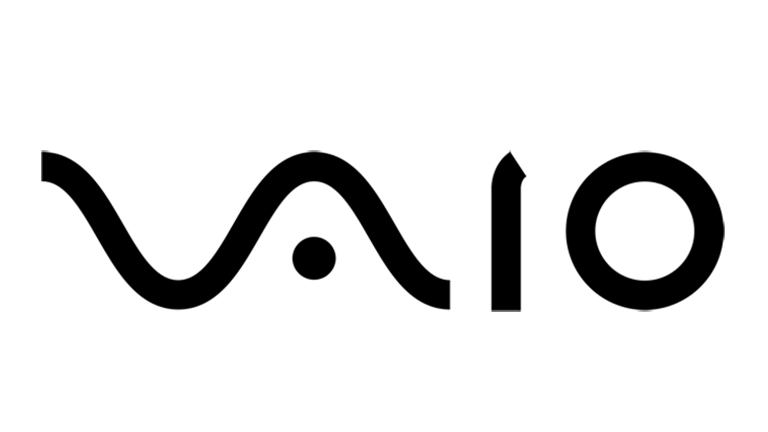
Vaio is Sony’s brand line of laptops. The logo is not just a stylishly written brand name but refers to turning analog waves into a digital form too. The analog waves are represented in the ‘V’ and ‘A’ while the letters ‘I’ and ‘O’ refer to 1 and 0, which are the two digits used in the binary code, the digital language.

Looking to get a perfect logo designed for your brand? Talk to our design experts.