NYX Ditech

Categories
Brand & Identity Design UX Web Design

CX vs UX: What’s the Difference?

CX vs UX: User experience or UX is a well-known term. Designers, even non-designers, are well versed with the meaning of UX. But, have you heard of the term CX? It’s not as commonly used as its counterpart – UX, but is soon growing in popularity. CX or customer experience is often mistaken to be the same as UX. However, the truth of the matter is that both these terms are fundamentally different and need to be treated as two separate entities. 

It all starts with how we address and define our clientele. Our users are our customers and vice versa. That’s where we start believing that user experience is similar to customer experience. So let’s clear this confusion once and for all. Let’s understand CX vs UX.

User Experience

The concept of user experience is specifically connected to your product; be it the app, software, or website. The experience of users while interacting with that product is user experience.

The design, interface, usability, navigation, visual hierarchy, information architecture, etc. are all contributors to the user experience. It can either be positive or negative for the product’s users. 

Similarly, UX design is the process of designing products that are intuitive, easy, enjoyable to use, and solve problems. The aim is to develop something that solves user problems in the simplest and most user-friendly manner possible. Success rate, error rate, task time, click to completion and abandonment rate are some of the metrics used to measure UX.

Read about UX trends of 2019

Customer Experience

Customer experience, on the other hand, is a much broader concept. It encompasses all the interactions a user has with your brand and not just your product or service. CX interactions occur across multiple touchpoints, like your advertising, marketing materials, social media channels, pricing, sales process, customer service, and your actual product. 

Customer experience is concerned with customers’ perceptions of the organization and its services as a whole, not just the usability and functionality of its products. Overall satisfaction, Net Promoter Score (NPS) and loyalty are some of the metrics that define CX.

CX vs UX

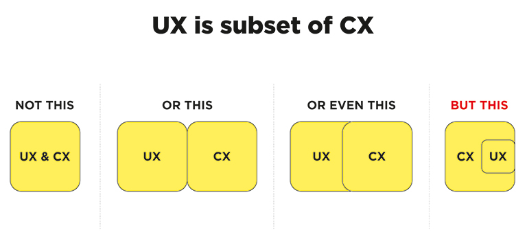
CX vs UX: The above image clearly explains that UX is a subset of CX. User experience is the experience your customers have with your product, whereas customer experience is the experience those users have with your brand as a whole.

Importance of UX and CX

Both UX and CX are equally important in today’s world. Overall customer satisfaction is no longer dependent only on the quality of the product or service; it goes far beyond that. The experience and process of buying must be a satisfying one. Not just that, even the after-sales service and support plays a crucial role in setting the brand image.

Studies reveal that more than one-third of consumers walk away from a brand they love after one bad experience, and more than half of the consumers do the same after two bad experiences. Consumers are willing to pay more for a better experience, and this fact needs to get its due importance.

The good UX design is important because users will decide within just a few seconds whether your app, software or website is worth their time or not. On the other hand, good CX is important because it goes beyond the usability and functionality of your product, and serves as a key differentiator in a competitive market. 

Both CX and UX are independent, and therefore there can be scenarios where either one of them is good. For example – Good UX and bad CX, or, bad UX and good CX. Let’s understand this with two scenarios:

1. Good UX and bad CX

Tom wants to buy a music system. He goes onto an e-commerce portal. The online store has a fantastic UI and UX. The search engine is accurate and helps Tom to reach to his desired models within no time. He compares a few models and selects the best-suited one for him. The checkout process is also seamless. Within a few clicks, Tom selected a payment method and made the payment. Great!! His new music system is on its way.

But, when he received the package, he was unpleasantly surprised. The packaging was awful, and he received the wrong product. The model which he selected and the one that was delivered were completely different. He rang the customer support and was pushed from pillar to post before he could reach the correct department. The team was not able to track his order and told him that he would receive a call back within 12 hours. No phone call for two days. He got a call on the third day and was advised to send back the music system at his own expense, then only the replacement could be initiated. The entire process took three weeks.

Tom’s experience after placing his order was nothing short of disastrous. He poured out his grievances on the company’s social media handles, product page, and many other places. No matter how good the UX was, he has no reason to remember it now.

2. Bad UX and good CX

Now let’s see the flipside. Haunted by his previous experience, Tom decided to try some other e-stores to buy a professional camera. He browses a new portal that has a poor UX. The search engine wasn’t accurate; there was no option to compare products, and lacked details on the product pages. It took him a lot of time to buy the product, but he did it finally.

However, history repeats itself, and Tom again gets the wrong product. He called customer support and was delighted with their response. The team apologized for his inconvenience and quickly arranged a pickup of the product. In the meantime, they initiated the replacement process. Within two days, Tom received the camera that he ordered. Moreover, the company gave him a 30 percent discount voucher to make him feel valued. John is unlikely to remember the lacking user experience and is highly unlikely to leave negative feedback in the comments section of the site.

UX is one of the strongest influences on the whole CX, but both CX and UX play a crucial role in the ultimate success of a business. Lacking in any of the two areas can lead to a bad overall impression of the brand. Therefore, companies must optimize both of them to stay ahead in this competitive market. Have more questions? Talk to our experts.

Categories
Brand & Identity Design UX Web Design

Web Designing While Accounting Human Errors

We often hear the phrase ‘To err is human’, and it can’t be truer in every aspect of our lives. We all make mistakes. Users on your websites are no different. Sure, you can’t stop them from making mistakes, but, can you follow some aspects of web designing while designing your website in a way that it leaves a scope of making mistakes?

Even the most careful and diligent users are bound to make mistakes at some point in time; others will make more mistakes. Therefore, it is critical to consider this fact while designing your website. The errors in web designing can be as simple as mistyping a URL, providing incorrect information in a sign-up form, adding info in wrong fields, etc. The mistakes could even be as disastrous as accidentally sending thousands of dollars to the wrong person via PayPal. So, here are a few tips that you can follow to account for human error while designing your websites. 

1. Provide Straightforward Instructions

A lot of times, we assume that the users are by default aware of the most basic instructions. Thus, we don’t feel it necessary to provide these basic instructions to them. Moreover, people often see basic directions as a bit snooty. It’s human to assume you know everything you need to know for a simple-seeming task. This causes errors.

Don’t assume they know what you mean. An imperative when delivering clear instructions is not to assume the recipient knows what you mean. This can be for anything from commonly used acronyms to simple navigation instructions.  Mixed messages, assumptions and multiple options mean that the message received might differ from what we actually meant.

2. Give Clear Warnings During

Just like the instructions, users must get a clear understanding of the consequences of actions taken on the website. And, sometimes they need to be informed and explained the implications, that too in detail. Still, there would be users who would keep ignoring your warnings, but there’s not much you can do for them in any case.

There’s also a second web designing approach which you can proceed with. A majority of people will leave your site when they face a warning message which they don’t fully understand. Else, they may look for help to understand the warning, which again may lead them to bounce off. You’ll have to decide whether you would rather deal with potential inaction from some customers, or more errors. Both approaches have their pros and cons.

3. Always Confirm Actions While

You may think that all users are completely sure of what they are doing on the website, or they may get annoyed with questions asking them to confirm their actions. A confirmation dialog may seem like an irritating and useless extra step; however, the truth of the matter is a quick “Are you sure you want to do that?” message can be invaluable. The user may be taking action for the first time, or the tenth time, it’s irrespective. A confirmation will only increase chances that the user takes the correct, intended action.

4. Validate Forms

Form validation may not be a full-proof solution, but a potent tool, and a great way to gently guide the user in the right direction. While proper form design can help keep users from simply putting the wrong text in the wrong form, form validation is excellent for double-checking information and catching typos and forgotten fields.

Improper validation of form data is one of the leading causes of security vulnerabilities. It exposes your website to attacks such as header injections, cross-site scripting, and SQL injections. It is important to note that client-side validation is beneficial, but it is not enough. If you’re going to implement client-side validation, it would be good to have some of the server-side too, just to be safe.

5. Use Appropriate Form Labels

In our last article, we listed out some essential tips for selecting the right button labels. The labels on the forms are equally important and can lead users to commit an error, if not used properly. There are tonnes of websites on the Internet with so many vaguely-labeled forms. Worse are the forms that use industry jargons on a client-facing website. In some of the sites, the labels and input fields are even misaligned. That’s just a strict NO-NO!

6. Improve Usability Through Color and Contrast

The colors and contrast are often used on a website most simplistically. People only go as far as using red and its shades to portray bad, and green and its shades to show good. But that’s not enough. It doesn’t necessarily help differently-abled users. A website should be usable by everyone, so various disabilities should be kept in mind. Disabilities can include but are not limited to, the inability to use a mouse or see the screen.

When someone has low visual acuity, specific color palettes on websites may make it difficult for that person to see and understand the website content fully. You must find a way to add contrast to your elements, in such a way, that they’re clearly and easily distinguished from each other. Pay special attention to this if two options use similar text, but do radically different things.

7. Provide ‘Undo’ Option Where Possible

We all know how handy the ‘Ctrl+Z’ option comes in every day while performing various tasks. The ability to undo an action is such a boon to everyone. We wish we had an undo button for our lives. Coming back to reality though, if you’re building a web app, you might seriously consider implementing some sort of “Undo” function for just about every action with permanent consequences.

You cannot ensure error-free browsing on your website; neither can you take a generic call on the abilities of your users. But, considering human errors while web designing, will increase the chances of good user experience and fewer errors. Speak to our experts to discuss more on it.

Categories
Design

10 Famous Logo Design And Their Hidden Meanings

For a lot of people, a logo is only a creative way of depicting your business name. However, there’s a lot more than this behind the concept of a logo design. Logos not only play an important role in the overall branding process, they also help people to identify and connect with a brand. That’s the reason why designers devote a good amount of time in carefully crafting a logo which communicates the brand’s language. While creating a logo, designers use their creativity in different ways and sometimes they squeeze hidden meanings in a logo design. Here are 10 famous brand logos which look very common but have a hidden meaning in its design:

1. Amazon

Amazon Logo
At first sight, the logo simply looks like the company name with an arrow. But, this arrow is not just to add an aesthetic appeal. The arrow starts from letter ‘A’ and goes till letter ‘Z’ which conveys that the company offers an A to Z variety of items across its online store. In addition to that, the arrow displays a smile which customers will pose as they will be satisfied by the wide range of products.

2. FedEx

FedEx Logo

The shipping giant’s logo is again no-brainer at first look. However, if you look closely, you will notice that the blank space between letters ‘E’ and ‘X’ shows an arrow representing speed and precision in company’s delivery.

3. Le Tour De France

LeTourFrance Logo

The most iconic cycle race across the globe is a world-class sports brand in itself. Again, there’s not much to think about when you first look at the logo. However, the designer has neatly fitted a cyclist in between through the letters ‘O’ ‘U’ and ‘R’ which clearly communicates what the brand is all about.

4. Beats

Beats Logo

The logo for Beats is pretty simple with letter ‘b’ enclosed in a circle, followed by the company name. But, the circle isn’t just a circle. It depicts a human head and the ‘b’ inside it represents a headphone which very effectively allows people to visualise themselves wearing company’s headphones.

5. Baskin Robbins

BaskinRobbins Logo

Interestingly, when Baskin Robbins was launched, it started off with 31 flavours of icecreams and the company very creatively highlighted this fact in their logo. The curve of letter ‘B’ represents number 3 while the stem of letter ‘R’ represents number 1.

6. London Symphony Orchestra

LondonSymphonyOrchestra Logo

This one is a little tricky and requires attention. The logo of London Symphony Orchestra shows the initials of the company written in a single freehand stroke. But that’s not it. There’s an orchestra conductor waving his baton in the logo. The joint of letter ‘S’ and ‘O’ represents the head of the instructor while the letter ‘L’ represents the baton.

7. Formula One

Formula1 Logo

Formula One is the world’s biggest and most renowned car racing championship. Its logo shows the initial of Formula and a race track. If you look closely the space between letter ‘F’ and the racetrack shows the digit 1, which completes the logo.

8. NBC

NBC Logo

NBC was once known as the Peacock Network and hence the bird was first used as its logo in 1956. The peacock has now evolved to this with its 6 colored tail representing the departments; News, Sports, Entertainment, Stations, Networks, and Productions.

9. Picasa

Picasa Logo

Picasa is an image editing and sharing site. The logo of Picasa features a colorful circle which represents a camera shutter. Also, the name itself has a hidden meaning. ‘Casa’ means home in spanish and thus Picasa means ‘home to your photos’. If you look closely, the space between the different colors features a house.

10. Sony VAIO

SonyVAIO Logo

Vaio is Sony’s brand line of laptops. The logo is not just a stylishly written brand name but refers to turning analog waves into a digital form too. The analog waves are represented in the ‘V’ and ‘A’ while the letters ‘I’ and ‘O’ refer to 1 and 0, which are the two digits used in the binary code, the digital language.

Looking to get a perfect logo designed for your brand? Talk to our design experts.