NYX Ditech

Categories
UX UX Design Web Design

10 Rules Every UX Designer Must Know

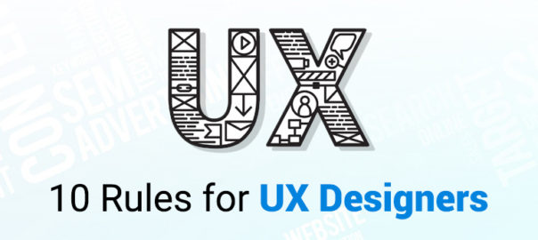
User experience or UX is a vast discipline. Anyone who practices UX design should be equipped with skills in many different fields. UX designer creates designs based on their knowledge, experience, trends, creativity, and gut feeling. While there’s no rule of thumb, or a fixed combination of ingredients when it comes to designing fantastic user experiences, here are ten golden rules which will surely help you in creating an excellent experience for people.

1. UX And UI Are Different

Swapping UX with UI, as if the two are the same, is a common mistake among many UX designer. It’s essential to understand the difference between the two disciplines. User Interface is the space where interactions between humans and a product occur, while User Experience is an emotional outcome after interactions with a product.

2. User Research Is a Natural First Step In The Design Process

It should come as no surprise that one of the most important factors you should consider when designing a product is the audience. If you plan to design a product your users will love, you must have an idea of what your audience actually wants and needs. And this means user research should be an essential part of the UX design process. It’s critical to keep your users top of mind before you start designing! This will allow you to provide value for people who’ll use your product and focus on benefits instead of features.

3. Test With Real Users

Designers often assume that people who will use their interfaces are like them. As a result, UX designer projects their behaviors and reactions to users. But thinking that you are your user is a fallacy. This effect in psychology is called the false-consensus — a tendency to assume that others share our beliefs and will behave similarly in a given context.

Most probable, the people who’ll use your product have different backgrounds, different mindsets, different mental models, and different goals. 

There is a technique that helps UX designer overcome false-consensus bias, called usability testing. If you want to build products that users love, then you have to focus on testing. Testing with real users allows designers to learn how to create products that are right for those who will use them. This may be time-consuming, but it’s the only way to be sure that you’re moving in the right direction.

4. Prototype Before You Build a Real Product

Skipping prototyping and putting a lot of effort into building an actual product is another common mistake among many design teams. When we put a lot of effort into creating something that we believe is great, it can be stressful to realize that our solution doesn’t work as expected when we release it into the wild.

Prototyping is creating a model of a product so that it can be tested. Prototyping allows you to test your hypothesis before spending time with an engineering team building the actual product. UX designer can use different design techniques for prototyping. One useful prototyping technique is called rapid prototyping. It’s a popular way of quickly creating the future state of a product, be it a website or an app, and validating it with a group of users.

5. Avoid Lorem Ipsum And Dummy Placeholders

Almost every product is based around content, whether that’s text, images, or videos. It can be said that design is an enhancement to the content. Yet many designers don’t take content into account during the design phase — they use Lorem Ipsum instead of real copy and placeholders instead of real images. While such a design might look great on a designer’s artboard, the picture might be completely different when the same design is filled with actual data.

6. Aim To Be Consistent And Straightforward

The hallmark of a great user interface is simplicity and consistency

In the context of digital products, simplicity means that’s it’s easy to understand and interact with a product. Your users shouldn’t need to read instructions to understand how to use an app or have a map to navigate through it. It’s part of your job as an interface designer to make things clear and subtly guide them from where they are to where they need to go.

Interfaces must also be kept consistent throughout a design. In an attempt to make designs appear more creative and memorable many UX designer intentionally add inconsistencies in style. For example, different color schemes can be used on different pages on a website. Such design decisions often cause confusion and frustration in users. Thus, it’s always important to keep the design element familiar, reinforcing the most important facets of your design at every turn. Remember to apply the Principle of Least Astonishment to your product design.

7. Design Must Be Usable And Accessible

Design for a diverse set of users that will interact with your products

When it comes to design, designers often obsess over the look and appeal instead of functionality and accessibility. Most of us try to make things look beautiful. Quite often, this leads to a situation where aesthetics become more important for UX designer than usability. Of course, aesthetics are important, and we definitely should try to make our designs appealing, but only after we have usable products. The most important job of digital products and services is to perform a function.

8. Design Is An Iterative Process

It’s important to understand that UX design isn’t a linear process. The phases of the UX process (ideation, prototyping, testing) often have considerable overlap, and usually, there’s a lot of back-and-forths. As you learn more about the problem, the users, and the project details (especially any constraints), it may be necessary to revisit some of the research undertaken or try out new design ideas. Don’t think that it’s possible to make your design perfect right after just one iteration. Instead, refine ideas to the point where you can test them with real users, collect valuable feedback, and iterate based on this feedback.

9. Preventing Errors Is Better Than Fixing Them

Whenever possible, design products to keep potential errors to a minimum. To err is human. Errors often occur when people engage with user interfaces. Sometimes, they happen because users make mistakes, and other times they happen because an app fails. 

Whatever the cause, these errors, and how they are handled have a huge impact on the user experience. Users hate errors and hate the feeling that they triggered such behavior even more. Thus, you should strive to either eliminate error-prone conditions altogether or check for them and notify users before they commit to the action.

10. There’s No ‘one’ Universal UX Process

UX process is a make-it-or-break-it aspect of UX design. Without a solid UX process, a designer could be completely moving in the dark. A clear and concise UX development process, on the other hand, makes it possible to craft amazing experiences for users.

Read more about how to prevent mistakes in UX practices here

Many designers believe that there’s one universal UX process that can be applied to all projects. Unfortunately, there’s no such thing as a one-size-fits-all UX design. While it’s possible to define individual steps for each project, a precise UX process should always be selected based on project requirements — each project is unique and has its own needs. This means that to create the best possible user experience a designer should be ready to adapt their design process based on project specifics. 
Talk to our team now – learn more about the rules of UX designing.

Categories
UI Design UX UX Design Web Design

7 Best Practices To Design Dropdown Menus

Dropdown menus are an integral part of website design and user experience. A clean, well-structured dropdown menu helps navigate visitors through a website, narrow their choices and save screen space easily. It is widely used in navigation bars, search bars and tab bars. However, it’s a perplexing task to design simple, effective and attractive dropdown menus. Even the simplest looking components can be tricky some times when designing for usability. Here are some best practices for designing effective and user-friendly dropdown menus.

Avoid Long Dropdown Menus

Using dropdown menus in forms is quite apparent. Forms don’t take much space on the interface, all browsers support them, and users are acquainted with them. It’s all right if you have 10-12 option, but it could be overwhelming for users to navigate when they have to choose from more than 15 options. Users face a hard time reaching to what they’re looking for. Also, there are scrolling issues where the user has to keep the mouse cursor within the dropdown box. They may end up scrolling down the page instead. 

The most classic example for long dropdowns is the country selector which has more than 100 options typically. Generally, it sorts by alphabetical order, but sometimes the most popular countries are placed at the top. That may look like a convenient practice but can confuse the users sometimes. The dropdown menu isn’t the best choice in this instance. A text field option with autocomplete functionality is more user-friendly here. The user already knows his choice and can input it quickly.

Grey Out Disabled Options

This one is a no-brainer, but still gets missed out by many designers. If you have an option that is disabled or unavailable, it should not be removed but greyed out. If disabled items are removed, the interface loses spatial consistency, and it becomes more challenging for the user to learn. When you grey out the disabled or unavailable options, it is more purposeful and adds to the user experience. You may choose to show a tooltip to indicate the reason why that option is disabled and how to activate it.

Use Clear Hover States

Designing an “active” class for hovered menus keeps the attention where it belongs. Most designers use the ‘CSS :hover’ pseudo-class, which works great for actively-hovered links. However, keeping the main link highlighted when the user is hovering submenu links is also a good practice. It acts as a clear path of activity where users can glance at the menu and quickly determine which primary link is active and which sub-menu link hovers. You can design hover states with many techniques like font color changes, text underlines, background color changes, highlights, box shadows, and more. The primary objective is to keep the parent link active even when it’s not hovered directly.

Avoid Dropdown Menus Where Typing Works

There are many situations when typing might actually be convenient and faster than using a dropdown menu. For example, inputting the credit card expiry date or entering birth dates. It is definitely much faster to type the dd/mm/yy or mm/dd/yy formats, rather than scrolling through two dropdown menus and selecting the month and year. Although a free-form input field does require data validation, in some form at least, it’s still a better alternative from usability and convenience point of view.

Keep The Number Of Actions To A Minimum

A dropdown menu must be customized based on the information required. This ensures that the user takes a minimum number of actions. A classic example is the “date selection” field, where you would need 3 dropdown menus (month, day, and year) if a normal list menu is used. This can annoy and frustrate users. Instead, the menu components must be customized, and users must be able to enter the date using only one dropdown menu.

Make Seamless Dropdown Menus

Dropdown menus should appear seamlessly and without interruption. Dropdowns should load immediately. Many times website developers end up overloading the menu, making it too heavy for instantly loading upon hover. The last thing you want is users waiting for something to happen with their cursors on dropdown menu title. Transition effects like wipe down or fade can be the other options to display the change. They look really cool but ensure that the transition is quick and not disruptive.

Use Clear And Concise Labels

Labels on menu options initiate the action. Users choose the menu option based on their labels, so it’s vital to make them accurate and informative. It’s best to use sentence case in labels. Avoid uppercase letters. Keep your labels short and crisp. Concise labels that clearly indicate the purpose of the selection must be used. As part of best practices, use verbs for action menu items. It should describe the action that will occur. For links, use nouns to identify the page that the user will be directed to. Exclude articles in menu items; use “delete page”, instead of “delete the page”. Lastly, keep menu items to a single line of text. Don’t write a story there.

Using these best practices, you can design dropdown menus that are attractive, user-friendly and purposeful. For more, feel free to get in touch with our design experts.

Read about Mega Navigation menu here

Categories
Brand & Identity Design Mobile Apps UI Design UX Design Web Design

5 Factors That Influence Readability and Legibility of a UI

No matter how exciting and compelling your story is, it will not be able to create an impact on users if it isn’t presented in a clear and readable layout. People generally focus more on the content than its packaging. No doubt content is the king, but packaging plays a crucial role in determining its success. Readability and legibility are two key aspects of user experience design. To simply put – app and web users will not read your content if it doesn’t look clean, clear, and consumable. In this article, we will cover the factors that influence readability and legibility in user interfaces and why it’s important to care about them.

Readability

As the name suggests, readability is the ease of written content perception. It refers to the comprehension of the text content. It includes – the simplicity of words and sentences, ease of consuming information, and clarity of thoughts. Readability is determined by considering your website’s typeface, which takes font size, font style, line length, and line-height into account.

Legibility

Legibility is a much narrower concept than readability. It refers to how easily your audience can recognize and differentiate between individual characters in lines of copy on your website. Legibility is determined primarily by your typeface design. We can say that legibility is one of the components to fall under the bigger umbrella of readability. It is generally analyzed by examining users’ reading speed in terms of words-per-minute.

Factors Influencing Readability and Legibility

There are plenty of factors that directly impact the readability and legibility of the content. Here are the five most important ones:

1. Typography

Typography refers to the font style. There are some fonts that are easy on users’ eyes and create a delightful reading experience. On the other hand, some fonts are not so pleasing. The choice of fonts directly impacts the readability and legibility of your copy. Font size, width, color, and text structure – every single element matters. Fonts also add to the visual element, just like images. Typography in design is the art of balancing the aesthetic aspect of the text and the ability to read it quickly.

Negative space, alignment, tracking, the spacing between baselines of text, line length, etc. are all key elements to clear typography and comprehendible content. Designers must avoid too little space between the words, very less distance between the lines or letters, tiny font size, and non-contrasting text and background colors.

2. Background

Just like printed books and newspapers, the background color has a significant impact on the ability to read and comprehend the content on websites. It allows readers to distinguish both interactive elements and content. For instance, black text on white or light background appears more significant than the white text on a dark background. An improper color scheme will mostly result in reduced readability, leading to poor user experience. Relevant content or useful data that is unreadable is of no use; users will most likely not read it.

The nature of the content also plays a role in selecting the color scheme. Text-heavy interfaces aimed at reading as the main activity should use color schemes based on light backgrounds. In contrast, the image-heavy interfaces should use dark backgrounds to amplify the pictures’ performance.

3. Writing

The UX writing must be clear, concise, useful and consistent. Text is a vital part of the visual design and user experience. The best you can do with the written content on your website, app, or blog is to make it human-like communication. When you interact with your users through text, at any level, they must feel as if they are interacting with a real human being and not a bot. 

Remember – users don’t read on the web, but scan through the content. Be short and consistent in your written copy. An extended form of writing pushes off users. You must also build a solid text hierarchy so that users can quickly scan your page content. Use numbers, marked elements, and textual variants to catch attention. Marking out specific information by using bold and italic fonts, unusual text sizes, different colors, highlighting, etc. has worked well for years and still holds its significance; however, avoid overdoing it.

4. Visual Hierarchy

Visual hierarchy refers to prioritizing the content into different levels. It is based on the Gestalt theory that deals with the psychology of visual perception of elements. The theory shows how people tend to group visual elements. It organizes UI components so that the brain could distinguish the objects based on their physical differences, such as size, color, contrast, style, etc.

As mentioned earlier, people scan content over the web. So, if we take an example of a blog, they will first notice the headline, then subheadings and only then copy blocks. This is a typical pattern. Users scan the headline and subheadings to understand if the article is interesting and useful to them. Only then will they read the entire blog. The headline and subheadings should be framed in a way that is both informative and enticing. On the other hand, if users see the vast and long sheet of text, they will be scared to read it.

To build an effective visual hierarchy, the text is divided into three levels:

  • The primary level – It includes the biggest type like in headlines. 
  • The secondary level – This is the type of element that supports scannability, such as subheaders or captions.
  • The tertiary level – This one is for the body text and additional data. 

5. White space

White space or negative space is the area of the layout that is left empty. It can be either around the objects you place in the layout or between and inside them. Negative space provides breathing space for all the objects by clearing the unwanted clutter from the page. White space is a strong tool to improve the readability of your text and thereby enhancing the user experience. It also helps in creating a connection between the text and non-text elements of a user interface. 

Many more factors influence the readability and legibility of the content of a user interface; however, these are the most important ones. If you feel like discussing them further in detail, our team of experts will be more than happy to assist you.

Categories
Technology UX UX Design

Creating Fantastic Frictionless User Experience

The digital world has become super competitive, and it’s a real challenge for businesses to keep themselves ahead of the soaring competition. One of the key propellers of attaining success in the digital world is to offer exceptional, or if not that, at least a good user experience. Companies need to understand the context that aids in creating a smooth, frictionless user experience. Designers and developers have acknowledged the importance of becoming familiar with methods to develop frictionless user experiences.

What is Friction?

NO! We are not going to discuss the scientific definition of ‘friction’ here. In terms of design and user experience, friction is anything that prevents users from intuitively achieving their goals while they interact with a product. Friction is everything people complain about when they find technology challenging. High friction is one of the major causes of cart abandonment and high bounce rates.

Frictionless User Experience

Users don’t want to stress out themselves while browsing your website. They expect simplicity while interacting with your site. Frictionless designs are synonymous with simplicity as it ensures that everything is simplified for the users. A frictionless experience is the one wherein the user needs not to learn anything. Here, the interactions are very intuitive, and every action or operation is a natural, smooth process.

How to create a frictionless experience? 

The first and the foremost step for designers and developers is to deep dive into the user interaction process. They need to understand how a user interacts with a user interface. Understanding the user journey is the key. Also, friction doesn’t need to be always harmful; it can be useful at times. They must decide when friction can be helpful, where it can be harmful, and design the product accordingly. The team can indulge in user research and testing, by creating user flows, to identify the exact places where friction might occur. 

Avoiding Frictions

1. Don’t overload users with content or features

One of the most difficult tasks of user experience is to keep the users attentive and focused. With a strong focus, users can achieve their goals without taking too much effort. The problem rises when you bombard users with loads of content and features; they lose focus.

Get rid of anything unnecessary. Follow the simple yet powerful principle of minimalism, which states that less is always more. Prioritize your content and features and place them according to user expectations. 

You don’t need to put everything on a single page. Prioritize your content and place it according to user expectations. Divide your content and other elements into chunks. For example – break lengthy and complicated forms into a few simple forms and simplify the form filling process. 

2. Users must not be guessing anywhere, anytime

A lot of UIs lack the ability to provide apt and timely feedback from the system. If users initiate action and don’t receive acknowledgment of the same, they think that their request wasn’t delivered. Therefore, they keep trying again and again, which leads to what is known as ‘rapid clicks’.

Visual or audio feedbacks are the most effective forms of feedback. Also, the loading time of the feedbacks must be pretty quick. When users have to wait for content to load, they experience friction. When the users have to wait for a long time for the content to load, they start worrying whether the app is doing anything or it is stuck. It’s essential to provide information on how much time is required to complete the operation.

3. Keep the design clear and consistent

Clarity has a direct and positive impact on user expectations. When users are aware of what to expect, they happily interact with a product. Clearly label all the interactive elements, like buttons and all, with labels that describe their function. Avoid using jargon in labels and other places.

An inconsistency often creates confusion. When the same elements in UI look different in different parts of the app/website, it confuses your users. Maintaining a consistent design approach allows users to use their previous knowledge when interacting with a product.

Simplification of navigation is another way to impart clarity. Poor navigation adds a lot to user frustration. Users should be able to navigate from one place to another easily. The app’s navigation hierarchy, at all times, must tell the users – where they are.

4. Avoid too many steps

Too many steps might also cause unnecessary friction. Right from sign-up to individual operations, every step requires some amount of effort and thus can create friction. Get rid of all the extra steps in user flow and always keep the KISS design principle in mind when designing user flows.

Use default settings, as most users rarely change them. Also, use the data you have about your users to offer a personalized experience. Amazon and Netflix provide tailored recommendations based on previous purchases and viewing habits, which enhances the user experience.

5. Anticipate errors and handle them appropriately

An ideal app prevents the user from making errors by anticipating the errors upfront and eliminating them. Still, it’s not possible to eliminate all error situations. But, a clear help text, telling them the reason for the error as well as about how to resolve the issue, can be provided to them. When you already prepare yourself for the potential errors, you design better experiences. By validating user input and providing feedback as soon as possible, you help users to detect and fix problems.

Conclusion

If there are traces of friction during user interaction, the user experience will not be smooth and enjoyable. As a designer, you must always strive to identify all possible friction elements and get rid of all of them. Discuss more about your design needs with our team NOW!!

Interested in More About UX? You might like the difference between UX and CX. READ HERE

Categories
Brand & Identity UI Design UX Design Web Design

Latest Logo Designing Trends For 2020

A logo is an integral part of branding for any business. It acts as the unique identity of a company and plays a vital role in creating brand recall. The style and pattern of logos have evolved significantly over the past years. Every year certain new themes gain popularity and some of the ongoing trends fade out. So, what are the latest logo designing trends which will shape the designing of stunning, effective, impressive logos in 2020? Let’s check out.

1. 3D Gradients

Looking at the current developments in the field of logo designing, we predict that the popular gradient trend will evolve and merge with the 3D trend in 2020. This would be a tailored fit for our smartphone society. Gradients are a great way to turn any group of colors into a dynamic spectrum of color that feels like it has life and energy. In 2020, designers will boost the latest evolution of gradients creating depth and 3D effects in logos. Particularly, tapered gradients are set to top the 2020 logo design trend charts.

Don’t forget, 3D gradient logos are tough to print. That’s why they’re apt for screens. Brands that don’t need to worry too much about how their logos look in print are the ones that can best use 3D gradient logos. We expect to see designers explore the full potential of gradients this year. They can create captivating 3D effects, shadows, and depth as never before.

2. Motion graphics and videos

It’s a common assumption that that logos are still and stationary. Whether they’re on product packaging or on a business card, we think of them as images only. However, that’s soon going to change with the evolution of video and animation. Motion logos are becoming an integral part of visual branding. The popularity and use of video logos are only going to rise in 2020.

The growing popularity of social media platforms, and them becoming central points for marketing, calls for creating more engaging advertisements. Brands need to push themselves and need to switch from plain image logos to more engaging ones, like the motion and gif logos.

3. Bye-bye grids

Over the past few years, brands have been playing it all safe, when it comes to logo designing. They have been using the grids to place colors and designing the logos. But, it’s 2020, and designers are ready to take a bit of risk. There is a time and place for using a grid to guide your logo designs—it ensures your composition is symmetrical and visually balanced. But in 2020, we’re likely to see a move towards more abstract logo designs that push the boundaries.

Now you must be wondering how do you incorporate this design trend without ending up with a messy and chaotic logo? Even though you’re not using a traditional grid, it’s all about making sure the visual elements you use are distributed in an aesthetically pleasing way. The focus must be on the hierarchy of elements and negative space that makes the overall design look poised.

4. Raw, not-so-perfect logos

On one hand, there are digitally designed gradient and 3D logos which will gain popularity in 2020, and on the other hand, we feel that hand-drawn, free-flowing logos will also become immensely popular amongst designers this year. These logos reject the sleek, perfect look made possible with design programs and take us back into sketchbooks where there are asymmetry, uneven lines and shading techniques like cross-hatching and contour shading.

Just like other 2020 logo trends, raw, imperfect logos have been on the rise for a while. This year, they’re getting grittier and more sketch-like and stamp-like as brands continue to embrace the homegrown, organic look. With all the digital perfection out there people are craving the raw imperfections of hand-drawn logos. Brands can use the hand-drawn look to show off their authenticity and give their logos the personality their customers want to see.

5. Responsive logos

Functional and user-friendly design is one such trend that will always be popular. We all have seen the rise of responsive websites, and now is the time for responsive logos. Today, the brands want to be unique, they want to create an impact on their customers, they want to revolutionize their industry. Responsive logos are bold, powerful and really showcase a business’s innovation and expertise as leaders in their fields.

A responsive logo is one that adapts to different screen sizes. Generally, this will require a designer to create versions at various dimensions, to optimize their performance. That way, whether you’re viewing it on desktop, smartphone or tablet, it will always look its best. Anyone can jump on the responsive logo trend and it’s an excellent way to ensure your brand stands out as being polished and professional. The best way to use this in your own designs is to find out the correct size for that device, and use custom dimensions tool to create a logo that fits.

Read about the stories behind the logo of these famous brands

Designing the right logo is critical for a business. There’s a lot of thinking which goes behind the process. Logo designing is a process that requires an amalgamation of the brand’s vision and design trends. It has to be done right to create an impressive and effective logo. Talk to our experts and learn more about logo designing.

Categories
UI Design UX UX Design Web Design

10 Great Examples of Creative Landing pages

The landing pages are the first and foremost introduction of your website and plays a vital role in marketing your brand on the web. it introduces the specific offers, your services, products and key elements of your business. Therefore it’s necessary to give a good thought behind designing a visually attractive, intuitive and user-friendly landing page. The goals behind the landing page design can be different. 

Landing pages are not just about selling and buying. They are also used to present and promote mobile applications, educational resources, communities, make special announcements, etc.

The design process for any landing page must start by setting a clear and concise target to be achieved. An ideal landing page must feature a clear visual hierarchy, bold and highly readable typography, a short scannable tagline, an instantly visible call-to-action element, and a readable and concise description.

Today, we have collated a list of 10 amazingly designed landing pages featuring a variety of products and offers. Take a look and draw inspiration from each one of them.

1. Photomate – A Photo Service

Landing Pages Example 1 - Photomate

Photomate is a digital product for photography lovers. It’s design is created for the direct purpose of web promotion. The app lets users keep their photos in an organized gallery and albums. They can find photos quickly and improve their looks with an AI-based editor. This landing page is a good example of using custom hero illustrations to boost storytelling, add originality and enhance the effectiveness of marketing efforts.

2. Cleanerz – An Innovative Car Wash Service

Landing Pages Example 2 - Cleanerz

The focus of digital products has shifted from selling, offering, informing, or educating to just connecting people who can help each other solve their problems. This design is a perfect example of connecting people. It is the landing page for a service that provides innovative car cleaning and let people join and earn money. This particular page is targeted at people who are looking to be hired as cleaners. The hero illustration is both cute and catchy. It creates a positive mood and informs about the nature of the service with readable and clear content placed on the light background.

3. Let’s Read Together – The Subscription Page

Landing Pages Example 3 - Let's Read Together

This is the subscription page of an online bookstore selling children’s books. Its conversion goal is to engage users and make them subscribe to the newsletters. The simple tagline and description that explains the benefits, with the hero illustration, instantly creates the proper aura and encourages users to subscribe. The dark background here doesn’t hurt readability in any way due to the thoughtful choice of fonts.

4. Checkbags – A Luggage Delivery Service

Checkbags

If you are a frequent traveler or you have to constantly move, you must be aware of the luggage challenge. This app aims to overcome this challenge and that’s the point behind the service presented in this design concept. The app picks up clients’ luggage from the desired location and delivers it to the chosen destination. The bright and catchy hero image along with a subtle color palette instantly sets the right mood. Color accents effectively unite the layout composition and the tagline fits great.

5. Flober – A Hair Accessories Store

Flober

One of the basic rules of e-commerce websites is to display the offered item at its best. This landing page demonstrates how to do it in the case of an e-commerce website. The page is designed for an online store selling exclusive hairclips and accessories. The illustration is very much prominent and artistic, which instantly sets the theme, gives aesthetic pleasure and creates a strong emotional appeal. The sophisticated typography nicely compliments the design.

6. Secure – A Security Service

Secure

This is another landing page that promotes a mobile app. The security application helps a user quickly contact the nearest police station and cares about the safety of the neighborhood. The visual contrast of a hero illustration, with irregular curves and thin lines makes the landing page stand out. Also, the bold solid Druk font creates an instant impact.

7. Carbonex – An Environment Protection Community

Landing Pages Example 7 - Carbonex

People are becoming more and more environmentally aware and concerned with every passing day. The seeking for solutions related to environmental problems is growing at a rapid pace. Carbonex is a web page designed for the website of the eco-aware community consulting businesses and manufacturers as well as launching projects devoted to environmental protection. The composition and color palette of the hero illustration supports the emotional appeal and creates an instant message about the theme. Visual hierarchy features easy scannability to make the major information. The infographics and CTA are also instantly visible.

8. Commo – A Social Network Management App

Commo

This catchy web page is designed to promote an application that allows users to manage all their social accounts in one place. The illustration has a dynamic composition that best reflects the fast-paced communication in social networks. The page has a split background with a light part for the graphics and the dark part for the text. The CTA button unites the general composition as white elements in dark. 

9. Smartmap – An Interactive Mapping App

Landing Pages Example 9 - Smartmap

Today, websites and apps are much more than just sources of information and communication. They are used for various purposes and often act as our virtual assistants. This landing page was designed to promote an app that allows users to build interactive maps for their smart homes, offices and even public spaces. The catchy and concise layout with an artistic hero image becomes reflects a strong brand image.

10. EasyShops – A Shopping Delivery Service

Landing Pages Example 10 - EasyShops

This is the landing page of a local delivery service, the one that helps shoppers who don’t have the time to shop. It uses catchy 3D graphics set in combination with a unique color palette which gives a trendy look to the page. It helps the brand to stand out. As the website is targeted at local clients, the CTA is designed for a quick call as a priority action.

Read more about UX tips on Landing Pages here

The web is full of such inspirations. It is just the trick to zero-down on the message that you want to convey, the way you want to convey and knowing exactly the brand perception that you want to build in your target audience’s mind. Wanna create a WOW landing page for your business? Talk to our experts.

Categories
Brand & Identity UX Web Design

Boost Your Conversion Rate With These UX Basics

The expectations of users over the web and mobile apps has risen exponentially. A vast majority of users are unlikely to return to a website after one bad experience. There’s massive importance of user experience in website design – UX Basics, and the conversion rate of any website is directly proportional to how good is its user experience.

User experience (UX) is the wholesome experience a visitor has on a website or in a mobile app. It is a complete compilation of various small interactions knitted together, producing positive or negative feelings about the website and the brand. It’s not just a single design element or layout that defines the experience. The connection that visitors feel and the experience they receive on a website, as a result of the UX design, directly impacts consumer retention, brand identity, and the business as a whole.

A research conducted by Stanford University suggested that over 46 percent of consumers consider website design as an indicator of credibility. The fact is crucial for brands to secure existing users and captivate new consumers.

The following three UX design tips will help you improve your UX Basics, increase conversions and revenue, and will boost your business.

1. Branding must be consistent

There have been ample studies conducted to study the correlation between consistent branding and revenue. These studies suggest that consistent branding can boost revenue by a substantial amount. Moreover, a connected visual identity across all the platforms and devices, including the website, will help in creating a brand that consumers love to engage with. If users enjoy engaging with your brand, they will come back to you, again and again.

This cohesive visual identity(UX Basics) is pretty simple to reproduce. The top website designs use a recognizable color palette, consistent typography, imagery that provides value and information, and ingenious branding on every page of the website. The consistency in branding creates a balanced environment that allows your users to look for, and find, the products or information they seek; that too, without diverting their attention or confusing them. Users are aware of where they are, what to expect, and they can determine what they wish to do.

Amazon is an excellent example of consistent branding and a delightful user experience design. The modern yet simple logo design and an easy-to-use website add to the user-friendliness of the website and its mobile app. Users can quickly search, easily access their profile and cart, and quickly find their way back to the homepage, in case they go too deep into the thousands of pages on the website. 

Read More about tips to boost your brand

This simple, consumer-centric, clean design is branded in its messaging too. Every piece of Amazon’s marketing collateral, from commercials to social media posts to banner ads, speak the same language. 

UX Basics - Amazon - 1
UX Basics - Amazon - 2

2. Use clear and precise calls to action

If you want something to happen, you need to take action and go for it. It is only one part of the user journey to get them on your website. Many users won’t have a clue of the action you want them to take until you make it crystal clear to them. You should use distinct, clear and precise calls to actions (CTAs) with direct language.

Follow these UX Basics to maximize the UX design and the effectiveness of a CTA button:

  • Use large and fully clickable buttons. Don’t just depend on the text within the button
  • Write clear, easy to understand copy. It can be witty and playful at times, but most importantly, users should immediately understand the action. 
  • Include a verb or an urgent adjective. 
  • Keep the whole CTA short and sweet.
  • The font itself should be readable and large.
  • Avoid playing with any trendy, swirling fonts. Stick to straightforward sans-serif typography.
  • Ensure the call to action stands out. Stick to your color palette and use a hue or unique shape so that the action stands out.
  • Include small complementary design elements, such as an arrow or a shopping cart if it is in line with.
  • Utilize white space to allow the messages to breathe.

Read More about designing your CTA Buttons

3. Be user-centric, not designers-centric

Remember that the consumers will be using your website and not the designers. Therefore, before adding any features or implementing any changes, designers should first walk through what that means for the user experience and customer journey.

After you conduct consumer research, you and your team will better understand the features. You can segregate the features into two categories. The ones that are most important for users and the ones that are less important. no matter how aesthetically appealing they may be.

Finally, once you design any UX design improvement, take the time to A/B test it. A/B testing of the new feature will ensure that it is functional and leads to better conversions. Studies show that most companies discover the best conversion rate optimization through A/B testing as opposed to total implementation.

Ultimately, investing in user experience design will provide a strong return on investment down the road. Want to increase the user experience of your website? Need help to improve conversion rate and revenue? Talk to our design experts.

Categories
Brand & Identity Design UX Web Design

CX vs UX: What’s the Difference?

CX vs UX: User experience or UX is a well-known term. Designers, even non-designers, are well versed with the meaning of UX. But, have you heard of the term CX? It’s not as commonly used as its counterpart – UX, but is soon growing in popularity. CX or customer experience is often mistaken to be the same as UX. However, the truth of the matter is that both these terms are fundamentally different and need to be treated as two separate entities. 

It all starts with how we address and define our clientele. Our users are our customers and vice versa. That’s where we start believing that user experience is similar to customer experience. So let’s clear this confusion once and for all. Let’s understand CX vs UX.

User Experience

The concept of user experience is specifically connected to your product; be it the app, software, or website. The experience of users while interacting with that product is user experience.

The design, interface, usability, navigation, visual hierarchy, information architecture, etc. are all contributors to the user experience. It can either be positive or negative for the product’s users. 

Similarly, UX design is the process of designing products that are intuitive, easy, enjoyable to use, and solve problems. The aim is to develop something that solves user problems in the simplest and most user-friendly manner possible. Success rate, error rate, task time, click to completion and abandonment rate are some of the metrics used to measure UX.

Read about UX trends of 2019

Customer Experience

Customer experience, on the other hand, is a much broader concept. It encompasses all the interactions a user has with your brand and not just your product or service. CX interactions occur across multiple touchpoints, like your advertising, marketing materials, social media channels, pricing, sales process, customer service, and your actual product. 

Customer experience is concerned with customers’ perceptions of the organization and its services as a whole, not just the usability and functionality of its products. Overall satisfaction, Net Promoter Score (NPS) and loyalty are some of the metrics that define CX.

CX vs UX

CX vs UX: The above image clearly explains that UX is a subset of CX. User experience is the experience your customers have with your product, whereas customer experience is the experience those users have with your brand as a whole.

Importance of UX and CX

Both UX and CX are equally important in today’s world. Overall customer satisfaction is no longer dependent only on the quality of the product or service; it goes far beyond that. The experience and process of buying must be a satisfying one. Not just that, even the after-sales service and support plays a crucial role in setting the brand image.

Studies reveal that more than one-third of consumers walk away from a brand they love after one bad experience, and more than half of the consumers do the same after two bad experiences. Consumers are willing to pay more for a better experience, and this fact needs to get its due importance.

The good UX design is important because users will decide within just a few seconds whether your app, software or website is worth their time or not. On the other hand, good CX is important because it goes beyond the usability and functionality of your product, and serves as a key differentiator in a competitive market. 

Both CX and UX are independent, and therefore there can be scenarios where either one of them is good. For example – Good UX and bad CX, or, bad UX and good CX. Let’s understand this with two scenarios:

1. Good UX and bad CX

Tom wants to buy a music system. He goes onto an e-commerce portal. The online store has a fantastic UI and UX. The search engine is accurate and helps Tom to reach to his desired models within no time. He compares a few models and selects the best-suited one for him. The checkout process is also seamless. Within a few clicks, Tom selected a payment method and made the payment. Great!! His new music system is on its way.

But, when he received the package, he was unpleasantly surprised. The packaging was awful, and he received the wrong product. The model which he selected and the one that was delivered were completely different. He rang the customer support and was pushed from pillar to post before he could reach the correct department. The team was not able to track his order and told him that he would receive a call back within 12 hours. No phone call for two days. He got a call on the third day and was advised to send back the music system at his own expense, then only the replacement could be initiated. The entire process took three weeks.

Tom’s experience after placing his order was nothing short of disastrous. He poured out his grievances on the company’s social media handles, product page, and many other places. No matter how good the UX was, he has no reason to remember it now.

2. Bad UX and good CX

Now let’s see the flipside. Haunted by his previous experience, Tom decided to try some other e-stores to buy a professional camera. He browses a new portal that has a poor UX. The search engine wasn’t accurate; there was no option to compare products, and lacked details on the product pages. It took him a lot of time to buy the product, but he did it finally.

However, history repeats itself, and Tom again gets the wrong product. He called customer support and was delighted with their response. The team apologized for his inconvenience and quickly arranged a pickup of the product. In the meantime, they initiated the replacement process. Within two days, Tom received the camera that he ordered. Moreover, the company gave him a 30 percent discount voucher to make him feel valued. John is unlikely to remember the lacking user experience and is highly unlikely to leave negative feedback in the comments section of the site.

UX is one of the strongest influences on the whole CX, but both CX and UX play a crucial role in the ultimate success of a business. Lacking in any of the two areas can lead to a bad overall impression of the brand. Therefore, companies must optimize both of them to stay ahead in this competitive market. Have more questions? Talk to our experts.

Categories
Design Mobile Apps UX

5 Key Uses of Animation in Mobile App UI

The advancement of technology has led to several new improvements and trends in web and mobile designing. Animation was once a visual luxury but has now become a functional requirement. Users expect to face animations at some stage while browsing a website or an app. Animation infuses life into interfaces and makes them more rousing and visually appealing.  The proper use of animations accentuates the responsiveness of an app. In this article, we will discuss five critical applications of animation within a mobile app UI design.

Animation infuses life into interfaces and makes them more rousing and visually appealing.  The proper use of animations accentuates the responsiveness of an app. In this article, we will discuss five critical applications of animation within a mobile UI design.

1. System Status

There are plenty of tasks and processes like downloading and uploading data, calculations etc. that continuously run in the backdrop while the app is running. While these processes run in the background, users often feel that the app is frozen, as there is no activity at the front end. You must always indicate the status of all the ongoing processes through visual signs of progress. It provides a sense of control over the app to the users.

Page loading time is unavoidable, however, it is a very stressful time for users. Using animations can’t shorten the loading time, but can provide comfort to the users while they wait. Creative progress indicators can reduce a user’s perception of time. If users can watch something visually pleasing, while they wait, they are more likely to divert their mind on the animation, rather than the wait time.

Similarly, “pull down to refresh” is also a well-known system status indicator that reloads the page. Pull-to-refresh animations should match the design outline of the app. Movement and visually pleasing items naturally draw attention and create interest. Animating your notifications is a pleasant way to notify users about things, without hampering their experience.

2. Visual Feedback in Mobile App UI

Visual feedback is critically important for any user interface. It helps users to know and understand their current context in the system at any given time. User interface elements like buttons and controls should appear to be tangible, as they interact with them in the real world.

But, bridging the gap between the physical world and on the web is challenging. Visual and motion cues must immediately recognize the input and animate in ways that appear to be direct guidance. Animations enhance various points of interaction and reinforce the actions taken by a user.

3. Structuring Information

Animation allows proper structuring of information across the app. An animation draws users and shows what content to look for and where can it be found. The menu bar is one of the most common places where this can be implemented. 

There are many elements on the main screen of the app. When we activate one of them, the app should change the picture and display a whole new app section based on the selection. Animation helps users to know that it is the same element but with different form and scale.

4. Navigation & Transitions in Mobile App UI

Usually, users take the help of menu bar to navigate inside an app. A lot of apps have a complicated structure to show the list of app sections or features, which is confusing for users. Animation works as a visual navigator. 

A user should notice a changing picture on the screen while selecting or changing app sections. This lets them know that they are navigating to a different section or using a feature. Animation is a great way to transport users reasonably between navigational contexts. 

Read more about Mobile App Navigation

5. In-app Guide

Some apps have a more complex structure compared to others. If you don’t want to scare-off or irritate your app subscribers, you should clearly explain to them how an app works at the very beginning. Animation comes in handy here. A user gets brief instructions about the app in very less time via animations. Usually, an animated guide opens up when the app runs. However, users should have access to the guide whenever they need.

Animations are really pretty, but as mentioned earlier there role is no longer confined to adding beauty to an app. So make animations with purpose and use it in the app UI design to simplify user interaction with the user interface.

Let us know if you are looking for designing your new or existing mobile app. Our UI and UX team will be happy to assist. Contact Us today

Categories
UX

5 Pro Tips To Better Your UX Design Practice

Designing for years and years often gives you a feeling that you have mastered this particular art. You start considering yourself to be a perfectionist and believe that there is no scope for improvement. Well, the saying ‘Practice makes a man perfect’ is absolutely true in all terms. However, people tend to stop their learning once they feel PRO. One should never forget that even the best in the business might need some learning. The skills of designers who are in the industry might start deteriorating as they haven’t spend any time in improving their skills. So, it’s best that the designers pull up their socks and start practicing best ux design practices to shine their skills. Here are 5 tips to get you started.

1. Trim Down The Jargons

Being a UX designer, terms like Heuristic review, agile, iterative design etc. would be quite common for you. But, ask any commoner and it will all be Latin & Greek to him. To be honest, they really don’t care as well. It’s OK if you use these terms during your UX team meetings, but you must avoid them during conversations with rest of the employees, investors, clients, partners etc. The clients and the stakeholders must always be on the same page as you are and this could only be achieved when you use simple terms which they can comprehend easily. If you are not doing the same, you are simply separating them which is not a good sign.

2. Use Your Past Creations

If you have been in the industry for quite a few years now, you will surely have several projects under your belt. But, do you ever review your past projects while developing a mindset for your upcoming project. Most of the designers don’t really do so. However, these projects could act as a great inspiration for your next project. By reviewing your old projects you would understand what you use to follow at that time, what you are using now, and you can draw a comparison between the two. An analysis of these projects could become a great whitepaper which you can be used to promote your business. Results from the past could be used to demonstrate your expertise to prospective clients.

3. Take A Break

This might sound a completely out of the box suggestion, but it has its own benefits. Monotony is a serial killer of innovations, ideas, and dreams. Taking a break is a great option for experienced designers to get away completely from designing and refresh their skills. You can involve yourself with different verticals like software development or product development. See the other side of the grass and judge if it is really that greener. It will allow you to appreciate what others do in the organization and will increase the level of understanding between everyone. More the understanding, more the efficiency.

4. Conduct A UX Team Review or Audit

Sadly, there is a very monotonous pattern of daily work that we have been following since ages and tend to follow it on a loop. We get a project, we work on it, we deliver, and we start again. By following this without any gaps or rest, we carry on the flaws and loopholes from one project to the next one as we don’t have time to even identify them. Take a break and utilize it by conducting an audit amongst the UX team. Review how you are working, what is the methodology that you follow, and ask questions about the effectiveness of every step that is being taken in the entire tenure of the project. This whole exercise will allow you to identify workflow flaws, loopholes, and areas of improvement. It will work wonders for your overall work efficiency and quality.

5. Play Around With New Tools

It’s a great practice to get your hands around the newbies. While working on their favorite softwares for years and years, designers hesitate to try out on new softwares. This only limits their knowledge and skills as every new tool adds a new skillset to the designer’s portfolio. Also, there are a lot of career benefits attached to it. Knowledge of a few comprehensive tools may become a game changer in your next interview. Choose a new wireframe package to play with it and adopt a new process of designing wireframes. This can help you in examining the way you build wireframes.

The crux of the matter is that no one is too old to learn something. Learning never gets wasted. Following these design practices allows you to brush up your existing skills, add new skills, follow the industry standards, and most importantly open up your mind for new groundbreaking innovations and ideas. Our UX experts are available to assist you round the clock to cater to your design needs. Speak to them NOW!