NYX Ditech

Categories
Technology UX

Why React Is The Best Choice For Frontend Development?

There are plenty of frameworks and libraries available for frontend development. But, not all of them are good for you. React is one of the most popular and widely used libraries (by the way, it’s not a framework) for frontend development.

What Is React?

React is an open-source JavaScript library used for frontend development, which was developed by Facebook. Its component-based library lets you build high-quality user-interfaces for web apps. This library allows you to place HTML code inside JavaScript and it works with Virtual DOM.

If you are even remotely associated with website development, chances are that you would have heard of React. This post will explain the benefits of using React and why you should choose React for frontend development.

Easy To Learn

React is very easy to learn as there’s no rocket science behind it. This is one of the most important reasons to choose this library. Since it’s not that tough to learn, it takes less time and you can quickly begin to build things with it. React is easy to learn not just because there are a great number of easy-to-understand tutorials available on the internet, but mainly because it’s a very simple library. Unlike Angular, it’s not a complex tool. The learning process becomes easier when you have great JavaScript skills.

Rich UIs

React lets you build rich user-interfaces easily. Quality of user-interfaces is important because a poorly designed user-interface is generally less user-friendly and majority of the users will not like. If your web app has cool, high-quality UIs, your users will love to use your app. So building high-quality user-interfaces is crucial to business success. That said, you can build amazing interfaces with other technologies too, but React lets you do it easily using the declarative components.

Swift Development

You can increase your productivity by using the reusable components and development tools. Developer’s productivity is important because if you can get things done quickly, you can earn more money in less time, which is a common goal of companies and startups. If it takes a huge amount of time to build a simple thing, you’ll lose money. On the contrary, if you can deliver products quickly, you can earn cash quickly and your clients will also be happy. There are plenty of development tools available for React which speed up your work. For example, there’s a browser extension called React Developer Tools, which can make your coding work a lot easier.

Trusted Resource

React is used by great companies and startups such as Facebook, Dropbox, Khan Academy, CodeAcademy, Netflix, Airbnb, PayPal, Walmart, Tesla Motors, IMDb, and so on. There are many, many popular apps that use React. The reason why so many popular companies are using React is because it’s undoubtedly a very high-quality tool for frontend development. Considering that super successful companies like Facebook and PayPal use React, that must mean that it’s a truly useful library.

Strong Community Support

One of the biggest reasons why you should choose React for frontend development is that it has a very strong community support. A large community of developers are making React better as it’s an open-source library and coders from around the world are helping people learn the technology in different ways. Some people upload free React tutorial videos on YouTube while others write useful tutorials, in-depth articles, and blog posts.

It’s evident from the above-mentioned points that React has a list of benefits attached to it; this makes it a great option for frontend development. Talk to our experts and know more about React.

Categories
Web Design

5 Vital Ingredients Of Designing A Delicious Food Website

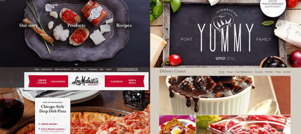
It looks delicious! Has it ever happened with you that you literally start drooling by merely looking at a dish or its picture? We bet you’ve experienced this. Long gone are the days when food websites relied on PDF format menu cards and boring stock images. They have undergone a major transformation and now use a splendid UI design, magnificent photographs, vibrant colors, striking fonts, and high-quality content on their websites. So what are really the ingredients that contribute to the recipe for a lip-smacking food website? Let’s find out.

1. Drooling Pictures

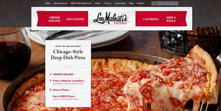
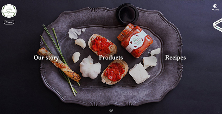
It goes without saying that visuals create the best impact on users visiting a website. That said, food photography is an art; it is the base of any food website and is a major contributor to its success. The food should look delicious, full of flavors, colorful, fresh and must make everyone drool. Every food brand must give a good amount of thinking to it. It’s not just the food, but its plating, cutlery, look and feel of the ambience, everything contributes.

Drooling-Pictures
LouMalnati’s

2. Delicious Colors

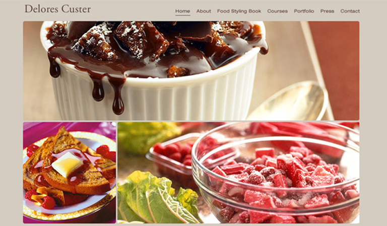
Yes! Colors can create an aura of taste and can easily make a food either look tasty or boring. Don’t be afraid of playing around with vibrant colors, however, don’t go too loud and over the top. A tried and tested trick of the book while selecting a background color is to sample colors from the food itself, and darken or lighten them; the food will look attractive. For typography, do the reverse (lighter or darker) than the background.

Delores-Custer
Delores Custer

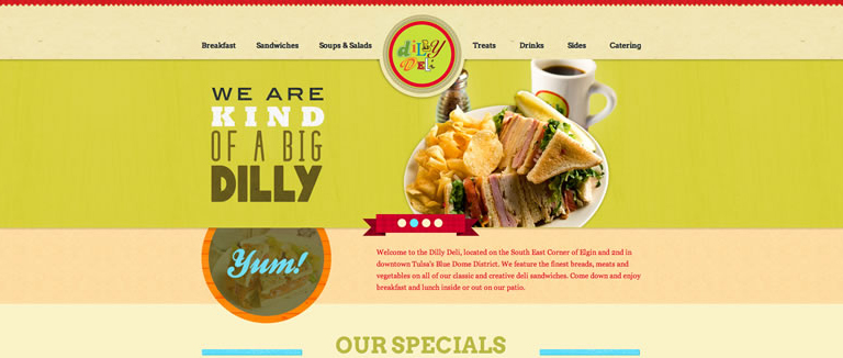
3. Appetizing Content

Content is the king, and in every context. Enticing photographs and attractive colors may make a visitor inquisitive, but its the content which will eventually engage users. Users will be interested in what value proposition you have for them and how you can increase their knowledge while providing food for their thought and interests. Content is really important, but just because it’s important, don’t complicate it. Keep your content simple, fun, and in a light tone. After all, you’re talking about food, not a world crisis.

Appetizing-Content

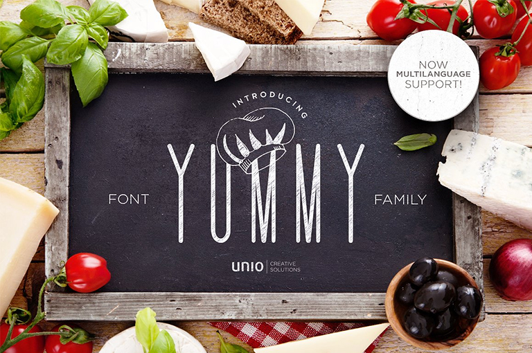
4. Flavorful Typography

Your food fonts should be good enough to eat. Fonts should compliment your food photographs as well as the appetizing content that you have put on your website. Draw inspiration from restaurant menus, cookbooks, or recipe books. They are an ocean of knowledge as far as the fonts are concerned. Create a unique style between the headings, subheadings and base text to create a visually pleasing style.

Flavorful-Typography
Unio

5. Yummy Interface

An effective interface is pivotal for any website, and a food website is no exception. A simple yet persuasive user interface ensures that the user is not lost on the website at any given point in time and can carry out the desired purpose without any distractions. A good UI is an unsung hero; it swiftly elevates the user experience while working in the background. All functions must be crisp, clear, and intuitive. A user must be aware of how to perform a certain action and what would be the result of it.

Yummy-Interface

The food industry is growing by leaps and bounds, competition is increasing day-by-day. It is very important for a food business to give more thoughts on how they present themselves over the web, as the internet has now become the predominant way of interacting with any sort of business. Engage in a quick chat with our web design experts to know more on how you can elevate your business through effective web designing.

Categories
Design

Mid Year Round-Up of Latest UI Design Trends

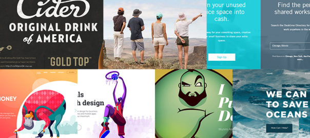
Half the year has gone by and we can say this was a pretty interesting year in terms of web designing, especially UI designs. A lot of new design trends surfaced, while a few faded away. Here’s a list of the hottest UI design trends which were highly popular by far in 2018.

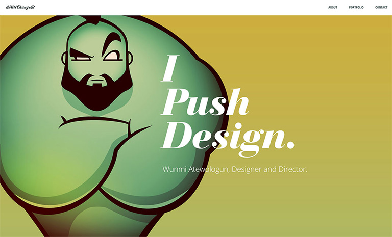
Storytelling with Character Design

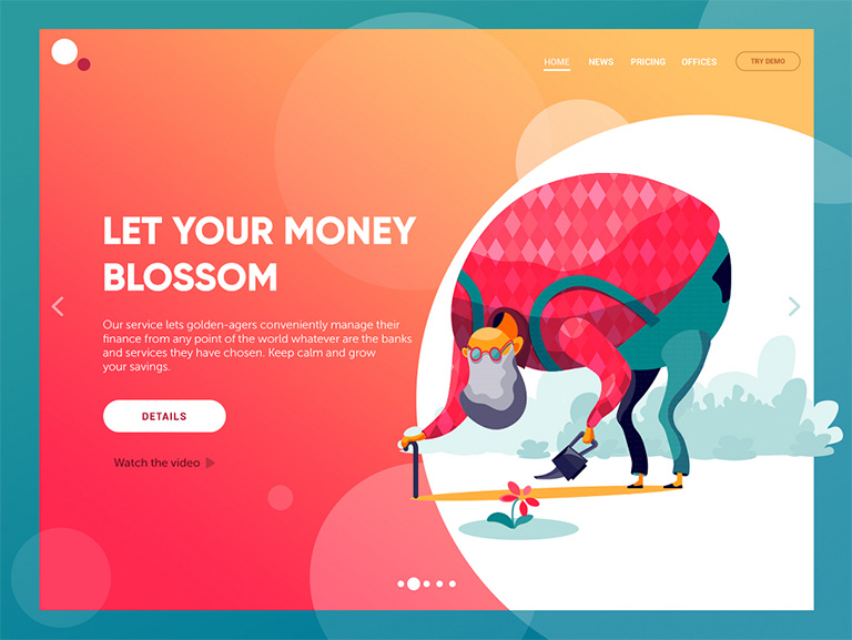
The trend of custom graphics has opened doors for personalization and developing personalized special characters. Character design for storytelling in the interfaces is swiftly gaining popularity. More and more websites and mobile apps turn to specially designed characters for storytelling, setting the tone, conveying messages or showcasing the benefits in a way that matches the mood and voice of the platform. The interactions are more human-like when original characters are involved and thus creates a strong visual association with the real world. Moreover, the characters make the page or screen compelling and vibrant.

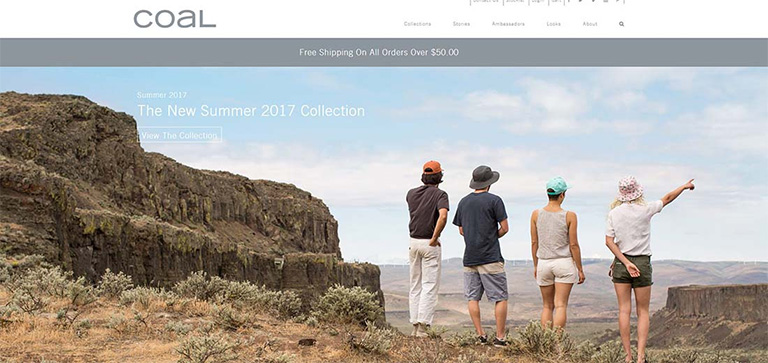
Full-Screen Background Images

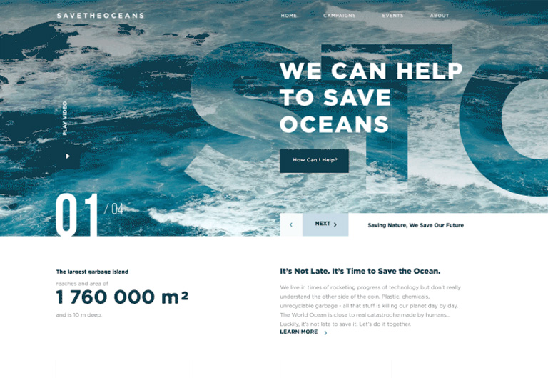
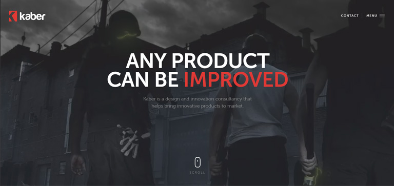
More and more websites have now started using full-screen background images, be it photos or specially rendered visualizations. Use of these images not only visually enhance the websites, it makes them emotionally appealing. It is the most effective way of captivating visitor’s attention and sets the tone for an ideal user experience even when the site is loading, in addition to boosting the UI. Only high-quality images must be used as background images; the recommended background image size is 1250×800 or anything higher than that but with the same proportions.

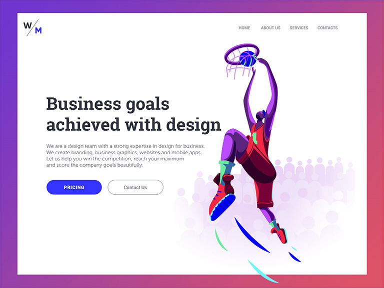
Custom Digital Illustrations

Some trends continue to be popular for years. Custom digital illustrations are one of them; its presence on the web and mobile user interfaces is increasing every day. Custom graphics effectively support the quick perception of information provided on the page or screen; they set a solid ground for originality. Custom mascots, icons, illustrations are some of the most common forms of custom graphics which designers use to enhance the look of a page or screen, as well as boost usability and intuitive navigation. Another growing trend is creating digital illustrations as title images for blog articles.

Hero Images

A hero image is the first, main photograph or graphic that you see at the top of a web page. Its primary objective is to grab immediate attention and show visitors what your site, content is all about. They are flashy, pretty and keep visitors engaged. Moreover, as well as any other striking graphics on web pages, this is a kind of content which is both informative and emotionally appealing. This might be the reason why designers often turn to this technique to add diversity to landing pages.

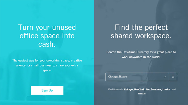
Split Screens

One of the hot trends of this year is the active usage of split screens in both web and mobile interfaces. However, this trend is not really a new one. We have noticed that it fades away, only to make a comeback in various spheres of design, and looking at the year so far, it’s safe to say that it’s definitely back and alive. Split screen approach is believed to be more effective in responsive designs as you can work around with different content variations without missing the consistency. Additionally, it offers liberty to designers to try different color combinations and experiments. Some websites even use split screens to show two options of equal importance.

Multiple Interactive Layers

UI designers never shy away from experimenting and infusing creativity in their designs to find new, interesting ways of making the web page interactive and highly engaging. One of the growing trends is applying several interactive layers that make scrolling experience and interactions look original. By playing around with the positioning of various items on the scroll, they create an amazing parallax effect that provides a deeply layered experience.

Bold Typography

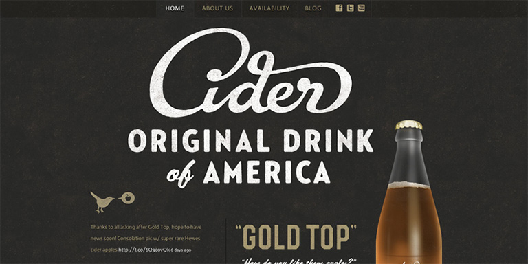
This UI trend has become very popular over the last few years and continues to do so in 2018. Bold and catchy typography can be seen all across the web and mobile layouts. In most cases, it becomes one of the key design elements and designers pay plenty of attention towards keeping it readable and scannable. Typographic hierarchy along with thoughtfully chosen fonts are among the core tasks of every UI design project.

Apart from these, there are many other UI design trends which have been the talk of the designer’s town. Share the ones you like in the comments section. Even better, talk to our design experts and know in-depth about the latest design trends.

Categories
Web Design

Why Is Whitespace So Important In Web Designing?

The term whitespace is often perceived as white empty sidebars between which the content is squeezed. But that’s not the case. whitespace, also known as negative space is also the empty area around images or other elements on the web page in addition to the spacing between letters in your titles and text. Irrespective of the design style you follow, it is very important to include and use whitespace wisely to create a visual appeal. It may not eat a lot of your screen real estate, but surely makes your website look refined. Here are a few benefits of using whitespace in your design.

1. It Grabs Attention

We may get into a never-ending debate zeroing down on the best strategy to attract user attention online. However, one thing we all may agree on is to what doesn’t grab attention- emptiness, blank space, nothing. This simple fact helps in putting blank space to best use. whitespace can be used to draw and funnel attention to the important elements which you want to highlight.

Grabs-Attention

You may clutter a page with images and texts, and highlight the important page elements; you can choose to leave more space around vital images or even go for larger fonts to make them stand out. You can do this on your homepage, landing pages, portfolio pages, conversion funnels etc. Empty space around the key object eliminates distracting elements or clutter around it, thereby extracting all of user’s attention towards the object itself.

2. Demonstrates Visual Hierarchy

It’s very important to distinguish important elements from the ‘not so important’ ones. Mostly, this is done by playing around with the size of elements. In addition to the size of the elements, size of whitespace is also critical, especially from a design point of view. Vital elements have more whitespace around them and the size of whitespace keeps on decreasing with the importance level of elements. This establishes a visual order or visual hierarchy.

Demonstrates-Visual-Hierarchy

By implementing this hierarchy of visual priorities and effectively using whitespace, your design will exhibit a smooth visual flow that eliminates ambiguity. The viewer knows what’s important and where to go next. Landing pages are usually the best examples of this. There’s a large title with more whitespace than the text that will follow, and that test runs up till a large ‘Subscribe Now’, or ‘Buy Now’ button that has the most amount of whitespace around it.

3. Sets Groups Apart

A lot of minds think whitespace is really waste of space, but when used appropriately and wisely, it actually saves space. If you find yourself running out of screen real estate and still have a huge list of products, services, or anything else that you want your viewer’s attention towards, then you may end up placing items too close together. This will make items in that section appear to be similar and will not get the desired attention as they’ll blend in with the noise.

Sets-Groups-Apart

To rectify this, instead of highlighting your products, you just alter the size of them, change their layout and orientation, or combination of the two. This will create some whitespace between the objects, set them apart from each other, and make it easier for viewers to pick up on that.

4. Improves Readability

Whitespace is the backbone of text readability. You wouldn’t be able to read through this text if it was all crammed together with minimal spacing. Text looks all packed up and hard to read if you leave very little whitespace. That said, leave too much space and you end up wasting it. This is the reason why the world’s top designers emphasis so much on fonts and typography.

Different fonts employ different amounts of whitespace, depending on the font style. However, font size holds equal importance. Headings are larger and use more space in order to draw viewers’ attention. Some other areas that use whitespace to improve and enhance the reading experience include line spacing and paragraph margins.

If one has to describe whitespace in a poetic way, it could well be “a perfect amalgamation of art and science.” A scientific application of this art is required for the design to be effective. One can achieve beautification through simplification by effectively utilizing whitespace. Intrigued by learning this?  Talk to our experts to know more.

Categories
Design Web Design

5 UI Trends That Topped The Charts In 2017

These 9 months of 2017 have been quite exciting in terms of technology and the web. The world of web is moving at a fast pace with new advancements emerging every now and then. In line with these technological advancements, the design world has also allowed itself to evolve by accepting new trends and ideas. Designers have welcomed fresh design trends and methodologies with both hands especially while designing the User Interface. With a majority of the year gone by, let’s have a quick look at the UI trends which ruled in 2017.

1. Use Of Deeply Engaging Videos

We have repeatedly highlighted the importance of videos in terms of web design and User Interface. It’s the best way of voicing out the brand’s message in an appropriately associated tone. ‘A picture speaks thousands of words’, and is much more engaging as compared to mere words. Use of pictures has been a trend for quite some time now and videos are its natural successor. Images are static whereas videos are dynamic, thereby creating an amplified effect. 2017 has seen a shift in momentum from the use of static images to engaging videos. Having said that, images are not going to disappear from the scene overnight. However, videos are the next big thing in designing an impressive interface.

2. Long Scrolling

Scrolling is not really a so-called trend and is more of a fundamental functionality. It has been prevalent from a long time both in websites and desktops. But, long scrolling has emerged as a design trend in the last few years. A huge number of websites are using long scroll & longform content for desktops and other larger devices in order to display their content. Due to an increase in access to the internet through smaller devices like mobiles etc., users have become extremely comfortable with scrolling. This has pushed designers to implement long scroll and longform of content in bigger screens. With help of long scroll, users can access a huge amount of content in a single and smooth motion. It works well with all forms of content like longform journalism, news articles, stories, landing page etc.

3. Flamboyant Colors & Gradients

The year 2013 saw the uprise of a design methodology which changed the look and feel of the web back then. It was the introduction of flat design. The concept was to keep the design as simple as possible while eliminating all the fancy and jazzy elements from the design. Functionality wise it was very strong and therefore soon spread like wildfire among the designers. However, it had its own drawbacks. Soon everyone was using a flat design and therefore every website looked more or less similar.

Designers realized the need of creativity and individuality once again and they broke the shackles in 2016. Designers started focusing more and more on personality, experimenting with bold colors, vivid colors etc. instead of dull and simple color shades to provide a sense of uniqueness to their websites. 2017 has seen a great increase in vivid colored and stylized websites. This trend has shown positivity and is bound to gain momentum in the upcoming year as well.

4. Bold & Beautiful Typography

In an extension to use of vivid colors and bold designs, designers have fearlessly experimented with loud Typography as well in 2017. Today, there are a lot of free or cost-effective web font services (like Google fonts, Typekits etc.) available to designers, which provides them creative freedom and more experimenting power. 2017 has seen a huge rise in the use of unconventional, bold, and out of the league web fonts in comparison to conventional fonts. This trend is here to stay for quite some time and the upcoming year will see more and more bold & beautiful typefaces against the traditional typefaces.

5. Illustrations

Illustrations provide an immense sense of personality, individuality, and character which can barely be achieved with traditional photography. Illustrations designed in line with a brand’s identity develops a sense of authenticity and builds trust in users and customers. Illustrations have their own versatility. Some brands may prefer sophisticated illustrations to achieve that posh and classy look, whereas others may rely on more rough and edgy styles to position themselves as fun and playful. Illustrations have performed well in 2017 and they seem to be buzzing in the coming years as well.

The only thing constant is ‘change’ itself. New trends and ideas keep on emerging at the scene and designers should always try to keep themselves abreast these trends. The aforementioned trends are the most popular trends that created a buzz in 2017. However, there is a huge list of other trends as well which were successful in modifying the design world. Share your design requirements with our experts and see how you can ride on these trends to create an impressive User Interface.

Categories
Web Design

How To Effectively Implement Long Scrolling While Designing Lengthy Web Pages?

A lengthy web page or infinite scrolling was considered bad from a design perspective and even from a user experience perspective. However, lengthy web pages have gained a good amount of popularity over the years. The exponential increase in the use of mobiles is the key propeller of long scrolling design. Smaller screens support long scrolling and thus an infinite scrolling design best suits for users on these devices.

Long scrolling helps in creating more engagement amongst users. The content appears more engaging when the user needn’t focus on navigation options on the page. Here are a few important rules which should be followed to effectively implement long scrolling while designing lengthy web pages:

1. Introductory Content Must Be Strong And Compelling

The common saying “First impression is the last impression” holds full value in case of a web page as well. The natural tendency of users makes them scroll down the page right when they land on a page. However, it’s very important that the most engaging and compelling content is always placed at the top of the page. If the content at the top is good, it increases chances of a user to scroll down the page. Use attractive images along with strong content to create interest among users.

2. Use A Sticky Menu

Even when you are creating a long scrolling web page it is important to provide the location and directions to the users. With no proper directions or lead to navigate around the page, they will most likely bounce off the page. Long scrolling becomes troublesome when the top navigation menu disappears on scrolling down the page. The user shouldn’t be scrolling all the way up to find navigation options. Use a Sticky Menu which will show the current location and will sit at a convenient location all the time.

3. URL Must Change Based On Scroll Position

One of the biggest challenges of long scrolling is the constant URL. The user’s scroll position is not reflected in the URL which makes it impossible for them to switch between devices and continue browsing from the same spot.
However, starting from HTML 5 it’s possible to change the URL without reloading the page. The history.pushState() function allows the change in the URL which enhances the user experience in terms of scrolling.

4. Provide Jump -To Options

It’s common for a user to get disoriented in a long scrolling design pattern. The amount of content is huge and is often broken down into chunks. It creates a problem when all the chunks contain equally important content. It’s possible that a user might have seen something important previously on the page and wants to go back to that content. However, he might not get a proper direction to reach back there. A “Jump To Option” is the solution to this problem. A Jump Down and a Jump Up option would solve the navigation problems for users.

5. Optimize The Page Loading Time

Another challenge with long scrolling pages is slow loading time. It’s very critical for any website to manage a decent or rather quick page load time else it can be fatal for their website. According to a research, 57% of the users exit from a web page if it doesn’t load in 3 seconds. Page-loading time should be optimized for long scrolling web pages using certain effective sequential loading techniques. Lazy loading is one such technique that enables users to access the most basic content swiftly. It loads only the basic content at the first go and while a user browses through the basic content, rest of the content on the web page is loaded.

In short, if the user’s browsing experience is delightful, then they won’t really mind scrolling down a long web page. Start thinking from a user’s perspective and design for their utter comfort. Talk to our design experts today and get the best advice on design aspects.

Categories
UX

5 Golden Rules To Create An Excellent User Interface

Over the last few years, the world has digitized so rapidly and drastically that it becomes a little hard to believe. Digital interaction and experience have become a part of our daily routine. This raises the importance of user experience to a whole new level. User Interface is associated with us practically everywhere. Be it on our mobiles, websites, car displays, thermostat control in our offices/homes and the list goes on and on. But what differentiates a quality UI from an ordinary UI ? Let’s find out the answer by discovering 5 key elements of an excellent UI.

1. The Design Must Be Simple:

As simple as it sounds. Simplicity has its own charm and it never fails to impress. Don’t clutter a page with unnecessary elements and options. Furthermore, the target is to provide only essential elements and options which are required by the user to complete their task. Rest of the elements can take a step back. A lot of designers push in a bunch of “can be neglected” elements in the page design which defeats the purpose of providing best user experience.

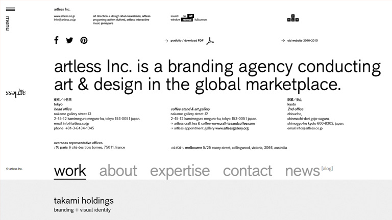
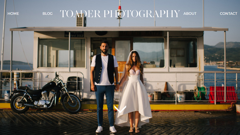
This Toader Photography website is a brilliant example of simple user interface.

Toader Photography
Pic Courtesy: toaderphotography.com

2. Users Must Sense Familiarity:

When a user lands on a web page, at no point in time he should think “What to do now?” Neither he should be greeted with something unexpected. The interface must be intuitive in nature so that users easily understand it. This will create a sense of familiarity in a user’s mind. A great example – A lot of restaurants and food joints are using a food article icon (like a burger or a pizza slice) on their app and websites. This instantly tells the user where the menu is?

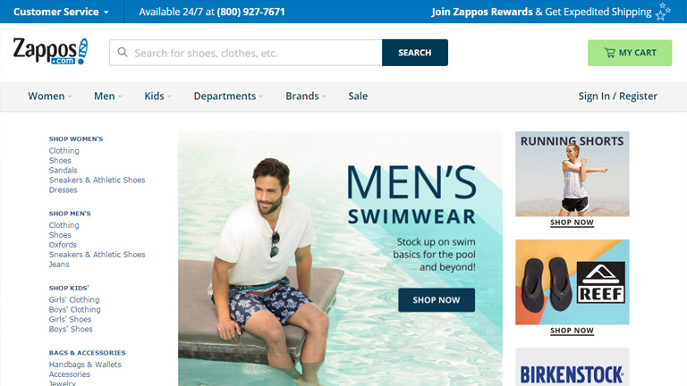
In another example, see how Zappos has placed all the familiar tabs at familiar positions.

zappos

Pic Courtesy: zappos.com

3. The Messaging Must Be Clear:

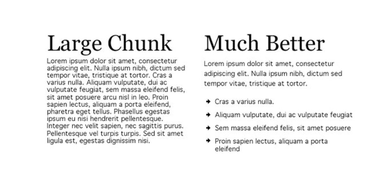
The first point emphasized on being simple and ditching the complexity. But, it’s equally important to be clear and concise. Save your users from the trouble of reading lengthy messages, labels, and descriptions. It will really annoy a user and would only lead him towards the “X” button. Cut to the chase and be point blank. Users like it. Moreover, it’s all about providing a delightful user experience and stretched messaging is a roadblock in this process.

4. Be consistent:

Never loose on consistency throughout the user experience journey. People like consistent interfaces as it smoothens the entire experience. They develop usage patterns and later rely on these patterns which further improves their experience. The process is simple. They learn about your design pattern and want to use the learning in their future interactions. An inconsistent interface will make it hard for users to understand how things really work on your website or app.

5. Create A Visual Hierarchy:

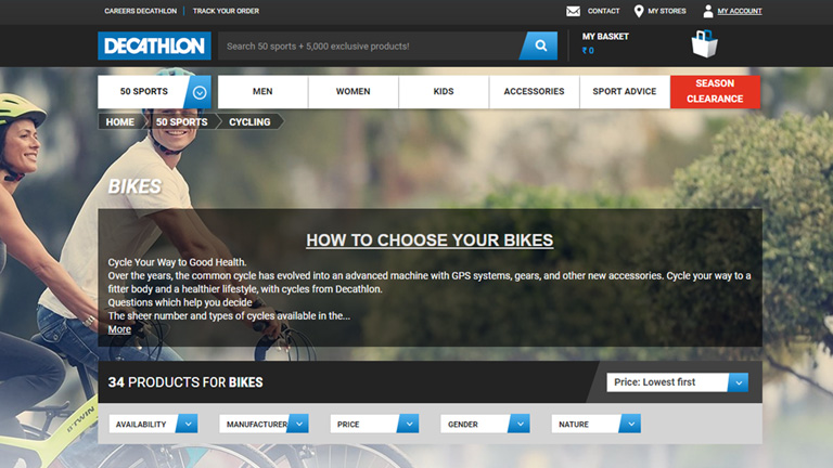
This is a very critical element in terms of user interfaces. However, most of the designers overlook it. It is quintessential to focus on the important elements. Never try to make every element look important. It clutters everything and the user gets confused in taking any action. A proper distinction between colors, shapes, and placement of elements must be maintained to guide the user towards the action. If the visual hierarchy is properly implemented in a design, it kills complexity and helps users in performing their tasks more efficiently and swiftly.

Look how Decathlon has highlighted the “Season Clearance” tab by coloring it bright red. This instantly grabs attention and leads the user towards the action.

decathlon

Pic Courtesy: decathlon.com

Times have changed and so have the users. They demand a satisfying user experience more than just a transaction. Therefore, designers should dig in deep and try to understand each and every aspect related to user experience to create a user-friendly interface. Talk to our experts and fulfill your design requirements.

Categories
UX Web Design

5 Tips For Creating A Familiar and Intuitive UI

Barge into a conversation between two designers and it’s inevitable that you will come across the term Intuitive User Interface in most part of their conversation. The term is so buzzing within the designers across the globe, it has almost become an adjective to a design project. Intuitive UI sits right on pinnacle of the pyramid of essentials for any design job. But, even if everyone is talking about it, do we really understand what it is?

What is Intuitive UI?

A user interface can be termed as intuitive when users understand its behavior and result without any assistance, experimentation, reasoning, or special training.
Let me put this in a layman’s term. Say if you see something on a web page that looks like a button, you immediately know that you can click on it. Similarly, if you see any link on the website, you know that it will result in opening of an external or internal link/web page.

A non-intuitive design is one which pushes a user into an unfamiliar situation and diverts his focus which leads to non-completion of the desired task.

So HOW do you create a Familiar and Intuitive UI?

Here are a few tips:

1. Avoid New Patterns

As humans, we are very reluctant to any kind of a change. We never like changes in our set patterns. People who have migrated from Mac to Windows or vice versa can totally co-relate to this fact. The Minimise, Maximise and Close options are on the left side in Mac OS whereas they are on the right side in Windows OS. We are used to certain patterns, and a change is just not user-friendly.

2. Minimum Steps Involved In Completion Of A Task

No one is ever interested in providing their life history just to complete the signup process. The signup process must be lesser than a minute, ideally 30 seconds. Thus the unnecessary steps involved must be eliminated. That’s the reason why almost every website provides an option to signup through Facebook to cut down on the steps involved.

3. Consistency Is The Key

Every soul browsing the internet is inquisitive as well as highly impatient. A slight distraction can easily erk them and lead to bounce away from your web page. That calls for an utmost focus on creating consistency across all your web pages. A user has certain defined expectations when he browses your website. If there is a change in the expectation, it only causes distraction and frustration.

Flipping between using a sidebar with navigation links to a top navigation bar on another page is a perfect example of causing needless distractions and frustration. This will only add to your website’s bounce rate.

4. Use Integrated Help Messages And Tooltips

No matter how hard you try and even achieve a spectacular UI, it’s almost impossible to create a universal UI. Some users may find your UI intuitive while others might beg to differ. To counter this, use integrated help messages and tooltips that act as a guide for users, educating them how the website works. The assistance is provided on a real time basis which saves a lot of time and makes the user experience smooth, clear and effective.

5. Page Load Time Should Be Minimum

No one likes to wait for a web page to load. It’s imperative that your web page loads quickly, else there are high possibilities that the user will simply close your web page and even would not consider coming back ever again. If you have heavy web pages, it is advised to display some part of the content or at least a loading bar to keep a user on the page.

A website that has a lot of distraction and confusing elements will never be intuitive. It is very important to focus on intuitive design along with core design factors like perfect color scheme or content structure. Your visitors are bound to move to a competition if you don’t offer an intuitive UI that is easy to understand and helps in completion of planned tasks.

Get in touch with our design experts to satisfy all your design needs.