No matter how exciting and compelling your story is, it will not be able to create an impact on users if it isn’t presented in a clear and readable layout. People generally focus more on the content than its packaging. No doubt content is the king, but packaging plays a crucial role in determining its success. Readability and legibility are two key aspects of user experience design. To simply put – app and web users will not read your content if it doesn’t look clean, clear, and consumable. In this article, we will cover the factors that influence readability and legibility in user interfaces and why it’s important to care about them.
Readability
As the name suggests, readability is the ease of written content perception. It refers to the comprehension of the text content. It includes – the simplicity of words and sentences, ease of consuming information, and clarity of thoughts. Readability is determined by considering your website’s typeface, which takes font size, font style, line length, and line-height into account.
Legibility
Legibility is a much narrower concept than readability. It refers to how easily your audience can recognize and differentiate between individual characters in lines of copy on your website. Legibility is determined primarily by your typeface design. We can say that legibility is one of the components to fall under the bigger umbrella of readability. It is generally analyzed by examining users’ reading speed in terms of words-per-minute.
Factors Influencing Readability and Legibility
There are plenty of factors that directly impact the readability and legibility of the content. Here are the five most important ones:
1. Typography
Typography refers to the font style. There are some fonts that are easy on users’ eyes and create a delightful reading experience. On the other hand, some fonts are not so pleasing. The choice of fonts directly impacts the readability and legibility of your copy. Font size, width, color, and text structure – every single element matters. Fonts also add to the visual element, just like images. Typography in design is the art of balancing the aesthetic aspect of the text and the ability to read it quickly.
Negative space, alignment, tracking, the spacing between baselines of text, line length, etc. are all key elements to clear typography and comprehendible content. Designers must avoid too little space between the words, very less distance between the lines or letters, tiny font size, and non-contrasting text and background colors.
2. Background
Just like printed books and newspapers, the background color has a significant impact on the ability to read and comprehend the content on websites. It allows readers to distinguish both interactive elements and content. For instance, black text on white or light background appears more significant than the white text on a dark background. An improper color scheme will mostly result in reduced readability, leading to poor user experience. Relevant content or useful data that is unreadable is of no use; users will most likely not read it.
The nature of the content also plays a role in selecting the color scheme. Text-heavy interfaces aimed at reading as the main activity should use color schemes based on light backgrounds. In contrast, the image-heavy interfaces should use dark backgrounds to amplify the pictures’ performance.
3. Writing
The UX writing must be clear, concise, useful and consistent. Text is a vital part of the visual design and user experience. The best you can do with the written content on your website, app, or blog is to make it human-like communication. When you interact with your users through text, at any level, they must feel as if they are interacting with a real human being and not a bot.
Remember – users don’t read on the web, but scan through the content. Be short and consistent in your written copy. An extended form of writing pushes off users. You must also build a solid text hierarchy so that users can quickly scan your page content. Use numbers, marked elements, and textual variants to catch attention. Marking out specific information by using bold and italic fonts, unusual text sizes, different colors, highlighting, etc. has worked well for years and still holds its significance; however, avoid overdoing it.
4. Visual Hierarchy
Visual hierarchy refers to prioritizing the content into different levels. It is based on the Gestalt theory that deals with the psychology of visual perception of elements. The theory shows how people tend to group visual elements. It organizes UI components so that the brain could distinguish the objects based on their physical differences, such as size, color, contrast, style, etc.
As mentioned earlier, people scan content over the web. So, if we take an example of a blog, they will first notice the headline, then subheadings and only then copy blocks. This is a typical pattern. Users scan the headline and subheadings to understand if the article is interesting and useful to them. Only then will they read the entire blog. The headline and subheadings should be framed in a way that is both informative and enticing. On the other hand, if users see the vast and long sheet of text, they will be scared to read it.
To build an effective visual hierarchy, the text is divided into three levels:
- The primary level – It includes the biggest type like in headlines.
- The secondary level – This is the type of element that supports scannability, such as subheaders or captions.
- The tertiary level – This one is for the body text and additional data.
5. White space
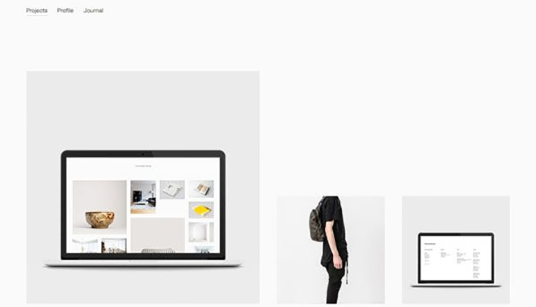
White space or negative space is the area of the layout that is left empty. It can be either around the objects you place in the layout or between and inside them. Negative space provides breathing space for all the objects by clearing the unwanted clutter from the page. White space is a strong tool to improve the readability of your text and thereby enhancing the user experience. It also helps in creating a connection between the text and non-text elements of a user interface.
Many more factors influence the readability and legibility of the content of a user interface; however, these are the most important ones. If you feel like discussing them further in detail, our team of experts will be more than happy to assist you.


